• Skip to primary navigation
  • Skip to content
  • Skip to primary sidebar
  • Skip to footer

Photography Life

PL provides various digital photography news, reviews, articles, tips, tutorials and guides to photographers of all levels

  • Click to visit our RSS feed
  • Click to visit our Facebook page
  • Click to visit us on Twitter
  • Click to visit our YouTube channel
  • Click to visit our Instagram page
  • Reviews
    • Camera Reviews
    • Lens Reviews
    • Other Gear Reviews
  • Learn
    • Beginner Photography
    • Landscape Photography
    • Wildlife Photography
    • Portraiture
    • Post-Processing
    • Advanced Tutorials
  • Forum
  • Photo Spots
    • Photo Spots Index
    • Submit a Photo Spot
  • Lenses
    • Lens Index
  • About Us
    • Contact Us
    • Workshops
    • Subscribe
    • Submit Content
  • Shop
    • Cart
    • Support Us
  • Search
  • Log In
  • Sign Up
Home » Color Management and Printing » sRGB vs Adobe RGB vs ProPhoto RGB
  • Click to share on Facebook (Opens in new window)
  • Click to share on Twitter (Opens in new window)
  • Click to share on Pinterest (Opens in new window)
  • Click to share on Reddit (Opens in new window)

sRGB vs Adobe RGB vs ProPhoto RGB

Spencer Cox81 Comments

Color spaces are essential in photography; they apply in some way to every photo you take. The most well-known color spaces are sRGB, Adobe RGB, and ProPhoto RGB. But what makes them so important? Beware: There’s a lot of misinformation about this topic online. Outdated and inaccurate recommendations abound – but so does a lot of valuable information, if you’re willing to learn it. This article introduces sRGB, Adobe RGB, and ProPhoto RGB, and when to use each one.

I’ll preface this article, like most technical articles I write, by saying that this is a complex subject! You might want to dig down and read it a couple times to fully internalize how everything works. I did my best to write it all in plain English, as well as define complex terms in context, so hopefully it’s still easy to understand. You’re also free to ask questions in the comments section at the end, and I’m happy to help clarify anything you’re still wondering about.

1. What Are sRGB, Adobe RGB, and ProPhoto RGB?

sRGB, Adobe RGB, and ProPhoto RGB are three of the most commonly used color spaces in photography.

“Color spaces” is not some fancy term meant to confuse or bewilder. It just means a set of colors – a container, almost. If you have two paints (say, red and blue) plus a white canvas, your entire color space is just the colors you can make by mixing the two paints. And yes, that includes painting more lightly to let some of the white canvas shine through.

A good way to envision color spaces is to look at a set of all the colors people can see. (If no one can see it, it’s not a “color” anyway – colors are subjective like that.) You may have seen an illustration like this before:

Colors the Human Visual System Can See
All the colors the human visual system can see. Courtesy Wikipedia, public domain.

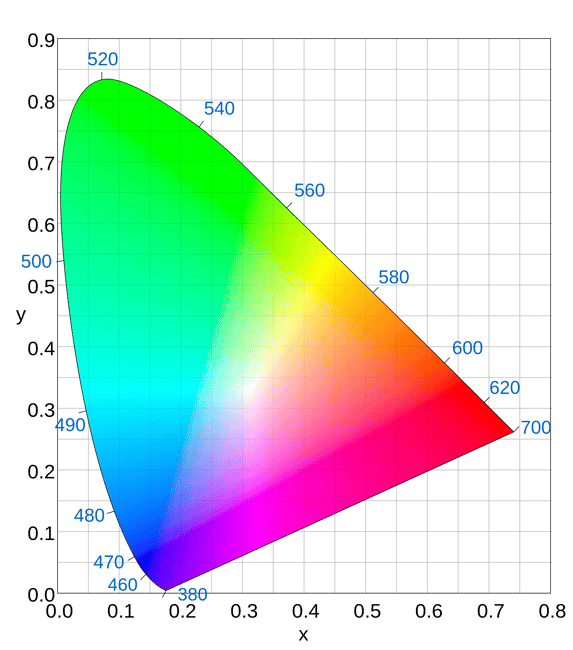
The diagram above represents every color we can see, although note that it’s a two dimensional figure (x and y axis only), so it doesn’t account for darker colors, i.e., luminance.

So, how do sRGB, Adobe RGB, and ProPhoto RGB fit into this? Quite simply, they intersect with the diagram above (and, in the case of ProPhoto, actually stretch beyond it in places). Here are the different shapes of the sRGB, Adobe RGB, and ProPhoto color spaces. If you’re first learning about these three color spaces, the simple diagrams below might answer some of your questions already:

sRGB

Adobe RGB

ProPhoto RGB

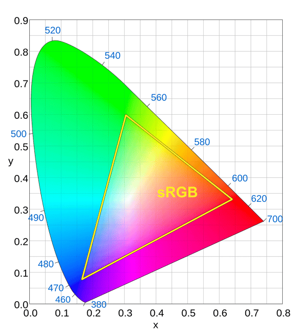
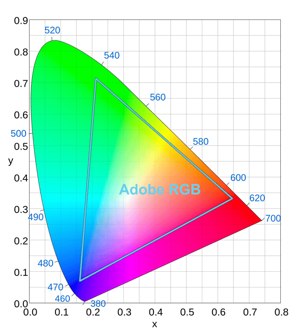
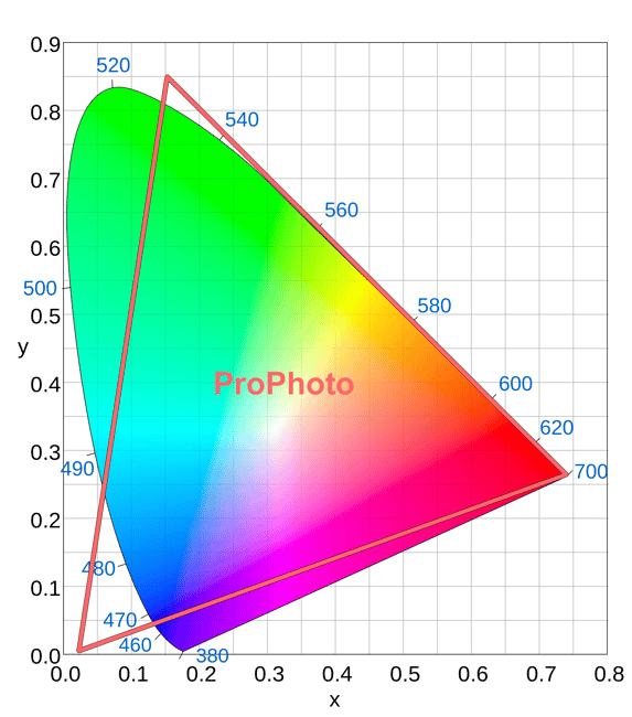
And here’s how they all look overlaid together:

sRGB vs Adobe RGB vs ProPhoto RGB

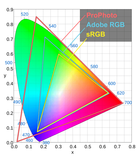
As you can see, sRGB is the smallest color space, with a gamut (another word for range) only covering a small portion of what our own eyes can see. The Adobe RGB gamut is larger, particularly in the green and cyan colors. It allows for more saturation (“chroma”) in those areas.

ProPhoto RGB is the largest of the three – and possibly the most interesting, since it includes “colors” outside what we can see. We call these imaginary colors just to induce fear in other photographers. You physically cannot see them; that’s what makes them imaginary. They aren’t especially important to this discussion, though. ProPhoto RGB only includes those values because it allows the gamut of real colors to be larger than that of other color spaces, including sRGB and Adobe RGB.

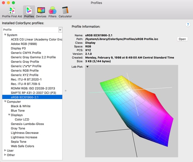
Remember, too, that these are just 2D representations. Here’s a 3D image of the sRGB color space (viewed from slightly overhead), so you can visualize the role that luminance plays:

sRGB 3D View in ColorSync Utility
Screenshot from “ColorSync Utility,” included on Mac

2. Understanding RGB Values

Let’s say that you want to specify a particular color, maybe a slight shade of beige-white. Color spaces are defined mathematically. Every color you could possibly think of has, essentially, its own “coordinates” within the color space so you can find it exactly. But keep in mind that these coordinates are specific to each color space. The same values won’t result in the same color in both sRGB and Adobe RGB, for example.

“RGB” stands for red, green, blue. This is what specifies the color you’re looking for – three values, one each for red, green, and blue. In sRGB color space, the beige-white color in question is specified as RGB 255, 248, 231 – meaning that the red channel value is 255, green is 248, and blue is 231.

But “255, 248, 231” points to a different color in Adobe RGB space, as well as in ProPhoto RGB space. That is very important to know; it’s why your photos need to include information about their color space. Otherwise, how can a computer application know what color you mean by “255, 248, 231”? It simply can’t tell.

Spoiler alert: Despite how important it is, some applications don’t read the color space of a photo. They just assume you’re using a default color space (more on that later). This is a problem for hopefully obvious reasons. You don’t want your browser or application to see the RGB coordinates “120, 140, 160” in both sRGB and ProPhoto color spaces and think they’re the same color.

3. Understanding Bit Depth

Another important topic to this discussion is bit depth, also known as color depth – simply how many bits of data are used to create each pixel.

The baseline in photography is usually 8 bits per pixel, meaning that each individual pixel can represent 2^8 or 256 colors. But your camera has red, green, and blue pixels. So that’s 256 shades of red, 256 shades of green, and 256 shades of blue. The total is 256 x 256 x 256, or a whopping 16,777,216 RGB values.

But why stop there? It’s common to work with photos up to 16 bit per channel, leading to an incredible 281 trillion RGB values at your disposal. Although this may seem absurd and unnecessary – it’s far more than the human visual system can perceive – there are benefits to using 16-bit color while you’re editing a photo. Specifically, it makes gradients in an image as smooth as possible, with minimal banding.

(Note that calling all of these 281 trillion RGB points “colors” is a bit misleading, since color is defined based on human perception. Sure, there are trillions of “color codes,” but many of them are too similar for us to notice a difference. And recall that some of ProPhoto’s color codes refer to imaginary colors anyway – ones we cannot see.)

3.1. Do Photos in Large Color Spaces Have More Colors than Others?

One major confusion I often see is the idea that photos in large color spaces like ProPhoto have “more colors” than others.

No! The color space of a photo says nothing about total number of colors in an image. ProPhoto RGB may be “bigger” in terms of range, but an image in ProPhoto RGB color space doesn’t have more colors than a photo in sRGB. An 8-bit per channel photo is limited to about 16.8 million RGB values, no matter what color space it’s in. Those values are simply spread out farther in color spaces like ProPhoto – potentially leading to a problem known as banding.

3.2. Bit Depth and Banding

The larger your color space, the more important it is that you work with higher bit depth photos. In sRGB, using 8-bit per channel color will often result in smooth gradients that are just fine, with no perceptible banding. But those same 16.8 million colors in ProPhoto will be by definition farther apart from one another, since they’re spreading out to fill a bigger “container.” This makes it more likely that you’ll see banding in gradients in your photos.

Banding-example1
Note the blocky transitions in this gradient. This is known as banding.

You can work around this easily by avoiding 8-bit color with ProPhoto images.

4. Working Space vs Output Space

There are two stages along the photo pipeline where you need to choose a color space: post-processing and outputting your image.

Okay, if you shoot JPEG (don’t), you also have to make this decision in camera, at least with some cameras (which have sRGB and Adobe RGB options). RAW shooters can ignore this menu option if they want. It will change the preview on the rear of your camera screen, so I recommend picking Adobe RGB, but it doesn’t alter the RAW data you capture.

Below, I’ll narrow down the importance of picking the right color space for both post-processing and output.

4.1. Working Space

When you post-process a photo, you have to choose which working space you’re in. This is the color space your post-processing software restricts you to use; no edit you make can lead to a color found outside your chosen working space. In general, it is ideal that your working space is ProPhoto RGB when you edit a RAW photo. That’s because RAW photos often contain colors outside of both sRGB and Adobe RGB color spaces, especially in high-saturation shadow regions. If you specify sRGB as your working space, you’ll automatically clip any colors that fall outside the sRGB range for every photo you edit. (Some software, like Lightroom, doesn’t even let you specify sRGB as your working space for this reason.)

Photoshop’s ideal settings are a bit tricky, and there are a few different philosophies on the best practices. But if you’re unsure, just set Edit > Color Settings > RGB > Preserve Embedded Profiles. That way, any ProPhoto images you open from Lightroom, Adobe Camera RAW, etc., remain in ProPhoto. And be sure to enable the checkboxes below so you know about any mismatches when they appear. (Another possibility is to select RGB working space to ProPhoto and “Convert to working RGB” so all your Photoshop documents are ProPhoto, for the same result in most cases.)

This is critical! A lot of photographers use software like Adobe Camera RAW or Lightroom for many of their important edits, then open the image in Photoshop. But they may have their export settings create images in sRGB or Adobe RGB working space, not realizing that this clips colors beyond it. Instead, click on the blue link at the bottom of Camera RAW and change the images to ProPhoto, 16-bit. In Lightroom, go to Lightroom > External Editing > File Format TIFF, Color Space ProPhoto, Bit Depth 16.

Equally critical! If you just realized that you’ve been using sRGB or AdobeRGB for Camera RAW’s or Lightroom’s export settings, and you’re rushing to change it to ProPhoto, hang on for just a minute. You’re about to do something useful – you’re avoiding clipping colors outside the sRGB space for no reason – but it comes with some responsibility. You now have an extra step when exporting images from Photoshop to the web: converting them to sRGB. That’s easy to do with Edit > Convert to Profile > sRGB. Converting to sRGB for web images is essential; don’t let a ProPhoto image loose on the world.

4.2 Output Space

Output space is merely the color space chosen for your final photo. The ideal color space depends on your output medium, but each one – sRGB, Adobe RGB, and ProPhoto – has its uses.

For the web, sRGB is generally ideal (more on that in the next section). To send files for other photographers to edit, perhaps ProPhoto is preferable. And for printing, converting directly from a large working space (ProPhoto) to the printer’s specific color space is ideal.

Some specific third parties may request photos in sRGB, Adobe RGB, or occasionally ProPhoto. For example, some (low-end) print labs won’t accept photos in any color space other than sRGB or perhaps Adobe RGB. In that case, send what they request, or ideally switch to a different lab.

5. When Should You sRGB, Adobe RGB, and ProPhoto RGB?

This is the bottom line – the best times to use each color space. Each of sRGB, Adobe RGB, and ProPhoto RGB has its uses, but you need to know when each one is ideal:

5.1. sRGB

sRGB is often touted as the “default” color space – the easiest to understand, the lowest common denominator. Beginning photographers are told, often by some loud voices in the photography world, to do everything in sRGB. That’s reasonable advice for exporting to the web or to clients, but potentially a very bad idea when talking about working space.

First, it’s true that you generally should export photos to the web or clients in sRGB. That’s because of two things: computer monitors and non-color-managed applications.

Remember when I said that non-color-managed applications don’t read the profile assigned to an image? They just pick a default color profile. If you guessed that this “default” was usually sRGB, you’d be wrong – but not far off. Instead, most non-color-managed applications use your monitor’s color space to map the RGB coordinates of a photo. Crazy, right? Not that there’s anything too weird about your monitor having a color space; it’s just the colors your monitor can display.

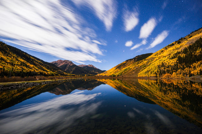
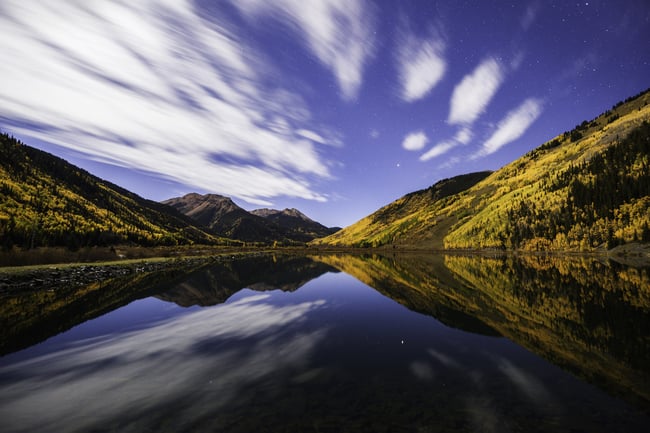
But here’s the important point: Most non-photographers use monitors with color spaces similar to sRGB color space. That means sRGB files will look the “least bad” when they’re interpreted with a non-color-managed application. By comparison, if you look at a ProPhoto image on a non-color-managed application (like an old web browser) with one of these monitors, it will look very dull and low in contrast. So, for web and client photos, export in sRGB.

Converted to sRGB
A sample photo with high saturation colors
Assigned to sRGB
The same photo, but matching what a viewer would see if the image were ProPhoto and viewed in a non-color-managed application. (I got this effect by clicking “Assign Profile” to sRGB in Photoshop rather than “Convert to Profile.”)

Lastly, don’t use sRGB as your working space for editing photos, or you’ll clip colors for no good reason. But at the same time, be certain to convert photos to sRGB for exporting to the web! You’ll need to add that step to your workflow if you haven’t already. Again, don’t let an Adobe RGB or ProPhoto RGB image escape into the wild.

5.2. ProPhoto RGB

I skipped Adobe RGB for the moment to talk about ProPhoto RGB, the ideal working space to use in most cases.

Note that I said working space – not output space. There’s a reason why Lightroom uses a cousin of ProPhoto RGB for editing images. When you edit an image in ProPhoto, you minimize the risk of clipping colors unnecessarily. And you can still export the photo in a smaller color space, so why worry?

At the same time, be very careful not to publish or send off a ProPhoto image. It’s easy to accidentally save an image from Photoshop in ProPhoto RGB if that’s your working space. If anyone views the resulting file in a non-color-managed application, the colors will look strange and likely quite dull.

This is why, if you have clients, one of the worst mistakes you can make is to give them a set of ProPhoto RGB images. Why? Because sooner or later, they’ll open the images on some old photo viewing program without color management, and they’ll think you totally ruined their wedding/event/portrait session. The same is true of Adobe RGB, too, although the colors won’t look quite as bad in that case on most monitors. This is why you export in sRGB!

5.3. Adobe RGB

Adobe RGB is a bit of the odd one out.

This color space doesn’t resemble that of most consumer screens, like sRGB does, making it a poor choice for export to the web. It also isn’t as large as ProPhoto, minimizing its utility as a working space. I’m tempted to say that you should avoid it entirely – and, indeed, sRGB and ProPhoto RGB are more useful overall – but there are still some cases when Adobe RGB is ideal.

First, if you buy a wide-gamut monitor, it will mimic Adobe RGB more closely than sRGB. In that case, for personal use on any non-color-managed applications, Adobe RGB will look noticeably better than sRGB (which will be oversaturated by comparison).

Second, if you print your photos and have a wide-gamut monitor, Adobe RGB can be useful in certain cases. It’s the best way to get your print to match the image on your screen – not always as ideal as it sounds, but nonetheless the goal of some photographers. I’ll touch on that in the next section.

Lastly, some clients and companies specifically request Adobe RGB images. In certain cases, they may have a good reason, while in other cases, they may just be confused. If you’re doing work for a company that already has a system in place, and they request Adobe RGB, just go with it. The same is true for certain print houses that request solely sRGB or Adobe RGB files. It might not be a high-end printing house, but you should follow their request or risk getting a bad print.

6. Printing Photos

It would take several articles to cover the nuances of color when printing photos, so this article will only touch on some brief recommendations:

6.1. The Two Printing Methods

If you’re not well-practiced at printing, the best thing to do is simple: Send your images off to a lab of your choice, without any extra photo edits or corrections, and pick their “color correction” option if they have one. Do so with sRGB files. This is the easiest way to get painless prints that look good and match your screen as much as possible.

For advanced printing needs, you’ll have to decide between printing at home or sending off to a higher-end lab (one that lets you do the corrections yourself). If you’re sending off to a lab, download their ICC profile for the ink/paper you’re using. Soft proof the photo in something like Adobe Lightroom, and make edits to exactly how the print will look. Export the image in ProPhoto (usually), then convert to the printer’s ICC profile. Send it off to the lab and specify no color corrections. For self-printing, do the same thing, just using the print module in Photoshop or similar. It’s worth mentioning that unless you have some practice here, the result has a good chance of looking worse than the prior method.

There certainly are printing methods in between, like sending photos to a high-end lab in ProPhoto space for them to color correct. But these are the two extreme ends of the spectrum.

6.2. Should Your Print Match Your Screen?

There’s a big reason why I said you should “usually” convert directly from ProPhoto to the printer’s ICC profile – and it gets down to the whole essence of this topic in the first place. No matter how good your display is, there are colors in ProPhoto that your monitor will not show. This means that when you’re editing in ProPhoto working space, you are editing colors that you can’t actually see on screen.

Don’t panic; this sounds scarier than it is. In real-world photography, it usually just means that saturated shadows have more detail and nuance than your monitor – or any monitor – physically can display. If you want that detail and nuance to show up in a print, follow the steps above.

But if you’re a stickler for the print matching the screen, this obviously won’t work. Instead, convert the photo from your working space of ProPhoto to the color space that resembles your monitor – Adobe RGB if you’re using a wide gamut monitor, and sRGB if you’re using a typical monitor. Make minor adjustments if needed, then print. You’ll get a print that more closely matches the screen – but at the expense of clipping away detail that your printer potentially can print.

No printer can encapsulate all of ProPhoto RGB’s real colors, nor those of Adobe RGB or even sRGB. But almost every photo printer on the market can print some colors outside the sRGB gamut, and even outside the Adobe RGB gamut. (Don’t believe me? Compare the gamuts of your printer’s ICC profile versus sRGB color space, making sure to look at 3D illustrations rather than 2D.)

The colors outside sRGB and Adobe RGB, but within your printer’s gamut, are the ones you’re after. They’re likely to look the best and most nuanced when you convert directly from ProPhoto working space to your printer’s ICC profile, then print.

Photo with Saturated Colors
NIKON D7000 + 105mm f/2.8 @ 105mm, ISO 3200, 1/100, f/2.8

7. What About Monitor Calibration and Profiling?

I almost forgot the one color topic that photographers know the most about: the importance of calibrating and profiling your computer’s display.

Although profiling your monitor is a bit removed from the theme of this article, it’s worth mentioning because it really is an important part of post-processing. Of course, if you’ve read about monitor calibration before, you’ll already know that every viewer with an uncalibrated monitor will see your photos differently anyway. But calibration and profiling are still important in order to get your print to match your screen as much as possible – and to get (relatively) consistent images among other photographers looking at your work.

Calibration and color profiles also apply to printers. However, not nearly as many photographers create custom profiles for those as for their monitors. In part, that’s because most common ink/paper combinations come with an ICC profile already (easy to find online if you don’t already have it), so creating a custom profile is more a case of fine-tuning. Still, if you’re willing, it can be better to see exactly how your own printer performs with a given combination of ink and paper rather than accepting the manufacturer’s profile. But that’s a topic for another day.

8. Conclusion

You made it, and that’s impressive – this is one of the lesser-understood topics in photography, despite its importance. Many photographers have no idea when to use sRGB, Adobe RGB, or ProPhoto RGB. Now you do! That should help you avoid two of the cardinal sins of color spaces: clipping colors unnecessarily, and publishing photos with the wrong color space.

If you have any questions or comments, feel free to add them below. I’ll do my best to help out if anyone is confused on this topic. Also check out the tutorials on Andrew Rodney’s website for more in-depth information about digital color in general.

Subscribe to Our Newsletter

If you enjoyed reading this article, please consider subscribing to our email newsletter to receive biweekly emails notifying you of the latest articles posted on the website.

Related articles:

Disclosures, Terms and Conditions and Support Options
Filed Under: Color Management and Printing Tagged With: Calibration, Printing, Color Management

About Spencer Cox

Spencer Cox is a landscape and nature photographer who has gained international recognition and awards for his photography. He has been displayed in galleries worldwide, including the Smithsonian Museum of Natural History and exhibitions in London, Malta, Siena, and Beijing. To view more of his work, visit his website or follow him on Facebook and 500px. Read more about Spencer here.

Reader Interactions

Comments

  1. Michael Vail
    December 7, 2018 at 6:26 am

    Ignorance is bliss!

    Reply
    • Spencer Cox
      December 7, 2018 at 6:34 am

      I suppose it is :)

      The reality is that most photographers will never learn this information, nor even need to do so. The basic knowledge of “shoot RAW, edit on a calibrated screen, export in sRGB” will get you good images that look right, or as right as possible, on viewers’ screens. It will even get you prints that look quite good and similar to your monitor.

      The knowledge in this article is mainly useful if you want to gain every bit of color fidelity possible, particularly for prints or for viewing on wide-gamut monitors. It also can be helpful to know some of this in case you need to troubleshoot strange color in a print/digital image. Or if you’re just interested in knowing the technical stuff for its own sake!

      Reply
      • Michael Vail
        December 7, 2018 at 4:08 pm

        Don’t get me wrong, I greatly value your articles and have learned a lot from them. Thank you for all that you contribute!

        Reply
        • Spencer Cox
          December 8, 2018 at 11:54 am

          No worries, Michael, I didn’t take your comment to be negative. Software today is quite good at putting the messy parts of color science behind the scenes, and only a few points in this article, mainly exporting as sRGB to the web, are really critical for most photographers. Thank you for your comments and kind words!

          Reply
  2. Erik B
    December 7, 2018 at 7:22 am

    Correct me if I’m wrong here, but If you are working in the ProPhoto color space with a monitor that can only cover the sRGB gamut, the image viewed on your monitor is going to look more “off” than it would if you are working in the sRGB color space. Also, if you are mostly interacting with the sRGB world and working with RAW files Lightroom in sRGB to keep it simple, if you someday get a better monitor or want to do some serious printing, you can always switch Lightroom to ProPhoto and reopen those already edited files into the new colorspace with your new calibrated monitor, tweak a little and export in Adobe RGB or ProPhoto? All the extra color info is still there, no?

    Reply
    • Spencer Cox
      December 7, 2018 at 7:33 am

      Hi Erik, good questions!

      If you’re working in ProPhoto space on a monitor that only shows sRGB, there’s nothing wrong at all. It will appear, to you, essentially identical to working in sRGB space. In fact, that’s exactly how I do it on my laptop, which covers only sRGB (and not quite even the full thing).

      When you say “working with RAW files in Lightroom in sRGB to keep it simple,” and then “switch Lightroom to ProPhoto” later, that is a bit of a misunderstanding. Lightroom is exclusively in ProPhoto in the develop module. Unless you’re using Lightroom’s soft proofing feature for every photo you edit, with the sRGB profile, then you’re already editing in ProPhoto working space! Even if you don’t realize it. And that’s a good thing – your working space should be ProPhoto, in part for a reason like what you mention: When you’re ready to take advantage of its nuances, you haven’t passed the point of no return and clipped colors for no reason.

      So, I think you and I are in the same boat here – editing in ProPhoto on a monitor that only displays sRGB, and getting good results from it.

      Reply
      • Erik Baumgartner
        December 7, 2018 at 7:39 am

        So by setting Lightroom to sRGB, I’m really only color limiting what is getting outputted to my monitor and my exported images, correct?

        Reply
        • Spencer Cox
          December 7, 2018 at 7:55 am

          Where is it that you are setting Lightroom to sRGB? As a heads up, I’m using LR6 rather than the subscription model, so it’s possible that Adobe added the ability to change working space in the newest version. Though I don’t believe this is true – haven’t seen a reference to it online.

          Reply
          • Erik Baumgartner
            December 7, 2018 at 8:29 am

            You are correct, I was thinking about Photoshop which works differently. However, in Lightroom, when I need to send a Tiff off to an external editor, there are color space options. Would I be better served if those were set to ProPhoto instead of sRGB?

            Reply
            • Spencer Cox
              December 7, 2018 at 9:28 am

              In general, yes, largely for the reasons in the article. But a couple caveats.

              First, your final output of the photo needs to be in sRGB as usual, assuming you’re outputting to the web or for clients. Whether this is direct from Photoshop – i.e., save as – or by saving the file back into Lightroom then exporting as sRGB, it doesn’t really matter. In fact, in most any circumstance, if you output in sRGB, there isn’t a downside to using ProPhoto as your working space at a particular step along the way.

              Second, the working space in Photoshop (or whatever external editor you use) needs to be set to ProPhoto RGB as well in order for this even to matter! If you have Photoshop set as sRGB, it doesn’t matter what your Lightroom settings are, or even if you then save the photo from Photoshop into ProPhoto color space – you’ll still clip all the colors outside the sRGB gamut.

              Hope this makes sense!

              Reply
              • Erik Baumgartner
                December 7, 2018 at 5:45 pm

                Thanks Spencer, I think I mostly get it. If Photoshop is set to ProPhoto, will it change how the image is rendered on my sRGB monitor, or is that determined automatically by the monitor’s color profile?

                Reply
                • Spencer Cox
                  December 8, 2018 at 9:56 am

                  Happy to hear it! Before I answer your question, one quick aside:

                  So long as you have Photoshop set to “preserve embedded profiles” under the color settings, which I believe is the default, you don’t need to set Photoshop to ProPhoto. All your exported images from Lightroom will edit as ProPhoto anyway. (Read my comment 11.2 below if you want more info as well.)

                  To answer your question, on your monitor, there will be only very minor differences between a ProPhoto image and the same image then converted to sRGB profile. Side by side, there’s a good chance you wouldn’t even notice.

                  You can do a quick experiment to this effect if you like. Export an image from Lightroom as an sRGB TIFF. Then, making sure your “External Editing” settings are for ProPhoto TIFF, open the same image from Lightroom into Photoshop. You should now have two Photoshop documents, one in ProPhoto and one in sRGB. (You can confirm that the two documents have different color spaces by checking the bottom toolbar; click the arrow next to document size and select “Document Profile.”)

                  Now flip between the two photos in Photoshop. The differences – though likely present – should be small. That’s because even a wildly saturated ProPhoto image with many colors outside the sRGB gamut will not have those colors show on your sRGB monitor. The monitor itself is limited to a color space that is very similar to that of sRGB.

                  On the other hand, if you perform this same experiment on a wide-gamut monitor, and your photo has enough color saturation, you might notice huge differences between the two Photoshop documents. The ProPhoto document would contain more saturated colors – those outside the sRGB space, but that your monitor can still display. The sRGB document would clip all the colors to sRGB and lose saturation in the process.

                  Reply
                  • Erik Baumgartner
                    December 8, 2018 at 3:12 pm

                    Got it. Thanks for all your help and another well written and enlightening article, Spencer.

                    Reply
          • Iliah Borg
            December 7, 2018 at 11:50 am

            sRGB can be set in Soft Proofing, like this: s3.amazonaws.com/Iliah…8%20PM.png

            Reply
      • Iliah Borg
        December 7, 2018 at 12:06 pm

        Soft Proofing space choice doesn’t change the working space. Whatever the Soft Proofing space is, Lightroom does not let you change the color space that it works in, Lightroom will still be using a colour space based on ProPhoto RGB primary colours (that is, same gamut as in regular ProPhoto RGB) with gamma=1 (linear) as working / editing colour space.

        Reply
        • Spencer Cox
          December 7, 2018 at 3:01 pm

          Thank you, Iliah, that’s useful to know, and it makes total sense upon reflection. If soft proofing actually changed working space, switching to sRGB soft proofing would clip all the out-of-gamut colors for good, even once you exited soft proofing :)

          Reply
  3. Bill Slattery Jr
    December 7, 2018 at 10:16 am

    The story goes that when walking with a young fellow professor Einstein was asked if it was proper that the genius had given students the same test with the same questions as he gave the previous year. Einstein replied, “Ah. The questions may be the same. But the answers have changed.”
    From what I’ve read flick uses whatever color space you send it and offers that photo for viewing and download in that same way? I thought it’s only old printers and browsers that can’t handle Adobe or Prophoto anymore by converting or displaying an image to match the systems capabilities?? Even most newer cell phones?

    Reply
    • Spencer Cox
      December 7, 2018 at 1:58 pm

      Yes indeed – most popular browsers and photography applications today are color managed. Even a ProPhoto image will look correct on typical phones, tablets, laptops, and so on. But that doesn’t mean all users will see it the right way. I’d be particularly worried about giving a client ProPhoto images, not knowing what program they’ll use on their computer to look at the images. That’s why it’s best to output to sRGB if you’re displaying your photo digitally to a large audience, or a non-photographer audience; you make sure that users who have non-color-managed applications will still see a reasonably good preview image.

      Reply
  4. bgavin
    December 7, 2018 at 12:14 pm

    I shoot Adobe RBG and RAW in my Nikon D810.
    Anything destined to the web is reduced to 72 dpi and written using the CS6EE “Save For Web” function to a JPG file.
    It is my understanding that Safe For Web does the automatic conversion from Adobe RGB to the format used by web pages.

    It is also my understanding that Facebook prefers widths of 960, 1024 or 2048 pixels for the least amount of FB resampling damage.

    Reply
    • Spencer Cox
      December 7, 2018 at 2:03 pm

      Jim is correct below – that 72 DPI number doesn’t mean anything with web output. All that matters are the pixel dimensions. A 2048 pixel wide image will be exactly the same whether you tag it 72 DPI, 100 DPI, 1000 DPI, or 2 DPI. No difference. See photographylife.com/dpi-vs-ppi

      Assuming that Save For Web converts the photo to sRGB color space, you’re good. That’s all that matters in terms of the “format used by web pages.” You should see a little checkbox in the Save For Web dialog that says “convert to sRGB.” It’s probably checked by default, which is what you want.

      Reply
  5. Jim
    December 7, 2018 at 1:14 pm

    bgavin: no reason to switch to 72 dpi for Web. DPI is only relevant to prints.

    Reply
    • Mark
      December 10, 2018 at 6:22 pm

      Actually, that is not correct. It depends on the software. And, technically speaking – with image editing software, you are setting PPI, not DPI. DPI is specific to printing on substrates, coming from presses to begin with. That said, while setting PPI to 72 has no impact on the total pixel dimensions, it does directly impact how some software understands actual view, or whatever the wording the software uses, since PPI suggests the pixel density the creator intends. AND different devices have a built in PPI, so images optimized for that kind of device will look best when designed for that devices design, whether it be an overall pixel dimension (where PPI is irrelevant) or designed around a certain PPI, so, if correctly handled, the correct PPI will match up to pixels in the device and overall dimensions will determine how much of the device screen is filled, or not filled – and if not enough or too many, then the image may be scaled.

      DPI is not the same as PPI. Never has been.

      Reply
  6. Andrea
    December 7, 2018 at 1:14 pm

    Congratulations, great little article on color managament for beginners!

    Reply
    • Spencer Cox
      December 7, 2018 at 2:06 pm

      Thank you, Andrea – it ended up being a bit longer, and a bit less for beginners, than I had planned! But it’s a deep enough topic, and I wanted to do ground-up explanations when possible. Glad you enjoyed it.

      Reply
  7. Simon Richards
    December 7, 2018 at 1:38 pm

    Very interesting article Spencer but I notice my D850 is set to shoot in sRGB, as opposed to Adobe RGB. Would you recommend to change this setting?

    Reply
    • Spencer Cox
      December 7, 2018 at 2:10 pm

      If you’re shooting RAW – yes. It has no effect whatsoever on the image data in your RAW photo, but Adobe RGB will potentially make your histogram and rear preview image a bit more accurate in-camera.

      If you’re shooting JPEG – it depends. Yes, if you’re shooting for maximum image quality, and you’re only using JPEG for reasons such as buffer clearance. No, if you’re not after maximum image quality and are more focused on ease of use and simplicity of the post-processing pipeline. In most cases, I wouldn’t recommend that a JPEG photographer shoots Adobe RGB unless they really are familiar with the topics covered in this article.

      Reply
      • Otakar Seycek
        December 13, 2018 at 4:08 pm

        Thanks, Spencer, for this great article. As for me, the best one I’ve ever read (on this topics), I’ve learned a lot.
        Concerning the informative value of the in-camera-histogram when shooting RAW: The histogram and the preview on the rear display are based on the JPEG embeded in the RAW file. Therefore, the camera setting for JPEGs (e.g. ‘Picture Control Settings’ in Nikon cameras) may affect the significance of the histogram a good deal more than color space selected (Adobe RGB or sRGB).

        Reply
  8. JKeyes
    December 7, 2018 at 2:38 pm

    Nice job on a complex subject. I just wanted to point out that AdobeRGB does have one convenient role: by almost entirely encapsulating CMYK, it offers considerably better color range over sRGB (for images headed to conversion for offset printing) without containing tons of color that could never hope to be utilized in CMYK anyway. But obviously this is fairly specific to those photographers’ whose primary or sole output is offset printing.

    Reply
    • Spencer Cox
      December 7, 2018 at 2:47 pm

      Thank you, J Keyes! Good point, and one I should have emphasized more – Adobe RGB is very good for certain printing applications, like the one you describe. Particularly with a wide-gamut monitor, and a printer whose gamut fits within Adobe RGB, it’s a great way to preview how the image will look based on your monitor.

      Reply
  9. Phil Service
    December 7, 2018 at 4:51 pm

    Good article, thank you. A question: in principle a camera sensor can record every humanly visible color (although I suppose it depends on the cut-off filtration for infrared and UV). Given that, why haven’t we designed a working color space that includes the entire human “gamut”. Even ProPhoto RGB fails in that regard. If we’re going to define a working space with imaginary primaries (ProPhoto RGB, why not go whole-hog and make it a space that includes all visible colors? CIE XYZ could do that, but I suppose there are good reasons not to go that route.

    Reply
    • Spencer Cox
      December 11, 2018 at 1:07 am

      Phil, your question is a very good one! I had to stop and come back to your comment after thinking about it for a bit, and I still don’t have a great answer. One possibility is that there is a lot of value in having smaller color spaces rather than defining a massive container, since even 16-bit might not be enough, and you’d be working with huge 32-bit files just to have small enough steps in the visible region of the color space. ProPhoto is already inefficient in that sense.

      Second, even though we can see some colors outside ProPhoto does not mean they are likely to appear in any photos we take. There’s another interesting gamut called “Pointer’s gamut” which represents all the surface colors found in the world. Although this excludes some colors we can produce by other means, such as certain specular highlights or even lasers emitting light at a particular wavelength, the end result is a gamut of all the colors you’ll generally photograph day-to-day. And despite the odd shape of Pointer’s gamut, with some colors outside both sRGB and Adobe RGB, ProPhoto RGB covers it entirely.

      As the last, perhaps more important reason – why would we need something larger than ProPhoto, when devices today almost universally cannot reproduce color outside it anyway? If, in theory, printers or monitors could display some of the colors outside ProPhoto, that might be a good reason to use a different, larger working space instead. But that certainly isn’t the case today. (So, you might think the answer to this question is “future-proofing.” But even then, there is only so far that printer and monitor technologies can feasibly go. Monitors, for example, are forever limited to real primaries, unlike imaginary primaries that ProPhoto uses to increase its gamut. And printers are forever limited to real surface colors, which makes them even less likely to reproduce the colors outside ProPhoto, perhaps impossible.)

      Though I don’t know the exact explanation, I hope these possibilities will serve as some food for thought.

      Reply
  10. Andrew Rodney
    December 7, 2018 at 7:28 pm

    >>ProPhoto RGB may be “bigger” in terms of range, but an image in ProPhoto RGB color space doesn’t have more colors than a photo in sRGB. An 8-bit per channel photo is limited to about 16.8 million colors, no matter what color space it’s in<<

    I think there's a problem lumping encoding of device values (color numbers) and colors (something we can see). If you can't see it, it's not a color. Color is a perceptual attribute of (in this discussion) humans. The areas that fall outside the CIE chromaticity diagram, the 'imaginary colors" are not colors; we can't see them but we can define them as a device value due to encoding. G255/R0/B0 is not a color. It's a number (a device value). As described here:
    digitaldog.net/files…rGamut.pdf

    Again, it's really important to distinguish what color is and isn't versus what color numbers are. Color is not a particular wavelength of light. It is a cognitive perception, the excitation of photoreceptors followed by retinal processing and ending in the our visual cortex, within our brains. As such, colors are defined based on perceptual experiments. The experts pretty much agree upon what color is:

    Fairchild's "Color Appearance Models". Page 1!
    Like beauty, color is in the eye of the beholder. For as long as human scientific inquiry has been recorded, the nature of color perception has been a topic of great interest. Despite tremendous evolution of technology,fundamental issues of color perception remain unanswered. Many scientific attempts to explain color rely purely on the physical nature of light and objects. However, without the human observer, there is no color.
    Further on the same page:
    It is common to say that certain wavelengths of light, or certain objects are a give color. This is an attempt to relegate color to the purely physical domain. It is more correct to state those stimuli are perceived to be a certain color when viewed under specific conditions.
    Page 1 paragraph 2 of Digital Color Management by Giorgianni and Madden:
    But color itself is a perception and perceptions only exist in the mind.
    Page 11 of The GATF Practical guide to Color Management:
    Although extensive research has been conducted, we still not completely understand what happens in the brain when we "see" color. The visual sensation known as color occurs when light excites photoreceptors in the eye called cone cells.
    Page 75 of Understanding Color Management by Sharma:
    Color is an impression that we form in our brains.
    There are device values (color numbers based on encoding) that are not colors. We cannot see 16.7 million colors. We can define 16.7 million (or billions) of numbers.

    Reply
    • Spencer Cox
      December 8, 2018 at 9:32 am

      Andrew, thanks for stopping by – your videos were a big help when I was working on this post.

      Around the time you posted your comment, I added the following statement to the article:

      Note that calling all of these 281 trillion RGB points “colors” is a bit misleading, since color is defined based on human perception. Sure, there are trillions of “color codes,” but many of them are too similar for us to notice a difference. And recall that some of ProPhoto’s color codes refer to imaginary colors anyway – ones we cannot see.

      I also just changed the statement you mentioned to “limited to about 16.8 million RGB values.”

      Along with the article’s mention of imaginary colors, do you think this is enough to cover the concerns you raised? I’m not opposed to adding more disclaimers, but I worry that, in an introductory article, the broader points about sRGB vs Adobe RGB vs ProPhoto can get lost rather quickly.

      Reply
      • Andrew Rodney
        December 14, 2018 at 12:15 pm

        It’s simply important to understand the difference between a color number (a device value) which may or may not be a color, and a color; something we can see. We can define two differing color numbers that are the same color. We can define color numbers that are invisible and thus not colors. So yeah, the idea of 281 trillion RGB points of color is misleading based on the fact we cannot see that many colors. We can define 281 trillion RGB “color numbers”. That’s the big difference.
        You have a 3lb Apple pie. You can slice it into 8 or 16 pieces. None the less, it’s still 8 pounds of pie no matter how thin or thick you slice each piece of the pie. Smaller slices doesn’t produce ‘more pie’ but simply more pieces of pie. That’s all encoding of color numbers does; 17.7 million numbers, not colors.

        Reply
    • Alex Ostrov
      December 14, 2018 at 1:38 am

      there is no color in nature, but there is a subjective interpretation by the human brain of electromagnetic waves, when, for example, dogs have different

      Reply
  11. ColorConsultant
    December 8, 2018 at 4:51 am

    “In Photoshop, you can choose working space by going Edit – Color Settings – RGB. With minor reservations, mentioned later, I recommend picking ProPhoto.”

    I think it does not work as you said. “Edit – Color Settings – RGB” is for “default” working colorspace, so it’s the colorspace you use when no colorspace (profile) is present in an image metadada : when PS does not know what each RGB tiplet in the image means.
    It is also related to “default” option when pasting from other image with other colospace (but PS let’s you choose more options than default policy).

    So IMHO the proper setting form most people, including those with widegamut monitors that export LR images in ProPhotoRGB would be:
    1-Edit – Color Settings – working colorspace – RGB = sRGB, that means that when no metadata is present (no profile) take that RGB tiplets as sRGB images, most of the internet images are untagged (no profile) as a designer some people would want to use kind copyleft stock images for their personal or professional projects.
    2-Color management policy (in the same window, sorry my PS is not english localized, IDNK the exact word):
    RGB & others = keep embeded profiles. Profile diferences, Ask when opened = UNCHECKED. An image will keep it’s metadata (& RGB values) unless you convert it.
    Profile diferences, missing profiles, Ask when opened = CHECKED, if ther is no metadata (no profile for RGB numbers) ask user what profile/colorspace user thinks is image is. Here is where “default profile” explained before plays a role: If there is no metadata (and you should not export a Raw image to an image format without colorspace/profile), take the hint that is very likely to be sRGB. but since we choose this option to be CHECKED if you open a TIFF image without a profile and you know that it comes from a “Export to prophoto” work, you can choose whatever profile you want to render that RGB numbers into your screen.

    I mean, it is good as a general recomendation to export a RAW in a wide colorspace 16bit, but “default RGB working space” in Photoshop works in a diferent way. It is just a general set of policies of what to do, so my recomendation as I explained above is:
    -Suggest sRGB when metadata is unknown
    -Ask user when PS is in doubt
    -Honor embeded profile for each image

    Reply
    • Andrew Rodney
      December 8, 2018 at 8:03 am

      Clarification to the above: G255/R0/B0 is not a color in ProPhoto RGB. It is both a color we can see and a device value in sRGB. Sorry.

      Reply
    • Spencer Cox
      December 8, 2018 at 9:18 am

      Hi ColorConsultant,

      Thanks for your comments! Your recommendation to ask the user when in doubt is very important, and same with sRGB when metadata is unknown. I fear that in writing out my personal recommendations so briefly in the article, without explaining why, I opened the floor for confusion. I’ve amended that section, and I will need to write a second article explaining this Photoshop option in more detail.

      At some level, once you’ve set “Missing Profiles: Ask when opening,” it doesn’t matter what RGB working space you pick in terms of unassigned images. You can assign them to sRGB when prompted by Photoshop. Beyond that, the options and best practices can get messy. If you select sRGB working space, but you make sure to enable “preserve embedded profiles,” you’ll probably be fine – because images you import from Lightroom as ProPhoto RGB will remain ProPhoto RGB.

      There are downsides to your suggested approach, though. Images you create from scratch, or sRGB images into which you paste ProPhoto RGB images, will not be able to include ProPhoto colors. That’s not something every user runs across or even cares about. But it does mean there’s an argument for setting Photoshop’s working space to ProPhoto (solving the from-scratch problem) and even setting “RGB: Convert to Working RGB” so that every sRGB photo you import into Photoshop is converted to ProPhoto (solving the pasting problem between documents). The downside there is that you need to be more vigilant about converting photos you save for the web to sRGB, as well as making sure “Image > Mode” is set to “16 Bits per channel” when exporting as a TIFF or another file type that supports 16-bit color.

      But by not making that distinction in the article above, I believe that I added more confusion than I cleared. So, thanks for including your perspective here. Let me know if there is anything with my approach that you disagree about as well.

      Reply
  12. EXkurogane
    December 8, 2018 at 5:06 am

    I’m a very technical person when it comes to photography, but this is too much for my brains haha. My rules are simple – shoot in RAW and Adobe RGB, and after i finished post processing I’ll export the jpegs in sRGB, since 95% or more of the content on the Internet, as well as the phone/computer screens of an average user only supports the sRGB color space.

    Even if my monitor supports a wider color space and i went overboard, i won’t gain anything; and worse, sometimes the color of my photos will be distorted when viewed by others on a lower spec monitor.

    Reply
    • Spencer Cox
      December 11, 2018 at 12:39 am

      That’s quite a reasonable approach! So long as you are exporting to the web at sRGB, it’s hard to be doing anything too wrong. At worst, you’ll clip some out-of-gamut colors, although it sounds like you might not even be doing that (depending on your post-processing software).

      Reply
  13. Glenn Butcher
    December 8, 2018 at 8:48 am

    You are a brave person to take on an abstraction of this topic. I’ve found a lot of the discourse on color takes place in a context described by the “counting cows” joke:

    Two guys on a train, one sitting next to the window, the other on the aisle. Window Guy, whenever they’d roll past a herd of cows would quickly scan the herd, then announce a number: “173”….”49″… etc. Aisle Guy: “What are you doing?” Window Guy: “Counting cows.” Aisle Guy: “How do you do that?” Window Guy: “Easy. I just count the number of legs and divide by four…”

    Not an easy topic to grasp, and the writings quickly devolve into terms like “tristimulus”, “CIEXYZ”, and such that require their own laborious study. You’ve done a pretty good job of abstracting the concepts to what I’d call a “mechanic’s understanding” which is where most of us want to be; that is, how do I use this stuff to make good images.

    I’ll offer one additional thing I’ve recently found significant in my imaging, that of the camera profile. In order to do all this “Adobe->sRGB” conversion your image has to start somewhere, and that is the profile that represents how it sees color. So, the full chain might be something like, CameraProfile->ProPhoto->sRGB, where the camera profile is used to convert the raw image to ProPhoto for editing, and the working image is then converted from ProPhoto to sRGB for output to a JPEG. Most of the raw converters have a humongous table of profiles, one each for every camera they support, so that first conversion happens “under the hood”. For the most part they handle the majority of situations with aplomb, but I’ve found they can go wanting when dealing with scenes that have extreme colors like theater lights. So I won’t dive down that rabbit hole here, suffice it to say I think there are times when one might need to consider doing camera profiles.

    Thanks again for taking on the topic!

    Reply
    • Spencer Cox
      December 11, 2018 at 1:15 am

      Thank you, Glenn, and that is quite the perfect joke for this topic!

      Good point about the camera’s own colors. After all, cameras can pick up something like perfect 520 nm green light from a laser, while none of the color gamuts in this article include it. Not that it’s too big a problem, since no monitors or printers can reproduce it either! But it is important to remember nevertheless that ProPhoto is not the starting point just because it’s the working space, and post-processing software still needs to interpret data directly from the camera sensor.

      Stage lights certainly would be a case where this software interpretation matters, turning camera profiles from a behind-the-scenes point to something more important to consider. It’s similar to why product photographers often create manual profiles in Lightroom or other software, aiming for the most accurate possible color reproduction in their final images.

      Reply
  14. lorraine spittle
    December 8, 2018 at 11:21 am

    Hi could you pleases help me i understand the differences between SRGB , RGB, Pro RGB but i have been asked to save some images to be projected ,they have asked for them to be saved in colour spaces SRGB . I have saved images before for this group only a few weeks ago and the images projected fine. But when i bring up the info of the images the colour spaces is RGB and the profile is SRGB . but the colours look ok when projected
    But i am a little mixed up now why is my images showing ok in colour spaces RGB when they have asked for SRGB or will changing the profile to SRGB do this . ?
    many thanks for your time

    Reply
    • Glenn Butcher
      December 8, 2018 at 11:41 am

      “RGB” is the name for any colorspace that codes it’s values as Red, Green, and Blue. Other ‘generic’ colorspaces include HSV, LAB, XYZ, where the color and tone are recorded with values representing things like chromaticity and luminance.

      sRGB and ProPhoto are RGB color spaces with additional information regarding the color gamut and tone curve. They’re usually specified as an ICC profile, which is a file format, but the same thing can be embedded in the image as metadata. There, too many terms to consider… :D

      Reply
      • Andrew Rodney
        December 14, 2018 at 12:09 pm

        RGB (like CMYK, Lab etc) is a color model. Adobe RGB (1998), sRGB, ProPhoto RGB are color spaces. They define the scale of (in this case) RGB numbers within the confines of human color perception. Anything that falls outside the CIE chromaticity diagram shown above is not a color.

        Reply
  15. nsanyal
    December 8, 2018 at 8:24 pm

    Very readable, thanks.
    Here is the ultimate color discussion: xkcd.com/1882/
    Cheers.

    Reply
    • Spencer Cox
      December 10, 2018 at 1:13 am

      Thanks, I love xkcd!

      Reply
  16. RQuick
    December 9, 2018 at 2:33 pm

    You mention calibrating your monitor, which is a good idea, but it should also be pointed out that many monitors can not fully reproduce the Pro Photo or Adobe RGB gamuts. Perhaps just part of those gamuts. Most will do sRGB (hopefully) at 100% as it is the standard. I mention this because this article recommends doing your photo editing in in these larger gamuts and then converting to the suitable gamut for the final destination. That’s OK if you can actually see those gamuts while editing. Editing in those color spaces on a monitor that doesn’t cover those spaces will be problematic. Monitors that have complete coverage of all gamuts (BenQ etc..) are pricey and probably not a lot of non-professionals have them. All the calibrating in the world won’t help that issue. The calibration s/w should give an analysis of the coverage for the different gamuts.

    Reply
    • Spencer Cox
      December 10, 2018 at 1:12 am

      Thank you, RQuick – in reality, though, this applies regardless of whether or not you have a wide-gamut monitor. There are no monitors out there which can replicate ProPhoto RGB (nor can there ever be, due to its two imaginary primaries) – yet I still recommend that people edit in ProPhoto RGB color space. Even my monitor is sRGB only, not wide gamut, and I still edit in ProPhoto!

      It sounds crazy, but there are some good reasons for this recommendation. First, if you convert a photo down to sRGB at any point in order to match your screen better, you’ll never get back those out-of-gamut colors, unless you still have the unedited file to start over from scratch. So, purely from the never-delete-your-data perspective, it’s best to edit in ProPhoto, even on a much smaller gamut display. (Especially since you’re converting your final exported photo to sRGB anyway).

      Perhaps more importantly is that there are some colors outside both sRGB and Adobe RGB, yet within ProPhoto, which today’s printers can reproduce. Often, these are subtle details in the shadows that may appear clipped on your screen, yet have quite a bit of detail in reality. You’re right – you can’t see those ProPhoto colors when you’re editing, which isn’t ideal. But even then, the reality is that they will rarely appear weird or wild in your final print; they’ll generally just give you better tonality and less clipping in your shadows than what can be reproduced on your monitor.

      That’s why I personally recommend converting directly from ProPhoto to your printer’s color space before printing, rather than going ProPhoto > sRGB > Printer space, or ProPhoto > Adobe RGB > Printer space. If you’re after total monitor-to-print similarity, then yes, you’ll probably prefer converting to sRGB or Adobe RGB first (depending on what your monitor can display). That’s a reasonable goal – but so is avoiding unnecessary color clipping in your prints, which is why I generally prefer the ProPhoto route.

      Reply
  17. Russ MacDonald
    December 10, 2018 at 6:50 am

    I have written several articles on this topic and read dozens, but none can match this one!

    This is by far the best article I have ever read on this topic; the easiest to understand and the most accurate!

    Thank you!

    Reply
  18. Russ MacDonald
    December 10, 2018 at 7:18 am

    One additional comment.

    I have found over many years as a wedding and portrait professional, that portraits often do not contain any color information that is outside of the sRGB gamut (except maybe clothing).

    Consequently, I have found that I usually get more natural skin tones when edited in sRGB. I have theorized that this is related to the 8 bit limit for colors which makes the steps between colors smaller. You mentioned this and its effect on banding, which I have also seen, but for me it really shows up in skin tones more often; not as banding but in slightly less natural skin tones.

    I also see this in any subject whose colors fit totally within the sRGB gamut, like high key images often do.

    Russ

    Reply
    • Spencer Cox
      December 10, 2018 at 11:51 pm

      Thank you for your comments, Russ! I’m very glad that you liked the article so much.

      You’re right, skin tones generally do land within the sRGB gamut, though there are exceptions under certain types of lighting, or certain skin types/features – and as you mentioned, clothing plays a role as well.

      I’m interested to know what software you use, and what bit depth you are using when you edit. In an image where every color falls within sRGB, it’s very true that an 8-bit sRGB photo could look better than an 8-bit ProPhoto image, even when there is no obvious banding, since you’re not spacing out the color values as much.

      However, if you’re editing with a higher bit depth working space, I’d be surprised to learn that you still see a difference. Say, 16-bit ProPhoto working space vs 16-bit sRGB working space, still using a photo with colors entirely in the sRGB gamut. Though there will be some computer-measurable differences when you export to an 8-bit JPEG, I’d be surprised to see any differences at all with the human eye. (Don’t take it that I disagree with your account if you’re editing in 16-bit space, just that it’s an interesting result and not one I would have suspected.)

      Reply
    • ColorConsultant
      December 11, 2018 at 4:55 am

      There is some banding caused by color management (transformations between colorspaces/profiles) and there is some banding caused by calibration itself.
      A more or less universal way to avoid it is:
      -color management: use some kind of temporal dithering while drawing/rendering an image on a screen. LR does it pretty well in develop module (even on 8bit input monitors), same for PS with Quadros/Firepros (even on 8bit links) and some PS+macbooks too (due to custom OpenGL driver, a fake but functional 10bit mode). Photoshop on other setups is likely to show some color managed induced banding (even on sRGB images) unless some “idealized” requirements are met. Most photographers should not care too much about this, but for illustrators/designer it could be a PITA unless someone explains them what is going on and what can they do to avoid it (at least partially).
      -calibration: inside monitor, or with a GPU with high bitdepth LUTs and dithered outputs loaded with a high bitdepth loader like DisplayCAL.

      IMHO from your symptoms it seems that something like this is happening.
      Some video players (apps) are able to do color management with temporal dithering like MPV (need bandless calibration) or players that support madVR (and its software LUT3D). It may be worth of checking if it disapears when there is no calibration banding and there is temporal dithering applied after high bitdepth color management transformations.

      IDNK why Adobe does not use its dithered render in PS for everyone (but who would be buying Quadro/Firepros…) or in Illustrator/InDesign. It is really a missing feature, at least for those two last ones.

      Reply
  19. Tracy Valleau
    December 10, 2018 at 9:54 am

    Nicely done. I teach this stuff, and yours is among the few that get it right. Two points, if I may:
    “Calibration” is not “profiling” and it helps understanding to distinguish between the two. (Calibration set the monitor luminence, and balances the RGB values to produce a true gray. It’s setting the starting point. “Profiling” is correcting for the differences between known values and displayed values. (That’s vastly over simplified, but basically correct.)
    and
    I noticed that you suggest “(converting from) ProPhoto to your printer’s color space” and “converting to your printer’s ICC profile”. Those would be two different things. The “color space” for my Epsons is ARGB, but an ICC profile is based on the paper/ink used.

    Nice article!

    Reply
    • Spencer Cox
      December 10, 2018 at 11:57 pm

      Thank you for the kind words, Tracy, and I have updated those sections of the article accordingly!

      If any future articles on Photography Life mention in passing that it is important to calibrate/profile your monitor, what would you say is the preferred verbiage? We typically just write “important to calibrate your monitor,” but I’d rather not gloss over the more accurate way to say it if there is one.

      Reply
      • Tracy Valleau
        December 12, 2018 at 12:30 pm

        Hi Spencer

        The problem with technical stuff is that it’s well… technical.

        Monitors can be calibrated and profiled by the user.
        Printers are factory calibrated and are profiled on a per-paper basis either by the paper mfgr or the user.

        Users perform the process of “correcting” their monitor (that’s the best word I’ve found; “adjusting” doesn’t cut it). Some of us create our own paper profiles; most use the ones from the paper manufacturer.

        These may seem like unconnected adjustments, but in fact, if you think about it, the profile has to be created -to- some standard. Indeed, there is a internal standard that you never see: the Profile Connection Space, a fixed set of color values based on human vision. So any profile is essentially a list of deviations from that space. That’s how a monitor profile “connects” to a printer (paper) profile, and makes the whole think work.

        My point regarding monitors, in stressing the distinction between profiling and calibrating is to emphasize the need to do so. It’s surprising how many folks don’t understand how critical this basic step is, and unfortunately they get frustrated that their “prints don’t match” and give up.

        So, is there a good single word to describe what are two different things? Well, part of the confusion stems from the fact that if you use a “puck” to correct your monitor, the software performs both actions: first it performs the calibration, and then it throws up the color swatches and performs the profiling. If you’re not paying attention, you may not see that distinction.

        Since that’s the reason for most of the confusion, if I had to choose, my best choice so far is “correcting” since it can apply to both monitors and papers. Or, since you asked about writing, perhaps a text shortcut, such as “cp” which expands to “calibrate and profile.”

        If forced to choose one of the two words, I’d personally choose “profile” since in real world use (actually doing it), the calibration “comes along for the ride.”

        I’d love to hear other’s suggestions to get around this, as these suggestions are just off the top of my head.

        Again: nice article.

        Reply
    • ColorConsultant
      December 11, 2018 at 4:30 am

      QUOTE: “Profiling” is correcting for the differences between known values and displayed values. (That’s vastly over simplified, but basically correct.)”
      No, it’s not that. It is not “correcting”. Profiling is just capturing a calibrated/uncalibrated device behavior (like a monitor) with certain amount of realism/idealization* configured by user inside a ICC/ICM file (and monitor’s white & grey calibration could be stored in that file too). Color managed apps/color management engines will know what to do with that info. You can even profile a display out of the box without calibrating it.

      *)Small Off Topic, but may be helpful to somebody : Because of several issues in Apple color engine for UI (just user interface & desktop and some apple apps, not Adobe Suite) it is recommended to “idealize” a lot (equal TRCs) if you are using a display with macOS.
      In Xrite naming (or clone apps like those form Dell or Viewsonic) it means matrix profiles, in DisplayCAL naming it means single curve profiles (or simpler). For high end monitors with HW cal like Eizo/NEC they usually choose the “idealized” (equal TRCs) by default because their near ideal grey ramp and in order to avoid some color management rounding errors that cause coloration in some greys.

      Reply
      • Tracy Valleau
        December 12, 2018 at 12:44 pm

        As noted, it was oversimplified, but a monitor profile “corrects” in the sense that it’s used to adjust the display output of the monitor. In this use of “correcting” it does indeed adjust and change the monitor output, which one can easily see by just switching between monitor profiles. I didn’t want to get too far off into the technical weeds when I wrote that. You are correct that the profile itself doesn’t “correct” – it’s just a list of data.

        Reply
  20. Robert Makar
    December 10, 2018 at 12:44 pm

    Thank you for addressing digital photography’s greatest mystery. Your explanations serve as a great point of departure for further research.

    Reply
    • Spencer Cox
      December 10, 2018 at 11:59 pm

      You are quite welcome, Robert! I’m glad this article helped provide a good foundation for more study on the topic of color.

      Reply
  21. jean pierre (pete) guaron
    December 10, 2018 at 2:06 pm

    Brilliant! Just what I need!
    Spencer, how do the ProPhoto and AdobeRGB gamuts compare on a screen like the EIZO monitors?

    Reply
    • Spencer Cox
      December 11, 2018 at 12:15 am

      Very happy to hear it, Pete, thank you!

      Eizo’s photography and graphic design monitors, at least, all appear to cover most of Adobe RGB gamut, in the range of 97-99%. In fact, they also cover some colors outside Adobe RGB (though within ProPhoto), particularly in the reds. This is excellent overall; there can’t be many monitors, if any, with significantly larger colors spaces than that. Certainly none which cover all of ProPhoto (which would be impossible due to its imaginary primaries). For printing and other critical color work, Eizo would be a great choice, though not a cheap one.

      Reply
      • Peter Declercq
        December 11, 2018 at 3:31 am

        So, ProPhoto would be a better output option if you are looking at an Eizo screen?

        Reply
      • ColorConsultant
        December 11, 2018 at 5:10 am

        Spencer, I think that he is asking if there is a way to check Out Of Gamut (OOG) colors when rendering an AdobeRGB or ProPhotoRGB image to an Eizo/NEC or Benq/Dell/Apple, but I may understood him in a wrong way.
        If I am right, @jean pierre, a universal way to check it is to use softproof with OOG marks in your photo editing software.
        Some high end monitos may have a built-in (factory preset) feature like this, with OOG marks but it is mostly related to video world: CGs with LUT3D fro Rec2020, I do not remember if PAs have it via some Multiprofiler, ask Mr. Rodney.
        Otherwise use photo editing app softproof options. It works for cheap sRGB monitors too if you profiled them.

        Reply
  22. Gene Harrisw
    December 10, 2018 at 3:24 pm

    Hi, Spencer, thanks for the article. This is a subject I’ve been trying to get my head around for a while, and this hopefully will go a long way towards improving my understanding.

    I’ve been using a workflow that’s probably pretty unusual. I’ve been using Capture NX-D for initial raw processing from my Nikon D7200 and then exporting to GIMP for any further processing. My end goal is to print my own photos with a recently purchased Canon Pro 100, and I’m not sure what my color space/color profile settings should be in either Capture NX-D or GIMP. Any thoughts?

    Reply
    • Spencer Cox
      December 11, 2018 at 12:26 am

      Very nice, best of luck with your new printer! I personally don’t have Capture NX-D installed, but I looked it up online, and I can’t figure out if you can set ProPhoto for your working space or not (or if it’s like Lightroom, where something akin to ProPhoto is the default no matter what).

      So, if you can use ProPhoto as your working space in Capture NX-D, the technically ideal workflow would be as follows: process the RAW image in Capture NX-D with ProPhoto working space, export as a 16-bit ProPhoto TIFF if it needs further processing in GIMP, and then edit in GIMP (ProPhoto working space, 16-bit). Print from GIMP and choose your printer’s ICC profile in the printing dialogue (specific to the type of paper and ink you use).

      Otherwise, set the largest working space you can in Capture NX-D, but still export in ProPhoto and do everything else in ProPhoto; your edits in GIMP might create very saturated colors, even if you don’t realize it, such as in the shadows.

      Beware that this method absolutely requires you to convert to sRGB for any images you export to the web, either from NX-D or GIMP!

      Reply
      • Gene Harris
        December 11, 2018 at 6:01 pm

        Spencer, thanks for the reply. Being pretty new to all this, a couple of further clarifications would be much appreciated re the settings in Capture NX-D and GIMP:

        1) In Capture NX-D — Preferences>Color Management under the heading of “Color Matching Profile” there’s a field called Default RGB Color Space. I can select ProPhoto RGB from a number of choices. I assume this is what I should do.

        2) There’s also a box called “Use this instead of an embedded profile when opening images.” I assume I should check this box.

        2) Under that, there’s a category called Printer Profile. Under this I have checked a box that says “Use this profile when printing.” There’s also a field in which I can select my printer and paper – totally cool. But under that there’s a field called “Intent” in which I can select either Perceptual or Relative Colormetric. Not sure which one I should choose (although that may be a question outside of this topic.)

        3) In GIMP Preferences > Color Management, there are many fields in which I could select ProPhoto RGB, e.g. Monitor Profile, Soft Proofing Profile, and Preferred Profiles (under this you have RGB Profile, Grayscale Profile, and CMYK Profile.) Should any or all of these be set to ProPhoto RGB?

        Many thanks for your advice!

        Reply
  23. Peter Connan
    December 10, 2018 at 11:32 pm

    Very interesting, and to be honest I am not sure that I entirely understand it yet.

    I understand that there is no direct relationship between bit depth and color space, but in 3.2 you effectively state that 8 bits are not enough when working in Adobe RGB and Profoto RGB.

    Which raises the question whether 12 bits would be enough, as photographing in 12 bits saves quite a lot of memory card space and tends to make the camera and post-processing computer more responsive. I have been shooting mostly in 12-bit, except when I do astro photography where I am expecting to have to do more radical lifting of shadow exposure. Is that a potentially problematic approach?

    Thanks you

    Reply
    • Spencer Cox
      December 11, 2018 at 12:36 am

      Sure thing, Peter!

      First, keep in mind that the camera setting of 12-bit vs 14-bit RAW is about dynamic range – detail in the shadows, not spacing between colors, unlike bit depth in this article.

      It’s also a setting that is down to personal preference, but in nearly all cases, you will not see a significant difference between 12 bit and 14 bit RAW. There is nothing really wrong about your approach. Then again, given that this article is all about getting that “last 1%” quality, and it attracts readers for whom that is a big deal, I suspect that most people who are putting the tips above into practice already shoot 14-bit – for benefits real or imagined :)

      For what it’s worth, I do shoot in 14-bit personally, but I really wouldn’t worry about your approach if you aren’t doing dramatic shadow editing in your images overall. Hope this helps.

      Reply
  24. Peter
    December 11, 2018 at 3:24 am

    Dear Spencer,
    Thank you for a very clear review of this complex matter. Can you give me some advice on the following?
    Within a few days I hope to receive a new iPad Pro, which I will use to view my photographs (through Synology Photostation).
    What output space should I use?
    And does the file type matter: is it better to use a TIFF file than a JPEG?
    Thanks a lot !

    Reply
    • Spencer Cox
      December 14, 2018 at 2:30 am

      When you edit a photo, your output space (i.e., export space) should be sRGB no matter what device you’re using. And your working space should be ProPhoto RGB if you make absolutely certain that you still export your photos in sRGB.

      For the iPad Pro, I would hesitate to bring any TIFF files onboard, since those are massive compared to JPEGs. Even if you are planning to make the iPad Pro your main editing station, I would still try to keep your images as DNG/NEF/CRW raw files instead, since they will be much smaller than TIFFs.

      Reply
  25. Jan Holler
    December 11, 2018 at 4:34 am

    Great article, Spencer. Thank you. Just four points I like to add.
    1. Profile your camera with an IT8.7 target and(!) calibrate your monitor, otherwise forget about Prophoto RGB (or any enhanced colour space) for editing. The colours will not match anyway. The input colour profile is much more important, the colour space is second. You can stay with sRGB as a working profile easily if your camera is not (input) profiled. Skin tones look best if you colour profile your camera (with different ISO settings and neutral settings in the white balance settings, btw).
    2. It is all about printing, if you go CMYK then there will be a massive gamut clipping from either of the three models above. If it is sRGB clipping will be less massive but still it is there.
    3. There is a drawback if editing in Prophoto RGB since there are no monitors which can display it. You risk gamut clipping which you won’t see because your monitor (even if wide gamut) just displays sRGB or AdobeRGB.
    4. If you shoot RAW do not bother about colour space settings in the camera. That is just for the JPGs. You can edit in any colour space (imho, best is the same as the monitor displays). If you output the photos and apply a colour space such as CMYK oder sRGB (or even AdobeRGB), (massiv) gamut clipping will appear anyway.
    Some may mention if you use AdobeRGB in your camera, the histogram will look differently. That is correct, since the histogram is (sadly) based on the embedded JPG. Which means it is basically useless.

    Reply
    • Jan Holler
      December 11, 2018 at 6:06 am

      The internal processing routines of any imaging software should be using CIE L*a*b* (or Lab) anyway. Is it really true, LR uses ProPhoto RGB only as internal colour space? What a joke. If we speak about processing colours we have to use the colour space of the human eye as the basic colour space.
      You should not have to care about the so called “working profile”, expect the software to use Lab as colour space, otherwise use a different software.
      Basically it is very easy to understand:
      1. Profile your camera, get it’s ICC profile, use an IT8.7 target.
      2. Profile, calibrate your monitor, get it’s ICC profile, use a colorimeter.
      3. Get the profile of the paper, printer combination.
      If you got the ICC profile of your camera you could easily work within that colour space (if you really want so, stay on Lab otherwise).
      It is all about the true representation of colours on different devices (printer paper included). If you want to match the colours you should profile every step of your work flow.
      The most important of all this is the quality of the conversion of one colour space into the other. e.g. convert the input profile to the display profile of your monitor and match as closely as possible the colours. The internal processing routines should, as mentioned, use Lab as its colour space model. The output depends on the device your photo will be displayed. For most of the time it is sRGB (web), AdobeRGB (processing, wider range of colours) and CMYK (printing).
      If you really want the optimum get an AdobeRGB monitor. That matches best the colours before converting to CMYK for printing.

      Reply
  26. Johan Adriaanse
    December 11, 2018 at 6:31 am

    Hi Spencer, thanks for this great article – it gets me to the point where I globally understand the subject, but I need to study more before I can do my own reasoning in this color space (sorry – bad pun). So let me ask you a question I’ve been struggling with.

    I shoot in raw+JPEG, and then continue with the raw file for photos that matter and JPEG for snapshots. My camera is set to AdobeRGB for the JPEGs. I use Lightroom for all the work I do on photo’s. I export from Lightroom using sRGB, because I either send photo’s off to a consumer lab or post them on the web. So, my flow for JPEG is JPEG/AdobeRGB -> Lightroom/ProPhoto RGB “cousin” -> JPEG sRGB.

    The question: does this flow, and specifically moving from AdobeRGB to sRGB cause any issues, or is it fundamentally sound in that Lightroom correctly handles both conversions (my assumption when I set things up this way)?

    Hope this makes sense!

    Reply
  27. Mike
    December 11, 2018 at 9:18 am

    I’m using CS6 and Camera Raw. When I save the adobe RGB working file as a jpg, is it auto converted to sRGB like it does in Photoshop “save for web”?

    Mike

    Reply
  28. Alex Ostrov
    December 14, 2018 at 1:39 am

    there is no color in nature, but there is a subjective interpretation by the human brain of electromagnetic waves, when, for example, dogs have different

    Reply
  29. Alnoor
    December 16, 2018 at 10:05 am

    The value of AdobeRGB over ProPhoto RGB should not be understated since as photographers we are dealing with what it visible to the eye through the limitations of display media. This applies to whether while working in post-production or displaying the final image.
    The downside of ProPhoto RGB is its benefit which is that it is too large a space. Some colors values are not real and therefore useless, while other in gamut colors cannot be displayed despite the eye being able to perceive them. Simply put, the colors are not useful.
    This would suggest a color space that is close to what the eye is able to perceive using today’s technologies, whether displays or print media, gives you the most useful colors.
    I have personally found this evident where there are subtle gradations in an image – the common example if a subject is photographed against a grey seamless with light fall-off. This is where a multitude of grey tonal values exist that can be better represented by AdobeRGB at 16-bits versus ProPhoto RGB at 16-bits and avoid banding.

    Reply
    • ColorConsultant
      December 17, 2018 at 1:30 am

      “This would suggest a color space that is close to what the eye is able to perceive using today’s technologies, whether displays or print media, gives you the most useful colors.”

      I could agree with that, at least partialy. One of those colorspaces is eciRGBv2. ECI=European Color Initiative. The location of its red primary covers printable colors outside AdobeRGB, but could be encoded in 8bit without too much issue like AdobeRGB.
      I mean I’m not talking just about “raw”/”photography” (here you may want to preserve everything) but to whatever “design product” is going to be created by you and printed in *different* media. Adobe Suite is not just PS/LR and other parts of this suite like Ai/In lack of the “advanced” rendering options that LR(develop)/PS(Quadros or newer macs) have: 10bit output or temporal dithering. That means that its users may suffer color management banding issues even if working with in sRGB and it could be very annoying if user does not know what is going on (you may need to know color management basics but to be a color management expert is not mandatory).
      Until temporal dithering features become mainstream (IMHO it is *THE* solution of most problems) for rendering color managed images to screen in amost all applications, there are situations were you may want to work in a more limited colorspace.
      This is not mandatory, or an advice, just an option to weight against the others for your particular situations. I find useful eciRGBv2.

      I could go beyond that, if you want to preserve as RGB encoded image your photographs without limitations (ProPhotoRGB-like), why to use a 1.8 gamma colorspace? Use ProStarRGB: D50, ProPhotoRGB primaries but L* gamma or another one with sRGB TRC.
      You can use it (or other custom profiles) in “modern” ACR for PS, or Capture One, or most of vendor RAW software (like Nikon), but Lightroom has just a limited set of colorspace for direct interchange between applications (edit in external editor configuration).
      So IMHO I would avoid the *profile* ProPhotoRGB *if you can* but not its primaries which could be useful as explained in this article: use ProStarRGB or other sRGB TRC variants *if you can*, if this new way does not break the way you work.

      Reply
    • Jan Holler
      December 17, 2018 at 2:49 am

      Hi Alnoor. You might want to have a look at the L*a*b* (CIELAB) colour space (see Wikipedia). CIELAB incorporates all by the human eye perceptible colours. CIELAB incorporates the gamuts of sRGB and CMYK (and ProPhoto-RGB) and is therefor the colour space used for transformations.
      For the post processing it is evident that the application is transforming the (internal) L*a*b* colour space to your display colour space (ICC profile of your monitor) to match as good as possible the colours and for printing it is helpful to simulate on the screen the (CMYK) colour space of your printer/paper combination. Why that? Because the gamut of the CMYK colour space is much smaller than the one of your monitor (and of L*a*b* of course) which would result in clipping of all colours outside the CMYK colourspace.
      I do not know about Lightroom, but darktable’s internal colour space is L*a*b* and so it is Photoshop’s.

      Reply
  30. joao adriano cortes de matos
    December 18, 2018 at 6:40 am

    Hi Spencer
    excelente artigo
    dissipou algumas das minhas dúvidas
    obrigado
    abraço
    joaodematos

    Reply
  31. connie vloutely
    December 29, 2018 at 6:17 pm

    Hi my camera is a canon 5D mk III. I shoot raw us DPP 4 to convert my raw files to TIFF files.
    What I want to know is: what is the color space of the TIFF file.
    Thanks,
    Connie

    Reply

Comment Policy: Although our team at Photography Life encourages all readers to actively participate in discussions, we reserve the right to delete / modify any content that does not comply with our Code of Conduct, or do not meet the high editorial standards of the published material.

Leave a Comment Cancel reply

Your email address will not be published. Required fields are marked *

Primary Sidebar

Categories

  • Composition and Art
  • Essays and Inspiration
  • Photography Techniques
  • Photography Tutorials
  • Post-Processing
  • News
  • Reviews

Photography Tutorials

Camera BasicsPhotography Basics
Landscape PhotographyLandscape Photography
Wildlife PhotographyWildlife Photography
Macro PhotographyMacro Photography
Composition & CreativityComposition & Creativity
Black & White PhotographyBlack & White Photography
Night Sky PhotographyNight Sky Photography
Portrait PhotographyPortrait Photography
Street PhotographyStreet Photography
Advanced PhotographyAdvanced Photography

Recent Topics

  • Sigma 18-35 f1.8 for close – macro
  • Z7 viewfinder on computer
  • Stolen photo
  • Sensor Gel Stick and Nikon Z Cameras
  • 2019 Death Valley Group Images
  • Looking for advice on a possibly defective lens.
  • Sigma 17-50 f2.8 OS ?
  • First snow in Banff; thoughts?
  • A Pro Photographer's Musings on Nikon mirrorless
  • autumn waterfall

Footer

Site Menu

  • Photography Tips
  • Forum
  • Lens Database
  • Photo Spots
  • Search
  • Submit Content
  • Subscribe
This site uses cookies to improve your experience. To find out more, please see our Privacy Policy

Reviews

  • Camera Reviews
  • Lens Reviews
  • Other Gear Reviews
Copyright © 2019 Photography Life
DMCA.com Protection Status