It might seem like one of the simplest parts of photography: leveling your horizon. Most photographers want their horizons to be straight, of course, but this isn’t an area of photography that gets too much attention. And why would it? Leveling the horizon is a very easy task — right? In practice, though, it requires more care than many people think. You can’t just rely on your camera’s “virtual horizon,” or your post-processing software’s “auto straighten” tool. Our perception of a level horizon is more complicated than that.
Table of Contents
1) The Easy Cases
Sometimes, leveling the horizon isn’t tricky at all.
In situations where the horizon is completely flat, and there are no obvious distractions around it — seascapes, for example, or large fields — it really isn’t tough to level the horizon precisely.
A level horizon still matters in these cases, of course. It’s just much easier to achieve, and it doesn’t require any steps aside from minor adjustments one direction or another in post-processing (including potential distortion correction).

Easy cases, though, are rarer than you might think. More often than not, something in your scene will cause the horizon to appear uneven or curved. In other cases, there may not even be a distinct horizon in the first place. Those situations make the issue significantly trickier.
2) The Perceptual Horizon
Every photo has a perceptual horizon — an angle at which your photo looks level.
The perceptual horizon doesn’t always agree with the actual horizon in a scene. In other words, perhaps you’re using a bubble level on top of your camera, and it says the image is completely level, but your photos still appear strongly tilted. The same goes for your in-camera “virtual horizon,” which can lead you to capture strongly off-kilter photos (even if it’s working perfectly fine).
The reason? If distant objects in your photo are tilted, such as a long slope running across the frame, that should function as your new horizon. If it isn’t straight, your photo won’t look level, no matter how well you matched the scene’s “real” horizon.

Hopefully, this photo looks fairly level to you. However, the “horizon” in the distance had a gradual slope, and I actually needed to straighten the final image significantly in order for it to appear level. (In other words, the perceptual horizon here didn’t match the “technically correct” horizon.)
3) Even Trickier Cases
Most people would agree — in the case of an uneven hill — that you’d need to tilt your framing in order to capture a level-seeming photo. But many situations will be noticeably trickier than that.
Sometimes, indeed, other visual cues can make a photo look tilted even when it’s not. For example, the horizon in the photo below is completely flat, yet, to many people, the image will appear to have a strong tilt (upwards on the left, downwards on the right):

Here’s the same photo with a flat line superimposed. I put the line slightly below the horizon to make things as clear as possible:

So, if you did see a clear tilt in the initial image, what’s going on?
In this case, the answer lies with all the other lines in the photo — the waves washing ashore. Due to the sloped nature of the beach, these lines all appear tilted. So, essentially, every visual cue in the photo tells you that it’s tilting too far down to the right. The only line that seems flat is the horizon itself, which isn’t strong enough to outweigh all the counterexamples in the foreground.
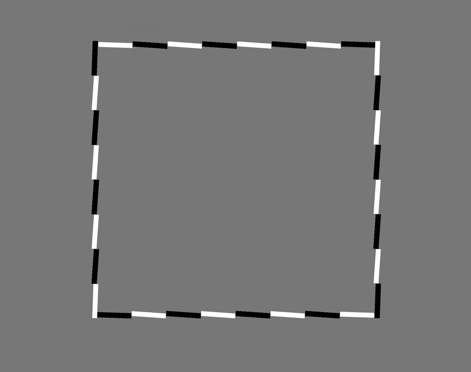
This isn’t the only case, either, where level horizons can seem off-kilter. Our visual system is easy to fool if you do it properly. Take a look at the figure below, for example, which is clearly tilted (up on the left, down on the right):

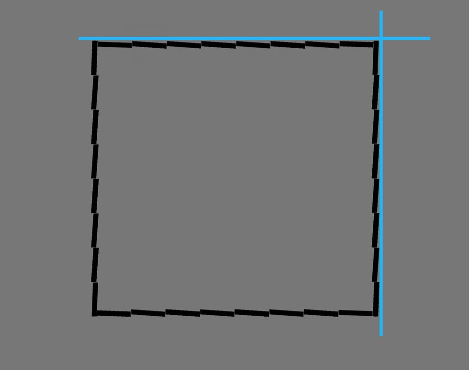
Except that it isn’t. This figure is completely level. But the vast majority of people will see it as indisputably tilted, since — at a local level — our brain sees each individual segment as tilted, and it constructs a tilted impression for the overall figure as a result. By turning the white lines black and adding a leveling guide, though, it should be easier to tell that it doesn’t actually have a global tilt:

It’s no different with photos, either. Even if the horizon in your photo is technically flat according to a line in post-processing, that doesn’t mean it looks flat. It’s very easy for visual cues to make it look off-kilter one way or another. Once again, my recommendation is to adjust for the perceptual horizon, since that’s the best way to make your photo appear level to your viewers.
4) What Can You Do?
Several elements make it difficult to capture a perfectly level photo:
- An uneven slope in the scene
- Noticeable lens distortion
- The simple lack of a horizon in some images
- Other deceptive perceptual cues
What can you do in cases like this — meaning, most cases?
My recommendation is to aim for the perceptual horizon rather than anything else. Most of the time, you’ll want your photos to look level even if, technically, they’re not.
To do this, be aware of any perceptual cues occurring in the photo. Is there a tree in your composition that appears to be tilted? Or, are lines in the foreground affecting the apparent straightness of an image?
Don’t blindly follow the “auto straightening” option in your post-processing software. Same goes for the bubble level or in-camera virtual horizon. Even drawing a flat line across your horizon to align your image isn’t foolproof. Although these techniques work in certain situations, they definitely won’t always match the perceptual horizon.
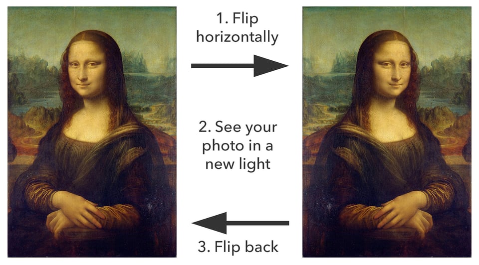
The other tip I’d like to mention is something we’ve covered before: Flip your image horizontally in post-production. By looking at the mirrored version, you’ll see the photo in a new way — including potential issues with the horizon that you didn’t notice initially.

Aside from that, I recommend revisiting your old photos from time to time and making sure that they still seem to have a level horizon. That way, you see your work with a fresh eye, rather than getting so used to an image’s appearance that you start overlooking its flaws.
5) Conclusion
Are these tips enough to ensure that all your photos look level? In all likelihood, no — aligning your photo to the perceptual horizon requires some time and practice to master. In fact, I would argue that no one can master it completely, since each person sees the world differently. (What looks totally level to me might appear tilted to someone else.)
Still, it’s worth trying. A non-level horizon will, in many cases, give the appearance of unprofessionalism, or of a rushed composition. Sometimes, that’s intentional — in which case, disregard this article! But, for many photographers, a flat horizon is what you’re after. If that sounds like your goal, my hope is that you found the tips in this article to be useful.
Really interesting, esp re perceptual horizons – also enjoying the comment threads! Yeah, agree, sometimes those buildings just gotta slant! :) Thanks!
Hi Spencer, I shoot beach scenes quite a lot and so have to deal with horizons all the time. I totally agree that horizons are a challenge. Since a water horizon must be straight, one has little choice in setting it, but I do think that sometimes they can be a little too perfect. There is not much you can do about it except maybe let it tilt ever so tiny an amount so that it is quite unnoticeable, but will be a little more pleasing to the eye. It is a very tricky technique to get right, and I do not do this often, but I also agree that the picture must look good first and foremost. I find that with land horizons, I satisfy the eye first off, just as you advise. Sometimes there is the compromise between a tree looking straight and a roof line looking right. I’ve found that in that instance just getting the roof line not to look crazy is all I can hope for. In severe cases, the delete button is a very useful tool. As usual, I enjoyed your article and photos so much. Please keep them coming as often as you can! :)
Wouldn’t the adaptive wide angle tool work in some cases?
Yes, it certainly could in some cases! The problem is that if you set up the adaptive wide angle tool to straighten the horizon, you’ll need to be sure that you’re setting it to align with the perceived horizon, which won’t always match the actual horizon line going across part of the frame. Same goes if there isn’t any horizon at all — in that case, the adaptive wide angle tool will be harder to use for this purpose. But it is a very useful option to have at your disposal if you use Photoshop to edit your images.
Yep, very true. Just took a photo of a bridge a couple of days ago. I am sure I was keeping the camera level with the river but in PP I had to tilt the image, because the bridge made it look sloping. Lesson learned.
I can see that being an issue! The bridge would be a much more dominant line in the image, yet correcting for it perfectly would result in the “real” horizon being tilted. It’s an odd dilemma indeed, but I think you went the right way by favoring the perceptual horizon.
Great article. I’d like to solicit comments under the following scenario in post production. I was fortunare enough to capture a horse framed within a barn opening. My position was at the other, far end of the barn. Morning light backlit the horse and accentuated deails of the barn. The problem was the old barn was sagging leaving the top beam and the barn door opening off by 2 – 3 degrees. The ground was level. The tie downs were even but the leading lines formed by the “box” corners were slightly cockeyed. If I straightened the architectural lines, the horse was angled. Both were equally important elements of the shot. Anyone dealt with a similar frustration with aging architecture? How did you handle it? Feel free to suggest a reference as a “go to.”
For some reason, your comment just now showed up in my inbox — not sure what happened, but sorry for the late reply.
When there are conflicting elements of the shot, like the scenario you’re describing, it can be very tricky to find a good horizon line. There’s no real answer, other than to just go with what looks right. I do recommend using the horizontal flip technique to find a decent balance between the two cues. From the description you gave, it almost sounds like I’d prioritize the horse, but it’s hard to know for sure. Either way, best of luck!
Hi Spencer,
I can definitely relate to this topic. Seascapes that include sloping hills in the far horizon can make the image seem imbalanced or off-kilter even when the water line is straight. Which is why your term “perceptual horizon” (also covered in the PL Creative Landscape eBook) is a very apt way to describe it, like an illusion that plays tricks on one’s visions. To a degree, I find it related to the topic of apparent and implied motion where the mind picks up cues from the elements and sees motion (or the implication of movement) in a still image.
Oggie
Oggie, yes indeed, I find that seascapes are often the most difficult! They have such a clear horizon going across the frame, but that makes them all the more problematic if other lines dominate the tilt of an image. When you correct for the perceptual horizon, it is much easier for other photographers to draw a straight line across the top of the sea and say that your “obvious horizon” is crooked!
All of this is strongly related to conveying motion in an image, too, you’re very right. Why is it that some cues cause us to see motion so naturally in a photo? I’m sure you’ve seen optical illusions where a static image appears to rotate or jitter from side to side, taking advantage of “flaws” in our visual system just like the tilted square illusion in this article.
These intricate details about perception might seem off the beaten path in most fields, but they matter quite a bit in photography! It is important to understand how our audience sees our work.
After all this time I was beginning to think that maybe I just see “funny.” The veil has been lifted! Thanks, Spencer.
Glad to hear it! Yes, perhaps you do see “funny,” but so does everyone else — our visual systems are not good at figuring out the “real” tilt of a scene, and they are quite easy to fool :)
Interesting article….very helpful…..something many photographers are not aware of is if the photographer has any visual astigmatism……even thought the image will look level in the viewfinder, it will be slightly skewed…and consistently the same amount. My friend is always off 3 degrees to the right while I am always off 3 degrees to the left. Knowing this makes it easy to correct in the viewfinder.
That is quite interesting, and I did not know it! Thanks for adding. The fact that the tilt is consistent would help with correcting for it, I’m sure.
Joe’s on the money with his comment, Spencer. As you recognise in your article, some shots it’s easy to set or fix. But I’ve struck a number where being “correct” is visually unacceptable – the eye rejects the “right” answer and demands a slight tilt, one way or the other, to create an “appearance” that the eye is prepared to accept as correct.
This is also true with verticals. It’s actually relatively easy these days, with tilt-shift lenses, tripods, etc and with the right software in post processing, to get a shot of a building with perfectly verticals. Except that it’s often far better to leave a slight convergence – the eye accepts that, but rejects the truly vertical version as fake.
Fully agree — I have an instinctive reaction against photos with tall buildings that have perfect keystone correction. It’s just not how we see the world. But a bit can be nice, since many photos have more convergence than what seems natural. Not an easy balancing act (and one more reason I’m glad to be a nature photographer more than anything else)!
Great article, it really solved some issues for me.
Thank’s a lot :-)
Glad it helped, Bjorn, thank you for the feedback!