Composition, as it’s usually explained, is the way you arrange the visual elements within a photo. But that definition misses something. A large portion of what’s important when composing a photo isn’t within the photo at all. Instead, it’s the bits outside the frame that are completely excluded from the image.
I believe that what you leave out of a photo is as important as what you put in it. In the same way that every element of your composition has emotion and visual weight, so do the elements that you exclude. Is there something near the edge of your frame that would attract attention? By including it, you shift the photo’s visual weight in that direction; by excluding it, you shift the photo’s visual weight away just as much.
At a simpler and more frequently-seen level, sometimes distractions creep into a photo, and they’re capable of harming the composition substantially if you don’t put effort into excluding them. I think half the energy I spend composing my photos is taken up by trying to get rid of distractions to my message, usually by excluding them from the edge of the frame. A density map of where I try to pay the most attention when composing a photo would probably look like this, where darker orange represents areas for more consideration:
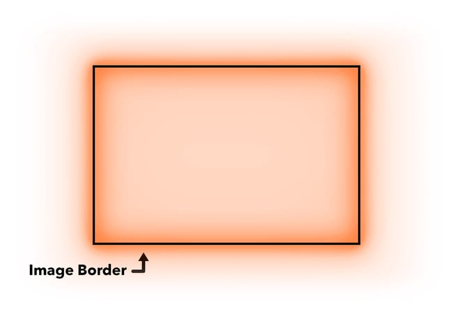
If, for example, I’m taking abstract photos in a slot canyon, a lot of my thoughts are on excluding the blown-out sky at the top of the photo. If I’m at the sand dunes, I try to figure out where to stand and how to frame the shot to avoid any trace of footprints. And so on. Distractions along the edges of an image can turn into major problems, and they’re not always easy to see in the field.
For instance, do you see the distraction that made its way into this photo? I didn’t when I took it:
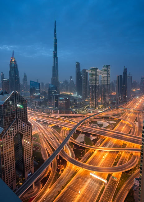
The distraction may not be immediately apparent because it’s not bright or colorful, but the gray triangle of concrete at the bottom left certainly is not a good addition to this composition. My options at this point are to crop the photo awkwardly, use a very generous spot healing brush, or leave the distraction as it is.
By comparison, here’s an image that I took from the same spot previously. This one has a better composition to my eye, since I excluded the gray concrete in the corner from the start:
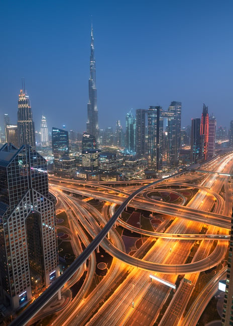
All it took in this case was using a different tripod position where there was a clearer foreground. That’s only one way to remove a distraction, though. You can also zoom in, shift your composition to the side or up and down, crop in post, or use a spot-healing tool.
And perhaps my favorite way to “leave something out of a photo” is to include it anyway, but cover it with something else in the composition! All you need to do is change your camera position, and the relative placement of each object in the image will change. If you’re clever about it, you can often bury whatever distraction is bothering you. I use this technique all the time to exclude unwanted elements of my composition, including here:
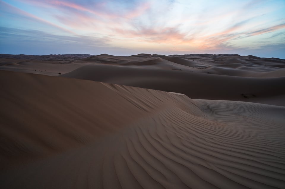
Note the distracting bushes on the left-hand side of the photo. (There are also some bushes on the right-hand side, but they’re smaller and don’t stand out as strongly against their surroundings, so they don’t bother me as much.) An easy way to leave them out of the photo is to lower my tripod and block them with the foreground dune:
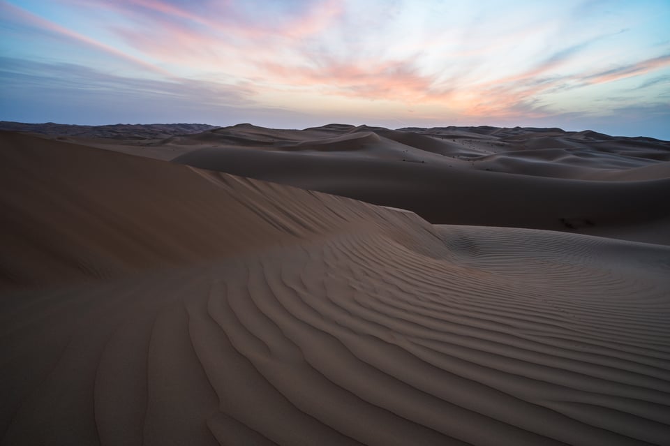
To my eye, even though the difference is subtle, this is a much stronger image. Excluding distractions from your photo can be a powerful thing.
Then again, it’s not just distractions that you might want to exclude. Sometimes, what you leave out of a photo might be an interesting subject in its own right, but it doesn’t work for the emotional message of the photo at hand.
Here’s the best example of this phenomenon that I can think of from my own work. There’s nothing exactly wrong with the following photo, as it shows a cool rock formation at sunset, but somehow – maybe because it’s backlit – the entire subject in the foreground and middleground just looks a bit dull and out of place.
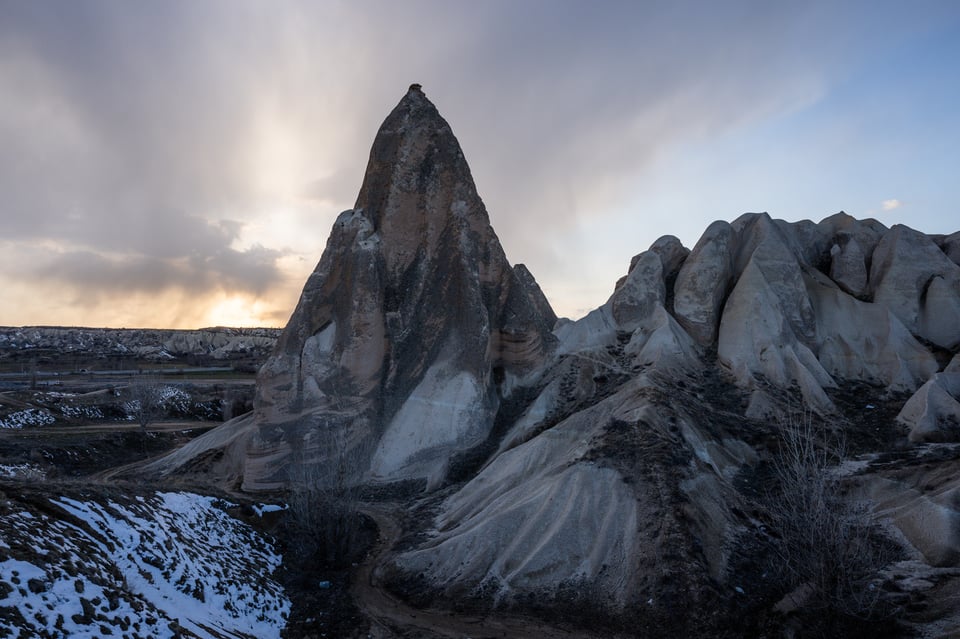
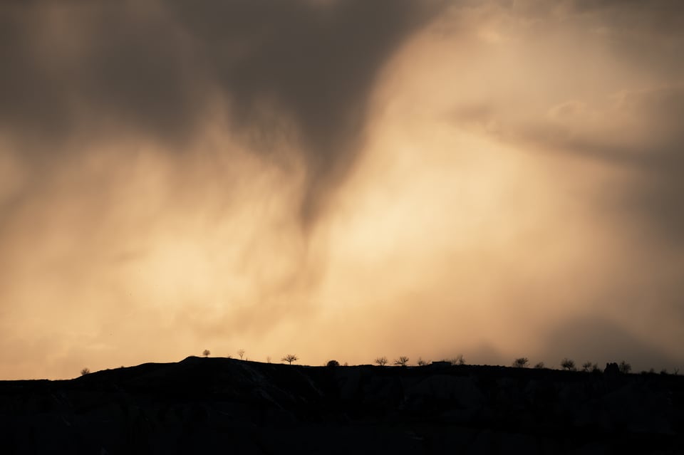
But wow, that sky! It’s small, but these are some of the most unusual clouds I’ve ever seen, combined with an intensity of light that seems somehow wasted on the foreground above. So, I chose to leave something out: the entire foreground. This time, the light is freer to show off its strengths, and I think the following is a much stronger image.
Maybe these examples helped you see why I think about composition the way I do. To me, leaving something out of a photo is just as important of a decision as composing the elements within. It may even be more important, or at least worth spending more of your time thinking about in the field. When you leave out distractions and subjects with a conflicting emotional message, you’ll see that what you leave in looks so much stronger because of it.
This is quite a nice summary of the issue. Sometimes you just don’t see things that creep into the frame. As for the bushes in the dunes photo, I don’t see them as a distraction but rather as part of the scene. All down to personal preference, which is why two photographers looking at the same scene will take two different photographs. Spencer, did you see the bushes on the small screen at the back of your camera? That’s develishly difficult.
Thank you, Gary! Whether the bushes add or subtract from the message is certainly a personal preference. I did manage to see them on the screen this time because they’re high enough in contrast against the surroundings. A lot of times, I wouldn’t catch something that’s so small in the frame.
I was reading about current smartphones and recalled articles by Nasim Mansurov pointing out how it was cellphones that were driving the camera industry. Computational photography advances were the way of the future, he observed, and he sure was right. Cellphones destroyed the point and shoot market, and now do amazing things that flagship mirrorless cameras cannot.
Nasim seems to have vanished from the website he created and brought to excellence.
His influence and voice are sorely missed.
Is he associated with Photography Life anymore? What is he doing? Will we hear from him again?
Sorry to rain on your parade here in Comments, but this is where Contact Us sends me.
I’ve been wondering exactly the same thing!!
Anthony, I was writing a fairly long response, and then somehow I managed to close out of my browser session, so I am going to keep it fairly short – my apologies.
Basically, Photography Life experienced a decline during the pandemic that made it impossible to run the site with both Spencer and I employed together. Instead of letting go of everyone and trying to keep the site alive on my own, I decided to go get a job that covers my expenses, while keeping Spencer on the team, as well as hiring a few talented photographers that can hopefully help grow the site. If things come back, I might be able to quit my job and come back as a writer, but at the moment, that is not a possibility. Unfortunately, the continuous decline of the photography market, lack of overall interest in photography, as well as intense competition from very large publishers that have been gobbling up the market all have made it tough on us financially, so we had to make some very difficult decisions.
At the same time, I do stay involved quite a bit still – I am still the technical brain behind running the site (it is a fairly complex infrastructure), and I help Spencer make decisions and bring some new ideas. Every once in a while, I will drop by and write a review or an article as I get a bit more free time. At the moment, it is a tough thing to do as I try to balance a full-time job. I am sure you know how it is in the corporate world.
As we go through this transition, I request all of our readers to be patient and keep coming back for more content. We are working very hard on coming up with some great ideas, more guides and tutorials, as well as in-depth reviews. We’ve paused lens reviews for some time due to my moving to a different location, so the lab environment has to be rebuilt, which we are trying to do as soon as possible.
Hope all this makes sense. Please let me know if you have any questions!
Me too, although I don’t think that algorithms and technology can substitute the artist. And when it’s used extensively, it actually denies it. HDR being a great example.
A very practical article. Thanks.
Question: It looks like the first 2 photos were taken in Dubai. Where were you standing when they were taken?
Thanks again.
It’s the view from the top balcony of the Shangri-La, where we stayed as part of our Middle East workshop this March. Great view of the city!
Thanks for the tips!
You’re very welcome!
This essay by Spencer is a wonderful, practice-oriented restatement of an important insight from Susan Sontag in REGARDING THE PAIN OF OTHERS.
In her beguiling book, Sontag insisted that “the photographic image…cannot be simply a transparency of something…to photograph is to frame, and to frame is to exclude.” In effect, photography is the act of “framing” which, as Spencer shows us, is as much about our choices to exclude and even conceal, as our choices of what we ultimately include inside the frame to achieve a certain compositional goal. What is great about Spencer’s piece is the way he actually demonstrates the practical aspects of this principle. Great work Spencer.
I’m very glad it struck such a chord with you, Gary. Thank you for the interesting Susan Sontag quote as well.
This is a highly important lesson for all, Spencer! The presence or absence of distractions at the borders and elsewhere in the frame often makes the difference between a picture that was *taken* and one that was *made*. Even out on a family stroll with just my mobile phone, you’ll see me running left, right, forward and backward, lifting the phone in the air or crouching down, carefully selecting what goes in AND what stays out. Without exception this makes a difference with the ‘snapshots’ my non-photography company might take. If you compare photo’s afterwards, they’ll also notice the difference in overall quality, even if they can’t quite put their finger on the reason behind it. The generic remark then usually is “you’ve got a good eye”, or even “a good phone”, but of course it’s down to the method behind the running-around madness ;-)
Greg, that’s a great way to explain it. When I take photos with my phone, 99% of the time I’m just grabbing a quick snapshot and not trying to “make” anything. The complete lack of artistic quality among those shots is proof that composing thoughtlessly doesn’t work for me! On the other hand, if I think about the concepts in this article, it at least gives me a fighting chance sometimes.
I can really relate to this essay. Just the other day I was composing a shot, and when I saw it on my monitor, there was a bit of wall there that I totally had not seen. I was so used to it being there that it had become invisible to me. I reshot the picture, and got it right, but of course there were certain elements that looked better in the first photo. It’s a good thing that these aren’t the good ol’ expensive film days. HA!
That’s how it goes! I’d actually say that shooting with film recently has helped me with this, precisely because it’s so much more painful to get it wrong. But the lessons of slowing down, scanning the composition, and trying to get things right in the field apply no matter what type of work you’re shooting.