Ever wondered why your subjects turn out yellow when photographing them in indoor environments? Or why your camera flash can make them appear blue? Thoroughly understanding the concept of white balance and how it works is very important in digital photography, because setting it incorrectly could ruin a picture, adding all kinds of unwanted color casts and causing skin tones to look very unnatural. In this article, we will go over the basics of white balance and color temperature, topics that can be a bit intimidating for beginners to understand.
Table of Contents
Introduction
No matter what you photograph, there is one thing you should realize about light. Not all light is created equal. I’m not talking about the quality of light, but rather the color of light. What you might see as white light from different sources can actually have different colors, or what are referred to as color temperatures. Direct sunlight at noon (which I’ll just refer to as sunlight) is considered to be a “normal” color temperature, so all light sources are compared to this as the standard. For example, light from an incandescent light bulb appears to be more orange than sunlight. On the opposite side of the spectrum, shady areas appear to be more blue than sunlight. In photography, we refer to these differences as being “warmer” (or more orange) and “cooler” (or more blue) than our neutral sunlight reference point.
So how does this apply to photography? Have you ever taken a photo that came out looking too orange or blue? When you looked at the scene with your eyes, it probably didn’t look orange or blue. It looked normal. That’s because our brains compensate for different color temperatures so that we just see normal colors.
If you are a skier or a snowboarder, try this quick experiment: put on your ski goggles and look at the snow – it should change in color tone. If you have ski goggles with a yellow tint, the snow will look yellowish. However, after you ski for a little bit, your eyes and your brain will adjust for the color and the snow should look white again. When you take off your ski goggles after skiing, the snow will look bluish in color rather than pure white for a little bit, until your brain adjusts the colors back to normal again. This example proves the fact that we are equipped with a very sophisticated color system that automatically adjusts colors in different lighting situations.
Our cameras, on the other hand, don’t automatically compensate for different color temperatures. Instead, unless you use a setting that compensates for different color temperatures (which we’ll discuss soon), cameras capture the light and color temperatures that are actually in a scene, not what your eyes see.
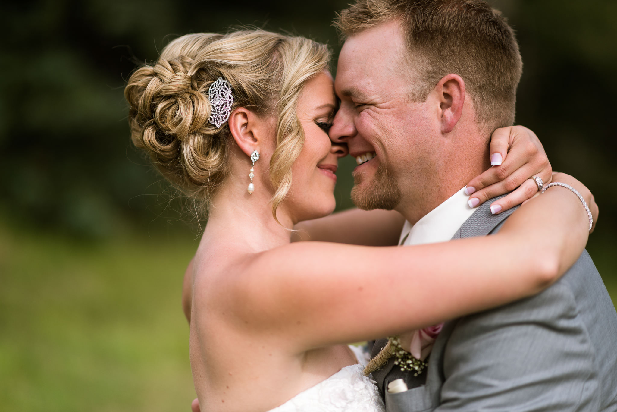
If an incorrect white balance setting is used in a camera, images turn out unnatural, with bad skin tones and color shifts. Here is an example of both correct and incorrect White Balance:
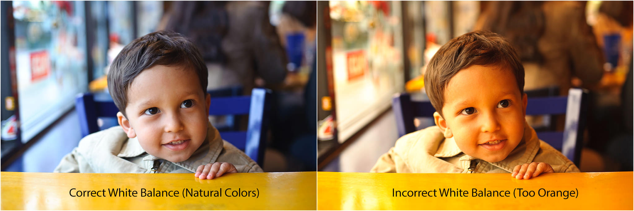
As you can see, the image on the left feels more natural and the skin tones look good, while the image on the right is way too orange. The second image clearly needs its white balance adjusted to eliminate the orange tones.
What Is Color Temperature?
Let’s talk a bit more about color temperature. Color temperature is measured in units of Kelvin (K) and is a physical property of light. There is a large margin for variance between different light sources, even if they appear to be exactly the same. For example, maybe you’ve been in a room with rows of overhead fluorescent lights and noticed that there were some bulbs that were a slightly different color than the others. Maybe they were older or a different brand of bulbs, but regardless of why, they had a different color temperature than the rest of the bulbs. Similarly, sunlight at noon can have a different color temperature than it does at sunset.
A neutral color temperature (sunlight at noon) measures between 5200-6000 K. You’ll find most external flash units come set from the factory in that range, which means they are basically trying to imitate sunlight. An incandescent light bulb (warm/orange) has a color temperature of around 3000 K, while shade (cool/blue) has a color temperature of around 8000 K. Here’s a chart that gives you a few different light sources and their typical range of Kelvin measurements:
| Light Type | Color Temperature in Kelvin (K) |
| Candle Flame | 1,000 to 2,000 |
| Household Lighting | 2,500 to 3,500 |
| Sunrise and Sunset | 3,000 to 4,000 |
| Sunlight and Flash | 5,200 to 6,000 |
| Clear Sky | 6,000 to 6,500 |
| Cloudy Sky and Shade | 6,500 to 8,000 |
| Heavily Overcast Sky | 9,000 to 10,000 |
Color Temperature of Different Light Sources
Photographically speaking, things get tricky when the scene you are photographing has multiple light sources with different color temperatures. This situation is known as mixed lighting. Take a look at the photo below:
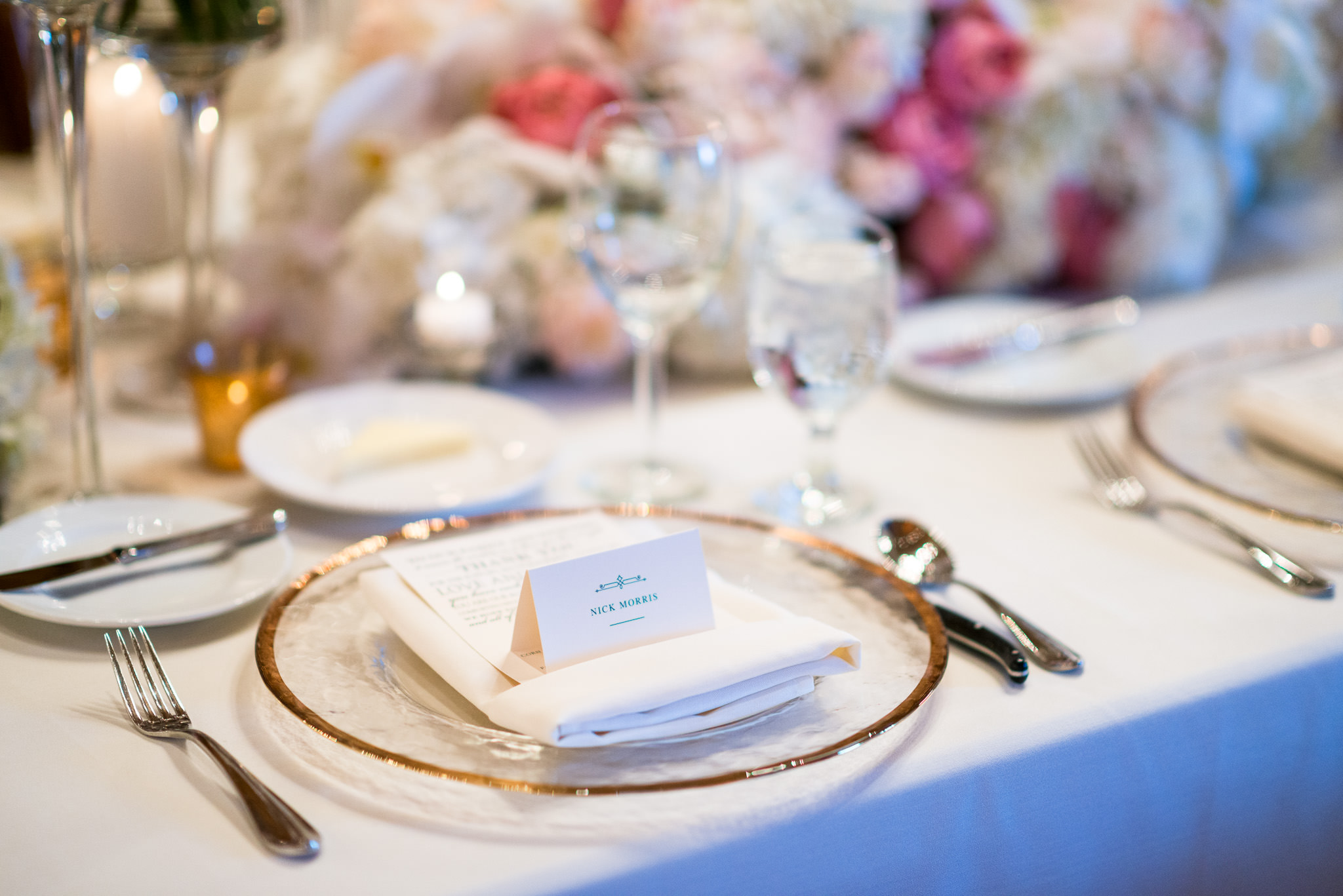
This scene had chandeliers hanging over the tables that had incandescent bulbs in them, while indirect sunlight was coming through the windows behind me. After adjusting the white balance for the tungsten overhead lighting (which I’ll explain how to do in a bit), the sunlight that is lighting the side of the tablecloth and the flowers on the right looks blue.
Color Temperature of Different Light Conditions
It’s not just different light sources that can give you different color temperatures. Different lighting conditions can also have different color temperatures. Take a look at these two photos:
They were taken only moments apart, but between the first and second image the sun went behind a cloud, creating shade and giving a cooler color temperature. The light source (the sun) didn’t change, but the conditions did.
What is White Balance?
Now that you know what color temperature is, white balance should be fairly easy to understand. As the name suggests, white balance balances the color temperature in your image. How does it do this? It adds the opposite color to the image in an attempt to bring the color temperature back to neutral. Instead of whites appearing blue or orange, they should appear white after correctly white balancing an image.
In simpler language, white balance in digital photography means adjusting colors so that the image looks more natural. We go through the process of adjusting colors to primarily get rid of color casts, in order to try to resemble the colors in our images with reality.
The good news is, adjusting white balance is very easy. You can do it in your camera, as well as in post-processing software.
In-Camera White Balance
Most cameras come with the option to manually set or adjust white balance. Typical settings include “sun”, “shade”, “tungsten” and “fluorescent”. Some cameras come with the option to manually set a color temperature by choosing a specific Kelvin value.
Let’s take a look at a few examples:
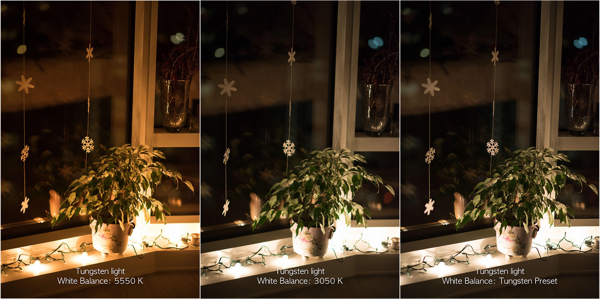
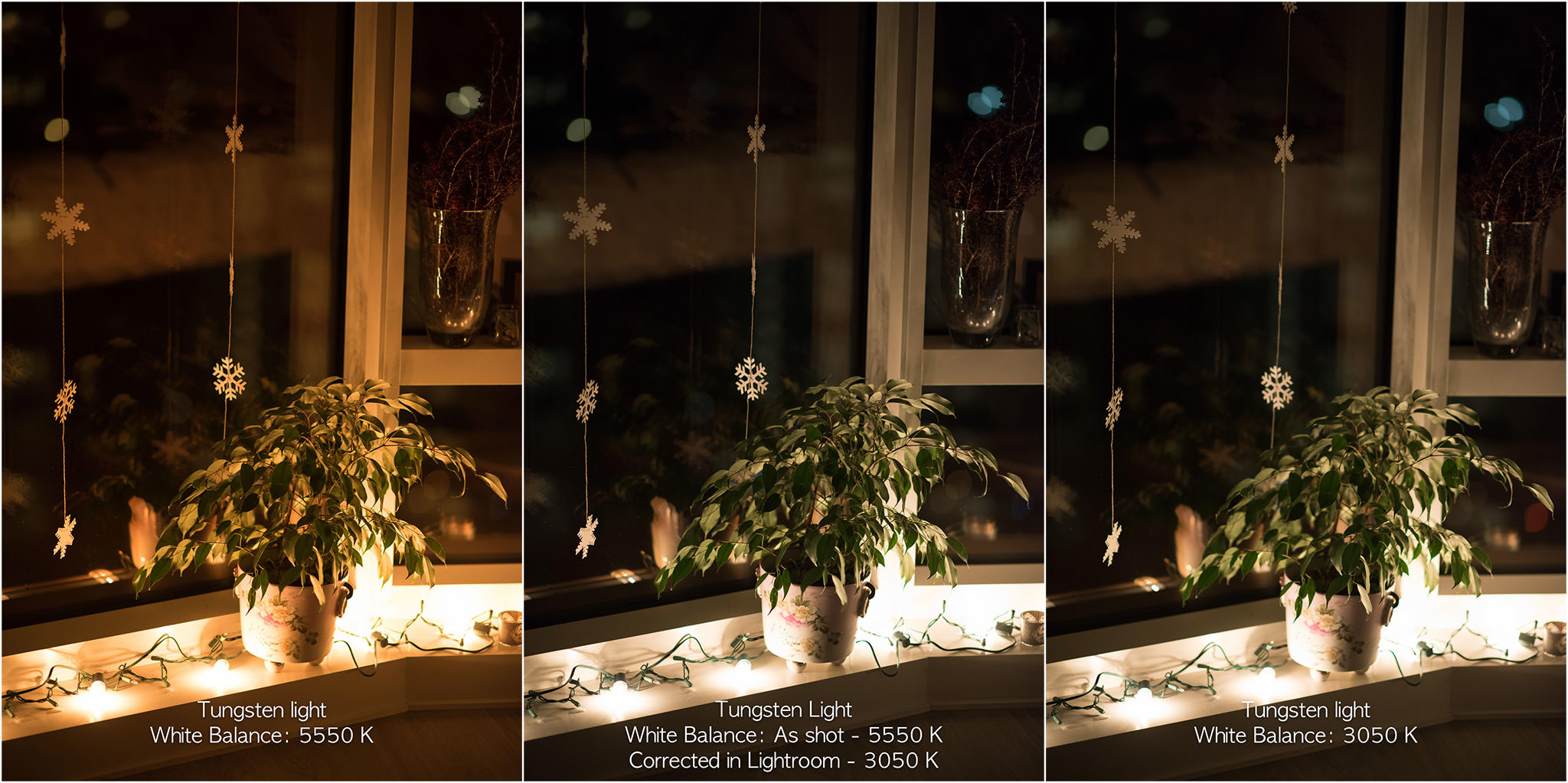
In the image on the left, you can see how orange the light bulbs look when I have my camera set to a neutral white balance, but once I change it to the color temperature of the bulbs (either manually or with a preset white balance), they look normal. Why is that? My camera is “cooling” down the color temperature of the bulbs by adding blue to the photo, giving us the appearance of white light. Notice that while the light bulbs now look white, the bokeh in the background now looks blue.
Still having trouble understanding what’s going on? Take a look at these images of the same scene that were taken in daylight:

Now that it’s daylight, you can see that 5500 K is the correct white balance for the color temperature. What happens if I set my white balance to 3050 K in daylight? The image turns blue! This is how much blue was added to the photo of the orange incandescent bulbs to balance the orange and make the color temperature of the incandescent light look normal.
Changing WB in Camera vs In Post-Processing Software
One of the great things about digital photography is that we no longer have to use white cards and color-cast removing filters in order to get accurate colors. If you shoot in RAW format, you can easily adjust the white balance in post-processing software later (that’s because the original RAW image does not contain any colors – they get added during the RAW conversion process). The original image stays untouched and unprocessed by the camera. This means that as long as you shoot in RAW, you can simply ignore the white balance setting.
But what if you do not use RAW and shoot JPEGs instead? Then you will need to learn how to adjust white balance on your camera, since adjusting white balance later can be quite damaging to the image, and you might never be able to get the colors right. Again, in most circumstances, your camera will do a good job of guessing the correct color temperature, but there will be cases where the camera will be fooled by lighting conditions and give you bad colors. That’s when you will need to manually change it on your camera.
Since I always shoot in RAW, I set my camera to “Auto White Balance” most of the time and I let the camera guess what the correct WB should be. If my camera is unable to guess the correct white balance, I simply change it in post-processing software like Lightroom later, and I can copy-paste my desired values to as many pictures as I need. This is explained in more detail further down in the article. So if you have your camera set to shoot in RAW, simply set it to Auto White Balance and you are good to go! And this is only one of the advantages of shooting in RAW. You can read about others in my RAW vs JPEG article.
How to Change White Balance in Your Camera
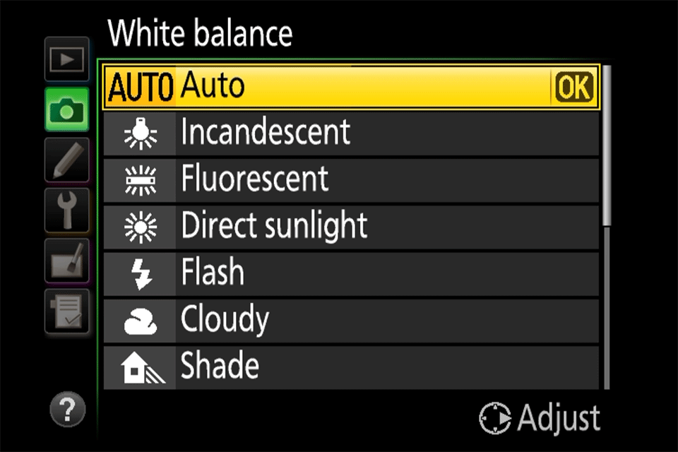
White balance can be changed very easily on most cameras. On most DSLR and mirrorless cameras, there should be a button that allows you to quickly change between different white balance presets. On Nikon DSLRs, for example, you will often find a “WB” button – holding that button and moving the rear dial will allow you to switch between different white balance settings, such as “Incandescent”, “Fluorescent”, “Direct Sunlight”, etc. If you don’t have a white balance button, or you prefer to select white balance through your camera menu, you can often find that setting in the general “Shooting” menu. For example, if you have an entry-level Nikon DSLR, simply navigate to the “Shooting Menu” and scroll down until you get to “White Balance”. Once there, you will be presented with a number of different presets, as shown below:
Let’s go through these, one at a time.
Camera White Balance Presets
Most current digital cameras have white balance presets that are set to a certain Kelvin number by the manufacturer. These presets also vary depending on the manufacturer and camera model. Here is the list of common presets for most Nikon DSLR and mirrorless cameras:
- Auto (A) – Default WB setting and what I use all the time when I shoot RAW. The camera automatically guesses the WB depending on ambient light and use of flash. Some cameras have more than one auto setting for different environments / lighting situations.
- Incandenscent (Light Bulb) – Use it strictly under tungsten light bulbs or the image will look very blue.
- Fluorescent (Glowing Tube) – Use if photos look too green or when under fluorescent lights. Since there are many different types of fluorescent bulbs, some cameras provide several different selections for this setting.
- Direct Sunlight (Sun) – Used when shooting outdoors with the sun shining on the subject.
- Flash (Lightning Bolt) – Used when utilizing on-camera flash.
- Cloudy (Cloud) – Used in cloudy days or in shades. Will yield warmer images than sunlight.
- Shade (House with a Shadow) – Warmer than cloudy, adding orange colors to the photograph. Good for sunsets and shades.
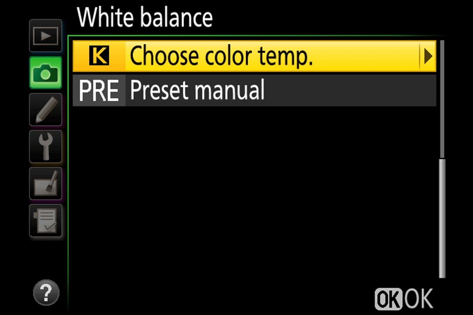
- Choose Color Temperature (K) – Lets you manually change the Kelvin value (typically from 2,500 to 10,000).
- Preset (PRE) – Used for color matching with a white balance card.
Again, the above list might be different for your camera and I’m providing the information only as a reference.
The best way to obtain the correct white balance is through the “Preset (PRE)” setting, but you will need a white balance card (also known as “grey card”, or “18% gray card”), and your camera needs to be able to read it. If you visit your camera’s white balance menu setting, you should be able to see something that says “Preset” (Nikon) or “Custom White Balance” (Canon):
The process involves holding the white balance card in front of the camera lens in order to have the camera read the correct color temperature of the light that gets reflected from the card. Some cameras might require you to take a picture of the white balance card first, then read the colors off of it to determine the correct white balance.
Keep in mind that this is not a permanent camera setting – each time your light conditions change, you will need to re-start the process.
How to Change White Balance in Post-Processing Software
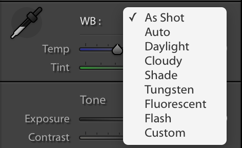
If you don’t want to worry about changing the white balance in your camera for different situations, as long as you are shooting RAW, you can always adjust the white balance of your images with post-processing software such as Adobe Photoshop or Lightroom. This is sometimes referred to as “color correction”. In your software you’ll probably see a panel that looks something like this:
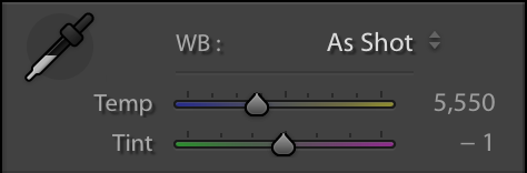
Just like setting the white balance in your camera, you can manually set the white balance either by adjusting the temperature value or by using the eyedropper tool on the left side and clicking on a neutral or white part of the image. Similar to your camera, you can also choose a preset white balance:
Here is the same image from above, both straight out of camera and with the white balance adjusted in Lightroom. Compare it to the image where white balance adjustment was done in camera:
Remember, this is only possible if you are shooting RAW images. If you are shooting JPEG, you will be able to make slight white balance adjustments to your images but will not be able to make drastic corrections.
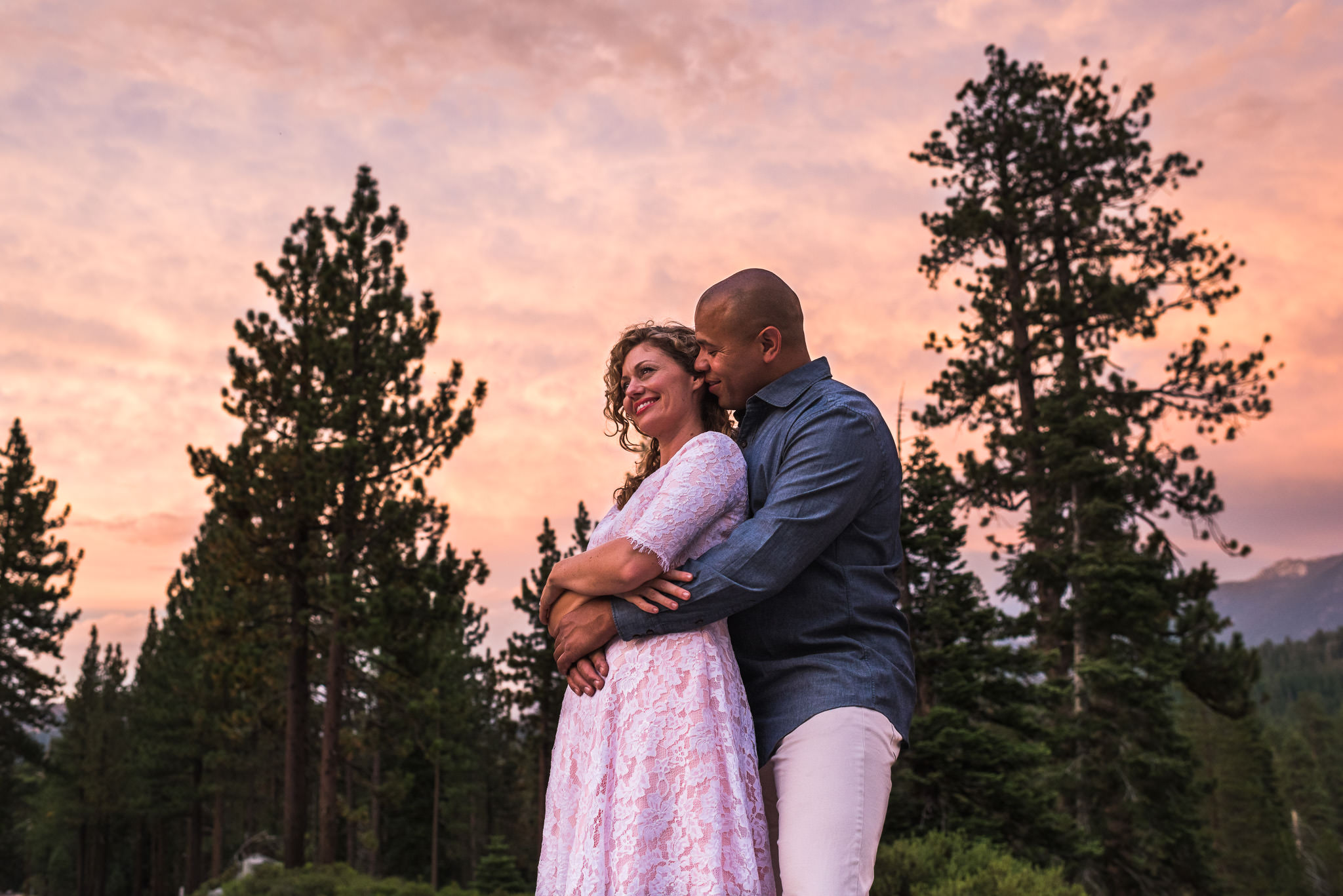
Here’s another example of adjusting white balance in post-processing. This photo was taken during an engagement session that started in daylight, so I set my camera to a white balance of 5500 K. As the sun started to set, the light got warmer and warmer, giving this image a very orange feel.
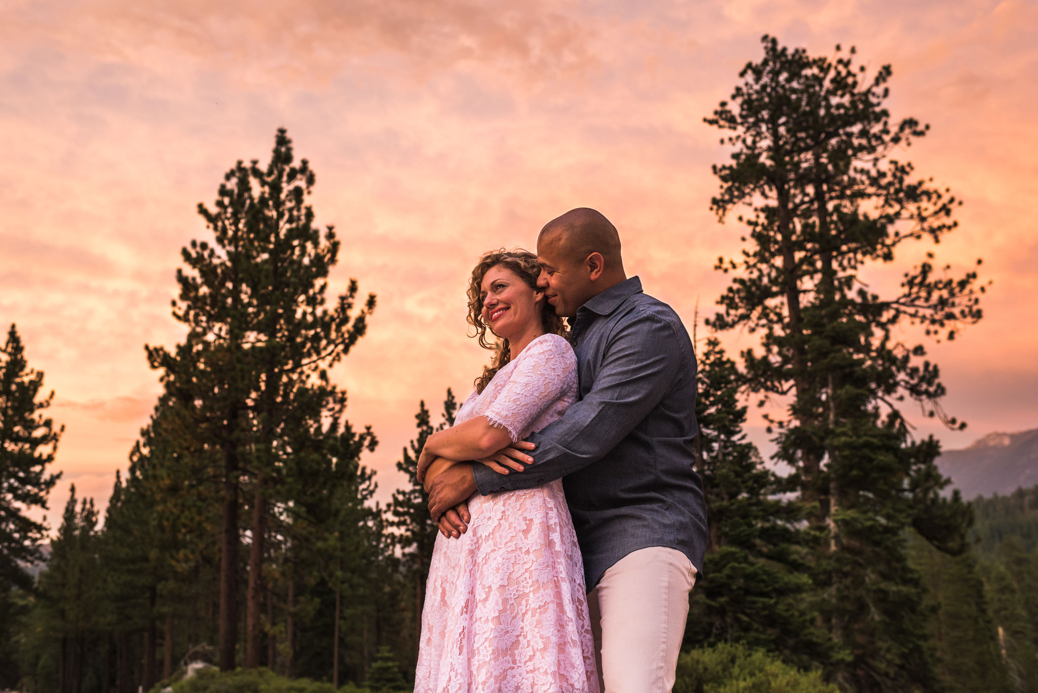
Now some people might like a sunset image to be this warm (it personally doesn’t bother me that much), but I thought it needed cooled down a bit to really bring out the pinks and blues in the sky, not to mention make their skin look a bit more normal. In Lightroom, I adjusted the white balance so that the temperature was at 4500 K, giving me this image which I feel looks more natural:
The Relation Between Color Temperature and White Balance
Now that you know the difference between color temperature and white balance, you should be able to see the relationship between them. They are the opposites! Unfortunately, since photographers mainly work with white balance, we sometimes get confused when referring to color temperature values.
Personally, I almost always shoot at a fixed Kelvin of around 5500 K. When I photograph interiors that are lit by incandescent bulbs, my images all look orange. Since I shoot RAW, it’s not a problem! In Lightroom I just “cool them off” by changing my white balance to around 3000 K. For shade, I “warm up” my shady images by changing the white balance to around 6500 K. In my head, higher Kelvin values start to equate to warm light and lower Kelvin values start to equate to cool light.
But remember, I’m balancing the color temperature! What I’m actually doing is adding the opposite color temperature to my image. I’m so used to thinking of 3000 K as cool, when I see that the color temperature of an incandescent bulb listed as 3000 K, it takes me a minute to remember that the 3000 K I think of as a cool color temperature is actually a cool white balance.
So now for the big conclusion you can draw from all of this. If you set your white balance to the color temperature of the scene you’re photographing, it should look great! If you’re photographing light bulbs that have a color temperature of 3000 K and you set your camera’s white balance to 3000 K, the light should look white! Now here’s the bad part. There’s really no way to measure color temperature, so you’re left approximating or adjusting in post-processing.
Using Auto White Balance
If you prefer shooting JPEG or just don’t want to worry about color correction after the image is taken, most (if not all) cameras and post-processing software come with the option to use auto white balance, or AWB. With AWB, your camera evaluates the scene that you’re photographing and decides on the best white balance to use. It will typically reference a neutral color in your scene such as white or grey to determine the correct white balance. Depending on your camera and the scene you’re photographing, your results will range from perfect to not close at all.
Using Auto White Balance In Camera
When using auto white balance in camera, your results will vary depending on the lighting conditions you’re shooting in. For example, if you’re shooting in daylight the white balance of your photos will typically look correct. Unfortunately, mixed lighting can really give AWB troubles, so you might still end up needing to adjust the white balance in post-processing software.
Even daylight can fool auto white balance. Here’s a set of images of an orange fox on a brown table that really demonstrate how inconsistent auto white balance can be without a neutral color in the image for your camera to reference:
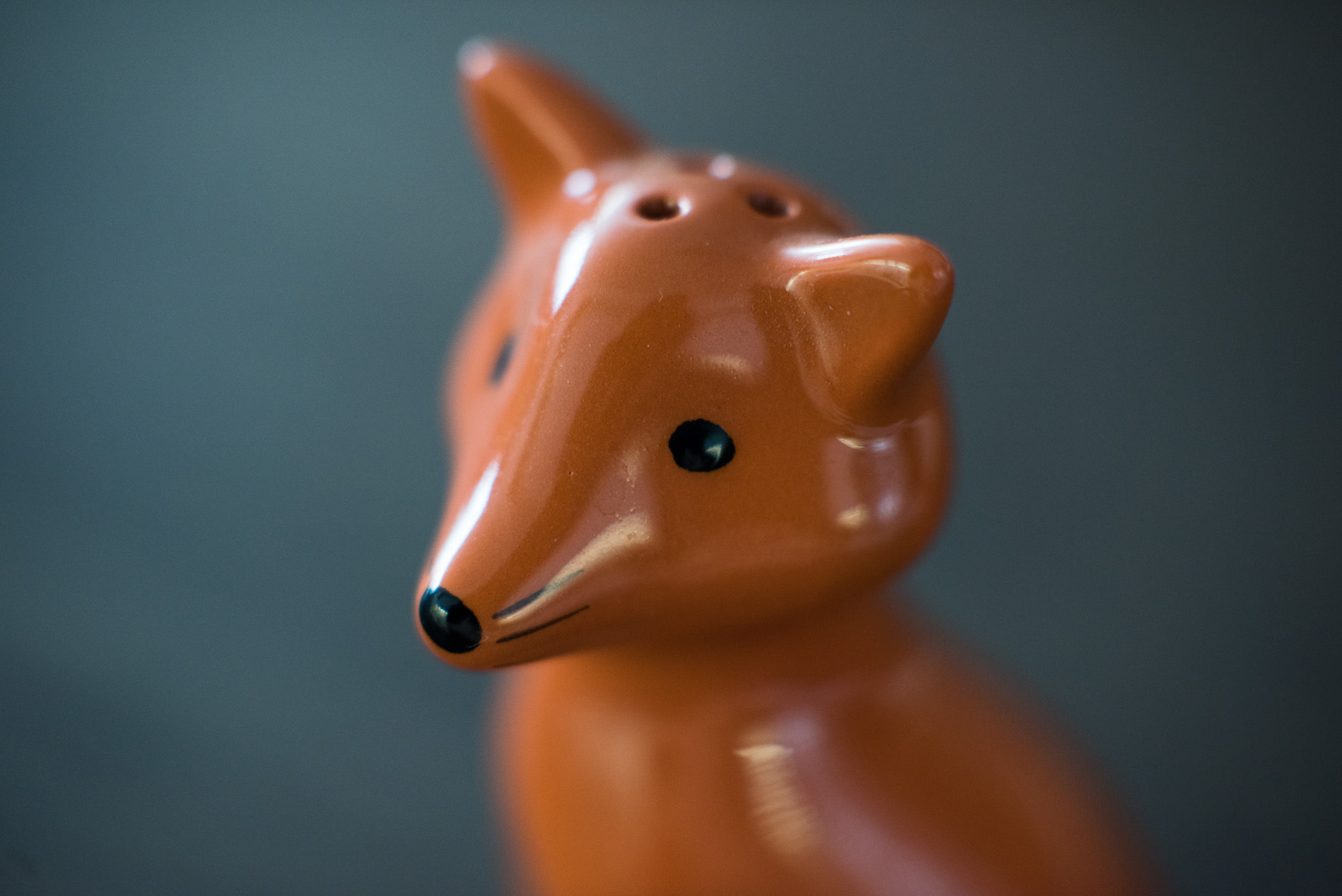
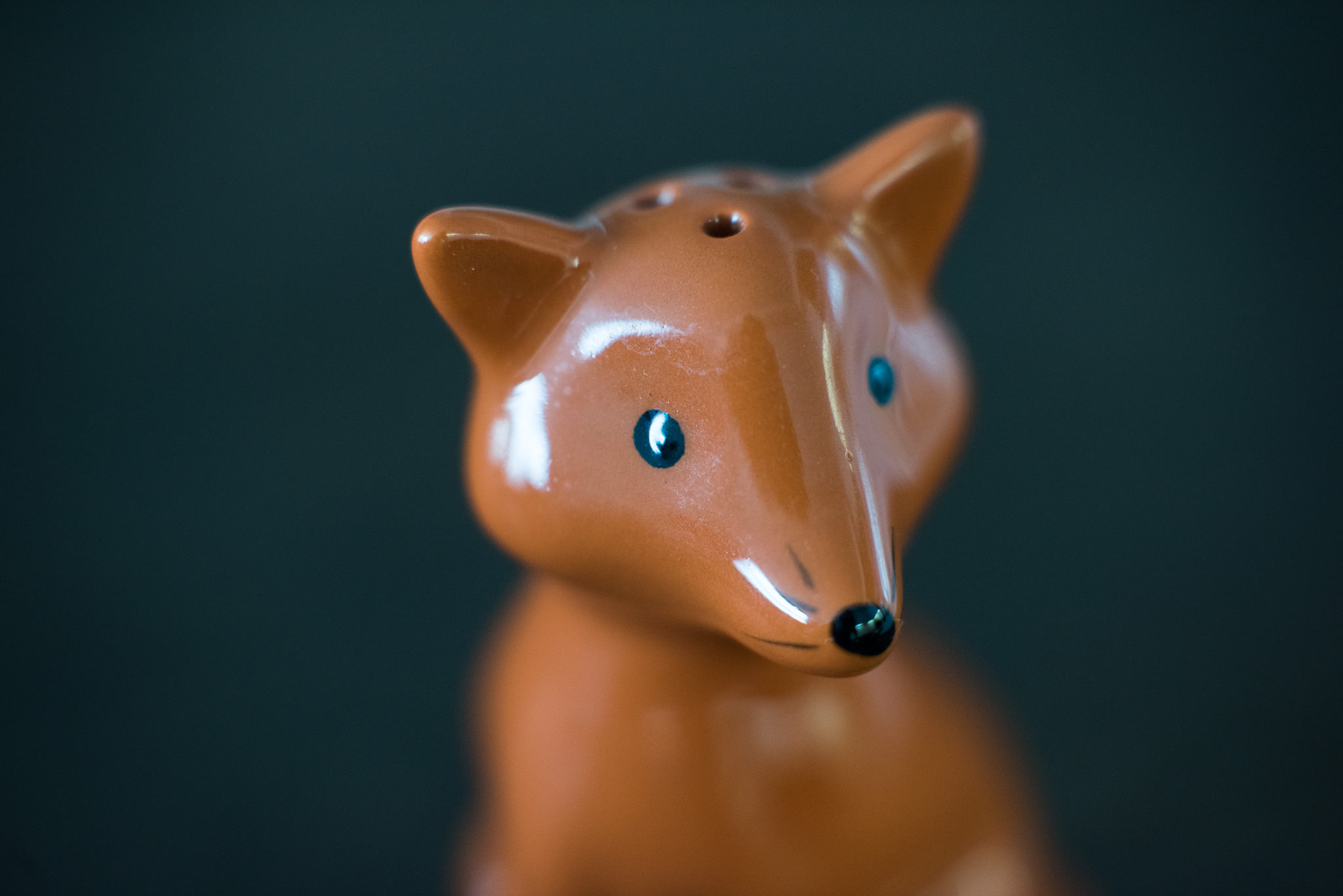
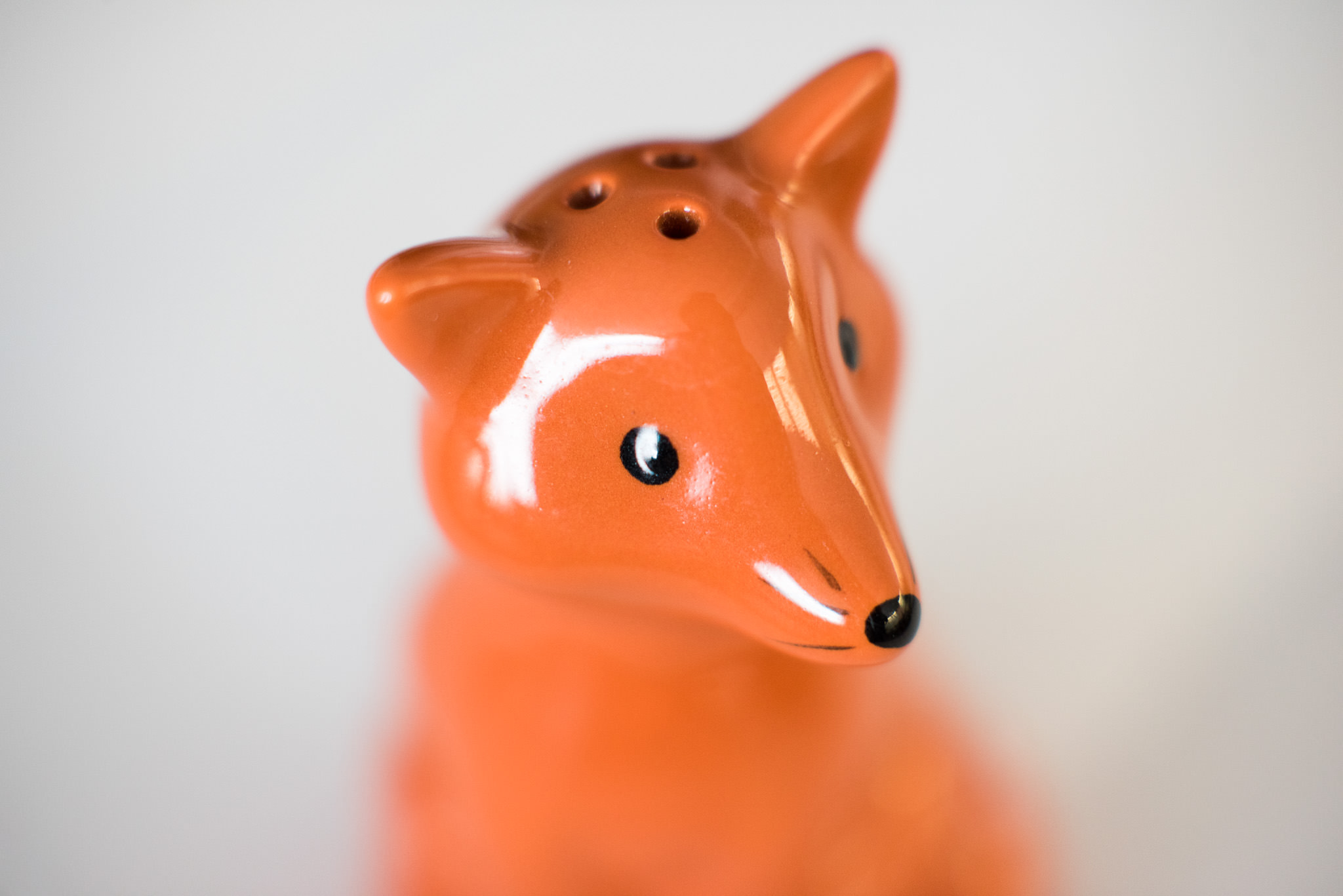
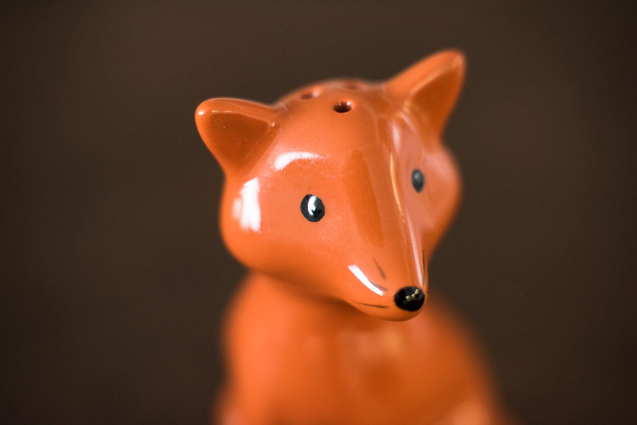
All of these images were photographed in the same light. You can see how much of a difference the background makes when using auto white balance. In the third image, simply adding a white background helped the camera get the correct white balance. You can see the last image is the same as the 2nd image, only with a correct white balance (adjusted in Lightroom).
Different cameras have different auto white balance capabilities. As with any technology, more recent cameras seem to be more accurate than older cameras. You’ll also typically have more advanced capabilities in more expensive cameras. That’s not to say that the AWB systems in entry-level cameras are not good. For example, my iPhone does a good job with AWB, but chances are my Nikon DSLR does a better job getting it right more consistently.
Using Auto White Balance In Post-Processing Software
Most, if not all post-processing software such as Lightroom and Capture One comes with an auto white balance option. In my experience, this is never as accurate as shooting with AWB in camera, but it can serve as a good starting point if you’re trying to adjust the white balance in your image and just can’t seem to get it right.
Here’s an example of using auto white balance in Lightroom on a simple, sunlit photo:
I don’t know about you, but I personally don’t think Lightroom got the white balance right in this image.
Tint
In addition to color temperature, light can also have a tint. While color temperature ranges within the orange/blue spectrum, tint ranges within the green/magenta spectrum. Major tint adjustments are typically not necessary when color correcting images taken in daylight. If you tend to photograph subjects that are lit by artificial light sources such as tungsten, fluorescent, LED or mercury vapor lights, you’ll find yourself adjusting tint much more than with natural light.
Here’s an example of a scene that was lit by fluorescent lights:
You can see that the first image has a very strong green tint. By changing the tint (adding magenta) but leaving the color temperature untouched, the white balance has been corrected.
Tint is not meant to compensate for color that is reflected onto your subject from nearby objects, such as in this image:
I photographed the model while she was facing a green door specifically to demonstrate this scenario. Although the white balance in the image is correct, there is a green tint to the shadow side of her face that has nothing to do with color temperature. It is a reflection of light off of the green door and can not be corrected by adjusting the tint of the image.
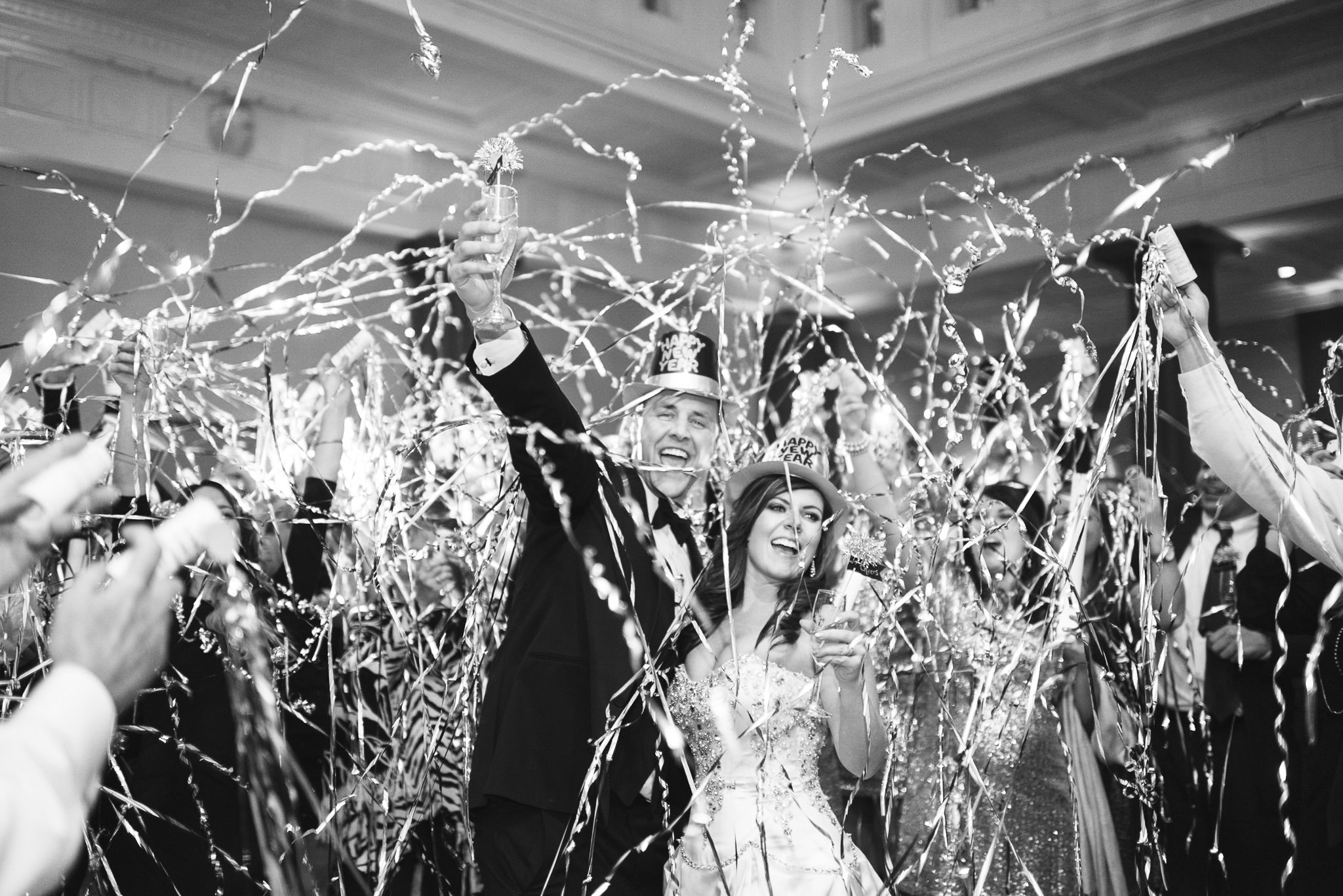
Just like reflected light that has picked up a color cast, colored or gelled lights on your subject are also not easily corrected by adjusting the tint of your image. For example, this image from a New Year’s Eve wedding has everything you’d want in an image taken at the stroke of midnight: streamers, celebrating, happy green faces on the bride and groom… wait, what?
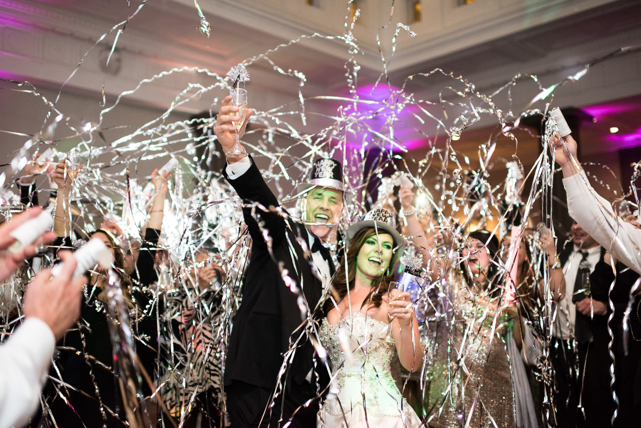
Unfortunately, this is not something that can be fixed by adjusting the white balance. Fortunately, it still looks pretty good in black and white.
Consistency (or lack thereof) Between Camera Makes and Models
As if getting the white balance correct between all of your images wasn’t difficult enough, using different cameras while photographing the same scene introduces a whole new dimension of complexity. This is something that wedding photographers know all too well since they typically work with another photographer who rarely has the same make and model of camera, but it’s something any photographer who works with more than one camera will encounter.
Take a look at these sets of images, taken in the exact same light but with different cameras:
Below each image, you can see what my white balance and tint were set to in Lightroom. Notice that, although they are identical, the images look completely different! This tells you that different camera models, even if they’re from the same manufacturer, affect the final look of the image. The reason for this lies in the software used for RAW processing. What does that mean for you if you use different cameras? It means that if you want to copy the white balance settings from one image and paste them onto another that was taken with a different camera make or model, your final images might not look the same.
Creative Uses
Keep in mind that as photographers, we get to decide what colors look more natural or more attractive to our eyes. This means that occasionally, you might want to practice your “artistic license” to give an image a completely different look and feel. For example, take a look at the below two images:
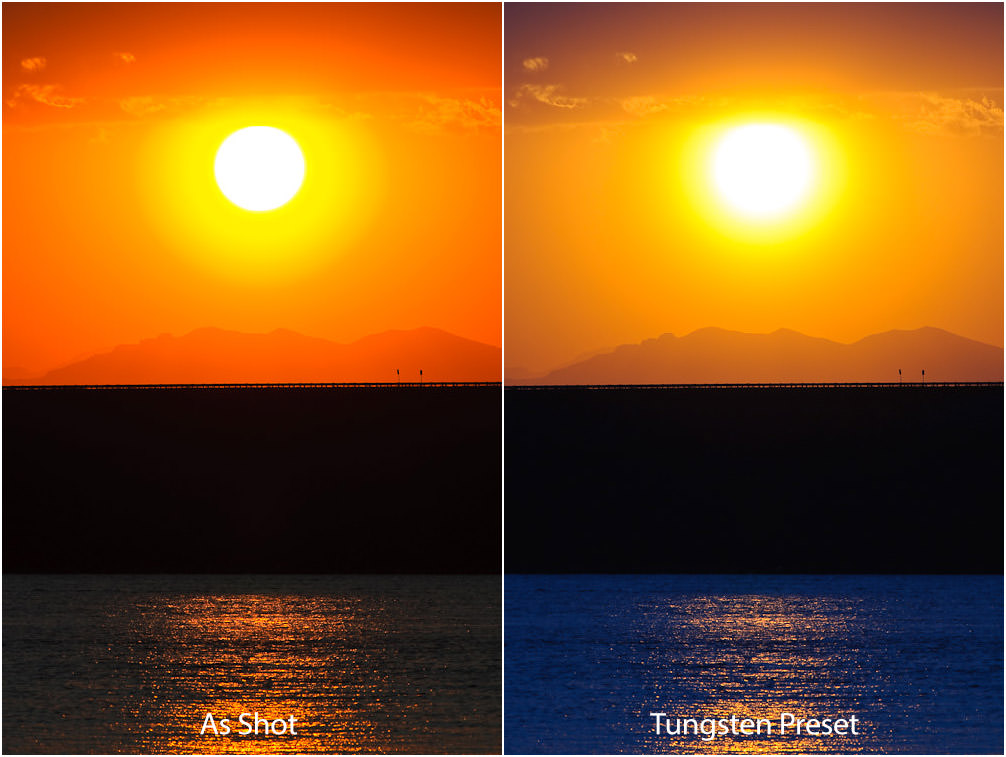
The image on the left is how it came out of my camera and the image on the right is how it looks after I changed WB to “Tungsten” in Lightroom. The image on the left looks a bit too dull for me, while the image on the right looks has plenty of color contrast. I like the blue color in the water and the fact that the mountains stand out, which gives the image a whole different look.
White Balance FAQ
In photography, while balance is the process of adjustment of colors to make them appear more natural in images. These adjustments can be carried out in-camera, as well as during post-processing.
Most cameras provide an easy way to change white balance. While higher-end cameras typically have a dedicated button for changing white balance, lower-end models might have a menu setting for adjusting white balance settings.
Getting natural-looking colors and skin tones in images is very important because it might be impossible to fix it later (especially if the image was shot in a lossy format like JPEG.
White balance can significantly affect global colors in an image. If it is set incorrectly, it can either make the image look too cool (more blue), or too warn (more orange).
If you shoot in RAW format, using the Auto White Balance setting is perfectly safe, because it can be changed later in post-processing software. If you shoot in JPEG format, Auto White Balance should work well in normal lighting conditions when using a modern digital camera. However, when shooting in mixed light or in challenging lighting conditions, Auto White Balance might produce mixed results.
The best way to get perfect white balance each time is to use an 18% gray card with a camera that can measure reflected light off of it and accurately set white balance.
It depends on lighting conditions. If you don’t know what to set white balance to, set it to “Auto” (Auto White Balance).
No. Exposure is how much light reaches your sensor and how bright or dark your photo ends up being, whereas white balance has to do with colors and how warm, cool, or natural your image looks. You might have a perfectly exposed photo that is also poorly white balanced.
Conclusion
As long as you shoot in RAW, knowing the color temperature of different light sources is not that important. Simply understanding the basic concept of color temperature should be enough for most photographers. What is important, is knowing how and when to adjust white balance, either in-camera before you capture it, or in post-processing software afterward.
Once you get comfortable adjusting the white balance of your images, you can start to use white balance creatively in your images, either warming them up or cooling them down to change the feel of the entire scene.
Great article well discussed,thank you
Great article! Thank you.
Easy to read and understand.
Great article. Detailed and easy to comprehend.
love this article jhon
Great article, you present a topic that most photographs need guidance in understanding. Thanks for the review, be shooting my Nikon D90 for years and article will help me capture with more true resemblance to the scene.
Thank you..
Great article.
hy sir canan 80 d camra sating
Hello thank you for your write up Excellent discussion and easy to follow. I will recommend this to my friends and co novice photographers.
Very well-written article, John. You are right in what you say about auto balance: even the AI-packed photo editors like Photoworks may not perceive the colors correctly, so we shouldn’t rely on them totally, which we forget about. Same goes for colors’ tints and temperature- they are important but we don’t pay much attention.