In this article, we will examine the various factors that affect saturation, including different approaches to obtain optimal saturation in post-processing (Photoshop) without making our image look unnatural. Lately, the internet and social media are filled with oversaturated images, thanks largely to heavy-handed filters and presets in post-processing software and apps. That’s precisely why this article’s title is How to Get “Optimal” Saturation and not “Maximum” saturation.
Table of Contents
What is Saturation?
In its definition, saturation is the purity of a color. Saturation is a very important aspect in photography, perhaps as important as contrast. In addition to our eyes being naturally attracted to vibrant tones, colors have their own unique way of telling a story that plays a crucial part in making a photograph.
We already know that every color we see gets translated into an integral value from 0 to 255, corresponding to the three additive primary colors: Red, Green, and Blue (aka RGB). For a color to be pure red, its value in digital form is (255, 0, 0). For pure green, that is (0, 255, 0), while pure blue is (0, 0, 255). Since these colors have no others mixed in – and have the maximum RGB value of their corresponding color – they are said to be at maximum saturation. To understand saturation better, let us take a look at the picture below.

As you can see, it has two parts. The upper part starts as pure red and fades into white, whereas the lower part fades into black instead.
In other words, in the upper part, we add white to red. We do so by increasing the values of green and blue in equal proportion until all three values are at 255. If you examine the RGB value of the leftmost part of the image, it would be (255, 0, 0). A color in the middle will be (255, 128, 128), and the rightmost part is (255, 255, 255), which is white. As you can see, when we added more greens and blues, the red color got progressively less saturated until it bleached out completely to white.
Similarly, for the lower gradient, it starts from red (255,0,0). As we move toward the right, it gets to (128, 0, 0) in the middle, and finally (0, 0, 0) at the end, which is black. This, too, reduces the color’s saturation.
You can also imagine a gradient from red to medium grey (128, 128, 128), where the saturation very obviously decreases from left to right. In short, adding shades of grey desaturates a color, while removing grey makes a color saturated.
Note, however, that saturation level only really depends on two of the three RGB values. For example, (255, 255, 0) is every bit as saturated as (255, 0, 0); it’s just maximally saturated yellow rather than red. And a value such as 128, 0, 255 is also at maximum saturation, since the difference between 255 and 0 is still present. In that case, you are dealing with a maximally saturated violet color.
Our Perception of Color
Why do oversaturated images look so artificial and plastic? That is because, in nature, it is pretty rare to see pure colors. Ambient light that is incident on any color tends to make it unsaturated. For example, if there is a card of pure red, and we shine the corresponding wavelength of light, it will appear as saturated red. In contrast, if we shine white composite light on the same red card, it would look less saturated. Hence, saturation not only depends upon the color of the subject, but also the wavelength of incident light. Since we seldom get to see fully saturated colors in nature with our naked eyes, when colors are too strong or saturated in a photograph, it gives an unnatural feel.
Another problem with saturation in a photo is that it is rare to get uniform saturation throughout the image. In other words, some tones in a photo are already going to be more saturated than others out of camera. So, when we try to add saturation in post processing, portions of the photo can get oversaturated – while the rest of the image remains undersaturated. This, too, can look artificial.
Next up, let’s take a look at the different factors that affect saturation.
Effects of Illumination on Saturation
In general, midtones have greater potential for saturation than either highlights or shadows. This is demonstrated with the diagram from earlier, where the most saturated version of a color was neither too bright nor too dark.
Colors also have a greater potential for saturation when they have an imbalanced ratio of red, green, and blue. This is because RGB values that are closer to one another are more and more grey, such as the (128, 128, 128) example from earlier, which is middle grey. The saturation slider would have to be increased to impossible levels for (129, 128, 128) to appear as very saturated red.
So, the colors with the greatest potential for high saturation are midtones with an imbalance between R, G, and B (more specifically, a large difference between the highest and lowest value of R, G, and B). To understand it better, let us take a look at the picture below:
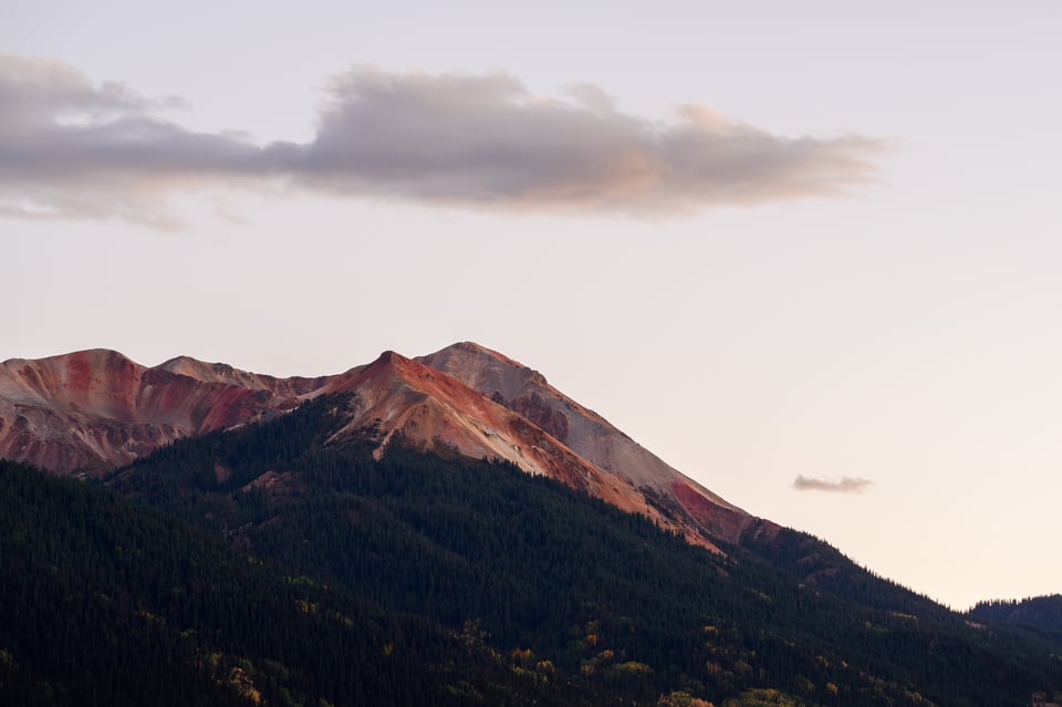
This picture was photographed late evening, just outside of the twilight. The peak of this mountain has an obvious red color, representing an imbalance in the RGB values (one specific sample I took had an RGB value of 185, 88, 72). As you can see, there are also strong shadows and highlights in this photo. What do you think will happen when saturation is increased to +100 in Lightroom? Here is that image:
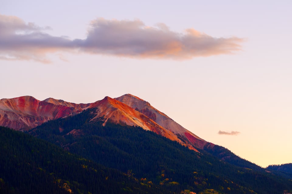
Although almost all of the image looks very oversaturated, the most extreme part is the red peak – because, as a midtone with imbalanced RGB, it had the greatest potential to increase in saturation.
However, I want you to note one other interesting thing that happens here. The brightest part of the photo is the sky at the bottom right, but it also increased in saturation a decent amount – more than some darker parts of the sky above. And this is because it had a stronger imbalance in the RGB values (again, the difference between highest and lowest of the three).
Specifically, a sample from the bottom part of the sky has values of (253, 244, 229) before adjusting saturation, compared to a portion of the sky higher up that has values of (246, 235, 229). Yes, the bottom part is brighter. But the difference in RGB values is greater, meaning that it is already more saturated, and has more potential for maximum saturation. The blue value is 229 in both cases, but the red and green values are both higher near the horizon. Keep in mind that a sample swatch of (255, 255, 0) – no blue, maximum red and green – is maximally saturated yellow. Hence, the bottom right portion of sky becomes fairly saturated yellow with the +100 saturation adjustment.
Effects of Tones on Saturation
Earlier, I explained that as we that as we add grey to a color, the image starts getting unsaturated. In other words, tones that are close to grey or have more grey in them will be less saturated than tones that are closer to absolute colors.
To further demonstrate the result of a saturation adjustment – this time focusing on grey colors – here is another example with +100 saturation, before and after:
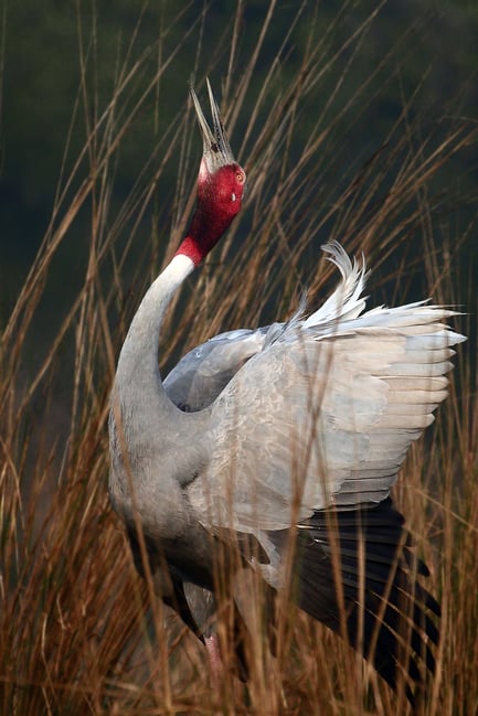
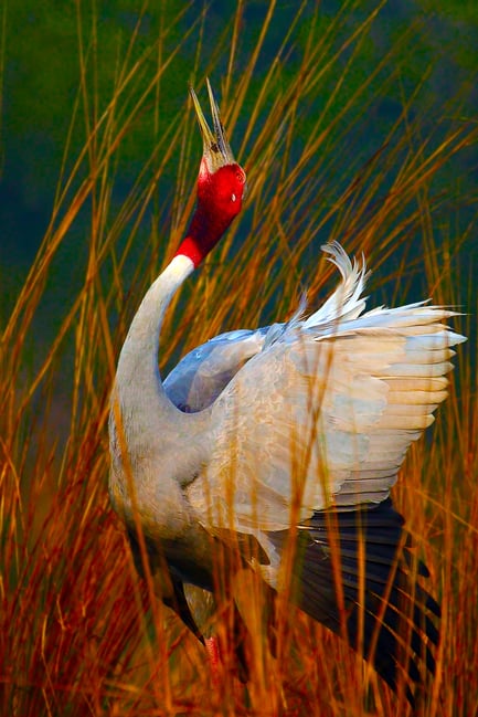
As you can see, the grey tones here – roughly middle grey – stay almost exactly the same. It is instead the colorful background that got oversaturated. That is because it is not possible to saturate grey, since there is no difference between the RGB values of pure grey. It’s the same reason why increasing the saturation on a black and white photo does absolutely nothing.
Effects of White balance on Saturation
White balance affects saturation quite a bit in some situations, since it makes colors more or less pure than before.
We all know that increasing the color temperature of an image, i.e., making it warmer, adds a yellow/orange/red tone to an image. Reducing the color temperature makes an image look bluish or cool.
When you make objects warmer, you can notice the reds moving toward the right in your histogram. Similarly, when you make the image cooler, the reds start moving towards the left and blues start heading towards the highlights. The definition of maximum saturation is when one RGB value is at zero, and another is at 255 (the third can be anywhere in between, simply affecting which color is at maximum saturation). So, since changing white balance moves the blues and reds closer or farther away, hopefully you can see why it changes saturation.
Here is one example to that effect:
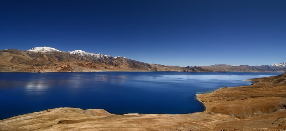
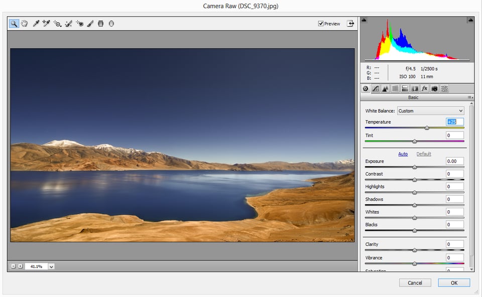
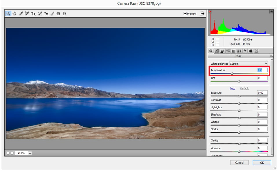
The above image was photographed at almost noon. I shot it at a color temperature of about 5700K to bring out the blue in the water. Normally, I would have taken the shot at close to 6000K. Since I had a polariser (and mine does make the image a bit warmer than what the daylight setting was in the camera), I had to reduce it a bit more. Now let us see what happens when we increase the temperature +25 in ACR and then decrease it by the same amount:
As you can see, the orange colors and then the blue colors become oversaturated, depending on the direction I shift the temperature slider. Don’t just look at the photo in these cases, but also the histogram. As you can see, the blues head to the left in the first image, and to the right in the second. The reds do the opposite.
Storytelling Capacity of Colors
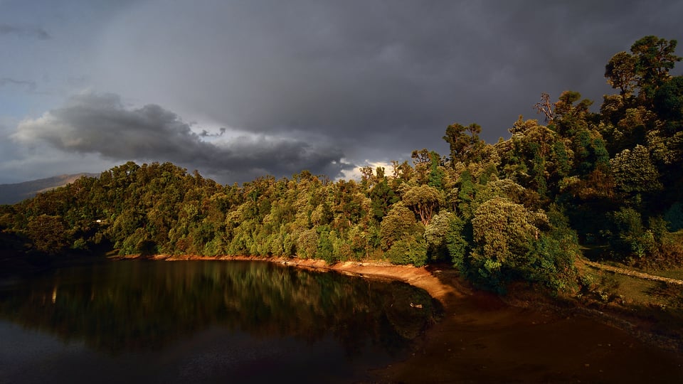
Each color tell us a unique emotion, something we have talked about before on Photography Life. Just like the particular color itself (or hue), the strength of the color also makes an emotional statement. Many photographers tend to saturate all their images in our pursuit to make them vibrant, but that’s not always the right approach. Let us understand how saturation alters the mood of an image.
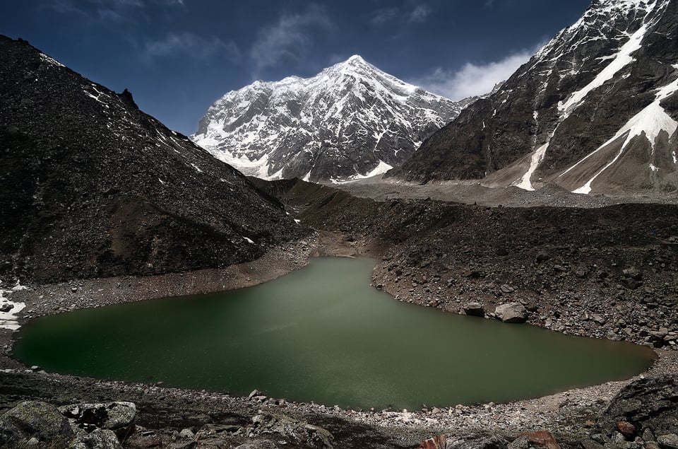
In the above image, since a major area of the frame is grey-based (mountain in the center and the formations on either side), I have undersaturated the greens in the lake and the sky. Had it been saturated, the image would have been torn apart between near-grey areas and the saturated areas, making it look artificial.
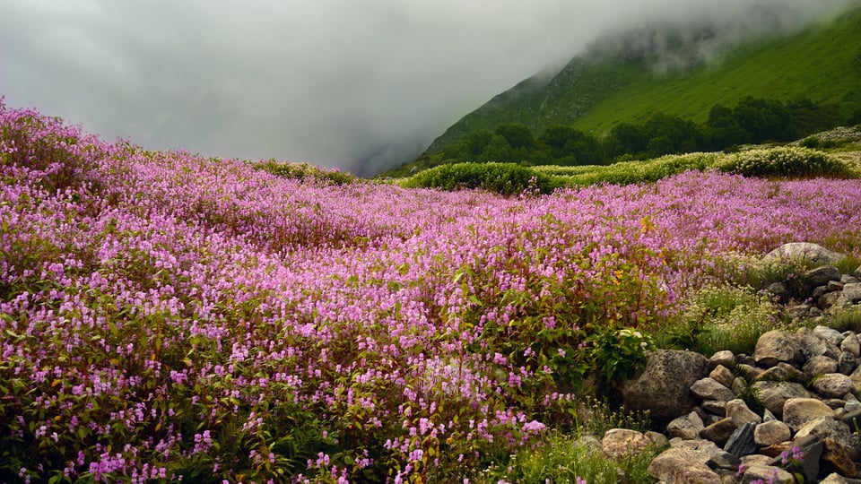
Contrary to the above image, in the one below, color (pink) is the predominant mood of the image. Had it not been properly saturated, especially compared to the vivid greens surrounding it, the image would have looked completely dull and uninteresting.
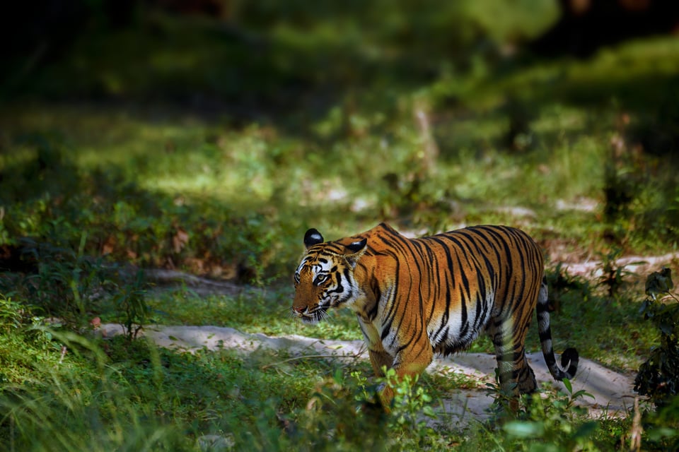
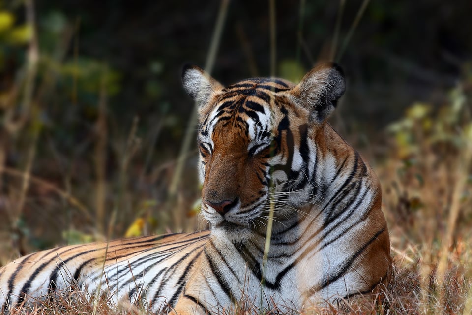
Let us see another example how saturation affects the feel of two different images, this time with the same subject. The first image below was photographed right after the monsoon rains when the forest was lush green. I have saturated the subject, the tiger, to overpower the saturation of the green – making for a striking orange walk between lush green. Whereas in the second picture below, the tiger looked as if it was at peace (after a heavy meal, as we did see the carcass the day before) and looked as though it was meditating. For this image, I felt a sober look would add to the mood rather than strong tones all around.
Saturation or Vibrance?
Now that we have understood what saturation is and the factors that affect it on the field, let us move to handling it in post-processing. Most photographers whom I know of – including me – seldom touch the Saturation slider. Even if it is needed, I do not remember a time when I pushed it past +10.
The biggest problem with the saturation is, it evenly applies the same strength of saturation throughout the image. So eventually either the close-to-pure tones get oversaturated, whereas the milder tones are hardly affected, making the picture look artificial. Adobe ACR and Lightroom – alongside most other post-processing software – have a solution that works most of the time, called Vibrance. Unlike Saturation, when we increase vibrance, the algorithm first tries to saturate the under-saturated areas. Only once the image is fairly evenly saturated does it increase the saturation of everything.
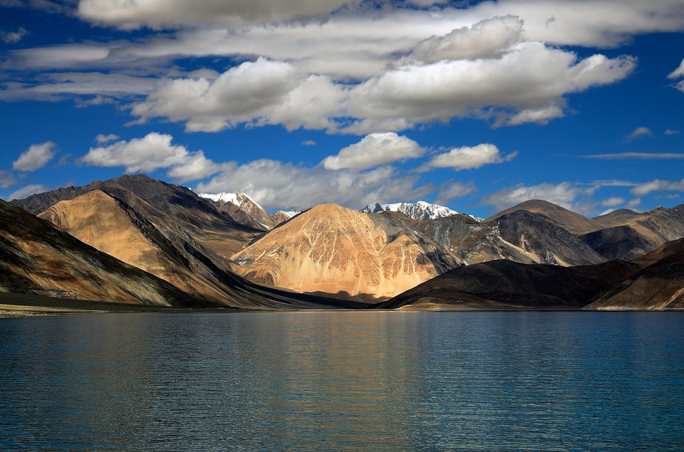
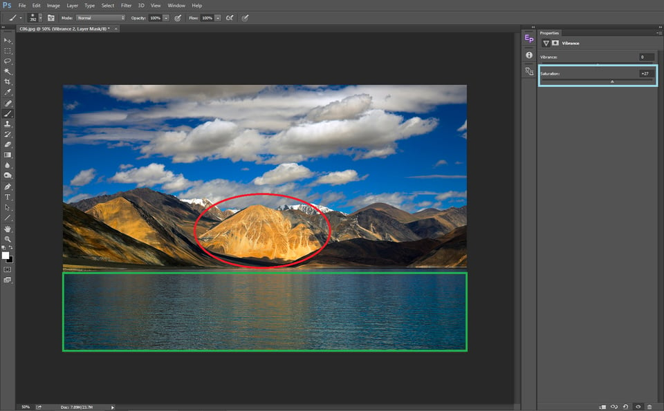
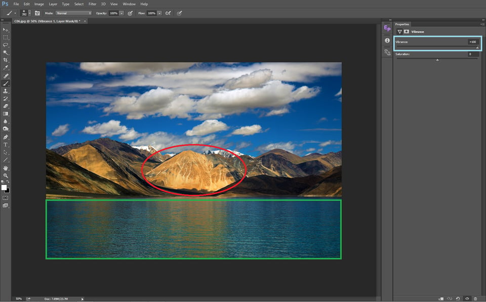
Let us see the difference in what happens when we add saturation and when we increase vibrance in the above image. First is saturation, then vibrance:
The yellow mountain in the center of the frame (marked with red) is one of the more highly saturated parts of the photo to start. By comparison, the water in the foreground does not have nearly as much saturation.
Clearly, there is a big difference in how each slider affects the image. The saturation slider makes the central mountain arguably oversaturated, while hardly touching the water at the bottom. Vibrance, on the other hand, strongly increases the saturation of the water without overdoing the mountain’s saturation.
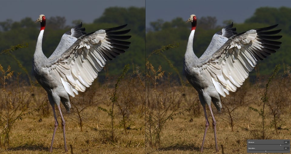
Most of the time, Vibrance hits the spot. But sometimes it does not yield the results we seek. The algorithm seems to understand most images, but not all. Sometimes, we have to use both the saturation and vibrance sliders to get the desired result. For example, certain images need very strong Vibrance adjustments to get the desaturated parts to look right – enough that the slider begins adjusting the already-saturated areas, too. In such a scenario, we first pull up the vibrance to a level where the under-saturated areas of the images get optimum saturation, and then we bring down the saturation slider just enough to get the over-saturated areas back to normal. The below image is one such example:
On the left-hand image, the bird looks about right to me, but the sky is not saturated enough for my tastes. On the flip side, the yellow areas of grass and the bird’s head are already more saturated than I want for this image, even out-of-camera. To bring the image to optimum saturation, first I have increased the vibrance (+60) to get enough saturation in the sky and then pulled down the saturation (-15). Now you can see the over-saturated areas have been handled well, and there is increased saturation in the sky.
Saturation and Contrast
Most of our post-processing is done primarily to enhance the contrast, then to get accurate colors and optimum saturation in a photo. When we adjust the contrast of an image in Lightroom or Photoshop, we should remember that doing so can change various colors as well. Even when using blend modes like luminosity, parts of the photo become brighter and darker, altering their saturation.
So, when working with Levels or Curves to enhance contrast, always take a look at saturation levels. You may need to adjust the vibrance and saturation sliders to correct for changes made by altering contrast. Even adjusting exposure or other sliders can do the same thing. For that reason, you may want to save saturation adjustments to the end of the editing stage, or at least keep adjusting saturation as you go along.
Selective Color Saturation
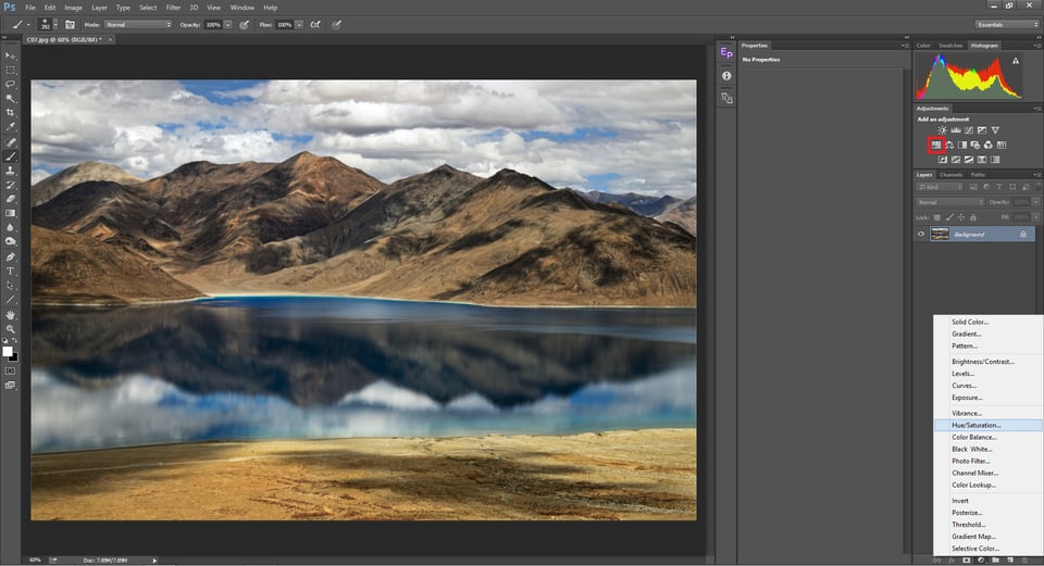
We now know that saturation is uneven throughout a photo, and we also know the factors that affect saturation. In the previous sections, we saw how to adjust saturation globally. But sometimes we will want to increase the saturation of specific colors and avoid adjusting the others at all. One easy way of doing that is by using the HSL Adjustment layer in Photoshop. It can be opened by clicking on the Hue/Saturation icon in the “Add an Adjustment” panel (marked in red below) or by selecting Hue/Saturation from “Create new Fill or Adjustment Layer.” There is also a corresponding HSL tab in Lightroom and many other mainstream software applications.
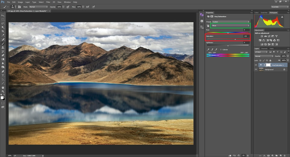
Now you will have a new Hue/Saturation adjustment layer added on top of your current layers. Click on the color selector drop down menu (marked in green below) and choose the color. In this particular image, we have only two predominant colors: Yellows and Blues. To increase the saturation of the yellows alone, select yellow and increase the saturation. You can see that the saturation of the blues will be unaltered, while the yellows alone will get saturated. Similarly, if you want to saturate the blues, select Blues from the drop down and drag the slider.
With Master selected, which is the default option, increasing or decreasing the saturation will result in adjusting the overall saturation of the image. This would yield exactly the same results of adjusting the saturation using the Adobe Camera Raw saturation slider.
Summary
In this article, we understood what saturation is and the factors that affect saturation in an image. Then we moved on to how to adjust it both globally and locally in post processing. If you have any other queries, please leave them in the comments section. I shall try to answer them as early as I can.

what is it for
Great article Madhu !! Very informative to some of us amateurs and hopefully can make for better photo’s.
Thank you
Thanks for a great article – very full and informative. I don’t understand one part though. If you shine white light at a pure red card, surely other colours of the polychromatic light are absorbed by the card and, again, only the pure red wound be reflected and we would see the pure red – fully saturated?
Theoretically it should Stu. But practically with white light, a particular wavelength is just a fraction of it’s luminescence. So we might not get exactly the same saturation with white light compared to what we would get by casting the particular wavelength of light.
Great post. Your thinking about the relationship between the channel values and saturation is quite helpful. I spent some time experimenting with changing values in the Photoshop color picker and it helped clarify it for me. Interesting to compare HSL, RGB and Lab values as I made changes.
Related thought: In her book “Vision and Art: The Biology of Seeing”, Martha Livingstone mentions that people remember colors as more saturated than they actually were. My takeaway from that is that photographers tend to oversaturate their images in an attempt to recreate their remembered experience. For others, who don’t have the memory, the colors just look unnatural. I find this to be a useful thought in teaching.
Thank you Alec & it is a good thought on what people remember.
“In her book “Vision and Art: The Biology of Seeing”, Martha Livingstone mentions that people remember colors as more saturated than they actually were.”
Any chance, you would recall the page or chapter. Thanks. MN
By using CPL one can add bit more saturation to original scene.
Great article Madhu! Very clear explanations! Love your tiger pics too!
I found this article to be very informative, and the specific technique that worked for me was to talk about it in terms of RGB 0-255. That really brought it home for me.
Don’t worry about his typos, this is an excellent article. Stunning Pictures. I care less about spelling and grammar :)
Top Drawer. Very informative. Clearly written. A future resource.
Thank you Ed.
I enjoyed your article it was spot on. I was really tired seeing so many over edited photos on Facebook. I live in Arizona and so many of the photos the reds are blown out. But, what really gets my dander up is people quoting Ansel Adams and his manipulation of B&W photos. It’s ok to manipulate photos cause he did in his digital dark room. It’s a raw file and it needs to be processed correctly.
This has been a big debate for a long time before us and I’m certain it would long after us. Personally, it is depressing to see great landscapes turn to hues of fluorescent green and blood reds. But that’s just me. If someone likes it, then it’s that individual’s preference.
Like most photographers, I do not remember posting any photo that was not processed, unless it was made so to support specific content. But the photographer, and only the photographer draws the line between authenticity and creativity. Beyond everything else, photography is an art. But as someone told me, “Now we live in a time where we have lot of cameras and cameramen but less photographs and photographers”
I agree, it reminds me when we developed Websites in the Bay Area back in the mid-90’s. All of a sudden everyone was a Website Designer/developer. Now with the advent of LR and PS every one is an expert. And, I agree everyone now is a photographer with all this new equipment. I really enjoy the people that buy the new Z cameras from Nikon and then complain because to Tokina lens won’t work with the Z System. By the way my new Z6 is a marvelous camera for photographs and video.