When you hear the term middle gray, you might be thinking of the halfway point between white and black, only to later learn that photographers refer to middle gray as 12%, 12.8%, or 18%. Why isn’t middle gray 50%? Even aside from percentages, what’s the point of finding or using middle gray at all? This guide will help you understand the important, fundamental concept of middle gray, both for both photography in the field and for the editing process.
Table of Contents
Definition of Middle Gray
To start, let’s take a look at what middle gray actually is. For photography, a subject in your frame can be completely white, completely black, or something in between. Middle gray is therefore the tone in the middle of that range. There is not one specific tone of gray that is universally agreed upon to be “the middle,” and it ultimately depends on context.
In Ansel Adams’s famous Zone System, middle gray is represented by Zone V. It serves as the target for manual metering, and later represented the target for automatic metering systems.
Metering
Middle gray serves as a good, but simplistic, target for metering just because it’s in the middle. If the camera can get most of the scene to be about middle gray in brightness, it’s less likely that your photo is either overexposed or underexposed. Modern metering systems have more complex modes that take subject recognition and other factors into account, but there’s still a bias for exposing the overall photo toward middle gray.
This can cause a number of problems with certain subjects, and you may have already run into these issues. Consider photographing a person on a stage, lit by a bright light, but with the rest of the stage being significantly darker. In this case, if the meter is trying to bring most of the scene to middle gray, the stage will appear too bright, and the person will be overexposed.
In contrast, taking a photograph of a bright, snow-covered landscape poses the opposite issue. A scene that should appear significantly brighter than middle gray is underexposed, appearing far darker than snow should.
To address these issues, either manual changes to exposure, called exposure compensation adjustments, or alternate metering modes, have to be used. Exposure compensation lets you manually shift the metering target to be brighter or darker, essentially shifting the camera’s target for middle gray.
Alternate metering modes can give you the same result. For instance, spot metering only pays attention to a small region of the frame, usually your focus point, so the “person on a stage” example would be properly exposed. Today’s default matrix/evaluative/multi metering mode also takes into account more advanced information compared to metering modes of the past, and it’s less likely to fail in situations like a snowy landscape.
For more on metering modes, check out our guide to Understanding Metering and Metering Modes.
Why is Middle Gray 12%, 12.8%, or 18%?
Now that we understand what role middle gray plays in photographing a scene, the next obvious question is why do photographers refer to middle gray as some value other than 50%? If middle gray is the value between white and black, why isn’t it just halfway between those two values? Furthermore, where do these percentages even come from?
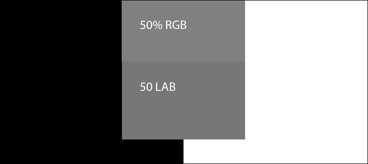
In software like Photoshop, middle gray represents the midway point in RGB (or CMYK, LAB, etc.) values. If black is represented as 0, 0, 0 in RGB values, and white is 255, 255, 255, then middle gray is 128, 128, 128. This still doesn’t give you complete consistency, because the 50% value may be brighter or darker in certain color spaces. Again, middle gray is relative and not absolute.
In real-world photography, the situation can be just as complicated. Imagine a white object, a gray object, and a black object being photographed side by side. The white object is bouncing back close to 100% of the light that shines on it (for calculating middle gray, the value of 95% is typically used). The black object is reflecting almost no light, appearing almost black (typically a value of 3% is used).
That middle object, if it were reflecting 50% of the light, would appear too bright for us to see as “middle” gray, since we don’t perceive brightness linearly. Instead, an object that reflects about 18% of the light is what we subjectively perceive to be about halfway in brightness. Hence the famous 18% gray card: a swatch of gray that’s designed to reflect 18% of the light that reaches it.
So, if you just put that gray card next to a subject that you want properly exposed, can you meter off of it and get the right exposure? That’s the idea, but the reality is that a camera’s meter – even the most simplistic spot and center-weighted systems – aren’t quite calibrated to expose an 18% gray object as “neutral.” They expose a bit darker than that, and it takes something closer to a 12% gray card (12.8% to be specific) to get a middle gray exposure on most cameras.
Regardless of the exact percentage, these values are only about a half stop apart, making little difference in perceived brightness and still leaving the subject right in the sweet spot of the exposure. If you have an 18% gray card, you can tilt it halfway toward the light to dim the card and make it reflect closer to 12% of the light that hits it.
White Balance
Beyond metering, the concept of middle gray also plays an important role in setting white balance. Photographers who already carry around middle gray cards to help with exposure can then use the same cards to serve as a reference point for white balance (either in-camera, or using the card as a reference point back on the computer when editing).

To use a middle gray card for white balance in post processing, which is my preferred method, just place the gray card next to your subject under the same lighting conditions. Then, in Photoshop or your preferred editing software, use the white balance tool or eyedropper to select the neutral gray value on the card. The software can then calculate the needed adjustments to bring the card back to neutral and apply those corrections to the scene. You’ll be able to copy/paste that white balance setting onto all photos you took under those lighting conditions.
Ultimately, the most common use of middle gray cards is for studio and especially product photography, where both exposure and color temperature need to be completely accurate. By taking one picture with a middle gray card at the beginning of your photoshoot, you can then apply the appropriate exposure and post-processing corrections to every subsequent photo and not worry about them any more in the field.
Tools for Finding Middle Gray
If you’re interested in having a middle gray reference point in the field, there’s a number of great options.
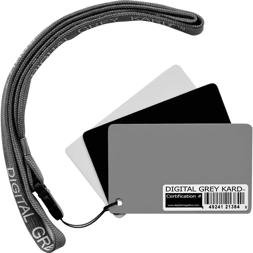
The least expensive is a basic gray card. The simplest versions of these can be gotten for just a few dollars, like this Delta 1 Gray Card that is literally $3. More advanced versions combine other cards, like a black and white card to help gauge shadow and highlight values, or provide alternate targets for white balance. These cards are also typically more durable, like this version from DGK, which is made of a glossy plastic.
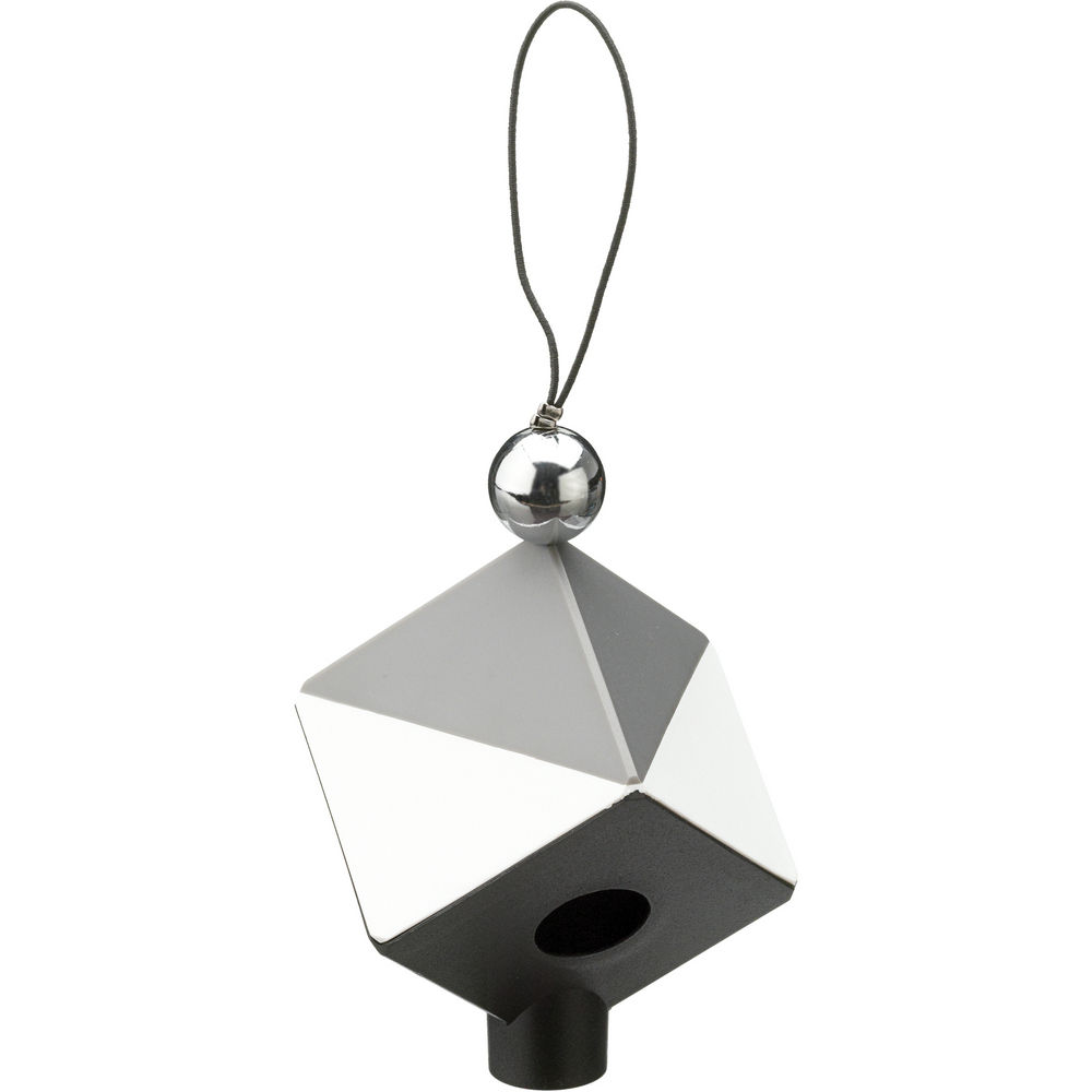
The fanciest version that still sticks to the gray card basics is the Datacolor SpyderCUBE. This product features white, gray, and black faces, along with a black trap for absolute black. At the top, a chrome ball helps catch specular highlights in the scene, serving as a reference for catchlights.
Finally, the Calibrite ColorChecker Passport represents the pinnacle of the gray card concept. It contains a middle gray target, a dedicated white balance target, and 24 patches of standardized colors to help ensure the most accurate color reproduction possible. These additional patches enable calibration of your entire capture pipeline, and are supported by industry standard tools like Hasselblad Phocus and Black Magic DaVinci Resolve.
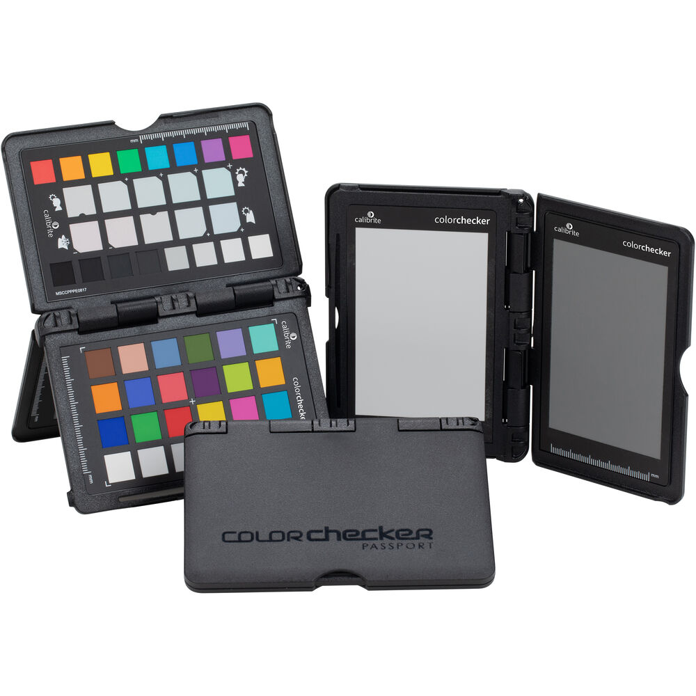
A number of high-end fashion and product photographers use a color checker passport like this to create custom color profiles for each of their cameras, to ensure that they capture accurate colors every time. It’s overkill for many types of photography, but if you’re frustrated by inaccurate colors, it could be the answer to your problems.
Conclusion
When you understand middle gray, you’ll have a better sense of the metering decisions that your camera is making for each photo. You can also use the concept of middle gray in conjunction with a 12% or 18% gray card in order to ensure accurate exposures in a studio or other consistently-lit environment. Finally, a middle gray card allows you to set the right white balance without difficulty when taking product photos under consistent light.
Since the way the camera “sees” isn’t the same way your eyes work, these concepts can take a little work to understand, but once you do, they’ll help you get the best results from your gear. I also personally like how the concept of middle gray has survived and evolved from the early days of film photography through to the latest principles and techniques in color science.
In my experience one should be aware that at least some of the cheaper gray cards are exposure-suited only and do not really provide color neutrality.
I tend to use spot metering where the dynamic range of an image is very broad. Rather than meter on the average, I find that by setting my spot meter on the brightest important area of the image I don’t want blown out and setting the meter 2 1/2-3 stops above average provides a good overall exposure. All the other tones within the image just fall into place. If I have an underexposed portion, I can bring those values up in post..
Just a thought, but couldn’t you just go to any paint store and get a free color swatch card with a suitable middle gray color if you know approximately what gray tone you need? Might not be exactly perfect, but for something easy and cheap to obtain it might do the trick for a majority of photographers.
QUOTE
A gray card is a middle gray reference, typically used together with a reflective light meter, as a way to produce consistent image exposure and/or color in video production, film and photography.
A gray card is a flat object of a neutral gray color that derives from a flat reflectance spectrum. A typical example is the Kodak R-27 set, which contains one 8×10″ card and one 4×5″ card which have 18% reflectance across the visible spectrum, and a white reverse side which has 90% reflectance.
Note that flat spectral reflectance is a stronger condition than simply appearing neutral; this flatness ensures that the card always has the same colour as its illuminant (see metamerism).
en.m.wikipedia.org/wiki/Gray_card
END OF QUOTE
The last paragraph explains why a proper grey card is much better than “a free color swatch card with a suitable middle gray color if you know approximately what gray tone you need”. Especially when using it also as a white balance reference.
Don’t understand why people try to explain Middle Grey with Photoshop and RGB 8 bit numbers. It’s confusing, doesn’t consider gamma and other details.
Middle grey is much older than digital.
Look to any testing card, the olders one especially. With different shades between black and white-there are usually 6 areas from pure black to white, they differ exactly 1EV. Difference between black and white is exactly 5 stops/EV. If pure black surface reflect let’s say 1 unit of light the whitest surface (pure white) reflect 1 x 2^5=32. The average between the 1 and 32 =sqrt (1×32) = 5.6 (it is geometric progression, not linear!). And 5.6 is about 18% of maximum (5.6/32=17.6%). 18% is rounded geometrical mean between 1 and 32. Middle grey reflects 18% more light than black.
The modern photo papers had higher quality and between pure black and pure white is about 7 stops/EV. So calculation changed: 1 x 2^6=64, geometrical mean=sqrt(1×64)=4. And 4/64=12,5%. Middle grey reflects 12,5% more light than black for high quality papers. 12,5% middle grey uses Sekonic for example… And I am still talking about analog era and papers and good old chemistry.. :-)
Sorrrry, typo… sqrt(64)=8! (not 4)
8/64=12,5%
:-)
Middle‑grey relative luminance in the reproduced image is:
● CIE 1976 lightness value L*=50
● (33/58)^3 linear ≈ 18.42%
● gamma‑encoded sRGB tuple (119,119,119)
● gamma‑encoded Adobe RGB tuple (118,118,118)
I put my Z6 into manual mode and meter with a Seconic digital hand held for perfect exposures. No second guessing the software, and perfect exposures.
18% gray is what most meters are calibrated to. Focus on taking the photo.