I think that photographers can learn a lot from classic works of art – not only by early photographers, but also from painters, sculptors, and other artists who lived before photography was even a twinkle in Nicéphore Niépce’s eye. One technique that is especially applicable to photography is called chiaroscuro.
Table of Contents
What Is Chiaroscuro?
Chiaroscuro literally means “light/dark.” The term traditionally refers to Renaissance paintings where the subject is well-lit and three-dimensional, usually with exaggerated shadows and highlights, and a background that transitions into darker, heavily-shadowed areas. Other artists after the Renaissance have also made use of chiaroscuro.
One of the most famous examples of chiaroscuro is the following work by Caravaggio, The Seven Works of Mercy:
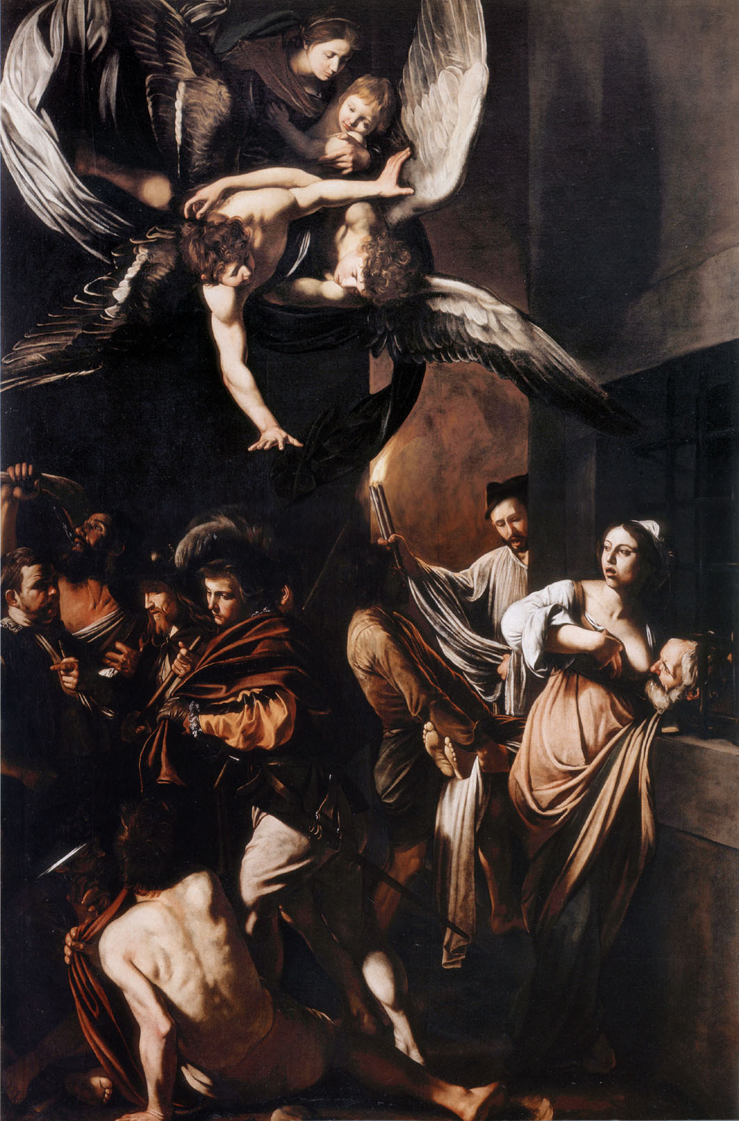
It’s has a dark, contrasty look, with dense shadows – though, for the most part, not completely black. The use of shadows in the background gives the painting an impression of depth and three-dimensionality. The subjects, meanwhile, are lit carefully, almost sculpted, by the light and shadow that falls on them.
Two other beautiful examples of chiaroscuro are Vermeer’s The Astronomer and Rembrandt’s Christ in the Storm on the Sea of Galilee.
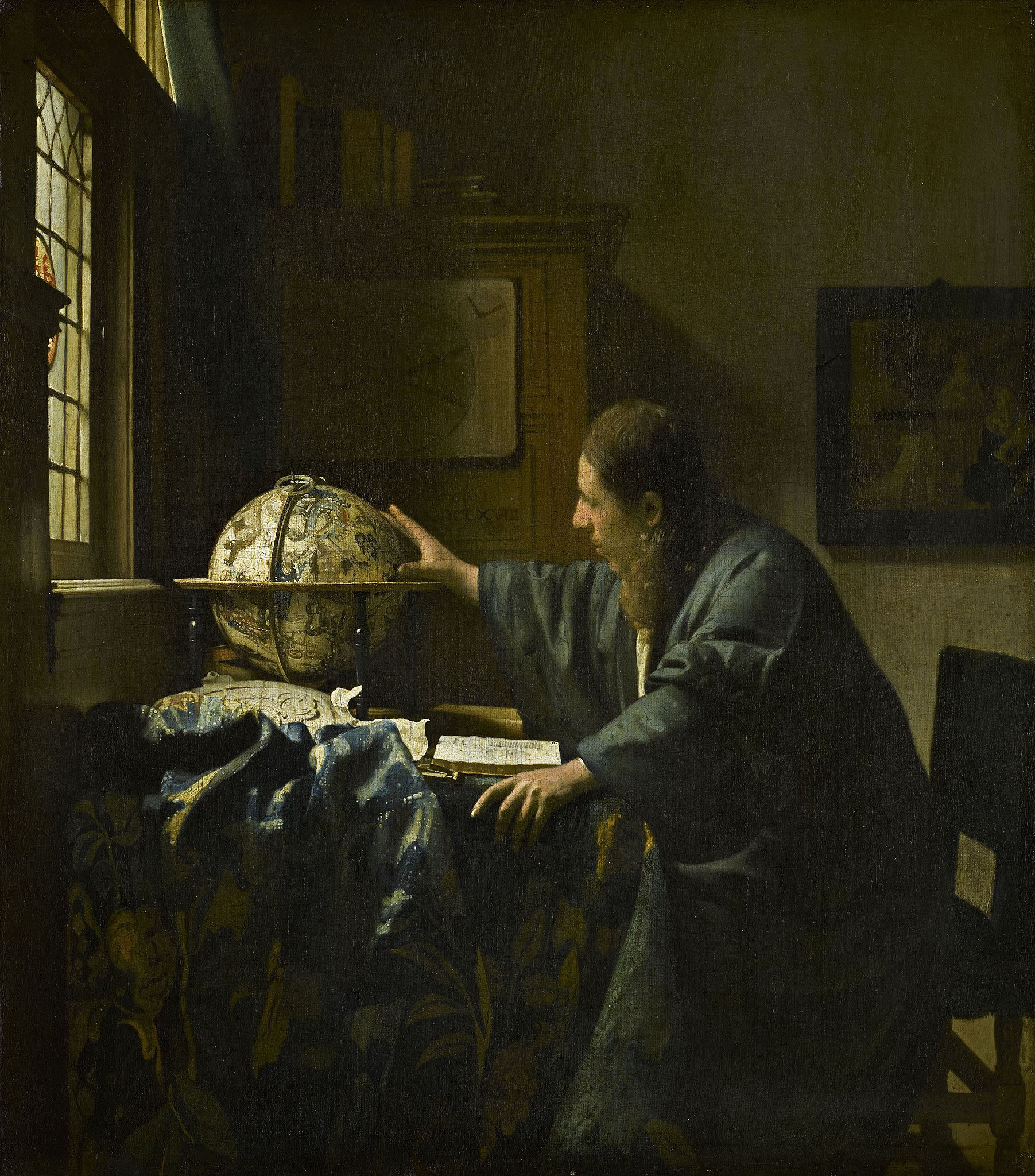

In all three paintings above, the artists relied upon plentiful and nuanced shadows to give the paintings dimension. It borders on a spotlight effect, although the dark backgrounds aren’t completely black or flat, like a strong spotlight might achieve. The light/dark transition is still visible in all three works.
How Chiaroscuro Looks in Photos
Although chiaroscuro didn’t originally refer to photographs, you can see how the same principles could apply. If your photos have dark shadows, high contrast, and carefully-sculpted highlights, you may already be taking pictures in the vein of chiaroscuro without even realizing it.
I’d like to try not to interpret a carefully-defined word in art history like chiaroscuro too broadly. To me, a photo that’s simply dark or has big regions of shadow isn’t necessarily chiaroscuro.
The following photo, for example, has roughly the same light/dark tones found in some examples of chiaroscuro, but it doesn’t use those tones to sculpt a sense of depth; the shadows aren’t falling on the subject, and the image lacks three-dimensionality. I wouldn’t call it chiaroscuro:
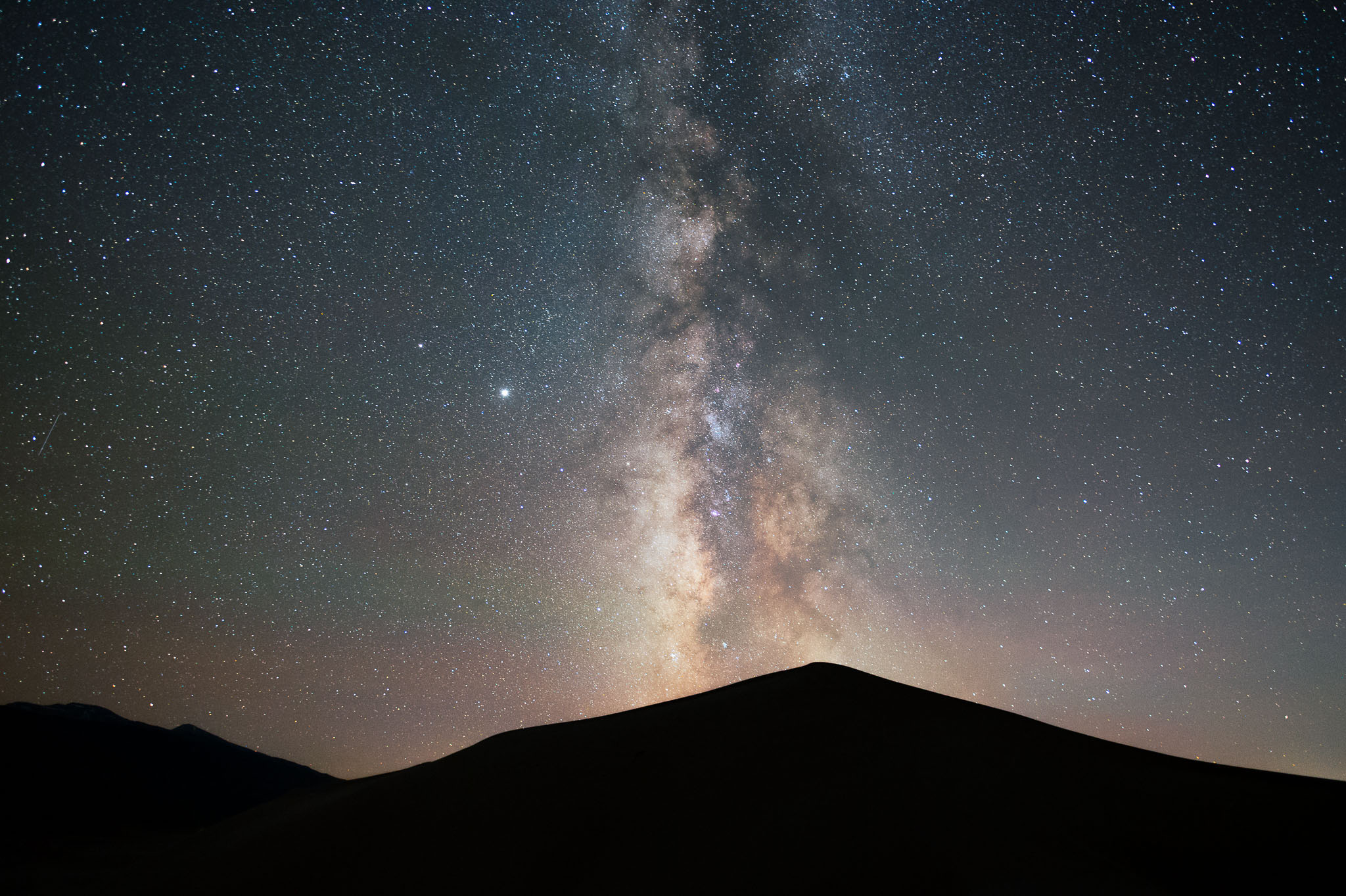
NIKON Z 6 + 20mm f/1.8 @ 20mm, ISO 6400, 20 seconds, f/2.0
This photo, on the other hand, I would call an example of chiaroscuro. It has a luminous yet shadow-covered subject, which is surrounded by darker (but not uniformly black) regions, giving the photo a clear sense of depth and dimension:
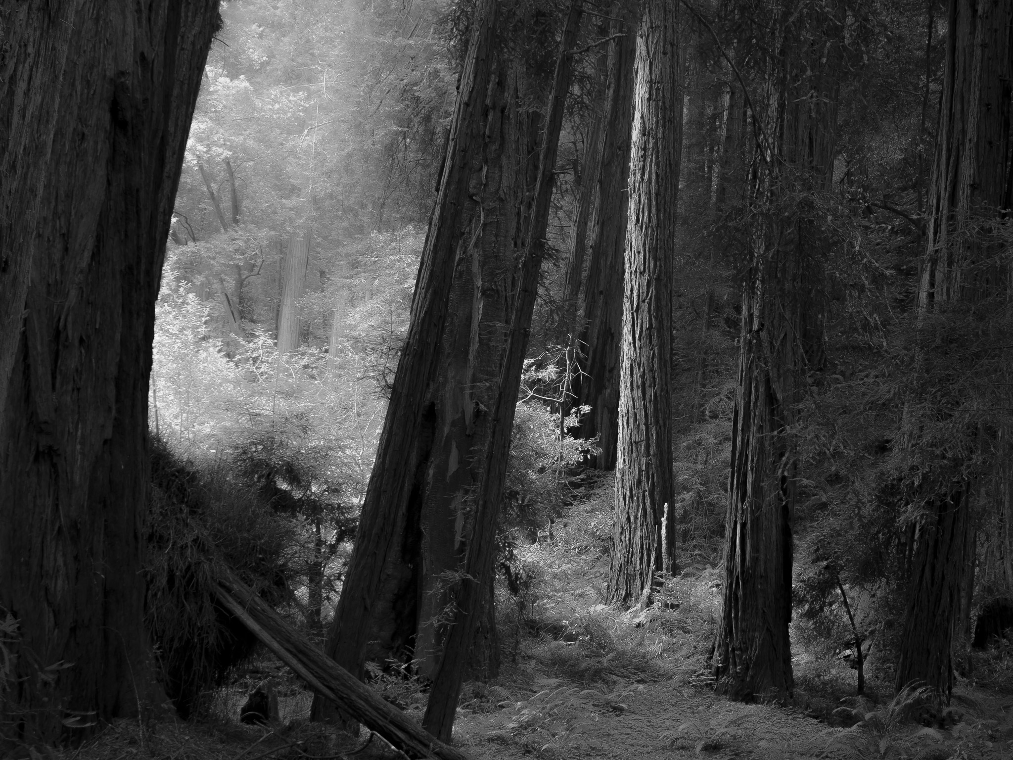
NIKON D7000 + 17-55mm f/2.8 @ 17mm, ISO 100, 0.6 seconds, f/8.0
Why would you aim for chiaroscuro in a photo? I believe it can be a very desirable look in photography. Chiaroscuro sends a dramatic message thanks to the high contrast, and it also evokes a sense of deliberateness in the photo, since this isn’t the type of look that usually happens by accident. Good photos with chiaroscuro feel three-dimensional and refined. Above, the deep shadows and occasional highlights sculpt this forest with a sense of depth. There are some small areas of pitch black, but almost all of the shadows have subtle details, unlike the Milky Way example photo from a moment ago.
Finding the Right Subject for Chiaroscuro
Even though most discussions of chiaroscuro in photography focus on the “oscuro” (darkness) part of the definition, I think the more important things are depth and contrast. To achieve this in a photo, everything starts with finding the right subject.
It’s easiest to capture chiaroscuro when an obvious light source is present, compared to something like an overcast day. You’ll want to look for deep shadows across the scene, with other areas – ideally your subject – remaining well-lit. The shadows on your subject should give it dimension, while the rest of the photo will usually be darker and help your subject stand out against its surroundings.
Chiaroscuro is not an obvious yes/no situation. I’ve taken plenty of photos that have some elements that fit with chiaroscuro, and others that don’t. I think the following photo is right on the edge of chiaroscuro, for example:
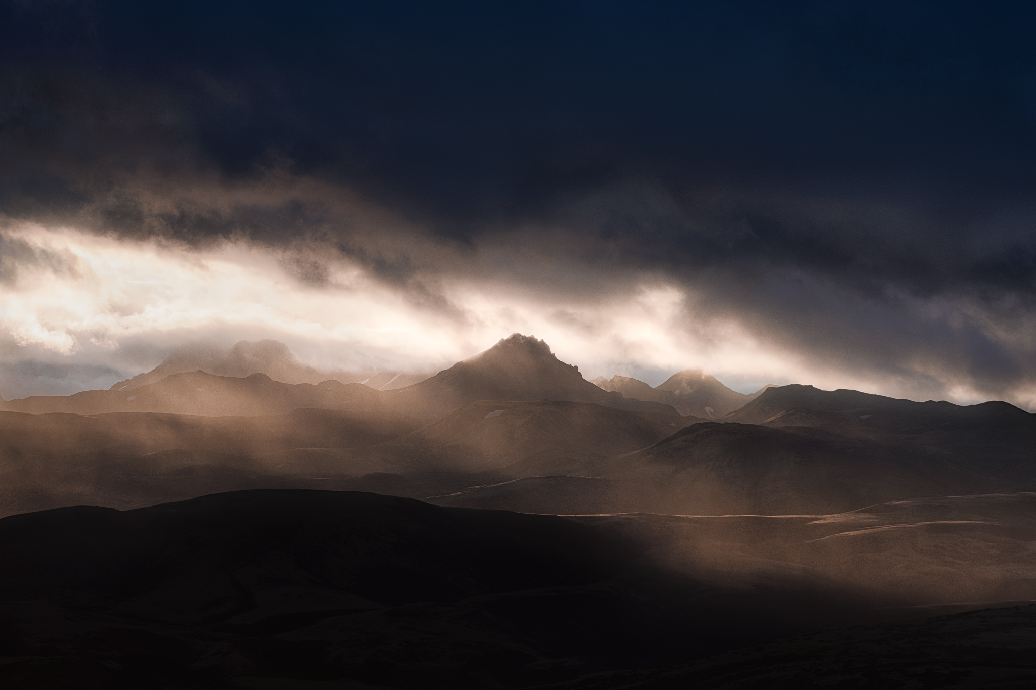
NIKON D800E + 70-200mm f/4 @ 135mm, ISO 100, 1/125, f/8.0
It has practically the stereotypical tones for chiaroscuro, and the direct light on the subject gives it a bit of depth. But the totally featureless areas above and below the bright mountain make this photo look flatter and less three-dimensional than chiaroscuro normally would imply. It’s not that it’s a bad look, but I don’t know that it’s quite the same as chiaroscuro.
Meanwhile, I think the following photo is a closer example to the traditional meaning of chiaroscuro:
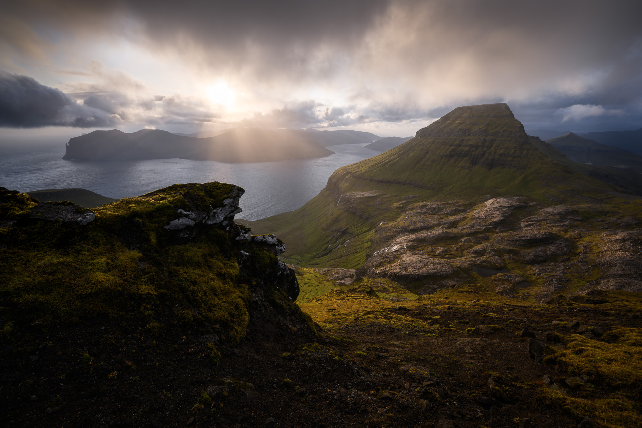
In the image above, subtle highlights shine on the most important subjects, while the shadows provide a sense of depth. It’s a dark and high-contrast image overall, but even the deepest shadows have textures that prevent them from looking flat. Few real-world scenes can match the exact feel of a painting with chiaroscuro, but this one definitely leans in that direction.
Not that this is always desirable, of course; chiaroscuro is just one type of look. It’s not always something to aim for, and just because a photo has elements of chiaroscuro doesn’t mean it’s always a good photo. For the same reason that high-key or low-key images must fit the mood you want to convey, so must chiaroscuro.
The Effect of Post-Processing
Aside from finding the right subject, the best way to evoke a sense of chiaroscuro in a photo is through careful post-processing. And I do mean careful. Just bumping up contrast and lowering brightness usually isn’t going to be enough on its own.
A technique that goes hand in hand with chiaroscuro in photography is dodging and burning. Dodging and burning is another term for local post-processing adjustments that selectively brighten or darken certain parts of the photo. Usually, dodging and burning are used to draw attention toward your subject and away from distracting parts of the photo. They can also sculpt the shadows and highlights of the image to provide a particular mood.
It’s probably easiest to understand how post-processing can create chiaroscuro by looking at an example. Here’s a minimally-processed image that definitely doesn’t evoke chiaroscuro:

The image above is relatively bright and has few substantial shadows in the photo, since it was taken on an overcast day. The result is a pretty flat-looking photo, even though the scene had plenty of depth in the real world.
A scene like this with completely overcast light is unlikely to be a perfect example of chiaroscuro, no matter what post-processing adjustments I make. But I can still push the photo dramatically in that direction compared to the original:
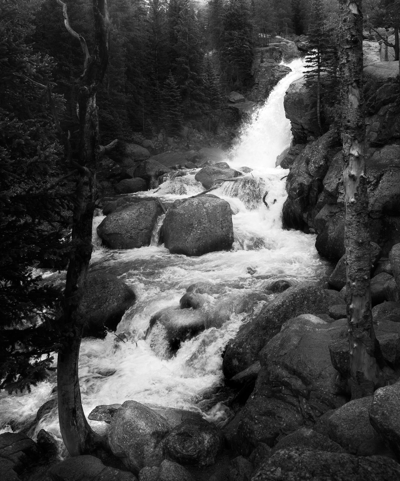
Much closer, at least! This edit is probably a bit exaggerated, but hopefully now you can see just how far you can push an image in the direction of chiaroscuro via post-processing. Note that this isn’t just a darker version of the original photo. Plenty of the photo is actually brighter than it was before, like the waterfall itself and the rock near the tree at the bottom.
Here’s a screenshot of one of the many local dodging (brightening) adjustments I made to the image, with the areas of red showing the exact spots I edited:
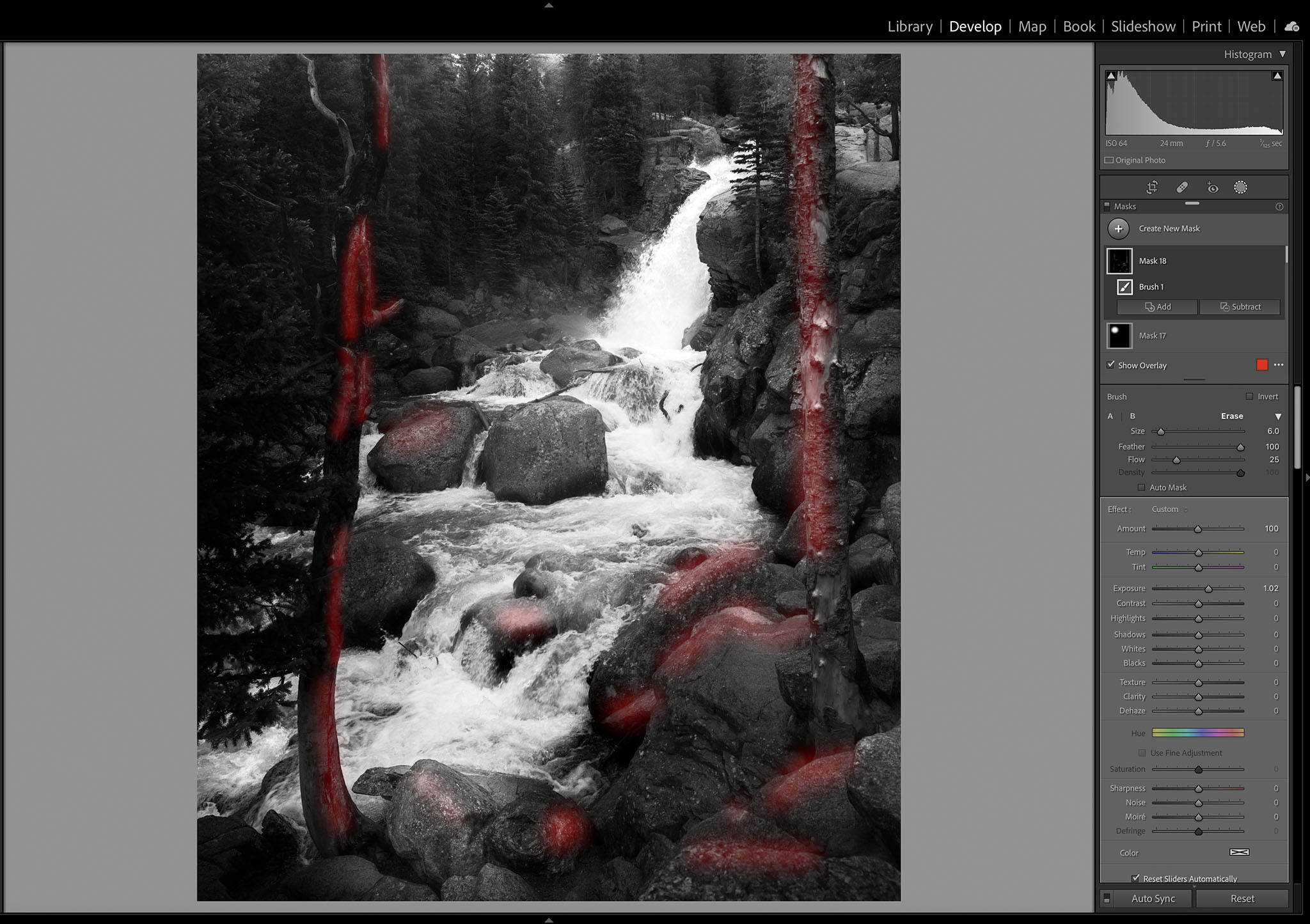
By brightening those parts of the photo, like the edges of various elements of the composition, I was attempting to give more three-dimensionality to those parts of the photo. For example, even though most of the rocks ended up darker overall, I aimed to make them look less flat than they did in the original. Beyond that, I did my best to make sure that even the darkest areas of the photo didn’t turn into totally black silhouettes that look like cardboard cutouts.
Again, I’ll emphasize that chiaroscuro is just one way to post-process a photo. There are tons of ways to edit a photo, and the best one depends on the look you want. I think that chiaroscuro works well for this specific image, but any photographer could disagree and choose to edit it differently, and they wouldn’t be wrong.
Lastly, even though I said earlier that bumping up contrast/lowering brightness isn’t enough to achieve chiaroscuro on its own, I’ll still mention my quick method to reach the effect without local dodging and burning. It’s also a good way to see if a particular photo is a candidate for the chiaroscuro “look” or not. All you need to do, before making any other edits, is lower the photo’s “exposure” slider in Lightroom by 1-2 stops, and boost “lights” in the Tone Curve panel by about +40 to +60. It’s a starting point that gives your images darkness overall, with deep shadows, luminous highlights, and areas of texture even in the darkest parts of the image.
Conclusion
I hope this article helped you to learn more about chiaroscuro and maybe gave you some inspiration from the world of classic paintings. Real-world scenes usually prevent “perfect” chiaroscuro in photography like painters can achieve, but you can still push a photo closer in that direction with careful choice of subject and post-processing.
Personally, as a landscape photographer, I start to think about chiaroscuro any time I’m taking pictures under storm clouds with light still falling on the landscape. It’s the perfect opportunity to take dark, high-contrast photos that still highlight my subject and give it a sense of depth. But I’ve also found myself aiming for this look more and more with everyday black and white photos, which have more leeway for post-processing compared to a typical color image.
Let me know if you have any thoughts or additions to what I’ve talked about in this article! I’m not an art historian by any means and did my best to put chiaroscuro in the proper historical perspective, but I’d love to hear more if you have additional context. You can also see many more examples of paintings with chiaroscuro on the dedicated Wikipedia page.
Excellent. Honestly I hadn’t thought of applying chiaroscuro in landscapes. I had thought of the “street” photography of Alex Webb and Valerie Jardin. However, upon reflection, those great photographers use a more light/dark technique–expose for the highlights and let the shadows fall dark. It’s dramatic but misses the subtelty of true chiaroscuro. Thanks for this thoughtful piece.
Sorry for being so late to the party – I was interrupted as I reached the end of the article and forgot to return. I just wanted to say that I always enjoy finding articles about the nature of successful imagery, especially when the scope reaches beyond perspective and leading lines. I had encountered chiaroscuro before in a painting context and while it can obviously appl;y to photographic images it does tend to be suppressed by the current obsession with shadow detail – which, of course, is important too…
It’s really helpful to have had some photographic examples to peruse. Thanks!
Spenser, your very well written explanation and examples imporved my understanding of this artistic principle. Thank you for sharing your knowelge and experience. I always benfit from what you have to say.
Thank you, Richard! I appreciate the kind feedback.
Great piece Spencer, excellent examples. Now I have a bunch landscape photos that I’ll take another look at. Most are ‘almost’ there but lack a certain punch. Your article gives them a new life ! – Thanks
I’m happy to hear it, thank you, Mark! It sounds like those photos just need the right finishing touches in post-processing.
Thanks for the well considered article Spencer . I don’t have much to add to the many fine comments by others . Other than I read quote many years ago ( I can’t remember the author) “Photography is all about the art of light and shadows “ We’d all do well to remember this in our craft .
I love that quote, and I agree completely!
Thank you Spencer for the wonderful education. I am touched by your seemingly simple, yet powerful, juxtaposition of European Renaissance master works and our beloved art.
Thank you, Fabrice! There are a lot of parallels between photography and other forms of art, including classic paintings. I think that many of the visual principles that make a work of art interesting are shared across mediums.
Very nice article, Spencer! I just want to add that I am primarily a fine artist rather than a photographer. One of the first things we learn in classical atelier training (drawing plaster casts of statues illuminated by a single light source with careful control over any reflected light) is that the world of light and the world of dark should not overlap. That means, when considering mid tones, the darkest lights (half tones before turning into form shadow into shadow) should always be slighter lighter than the lightest darks (reflected light within shadows). Something for photographers to keep in mind when doing dodge and burn or HDR.
Thank you, Joyce – it’s great to hear the perspective of an artist who isn’t just a photographer. I think you bring up a great point as to why many HDR photos look unnatural by default. We’re not used to the blue sky being darker than the shadowed foreground!
Nice article. I’m almost tempted to say – very illuminating. ;) I think that careful use of vignettes and ND grad filters (in post) can also contribute to the desired look with a highlighted subject and elevated overall contrast.
I agree! Vignetting is a useful tool to guide the viewer’s eye toward highlighted subjects. You’ll see it in a lot of paintings with chiaroscuro. And dark gradients in post-processing are just a more versatile way to accomplish something similar.
Fantastic article!!
Thank you, Abhinav!
Thanks for a great article, Spencer. It seems to me though that colour also has a role, as your mountain landscape illustrates – the complex tertiary colours and their subtle interplay, that reflect the wonderful Caravaggio & Rembrandt paintings you chose.
I appreciate it, Ken! Chiaroscuro is defined by strong contrasts – which is usually taken to mean light/dark contrast, but that’s not the only type. These artists reached the pinnacle of their craft and clearly understood that color contrast can leave a similar impression. It’s especially striking to me in Christ in the Storm on the Sea of Galilee how much the warm/cool contrast heightens the effect of chiaroscuro. But in all three paintings, the bright portions of the subjects are much warmer in tone than the darker surroundings. I’m glad you pointed out the role of color so I could bring that up.
Interestingly, a lot of real-world scenes with the chiaroscuro “look” have a similar warm color palette in the highlights, with the shadows looking less saturated or blue. It definitely adds to the effect in photos.