In this third installment to this series on visualization and film photography, I have selected a sample of photographs (mostly made in the 35mm format) to share and discuss. Although I heavily focused on technical aspects in film photography in previous chapters, my goal with this chapter is to provide a more aesthetic description and simplified approach to the construction of photographs. I thought it would be of interest to beginning 35mm photographers to briefly discuss some of the film choices available. Although the choices of film stocks have dwindled over the years, fortunately there remain a plethora of excellent professional and consumer 35mm films from which to choose and enjoy. Even though I have used many – but not all – of the available film stocks, I cannot possibly discuss all of them here. For one particular film stock, I am delighted to share a pair of interviews with more experienced photographers that readers might find interesting and helpful. Of note, Photography Life contributor Vaibhav Tripathi has previously shared his experiences and beautiful photographs made on 35mm with Fuji’s Velvia 50 and Kodak’s Portra stocks in his inspiring photo essays on Acadia National Park, landscape photography, and Waterfalls of New England series that may also be of interest.
Personally, I use 35mm for capturing the moment, the emotion, and as my “fun format”. I use it less so for technical image quality, for which I rely on other formats. Among the many beauties of film photography, the myriad of formats, cameras, lenses, and films from which to choose and mix and match provide the photographer limitless combinations to explore their creative potential. On days where I wish to carry minimal camera gear, shoot hand held, cover distance quickly, and not be bogged down with mechanical considerations, I have no hesitation to grab one of my 35mm cameras and one (maybe two) lenses to explore and capture the moment, whatever that may be.
So, let’s begin with this photograph, which I made this past spring. As I was navigating a busy, crowded, and noisy courtyard following a ceremony, I called out to this young woman. She quickly turned around, made brief eye contact, and … click! Her attention was immediately diverted and she disappeared into the crowd before I could get in another word…
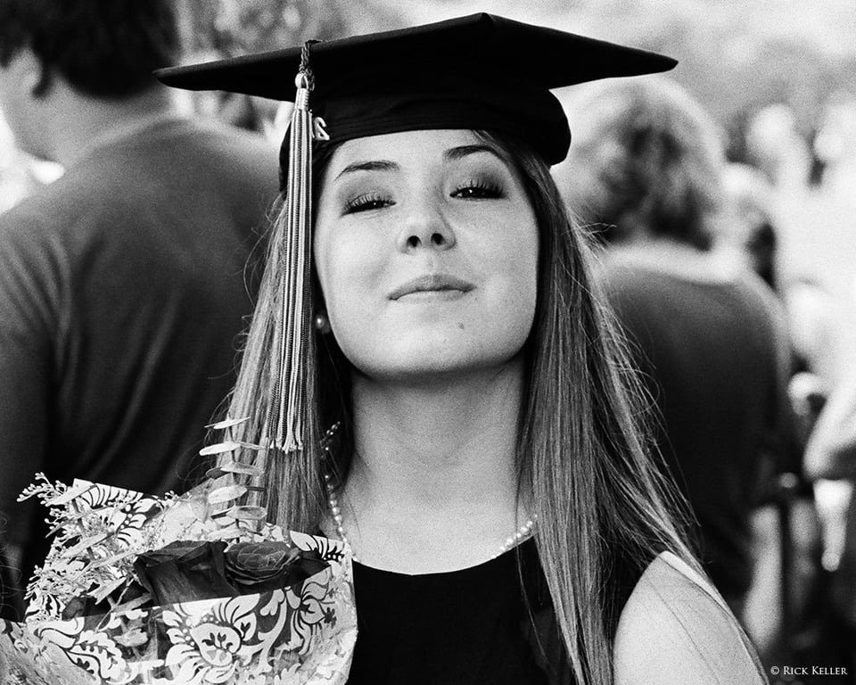
It goes without saying that for capturing the moment, 35mm based formats (analog and later digital) have given photographers the upper hand to do just that for over 90 years. Whether the subjects have been events, street photography, journalism, sports, or wildlife, 35mm has proven to be an instrumental, creative, and enjoyable tool. For this photograph, I chose Kodak Tri-X black and white film, which has been a legendary film stock for decades and remains one of the most popular and best selling black and white films to date. Interestingly, it was only this past spring that I decided to experiment with Tri-X. Up to that point, I had been pleased using other 35mm black and white films (Ilford Delta 400 and Kodak T-Max 100, for example). It is not uncommon for a photographer to meet and fall in love with one or two particular film stocks, swear by them, and use those as their “go-to” film until they decide to explore other choices. It is a very interesting (and beautiful) phenomenon, actually. As I began to admire and study the Tri-X work of other photographers, I became inspired to try my hand with this film. Through only my first roll, the aesthetics and the emotion that Tri-X conveys, particularly with people and skin tones, prompted me to switch gears. The overall rendition of the scene and the prominent and beautiful grain of Tri-X have made this film one of my personal favorites for photographing people. Words cannot do it justice. It is simply a beautiful film. For this lovely young woman, in the midst of a busy scene, I did not even think about adjusting camera settings (I just had taken a group photo seconds earlier). I quickly composed and opened the shutter. ”f/8 and be there”, as the saying goes . . . The “feel” that Tri-X evokes in this photo, the soft quality of her skin tones – and that grain – made me fall in love with this film.
Technically, Tri-X is quite versatile and available in all formats. In 35mm, it is a 400-speed film, making it well suited for low light and action; its wide exposure latitude has been highly praised. Although I have not personally tested the exposure and development limits of this film, based on anecdotal accounts and the work from expert and amateur photographers alike, Tri-X can be overexposed by three stops (and perhaps more), or underexposed by as much as one stop and still deliver perfectly natural images, not unlike many other negative films.
Since I have limited experience with Tri-X, I decided to reach out to my fellow photographers to share their thoughts and experiences on using Tri-X in the visualization process. This next photograph, “Lying on the Bed”, was made by Mr. Francesco Carloni, a young and gifted photographer from Bergamo, Italy (and also a medicine and surgery student). What captured my interest in this photograph were the mood that the scene evokes and the prominent and beautiful grain.

© Reproduced with the expressed permission of Francesco Carloni
In a recent interview, Mr. Carloni kindly shared his thoughts on this photograph and on the joys of shooting Tri-X film.
Rick Keller: Francesco, thank you for taking the time to contribute to this article. Can you share with us the story behind this photograph?
Francesco Carloni: This frame was taken in a hotel in Rome where I was on holiday with my girlfriend, just after a shower. I simply wanted to represent an intimate moment of my life and I opened the shutter when she looked at me with her eyes hidden by the hair. I think that this picture perfectly renders her shyness and the gentleness of her glance. She is not a model and I’m not a professional photographer, but the feelings are all real and it’s clearly visible! This isn’t an “artificial portrait”, it’s just our life.
Rick Keller: Why did you choose Tri-X for this photo?
Francesco Carloni: I mainly use Kodak Tri-X for indoor photography in low light conditions. My first choice developer is Rodinal (precisely Adox APH09) and I think that Tri-X pushed until 2000 ASA, or even 3200 ASA, and developed with high dilutions for long time can give a very nice contrast while retaining shadow detail. The recipe I use is Rodinal 1+100 for 120 minutes @19°C, about 20 inversions the first minute and then every 30 minutes I gently swirl the tank for 15 seconds. This photo was taken in a bedroom and the only light sources were the two 40W bulbs at the sides of the bed in this circumstance. Tri-X developed with this recipe is, in my opinion, the best choice ever!
Rick Keller: Are there any unique qualities of Tri-X that appear in this photo?
Francesco Carloni: The first thing that even a blind man would see is grain, HUGE GRAIN. Is this a quality? In indoor low light portraits I think that grain is the icing on the cake, it gives you the mood and the expressiveness that any digital camera can’t yield, especially if you wet print the negative in a darkroom! Another quality of this fantastic film is the shadow detail it can ensure even with a 3 stop push process, without however burning the highlights. This wide tonal range is emphasized by the semi-stand process in Rodinal 1+100 which has a characteristic compensating feature.
Rick Keller: In general, either from an aesthetic or technical standpoint (or both), what does Tri-X mean to your photography?
Francesco Carloni: As I said above, I use Tri-X mainly in indoor circumstances where I shoot intimate moments of my everyday life; they’re basically portraits of my girlfriend with natural light (I don’t like camera flashes for this type of pictures, I think they ruin the mood and the passages between light and shadow). The grain and the contrast enrich the expressiveness of the shot, that’s why pushed Tri-X is my first choice film for these situations. With the diaphragm wide open, this fantastic film makes the bokeh as “creamy” as possible, like a crayon drawing, and that’s awesome for me!
Rick Keller: Francesco, thank you very much for sharing your thoughts for the audience.
This next photograph, “Little Baker Girl”, was made by another young and gifted photographer, Mrs. Ellen Goodman from St. Louis, Missouri, USA, who has been exposed (pardon the pun) to photography since her teenage years. OK, this photograph is actually medium format, but she made it on Tri-X nonetheless and I absolutely *adore* this photo!

© Reproduced with the expressed permission of Ellen Goodman
In a recent interview, Mrs. Goodman kindly shared her thoughts on this photograph and on the joys of shooting Tri-X film.
Rick Keller: Ellen, thank you for taking the time to contribute to this article. Can you share with us the story behind this photograph?
Ellen Goodman: This photo was taken of my daughter at our home in the winter of 2013/14. We had quite a bit of snow and had been stuck inside for a few days. I had been wanting to shoot but also wanted to do something fun with her, so I decided to bake and take photos of that. The lighting was uneven. There was natural light behind and above her and a kitchen light was on. I thought about trying to even the lighting out, but I wasn’t shooting to get a technically great shot, but simply shooting to shoot. I always try to wait until a connection is felt before tripping the shutter, whether it’s an emotional connection between the subject and me or seeing a universal emotion/truth surface. Here that emotion / connection was the joy of having fun. We were talking about what a mess we were making when she decided to throw flour all over the place. She looked at me and said, “Don’t worry Momma, Natalie clean up”, which was heartwarming and hilarious at the same time. I felt the joy of the moment of her having fun and the joy between us and clicked the shutter.
Rick Keller: Why did you choose Tri-X for this photo?
Ellen Goodman: I knew I wanted to shoot 400 speed, I had Tri-X and TMAX. I wanted the grittier / less smooth grain of the two.
Rick Keller: Are there any unique qualities of Tri-X that appear in this photo?
Ellen Goodman: I think so, but I’d be hard pressed to say definitively what those qualities are, especially in this shot where it’s more subtle. Is it the grain structure? The randomness of it? Maybe. Probably. I develop with Xtol quite a bit, which makes it even harder for me to try to figure out. I can say that if this was shot on TMAX it would have had a “cleaner”, more “perfect”, look to it.
Rick Keller: In general, either from an aesthetic or technical standpoint (or both), what does Tri-X mean to your photography?
Ellen Goodman: It gives me the ability to create photographs that feel raw and real. Beauty lies in imperfection and Tri-X mirrors this beautifully. It’s also a wonderfully forgiving film, in the camera and in the darkroom.
Rick Keller: Ellen, thank you very much for sharing your thoughts for the audience.
For the beginning film photographers who might be comparing the above Tri-X prints, you will probably notice a difference in grain structure. Since Mrs. Goodman’s photograph was made on medium format, the grain structure present in her image is less conspicuous than the grain in the previous 35mm exposures. In general, all other things being equal (e.g., same film, exposure, development), grain prominence is inversely proportional to the size of the negative: the larger the format, the less prominent the grain. And faster speed films, all other things being equal, exhibit more prominent grain structure than slower speed films. Again, one of the beauties of film photography is by virtue of the choice of film stock, format, and film speed combined with manipulation of the exposure, development, and the printing process, the aesthetic and emotional qualities that one can attain on the final print are boundless.
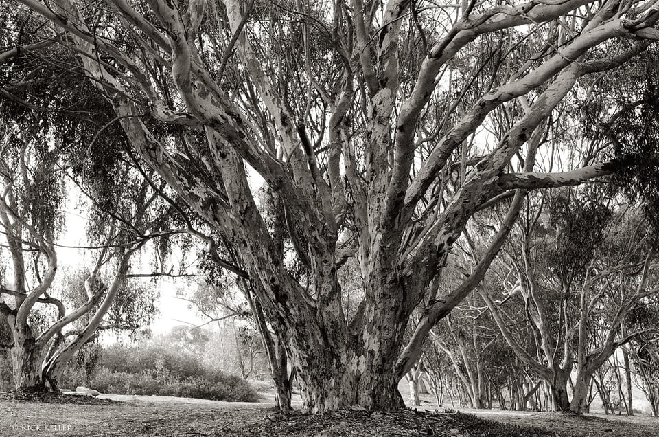
Next, I have selected a series of 35mm photographs that I had made over the past year with additional film stocks. I made the following photograph on Ilford Delta 400, another excellent moderate speed black and white film and one of the first black and white films with which I started in 35mm. In contrast to Tri-X, Ilford Delta 400’s grain structure is finer and less conspicuous, but it nevertheless provides a lovely rendition with a forgiving exposure latitude. During a walk in a wooded area near where I live, it was late-morning with clear skies. This modest grove of eucalyptus trees under strong backlighting captured my attention. I desired to capture as much shadow detail in the shade and low values on the bark of the prominent tree in the foreground. After carefully studying the scene, I had no interest in preserving any highlight detail here, so I decided to place the low values of the tree trunk higher on the exposure scale (Zone V) and request normal development for the entire roll. For my camera and lens, I chose my Mamiya ZM Quartz (manufactured in 1977) with a 50mm single-coated lens. I chose this camera system specifically because I have found that the lens provides a low contrast and soft rendition to a scene; those attributes were what I desired in this image. Upon viewing the negative on the light table, there was ample shadow detail to appreciate. After I studied the scanned image and an accompanying 10 x 13” print, I concluded that among the many reasons that I enjoy Ilford Delta 400 are the beautiful tonal range and fine grain that it confers.
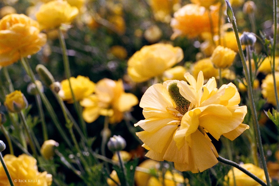
For the next photo, I chose the same camera and lens system to achieve the same aesthetic effects. For this patch of ranunculus flowers, I desired a soft and natural rendition to the color, so I chose one of my favorite color negative films, Portra 400, which is renowned for providing a beautiful and natural rendition of color (in particular for skin tones). Portra 400’s color saturation is moderate and its grain is fine. The moderate film speed and generous exposure latitude make it a versatile tool with which to photograph in just about any lighting conditions. The image yielded soft colors with low contrast that conveyed a soothing and cheerful mood.
Here is another Portra 400 sample, made with a more contrasty lens. In the midst of a splendid hike through Olympic National Park in Washington State, USA, I had stopped briefly to reload film into my camera. As I was shuffling though my pack, this friendly fellow (a black-tailed deer) approached me with curiosity. She held still just enough for me to make this delightful portrait. To my taste, the color palette and saturation of Portra 400 appear natural and neither vivid nor over the top, which is why I enjoy this film for photographing people and animals. The image that you see here is “straight out of the camera”.

Ahh, I made this next photograph during an uplifting promenade though the Flower Fields in Carlsbad, CA, where I make at least one visit right around the Spring Equinox to enjoy the vast acres of gorgeous ranunculus flowers. It was late morning on a cool and partly cloudy day. As I came upon this stretch of the fields, this beautiful arrangement of yellow ranunculus resonated me with me. As the sun was high in the sky but intermittently shielded by the clouds, I was treated to a touch of contrasty light on this middle quartet of flowers. The moment just felt right to make an exposure. On this particular day, I did not concern myself with technical consideration and camera settings. I was just there to capture the moment and the ambiance on color negative film – just to shoot in the name of art and nothing else. In order to capture vibrant colors on color negative film, my personal favorite is Kodak Ektar 100, which is a vibrant, high contrast, highly saturated, fine grained, and *sharp* color negative film. Ektar has been a popular choice among many nature and landscape photographers (in small, medium, and large formats) for precisely these attributes. Interestingly, Ektar is sometimes referred to by photographers as the “Velvia 50” of color negative film, to which I find there is some merit to that comparison. I patiently waited for the wind blowing in from the ocean across the highway to attenuate a bit and the clouds to cover the sun just enough to moderate the contrast. With the scene framed through my composing card, Ektar loaded in my camera, and an 81A warming filter attached to filter out blue light, I made the exposure and requested normal development for the entire roll. Here, I was not overly concerned with recording shadow detail, as my goal was to record vibrant yellows and alluring highlights on top of the flowers.
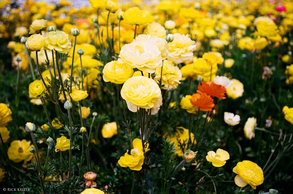
From an aesthetic and technical standpoint, both the negative and the scanned image came out exactly as I had visualized. The color, vibrance, and contrast were delightful. The shadow detail was ample to appreciate and enjoy. More than anything, I was pleased with the uncanny three-dimensional appearance of the center ranunculus. Upon viewing the negative on the light table, the flowers popped such that you can almost reach out and grab them by their stems. Based on my experience with Ektar in multiple formats, this three-dimensionality is one of the hallmarks of this film (just as it is with Velvia 50) and is more prominent and enjoyable on a print than it is on a computer monitor. I made no post-processing adjustments (straight out of the camera!). I slightly cropped the frame to a 3:2 aspect ratio, printed it, and matted/ framed it.
On a brief technical point, it is worthwhile to mention that many photographers do not believe in using color correction / color conversion filters with color negative film, arguing that the color balance can be appropriately corrected at the scanning and printing stage. Others, however, argue that color correction filters with negative film are instrumental to obtain the desired color balance during the exposure so that photographers need not worry about this issue downstream. Personally, I favor the latter approach and often use warming filters, especially under overcast skies and shade to filter out excessive blue casts, which I find highly undesirable in my prints. It is just my personal style and philosophy to take command and control over the light as much as possible during the exposure. There is no right or wrong with this technical decision; it is just a matter of personal preference in the visualization process.
Next, I made the following photograph during another hike through Olympic National Park. As sunset neared, I was in the midst a dense grove of birch trees. At the moment, I felt inspired to capture the brilliance of the sun bursting through the dense trees and to convey a warm and uplifting emotion. In setting up this shot, there were three challenges in the visualization process. One, there was a wide dynamic range to be captured. Two, the foreground was dimly lit, cold, and visibly blue. Third, there was a lack of compelling structure in the foreground to balance the brilliance of the distant sun. Since I was working with color negative film, I was not overly concerned about the dynamic range to be captured. So, I decided to heavily expose the dimly illuminated foreground, develop the entire roll normally, and let the lights be (potentially) blown out. In the back of my mind, since this is negative film, I knew a priori that the overexposed highlights would might sill turn out beautifully. To correct the cold, blue cast in the heavily shaded foreground (again shadows in open shade are predominantly lit by blue light), I used a stronger warming filter, the 81C. For aesthetic effects, I deliberately pointed the lens where I would introduce flare to create some degree of foreground interest. I stopped down the aperture to f/16 to create a multi-ray “sun burst”. Of course, heavily exposing for the shadows and stopping down the aperture made for a relatively “long” exposure, so I had to put the camera on a tripod.
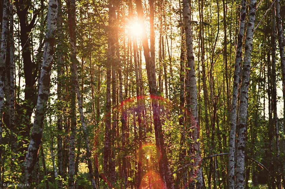
Upon examining the negative on the light table and the scanned negative, there was ample detail in the deep foreground shadows; the 81C filtered out the heavy dosage of blue light; the development yielded a beautiful highlight rendition of the sunburst with ample detail visible around the sun rays; and the flare conferred both a pleasant aesthetic mood and a lead into the scene. I was quite pleased with the moment and the final result.
Finally, during a spring promenade through downtown La Jolla, CA, I fortuitously came across a small, but delightful, rose garden at a street corner. This particular rose caught my attention because of its isolation and its subtle radiance under overcast skies. What I desired here was to make a soft portrait at close range to confer a gentle feeling of beauty. Ideally, I would have preferred a high speed film for hand holding (i.e., Portra 400), but since I still had multiple exposures of Ektar 100 remaining in my camera, I decided to open the aperture up an additional stop, which was OK, since I desired a shallow depth of field for aesthetic effects. To eliminate the subtle, but noticeable, blue light in the deep shadows, I used my 81A warming filter. I composed at a modestly close range (1:8 magnification ratio).
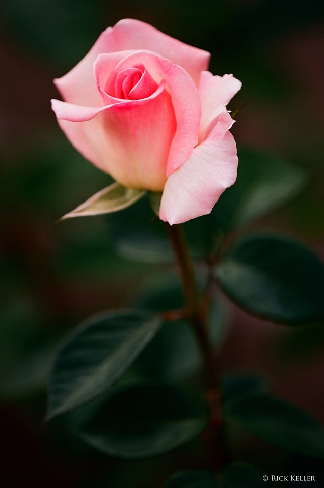
As in the earlier photo of the ranunculus field, what Ektar yields even under relatively low contrast light is a lovely and vibrant (yet not over the top) color rendition along with a three-dimensional appearance. On a historical note, some film photographers have lamented that Ektar yields a slight green rendition to the color palette. Personally, I have not noticed this green tint during any of my exposures, perhaps because I tend to give a healthy dose of exposure to capture ample shadow detail. At any rate, if a photographer uses Ektar to photograph landscapes replete with greens, for example, and does underexpose the scene (gasp!), then this green tint might well become inconsequential, in my humble opinion.
To conclude, although there are many reasons that photographers choose 35mm (and bigger formats, too) and negative films in the visualization process, if there is one common denominator to those then I would say that it would be the unique “personalities” of these films, which provide them with a versatile creative platform to explore their vision and creativity. The choices of films today remain plentiful; the applications, diverse; and the creative potential, boundless. If there is one technical challenge to using 35mm (or roll film in general) in visualization that deserves mention and that merits deliberation, then it would be the fact that the entire roll must developed the same for all frames, in contrast to sheet film where individual sheets can be developed differently as desired. But even then, for the seasoned and skilled film photographer, I consider that restriction not as a drawback to the process but actually a strength, since the photographer might hopefully take a more intuitive and astute approach to the lighting and exposure for all of those frames. And a more insightful approach to visualization hopefully will translate into a good final result.
I hope you have enjoyed this third article on film photography and visualization. Special thanks to Francesco Carloni and Ellen Goodman for their superb contributions to this article and to Northcoast Photographic Services in Carlsbad, CA, which provided both the 35mm development and scanning services for my film contributions (great job, Bonnie and Scott!). Perhaps in the near future, when I will have obtained more experience with other popular 35mm film stocks, (e.g., Fuji Superia, Fujicolor Pro 400H, Kodak Portra 160, Kodak Portra 800, Ilford FP4 Plus, Ilford HP5 Plus, Kodak T-Max 400, Fuji Velvia 100, Cinestill), I will return to share more thoughts and experiences with these films. In the concluding Part IV to this series, I plan to share additional photographs (more architecture and close-ups) with a brief discussion and application of film reciprocity, the application of exposure calculations in close-up and macro photography, and concluding remarks.
Table of Contents