In this second installment to this series on visualization and film photography, I have selected two photographs, “Gravida” and “Pyramis” (both architecture), to share and discuss. As on the first page of this article, I will provide a detailed description of the thought process behind the construction of the photographs, the choice of tools, and the technical considerations involved.
This year, I have been particularly interested in studying and photographing abstracts in natural and artificial subjects. This summer, I decided to seek out architecture to study structure, shape, pattern, and abstracts. With this goal in my mind, I paid a visit to the Mission San Diego de Alcala, which was first the mission that was founded in California. The façade of the building is striking: whitewashed stone with interesting textures, lines, and shapes. The whitewashed stone is reminiscent of Aegean-Mediterranean architecture; and the façade is reminiscent of the Alamo in San Antonio, Texas, which is another famous mission in the U.S.
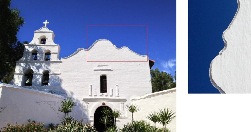
As I studied the beautiful façade with my composing card, I was interested in the confluence of the lines on the roof with the stark contrast between the whitewashed stone and the deep blue sky. As I studied even more carefully, I was struck by what my mind interpreted as the profile of a pregnant woman. As I held up my composing card to frame the composition, the structure and the aesthetics resonated with me. At that moment, I knew exactly what I wanted to accomplish. I desired to construct a photograph that tells the story of an expectant mother in an abstract presentation. So, with that objective and composition clearly defined in my mind, I went to work.
There were multiple considerations for this photograph: the light, contrast, the perspective, exposure, and development. In terms of the final print, I desired to make an image of a brightly illuminated facade outlining the profile of the gravid woman that stands out from a black sky. In other words, I desired a pure abstract associated with *strong* contrast to captivate the viewer’s imagination. At the same time, I wanted the negative to contain just enough detail in the stone for the viewer to appreciate. For the lighting, I deliberately waited for a day when there was a cloudless sky replete with the harshest and most contrasty light available (i.e., between high noon and mid-afternoon).
For my choice of tools, I decided to use my monorail view camera, the Cambo SC 4 x 5. In contrast to a folding field camera (as in the Tachihara in the first section), monorail cameras are a type of view camera in which the front and rear standards are positioned onto a strong center rail. The design makes the camera more versatile with respect to camera movements as it allows extensive movements (even precise geared movements in some models) of both the front and rear standards(e.g., rise/fall, tilt, swing, and shift), as opposed to the more limited movements with the folding field view camera variety. For these reasons, monorail view cameras have traditionally been the tool of choice for architectural photographers. To frame this perspective, the obvious choice was the use of a long lens. Ideally, I would have preferred a 355-360mm focal length, but I do not have that lens in my camera bag. So, I chose my Nikkor-M 300mm f/9, which is a gem of lens. It is a compact, contrasty, and razor sharp Tessar design. For those who are interested, you can find a description of Nikon’s large format lens line-up here, kindly provided by Kenneth Lee Gallery. Thanks once again, Ken! In the 4 x 5” format, the 300mm focal length gives an angle of view that is similar to that seen with an 85mm lens in the 35mm format. In terms of framing the perspective, the 300mm focal length was a tad short and provided a wider angle of view than I desired. Unfortunately, due to a garden that was situated directly in front of me, I was not able to move closer. Thus, I will have needed to have cropped the negative.
In order to control the shape of the perspective and distortion of the lines, I applied forward tilts to both the front and rear standards to align the standards parallel to the wall in the vertical orientation. In addition, I slightly adjusted the front and rear swings to ensure that the standards were parallel to the wall in the horizontal orientation. To control depth of field, which was not a significant consideration with this relatively flat subject, I stopped the aperture down to f/16 (1⅔ stops down from the maximum aperture.
For film, I chose Ilford Delta 100, which is a high contrast, fine grained, sharp, and high resolution black and white film and one of my “go-to” sheet films.
The challenge with this photograph was to translate the aesthetics of the vision in the mind’s eye into the appropriate exposure strategy. Achieving a pure black sky on the negative and print (i.e., in Zone 0) required the use of a skilled approach to light filtration and metering. This is where the black and white contrast filter, which I briefly described in the first section, plays an instrumental role in the exposure. I used two filters to make the sky print black: a red filter (also known as a Wratten #25A) combined with a polarizer. “Wratten” refers to a historical labeling system for contrast filters. At this point, please allow me digress briefly to provide some background to explain the physics and the rationale behind contrast filters.
Black and white contrast filters, which were originally designed as rectangular gel filters, are now widely used as circular glass filters that screw into the front lens thread (or into a front lens adaptor for those lenses that do not have front lens threads). A time honored schematic that is helpful in understanding the physics is the so-called “color wheel”. Physically, these filters *pass* light whose wavelengths are of the same color as the filter. Conversely, these filters *block* wavelengths of light that are on the opposite side of the color wheel.
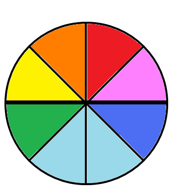
For example, a red filter passes red, orange, and some yellow light but blocks blue and green light. A green filter passes green, cyan, and yellow light but blocks red and some orange light. In general, a given contrast filter will lighten colors that are near each other (the adjacent sector) on one side of the color wheel and will darken colors that lie on the opposite side (two to three sectors around). Thus, these filters can be used to exert potentially creative effects on the contrast and aesthetics of the print. For example, red and orange filters can be used to darken a blue (and cyan) sky and increase the contrast between the sky and clouds, yet they also darken green foliage. In this regard, the red filter exerts a more powerful effect than the orange filter. Green and yellow-green filters can be used to lighten foliage and also to darken the sky to some degree. Of note, green filters have also been used creatively to darken and separate the reds in rocks structures in the desert southwestern U.S., for example. In addition to red, green, and orange filters, there are also yellow and blue filters. For a given color of contrast filter, there are also varying strengths from which to choose. Of note, red and orange filters also strongly block UV light. Below are some simplified schematics that illustrate the physics.
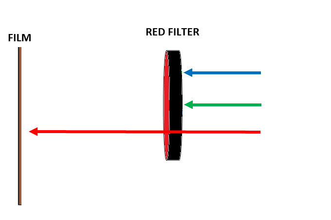
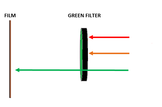
With this simplified background on contrast filters set forth, hopefully it will be easier to understand why I chose a red filter to significantly darken the sky. Since the red filter heavily blocks blue light at the *point of contact* with the lens, blue light (in theory) *never* reaches the film plane. Consequently, the black and white film effectively becomes “blind” to blue light. Therefore, anything that is blue in the scene is recorded as – you guessed it – black, because photons of that wavelength from that area of the scene will have never made it to the film plane. It is that simple. Now, why did I add a polarizer to the filtration strategy? The answer is that the use of a polarizer will augment the certainty that the sky prints black. As in any form of photography – film or digital, black and white or color – polarizers can darken the sky if they oriented close to a 90 degree angle from the sun. Yet, the combination of a red #25A and polarizer in and of itself may not guarantee that the sky prints black. This is where the exposure strategy is critical and where the Zone System serves as a powerful tool for the photographer. Since the objective for this exposure is to print the sky black and print a near white façade with just enough detail and texture to appreciate, the negative would ideally have the sky fall in Zone 0 (pure black, no detail or tonality) and the façade on Zone VIII (bright white with some detail and texture). By studying the scene, the deep blue sky fell on Zone V (middle gray, midtone) and the façade between Zone VIII and Zone IX. As a reminder, all Zones in the Zone scale are separated from the adjacent Zone by one exposure stop.
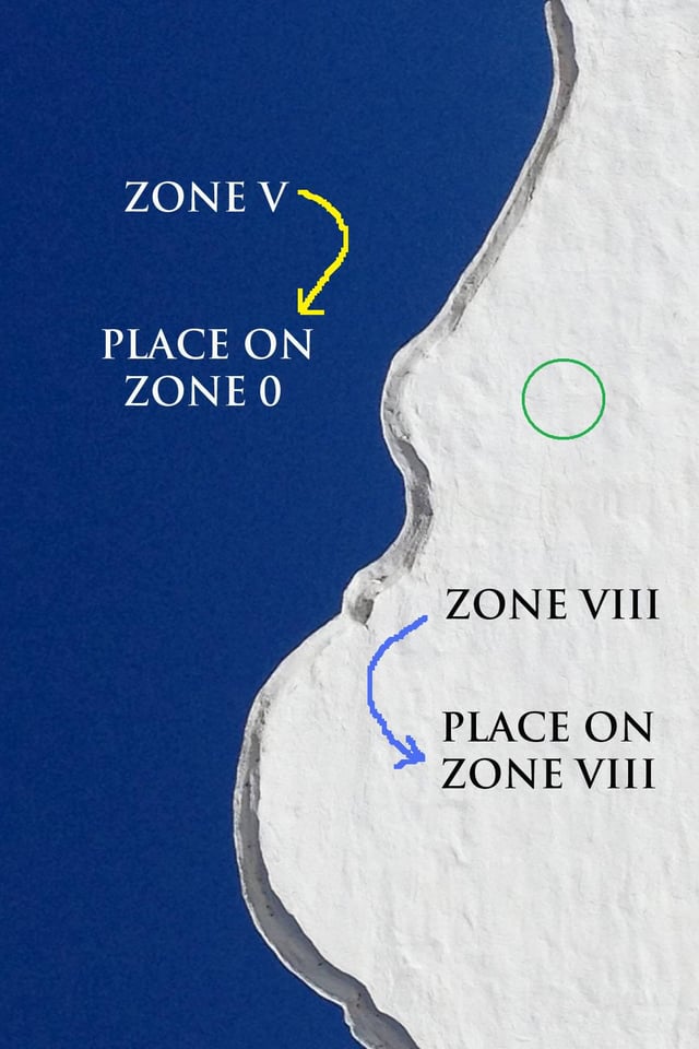
One possible exposure strategy could call for metering the sky to place those values in Zone V followed by normal development of the film; that would likely have made the façade bright white with some detail (Zone VIII) but made the sky print dark grey, not black, as Zone V lies too high in exposure scale. Alternatively, one could meter the façade in Zone VIII and develop the film normally, but that potentially could have resulted in the same suboptimal outcome. For the solution, I followed the masterful exposure strategy employed by Howard Bond in his incomparable work on the Cyclades Islands of Greece, where during a series of trips in the 1980s he made *phenomenal* abstracts of whitewashed Greek buildings. In my humble opinion, Mr. Bond’s work there ranks among the greatest works of photographic art ever made and epitomizes the process of visualization. In his article, “Filters for Black-and-White Photography” in Photo Techniques Magazine, Mr. Bond describes his filtering and exposure strategy on the Cyclades Islands:
“The first time I combined a polarizer with another filter was with a #25 red when photographing a white-washed Greek church against a blue sky. I wanted the sky to be rendered black, since the print might look weak if its darkest value were gray. The sky was a rather pale blue because of the presence of a lot of white light, presumably polarized. The polarizer got rid of that, leaving a strong blue that responded well to the red filter. Even so, the sky would only have been dark gray if I had placed the brightest whitewash on zone VIII and given normal development. Instead, I placed it on Zone VI, which made the blue sky fall low enough to ensure that it would print black. N+2 development brought the highlights back up to Zone VIII.”
Thus, I chose to meter the façade (indicated by the “green” circle in the iPhone illustration) and place that high value in Zone VI and then extend the development of the film by two stops (N+2) to bring up the highlights back into Zone VIII. In theory, the metering strategy will have dropped the exposure of the sky into Zone III (dark to dark-grey), which in the face of drastically reduced blue light transmission by virtue of the red filter in place, combined with the darkening effect of the polarizer, would have ensured that the sky prints black.
As I briefly explained in the first section, the most critical steps in any exposure strategy are for the photographer to correctly assess the luminance values of the metered Zone of interest and then to override the meter in order to properly expose that Zone on the negative. Although I should have provided more clear-cut examples of this on page 1, please allow me to do so briefly here. Again, a spot light meter sees just one thing: Zone V, middle grey, or the middle of the exposure scale. By default, the meter will automatically assign an exposure value in Zone V, regardless of whether the scene is brightly lit or dimly lit. For example, if the photographer meters a brightly lit area of the scene (such as snow in bright light), the meter will want to bring that exposure value *down* to Zone V. Conversely, if the photographer meters a dimly lit area of the scene (such as shadows, or black fur), the meter will want to bring that exposure value *up* to Zone V. Obviously, an assigned luminance of Zone V at the metered region may *not* represent the desired luminance that the photographer wishes to record on the negative. If the photographer does not override the meter, the results can be disastrous. In a brightly lit scene where the photographer wishes to maintain the high values, in the absence of manual override by adding positive exposure compensation, the negative will be *underexposed*. Conversely, in a dimly lit scene where the photographer wishes to maintain the low values, in the absence of manual override by adding minus exposure compensation, the negative will be *overexposed*.
So, with the exposure strategy set, I took my spot meter and dialed into the ISO dial the rated film speed (exposure index 80) and the filter factors for the red filter (+3⅓) and polarizer (+1⅔). I metered the façade, which by default gave an exposure value that lies in Zone V. I adjusted the EV dial to override that value to place the luminance on Zone VI (+1 stop more exposure) and then read off the shutter speed. I sent the film for development at Northcoast Photographic Services. I specifically communicated to my film technician, Scott, the type of film I used, my rated exposure index, and into what Zone I desired my highlights to fall, namely in Zone VIII. Consequently, with that information he extended the development of the film by N+2.
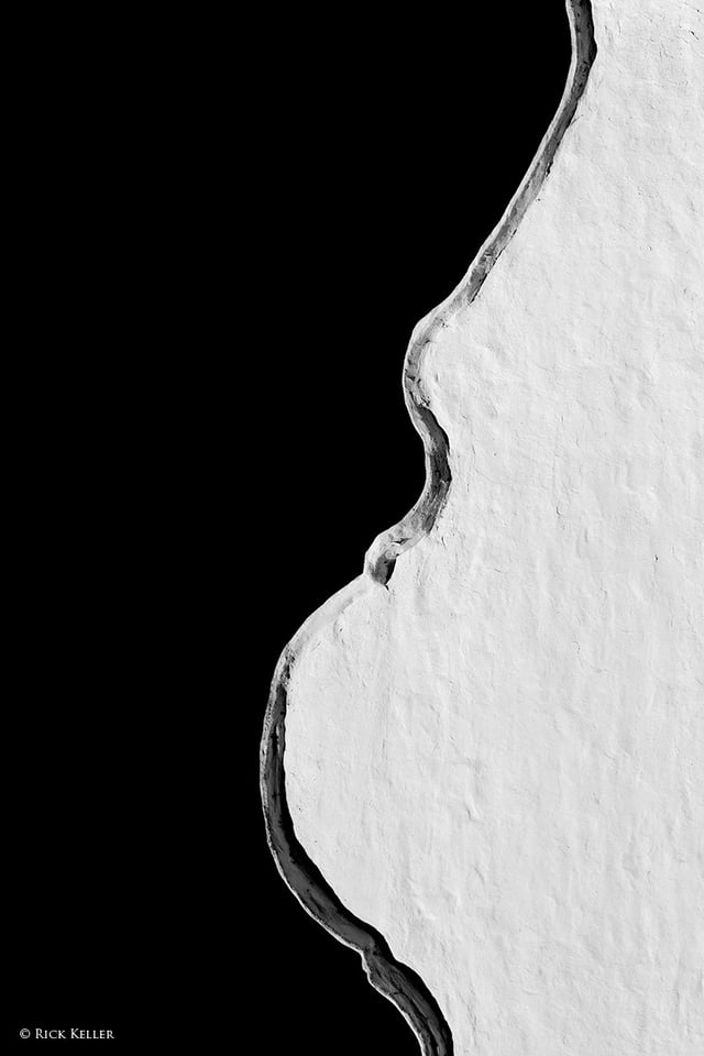
Cambo SC 4 x 5, Nikkor-M 300mm f/9, Ilford Delta 100
Upon examining the negative on the light table, the exposure and development turned out perfectly – the sky on the negative appeared clear (i.e., pure black) and the façade appeared very dark with enough detail to appreciate (i.e., bright white with some detail). On the light table, the image had an uncanny 3-dimensional appearance such that one could run fingers tips on the façade and feel the textures… I scanned the negative on the Epson V850 flatbed scanner at 3200 dpi. Since the usable area of a 4 x 5” negative is 3.75 x 4.75”, with this output resolution and film dimensions the scan yielded a 182 megapixel image. I made no post-processing adjustments. I cropped the image to a 3:2 aspect ratio. Overall, I was very pleased with the outcome. Aesthetically, I thought the image tells the story exactly as I had envisioned it in my mind: the story of an expectant mother in an abstract manner conveyed with a sense of minimalism. From a technical standpoint, I was pleased with the strong contrast and the detail on the facade. Even though the façade was illuminated with harsh sunlight, the film managed to record and resolve ample detail and texture on Zone VIII.
In a recent correspondence with Mr. Bond, he related that ever since his work on the Cyclades Islands he has found that the Wratten #29 filter, or deep red filter, blocks so much blue light that it obviates the need for a combined Wratten #25 filter and polarizer filter to make the sky print black. Since I made this photograph and my conversation with Mr. Bond, I have added a deep red filter to my camera bag. Thank you, Howard!
Next, continuing with the spirit of exploring architecture and abstraction, I chose the following photograph to share and discuss. One of the most iconic buildings in the city of San Diego, California is the San Diego Innovation center, known locally as the “pyramid building”. It bears a striking resemblance to the renowned and iconic Louvre museum in Paris, France.
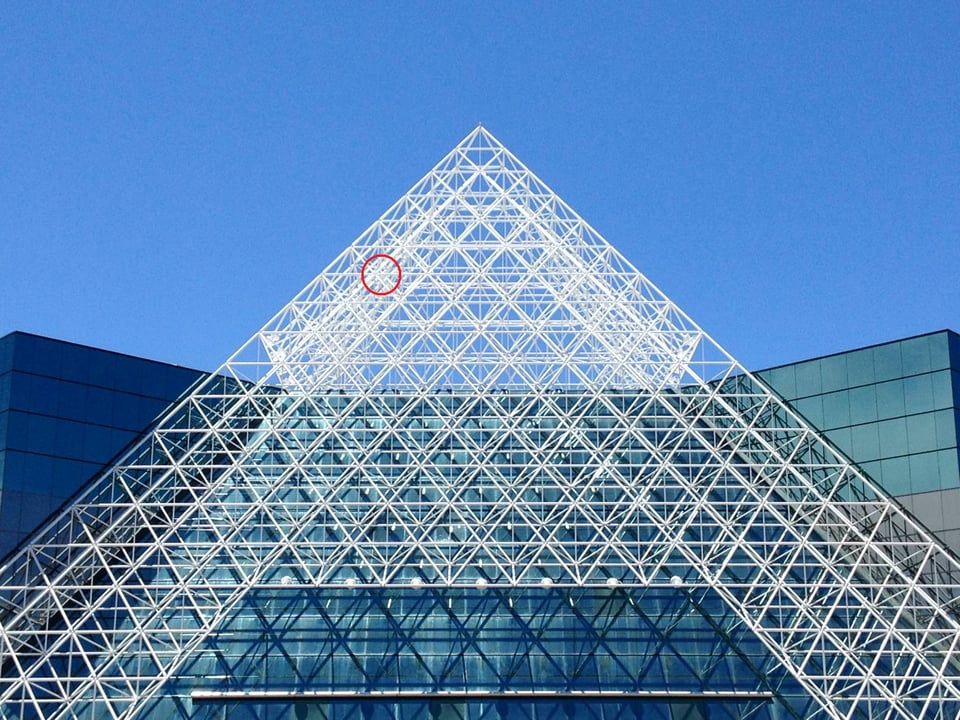
iPhone 4S @ 4.28mm, ISO 50, 1/1972, f/2.4
Before I decided to study this unique structure in depth, I had actually driven passed this building several times over the years and intermittently contemplated making an abstract photograph of it. I had repeatedly deferred this feat because I was neither comfortable nor confident with my creative mindset or with my skill set at the time. As with any potential artistic creation, it goes without saying that the artist has to *feel it* to make it happen. Last month, I was *feeling it*. The geometry, pattern, abstraction, and contrast resonated with me. I began to dream of this structure… To make preparations for an exposure, I made two separate scouting trips to this structure. The principle considerations were the light (sound familiar?), the contrast, and the perspective.
As in the first photo,“Gravida”, in order to create a very high contrast and abstract image, I desired the harshest and most contrasty light Nature could provide: clear blue skies at high noon. The next decision was to choose the proper perspective in order to convey a compelling sense of structure and to emphasize the geometry and abstract nature. As I studied the structure though my composing card at close range, the perspective was predictably distorted, as the spacing of the lines of the lattice and the relationship between the lines and glass walls were widened. Framing with a wide angle lens would have been inordinately difficult. Further away (about 80-90 yards) from the building, the perspective appeared more interesting and pleasant. The spacing of the elements appeared more compressed, which lent itself well to emphasizing the aforementioned attributes. I chose this spot to make the exposure. In order to frame this perspective, the obvious choice was the use of a “long-normal” lens, for which I chose a Goerz Red Dot Apo Artar 16.5” (420mm) f/9.5. In the 8×10” format, this focal length provides an angle of view that is similar to that seen with a 60mm lens in the 35mm format. My other tool choices were the Tachihara 8×10 field view camera and Ilford Delta 100 film.
What I visualized in my mind was an image that revealed high contrast between the high values of the lattice and a very dark sky. Interestingly, the high values of the lattice near the top half were significantly higher (by about 1 to 1 ½ stops) than at the middle and at both lower corners of the structure. With the confluence of a black sky and this gradient of high values, the potential to create a striking abstract was enticing.
As you may already be anticipating, in order to make this photograph a reality, I followed a near identical exposure strategy as with “Gravida”. To briefly summarize, in order to make the sky print black, I employed powerful filtration to block blue light from exposing the film combined with judicious underexposure of the sky. And in order to widen the contrast range (i.e., negative expansion), I extended the development of the film to push the high values up on the exposure scale. Again, with a firm understanding and command of the physics of light filtration, the Zone System, and experience, achieving the goal was straightforward. After I pointed the camera slightly upward to frame the scene, I controlled distortion and the shape of the perspective (i.e., keeping the horizontal lines of the lattice parallel) by applying tilts and swings to both standards. In order to control the place of focus, I applied a modest tilt to the front standard. And to control depth of field, I stopped down the aperture to f/32. At this point, at high noon at 85 degrees Fahrenheit, it was getting mighty hot under the dark cloth…
As I did not yet have a Wratten #29 deep red filter in hand, I again used my Wratten #25A red filter and polarizer. For the metering strategy, I carefully chose a tight intersection of the high values near the top of the lattice (illustrated by the “red circle” in the iPhone photo) and placed those values in Zone VI. After entering the filter factors and film exposure index into the ISO dial, the spot light meter (as always) yielded an exposure value that lies in Zone V. In order to override the meter to place the metered spot in Zone VI, I rotated the EV dial to indicate 1 additional stop of exposure and read off the shutter speed. Subsequently, I requested N+2 film development from my film technician, who again did a brilliant job (Bravo, Scott!). Upon examination of the negative on the light table, the exposure and development were on target with strong contrast between the sky and the pyramid and good overall sharpness. The sky was exposed black and the high values fell onto Zone VIII. There were a few small exposure artifacts in the sky, but I was not concerned about those. I scanned the negative on the Epson V850, made no conventional post-processing adjustments, spotted the artifacts, and cropped the photo to a 4:3 aspect ratio. Overall, I was very pleased with the image, which came out exactly as I had visualized it.
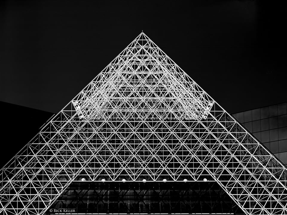
Tachihara 8 x 10, Goerz Red Dot Apo Artar 16.5” f/9.5, Ilford Delta 100
As with many other aspects in film photography and visualization, the salient principle for me in the construction of “Gravida” and “Pyramis” was being in command and control of the *process*. Simple physical tools (filters) and a thorough understanding of light and exposure gave the photographer the power to translate what he saw in the mind into the final image. It was the photographer – and the photographer alone – that decided what light reached the film plane to create the photographic image. *Command and control* of the light – that is where it all begins. For these reasons, I consider black and white contrast filters, when used selectively and strategically, to be a powerful tool in the visualization process.
As a brief historical note, for many years red filters have been used by both photographers and cinematographers in order to simulate night time and moonlit scenes in broad daylight with judicious underexposure of the sky. Even though that was not my intent with “Gravida” and “Pyramis”, red filters can certainly be used as creative tools to this end in a variety of photographic scenes, such as landscapes.
Although the thought process, approach, and technical considerations – the craft – in the making of these photographs might seem overly complex to the beginning film photographer or even perhaps to an advanced film photographer, actually, they are quite straightforward and based on sound principles and experience that have been validated by photographers for over 80 years. The Zone System and filters are just a means to an end, not an end in and of themselves. They are merely tools that empower the photographer to consummate visualization to create good photographs and works of art. As the great Fed Picker espoused, “Don’t be creative when you should be mechanical, and don’t be mechanical when you should be creative”, and “The hardest part of photography is finding the right place to stand.” In the creation of any photograph, artistic vision and creativity reign supreme, yet that is most difficult part of the whole process. Manipulation of the light and applying the craft – once the photographer is in command of it – is the easy part.
I hope you have enjoyed this second article on film photography and visualization. On the next page, I plan to share additional photographs – exclusively in the 35mm format – with a description of select choices of black and white and color negative 35mm films. I will conclude this series on page 4 where I will include a brief discussion and application of film reciprocity, the application of close-up and macro exposure calculations, and concluding remarks. Please, stay tuned.
References:
- “Filters for Black-and-White Photography”. Howard Bond. Photo Techniques Magazine.
- “Black and White Filters Tutorial”. B. W. Perovich. Freestyle Photographic Supplies.
- “White Motif: The Cyclades Islands of Greece”. Howard Bond.
- “The Negative: The Ansel Adams Photography Series 2”. Ansel Adams.
- “The Zone VI Workshop”. Fred Picker.
- “Beyond The Zone System”. Phil Davis.
- “Scanning Tips”. Kenneth Lee Gallery
- “View Camera Magazine”
- “Principles of View Camera Focus”. Harold Merklinger.
- “View Camera Focus and Depth of Field: Part I”. Harold Merklinger.
- “Technical Books on Photography”. Harold Merklinger.
- “Check List for View Camera Users”. Howard Bond.
Table of Contents