Last March I contributed an article at PL titled “Venice in Black & White“. I ended it by saying that I was hoping to return to Venice that year. Despite my wife reminding me that I already have tons of photos, I still wanted to go back and get better images, as well as have a chance to use the Nikon 19mm PC on the Z7…
I did return. Early last June. But little did I know that within less than 9 months Venice would be in lockdown. So now seems to be the perfect time for a virtual visit.
My real visit lasted less than 36 hours and this essay mostly follows my wanderings over 24 hours from my first morning to sunrise the next day.
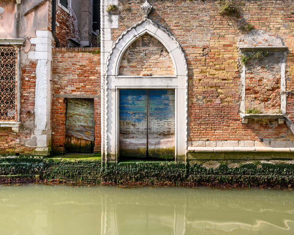
NIKON Z 7 + NIKKOR Z 24-70mm f/4 S @ 33.5mm, ISO 64, 1/100, f/8.0
Table of Contents
Planning
With a short trip in particular, some planning is essential. Venice is a city of photogenic narrow canals and lanes, but for this trip I was particularly interested in the open spaces and wider views.
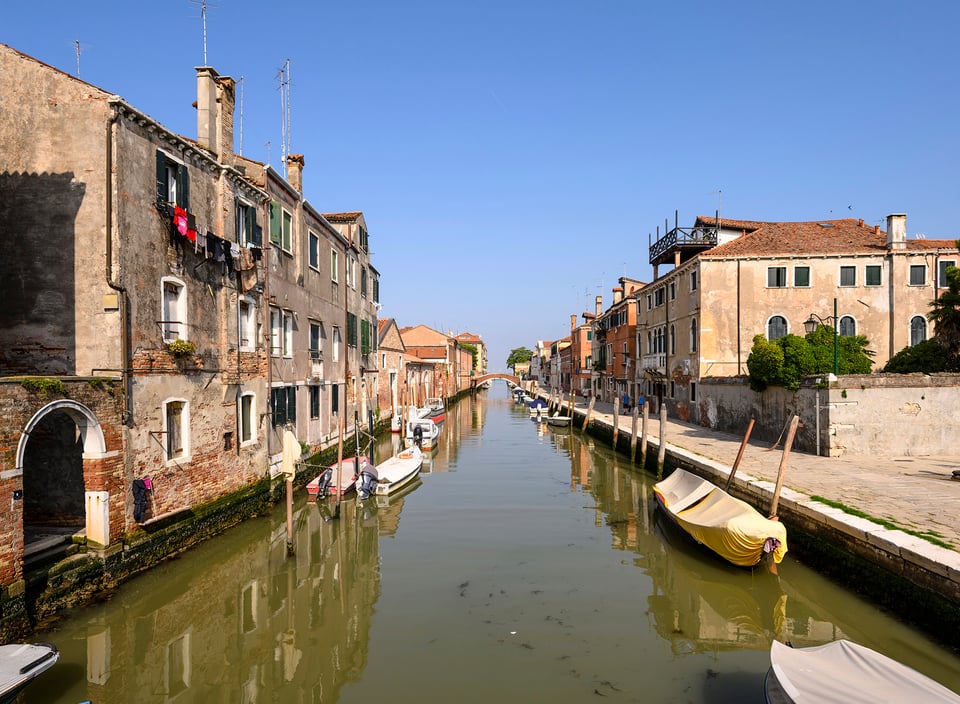
NIKON Z 7 + 19mm f/4 @ 19mm, ISO 64, 1/200, f/8.0
First, I printed a detailed map and identified a number of possible locations: quiet squares, quaysides, Grand Canal access points and bridges. I then explored each location using the Venice Street View facility in Google Maps to refine my choice.
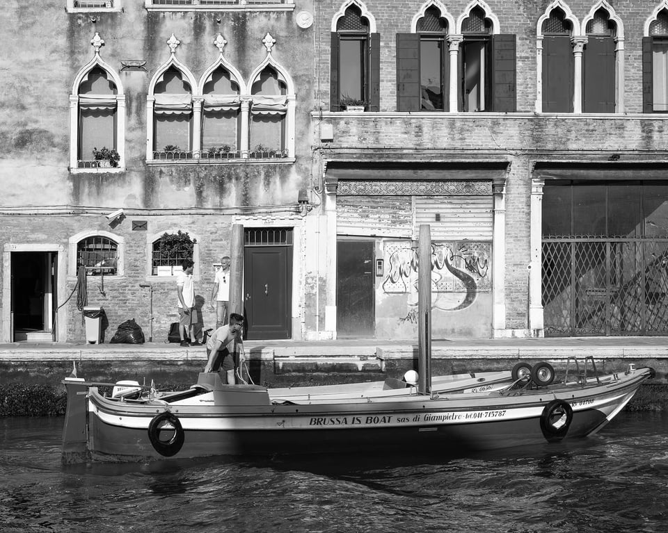
NIKON Z 7 + NIKKOR Z 24-70mm f/4 S @ 45mm, ISO 64, 1/250, f/8.0
Last but not least, I explored each location with the Photographer’s Ephemeris app, identifying the best times of day for lighting. Assuming, of course, it would be sunny which is the one thing I couldn’t plan!
The final result, and my constant companion, was an A3 hardcopy map annotated with possible locations and rough morning, afternoon and evening walking routes.
The Gear
Everything had to fit in a carry on the rucksack that wouldn’t be too heavy for a long day on my feet. This was my first trip with my Nikon Z7, and I really noticed the weight difference from my previous D850 based trips. My kit was –
- Nikon Z7
- Nikkor 19mm f/4E PC
- Nikkor Z 24-70 f/4 S
- Nikkor Z 50mm f/1.8 S (not really needed)
- Nikkor 70-300 f/4-5.6E VR
- Spare battery
- Induro CT014 Carbon Tripod & Benro GD3WH geared head
The Benro head was so much lighter than the Manfrotto geared head I used on my last trip – highly recommended.
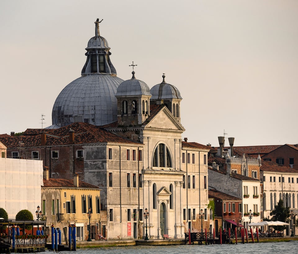
NIKON Z 7 + 70-300mm f/4.5-5.6 @ 200mm, ISO 280, 1/500, f/8.0
Perspective Correction with the Nikkor 19mm f/4E PC
This is a stunning lens albeit extremely expensive. Much sharper in the corners, and when shifted, than the Nikkor 24mm f/3.5D PC-E I used on my previous trip, and with beautiful color and contrast. Corner sharpness, in particular, can be very overrated, but for me not where architectural detail is the subject, as it was on this trip.
Yes, I know you can straighten perspective in Lightroom after the event. That can reduce quality though, and more importantly for me using a shift lens over Lightroom correction allows the final image to be composed on the spot, using live view and a geared head tripod to make fine adjustments to ensure everything is level.
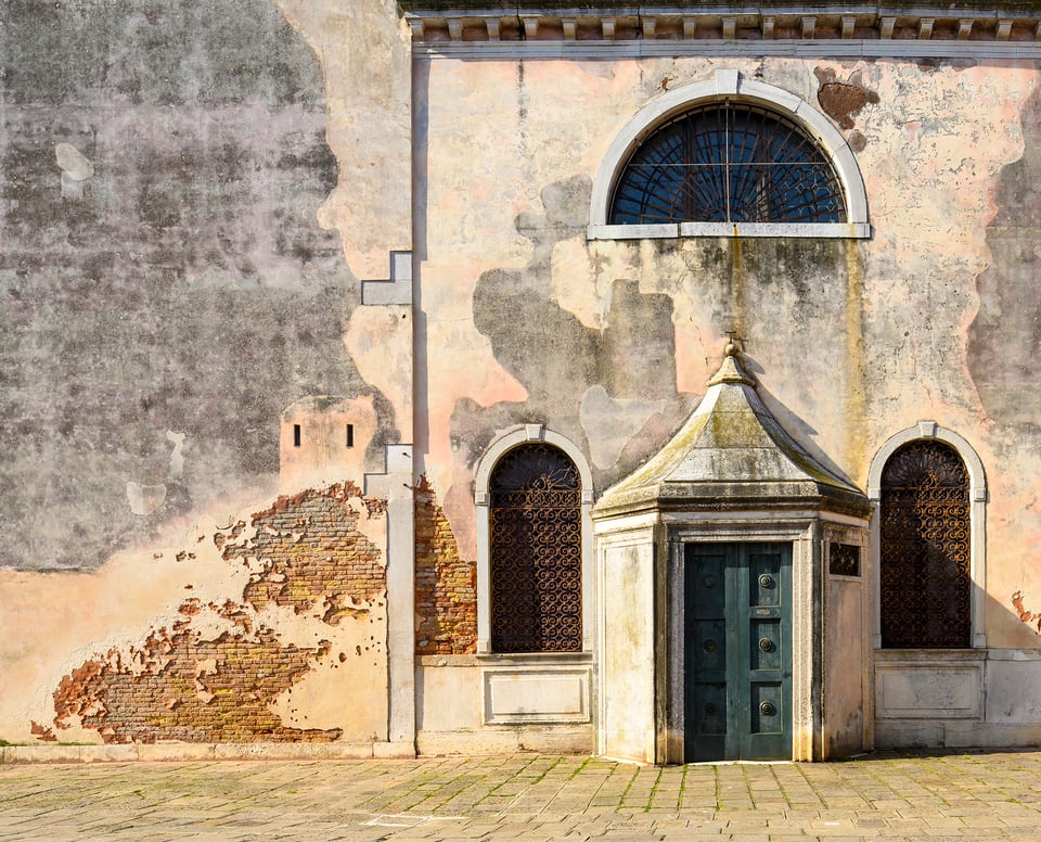
Above is a typical shot with the 19mm PC. The simple shapes and interesting textures called for a very formal, square on image. So level the tripod head in all directions (easy with a geared head) and make sure the plane of the subject is absolutely parallel to the plane of the sensor (easy to not get quite right!). Check it all, including exposure, on live view, and that’s it.
Actually, 19mm was too wide here so the final image is quite cropped – the flexibility to do this is the reason I chose the Z7’s extra pixels over the otherwise totally adequate Z6.
But not even a shift lens can totally straighten buildings that are leaning themselves:
I chose monochrome here to emphasis the clarity of line of the left-hand building and included a lot of the featureless sky to make the most of the subtle tone changes.
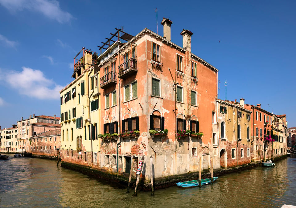
Next is the junction of 2 canals. The 19mm lens, coupled with the carefully chosen angle of view, gives a much more dramatic corner perspective than the 24mm PC-E I used for a previous version. But better still: this time a blue sky creating, with the orange building, the classic complementary color combination that demands a color image.
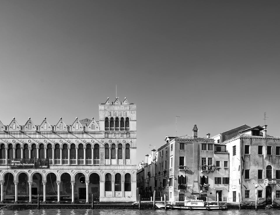
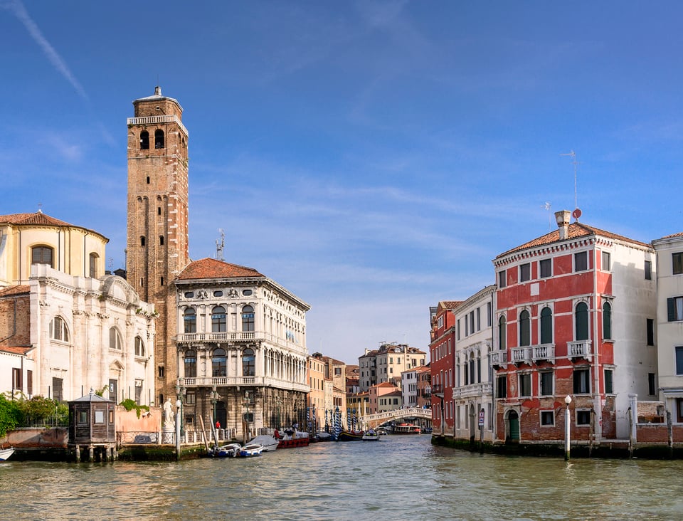
Below is a deliberately classical view of a side canal leading off the Grand Canal. It’s easy to find views along the Grand Canal from the few bridges that cross it, but as most palazzos are built directly onto the canal it’s more difficult to find quayside locations looking across the canal. This is taken from one of the few.
This image raises an interesting question. Do you need to spend lots of money on a shift lens to photograph architecture, particularly if you have a high resolution camera like the Z7 with lots of scope to crop?
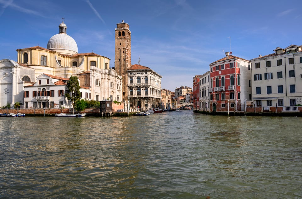
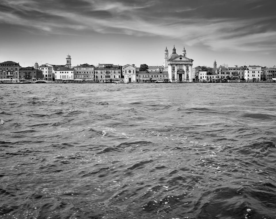
As you can see this was taken with the Z 24-70, not the 19mm PC. The verticals are vertical, but they were taken that way and not corrected in Lightroom. The version below is the original uncropped image. You’ll see that I levelled the camera even though I knew compositionally that would give too much water, and I used a wider angle than I wanted for the final image. I then cropped out much of the foreground and the left and right sides, achieving what in effect a narrower focal length shift lens would have done if shifted upwards. The only downside is reduction in pixels, but this reduced image is till around 17.5mp which is quite sufficient for even large prints depending on the viewing distance.
Color or Monochrome?
In many ways Venice seems made for black and white, emphasizing certain aspects – the atmosphere, the light, the texture, and the patterns. That’s why my previous article was devoted to monochrome images. But this time as you can see I’ve mixed things up – choosing color or monochrome depending on the subject, though sometimes the choice is not black & white (sorry!).
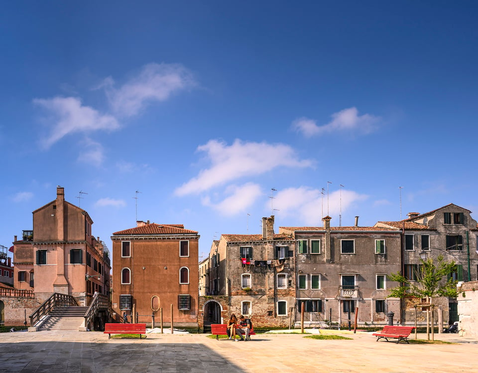
NIKON Z 7 + 19mm f/4 @ 19mm, ISO 64, 1/250, f/8.0
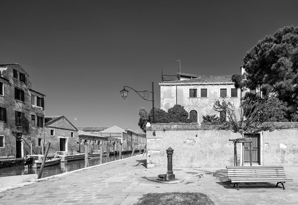
The 2 images above were taken from almost the same location although in different directions. I stuck to color for the first one as I particularly liked the color of the buildings against the blue sky, and to make the most of the bright red benches echoed in the red washing hanging out to dry.
I chose monochrome for the second image as I love the deep grey graduated tones from a cloudless blue sky, and this time the bright red bench would have been unbalanced the composition and distracted the eye from the other street furniture – the old water pump and the lamp.
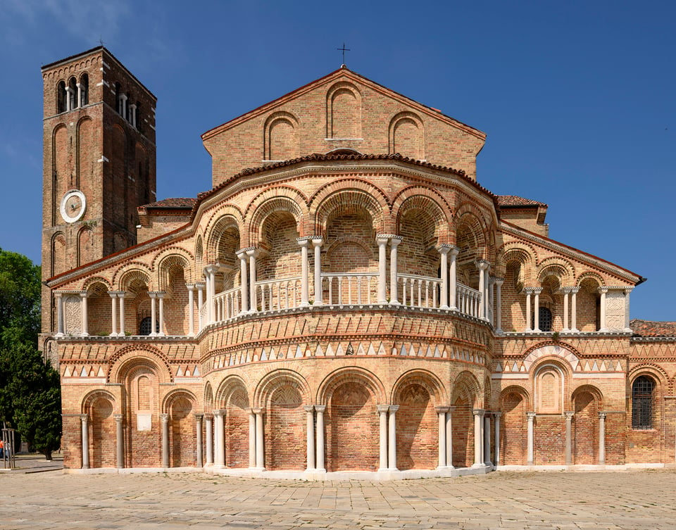
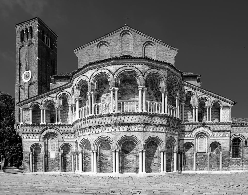
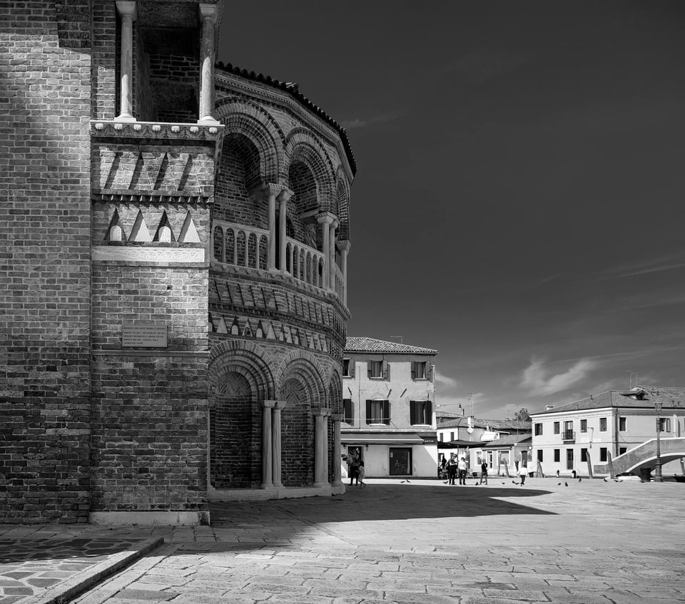
Next are color and black and white versions of the same image of the apse of the Basilica dei Santi Maria e Donato on the island of Murano, a short water bus ride from Venice itself.
To my mind, the black and white version better brings out the elaborate brickwork and ornate colonnades, flooded with morning sunshine.
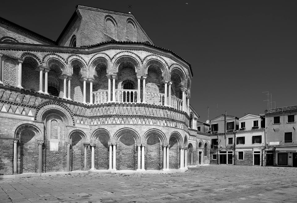
Unusually for Venice, there’s a lot of space in front of the apse to explore different angles and compositions.
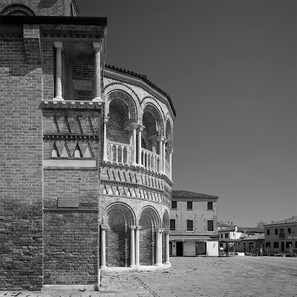
Below is an image from an earlier trip included in my previous article taken a few hours later when the sun had moved round. You can see the value of the Photographer’s Ephemeris for planning the best light as I did on the present trip. Despite my best efforts with lifting shadows etc in this image, the apse is still in deep shadow. But I do like the diagonal shaft of sunlight on the side wall, and the light on the buildings on the right across the square. So there is no absolute right or wrong!
“Streets full of water: Please advise….”
…telegrammed journalist Robert Benchley to his magazine on arrival on assignment in Venice.
I have visited Venice often over 40 years or so. My early photos were mostly of narrow canals and reflections, which is probably why I now tend to focus more on the architecture. But I’m always drawn back to the wide, airy, Giudecca Canal, and to the Giudecca Island with its long sunny promenade that can be a quiet location to set up a tripod and work slowly even in June.
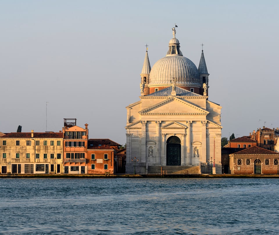
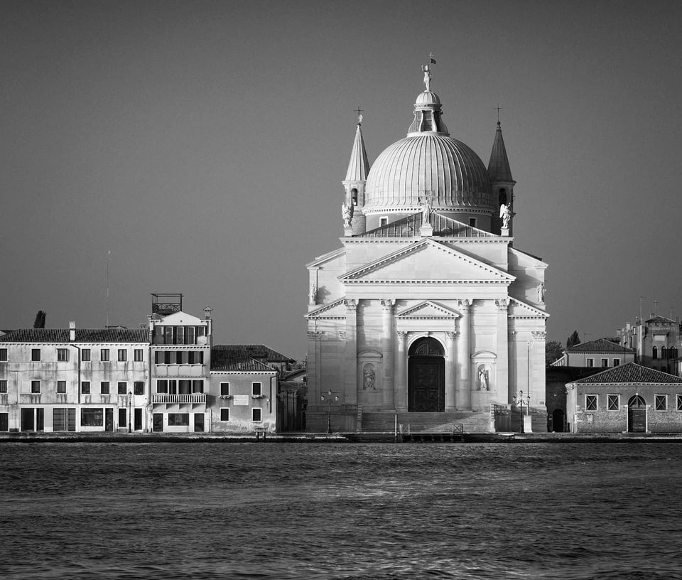
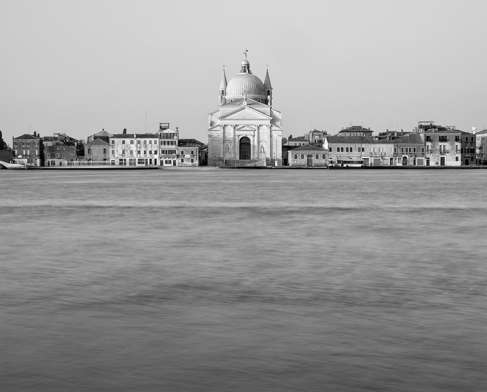
My particular favourite on the Giudecca Island is Palladio’s masterpiece of harmony and balance, Il Redentore, completed in 1592. I’ve photographed it from several angles and in different light. This time I went for a very carefully set up symmetrical view.
I have included color and monochrome versions taken not long after sunrise (6.18 am). The color one has the warm morning light on the marble façade and the soft pastel sky. That is lost in the monochrome version but in contrast it better emphasizes the architectural detail, particularly in the dome, and the contrast between the formality of the façade and the informality of the surrounding buildings.
To be honest I’m (unreasonably I know!) slightly suspicious of ND filters, perhaps because I feel they’re a bit too overused when water is involved. But I do have one and thought I’d try it. Here is the Redentore church again, from the same viewpoint but a very different lens and composition. My objective was to smooth out the water into bands to complement the very simple geometric composition, and to balance the lack of detail in the sky.
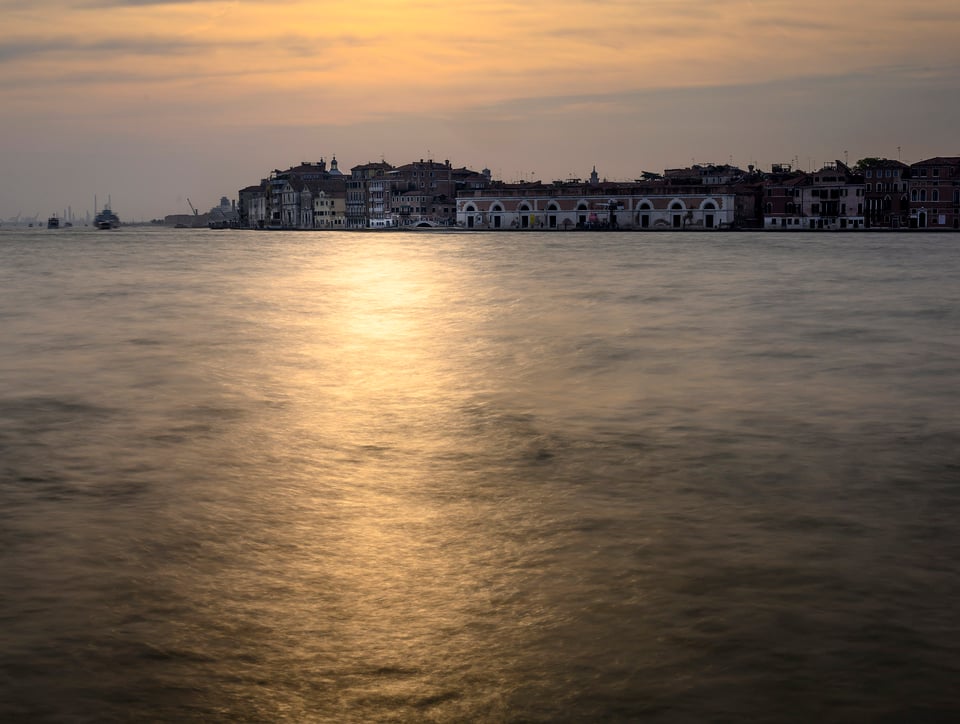
I’ve sneaked in another ND image looking across the Giudecca Canal towards a hazy sunset. The water seems positively metallic but still retains texture from the relatively short exposure.
Nightfall
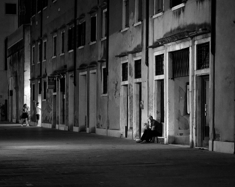
The Giudecca Island is also an excellent place to spend the evening, walking the wide promenade, eating an open-air meal with views back to St Mark’s square, then finding atmospheric locations for night photography. Generally, I find black and white works best for night images, although as you’ll see below I did once stray into color.
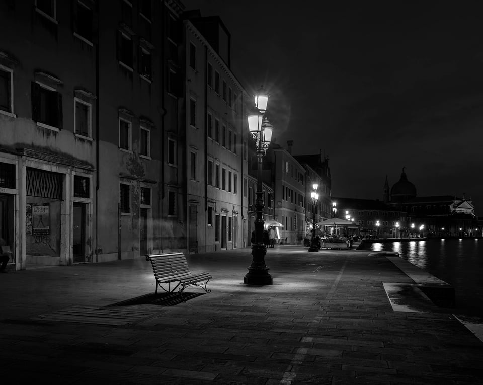
NIKON Z 7 + NIKKOR Z 24-70mm f/4 S @ 31mm, ISO 64, 10/1, f/8.0
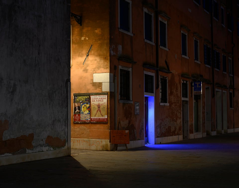
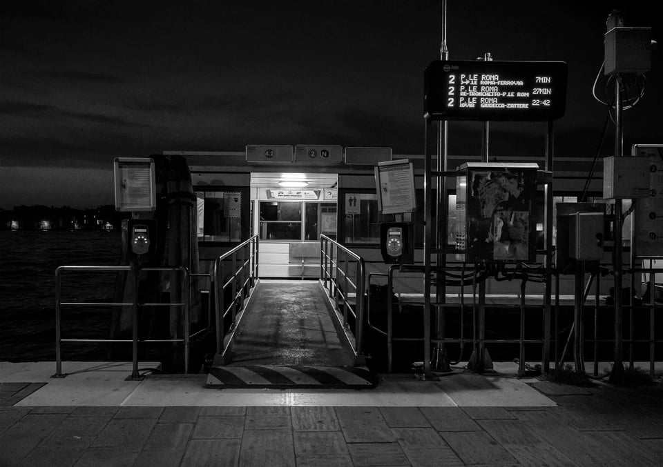
NIKON Z 7 + NIKKOR Z 24-70mm f/4 S @ 55mm, ISO 64, 5/1, f/8.0
Here is a lonely, atmospheric, water bus stop. It’s only 10pm but even in normal times these landing stages away from the centre are often empty by then.
This was the most challenging image technically. At first sight it looks straightforward, just pop the camera on a tripod, line it up, and check the exposure in live view. Yes, but the “bus stop” is a pontoon rocking up and down on the canal, so even a 1/1 sec exposure is going to be blurred. All I could do was crank up the ISO and hope that f/5.6 would retain enough depth of field. I took a few – this was the only one that was sharp enough!
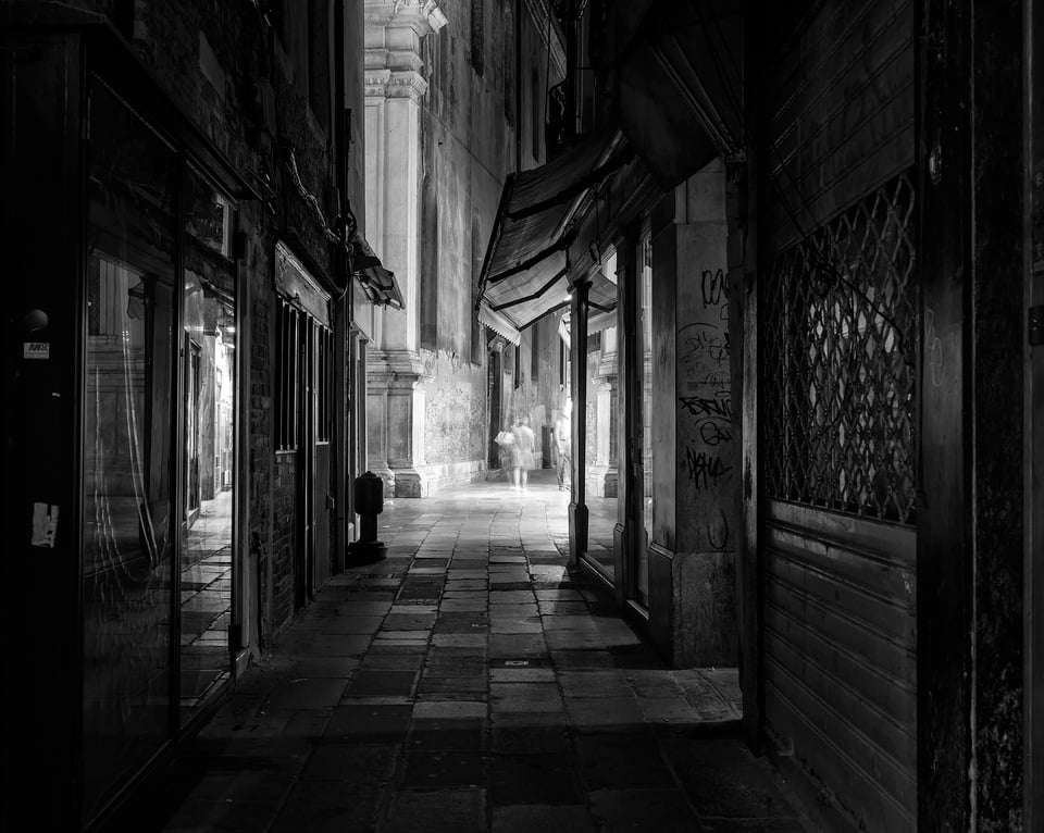
Walking back through the shopping streets behind Piazza San Marco, ghostly images of a few stray tourists in a pool of light contrast with the solidity of the paving slabs and sharp reflections in shop windows.
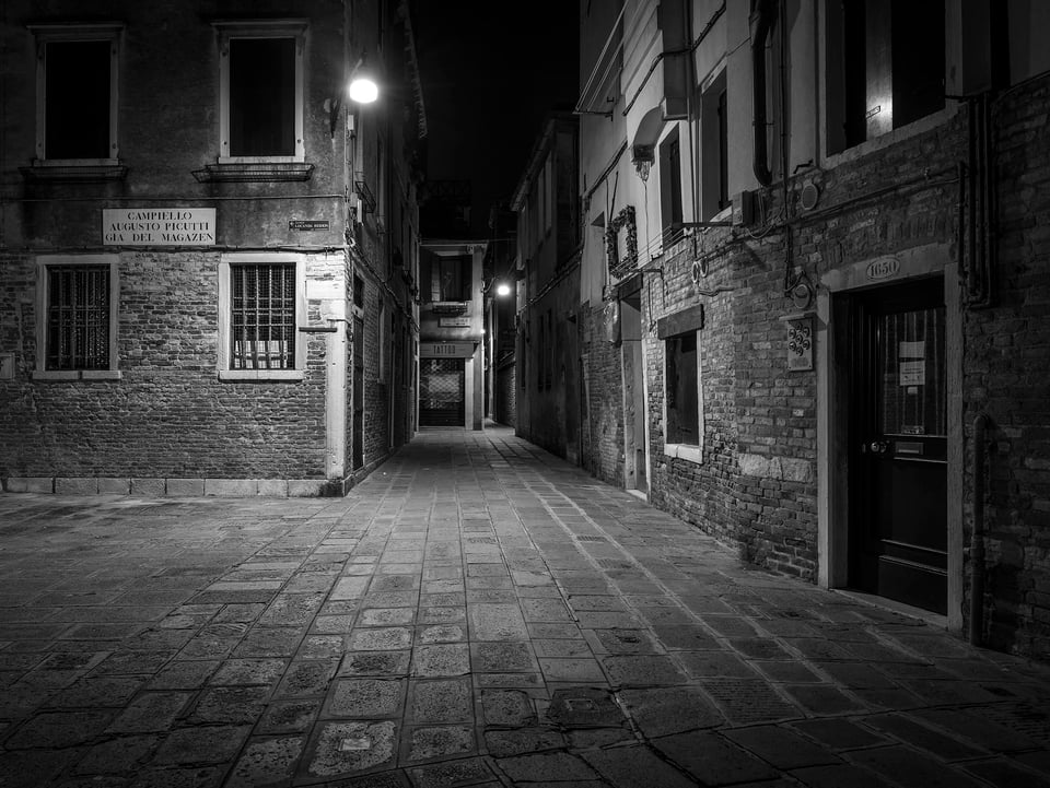
Almost midnight now and the city is really deserted:
A New Day
Just before and around dawn is a wonderful time for photography in Venice. Almost no-one around and soft pre-dawn light followed by a hazy sunrise. There is a downside though in June at least: it’s starting to get light just after 5 am so a very early start, and worse, I couldn’t find a cafe open until 8 am!
The Piazza San Marco and the Piazzale that runs off it are normally thronged with people. But at 5.15am there are lots of photo opportunities I would otherwise just rush past through the crowds.
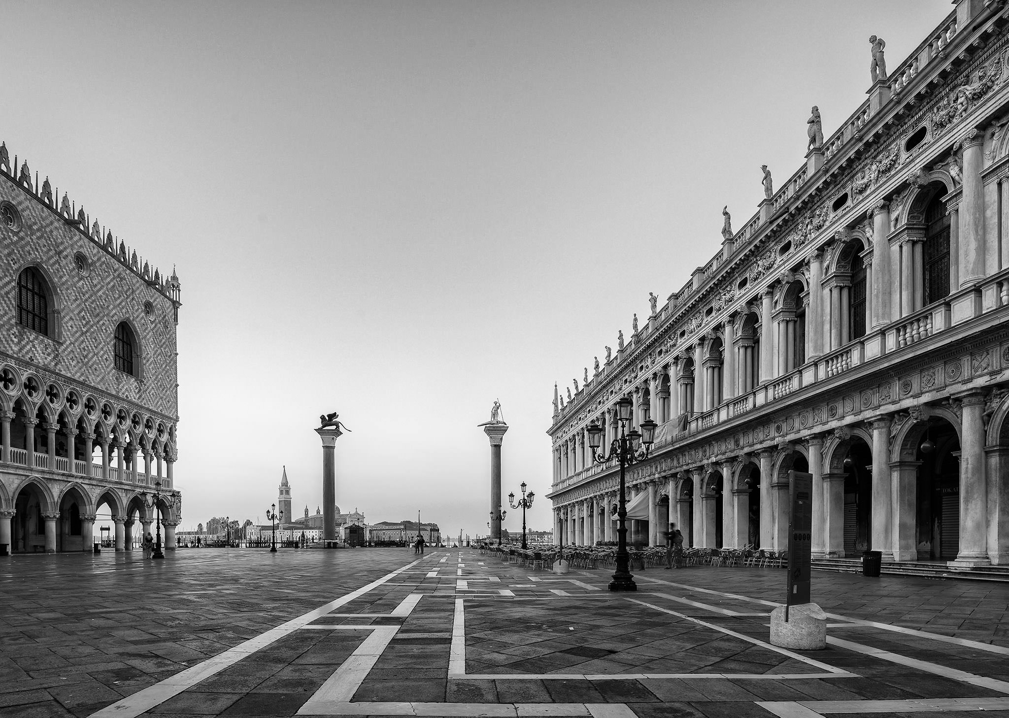
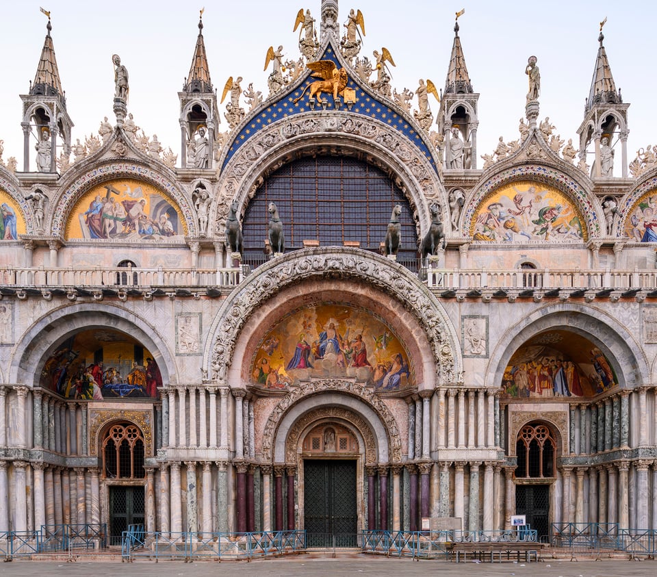
NIKON Z 7 + 19mm f/4 @ 19mm, ISO 64, 1/2, f/8.0
A rare sight – no queues in front of St Mark’s Basilica. I’ve kept this one in color for the mosaic over the doorway. The mosaic is just a taster for what’s inside: over 85,000 square feet of gold-encrusted mosaics!
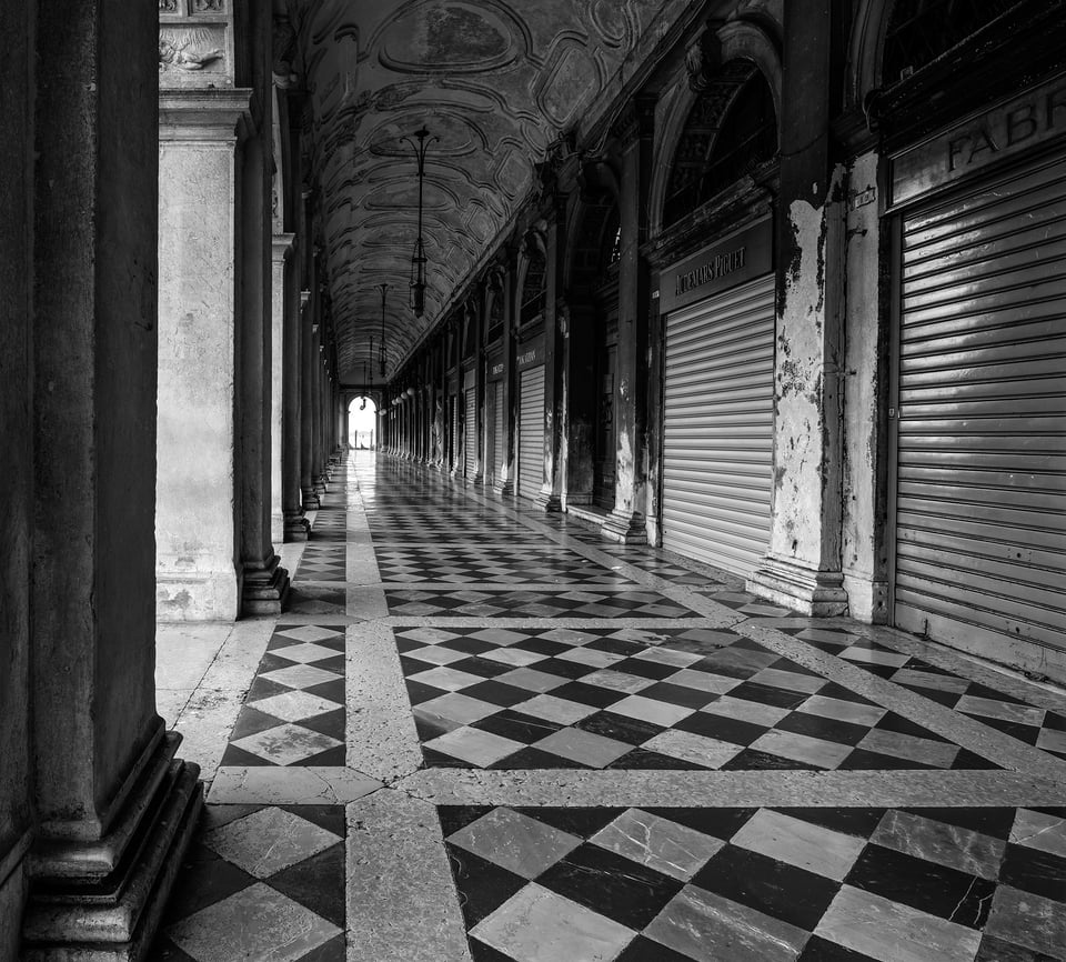
Fun with perspective and a beautiful but simple marble arcade floor:
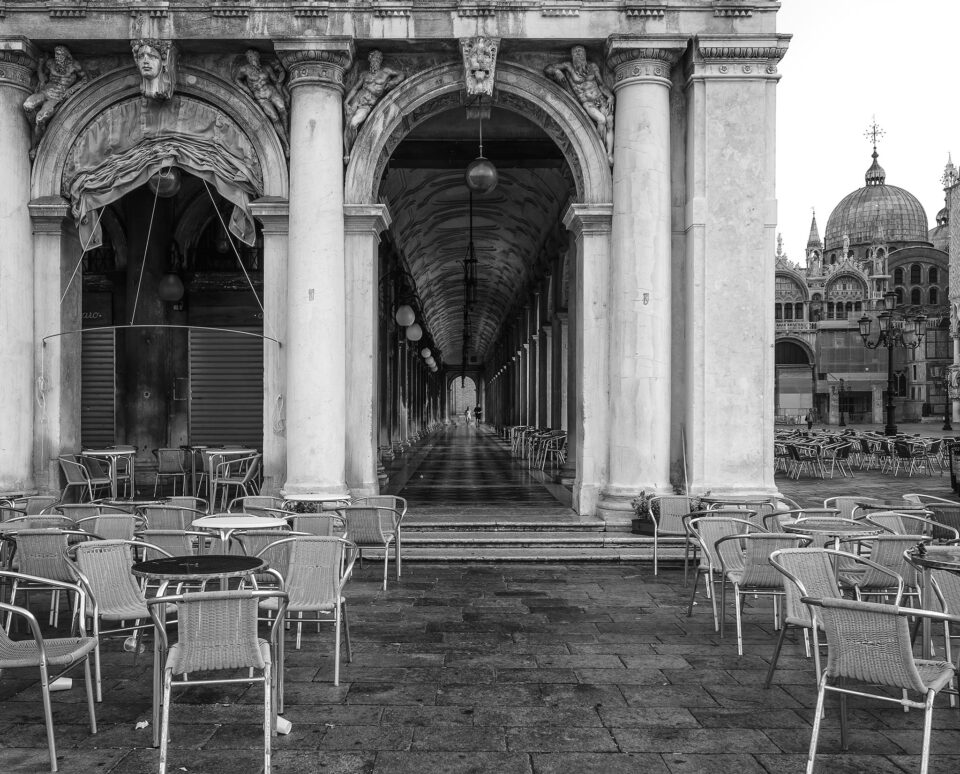
Empty cafes, colonnades and the onion domes of St Mark’s Basilica:
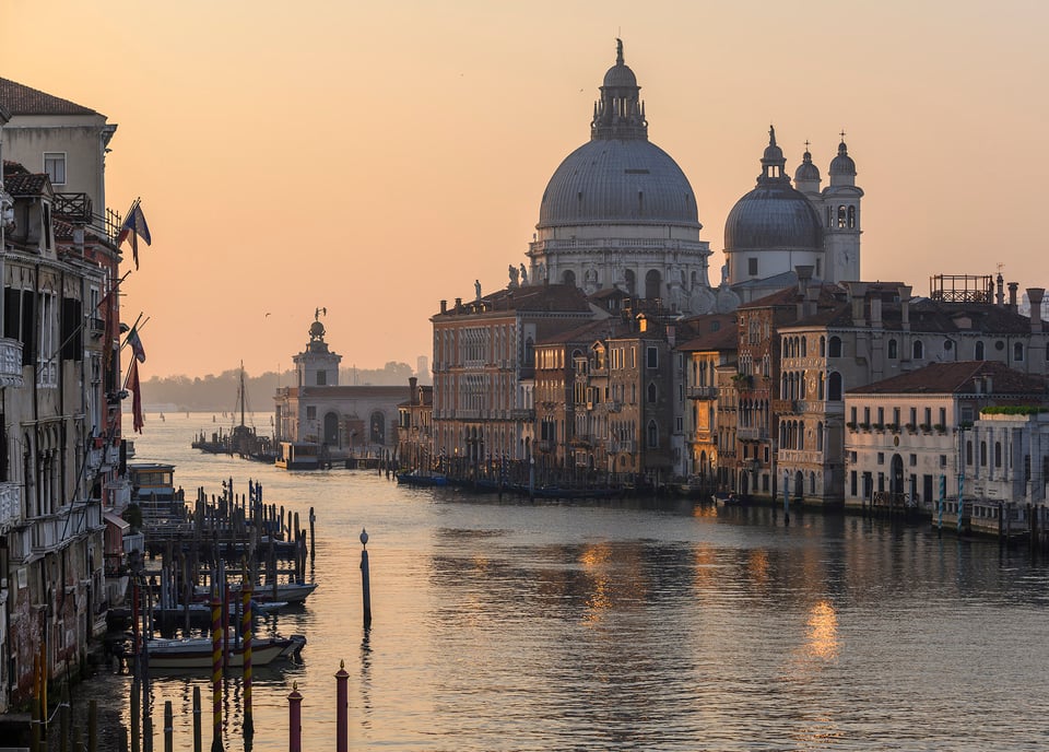
A short walk from the Piazza is the Accademia Bridge, famous for its classic view of the mouth of the Grand Canal with the imposing dome of the church of Santa Maria Della Salute. It’s almost 6 am now and the sun is just rising, creating a soft, golden, light. An uplifting end to a packed trip, and a positive note to end this article in these difficult times.
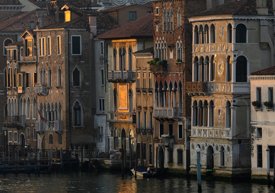
Of course I was not alone here: several photographers already had their tripods pitched. So lovely as the wider classic view is, I focussed more on trying to capture the golden highlights on glazing and the deep rich tones in the detail of the buildings. Here again the extra pixels of the Z7 gave me considerable room to crop without any loss of quality.
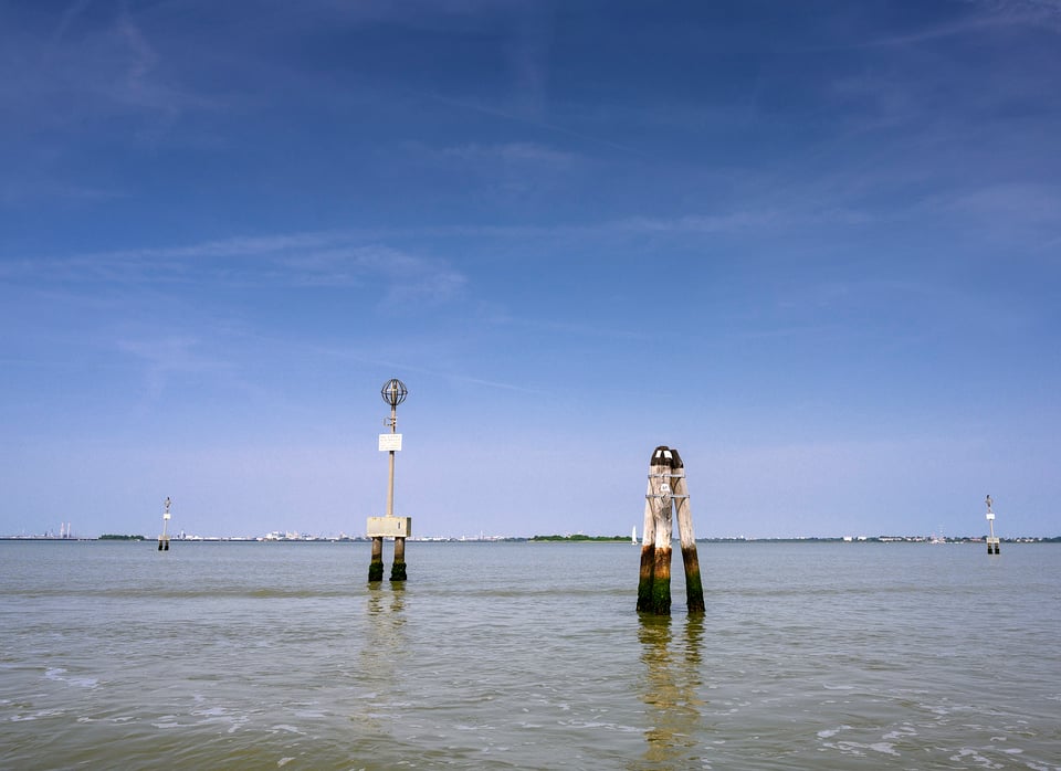
Goodbye Venice…For now. The last image was taken out on the lagoon on the boat trip to the Airport. Beats an airport bus or taxi any day!
Thank you for taking the time to look at this post.
This article has been submitted by our reader David Nash. To see more of his work, please visit his website.
I have 13+ Nikon lenses, including my lovely 20mm/F1.8G, however, I am moved by your 19mm PC lens. It solved the distortion problem ordinary photographers encounters when taking pictures in Venice and other locations. Brave! I’m planning to visit Venice the 3rd time, next year, if the situation permits.
Love the photos. Nicely done. My only visit to Venice was a 2 day weekend spent some 40 years ago when I was in college. I sincerely hope to get back there before I leave this earth…
David: These are the most elegant and beautiful urban travel photos I’ve ever seen. They take my breath away! Both the color and B&W are stunning. So simple, so satisfying.
I recently sold my D800 and replaced it with the Z7 with which I’m totally happy. Was hoping to keep it light and not spend too much on lenses (I have the Z50/1.8 and a Nikon 20mm 1.8 I use with the adapter and a 24-85/f4 I also use with the adaptor), but you’re convincing me to get the 14-30 and the new 70-200.
Thank you for these gorgeous images.
Thanks very much Kathleen for your very generous comments. But Venice is so photogenic in many different ways and I do know it well.
Glad you’re enjoying the Z7. None of the above were taken with the 14-30 as I didn’t have one then – wasn’t quite sure about it and also thought 24-70 plus the 19mm was wide enough for me. But then I bought a 14-30 for trip to South Africa last month, sadly cut short, but was very impressed with the lens for the few days I used it. Light, sharp and lovely colour & contrast. Wish I’d bought it sooner! But the 24-70 is excellent too…..
Nice to see pictures of Venice, thanks. I visited years ago and still relish the images from that trip as they reflect the city’s vibrancy.
I do notice, however, that unless your pictures have strong converging lines that the images are relatively flat. Do you attribute this flatness to the Z lenses or Z sensor?
Thanks Marco
Do you mean flat as in 2 dimensional (in contrast to ones with converging vertices) or flat as in low contrast?
Either way, me not the lens or sensor! When photographing buildings I tend to go to 2 extremes – either dramatic perspective or very 2 dimensional. I suppose I’ve always liked things geometric and for this type of subject I look at arranging simple shapes within the frame, and often that takes the form of very flat 2 dimensional compositions. I also like occasionally using a telephoto for that purpose – ie compressing/flattening the perspective like the 3rd last image.
A wonderfully inspiring series.. thank you for putting this together and posting it. It is possible to learn so much photographically by looking at these quality images and reading your commentary.
That’s very kind David – glad you enjoyed
Thank you for some great images. We have a return trip still on the books for late September but I don’t know if we will make it, what with the world as it is today. Your photos have reminded me why I wanted to go back.
Ah. I cannot forget venice, 3 times i got lost in those streets and met other tourists on the way who were similarly as lost as me, so great.
It must be my browser or something, because I just don’t see any picture worth keeping. Could you guys please point out which picture in particular is “excellent”, and why?
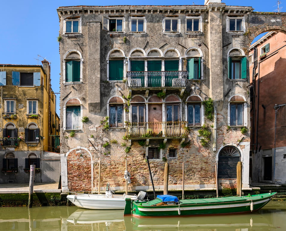
The only photo that caught my eyes was the fourth from top with the green boat in olive green water in front of a house with green shutters and green plants growing on the wall.
But if I would have taken it I would probably also have tried, if possible, to move a few meters to the right to make sure the boat would be seen fully in front of the house, even though the house then would be seen from a not straight angle and made sure to crop out surrounding buildings in post production just to concentrate on all the green areas and nothing else distracting the view.
So nice but no cigar. As for the other photos most are also not my piece of cake.
Maybe for the exception of the photo of a square with a couple sitting in one of three red benches and with a couple of red pieces of clothing hanging out from a window above them.
But it needs heavy cropping. The shadows at the bottom must mostly be cut away, leaving just a tiny bit of ground under the feet of the couple. On both sides cuts must be done leaving the space of roughly the half length of a bench on each side of the benches without people. Finally 30-40% of the top of the image must be cut. Just too much sky.
In the end what is left is less than 50% of the original image. If we also consider the image presented is already cropped(!) what remains for what I consider a good image is just around 45%!
That is a lot of wasted sensor area! For the cropped image area a 28mm lens would have been just about perfect!
Thanks for taking the time to analyse and comment! There are always lots of compositional choices its good to debate them. Yes, for example I could have done a tighter crop fir the couple sitting on the red bench, but I wanted to keep the bridge on left and I certainly wouldn’t want to crop out any of the sky but that’s a matter of taste! The one thing I would change is the shadow you refer to.
Lovely photographs David. Thank you for sharing them; they have me yearning for the possibility of travel again. Your night shots are particularly evocative.
As a fellow tilt-shift addict, it’s always comforting to read commentary on the experience of others with these Nikkor PC lenses for architecture. I note your comments on a desire for a tighter field of view than what the 19mm provides in some instances. Out of interest, have you tried adding a teleconverter to your 19mm PC lens? I use a Kenko 1.4TC with mine, thus achieving an approx focal length of 26mm. The teleconverter is nice and small enough to just keep in my pocket and throw it on when I need it. Obviously there’s the usual caveat of a small loss of sharpness, but I’ve found that while the sharpness at the edges does diminish a little, it still yields a much better/sharper result than the comparatively crappy 24mm PC-E when shifted.
I own five TS lenses: 19mm, 24mm, 28mm, 45mm, 85mm. They’re my bread and butter. Coupled with the 1.4TC that gives me a further 5 focal lengths if needed. I use all of these lenses day to day shooting here in my home town, but couldn’t possibly travel with them all. So when carrying gear on a plane, I need only take along the 19, 45, 85 and the TC. The older Nikkor 85mm PC is still super sharp on my D850 and is often useful for generating more detailed, in-camera-straightened shots to compliment the wider shifted images. This way I rarely need to crop, and am gathering images at their maximum resolution.
Thanks again for your post and great pictures!
Thanks Ben for your comments. I wish I’d taken more night shots but to be honest I was pretty tired by the ned of the day!! And that’s a serious collection of tilt shift lenses!! I’ve never thought about using a teleconverter but I have often thought about buying a used 45mm.
Hello David,
these are really fantastic, atmospheric photos. I have long wanted to travel to Venice again. But I always put it off. I have to confess, I haven’t been there for 50 years.
Your report will put Venice at the top of my list. I think this will probably last until next year. I hope Corona is over then.
Thank you for your great travel impressions and for your technical information. I noticed that almost all of your photos were taken at aperture 8. – Maybe it’s the right compromise.
Regards, Rolf
Thanks very much Rob and glad I’ve inspired you to return! Just make sure you avoid the busiest times and places – there are now serious crowds that were not there decades ago. You could even try late February after the Carnival – that can be very quiet.