I saw an earlier article on Photography Life about photographing the city of Venice (Venice – The Most Beautiful City in the World by Alan Mosley) and felt inspired to write one of my own. I, too, find the city to be inspirational for photography, especially architectural work. Moreover, I enjoy photographing Venice in black and white, which I find captures certain elements of the city with more emotion – the atmosphere, the light, the texture, and the patterns. That is my purpose with the photo essay below.
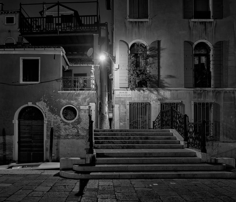
Table of Contents
An Early Morning Stroll
For me, there’s nothing pleasant about a 4 AM alarm. At first. But then there is a special magic to walking through Venice’s deserted alleys, over empty bridges, water lapping gently against worn marble quaysides, when it’s still dark. Almost no-one out and about, just the occasional all night water bus and polished wooden taxi launches heading across the black lagoon to catch an early flight.
That is how this photographic journey through a Venice day begins.
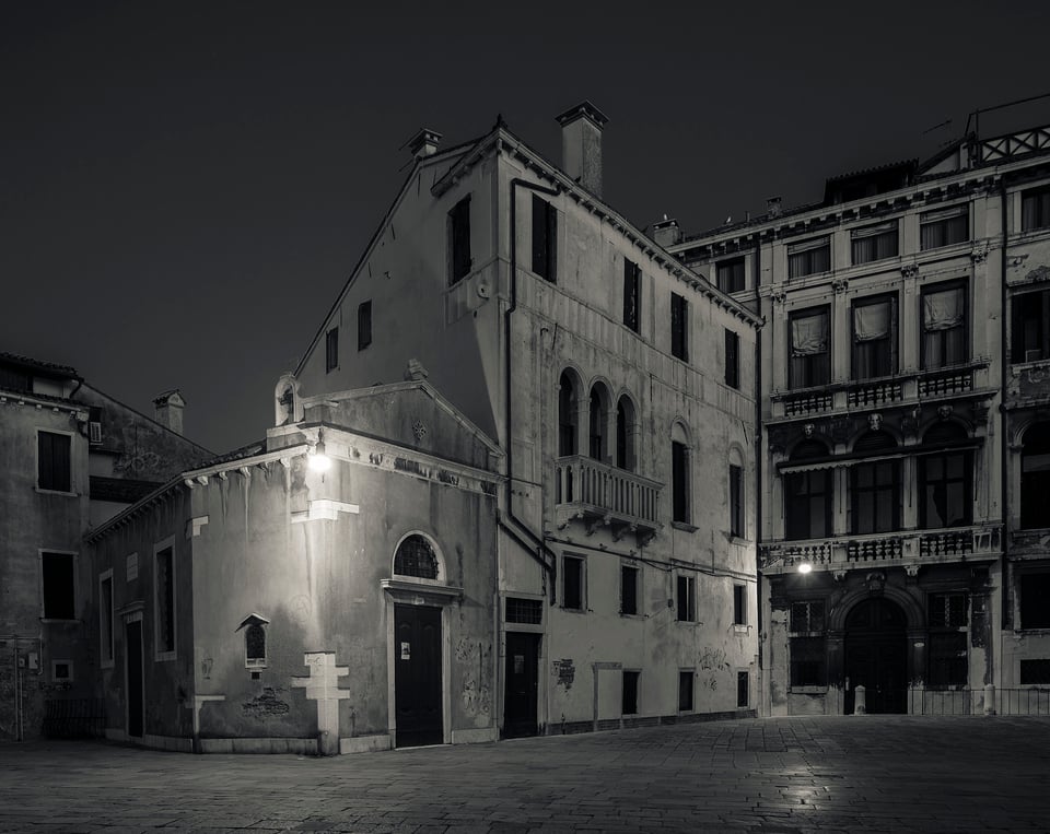
Although I enjoy photographing Venice in color, there are a few reasons why I chose this photo essay to be entirely in black and white. Partly this is to complement the color images in Alan Mosley’s post, but it is also for the creative reasons I mentioned in the introduction: black and white emphasizes composition, lighting, tonal gradations, patterns, and textures in a way that just seems made for Venice. Below, I have also tried to present the sheer range of photographic interest Venice offers, from iconic architectural masterpieces and classic views to the atmospheric and the less frequented corners.
But I have to admit to slight cheating: although presented as a day from before the dawn to late at night, these images were actually taken over a number of years, with a range of cameras.
Around St Mark’s Square Before the Crowds
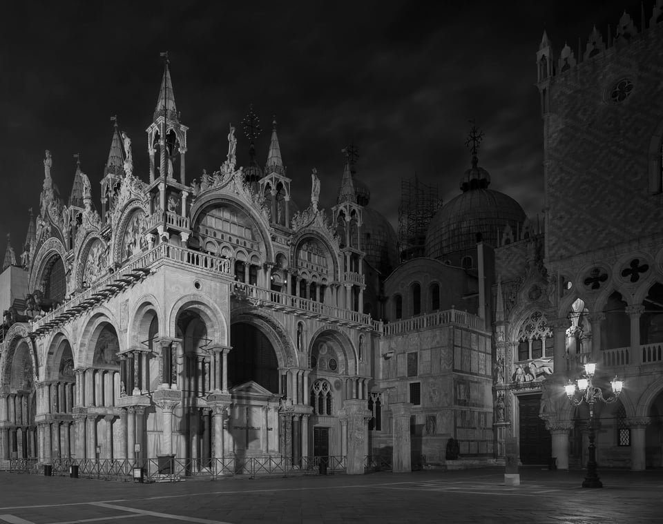
St Mark’s square is less busy than usual at 5am. In fact, there’s no one there at all. Just a few pigeons. And me with a tripod and the wonderful Canon 24mm tilt-shift lens. Below is St Mark’s Basilica, the floodlights illuminating the extraordinarily detailed facade, with an iconic Venetian street lamp thrown in for good measure…
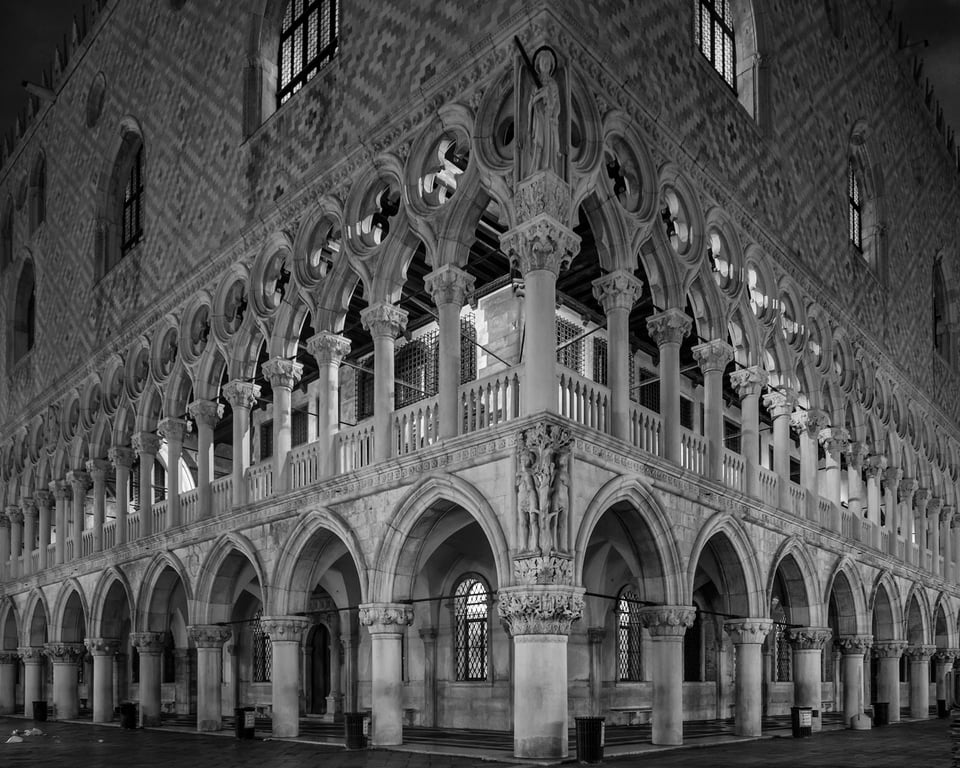
Just a few steps away is the Doge’s Palace, taken up close and low to emphasize the perspective.
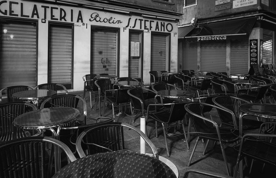
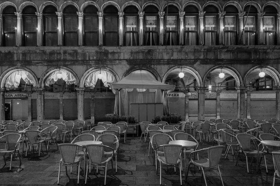
Plenty free seats in the very expensive cafes… I love the light on the aluminum chairs and the symmetry of the arcade.
Early Morning Light
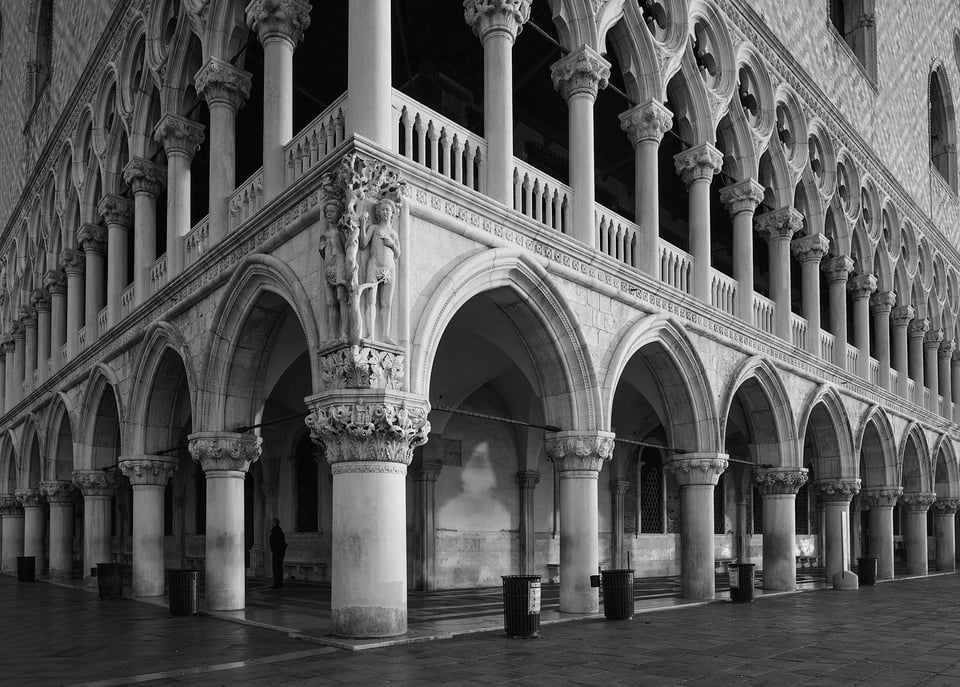
6.15 am, October. The sun comes up, the first rays catching the east facade of the Doge’s palace, picking out the intricate carvings and the figure above the corner column…
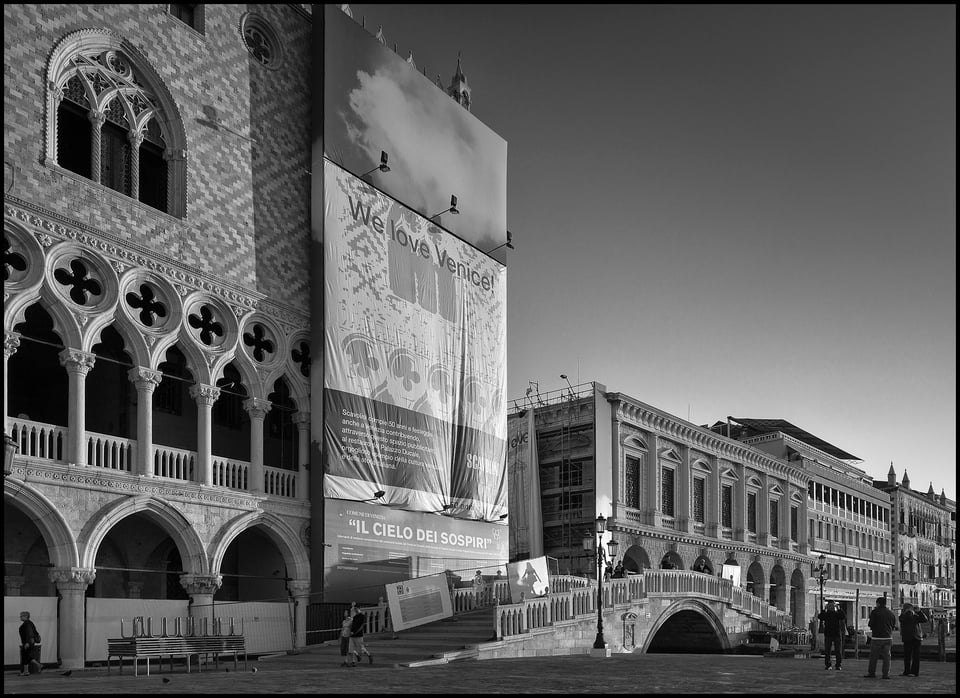
…and a few minutes later catching the “we love Venice” tarpaulin covering building works on the corner of the narrow canal leading to the Bridge of Sighs against a perfect sky.
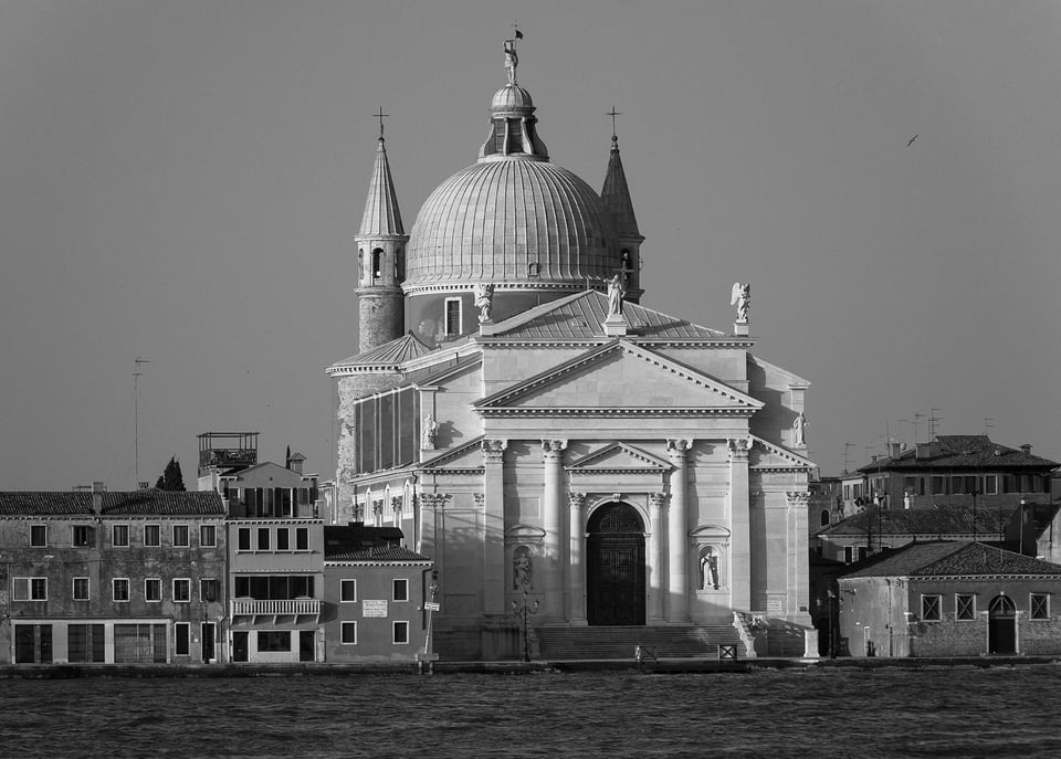
By 6 AM on a June morning, the sun is still low enough to create long shadows and etch the detail in Palladio’s masterpiece of harmony and balance, Il Redentore, completed in 1592. One of Venice’s visual fascinations is the way iconic set piece buildings are juxtaposed against slightly faded houses and commercial buildings. Here the Redentore is flanked by simple quayside housing, providing interesting tones and textures to complement the dramatic sunlight catching the white marble facade and accentuating the curves of the dome.
The Giudecca Canal
The Giudecca Island is less well know, but my favorite place to stay in Venice. Not only does it have wonderful view across the broad Giudecca Canal, but on the city facing side there is a wide promenade running the entire length, a good mile or more. Great for exercise and equally great for setting up a tripod in no one’s way.
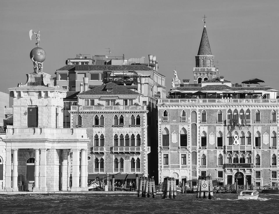
I love composing dramatic perspectives, but a long lens is great for arranging simple flat shapes. This is taken from the east end of the Giudaecca looking across to the mouth of the Grand Canal, a study in bricks, tiles and the unique Venetian Gothic style of architecture.
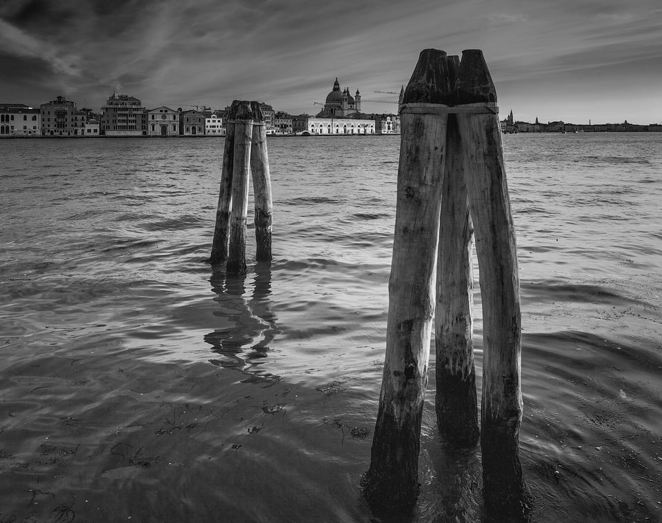
This is taken from almost the same location, tilt-shift lens shifted down to focus on the foreground water, the low sun adding contrast and catching the distant facades.
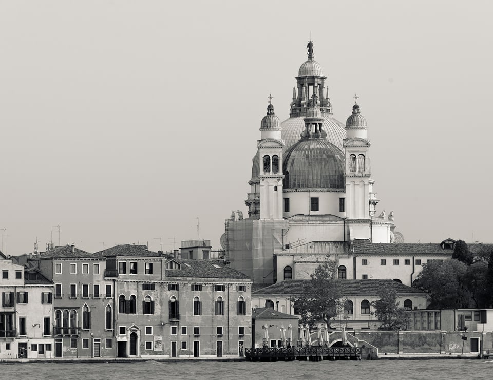
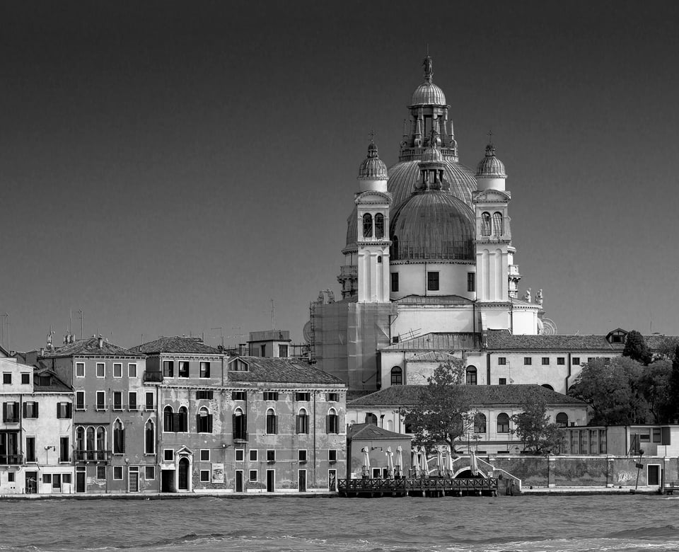
By mid morning, the view back from the Giudecca is evenly lit with few harsh shadows. Yes, this lighting is less dramatic and three-dimensional, but with a little clarity increase on Lightroom there is still plenty of detail. Here is the rear of the church of Santa Maria Della Salute, more usually seen from the front in the classic Grand Canal view from the Accademia bridge. I had fun finding a spot that perfectly aligned the two domes, emphasizing the symmetry of the otherwise complex shapes, contrasting with the simple facades to the left.
I’ve included two versions processed to give a very different feel. For me, this is one of the attractions of monochrome versus color: usually far more scope for creative post processing than there is with color images. The first version is quite soft, with a slight split tone: warm midtones and highlights set off by cool shadows and blacks. The other version is pure monochrome with a strong gradient filter, reduced saturation on the sky, and more contrast. Take your pick:
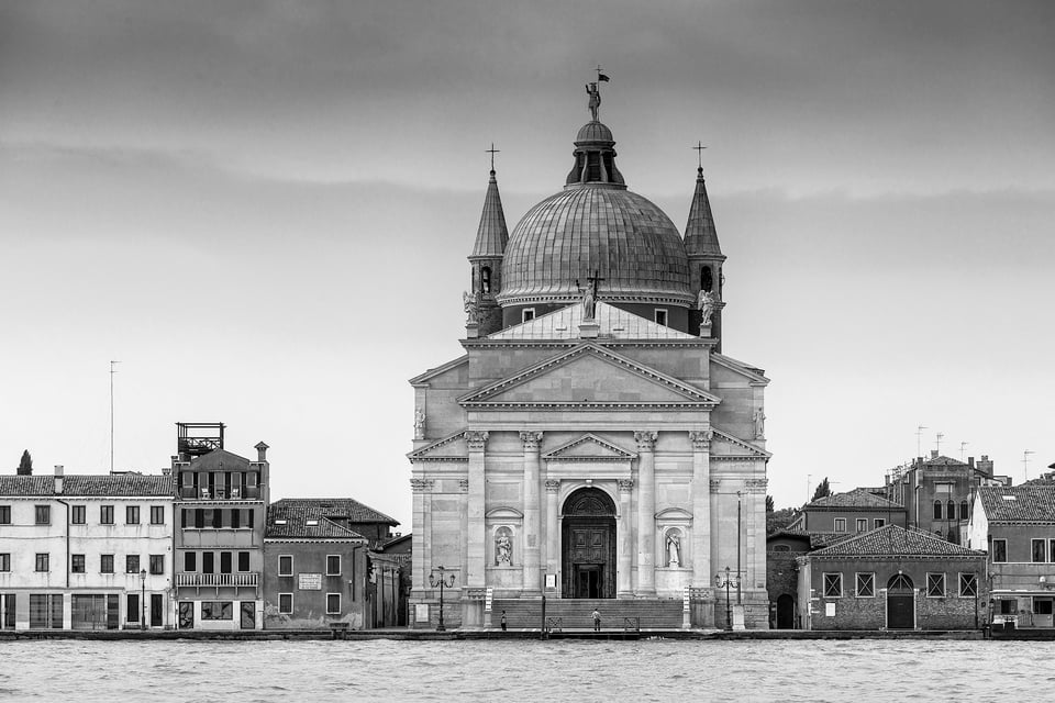
A short waterbus trip across the Giudecca Canal takes you to the Zattere quayside, with views back to the Giudecca Island. Here is the Redentore church again, formally posed this time to emphasize the beauty and geometric simplicity of Palladio’s facade, dome, and flanking towers.
Classic views: The Grand Canal
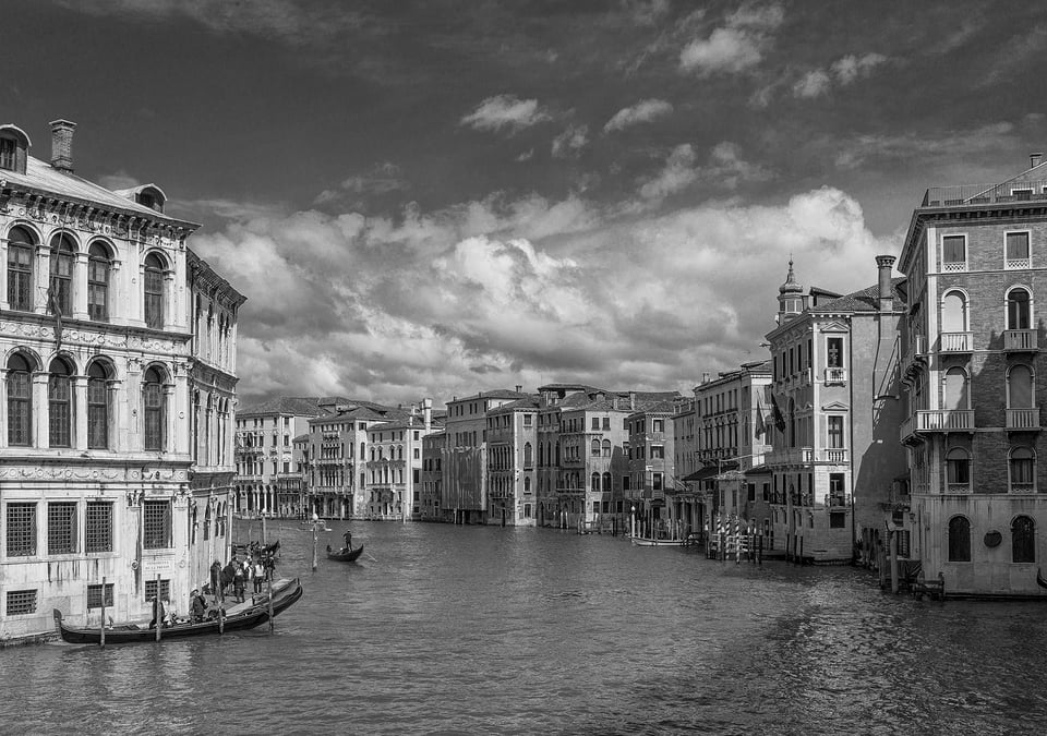
Hackneyed it may be, but the Grand Canal is still a wonderful photography set. First, it is lined by Venice’s grandest domestic architecture, mostly unified in style but all different in proportions, dimensions, details, and colour. Second, it is broad and follows a long S-shaped curve, so every view is wide and changing. Yes, Venice is traffic free, but the challenges here are minimising water buses in the foreground and finding a place to access the water; there are few quaysides to be found, except around the station and the Rialto Bridge. The best bet is often the pontoon water bus stops (but not the steadiest for long exposures: they float!).
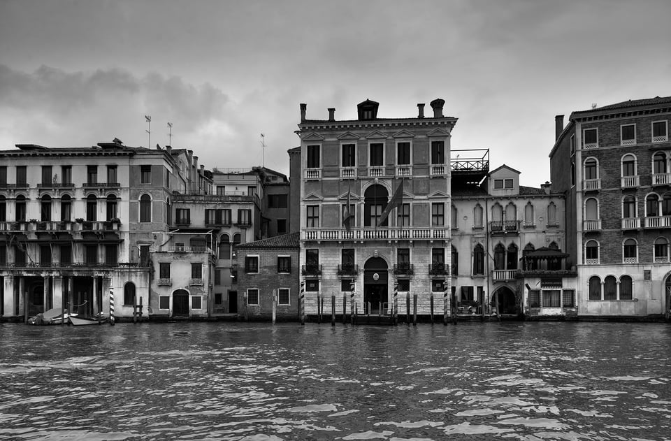
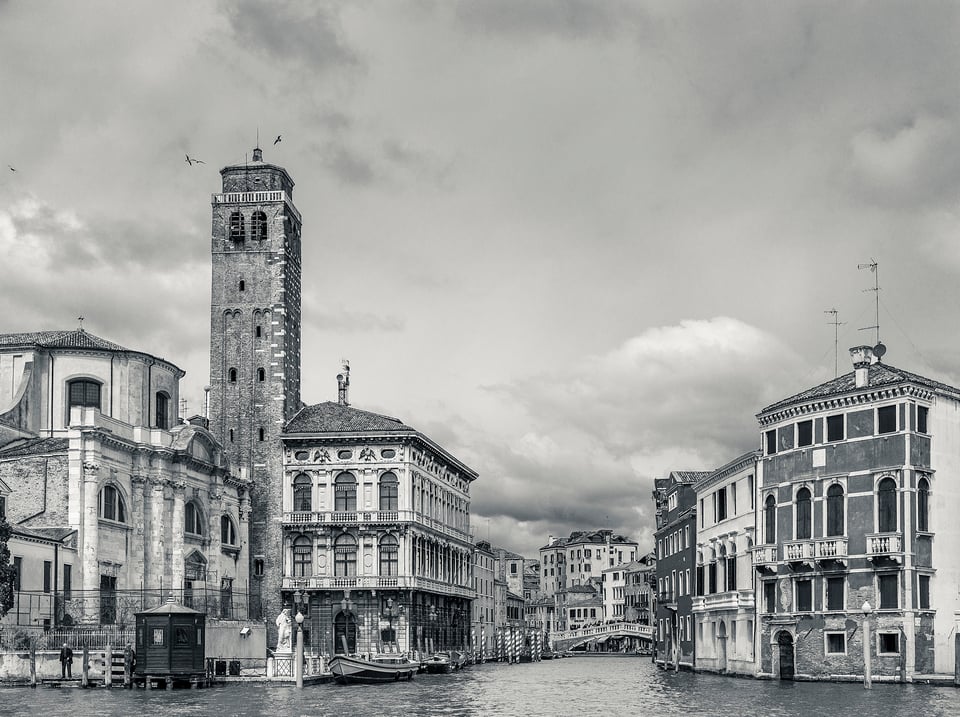
Here are two views across the Grand Canal, the first from the fishmarket quay near the Rialto bridge and the second looking down the Cannaregio Canal near the station, each processed differently to bring out different aspects. The first emphasises the atmosphere of a rather dull day through the darker midtones, as well as the unstructured jumble of different sized buildings. In contrast, in the Cannaregio Canal image, I’ve increased the exposure and clarity, and darkened the blacks, to focus on the detail and the lines of the complex receding perspective.
I make no excuses for including this timeless classic view from the Rialto bridge that most visitors will have taken. What drew me this time was the empty water, the texture of the clouds against an otherwise deep blue sky, and the sweeping curve of the canal leading the eye along the procession of palazzos.
An Afternoon on Murano
This visit, my plane was delayed a few hours, so I got off at the first stop on the water bus from the airport: the north side of the island of Murano. The south side (facing Venice) is a tourist trap, lined with glass factories. But the north end is a different story.
First (and foremost after a delayed flight) you can lunch on a quiet canal on lightly fried scampi and calamari washed down with chilled local red wine. Then, if you’re up to it, you can while away an hour or so setting up your tripod on spacious quaysides.
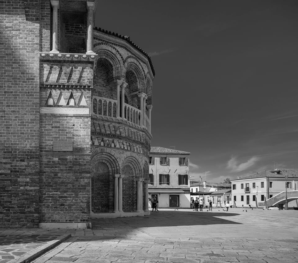
This is slow photography: tripod, live view, and a manual focus Nikkor 24mm PC-E lens. I know you can deal with converging verticals in Lightroom, but it’s just not the same as seeing the correct perspective in live view. Despite the extra weight, I use a geared tripod head for buildings. Not nearly as fast to use as a pistol grip ballhead, but much more accurate, and the precision is just part of the fun! (And slowness….)
Here is a side view of the apse of the Basilica dei Santi Maria e Donato, a symphony of elaborate brickwork and ornate colonnades. It was the wrong time of day to take the apse full on. Yes, I did have the Photographer’s Ephemeris app on my phone (check it out if you haven’t already) but I had only one night and other plans for the morning…
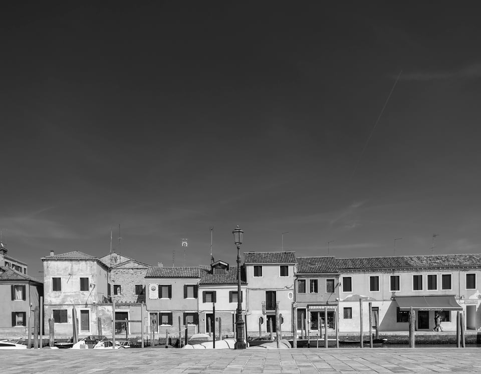
Here is the view from almost the same spot, but looking with the sun. No grand palazzos, just a photogenic row of unassuming houses facing a quiet canal.
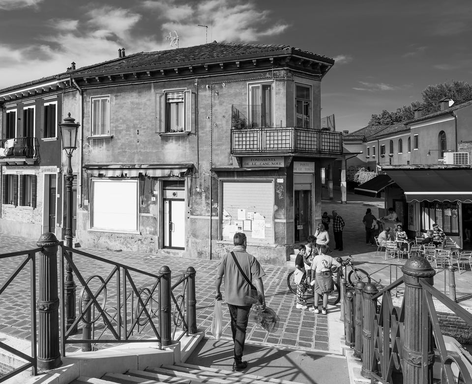
You may have noticed my Venice images are rather devoid of people. Partly this is because my main photographic intertest is the architecture and many of my images are early morning or late at night, but the reality is that most people in Venice are tourists anyway. Sadly, Venice is rapidly losing its population though a combination of soaring property costs and the practicalities of living a 21st century life in car-free and supermarket-free city. The resident population has dropped over the last three decades from around 120,000 to 50,000. The annual visitors now number around 20 million.
But Murano is one of the few areas where locals seem to live, and here are a few going about their business, playing on bikes and having a coffee. A busy composition that took a bit of trial error..
Off the Tourist Tracks
Even in summer, you can still escape the crowds during the day if you know where to go, or more accurately where to avoid. I rarely follow a map, preferring just to wander around getting lost. There are two key tricks. The first is to ignore the signposted routes; they channel hundreds of people along narrow alleys when there are often several alternative unsigned routes that are near-empty. The second is to keep away from the centre and the Grand Canal.
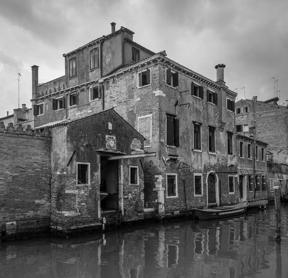
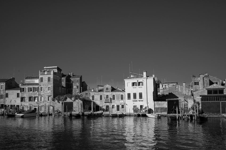
Here are two images from well off the tourist trail. The first taken to the north of the Grand Canal, the second right at the eastern tip of Venice. Neither show grand buildings, but both to me ooze crumbling charm and character.
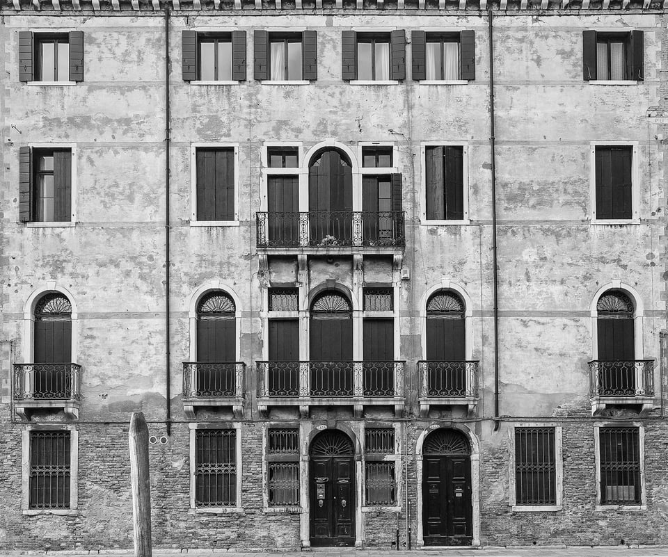
Here is a simple palazzo facade in a quiet square, Campo San Barnabo. Deceptively simple perhaps: look closer and there’s a lot of visual intertest in the ironwork and in the transition from the stucco exterior of the upper floors to the exposed brickwork of the ground floor. Even with the tilt-shift lens, composing this needed care to ensure the camera was centred on the central vertical axis. Otherwise the perspective on the end balconies would have been different (and not fixable in Lightroom!). I decided against sawing down the wooden mooring pole as it rather nicely balanced the lack of window at that point…
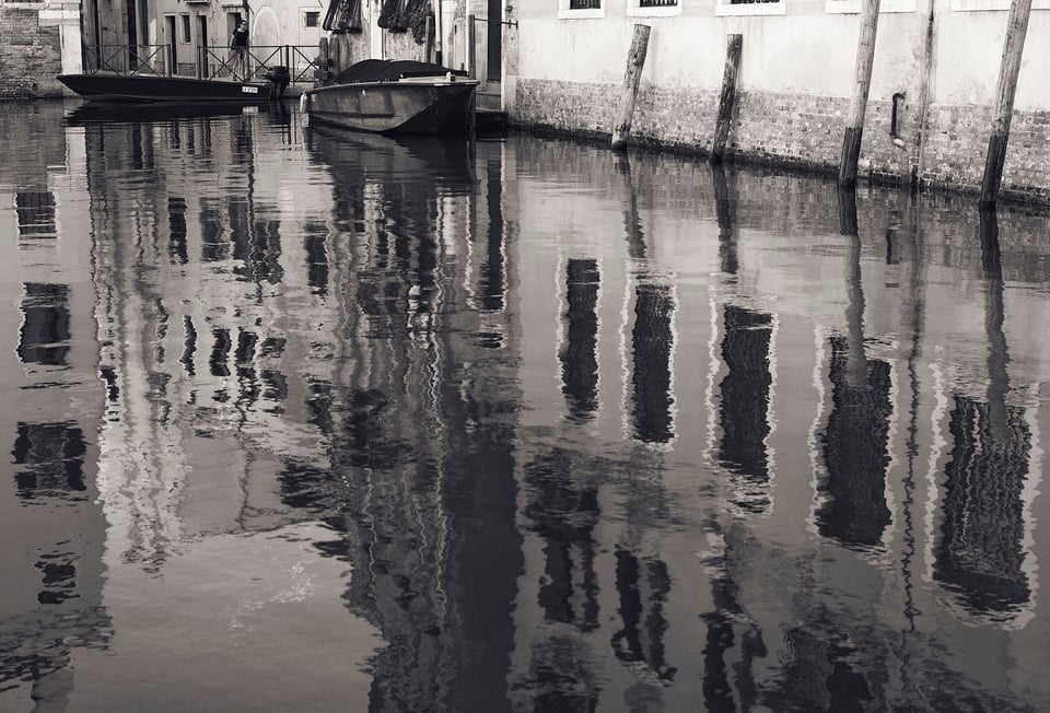
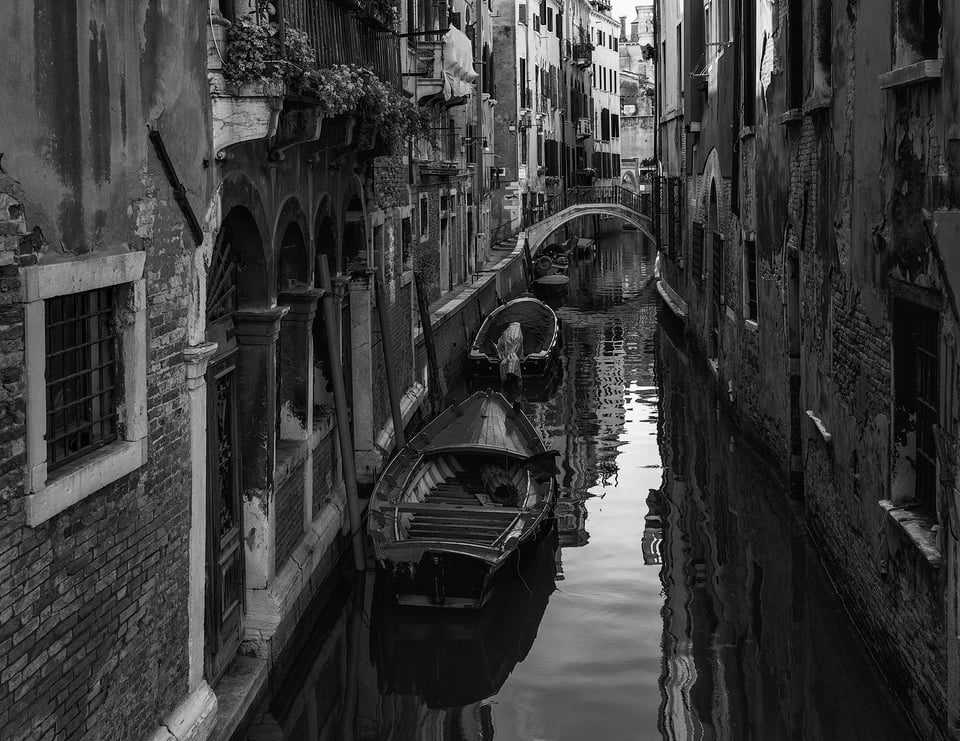
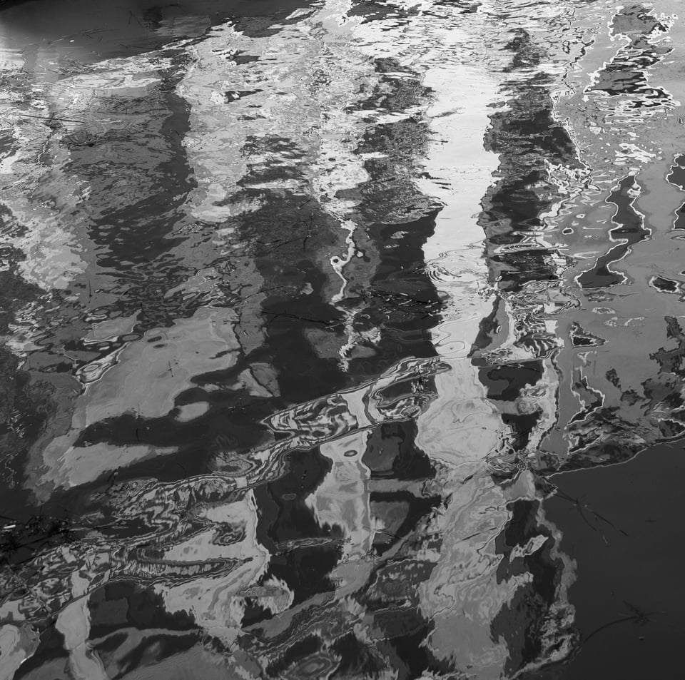
A collection of Venice images would of course be incomplete without some moody canals with reflections. Here are three examples, the first mostly water, the second mostly buildings and the last just reflections. Endless possibilities even in monochrome.
Nightfall
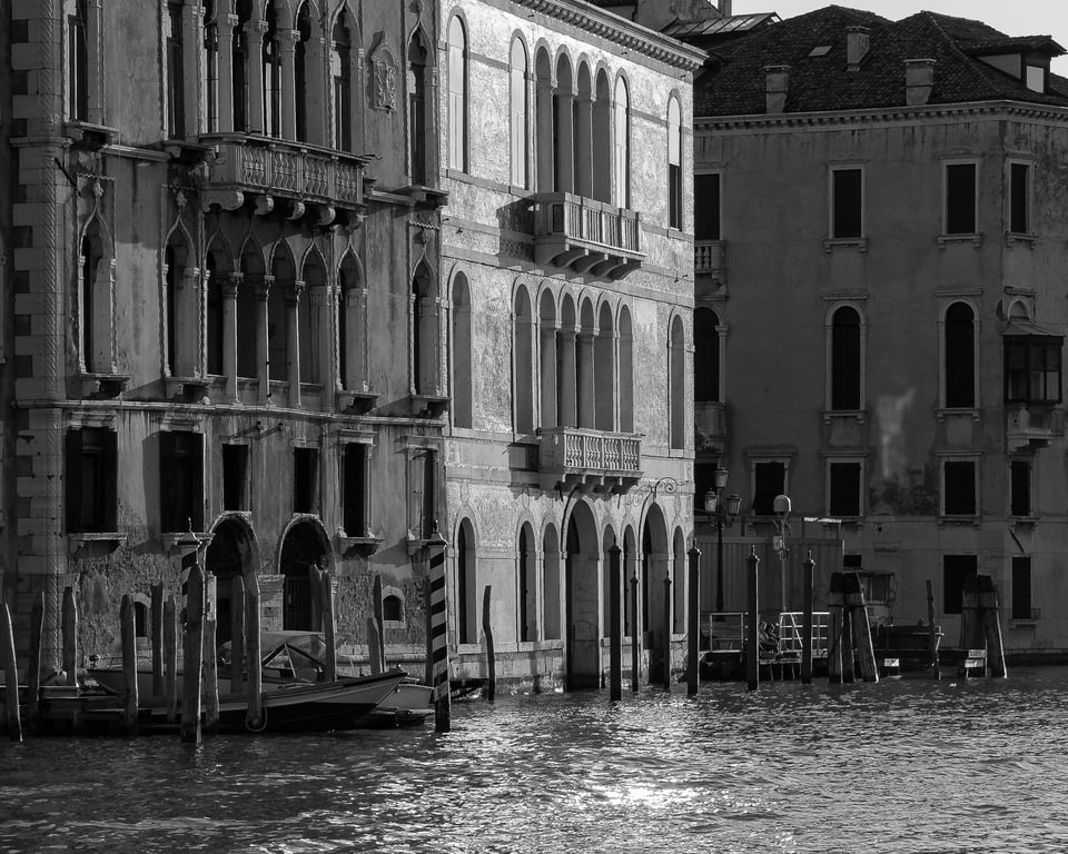
One of my very first digital images of Venice. Grand Canal Palazzo facade caught in the late afternoon sun (July, 7:30 PM):
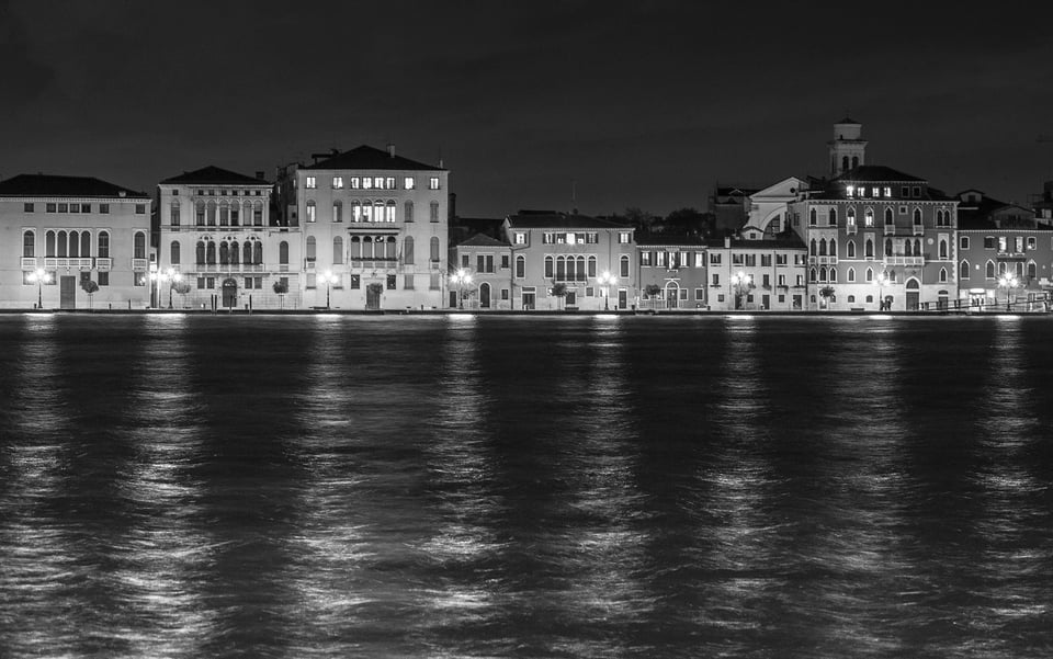
Back to the Giudecca Canal, looking across to the Zattere:
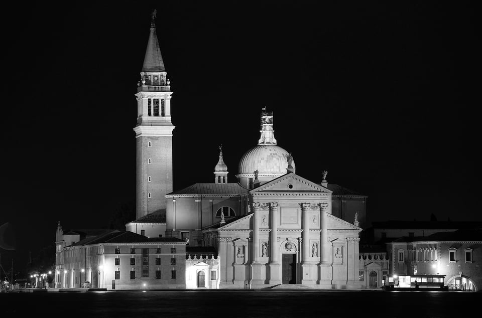
Here is the much-photographed San Giorgio Maggiore, set on its own island off the east end of the Giudecca. This is hardly the most original image, but I couldn’t resist the beautifully floodlit brick and marble exterior, and the campanile (bell tower) set against a pitch black night sky:
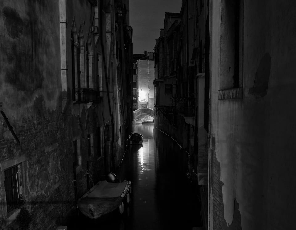
Last but not least, 11:30 PM, looking down a narrow canal to an artistically posed and lit bridge, the streets as silent and empty as my morning stroll. (With just a bit of help from the excellent dynamic range of the Nikon’s sensor!)
I’m hoping to return to Venice this year. “But you’ve tons of photos of Venice” my wife reminds me. True, but I’m always hoping to get better versions, and of course there’s my wonderful new(ish) 19mm Nikon PC-E to try out on the Z7…
Thank you for taking time to look at this post.
This article has been submitted by our reader David Nash. To see more of his work, please visit his website.
Beautiful images with composition and contrast. Also your commentary is informative.
Planning to visit La Serenissima this October and
since you discovered this wonderful city could you recommend a beautiful, quiet boutique hotel far from the maddening crowds to spend some concentrating hours to properly photograph Venice?
Ciao
Ron
Hi Ron
Thanks for your comments. Haven’t been for a few years and not sure your budget but I like staying on the Giudecca Island. It’s quiet, has a beautiful long promenade with great views…..
Lovely clear photos. One question, is pollution a problem with the canals?. For a lazy slob it looks to be quite easy to toss stuff out of a window into the water.
You definitely do not want to swim in that water!
Just magnificent, David. Thank you for sharing them.
As it turns out I just came back from Carnevale in Venezia. One of my favorite shots was also done in black and white. I must say while I really like your images very very much, having the colors of Burano so fresh in my mind, B&W seems less appropriate there than in the rest of Venice. In any case, great images. Thank you for posting this article.
Thanks for your comments. Totally agree Richard – I deliberately didn’t include Burbank images of which I have quite a few – they really do not colour with only you a few exceptions.
Burano!
Thank you for posting such lovely photos accompanied by such thoughtful commentary. Seeing your photos brings back so many fond memories of Venice.
I’m not an architectural photographer but find myself quite enraptured by your images.
The absence of people and the handling of the light give them a haunting quality.
Thank you.
Excellent images of one of my favourite cities. Thanks for sharing.
Thanks very much Spencer. Appreciated. But that’s what I’d say about your landscapes! And maybe you’ll take up my suggestion for an article on post processing the same image in different ways….
David, I’m a big fan of these photos and your attention to detail. Thank you for sharing.
David,
Agreed, despite my calibration efforts I have never found it possible to get a print looking even slightly similar to the on-screen view. Of course that is because of the different types of inks and print media used, not to mention screen brightness and room conditions. When I do get a shot worth printing up to A3, I find a huge difference between good-quality glossy paper, and top quality like Canon Pro-Platinum. At least matching image style to media type is far more fun than worrying about megapixels or 6-stop pushes!
Burghclerebilly
I would suggest that if you are finding it impossible to match screen to print then you need to revisit your calibration and stabilise your viewing conditions.
‘Normal’ calibration (120cd, 6500K, gamma 2.2 and around 0.09 cd/minimum black point) simply won’t work. Prints will always look too dark and lacking in contrast.
For print, to simulate the characteristics of paper, the calibration targets need to be set differently: 80-95cd, 5500-5800K, gamma 2.2 and black point around 0.3cd – that is lower luminance, warmer white balance and black point around 0.3cd to lower contrast. Not all software will permit this, but it drops the contrast ratio from over 1200:1 to about 300:1 which is about right for paper. It looks pretty muddy compared to a regular screen calibration but with a good printer profile, the soft proof on screen provides a pretty accurate preview of the intended print appearance. Some experimentation and test prints are needed to zero in the optimum targets for your particular set up, but when dialled in well, an extremely good match is achievable. I rarely need to make a second print other than for aesthetic tweaks.
Viewing conditions need to be standardised too.
So for a photographer working for both web and print, two separate calibrations are required.
Hope that helps.