Often when we are creating images, especially landscapes, we can get so focused on the main subject that we forget to think about incorporating a foreground element to help add depth and drama to our scene. There are a number of different approaches we can use. In this short article I’ll be illustrating three simple and effective ways you can incorporate foreground elements into your images. The first is something that I like to call a ‘bottom band’ during my landscape seminars.
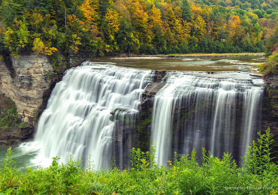
A ‘bottom band’ can be any kind of homogeneous grouping of plants, rocks, or man-made structure that sweeps across the bottom of our image. A ‘bottom band’ creates a base for the main subject in our image and forces the viewer’s eye to rise over it, and in doing so creates more depth to the image. Here are a couple of additional examples of ‘bottom bands’.

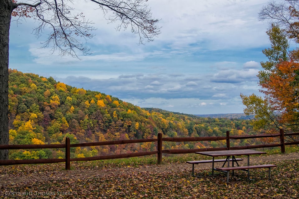
Another approach is the ‘reveal’. This is commonly done by using foreground elements on either side of the frame to create the feeling of a door or window through which the viewer must pass in order to see the main subject.

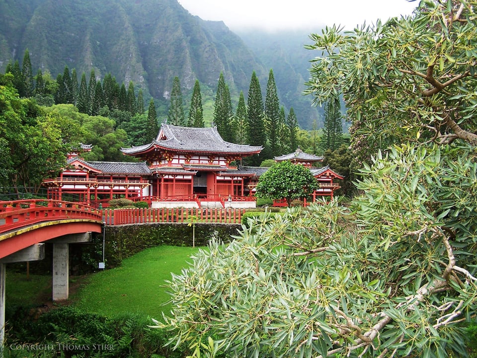
A ‘reveal’ can also be created by using only one foreground element, provided it is sufficiently large. These can be very effective if also supported by a strong leading line which takes the viewer’s eye deeper into the composition. In the following image the reveal is created by the green foliage on the right hand side of the image and the bridge entering the photo on the left serves as a leading line to draw the viewer further into the composition.
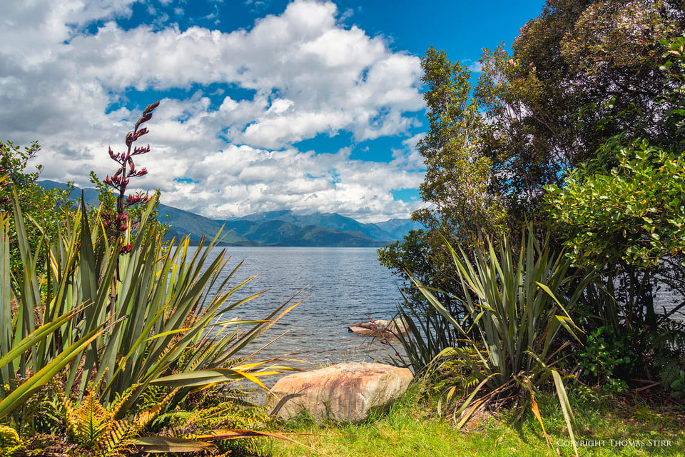
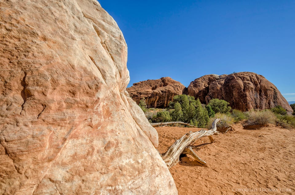
The large rock that fills the left-hand side of the frame creates the reveal in the next image. The weathered, dead tree forms a leading line to connect the viewer to the other elements in the image.
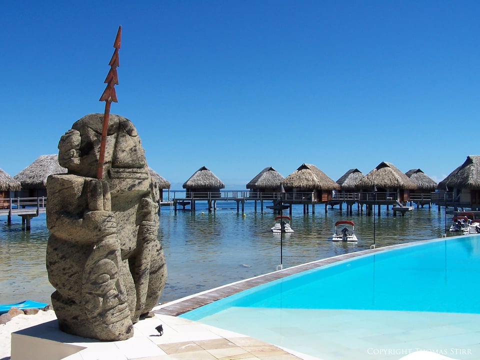
The final approach is one I refer to as the ‘corner anchor’. This can be any large element that resides in a corner of your image. Again, it can be man-made or natural. A ‘corner anchor’ can serve to create size perspective, and at times may even represent the main subject of your photograph as in the image below. You will also notice a strong leading line that serves to draw the viewer further into the image, and the splashes of bright blue on either side of the statue help to balance it visually.
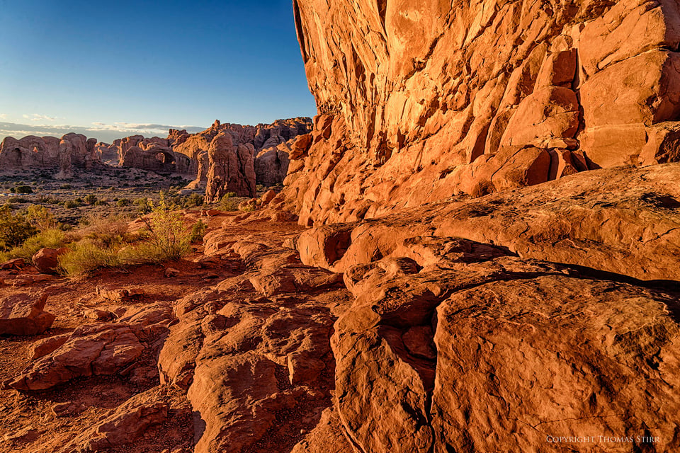
Some corner anchors can be dramatic and dominate an image. In this next example the corner anchor forces the viewer’s eye off into the distance where the blue sky offers visual relief.
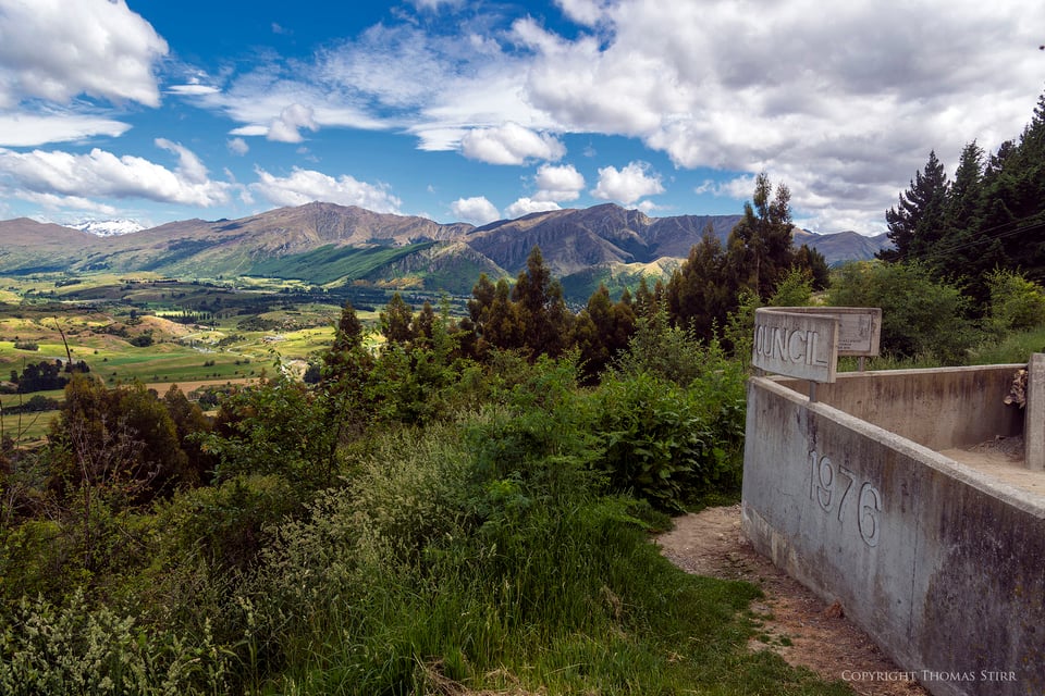
Some corner anchors can do dual service and also act as a strong leading line for an image as in this final example.
As we all know photography is a very subjective art. What appeals to one photographer may not be of any interest to the next. If you’re looking to add some depth to some of your images you may choose to experiment with using some foreground elements as a ‘bottom band’, a ‘reveal’, or as a ‘corner anchor’.
Article and all images Copyright 2014, Thomas Stirr. All rights reserved. No use, reproduction or duplication including electronic is allowed without written consent.
Great shots at Letchworth. that is in my stomping grounds.
Hi Doug,
It’s a beautiful part of the state!
Tom
Hi Victor,
:-) It’s great that you found the article of benefit! All the team members here at Photography Life feel great when we get this kind of feedback from readers! Thanks for the positive words.
There are always new and different things that are being developed at Photography Life as well as by individual team members so it is hard to keep up with everything. I’m not aware of anything in the Dallas/Fort Worth area, but that is something that Nasim is best positioned to answer.
Tom
This article is another winner. I get so much out of this site compared to numerous online courses I have taken in the last few years. I live in the DFW (TX) area and wonder if your team offer photography courses around Dallas/Forth Worth area.
Thanks again!
Very instructive, and a very illustrative set. Thank you so much for posting this.
I’m slightly surprised that so much is in focus at f/8, f/9 on the FX shots. Can you please tell me how wide you are on image 9 in particular and on image 10?
Hi Shawn,
You’re most welcome, glad that you found this helpful!
Both of the images were shot at 24mm.
Tom
Interesting article. Thank you. I am a painter and these principles also apply there.
As a newbie to photography please can you refer me to information regarding the figures in photo #2 where the shutter speed appears in all the other tag lines
NIKON 1 V2 + 1 NIKKOR VR 6.7-13mm f/3.5-5.6 @ ISO 160, 50/10, f/5.6
Hi Janet,
The software on the blog automatically shows the shooting data on the images, but sometimes displays the shutter speed in an unusual format. 50/10 means that image #2 was a 5 second time exposure.
That image was taken while we were having dinner and seated outside overlooking the pool. I did not have any tripod with me but I was able to frame the shot by placing my camera on the top of a low wall next to our table and adjusting the zoom lens. I used an electronic shutter release to avoid having to touch the camera.
Tom
Thanks for that simple explanation of what made no sense to me! Lovely colours in your pic, and a great location for dinner no doubt.
Ditto on the “I have enjoyed your contributions to Photography Life and look forward to every article you produce” ;-)
The bottom band is a spin on foreground interest I wasn’t particularly familiar with but your photographs illustrate extremely well! I’ve often used a foreground object in wide-angle photography but a suitably interesting object is not always available – your bottom-bands are obviously highly effective. Appreciated.
Your reveal was a good reminder but once again your large object reveal was a revelation. The large corner anchor was also very helpful to me.
I’m enjoying Photography week so far. Oftentimes I intuit some of this stuff in my current photography, perhaps leaned it a long time ago but knowing more concretely about it (rather than “this feels right”) will allow me to make stronger images, so again thanks!
Hi KnightPhoto,
Always good to hear from you! Thanks for the positive comments about the article. I’m glad that you found it interesting and helpful.
Tom
Hello Thomas,
I have enjoyed your contributions to Photography Life and look forward to every article you produce.
Because of your Greece presentations I find myself considering a micro 4/3 system…Olympus EM1 to be exact.
My question is how large a print would YOU print with an excellent image from a 4/3 system with a 3-5 foot viewing distance.
Bert
Hi Bert,
I’m glad you’ve been enjoying the articles!
As far as your question goes…It would depend on the room, the available wall area etc.
If you were using a good quality printer I imagine you could print an image 16″x20″ and perhaps a bit larger – 24″ width.
Most of the prints I have displayed are a maximum of 12″ x 18″ in terms of actual image size…but that is just a personal preference.
Tom
Hi Bert,
Generally the ‘standard’ good picture quality is the picture with 300 dpi, dots per inch. Olympus EM1 resolution is 4608×3456 so you can calculate the maximum print with good picture quality as follows:
– 4608/300 = 15.36 inch, or 39 cm
– 3456/300 = 11.52 inch, or 29.3 cm.
You may boost the size of the good quality print by using proper software, like ‘Photo Zoom Pro 5.0’ which will let you to increase your print 2x without any ‘damage’ done to the original pic.
So you can have maximum print or 78 cm x 58 cm
Waldemar
Whilst this is a very popular rule of thumb, visual acuity plays a very big part in determining how big a print you can really go. Never be put of by the 300ppi rule because this is only relevant at around a viewing distance of ~30cm. If your print is normally viewed at 60cm then a print at 150ppi will look exactly the same, at 1.2m then 75ppi is fine.
There are dozens of websites which will explain the math in more accuracy and detail then I have here, but my point is, you can go much, much larger than you think – it all depends on the distance you are viewing from.
A billboard photo looks at from 100 meters away, and it’s resolution may only be 15ppi.
Just a reminder that excellent printers such a the Epson stylus Pro 3880 up to 9XXX have their max quality at 240 pixels/inch, so with the same file you can print larger than at 300 pixels/inch. I purchased OnOne software Perfect Photo suite 8.5.1 8.5 for their “resize” option and gallery wrap but never used it so far. If any of you have knowledge how well it performs, can you share it with us ?
Hi Thomas
Thanks to bring that interesting subject. Many photographers say that the foreground should always be in focus while others are not so drastic about it. Would you please give your thoughts on this. And finally can you let us know with today’s lenses how to set our lenses to hyperfocal distance ? This function was so easily done in the old days when lenses were showing on the lens barrel the dof at a given focusing distance and aperture.
regards
Ardo, here is my quick take on the hyperfocal distance and how to easily calculate it. Approximate the distance between the nearest subject that must appear sharp, then simply double that distance. I do this visually, but you can use the distance reading on the lens (although I do not find them to be particularly accurate on some lenses). Another method is to focus at infinity (very distant subject), then use image playback to move from the infinity object to the nearest object and see where it starts to get blurry. Simply focus the lens on that area and that’s your hyperfocus distance. Both methods work really well!
Nasim and Tom
Thanks for your answers, but Nasim I have two questions on your comment:
1- concerning your first technique of approximately doubling the focusing distance from the camera to where the foreground in focus starts. Is this apply to any aperture above F11 ?
2- On your second technique, do you need to use a “Hoodman Loupe” for finding precisely where you start to loose sharpness in sunny days ?
Thanks
Ardo, hyperfocal distance is not dependent on your aperture. Aperture, in combination with hyperfocal distance, gives you maximum depth of field. So if you are already at your hyperfocal distance and objects do not appear sharp, you have several options:
1) Increase f-number / decrease aperture size
2) Move away from your closest subject that you want in focus
3) Get a tilt shift lens
For the second technique, you do not need to use a hoodman loupe, but it would help if you do this on the LCD on a bright sunny day…
extremely clear answers.
Thanks Nasim
Is the first method aligned to another thirds rule, that being a third in front of the focal point is in focus and two thirds behind depending on depth of field?
Hi Ardo,
Thanks for your comment and questions.
In terms of whether the foreground should, or should not be, in focus, I think this is a personal choice of each photographer and is dependent on their individual style. My preference is to have my foreground in focus whenever possible.
Nasim wrote a very comprehensive article on landscape photography and it does cover hyperfocal distance: photographylife.com/lands…aphy-guide
Tom