What’s the difference between a good photo and a bad photo, even of the same subject? It’s a hard question. If I knew for sure, I’d never need to delete a photo again. But there is one concept that I’ve found helpful to answer the question: unity.
Unity is all about getting the whole photo “on the same page,” so to speak. The photo’s emotions are all in sync as much as possible.
It’s a bit like the concept of simplicity in photography, where you get rid of everything in the photo that takes away from your message. But in this case, you’re not looking for individual distracting elements like an ugly piece of trash in the middleground of your landscape photo. Instead, you’re looking for emotions that contradict each other, and shifting them so they complement each other instead.
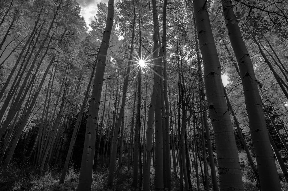
It’s easier to picture with examples. Take a look at the two photos below, which of course is just the same photo with two different post-processing styles:

I’ve asked a number of photographers which one they like better, and so far all of them have said the first photo. I agree.
But why? It’s not as though a high-contrast, dark, monochrome edit is always a bad fit. I’d even say it’s one of my favorite post-processing styles, both in my own photos and in my favorites that I’ve seen from other photographers.
Yet it doesn’t work here. I believe the reason is that it messes with the photo’s emotional unity. In the real world, the aspen trees in front of me were bright, yellow (probably the most optimistic and sunny color), and inviting. By comparison, the monochrome edit tries to impart emotions of intensity and mystery. Those are hardly bad emotions in photography, but in this case, they branch off completely from the emotions of the subject!
How can you change emotions in photography in the direction you want? There are plenty of ways. You could change your light, post-processing, subject, or composition. Even camera settings and camera equipment play a role.
My contention is that one of the best ways to take a strong photo is to make sure these emotions are unified. For example, gentle and low-contrast light complements a calm and peaceful subject; a balanced composition of the same scene continues the mood even further. If you do all that, the result is likely to be much stronger than a photo with a haphazard smattering of different emotions.
Here’s an incomplete list of the emotional decisions that exist in photography:
- Quality of light: Low contrast vs high contrast. Dark vs bright. Colors – and which ones – vs monochrome. Whichever light you pick (or wait for, if it’s natural light) has a massive impact on a photo’s emotions.
- Subject: Consider the differences between a rocky, jagged mountain and a gentle hill of grass. Figure out what adjectives you’d use to describe each one; those are the emotions the subject will convey in your photo. (In portrait or wildlife photography, the subject’s own emotions play a major role here, such as if your subject looks happy or sad.)
- Balance: A balanced photo is peaceful, deliberate, and static. An imbalanced photo is tense, chaotic, and active.
- Space: A photo with lots of positive space feels crowded and busy. A photo with lots of negative space feels lonesome and empty.
- Structure: Imagine three people huddled together, versus the same three people far apart from each other, versus two people together and one alone. Each arrangement has its own emotions. The same is also true of broader compositional shapes and structures, like a circle versus a triangle.
- Texture: Gentle texture, gentle emotions; harsh texture, harsh emotions. The emotions a texture conveys in a photo are almost always similar to the adjectives you’d use to describe that texture (as is also true with your subject).
- Other Post-Processing, Camera Settings, and Compositional Choices: There are many more ways to change a photo’s emotions. In post-processing, you can dodge and burn certain areas of the photo to emphasize or de-emphasize them. For your camera settings, you can use a long exposure or a fast exposure to change the character of your subject (say, blurred versus tack-sharp). Even camera gear can play a role, such as putting a soft-focus filter on your lens.
The key is that as many of these factors as possible should be telling the same story. You can shift all these factors toward a punchy photo, a somber photo, an etherial photo, an organic photo, or almost any other emotions you can think of. The more unified these factors are, the clearer and more effective your photo’s emotional message will be.
Take this example:

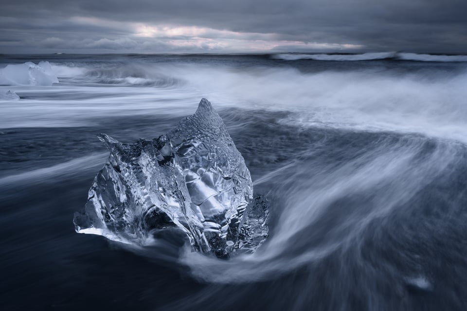
I was standing at the edge of the Arctic Ocean on a stormy evening. The subject in front of me was a jagged block of ice that had washed ashore, plus an angry ocean behind it. I deliberately chose an off-center composition rather than balancing my subject. I waited for blue hour to get dark, high-contrast light (which also happened to be blue, the same color as the subject – even more unification).
All those emotions are on the same page. The whole message of the photo is unified. Compare that to the photo below – which is a very similar subject, but is a much less unified and effective photo:

Although the block of ice is similar in both photos, this second shot is so much weaker. The pastel light in the sky and the centered, balanced composition give off gentle and static emotions, which are totally wrong for such a harsh block of ice. The message isn’t in sync at all.
In the field, it’s almost as if there’s a checklist you can go through to shift a photo’s emotions in the right direction. High contrast? Check. Dark light? Check. Imbalance? Check. Intense subject? Check. Jagged texture? Check. Everything is on the same page.
Of course, I don’t keep a physical checklist with me in the field, but I absolutely think about these things before taking a picture. I try to consider elements like light, balance, space, and texture to make sure that each one pushes the photo’s emotions in the direction I want. If I realize the emotions aren’t unified, I try to change things like my composition or subject to make sure they are.
It may sound like all this takes too much time, but it’s still possible to unify a photo’s emotions even in fast-moving situations like sports and wildlife photography. Perhaps it’s as easy as changing where you’re standing so the colors in the background tell the same story as your subject. Or maybe it’s zooming in to get more positive space, because you don’t like the empty, negative space emotions of the zoomed-out composition.
Perhaps you’re also thinking that this is all fine and good for genres like studio photography, but almost impossible for something like architecture or landscape work where you have less control over your subject. But that’s not the case at all. You can always move around to find a different perspective, wait for the light to change, look behind you, zoom in or out, and countless other things. Although it’s not possible to physically move a mountain, it might as well be, considering how many different ways there are to change how the mountain looks in a photo. (See Václav Bacovský’s amazing photo project of the extinct volcano Trosky, which he posted on Photography Life a couple years ago.)

The concept of “emotional unification” doesn’t have to be a conscious process. While I’ve found that my photos improve quite a bit when I make these decisions deliberately, I know other photographers who prefer their results when they don’t overthink things. If you’re unsure which method fits you better, you may find that my article on the head versus the heart in photography helps figure it out.
Either way – whether you’re a spontaneous or a deliberate photographer – the fact remains that photos are almost always stronger when they have a unified emotional message. Look through your own best photos, and I’m sure you’ll see this rings true even if you didn’t do anything consciously at the time; the light, composition, subject, and post-processing all contribute to the photo rather than branching off in conflicting directions.
Unity in your emotional message isn’t the only thing that makes a good photo, of course. You still need some reason for the photo to exist in the first place, like an interesting subject or moment. But once you’ve done that, you’ll find that getting everything else in the photo “on the same page” is a great way to make it stronger and more effective.
As with the fundamental concept of simplicity in photography, the more problems you can eliminate in a photo, the better it will be. While these problems sometimes take the form of individual distracting elements in your composition, arguably the bigger problems are emotional distractions – elements that don’t tell the story you want. Fix them by shifting your light, composition, and subject in a more unified direction, and you’ll see the quality of your photos improve.

Then I enjoyed your article, and it’s just what I thought, to find your own style, which most photographers seem to think is the “holy grail” of photography, has no point.
The point of being a photographer is not to find your own style, but to find the style for each different image or motiv.
To shoot just hard contrast images here I live, with this soft, rolling landscape, would be very silly. Generally this is a place for muted colors.
Thank you, Spencer for a great article. “Emotional unification” will be in my mind forever irrespective of the subject in the viewfinder. You really brought a make or break aspect of a pleasing photo home.
Hi, nice article, enjoyed it and many others, for me I find myself as a general rule 10 % of the photo made is dependent on gear, 90% is the person behind the camera.
What I look for in a a Photo is
1) a story, message, connection to the viewer that evokes emotion.
2) that it is technically acceptable
3) and has a WoW Factor.
For me these 3 factors haven’t changed since the beginning of time LOL.
I find a camera and lens are tools only that records what the photographer sees and uses a combination of time light and speed…….that’s its.
All this helps me keep grounded and focused on photography.
Only and opinion
Oz Down Under
Thanks for your thoughts and insights, Spencer. Great photographs parallel great design and art direction. Bringing all of the elements together in one photo is the best feeling once you see the final result!
Thank you Spencer. I have mentioned this topic on a Facebook Group page I have but this is a great explanation. I shared with my group.
This is my favorite type of articles, informative, technical and objective. It’s always a great exercise to actively think about the photography, technically speaking, when you’re taking photos, even if it can’t be 100% translated into the end product, due to a lot of variables that we can’t control (unless the photo is taken in a studio or if you force it on editing, which I tend to dislike to a degree).
Anyway, I love this kind of article, and, even if it doesn’t receive the same passionate response as a camera/lens review, I do believe this is what really differentiates this site and what makes me come back for more!! Keep up the great work
Really happy to hear it, thanks, Alexandre! I think it’s important to have some breaks from all the camera and lens articles. But you’re absolutely right, the view count on these articles is always way less than anything gear related.
Great article, Spencer! I enjoyed it very much. One of our most important topics is composition, and the more we can learn, the better. I look forward to more articles on this subject.
Thank you, Elaine! More on the way soon.
I agree with all of this and would just add the thought that an even more basic requirement for a good photograph is that it have an emotional effect at all, of at least some kind. The photos I am most often deleting are the ones that fail to generate any kind of emotional response. Even a disunified response would be more interesting than a completely bland photograph, and from that perspective even the ones you’ve included here as less preferable examples aren’t that bad at all.
I agree. It’s like that famous quote – “If you want to be a better photographer, stand in front of more interesting stuff.”
The issue is that I’ve stood in front of interesting/emotionally impactful stuff plenty of times without getting a great photo! Which is where I’ve found the system in this article helpful.
Really excellent content. Thanks so much. It’s so easy to fall into the technical side of photography (which I love), but the real challenge comes from the artistic and emotional side. Spencer, I follow a lot of Photography blogs and sites and you are consistently producing the best, broadest content that is refreshingly different from the rest. Thank you for your effort and for sharing.
Very kind of you to say, thanks, Brian. I like the technical stuff as much as anyone else, but I have never started taking better photos because of reading a new camera’s specs!
I second that.