What is contrast? How can you get high-contrast images? It’s a sought-after concept in photography, but also one of the most confusing, as there are a wide number of ways to bring it about. To start, let us get to answer the first question. Instead of putting up grey-scale maps, let me explain it with pictures. I will start with monochrome images, as they are easier to explain than their coloured counterparts.
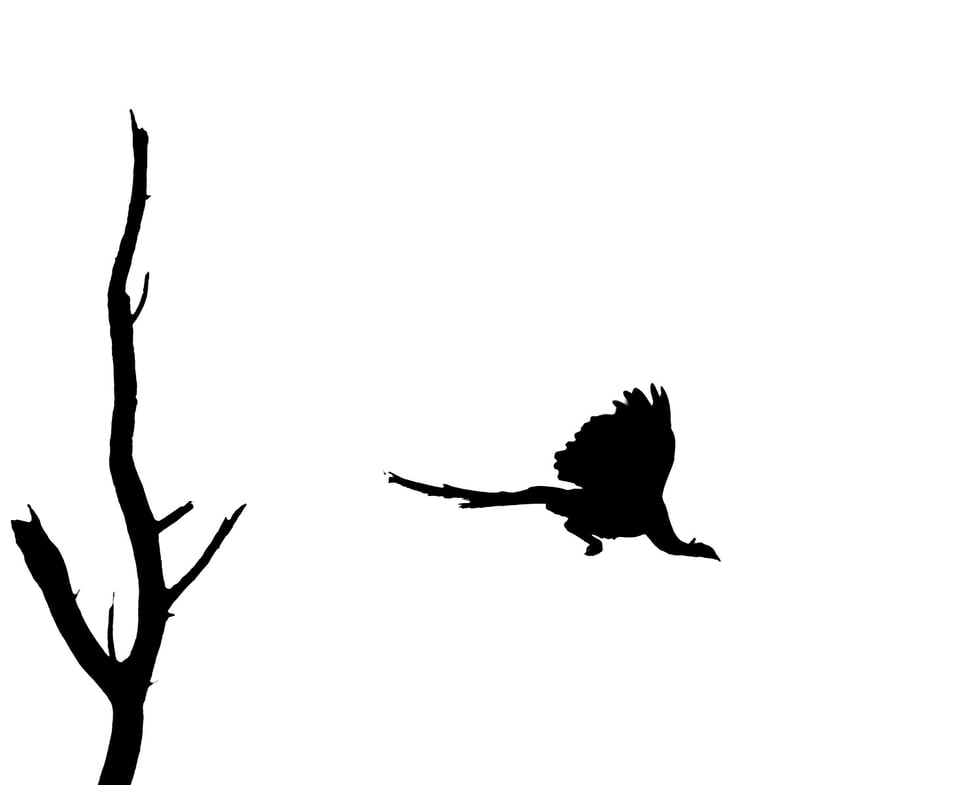
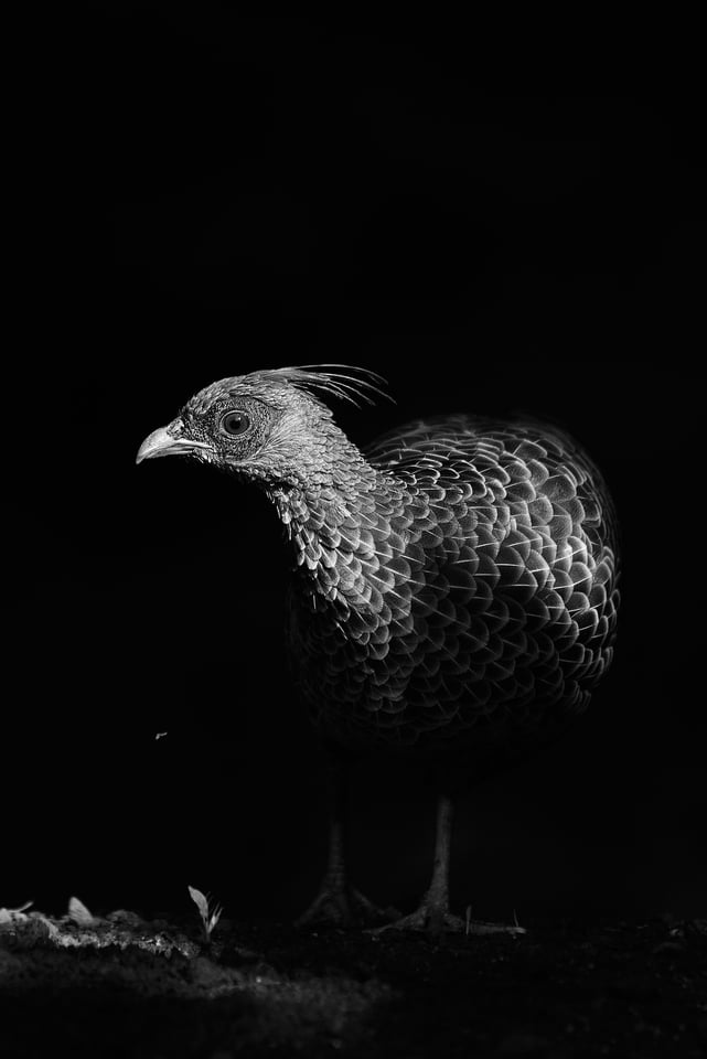
Which of the above two images has more contrast? The first image of the peacock taking off has both white and black, with essentially no shades in between. The contrast is well defined. Whereas the image of the Khalij Pheasant has an array of grey, starting from some over-exposed areas (blown out white) to the completely under-exposed (black) background. The answer is that both of these photos have high contrast, but in different ways, forming different impressions for a viewer. The first image technically has higher contrast – as high as a photo can possibly have – yet the second looks more contrasty.
Contrast is not a universal entity that always appears the same. There are many types of contrast, and we shall look into the ones that matter the most.
Table of Contents
Luminosity Contrast
To understand the first type, luminosity contrast, we will go through what most of us do when we intend to add contrast in the simplest way: adjusting the contrast slider in any post processing software like Adobe Lightroom or Photoshop.
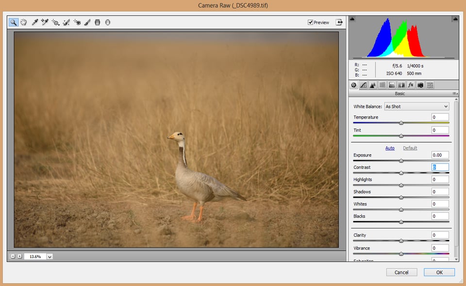
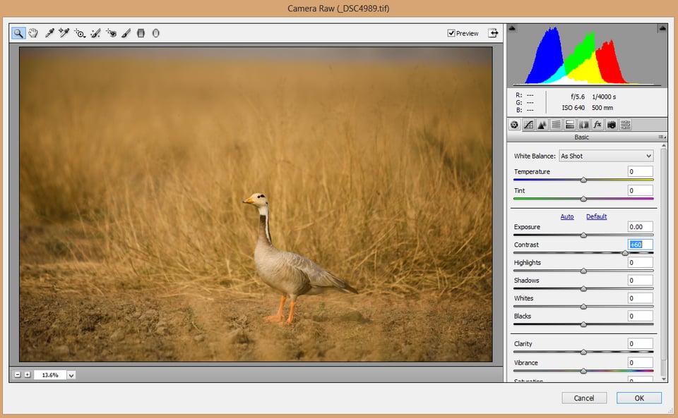
Take a look at the histograms between the two images. The first one is a straight out of the camera image. With the one below it, I have pulled the contrast slider to +60. The histogram that looks a bit crumbled in original image has moved wider in the next. In other words, the whites and highlights have moved toward the right, whereas the darks and shadows have moved towards the left. To put it simply, by adding contrast we have made the brights brighter and the darks darker. This is what we call luminosity contrast.
It is true that, to a certain level, luminosity contrast depends upon the lens you are using and the dynamic range of your camera. But lot can be done in post-production as well (though keep in mind that subtle, controlled contrast is often better than pulling the contrast slider all the way up to +100). Remember, adding more contrast pushes your highlights to the right and shadows to the left – which means you have the risk of both blowing out your highlights and sacrificing the details in your darks, ending up in making your entire picture artificial. Secondly, our target is not just adding contrast, but also optimizing it. In fact the lines in MTF charts corresponding to contrast signify luminosity contrast. Now the immediate next question that pops out of our minds is, how do we bring it out in post processing?
In this article I am going to explain all post production with respect to Photoshop. Similar results can be attained using Lightroom or other PP software as well.
The Levels Tool
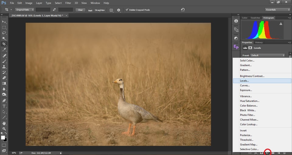
Getting back to adding contrast, most of us are familiar with the contrast slider in ACR (Adobe Camera Raw) or in Lightroom. It does add overall contrast to the entire image as explained above. But there are other tools to do so, many of which give more precise control over the image. One powerful yet simple tool to achieve that is the Level Adjustment layer in Photoshop. You can add it on top of any layer by clicking on the “Create new fill or adjustment layer” button or “Layer > New Adjustment Layer > Levels.”
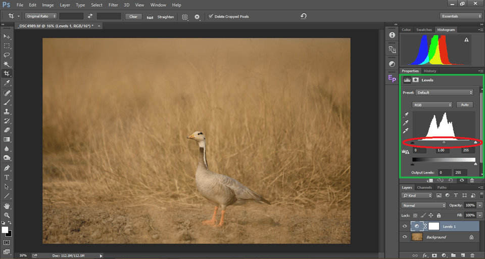
Now you will see a levels adjustment layer (named Levels 1) on top of the layer that you selected. In the properties window, you will see a histogram with three sliders below it: Black, Grey, and White. These correspond to shadows, midtones and highlights respectively. Just below the sliders, you will find their corresponding values: Black-> 0; Grey->1.00; White->255. As most of us know, the RGB scale is a value corresponding on the scale from 0 (black) to 255 (white) and everything in between. For a broader discussion on the meaning of RGB values and color, take a look at Spencer’s article here.
Below are a few pointers on how to use the Levels adjustment:
- Moving the highlights slider towards the left makes the highlights brighter.
- Moving the highlights slider towards the right makes the highlights darker.
- We cannot move the highlights beyond 255 because that is white.
- Moving the shadows slider towards the left makes the shadows brighter
- Moving the shadows slider towards the right makes the shadows darker.
- We cannot move the shadows below 0 as that is black.
- Making the highlights brighter and the shadows darker adds contrast.
- Making the highlights darker and the shadows brighter reduces contrast.
- Moving the mid-tones slider towards the right pushes the mid-tones towards the shadows.
- Moving the mid-tones slider towards the left adds light to the mid-tones.
- The midtones slider will move correspondingly when you move the highlights or shadows slider.
To understand it better, take a look at the below image:
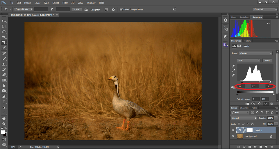
You can see that the unprocessed image – initially very flat – has attained depth. The grass appears to move into the background, while the goose pops out to the front. So, how did we do it? The process was quite easy – I simply dragged the black and highlight sliders to the corresponding ends of the histogram, adding contrast. This is something I commonly do for my photos (though not always).
A useful tip here is to hold down the Alt/Option key in Photoshop while dragging the shadows or highlights slider. This gives you a preview of any areas of the photo that have lost all detail, turning completely black or white. Other software has a similar preview available, so this applies beyond just Photoshop. Stop the slider right before you clip any detail in the shadow or highlight regions, indicated by the preview changing color. For example, in the illustration above, I moved the shadows slider to a value of 33, right before any shadows clipped to black.
Once you set the shadows and highlights, move the mid-tones accordingly to get the optimum contrast. This is better than a simple “contrast” slider because you can adjust the highlights, mid-tones, and shadows individually. You don’t need to have Photoshop for this type of adjustment, either, since you can do something similar in most other post-processing software, either through a similar Levels adjustment or multiple sliders working in tandem.
Note: When you are adding contrast, you could see the saturation being added to the image. In that case, you may need to tone down the opacity of your layer or perhaps reduce saturation with a separate adjustment, unless you like how it looks.
And contrast adjustments don’t just stop at Levels. The ultimate weapon of choice is always the Curves adjustment, which is much more powerful (and much more complicated), which would demand an article in itself.
Note, also, that I have conveniently selected a picture with a narrow dynamic range for the illustration above. What do we do when the dynamic range gets too high?
Embrace the Shadows and Protect the Highlights
We often tend to head straight into following rules most of the times. I have seen photographers all along the way trying to pull details from every inch of the frame, boosting shadows and recovering highlights no matter the photo. For a long time, even I found myself in that bandwagon. But later I understood that was not always what was required.
Especially when your subject is in front of a dark background, such as a lot of my wildlife photography, high contrast and dark shadows can make the subject pop out beautifully. Psychologically, our eyes naturally orient towards the brighter areas of an image. So a darker background brings the observer’s eye to the subject and holds it glued to the subject. The literal meaning of contrast is difference. For that reason, a dark background makes the subject seem brighter and vibrant.
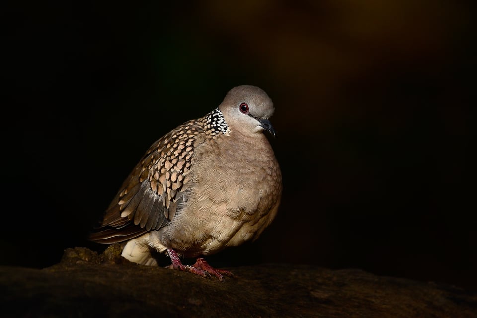
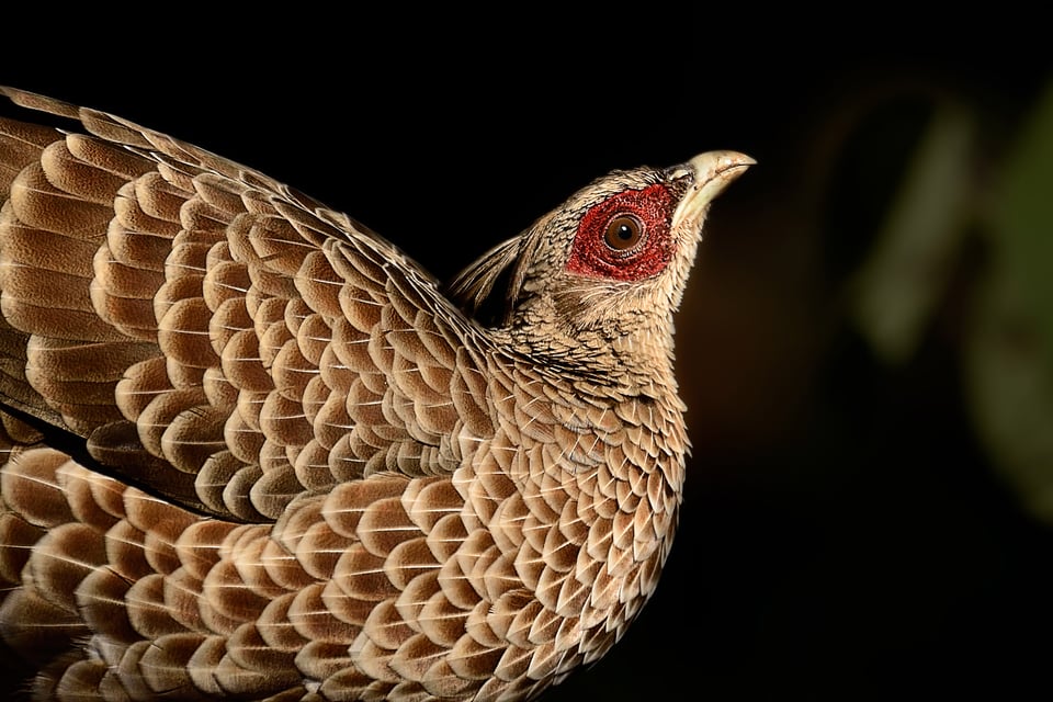
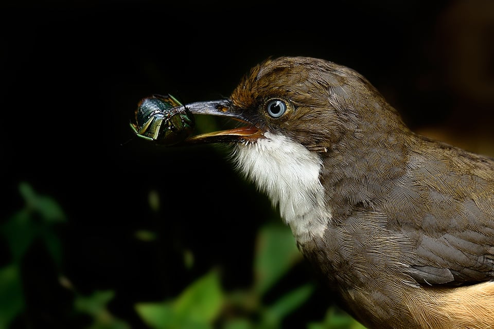
The above images would have not been half as appealing IMO had the backgrounds been brighter than the subjects.
A photograph that has a subject over a dark background, with a histogram weighted strongly to the shadows overall, is called a low-key image. How do we make such images? It is wise to always have in mind that the whole process of making an image has to start before clicking that shutter button until the final output is processed. Here are a few pointers on how to make dramatic low-key images:
- Shoot when the light is at an angle. One of the best times is the golden hour with the sun right behind you, illuminating the subject and bringing out natural contrast in your subjects.
- We often use a so-called “machine gun mode” when we see the subject or a scene. Instead, wait for your subject to move to interesting light and/or background. Light is the predominant emotion in any photograph. After all photography itself is recording of light. So take time to compose your image to get a contrasting foreground and background.
- When you find the background considerably darker than the subject, switch to Spot metering from Matrix metering. That will ignore the light calculated from zones outside of the focus point hence naturally creating a high contrast between the subject and the background, and making it less likely for the camera to overexpose.
- This is yet another scenario where the back button focus comes into play. Focus using the back button and move the focus point to the brightest point in the frame and then click the short. I personally map the back-button to lock the exposure when pressed (AE-LOCK ON), still in spot meter mode, and then focus on the subject. Generally, that is the eye in case of wildlife photography. With this technique, we can protect the highlights from blowing out.
Also see the longer article I wrote specifically on low-key black and white photography.
How Can You Bring out Contrast Locally?
Sometimes, rather than adding global contrast (editing the entire photo) with a Levels or Curves adjustment, it is better to adjust a single part of the frame instead. This way, you can add contrast to part of the photo without suffering elsewhere in the frame. For example, you can darken the background of your image without darkening important details in the other parts of the photo, like your subject itself. This is also known as dodging and burning. Spencer has written a detailed article on dodging which you can find here.
Don’t Try to Bring out Contrast that Doesn’t Exist
It is very tempting to avoid the general rules/guidelines and try to squeeze too much from our raw files. But if we aren’t careful, it is easy to end up creating “plastic” images. Take a look at the photo of an eastern imperial eagle below:
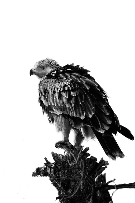
It was already about 11:00 AM when I took this photograph. There was a huge patch of detail-free cloud behind the bird, and no angle could avoid it. I was certain that I was going to get a backlit image. I sacrificed the background and worked on getting all the details on the subject.
This is the exact opposite of the images we saw above, with a completely blown out background, holding maximum possible details on the subject. Still, it is a high contrast image; such images are called high-key images. While low-key images are all about retaining highlight detail, high-key images are just the opposite. Here, if you want the subject to be visible and detailed, it is important to keep the shadows intact. (If you don’t, the subject will be more of a silhouette, like the first photo in this article. That’s not always a bad idea, but it is a very specific look that doesn’t work well for every photo.)
The bottom line is, instead of trying to shoot ‘ideal’ pictures, it works better to make the best of what is available and tailor your decisions based on the subject in front of you and the mood you want to convey.
Lighting
Irrespective of what we are photographing, the incident light on the subject is what dictates the overall quality of the image. No camera/lens combo can convert bad light into good light. We can only make good light look better. More than anything else, light decides the contrast of our image.
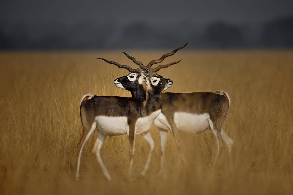
While photographing the above image, the light was perfect. My shadow was pointing right at the subject, meaning the sun was directly behind me. I was in the golden hour, and I exposed for the shadows so that I got the fine details on the blackbuck. As a result, there are no harsh highlights or shadows in the image, yet the subjects still stand out from the background.
It is an ideal scenario, but we do not get so lucky all the time, especially with wildlife photography. It is generally said that if the light source is at an angle even slightly to our left or right, beyond about 20 degrees behind us, we get partly-lit or half-lit subjects. Sometimes such angular light brings out beautiful emotions in our subjects, including high contrast. Other times, it lights up too many details and makes the photo look messy. The key is to continue looking for simplicity:
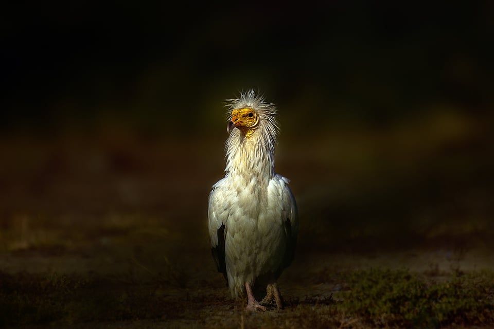
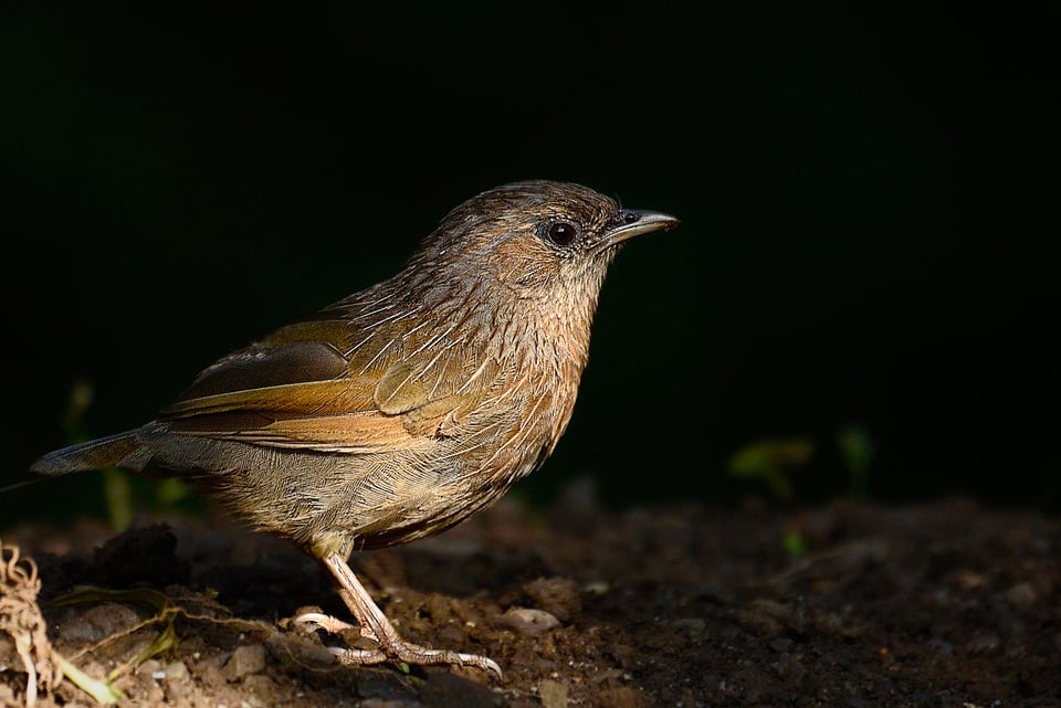
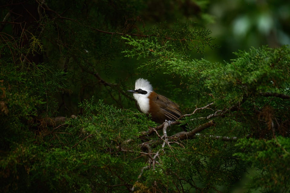
In the Egyptian Vulture picture above, the sun was almost at 45 degrees next to me, leaving a shadow on the other side of the subject. It creates some contrast within the subject making it pop out further. With the next one, the Streaked Laughing Thrust moved to a spot where diffused sunlight between the branches lit it unevenly against a dark background, adding to the overall contrast of the image, and to the subject itself.
We often strive to end up with a technically correct picture, forgetting the fact that a technically perfect picture might always not be a stunning picture. Rules are mere guidelines that make our understanding easier, but as told in the movie The Matrix, some rules can be bent, others can be broken.
Color Contrast
So far, we saw what was macro contrast. Primarily, we saw the contrast between highlights and shadows, a.k.a luminosity contrast. Now let us take a look at color contrast and illustrate it with an example:
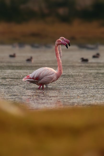
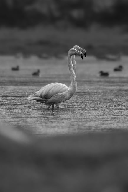
There was no other editing done between the two images above except the addition of a black & white layer over the color image. The B&W seems flat, with little separation in the yellow-orange foreground, or between the red-magenta flamingoes and the background. The birds just don’t seem to pop out of the blue water and the plants behind them.
This is because, just like the contrast between highlights and shadows, there is contrast between colors. To understand it better, let us brush through the color theory. We have Red, Green, and Blue (RGB) on one side which are the primary colors, and Cyan, Magenta, Yellow (CMY) as their inverse (or maximum contrast). Just like black is the opposite of white, Cyan is the opposite of Red, Magenta is the opposite of Green, and Yellow is the opposite of Blue.
Even if you have two contrasting colors of the same luminance, the difference in color alone makes the picture pop. Most of us have experienced this before when seeing how a picture can go flat when we make it black and white.
Below are a few examples where color contrast plays an important role:
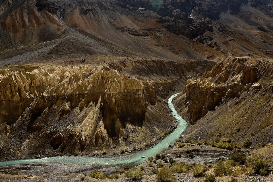
Now how do we enhance color contrast? When we have two contrasting colors, preferably next to each other, we can make one of the contrasting colors brighter and the other dark.
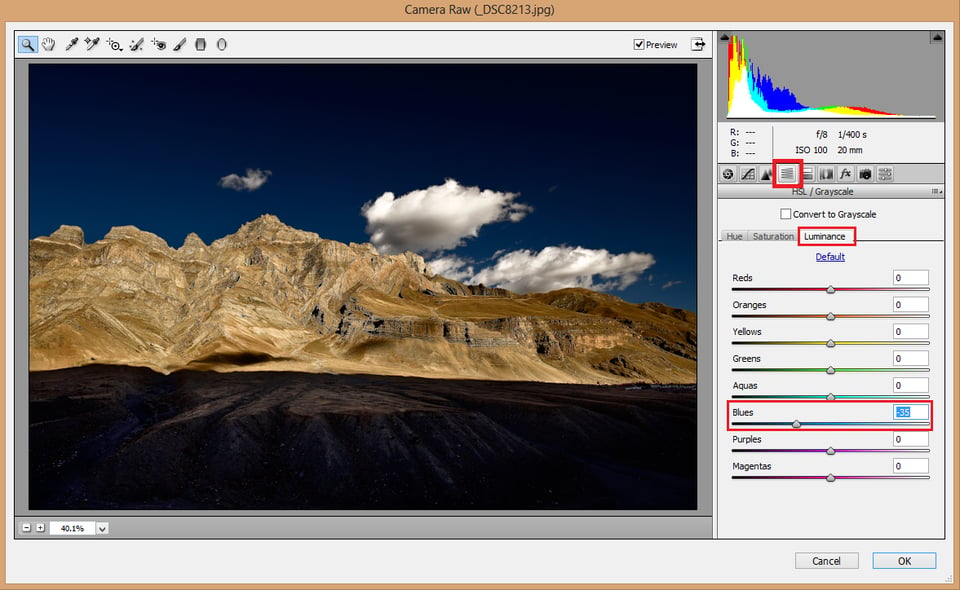
Take a look at the below picture. The blue sky is just bordering the golden mountains. This picture was shot near sunset, with the sun right behind me, flushing the mountains with its warm light and bringing out the yellows. I was standing at almost 15,000 feet (4500 meters) for this photo. As you go higher, the sky gets darker. That is why, when you are in an aircraft cruising at high altitude, the sky looks so dramatically blue – but you can see the sky getting bleached as you land. The sky gets overexposed.
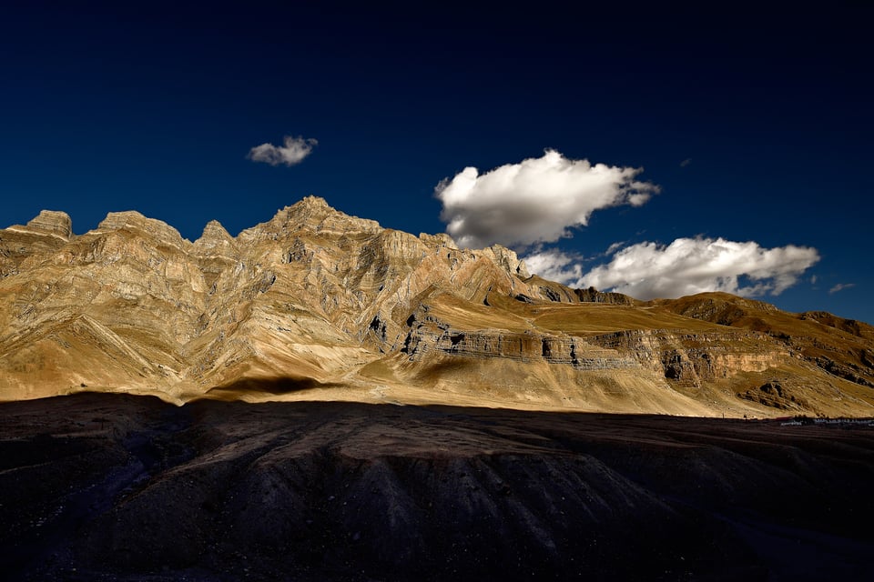
We can further enhance the contrast in post processing using the HSL option in ACR or in Lightroom. Once you are in Photoshop, click Filter > Camera Raw Filter, and select the HSL Icon. Click the Luminance Icon and there you can increase or decrease the luminance of individual colors. Make sure you do not overdo it, as too much of this adjustment is likely to add noise and/or create banding in the smoother regions of your image (like the sky).
Micro Contrast
An article on contrast is not complete without addressing micro-contrast. What is Micro Contrast? To put it simply, it is the contrast between the tones that are nearby one another in proximity. To understand it better, let us take a look at the picture below.
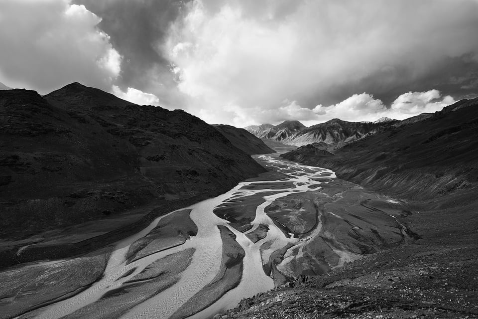
For example, take a look at the mountain on the left. The whole mountain falls in the shadows, but there is still a lot of contrast between those shadows that are so close to each other.
Microcontrast is a highly debated topic, and there are many photographers who call it a myth. Perhaps this is a case of everyone simply having different definitions of microcontrast. But I personally believe it exists, as well as the fact that it is dependent on the lens. I find a lot of difference when editing two pictures of the same subject/frame by two different lenses. As a matter of fact, during post production, we can not pull out something that is not available.
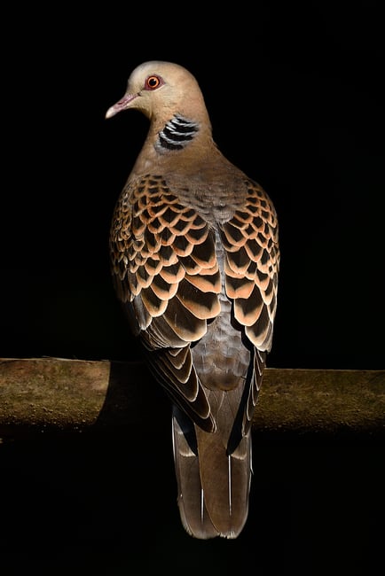
Even though microcontrast is more associated with monochrome images, where it really takes center stage, it also takes considerable precedence over color images. The picture below is mostly composed of various tones of brown but you can see how the different browns, all right next to one another, stand out and give the subject its realism:
Conclusion
In this article, we saw how contrast goes beyond merely pushing the contrast slider. The bottom line is not to get maximum contrast, but to end up with optimum contrast. Neither too much nor too less.
It is similar to the difference between taking a picture under the mid-day sun and the golden hour. The midday sun throws out extreme contrast, almost flushing away the finer details and leaving out harsh shadows. Whereas the golden hour brings out the inter-tonal contrast which is ultimately what is pleasing to the eyes.
Remember, you cannot get what you cannot see in the first place. There is no camera/lens that brings out contrast as well as the human eye. If you see a hazy scene, you certainly will end up with a hazy frame, and haze burns out fine contrast. You might be able to recover some contrast with post production, but it would be very difficult to make it look natural. It is always better to stick to the long standing wisdom of getting it right from the camera.
This is another reason why we should expose properly (see our articles on exposure and ETTR), without burning out the highlights, so that we can bring out the optimum contrast during post production. In most cases, it is easier to make a great picture out of a properly exposed picture than a dull/underexposed picture.
If there are any queries/comments regarding this article, please feel free to put it in the comments section and I shall try to respond as early as possible
Thank you–this is so well-written and really helpful. I’ll definitely look up any other articles you’ve written.
This is an article well written in a package with no strings attached. Normally, if an article something this good will always ask for money during mid-article. Thank you so much.
Excellent explanation of contrast in photography. Even experienced photographs can forget about some of the nuances you discussed. Also, great wildlife photos.
Madhu, your images are absolutely stunning! And I will surely study (and apply) your useful suggestions (especially those that are highly salient for images to be rendered monochromatically). Thank you for a great article.
I was well aware (like most of us, I suspect) of the concept of luminance contrast, but micro contrast due to colour opposites is totally new to me, at least in a formal way, such as it is here presented. Loved it! Thank you very much!
Excellent job. Clear and to the point.
Excellent article. Can you discuss how to best achieve a desired level of micro contast using various post-processing techniques. Thanks.
Beautiful article, thank you!
I appreciate the careful and lengthy (just enough) explanations.
Will re-read amd apply.
Cheers!
Excellent images and article. Thanks.
Thank you for the very nice article. I went back to some photos I had already partially edited and worked through them again using your tips about the levels tool (I use Capture One 12, but it seems the same as LR in this regard). I got some really nice results on photos that I had not liked much the first time through. I have played with that tool before, but it was sort of trial and error. I’m not trained with this software and am learning as I go along. Your descriptions about how the tool works helped me think through much more systematically how to use it, and that made the difference.
These sorts of articles are what keep me coming back to this site. I learn a lot. Really gorgeous photos as well, by the way.
I’m glad that the article was helpful to you Kevin. It does take time for us to understand the underlying concepts and once we get to know them, the possibilities are almost endless. But as all art forms, as photographers(of course with post processing included), we have to go through the learning curve and there is no other option than practice.