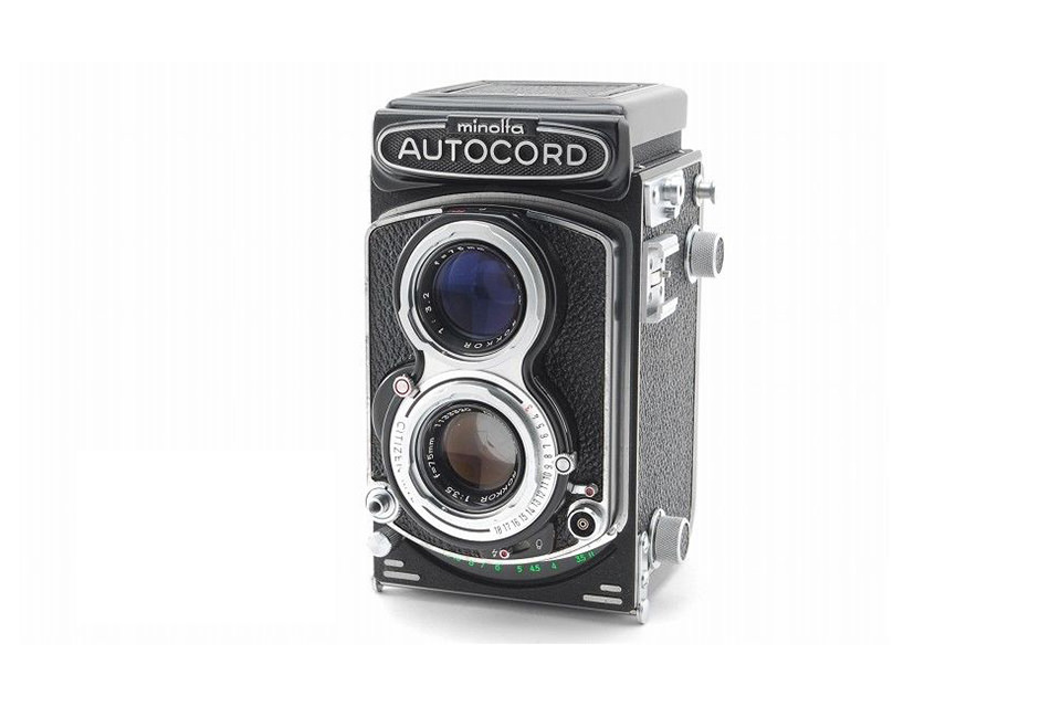
It seemed that my university years were filled with little other than lectures, studying, term papers and exams. Having said that, I did secretly have one hobby. In my second year I had purchased a Minolta Autocord film camera. The downside of being an impoverished student was that I could only afford B&W film, B&W chemicals and B&W contact sheets. The square 2-1/4” by 2-1/4” images arranged tightly into rows and columns were my only way to later enjoy what I had shot. Even today, when I stumble on those old, faded sheets, I’m taken with the impact that they still have with the well-defined shapes, crisp detail, shadows and grey scale tones that color just didn’t seem to convey.
It was something like Bogie and Bacall beside Brad and Angelina.
What has remained constant throughout the intervening years is my continued love of B&W much to the disdain of my wife who once asked what possible interest I could have in such a bygone medium.
This forced me to think deep and hard.
Why did color images often overpower my senses and leave me feeling artistically uninspired as if I were being asked to, without question or reserve, embrace one single visual experience to the exclusion, or at least subordination, of all the others?
For both of our sakes, let’s hope the following reasons explain away some of the mystery of why B&W works:
- When our main subject has significantly interesting and well-defined visual attributes other than color that we wish to do credit to.The primary interest of our subject isn’t derived from color, but more from qualities such as texture, surface, shape, form, repetition, contrast, etc., and these attributes are so essential in defining and describing our subject or scene that the addition of color isn’t considered necessary.
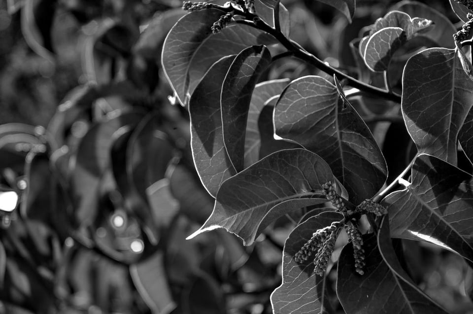
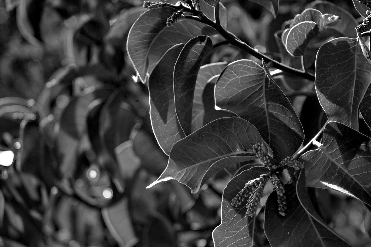
NIKON D300 @ 70mm, ISO 200, 10/1250, f/6.3 
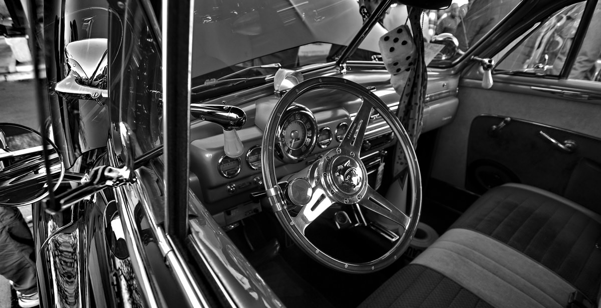
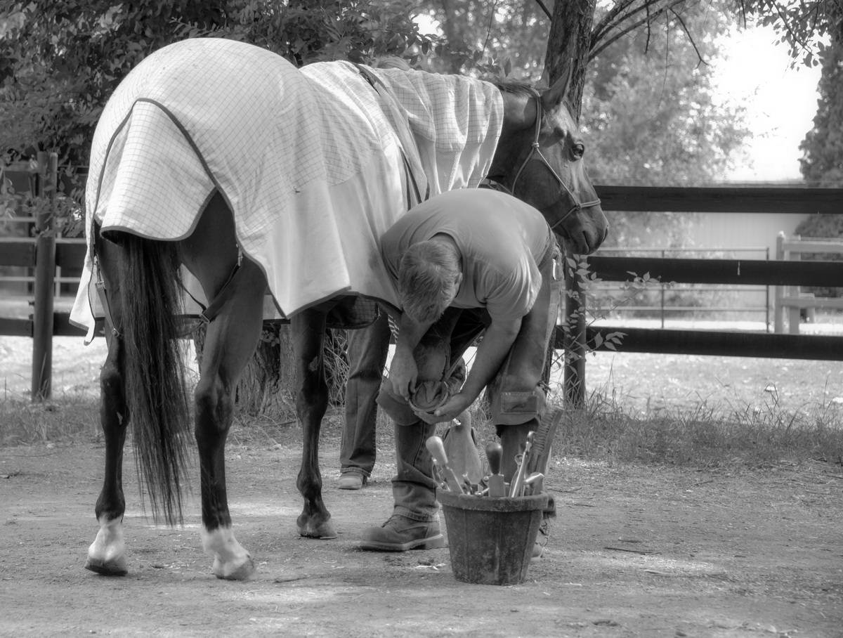
NIKON D300 @ 11mm, ISO 200, 10/500, f/3.5 - When the main subject itself doesn’t have any significant color.When the subject has little or no color attributes itself then black and white is often the logical option.

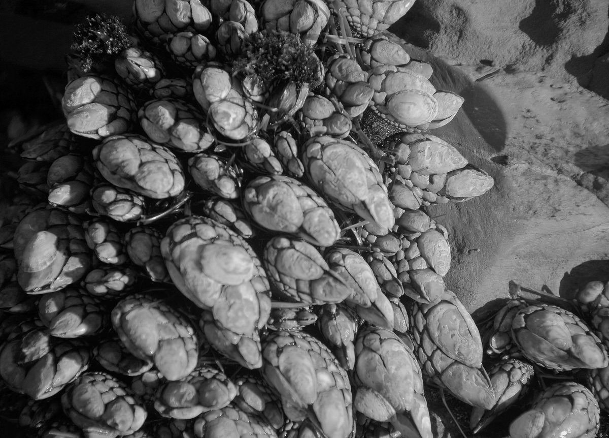
NIKON D300 @ 135mm, ISO 200, 10/8000, f/5.6 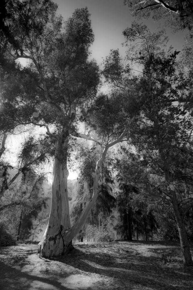
NIKON D300 + 12-24mm f/4 @ 12mm, ISO 400, 1/160, f/6.3 - When the surrounding field upon which our main subject sits will, by its own color, diminish the visual impact of our main subject.In this case, rather than have the subject and the subject’s message diminished by the strength of the field (foreground and/or background) on which it’s sitting, black and white may offer another logical option by leveling the playing field into grey tones.

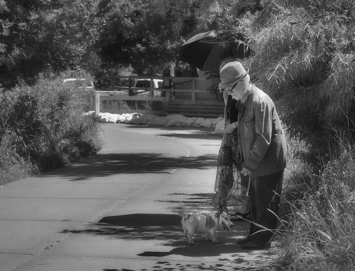
NIKON D610 @ 78mm, ISO 400, 10/10000, f/8.0 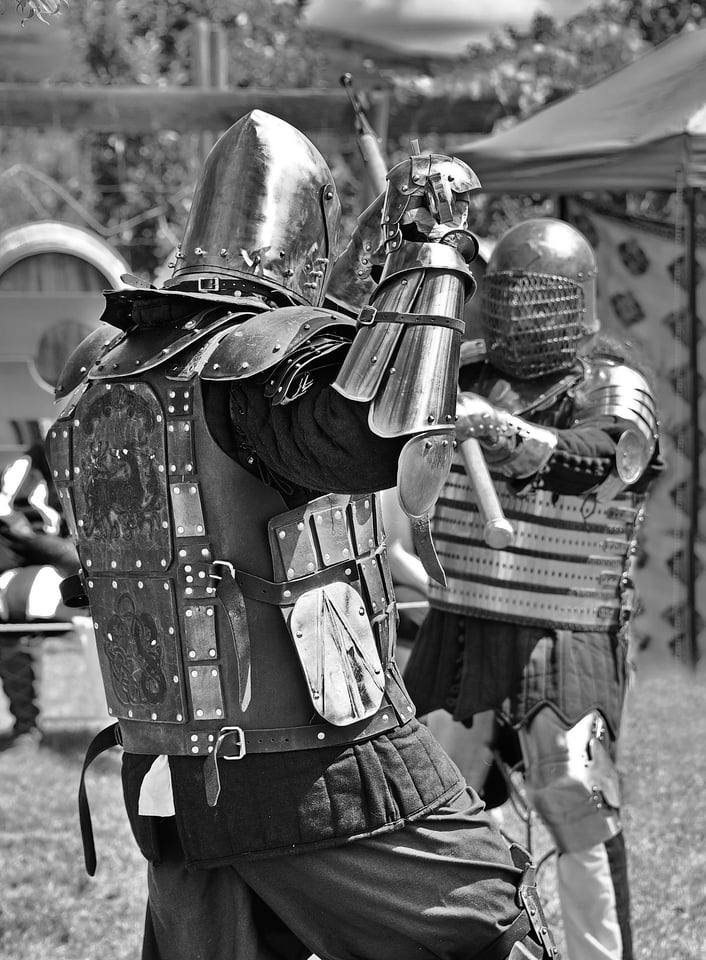
NIKON D610 @ 122mm, ISO 400, 10/8000, f/7.1 - When the photographer’s overall historical context/message might conflict with, or is inappropriate to, the use of color.Images that historically would have been captured in B&W often are assigned greater, more relevant impact when they are re-created in monochrome. A sub-category of this would be the use of sepia-tone to simulate images that would have been processed using a tintype, daguerreotypes or other similar pre-film photographic processes.

NIKON D610 + 28-300mm f/3.5-5.6 @ 85mm, ISO 500, 1/200, f/5.0 
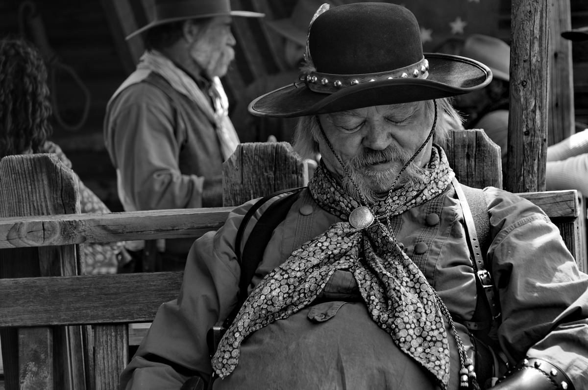
NIKON D610 @ 52mm, ISO 1600, 10/400, f/4.5 - For dramatic effect as in Low Key (portrait) portrait photography.Often B&W will be used to enhance a sense of drama, facial characterization and/or emphasis on the human form.

NIKON D300 @ 86mm, ISO 200, 1/80, f/7.1 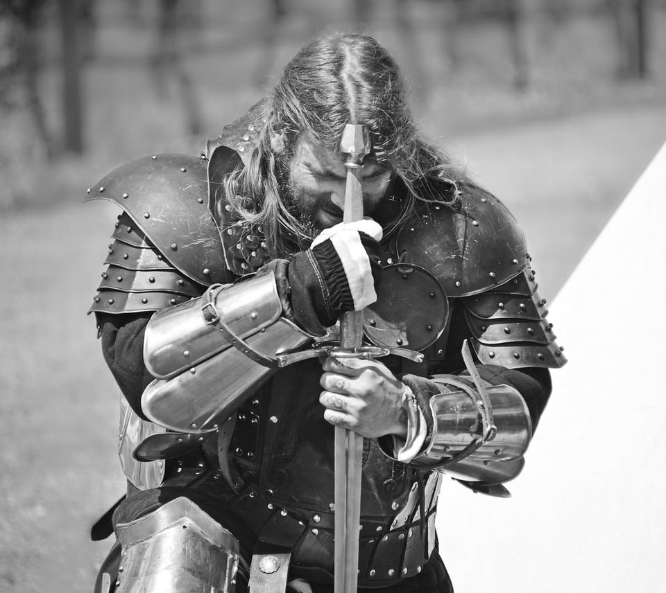
NIKON D610 @ 300mm, ISO 400, 1/2000, f/5.6


Photography Life also goes into much more detail on black and white photography here, but I hope the thoughts above help inspire you to take some monochromatic pictures yourself.
This article has been contributed by Tom Cooper. Tom is a member in good standing of Professional Photographers of Canada. For a decade he taught digital cameras, digital photography, digital photo-editing and digital file management at Okanagan College’s Kelowna, BC campus. He currently teaches the Digital Photography Certificate Program at Red Deer College, Red Deer, Alberta. Tom and his wife reside in Kelowna, BC, Canada.
© 2018 by T. W. Cooper All images and content are the property of the author. All rights reserved.
Hello Tom,
Thank you for the interesting article and photographs. I have couple questions,
do you take pictures in color and then convert to B&W, or straight in B&W?
And from your experience, do you think/believe that some sensors are really better for B&W than others in reproducing monochrome images, in respect to some attributes that can not be made up/modified in post-processing? Thank you
Hi Eugene, Interestingly I shoot RAW + JPG so when I’m keen on a particular subject suiting B&W more than color, I shoot using the Nikon Picture Control set to Monochrome and then, later in post-processing decide on whether or not my original B&W idea was good or not. In this manner, I’m free to edit the RAW file in colour (RAW files do not record or retain any Picture Control or WB metadata) or continue on to edit in B&W. Often the original paired JPG serves only to twig my mind as to the original intent. There seems to be a certain difference between shooting in monochrome and processing to monochrome and there seems to be a huge variation in what comes out at as the final product and I probably am no better informed than you are. Some plug-ins handle B&W as an art form in themselves. Sorry to not have a definitive answer for you.
The text justifying B/W is quite good in a general way – the photos are also quite good but I think visually pleasing in a specific stylized way: sharp, contrasty a bit hyper-real or even sculptural for that reason. There are other B/W aesthetics that seem more about bringing out something from within, than about fashioning the subject externally. A difference, not a judgement.
What an amazingly astute observation and one I heartily agree with. What else could possibly matter more than the content (of your message)? Anything else is just glitz and glamour. With this in mind, I should have taken the time to select only compositions that offer (primarily) subjects that depict strong content that is in keeping with the timeless, universal format that b&w seems to engender.
I shoot in black and white at night a lot because the color of the street lights can be bleh and it just solves it for me, plus not a lot of color at night anyway. Great article.
OK, so now I just have to try it out for myself. Never thought of it Joshua. Thanks.
New to photography…what does iso 400, 10/8000, Not familiar with the 10/8000? Would you explain. Thanks
Hi Bob, The editor (or the automated program that extracts the EXIF or FILE metadata) has hiccuped on several of the shutter speed settings and they should read as follows:
Backlit Leaves: 10/1250 should read as a SS of 1/125th of a second
Dashboard of Classic Car: 10/500 should read as a SS of 1/50th of a second
Shells at Low Tide: 10/8000 should read as a SS of 1/800th of a second
Elderly Gentleman: 10/10000 should read as a SS of 1/1000th of a second
Two Knights sword fighting: 10/8000 should read as a SS of 1/800th of a second, and
Interior of Local Museum: 10/400 should read as a SS of 1/40th of a second
Sorry for the confusion and thanks for bringing it to my attention. Hope it’s clear. All of the ISO settings and aperture settings were correct, btw. Tom Cooper
Your article is very inspirational. After many years I am back doing photography learning my way into the world of digital photography……..its not the same…the dark room, the excitement of developing your own film, the dark room etc. Eventough doing post processing on the computer is not the same I still get a different feeling of satisfaction when I see the end result. The art of b/w!!
Hi Fabian, So glad that somehow the blog resonated with you and your connection with the newer digital photography world we now live in compared to the traditional film and fumes environment of decades ago. Thanks for taking the time to comment. Tom
Very strong logic in favour of Black & white photography. Thanks for nice article.
Hi Shivji, Thanks for your kind words. They are very much appreciated. Despite the left-brain logic behind b&w photography that I talk about in this blog, for me it’s still very much a visceral motivation when I choose b&w over color. Just an inner sense of value that b&w imparts to certain scenes and subjects.
Hi, Tom,
Thank you for the excellent photographs and the article. Even though your photographs look breath taking even on the iPad’s screen, I can only imagine how they would look like printed 11 by 17 inch on a high quality paper! This is one of those occasions when size matters.
Your position and experience on this subject is truly inspiring!
Val
My goodness Val. I’m blushing in pride even as I write this reply. Thank you so much for your flattering feedback. I don’t think that I’ll ever stop finding a place for b&w in my portfolio.
Hi, Tom,
What software do you use for B&W conversion?
Thank you,
Val
I’ve been using ACD Systems s/w for years now. I’ll typically do all my sorting and some simple editing such as the B&W conversions using ACDSee Ultimate 10 (now I’m using ACDSee Photo Studio Ultimate 2018). Most of my other edits are done in Adobe Lightroom Classic or, in some cases, Adobe Elements. I have the Photoshop/Lightroom bundle from Adobe but simply haven’t taken the time to get to know Photoshop better. Hope, in a roundabout way, I’ve answered your question?
Hi, Tom,
Thank you for the answer. Yes, you answered my question. Since reading your article, I’ve been thinking about B&W as it was my passion for the decades and then it was abandoned for a while.
I’ve been using Nik Silver Effex in the past, than switched to the Tonality. The problem with the tonality is that they are switching back and forth between different the version so fast that I cannot keep up with my licenses. Tonality -> Tonality Pro -> Tonality CK -> Tonality CK2. All attempts to re-download the software that I’ve paid for are unsuccessful – they just simply ignore my emails. BTW, I bought the entire Creative Kit which I cannot re-download. In addition, I am not very impressed with the Tonality.
My main software is Capture One Pro 11 which has a very good built-in B&W converting capability. I am going to continue using it, maybe I will purchase their B&W style. Perhaps, I will use Silver Effex occasionally.
You’ve put a splinter into my brain regarding B&W, Tom. Hopefully, I will produce something worthy.
Thank you again,
Val
Well it was never my intention to put a splinter anywhere but if the ends justify the means then this forum has accomplished something after all! :)
I guess for some of us, B+W was almost a standard. I used to shoot Kodak Tri-X in 35 mm and then I had a Graflex Speed Graphic that I could shoot roll film on (if I remember correctly) – I learned how to develop the film and how to operate the darkroom, made lots of 8X10 prints on various types of Ilford paper. Your story with the images brought back a lot of memories. Its true, B+W images lets the mind fill in the colors – I would shoot a lot of landscapes and one day I realized as I was looking at the scene in front of me that it felt like I was “seeing” it in B+W. Your images stirred up some memories of days gone by, and so thank you, you have produced some wonderful images.
And what is most interesting in my work over the past half century, is that my love of b&w has never waned or lessened in any way and there will ALWAYS be a time and place when this timeless format just seems to hit the mark in a manner that colour can’t. Thanks so much for taking the time to share your thought Ron.
I very much appreciated this article. I have always been struck by the power of depression era B&W photos. Color would have been an unwelcome distraction in most of them. It is the familiar signal-to-noise problem. Sometimes B&W structure is the signal while color is simply noise.
Interesting comment Jack. B&W the signal and color the noise. I guess in B&W we can more easily feel/intuit the mood, essence, intent without the distraction of color which could water down (if not eliminate) the emotional content by offering the all-too-tempting experience of the colored rendering of our day-to-day reality.
A very well known photographer (I cannot recall whom, or where I saw the quote) said that color photos are all about the color while B&W photos are about everything else.
I use an infrared converted camera for my B&W work and enjoy the time focused on that work. Color works for flowers and some other things while the B&W opens many other possibilities. I enjoy both and cannot commit full time to one or the other because each has its purpose. Nice work, well-written articles and beautiful photographs!!
Thanks Joe. I wrote, several years ago, an article about what specific visual characteristics go into creating visual strength to objects within a composition and, of them all, color seemed to be without doubt, at the top of the list. Put a lady with a red jacket in a shot, no matter how small she might be, and the eye will spot it first and for better or words, assign it top ranking. Without color in the equation, we allow contrast, form, shape, repetition, reflective qualities, texture, all forms of perspective, leading lines, framing, etc. etc. to then play their well-earned roles on a more level playing field. Thank you so much for reminding us of this and for taking the time to leave a valuable comment that we should all learn from.