One of the most popular ways to compose your photographs is to use the “Rule of Thirds”. Although this compositional rule is frequently used by photographers, not everyone understands exactly what it is or when it works. This article introduces the rule of thirds and explains when to use it for composition (or not). Keep in mind that this rule is a suggestion for beginners and those who struggle with properly composing their pictures, and it is far from the only way to take good images.
Table of Contents
What is the Rule of Thirds?
The Rule of Thirds is a type of off-center composition where important elements of a photograph are placed along a 3×3 grid, which equally divides the image into nine parts. For many photographers, this type of composition is a basic way to give structure to photographs and make them more appealing. With the rule of thirds, photographers envision four lines across their photographs, which also creates four intersecting points. Take a look at the illustration below:
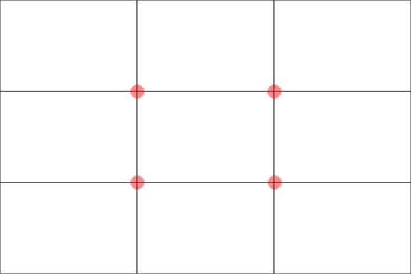
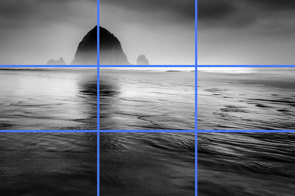
The important elements within a frame should be placed at the intersection points of these lines, as shown in the above diagram. Or, when photographing subjects like a tree or horizon, which are comprised of straight lines, the rule of thirds suggests placing them along one of the four lines instead. Take a look at the below photograph:
As you can see, both the horizon line and the primary subject are placed along this grid:
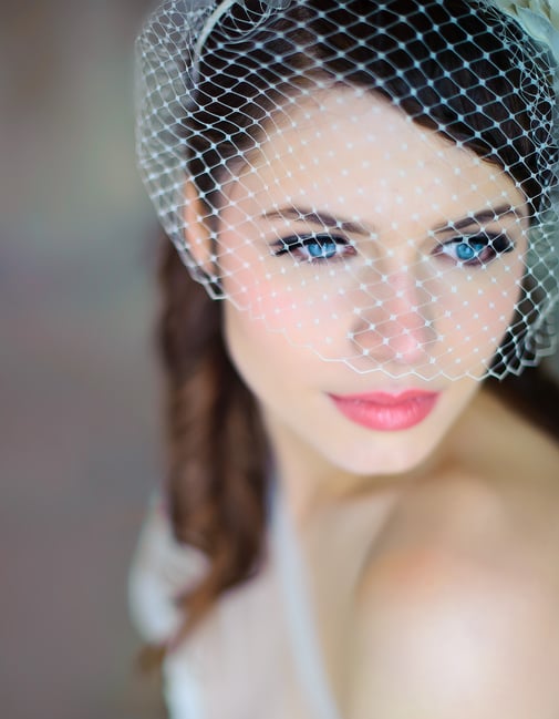
You can apply the rule of thirds to any genre of photography. In the portrait example below, the subject’s eyes are placed about two thirds up the photograph, and her nose aligns with the rule of thirds grid as well:
How to Use the Rule of Thirds
To use the rule of thirds, start by imagining a 3×3 grid and place your subjects along those lines and intersections points. When you evaluate the result, you may find that you like it more than with your subject in the center.
Some cameras also have a built-in guide for rule of thirds composition, which is shown as an overlay in the rear-view display or electronic viewfinder:
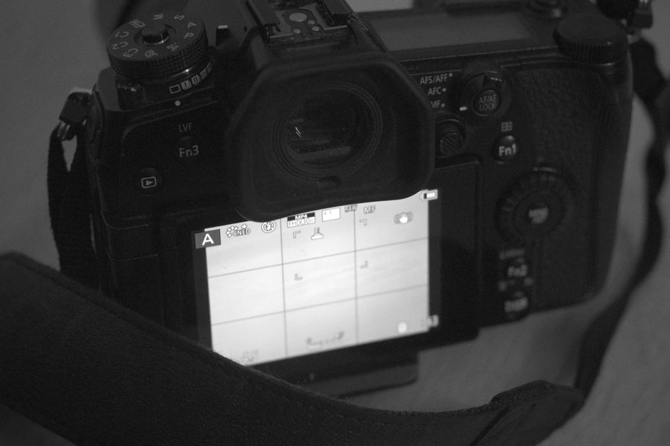
As a bonus, using these guides can help you straighten your horizon in landscape photography.
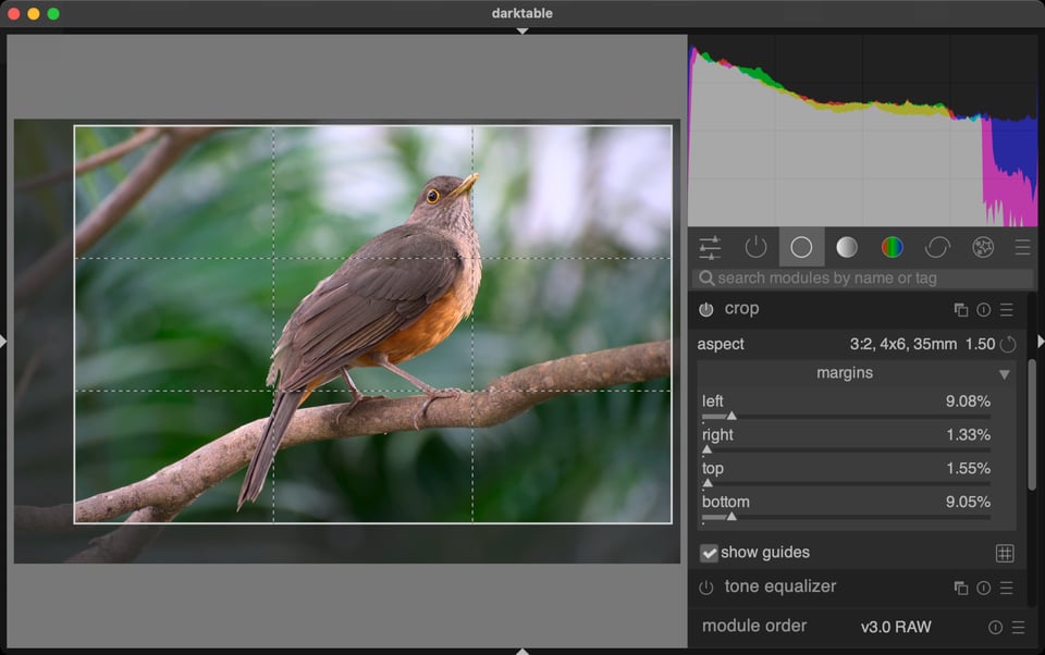
Finally, the rule of thirds isn’t only for composing while shooting. You can also use it for cropping photos in post. All modern Raw editors have an option to show thirds guides while you are cropping so you do not have to guess where the thirds lines are.
When to Use the Rule of Thirds
The rule of thirds works well when there is a strong point of interest in your photo, and you want to contrast that point of interest with the supporting elements in your scene. As an example, consider this shot:
In this shot, the attractive eye of the Egyptian Goose is placed roughly in the upper third of the photo, contrasting with the rest of the scene. Not only does this give the rest of the scene more room in the photo, it also places the bird in a more natural pose that shows most of its body.
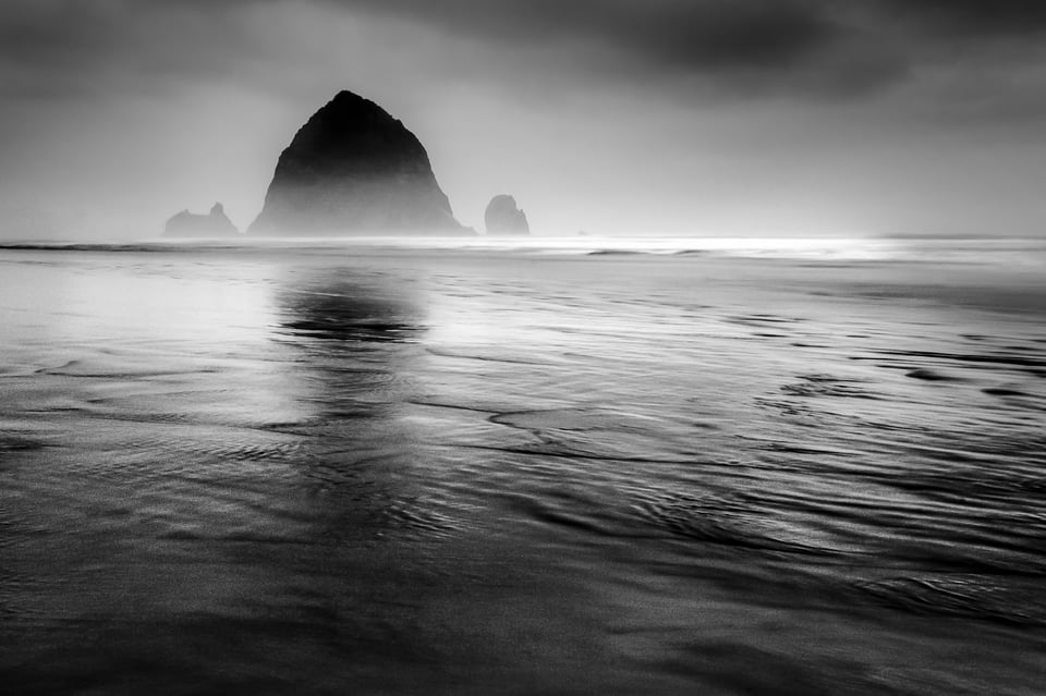
In landscape photography, the horizon line is also frequently placed roughly on the thirds line:
This breaks the balance between the sky and the ground, and gives one more emphasis than the other. Even if you do plan on placing the horizon line outside of the basic thirds lines, starting with a rule of thirds composition in your viewfinder can be the first step to the perfect composition.
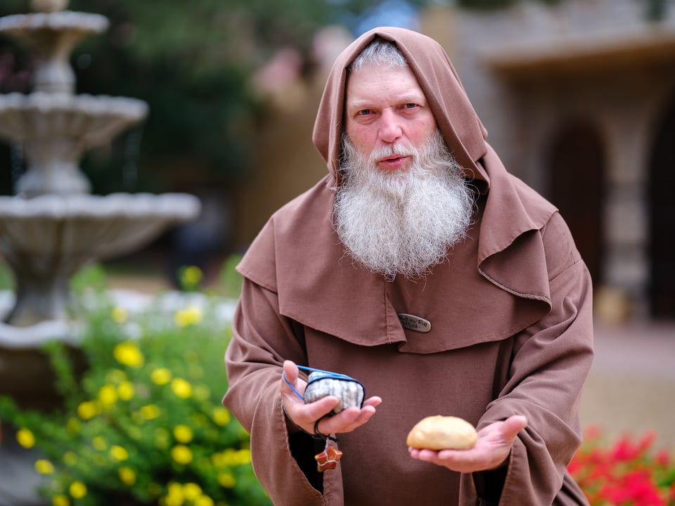
The rule of thirds works very well in more minimalist compositions, where the subject is concentrated in a relatively small area of the photo, and the rest of the photo is subdued, such as in photos of people with a blurred background:
So, when should you use the rule of thirds? The basic value of this rule is to remind yourself that off-center compositions can work well and be successful. Most of the time, beginner photographers will place their subjects in the dead center by default, forming central compositions. Although central composition can be a very strong way to compose photographs, using it for every photo can be boring. If you find that you are doing this, you can add more interest and variety by using the rule of thirds.
So, if you are struggling to compose your images, you might find that the rule of thirds can be a quick way to make your photos more dynamic.
When Not to Use the Rule of Thirds
The biggest problem with the rule of thirds is that it doesn’t change, even when your subjects do. It simply does not take into account what you are photographing. For example, in some scenes, you might be compromising your composition and excluding important elements just to adhere to the rule of thirds. So, in a way, it is a cookie-cutter composition.
The whole idea of the rule of thirds is that it introduces beginners to off-center composition. However, it might lead you to think that your subjects always (or often) need to be placed along the exact lines and intersections of the 3×3 grid in order to capture a successful composition.
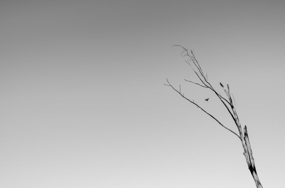
In reality, any type of off-central composition – not just the rule of thirds – can work well. Instead, try framing your subject just slightly off center, or even in the extreme corners. Sometimes, the scene itself will dictate the type of composition which will work best for your photograph. In the image below, you can see that the subject has been placed close to the edge of the frame in order to convey a sense of isolation with a negative space composition:
While taking this photo, the goal was to make it look somewhat striking and unexpected. Had the photo followed the rule of thirds, it would not have conveyed that emotional message.
Along with that, do not underestimate central composition. Although it can be boring if you use it too much, it also can be the most powerful way to compose and frame photographs. For example, it works very well if there is a single, strong subject in the scene:
The rule of thirds is a consequence of a more general theory of composition that the elements in your photo should work together to create a sense of balance between harmony and disharmony, that convey both the subject of your shot and your own emotions as a viewer of the scene. In some cases, and especially with simple compositions, the rule of thirds gets pretty close to that ideal. In other cases, you may need to try something else.
Conclusion
The rule of thirds is certainly worth exploring, especially for those who are just starting to learn composition in photography. However, as you get more advanced, you will start to realize that good composition is not about adhering to strict rules, but rather about composing each photo for its own merits. Different compositions will be ideal in different situations. While the rule of thirds works well for some photographs, it is not the only way to capture a good image. Indeed, any type of composition can be beautiful, and you will miss many opportunities if you never go beyond the rule of thirds.
Very interesting…
very the good
I have questions rather than a comment. I’m using Photoshop CC 2018 and need a better computer screen for more accuracy when editing. Can you suggest one? I have a Dell laptop which I love and thought I might be able to add another screen.
Also, could you recommend a medium to expensive price photo printer?
Love your articles. Thank you.
I usually use the rule of large numbers, where I real off a hundred shots in the hope of getting a “keeper.” :-O
I’m a big believer in the rule of thirds and feel it’s very effective for landscape and portraits. I find it less applicable to wildlife. Especially when the subject is long. I personally don’t think the lizard’s eye should be so far to the right in the photo above. Usually when the subject is long and facing one side of the frame, I like to leave more space in front of it. Even it means cutting off the tail a little. The left portion of the photo is dark and has little interest. Hey, it’s just my useless opinion :)
Thank you, Chris, and that is not a useless opinion at all! I’ve experimented with cropping this image slightly or moving it in different directions, and this was the frame I settled on, regardless of the rule of thirds (which I try not to think about in general). But because the lizard’s eye does align so closely to the rule, I figured it would be a good way to start this article :)
Hi! I enjoy your articles. Your notifications pop up in my desktop at work and I save to read later or at lunch time, like today. You have very good information and I wanted to ask you how does the rule of thirds apply to Instagram if you keep your photo square.
See my point above Clarissa. The ‘Rule’ of Thirds applies equally to whatever size rectangle your whole frame is, from a square to a wide panorama, just divide it into 3 equal portions horizontally and vertically.
I have read some ‘advanced’ discussions suggesting that just outside the 3×3 grid intersections might be better for square frames, and just outside the 3×3 grid intersections on the horizontal lines might be more pleasing for very wide shots, but such thoughts are obviously very dependent on each specific picture.
Thank you very much!
The rule of thirds is a good starting place for many people. However, it shouldn’t be called a rule but a suggestion. Same as things like Dutch angle, golden ratio, etc. They are great starting points for composition and seeing but they can’t be treated as a magic formula for a lack of strong content.
Although I tend not to find the rule of thirds especially useful while taking pictures in the field, that’s a personal decision for my own photography, and many photographers clearly find it to be a useful guideline (or something more). So, I think it was important to write this article, even though I completely agree with you that the rule of thirds is not a universal formula for capturing great images or great compositions!
The ratio of the sides of 35mm FX film (and linked formats) is 36mm:24mm = 1.5:1
The ratio of a typical TV is 16:9 = 1.66:1
These ratios were chosen because of the stereoscopic nature of human vision.
The ratio of A4 paper is 2^1/2:1 = 1.41:1, that provides the practical advantage of being able to fold in half (or tape together on the long edge) and maintain the ratio, which makes manufacturing more efficient.
The Golden ratio is 1:(1+5^1/2)/2 = 1.61:1, which happens to be the ratio of growth that many plants, trees and some animals show one stage to a next (typically annual).
The reason these ratios are also ‘pleasing’ to the human eye is because the are to an extent ‘natural’.
Overall, a very useful guide to consider when circumstances allow, which often makes the result look better than an unconsidered composition. The confusing thing is that the Rule of Thirds works even if the whole frame is square or even panoramic, it doesn’t rely on the print itself being in the 1.5:1 ratio.
Hi Burghclerebilly
Liked your answer to John Arcuso’s statement and I think you pinned it down with this: “…a very useful guide to consider when circumstances allow, which often makes the result look better than an unconsidered composition. ” Spencer’s article are aimed clearly to those who until now have had no real ideas how to compose a photo. The discussions whether there are rules we all do (have to) follow while looking at art (a painting, a sculpture, even a photo…) are very, very old. We maybe learned or heard in art history classes about them. Maybe we should consider that art by definition is independent of any rule and therefore has the freedom to follow rules. Rules help (e.g. the beginners) to make the first steps and rules help the observer to understand.
It is not just the photographer but also the public, those who care to take a look: We are all trained in a certain way which means nothing less than we all follow rules. Be it consciously or unconsciously. Denying rules might as well be the origin of something very creative or the origin of failure.
Cheers!
-jan
Thanks Jan,
Yes, although most artists I’ve met often struggle to explain what they are doing in compositions, I have found that they typically also have studied the history of art and picked up many such composition ideas somewhere in their formative years.
Another way to experiment with RoT is to force yourself to apply it in every shot (including making precise crops in post) for a period of time / project, as a kind of way of saying that your own judgement on composition isn’t reliable. Basically, pretend an editor is checking every one of your shots and adjusting them to a RoT arrangement initially. By forcing yourself to start with a RoT composition, you can then experiment with breaking the boundaries. I find that can help speed up the post processing my wildlife work where the initial framing is normally not controllable.
Thanks Burghclerebilly. Yes, many artists got the ideas before and they internalized what they have learned or experienced. They got a “feeling” for what is a good composition.
To crop later to fulfill rules is an interesting approach but that needs a high resolution camera. My neighbour at work is a film producer for more than 30 years now. He told me that his world changed radically. Not a long time ago every camera position, every framing, every angle, every panning, whether it is going to be a closeup and so on was carefully planned before the shooting. Of course many do it still this way. But now some scenes are shot from different angles at the same time with very high resolution cameras. Camera movement (panning), zooming, cropping etc. is done in post processing.
To me such an approach appears less ideal. I think it is better to know what you want before the exposure.
When I got my D800E (36MP) I played around with cropping because such a high resolution gives you the freedom to do so. I got a bit sloppy thought to “recompose” e.g. to the RoT later. But soon I realized that this would not make my photos any better but it had nevertheless a learning effect. I invest even more time in composing now than before. But sometimes, of course, if the initial framing is not controllable, cropping later is the only way to go.
I think the main value of the Rule of Thirds is that a beginner learn that our natural way of seeing, where only the center of our vision is, in fact, the only area in focus, does not create the most effective image–but neither does the Rule! The point is that we need to consider the message we want to deliver, then find the composition that expresses that most effectively. Applying any rule doesn’t make a better photograph, making the best photograph regardless of where we place an object/subject is the goal.
I may be the only person who has researched where the Rule of Thirds came from. Why? Because after almost 30 years of photographing, having work included in Museums, studying with master photographers-including Ansel Adams, teaching in art school and serving international clients as a commercial photographer, I had never heard of it. It was only when I first visited an amateur photo site in 2005 that I heard it mentioned–and that it was the most important Rule of composition. Really??
I took many months researching it and discovered where it came from and why it became a ‘Rule’!
The currently familiar grid and points of intersection first appeared in photographic literature in 1920, it was first named–as far as I could find–in the 1940’s. But the use of grids–yes, plural–and the importance of their points of intersection goes back to at least 1837. In that book, The Sketcher’s Manual (can be found on-line) the idea was that there were many rules to its use. It could be effective because the grid process was completely plastic in that if you used it, you placed your subject and “Balancing” objects according to a set of rules–we don’t have that luxury with photography, so it can only be effectively used when we are ‘lucky’ enough to find a scene where things fall into precise position. (I should note here that the author clearly states that the rules he gives were for those who didn’t yet know how to compose and that those who do know, Masters, don’t necessarily follow any of his guidelines in creating effective images!)
Now, these rules were known to photographers and this book was referenced in a photo book back as far as 1901–I should note that this only appears in books for amateurs, it is not found in academic texts on composition found in our Art Schools and Universities.
About 1915 a mathematician in the Boston area wanted to quantify the beauty of Greek art. He came up with a theory called Dynamic Symmetry. His work, and theory, were widely published in magazine called The Diagonal–also can be found on-line. What he found was that if you divide a rectangle–he suggests rectangles of certain proportions based on the diagonal of the square–root one rectangle–and then each diagonal of the next rectangle derived from this–you use the diagonal of the square to create a new rectangle that still has the same height as the square and the length of the diagonal. The first result is what he called a Root 2 rectangle. If you then draw a diagonal through that rectangle and then from the opposite corners, lines that intersect the diagonal at a right angle, the points of intersection, if joined both vertically and horizontally, you end up dividing the rectangle in thirds–something he claims creates the beauty we see in Greek art (this principle can be found in the cropping grid in PS called ‘Triangles’. The problem, and genesis of the Rule in photography, is that it only divides the rectangle in thirds in this one ratio rectangle–his findings suggest that this same process works for any rectangle ratio in this theory but does not create ‘thirds’ in the others. Coincidentally, in 1920 this proportion of a rectangle was very similar to the most popular film size of the day–2-1/4×3-1/4 and the most popular prints size 5×7. (You can find this on-line: Pictorial Composition by Hammond ) Unfortunately, I don’t think it was either made clear in that publication–or was understood–that it only applied to that particular rectangle–approximately one of a 1.4 to 1 ratio–it doesn’t work with 2×3 or 4×5 or square or any other rectangle.
Of course, the problem is still that we don’t control where all of our objects in a photograph exist. What is important is that our images tell our story. Do we Emphasize our subject, is our image Balanced, does the image have a sense of Unity etc. If these qualities don’t exist, does their absence help clarify our image.
What I discovered through my study was that the Rule was never really widely adopted although there were pockets that followed it–just like there were those that followed the Divine Ratio. It was only with the advent of digital and the great influx of amateurs into photography that this Rule ever became so prevalent. In fact, in my amateur books dating back to the 70’s there is no mention of this Rule. My wife has books from 2000 that don’t mention it but I haven’t seen one amateur book or article on composition that doesn’t mention it now. It is no more important that 1/4’s, 5ths, 7ths etc. In fact none of these are important unless they work for the given image being created. I don’t know anyone who used a grid of any sort before the digital revolution but applied the more effective and relevant Principles of Design and Elements of Art which are liquid in their application to an actual visual problem.
So, my point isn’t that it can’t work, that we won’t find great images that seem to fit (even though often it fits more like ‘close’ in horseshoes than reality) but they aren’t great because the fit the rule. They are great because they effectively managed the given visual problem and message–the same reason many image don’t apply any of the popular rules and are incredible image.
Hope this helps.
Hi John,
The rule of thirds ratio is 1.5:1, which can be considered as an approximation to either to the 1.41:1 and 1.61:1 ratios I mention below with their ‘natural’ heritage. These features were extensively studied by Euclid, Archimedes and daVinci as well as many artists (Vermeer, Holbein etc) over the centuries, probably to the extent that explanations were thought redundant by the 1990s, but the artistic merits were certainly described in early editions of Hedgecoe, Langford and Freeman’s photography books from the 1970s/80s.
Sure, the ratio’s you mention are like Horseshoes when it comes to the thirds. History indicates, as I said before, that people suggested other ratios as being useful for composition but they aren’t thirds. But it is also true that no ratio is an answer in itself, the right placement is based on the visual elements and the message–including the center but off center ‘isn’t’ an approximation of 1/3’s–it either is or isn’t but is certainly closer than the middle ;))!
There have been many investigations into what is beautiful or creates beauty. There is nothing wrong with exploring any of them but they don’t correlate to one another. They also don’t correlate to images that don’t follow any of them and, yet, are successful. Also, tastes change. For instance, it was once believed that the Divine Ratio for a rectangle was the most beautiful, however, that is hard to prove today as we have grown used to TV’s, monitors and other electronic devices with wider screens. I shot mostly 4×5 until 2008 and the 35mm format was never pleasing to me–vertical still isn’t. Now, having shot all 35mm in the last 10 years, I find that I still like my 4×5 ratio prints (I have a familiarity with those) but when I now find that format too constrained when shooting. We get used to the things that are most known and tastes change.
The fact is that, as I said, we don’t find such hard rules or ratios when one studies art except in amateur venues–unless one is studying an actual, well thought out theory–the Rule of Thirds isn’t based on any solid footing but is arbitrary as I explained above. The reason is that each visual problem needs its own, unique solution. That said, there are artists, largely those not in the photographic arts, who have explored these various theories–all proffered by mathematicians by the way, not artists–but they can control all the elements of their work. (sometimes they work and sometimes they don’t) As a photographer our only way to approximate this is when we physically set up an image. Even then, we are subject to existing objects unless we pay for or create our own props and sets.
The problem isn’t that these things can’t work but that if we don’t really understand the Principles of Design then we have no way to explain/analyze why an image that follows some theory, or one of our common rules doesn’t work, or when one that follows none does. That should be our goal as once we understand the Visual Principles we don’t need rules or guidelines but rather can intellectually/intuitively solve our unique visual problems.
Yes, totally agree. I was considering it given that there is (i) no such thing as a ‘Rule’ in photographic composition, as in any art, and (ii) it won’t matter how ‘optimal’ a picture is from a composition and technical standpoint, if it’s a boring picture. Just a potential reference that can help especially in post.
Hi John,
Have you heard about Myron Barnstone and his approach to design in painting? If so, any opinion on this matter?
I hadn’t heard of him before your comment here. I did take a bit of time to watch a few portions of videos but not him showing others ‘how’ to paint, rather one’s where he was analyzing the works of some masters.
His approach to analysis is not unfamiliar to me, however. I have seen others do similar things and generally–not saying this is his deal–look for images that ‘fit’ their ideas to prove their point (fit is a relative term as often they don’t except by tweaking-fudging-on the actual ‘fit’–sort of the horseshoes thing I mentioned above.). I don’t think that many of the artists analyzed thought of, or even knew of, many of the principles attributed to them. Instead, they understood general visual principles and were masters at solving visual problems. Certainly, a work here or there will appear to follow some visual theory, the theories have merit–as do rules–in those cases where they actually WORK(ed)! It doesn’t mean they were applied as rules or theories, only that they seem to fit and that they were the ‘right’ solution to a given problem.
As I said above, there are artists who have purposefully explored and constrained their art to these various theories and there is much evidence that at certain times in history it would have likely been dangerous for an artist not to follow the ‘rules’ for how things should be rendered. Of course, there have also been movements in art where certain principles–although not so much structural theory–were adhered to by a large number of artists.
Hope this helps although maybe more of an answer than you were looking for…… :))
Thank you, John for sharing your opinion. Don’t worry I just ignored things I disagree with :))
Some words from some of the greatest photographers. If you want to make photographs that look like everyone else photographs follow the same rules as they do.
A little video by one of the greats Jay Maisel
vimeo.com/116692462
It’s short and really worth a watch.
And some words by some of the greats.
“When subject matter is forced to fit into preconceived patterns, there can be no freshness of vision. Following rules of composition can only lead to a tedious repetition of pictorial cliches.” – Edward Weston
“There are no rules and regulations for perfect composition. If there were we would be able to put all the information into a computer and would come out with a masterpiece. We know that’s impossible. You have to compose by the seat of your pants.” – Arnold Newman
“There are no rules for good photographs, there are only good photographs.” – Ansel Adams
[I]”And in not learning the rules, I was free. I always say, you’re either defined by the medium or you redefine the medium in terms of your needs.” – Duane Michals
“There are no shortcuts, no rules.” – Paul Strand
“Photography is not a sport. It has no rules. Everything must be dared and tried!” – Bill Brandt
“I came from the outside, the rules of photography didn’t interest me… “-William Klein
“…… a photograph can look any way. Or, there’s no way a photograph has to look (beyond being an illusion of a literal description). Or, there are no external or abstract or preconceived rules of design that can apply to still photographs. “-Garry Winogrand
and maybe my favorite ” ……so called “composition” becomes a personal thing, to be developed along with technique, as a personal way of seeing.” – Edward Weston
I’m guessing you don’t really take any real photos yourself. Quoting past photogs who were solid in some ways, but meh in others relative to the whole of photography over time is mostly useless since the quotes are completely out of context.
I see the many guidelines that exist a lot like my years in chemistry. We learned general trends for how chemistry works for a year. Then, we got into the weeds and discovered how in many instances the general idea was not as always applicable.
Bottom line, there are clear principles of design that come into play in strong visual communication. What parts a person masters has a direct correlation to the strength of their images, relative to people understanding what the image is about, without caption or explanation.
Lack of vision in images isn’t about the rules, but failing to understand them well enough to know how to wisely use them for benefit and when choosing not to, know why not. Blaming guidelines for better composition for mediocrity in the results is misguided. At the end of the day, it’s a human choosing to capture what they see – if it’s a me-too shot, or one blindly following some guideline, the miss is on the human, not their poor understanding/application of a guideline that can help one develop their own vision.
Quoting people out of context is just plain lame.
Mark, many of the photographers quoted in Allen’s comment are indeed referring to things like the rule of thirds or other rules of composition, and I think it was quite fair for him to post in this discussion. At the very least, there certainly is no need to call it lame!
As to your comments, I think you are right, there are solid principles of design that have a major impact on whether or not a photograph is successful. Photographers like Ansel Adams, Edward Weston, etc., knew those principles quite well, and I don’t believe their anti-rule quotes conflict with that fact. Either way, thank you for sharing your thoughts.
I have a book coming out in the next month or two. I have had dozens of exhibits over the years. I am a full time pro and have been for a few decades (advertising/commercial) and have a B/A in photograph and have taught on the college level. Usually between my professional and my personal work I shoot thousands of images a month.
Heres a piece Leica did on my work a while back. blog.leica-camera.com/2016/…tionships/
To topic and away from the personal. What do any of these great photographers know? They just did it and all are still in the important conversations about photography as an art form. But in this world of the internet all the forum experts always know more than those that history has deemed important.
Rarely in any of these forum exchanges is there a discussion about bodies or work. Or how the images are composed and look like the photographers work that made the images. That gets to exactly what Weston was talking about in this quote “……so called “composition” becomes a personal thing, to be developed along with technique, as a personal way of seeing.” – Edward Weston
And this by Weston which supports my comment if you want to make images that look like everyone else’s images follow the same rules.
“When subject matter is forced to fit into preconceived patterns, there can be no freshness of vision. Following rules of composition can only lead to a tedious repetition of pictorial cliches.” – Edward Weston
In my opinion a photographer is starting to arrive when someone says that they can tell that a photograph is that photographers photograph before they see the signature.
One thing I have learned, especially in the forum world, and when I was teaching, in a lot of cases, when someone learns a rule like RoTs then they tend to only make photographs that fit into that rule. Also they then dismiss great photographs that don’t fall into the preconceived ideas that these rules create. I have seen this a lot in comments and critiques especially the ones that are on line.
Revisit the link to the video I posted, Maisel has some very good advice in that video. Also Winogrand really nails it in the quote I posted. In my opinion I think that one should spend more time trying to find who they are as a photographer and how they compose and put photographs together. To make bodies of work that have images relating to one another in some kind of visual or conceptual way and let go of as Maisel says all these GD rules.
Thats my 2 cents so take it for what it’s worth. If I have reached just one photographer out there then that is good. Maybe they will create the next great body of work.
For anyone interested the book is now available here. See I do have those opinions and I do actually take photographs. Winogrand, who I share the same opinion with probably had more undeveloped negatives when he past than many photographers actually take in a lifetime. You can be a very prolific photographer and share that opinion.
Here’s a link to the book
www.blurb.com/books…c6a747cb81