I have never liked the phrase “rules of composition.” To me, it seems too formal, suggesting that such a complex topic as composition can be boiled down to a few quick tips. In this article, I will aim at the heart of photography school’s most basic lesson in composition: the rule of thirds.
A brief warning – the rule of thirds frustrates me more than it probably should, and I wrote this article while I normally would have been sleeping. If you find the rule of thirds to be helpful, please do not take this article to be an attack on your style of composition. Everyone is different, and I wholeheartedly support any method that helps you take the photos you enjoy.
Table of Contents
1) What is the Rule of Thirds?
Most people reading this already know about the rule of thirds. It’s simply a grid that divides a rectangle into nine equal parts, as shown below:
The rule of thirds is intended to be a guide for successful composition – it suggests that you place your subject along one of the four lines, or ideally at one of the four intersection points.
2) An Ambiguous Subject
It’s easy to analyze certain photos for the presence of the rule of thirds – specifically, those with a relatively small and obvious subject. If you take a photo of an isolated bird in flight, for instance, it should be pretty easy to tell if the bird (or perhaps the bird’s eye) intersects with the rule of thirds grid.
Often times, though, I find that my subject is too large to fit definitively on the grid, even if it technically crosses one of the thirds. This issue seems to be more common for landscape or architectural photographers who deal with larger, less-defined subjects, but it certainly affects all genres.
Look at the photo below:

Now look at the photo with a rule of thirds grid for comparison:
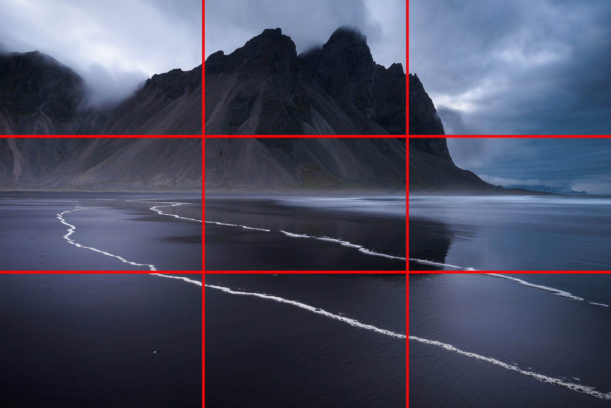
As you can see, the mountain does indeed intersect with the top 1/3 line. But it also extends significantly above and below – in fact, the top 1/3 line intersects just as much as any other line from the top quarter to almost the center of the photo. Although the subject technically does cover part of the 1/3 grid, it would be a mistake to think that this photo is an example of the rule of thirds.
Even then, this photo is easier to compare with the rule of thirds than many of my others. What happens if you’re photographing an abstract or multi-subject scene? Is it even possible to compose such a photo using the rule of thirds? I don’t believe it is – if your subject isn’t relatively small or well-defined, it is almost impossible to tell whether it fits the rule of thirds in the first place.
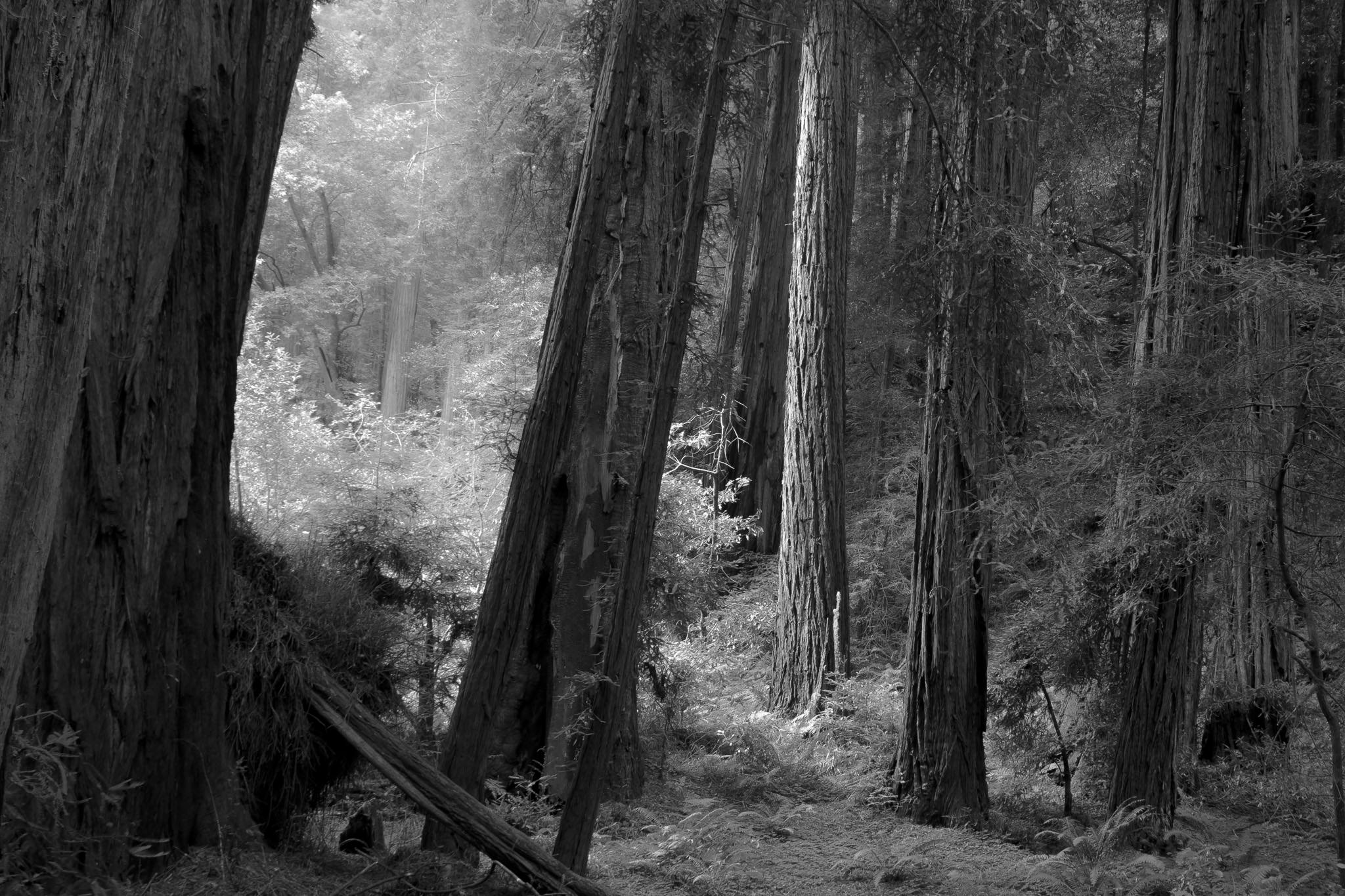
You could argue that the above photo fits the rule of thirds – at the very least, some of the trees intersect with the vertical 1/3 and 2/3 lines. Yet, elements of this photo would intersect with any vertical line drawn across the frame, and the main subject (the glowing tree near the middle-right) doesn’t fit with the rule of thirds at all. This isn’t a particularly unusual photo, either – nearly every time you take a wide-angle picture of a forest, the rule of thirds can be made to fit the scene arbitrarily.
3) The Ambiguous Grid
In the section above, I discuss how easy it is to force a photo to fit the rule of thirds, assuming that its subject is large or vague enough. But what if the subject is easily definable, but only barely off one of the third lines? Look at the photo below:

The damselfly’s eyes in this photo certainly seem to fit the rule of thirds. But what does the all-powerful grid say?

Okay, the eyes are slightly off of the 1/3 intersection. No big deal, right? This photo almost entirely complies with the rule of thirds.
However, if this is your thought process, the “rule of thirds” becomes “rule of what looks roughly like thirds.” So, there’s a gradual transition – the farther away from the 1/3 markings you place your subject, the less clear it is that your photo fits the rule.
To account for this flexibility, the modified rule of thirds grid below would recommend that you place your subject in the red zone:

But that’s not entirely right, because most people wouldn’t recommend putting your main subject along the absolute border of the photo. Let’s modify the grid again so that it looks like this:

Now we have the rule of lumpy donuts. If you put your subject roughly within the ring-shaped red area, you should have no trouble convincing other photographers that your photo follows the rule of thirds.
4) Exceptions
Every rule-of-thirds lesson I have heard concludes the same way:
“By the way, there are exceptions to the rule. Sometimes, you will want to compose your photo in a way that doesn’t fit the rule of thirds. That’s okay! As a photographer, you have the ultimate say in the appearance of your photo. Don’t be afraid to break the rules if your photo looks better a different way.”
Or something to that effect.
Now, the ambiguous rule of lumpy donuts is now growing even vaguer: “Generally, put the subject within this donut-shaped grid. But if the photo looks better some other way, don’t be afraid to abandon the rule.” Perhaps the genius of the rule of thirds is that it recommends that you put the subject wherever you want in the frame. If this is the case, I agree with it completely.
5) Outgrowing the Rule
Some photographers defend the rule of thirds by saying that it is a helpful learning tool for beginners – over time, good photographers will stop relying on it to compose their photos. The suggestion here is to learn the rule of thirds, then abandon it later.
Of all the arguments for the rule of thirds, I agree with this one the most. I do believe that, at some level, the rule of thirds is an easy way for beginning photographers to see the power of composing a subject off-center. Certainly, most beginners frame their photos with tightly-centered compositions – perhaps the rule of thirds helps these photographers realize that off-center subjects can be just as beautiful.
On the other hand, if you want to teach beginners that off-center compositions can look beautiful, why not just say that instead? If the rule of thirds is a middleman between beginners and their knowledge of off-center compositions, I fail to see why it is necessary in the first place. If you want to help beginners think creatively, which method would be more effective – teaching them to take rule-of-thirds-based photos, or teaching them to take photos where the subject is off-center? Both would have a similar effect, but one is far more limiting than the other.
Thus, I don’t really subscribe to the learn-then-outgrow view towards the rule of thirds – considering that there are other ways to teach the concept of off-center composition, I don’t believe that the rule of thirds is worth learning in the first place.
6) The Golden Ratio
All this talk of the rule of thirds, and I have yet to mention its infamous cousin – the golden ratio. The golden ratio of 1.618 : 1 is an approximation of the following:
½ (1 + √ 5 )
This number matters because of the Fibonacci sequence, where every subsequent number is the sum of the previous two: 0, 1, 1, 2, 3, 5, 8, 13, 21, 34, 55, 89, and so on. If you divide a given Fibonacci number by the previous one, you approach the golden ratio. For example, 89/55 rounds to 1.618.
I commonly hear people say that the rule of thirds is a simplification of this golden ratio, which is why it “works.” To that, I offer two counterpoints:
One: if the rule of thirds is an approximation of the golden ratio, it’s a pretty bad one.
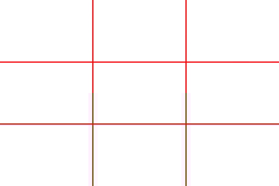
Look at the grids below (rule of thirds in red, golden rectangle in blue):
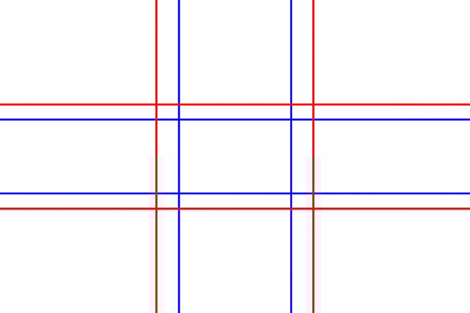
If the rule of thirds is widely intended to be this far off, why isn’t it taught as such – and why do in-camera compositional grids typically divide the frame into thirds, rather than into the golden ratio? Not to mention that this additional grid makes the donut even more lumpy and ambiguous.
Two: it probably doesn’t mean anything anyway.
I know that this point is controversial. After all, the golden mean/ratio/rectangle shows up in nature all the time, right? And if the Greeks used this number as the basis for the Parthenon, it must have some intrinsic value.
Unfortunately, the answer is that it probably doesn’t.
As an example, consider two of the most popular claims of the golden ratio: it appears in galactic spirals and nautilus shells. Although both of these examples typically follow logarithmic spirals, the golden ratio is just a single special case of logarithmic expansion – rarely are the specific angles in galaxies or shells the same as those of the golden spiral, in part because galaxies and shells already differ among themselves. If spiral galaxies don’t all have the same angles, how could they possibly be modeled off the golden spiral? The details are too specific for me to cover here, but you can read more information on the Logarithmic Spiral Wikipedia page.
Granted, the golden ratio is an interesting mathematical quantity, but I see no reason that it should have any effect on the human perception of natural beauty – especially considering that it doesn’t appear in the natural world all that often.
And even the Parthenon doesn’t embody the golden ratio, despite the pictures you may have seen. It is possible to superimpose almost any rectangle over the Parthenon and claim that it magically fits your desired ratio – there are enough “starting points” along the Parthenon to do so – but the most obvious rectangle in the Parthenon (shown below) has a ratio of exactly 9 : 4, or 2.25. This is far from the golden ratio of 1.618.
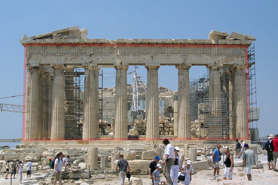
“Parthenon – facade est” by Florestan – Own work.
Licensed under CC BY 3.0 via Wikimedia Commons
https://commons.wikimedia.org/wiki/File:Parthenon_-_facade_est.jpg#/media/File:Parthenon_-_facade_est.jpg
The other possible rectangle on the Parthenon is the one formed by the now-collapsed triangular façade at the top. This is the rectangle that most people mistakenly label as fitting the golden ratio. If the red rectangle in the image above were extended to cover the tip of the façade, as well as the lowest step (then extended to the outer edges of the façade), its ratio becomes about 1.71. Yes, this number is somewhat close to 1.618, but the ancient Greeks were a smart group of people – if they had wanted the Parthenon to embody the golden ratio, they wouldn’t have built a rectangle that is “almost” right. Most of the diagrams you see online use thick enough lines and generous enough spacing to correct for this 5% discrepancy, but the differences are much larger in the real world – the Parthenon is almost seventy meters (225 feet) wide.
It is worth mentioning, though, that the golden ratio does appear in some corners of the natural world – or, at least, the Fibonacci sequence does. For example, when leaves spiral around a stem, they often do so at a fraction of a circle that can be expressed by two Fibonacci numbers – such as 1/2 or 5/13. But even then, this spiral isn’t the same as the golden ratio – it just uses two numbers from the same sequence.
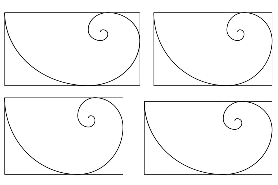
I think that spirals in general are beautiful, which makes it easy to assume that the golden spiral is special – without a doubt, it does look nice. But in the four diagrams below, can you even tell which one is the golden spiral? If so, does it look significantly more beautiful than the others?
Ironically, thirds appear in nature far more frequently than does the golden spiral – and halves are the most common of all, at least in animals. Does this mean that the ratio of 1/2 is inherently more beautiful than the ratio of, for example, 17/23? Honestly, I’m not sure if this is even a logical question.
I truly hope that someone can prove me wrong here – this topic always has fascinated me – but until then I’m tempted to file the golden ratio’s artistic nature away with homeopathy and aluminum hats.
Update: This section generated quite a bit of feedback in the comments, both for and against my arguments. One of the best contributions comes from reader John Acurso, who found a wonderful video from Stanford University that covers the golden ratio quite thoroughly. Give it a watch if you have time – the video goes through each of the golden ratio’s popular claims one-by-one, debunking most of them (see the 28 minute mark for a discussion on the Parthenon). There is a lot of misinformation on the golden ratio, so it’s great to see a video that shows the other side of the coin. Thanks, John!
7) Conclusion
Yes, of course, this whole article is somewhat tongue-in-cheek. Every photographer I know understands that a photo’s value has nothing to do with how well it matches to an arbitrary grid of thirds, and I would be surprised to meet anyone who believes otherwise. Similarly, I know that most people agree that the best way to compose a photo changes depending upon the specific scene in front of the camera.
The danger is that photographers use the rule of thirds by default. This habit paves the way for sloppy compositions – placing the subject off to the side even when a centered composition would be best, for example. And even though all photographers know that the rule can be broken, some rarely put that knowledge into practice.
Thus, I believe that it is a bad long-term idea to teach the rule of thirds as a cornerstone of composition in the first place. Perhaps the rule of thirds can show a beginner the power of off-center framing, but I think that the rule loses its value at the moment it it limits a photographer’s creative process (which I believe occurs whenever a photographer actively considers using the rule for a given photo). The rule of thirds forces you either to follow it or consciously break it – which limits your creativity almost by definition.
I want to see someone teach basic composition without even mentioning the rule of thirds, as if it doesn’t exist at all – because perhaps it really doesn’t. Although it is nice to think that you can improve your compositions through a simple trick like this, such an easy fix never really works in the long run. Eventually, to move beyond the basics of composition, you will have no choice but to wander into the intangible. Why hinder this process with creativity-reducing rules?
And if all of that isn’t enough of an argument, consider this final point: the rule of thirds is the best way to compose your images just like everyone else. Even if the rule does have special properties, the value of uninhibited visual creativity is impossible to ignore.
I’ve had these same thoughts for years. I love the way you’ve explored this topic and the way you’ve expressed your findings. Top stuff!
I have reached a point where I, by default, most of the time compose with the rule of thirds. Except there are moments when it doesn’t really fit and I happily break the rule. I believe composition is one of the more subjective topics of photography. I don’t think any kind of beauty is natural to the human being, rather some learned way of thinking and feeling that we like to experience repeatedly. It is more like a language. You may be used to it but if you repeat something different enough times you will become used to it instead. Great post, I still love the rule of thirds but I like to break it whenever I want.
just wondering where the beach picture was shot it looks so cool
The “rule of thirds” should be taught to those who are grappling with photography, especially at the beginning. This device will help them understand that putting a single main subject in the middle of the photo lacks interest. It alerts them to possibilities of composition and they will look at framing the photos in a more pleasing way because they will be pleased when they see the results. After a while, the more experienced photographer will just look at the scene and find the most interesting way to present it, or part of it. So I don’t mind the “rule of thirds” even though I rarely (if ever) think of it when shooting. My eyes and brain are now working together looking for ‘stories’ to tell through a frame. That is what separates casual and serious photographers.
Lesha.
Very interesting topic,it is comforting to know that one is not alone in the struggle.what i find is that when i go photo shooting , the rule of thirds is not part of my repertoire in preparing for a shoot. luckily my subjects are birds and wild animals,if i fail to place them according to the rule of thirds while shooting ,i fix that in post processing.Sometimes i just leave the subject as shot because according to me they are well presented.
awesome article.
Enjoyed your article, thanks for posting it. Loved this line “the rule of thirds is the best way to compose your images just like everyone else”
The first class I ever took on composition was from a nature photographer who detested the rule of thirds, largely because so many people were already so dogmatic about it. He started with elements and moved on to arrangements, then on to putting that all together. The rule of thirds hardly came up at all during that class, which lasted around ten months in total.
That’s my problem with it as well — people just use it too loosely. I don’t have any problem with people talking about the benefits of an off-center composition, because that often is a wonderful way to compose your photos! However, calling it the rule of thirds implies far too much importance, at least in my experience. Thanks for your comment!
Ya… a lot of people ascribe a lot more value to the rule of thirds than it deserves. It doesn’t give you any tools for understanding how the elements in a frame work together, so it’s really only suitable for the most simple compositions, and essentially useless for shots using deep focus, near-far shots, and also for storytelling.
Thanks for your tutorials. I am a total photography beginner, and I am learning a lot.
There is an art instruction book called ‘The Simple Secret to Better Painting’ by Greg Albert. He talks about the ‘one rule of composition’, which is to try to avoid identical intervals (not just in placement). I think the rule of thirds is trying to express this idea (avoid too much symmetry). It just isn’t the best way to express it. A simple example, two trees. If you place the trunks on the vertical thirds you end up with a very symmetrical composition (two identical spaces on either side, and they also sum to the space between the trees). If you vary these spaces, you get a better composition. Even though you are not following the rule of thirds, you are following his ‘one rule’. Much more latitude in applying this rule, I think, with the same basic intent in mind.
thank you, very interesting.
Below I share another article on this subject, which I found very enriching because it shows the relativity of ruleofthirds by way of explaining a lot of alternative composition strategies based on gestalt perception investigations:
petapixel.com/2016/…of-thirds/
hope you like it
Thanks for sharing this. I read that article when it first came out and found it interesting. I completely agree that the ten “myths” the author pointed out really aren’t true. However, I just as strongly disagree with the author’s justifications for why they aren’t true. Dynamic symmetry is no different from the golden ratio, and I haven’t seen anything to indicate that it explains the way we see photographs. I tend to think that an author is inventing rules any time that arbitrary grid lines are drawn over a composition.
Juan
Thanks for this link to a very stimulating article.
It made my day.
The rule of thirds is a dead end cookie cutter composition tool that offers nothing to enhance a photograph or anything to do with art. Master photographers don’t use the rule of thirds anymore than a master artist uses it. Master artists use Dynamic Symmetry (a design system using the golden section). When I say the golden section, I’m talking about many rectangles, not just one, the 1.618 that you mention. Photographers don’t use the 1.618 rectangle to design in the 1.5 rectangle either. They use the armatures of the 1.5 rectangle as well as overlap root 4 rectangles. This is what Henri Cartier Bresson did as well as most if not all of the Magnum photographers that shoot 35mm format. Your frustration is due to the rule of thirds because it offers no harmony, rhythm in a photograph at all. I see so many websites that will lay a rule of thirds grid over a Da Vinci, Van Gogh or any other master artist which is a total misuse. These master artists designs were way more complex than that and their designs have nothing to do with the rule of thirds. If you want something better, do a web search on Myron Barnstone and download lesson 7 & 10 of his drawing series. He covers all of the information as well as also shows how HCB designs his images. You can also do a search on Michael Jacobs, The Art of Composition: A simple application to Dynamic Symmetry. Thats a great starter book. You can also check out my website, I have many free downloads on design at LeicaCameraMonkey.com
Jim, I found it interesting that you dismissed the “Rule of Thirds” and then suggested that masters use Dynamic Symmetry (DS). First, I agree with what you said regarding the Rule of Thirds, mostly only amateurs even know it and it is no more valuable than any proportion that creates an effective image that conveys our idea/intent. But you do realize that the Rule of Thirds just may have its Roots in Dynamic Symmetry–although it may also be in concert with a more robust system of grids that dates back to at least the early 1800’s and included a thirds grid (interesting but no more valid as a rule).
It is the root 2 rectangle, divided per DS procedures, that ends up creating the thirds grid and the points of emphasis. Coincidentally, it was in 1920 where I first found the thirds grid published in an amateur photography book (Hammond) and that is the same year the first book on DS was published–although a journal based on it had been out for several years before–DS was formulated/codified by Hambidge in 1915. Also coincidentally, the root 2 rectangle of DS and the most popular film size of the times 2-1/4 x3-1/4, as well as the most popular print size, 5×7, had very similar proportions.
While you might find DS of interest, I personally have to agree with something I read in another book for amateur photographers in the 40’s. There was an allusion there to DS and the Rule of Thirds and the author suggested that the elasticity of DS had made most consider it able to justify any composition. In other words, there were so many ways to “divide” an image by varying rectangles and their further subdivision, that any image could be suggested to follow DS principles. As I said, I would have to tend to agree.
I’m all for anything that we find and which works for us but have always dismissed any of these theories as the tend to suggest HOW we should compose rather than the fact that our compositions should support our ideas, thus the great variety of successful images that don’t conform to any theory. Of course, we will always find, if only by chance, successful images that seem to support our theory–we just can’t then explain the great ones that don’t! And that is the reason art schools don’t teach visual theories as a basis for design or composition, but rather the more broad Elements of Art and Principles of Design.
Hope this helps.
Well put.
It may be pure coincidence, but I find ‘designed’ images – those which which have been made to perfectly conform to one golden proportion or another, too often singularly lacking in content (banal), static (contemplative), and, dare I say it, desperately uninteresting (boring).