When my wife and I are out and about on a photography tour I like to let my mind wander and keep my eyes ‘fresh’ so I don’t get too locked in on one particular type of image composition. We recently spent a couple of weeks in Nova Scotia doing some field work for an eBook project. Since the emphasis of that endeavour is landscape, seascape and shoreline photography we did focus the majority of our time on those subjects. As a result, visits to Peggy’s Cove, Lunenburg, and many small, seaside communities were on our itinerary. Many of the images captured were fairly complex scenes as could be expected. This article shares a couple of dozen photographs that highlight some of the simplicity, patterns and details in Nova Scotia that we experienced and included in some images.

This first image (above) was captured in Peggy’s Cove but it could have just as easily been found in any one of dozens of small fishing villages in Nova Scotia. At first glance this seems to be just a jumble of buoys and coloured ropes but I saw some interesting balance and nice angles in the mayhem. I purposely shot this image from a lower angle so I could frame the buoys and ropes with blue tones top and bottom. To my eye this helped to balance the composition and its colours.
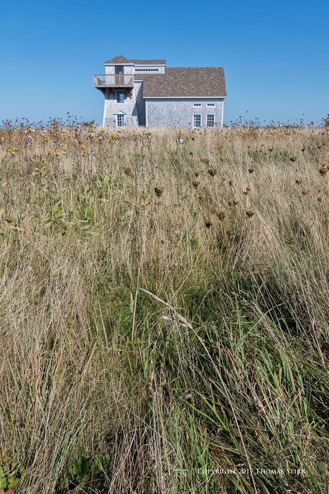
During our two weeks our intent was to circumnavigate much of the province along the coast roads. This led us to many small communities with their churches and the occasional lighthouse. I noticed an expansive field of wild grasses adjacent to the lighthouse above, and hiked out a little bit to compose this image. Having an expanse of grass, an absence of other structures, and a clear blue sky helped create a feeling of simplicity and isolation in the image above.

Flowers make obvious choices when looking for single, detailed photography subjects. This image above was captured at Annapolis Royal Historic Gardens. This particular bloom was in bright sunlight and I certainly appreciated the improved dynamic range and colour depth of my J5’s sensor (compared to my V-Series bodies) as that helped to avoid some blown-out highlights. What caught my eye with this particular flower were the gentle curls of its petals. Being able to frame the blossom off to one side with a standard ‘rule of thirds’ composition, shooting at an angle to the flower to cause some of the petals to go slightly out of focus on the right-hand side, and using a monochromatic green pallet along the right edge of the image, all help guide a viewer’s eye to centre of the flower.
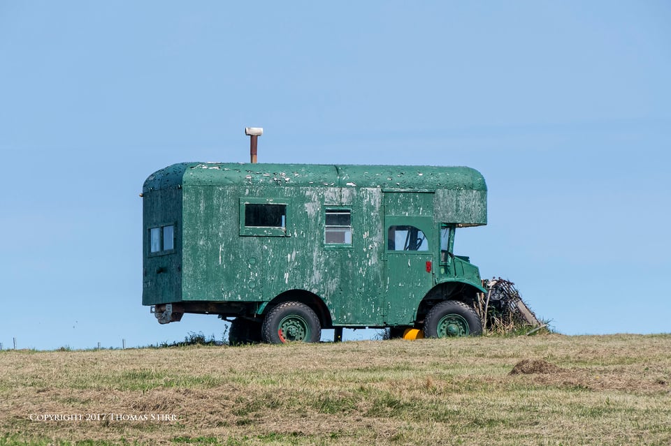
My wife and I love to get off the beaten path and explore small side roads. One of those explorations led us to an anticipated dead-end, but it did provide an opportunity to photograph this rather unique looking vehicle. I shot this image from a low angle so I could frame the vehicle against a clear blue sky, rather than having some of the farm animals that were in the field on the downside of the slope just past the vehicle, included in the composition.
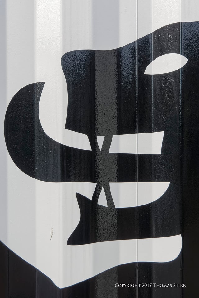
Speaking of simplicity, how much simpler could an image be than a black, painted shape on a grey metal building? This image above was captured at the harbour in Halifax. Much preferring rural settings, we only spent about an hour and a half in the city of Halifax during our two weeks in Nova Scotia. All of that time was spent in the harbour area capturing a few photographs.
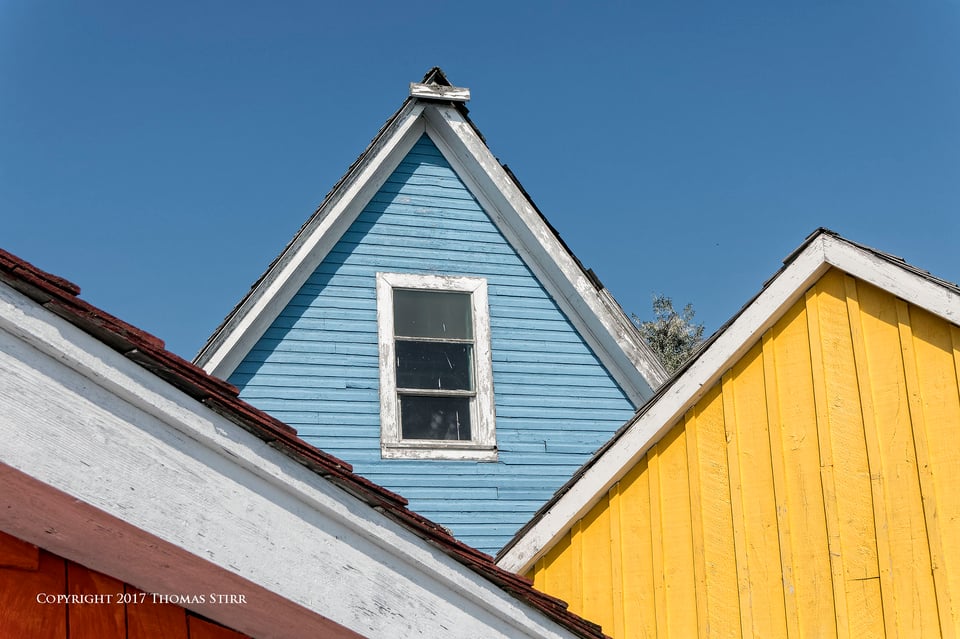
While in the town of Pictou we visited the Hector Heritage Quay. This museum features a replica of the Hector, a sailing ship made famous for its involvement in the first major Scottish migration to Cape Breton Island in 1773. The site also has a number of buildings that replicate settlements of the time. What caught my eye was the convergence of various roof angles and the primary colours of the buildings, resulting in the composition above.

We spent a number of hours exploring the Fortress of Louisbourg which was originally constructed between 1720 and 1740. This national park is the one of the largest historical reconstructions in the world, featuring a wide selection of buildings and battlements. As I looked at the leg iron captured in the image above I couldn’t help but think about the battles fought between the French and English in this part of Nova Scotia, and what it must have been like to be held captive.
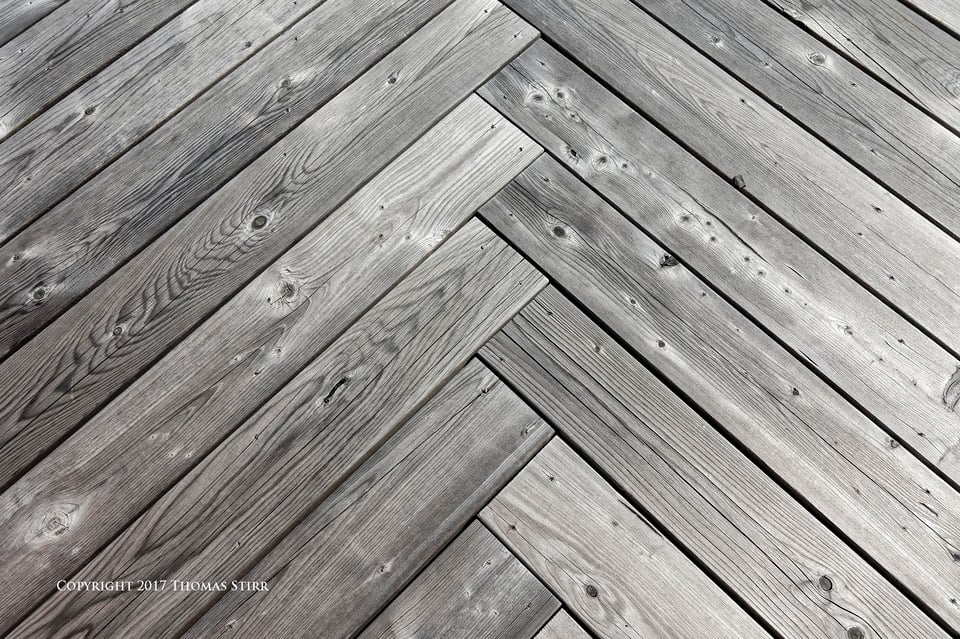
I composed the image above while visiting Hector Heritage Quay. It took a bit of time for me to get the framing exactly as I wanted, with the spaces between the boards on the right and left bottom corners both making clean corner exits, and the overlapping boards forming a balanced line in the centre of the frame.
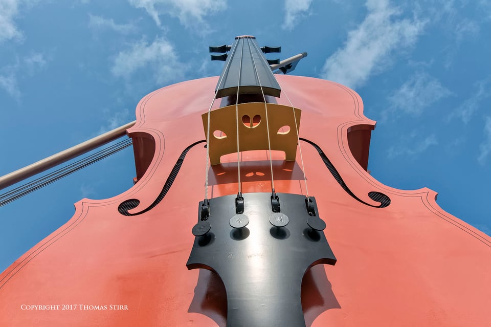
In 2005 the city of Sydney Nova Scotia unveiled the 60-foot, 10 ton giant fiddle pictured in the photograph above. This fiddle celebrates the folk music and traditions of Nova Scotia’s Celtic community, and welcomes cruise ship visitors. The day we were in Sydney a large cruise ship was in port and the area was bustling with throngs of tourists. Rather than capture an image cluttered with people, I decided to create this image from the base of the giant fiddle, shooting up against a bright, blue sky. I like the drama and simplicity of this composition.
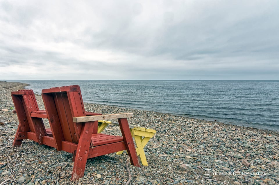
As we drove along the coast roads in Nova Scotia it was very important to pay attention to fleeting glimpses of beaches etc. along the roadway. I noticed this chair set and table out of the corner of my eye, and doubled back to capture this image. I had to hike down from the road along a rock strewn path to reach this small part of secluded beach. After trying a few different composition approaches I decided to shoot this image from the back of the chairs, looking out over the water. I adjusted my camera’s shooting angle to ensure an unbroken horizon as I felt it added to the feeling of vastness of the water in the scene. I used a ‘curves’ adjustment in CS6 to help bring out the colour of the blue-grey rocks on the beach, helping to create a monochromatic flow between the beach, water and sky, and further accentuating the colours of the chairs and table. An important image framing consideration was to leave an equidistant amount of stone beach on the bottom and left-hand side of the beach chairs.
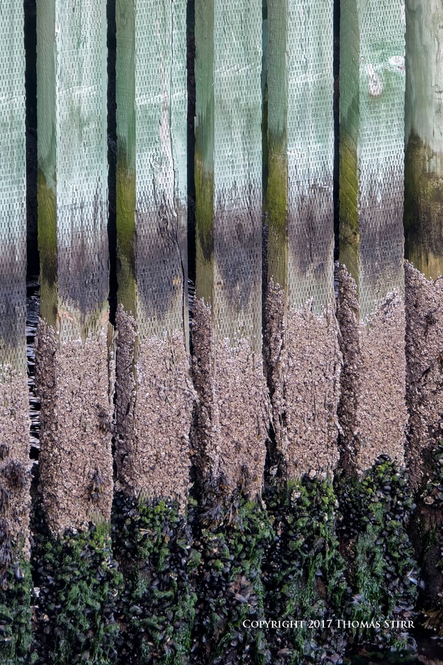
The tide was out during the time we were capturing images at Halifax harbour, revealing this pattern of colours and textures. When composing this image I made sure to get in fairly tight to accentuate the strong, vertical lines. I applied some perspective control in OpticsPro to ‘square up’ the lines.
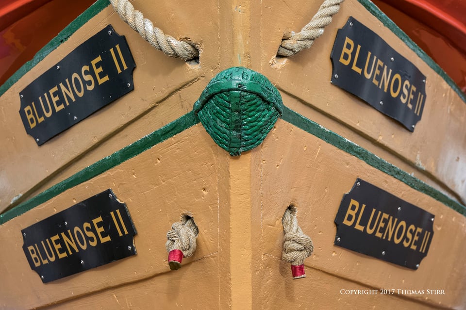
At the beginning of our trip while in Lunenburg (one of only two urban UNESCO World Heritage sites) we had a chance to see the iconic Bluenose II in port, where it was undergoing some maintenance. Then, on the second last day of our photography tour we came upon the Bluenose II once again while at Halifax harbour. I loved the repeating pattern of the name plates on this pair of lifeboats that were on the deck of the Bluenose II and used the bow of one of the lifeboats as the focal point of the photograph.
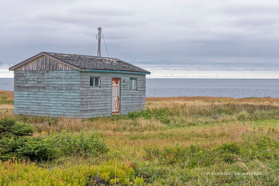
Travelling along the some of the more remote coast roads in Nova Scotia will bring you to many small, fairly isolated communities. The image above was captured at Neil’s Harbour, a small village just off the Cabot Trail on Cape Breton Island.
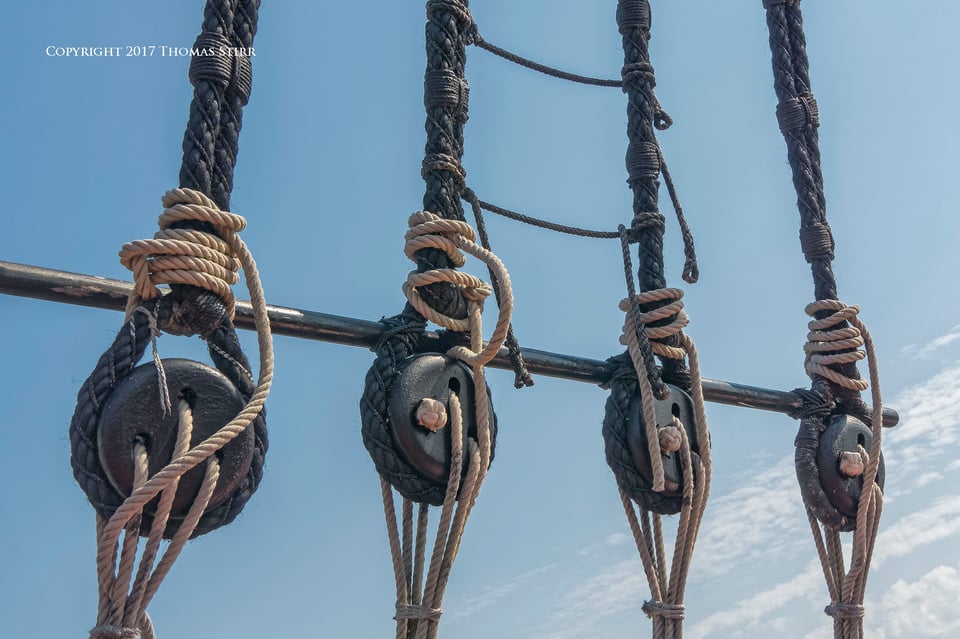
My eye is always drawn to repeating patterns and shapes. This image was captured at the Hector Heritage Quay while aboard the replica of the Hector.
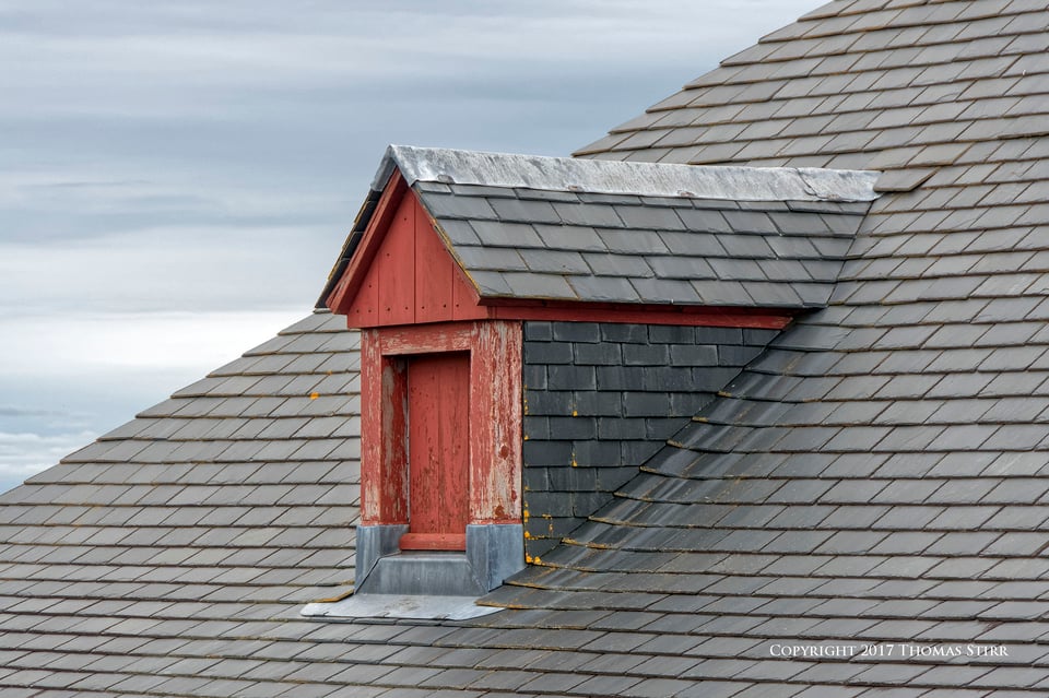
This roof-line and dormer image was captured at the Fortress of Louisbourg National Park. To create a smooth contour between the roof line and the dormer I made sure to frame this photograph at a very precise angle where the slope of the dormer flowed directly onto the edge of the roof line. This also enabled the image to achieve a 1/3 to 2/3 ratio between its two fundamental components of sky and roof, and give it a strong sense of balance.
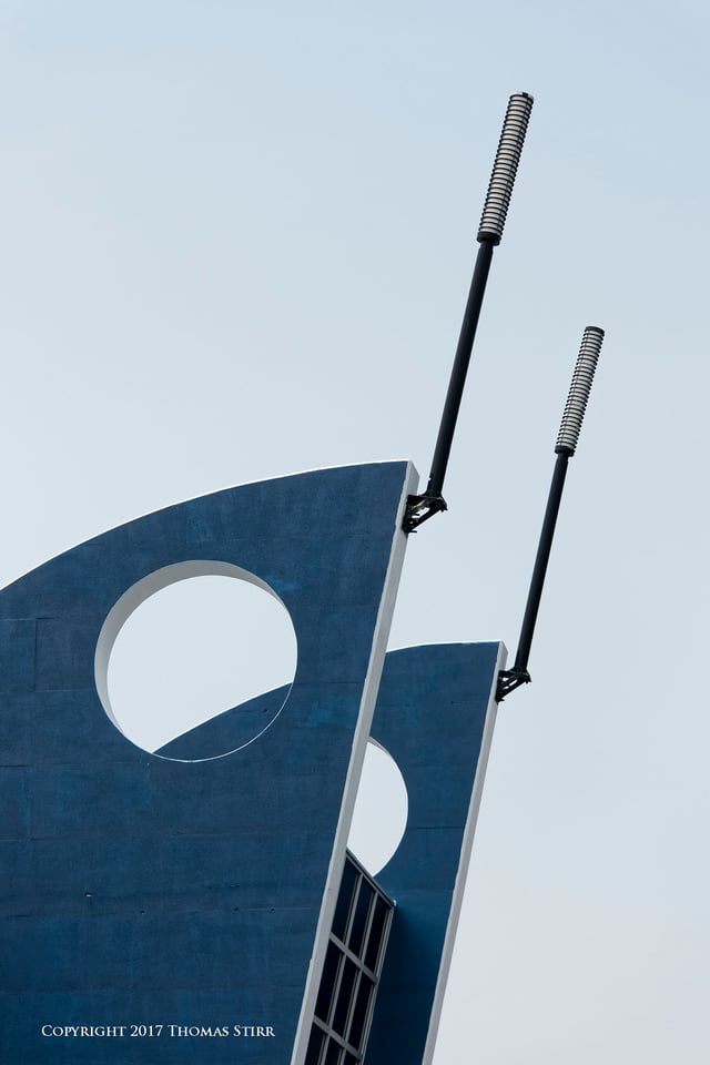
The image above was composed at the Sydney Ferry Terminal, utilizing the shapes directly above the entrance of the building. When composing this photograph I paid special attention to the parallel lines of the structure. I also wanted to achieve a 3-D effect by using one of the circular cut-outs to frame part of the structure behind it. Strong sunlight reflecting off the white painted surfaces helped to define the edges of the structure and add to the desired 3-D effect.
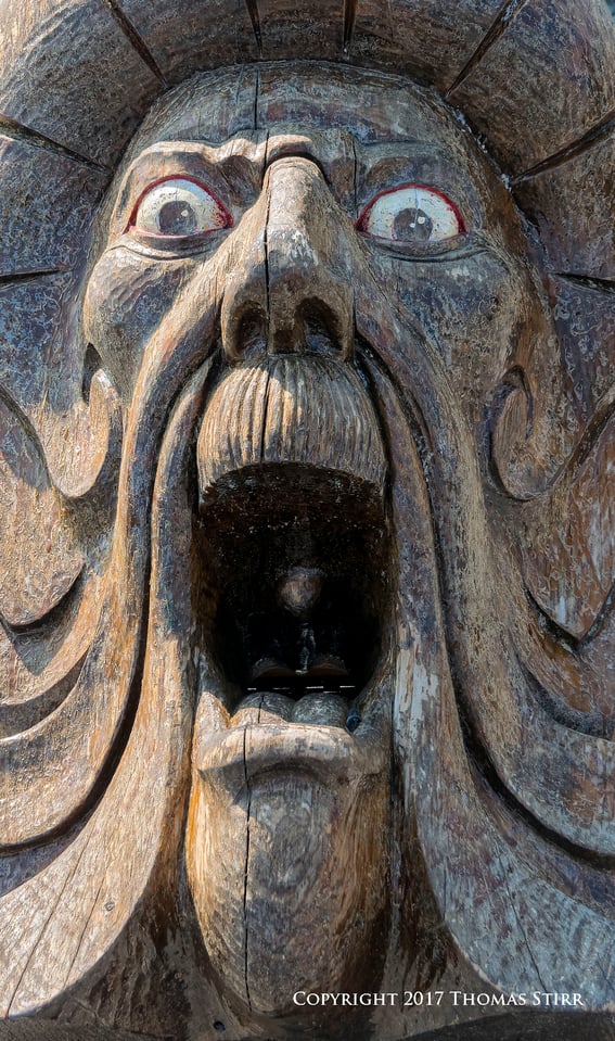
This carving was found at the Hector Heritage Quay. I used a full image bleed with this composition to create a strong sense of drama and to accentuate the emotion in the carving.
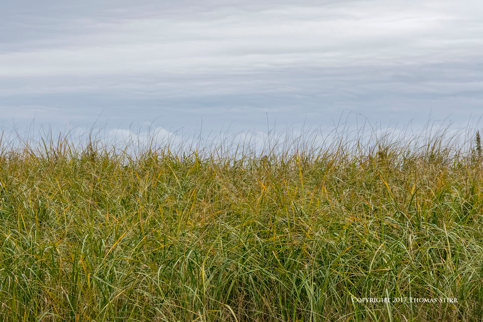
From time to time I like to experiment with minimalist compositions. I captured this image at Martinique Beach, shooting up at the grass on some of the beach dunes and framing it against the sky. I used a 50/50 sky to earth ratio to give the composition balance between these two realms.
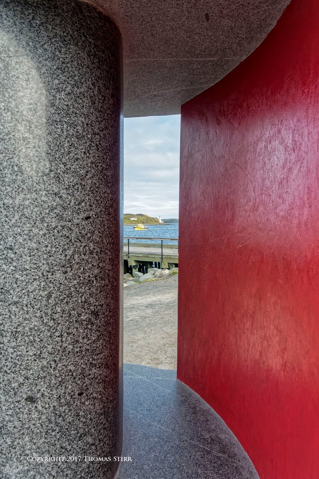
This ‘peek-a-boo’ photograph was captured during our brief visit to the Halifax harbour. I liked the juxtaposition of the modern curved lines of the sculpture revealing an older wooden dock, boat passing by, and classic-looking lighthouse in the distance. As I was initially composing this image the yellow boat entered the frame. I waited until the boat had passed the lighthouse and formed a triangle with it and the other white building in the distance, before capturing this image. This helps to create some balance in the distance.
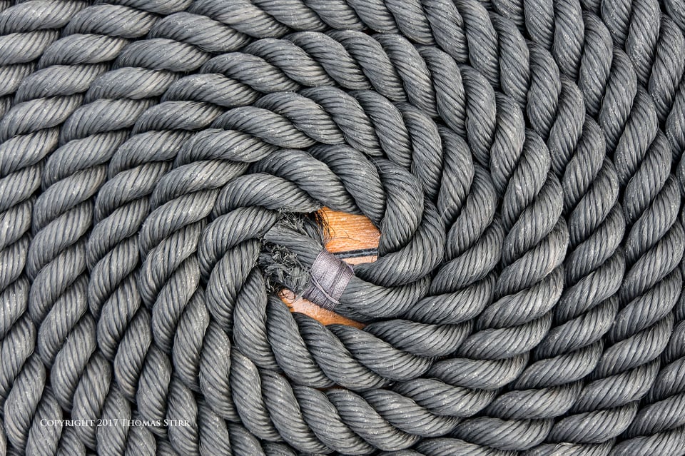
I loved the strong, concentric lines of this coiled cable. I held my camera out straight in front of me, with the rear screen at a 90-degree angle to compose this image. Applying some micro contrast in post helped to bring out the fine details in the coiled cable.
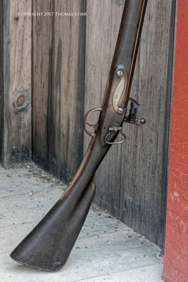
The musket image above was captured at the guardhouse at the Fortress of Louisbourg National Park. I loved the elegant lines of the musket, and when composing the image I made sure to include some of the reddish paint on the frame of the guardhouse door frame to give the image a touch of added colour. This also helps to highlight some of the subtle shading of the wood on the stock and metal details of the musket.
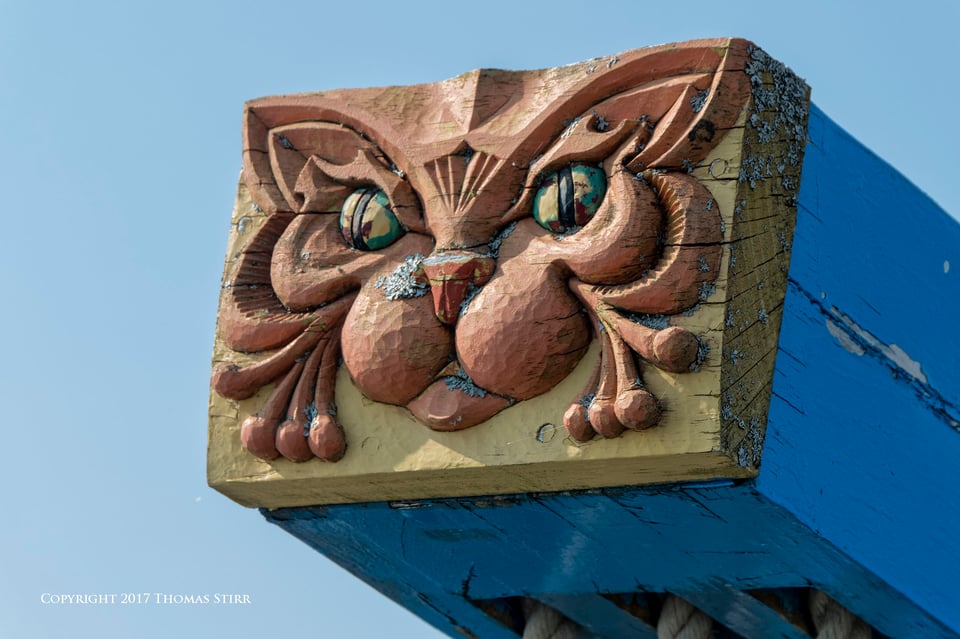
This is another image captured at Hector Heritage Quay. It is one of the carved details on the Hector replica ship. I left some sky on three sides of the carved head to frame it and add to the 3-D effect of the composition. A corner exit in the bottom right was used to add image flow.
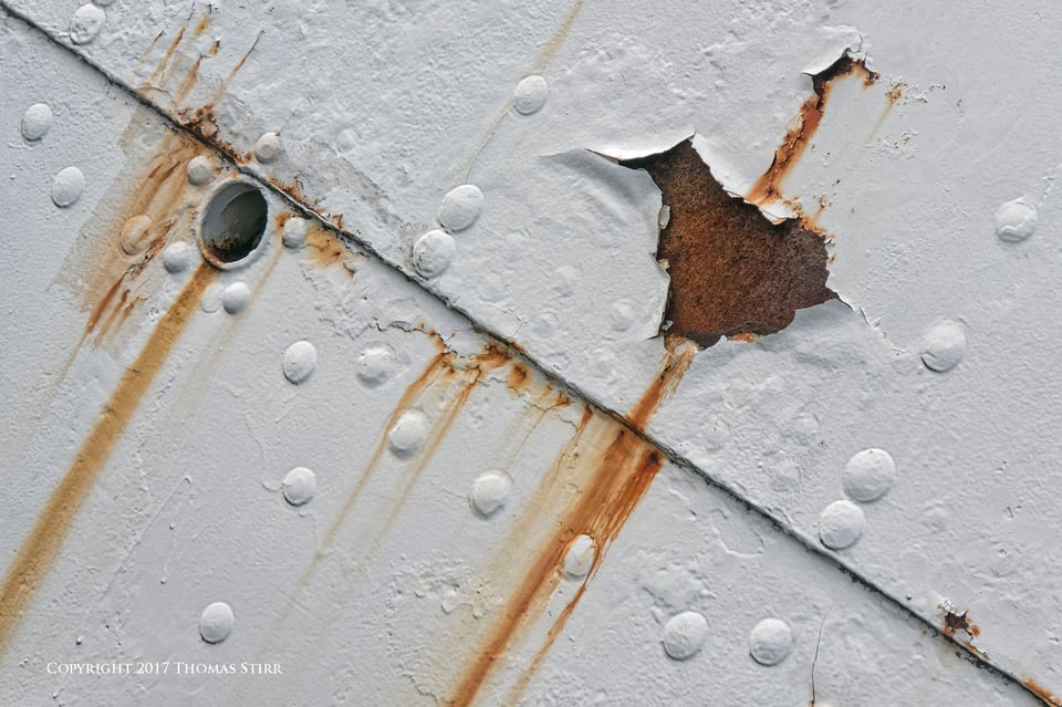
This photograph of some rusty, riveted side plating on a ship was captured while shooting at Halifax harbour. I angled my camera to create a strong top-left to bottom-right image flow. A key consideration of the composition are the two, precise corner exits which help bisect the photograph.
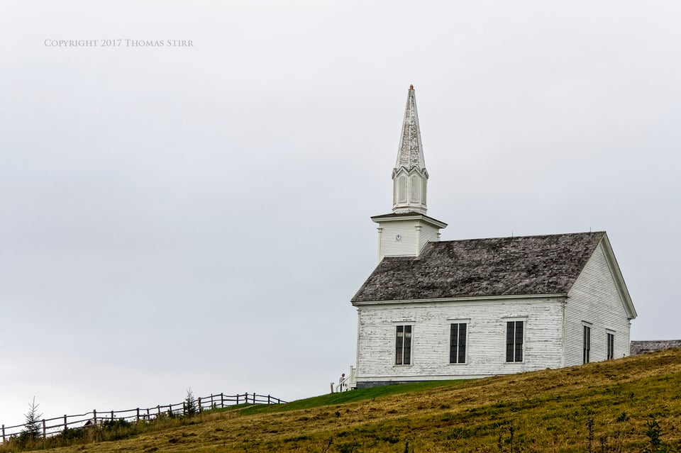
The final image in this article is of a replica church at the Highland Village located in Iona, Nova Scotia. To me, the beaten, weathered look of this church captured the original pioneering spirit of the settlers of Cape Breton Island…persevering in the face of adversity. I purposely captured this image with a tourist entering the church as I thought that detail helped to signify the importance of area churches as local gathering points. As you drive through various rural Nova Scotia villages you will pass by numerous small, community churches, each having their own unique history and impact on the local area.
Technical Note:
All photographs in this article were captured hand-held in available light using Nikon 1 gear as per the EXIF data. To calculate the equivalent field-of-view when compared to a full frame camera, multiply the focal lengths in the EXIF data by 2.7. All images were produced from RAW files using my standard process of DxO OpticsPro 11, CS6 and the Nik Collection.
Article and all images are Copyright 2017 Thomas Stirr, all rights reserved. No use, adaptation or duplication of any kind are allowed without written consent. Photography Life is the only approved user of this article. If you see it reproduced anywhere else it is an unauthorized and illegal use. Readers who call out websites that steal intellectual property by posting comments on offending websites are always appreciated!
Hi Thomas,
I definitely view the world in a similar way to yours, judging the photos in this article.
The odd angle, the detail, and when available, the unusual animal, or the unusual pose!
Usually with a macro lens, or a long, telephoto lens. The rest are seldom used.
I do shoot wide angle as well, but then I usually get as close as is possible, so that the interesting item/animal/plant/person takes up as much as possible of the image.
Being surrounded by masses of people at work, 5 days a week, I find little interest in people, while a single person, close-up, can be thrilling.
Thanks for adding to the discussion Tord! It certainly is interesting how each of us experiences the world around us. Off the top of my head I can’t think of photographic subject of less interest to me than people. I remember when my wife and I were in Greece and I was doing some street photography in various towns I would purposely try to wait until the street scene was completely devoid of people before I would capture my images.
Tom
Your images are superb. I enjoy them.
On the subject of order in chaos [comment 2 above], in scientific usage of the concept, there is order in chaos – the fractal dimension and this is not always readily apparent. Perhaps our pattern recognition can detect such hidden order even though it’s not patently obvious in many scenes that grab our attention.
Thanks gosh1, I’m glad you enjoyed the images! Thanks as well for adding to the discussion.
Tom
No disrespect to anyone, but I have to agree with Turtle Cat. A good photograph connects the viewer instantly to the story, visually, without explanation. Sorry for not holding back like Turtle Cat. I find these pictures boring and uninspiring. I can’t imagine someone who could appreciate Henri Carter-Bresson, Steve McCurry, Arnold Newman, would give appraisal to these photos. Sorry I voice this out, the internet is getting more and more mis-educating. To master photography, just go get some books by the Photography Greats. Understand what make those photos great, get inspired. Forget all about leading lines, rule of thirds, patterns etc. When you look through the viewfinder, scrap all those things. Those are only for post analysis in lecture rooms. Let your subconscious artisan within do the job. Because when you read and understand Bresson, Bresson has already trained you well.
Thanks for sharing your perspectives Zeissiez.
Tom
Sorry for saying what I felt, but that refered only to this set of photos. I’m sure, given the level of admiration from your fans, you have got some awesome work which I have not seen.
“… I can’t imagine someone who could appreciate Henri Carter-Bresson [sic], Steve McCurry, Arnold Newman, would give appraisal to these photos.”
That doesn’t make sense — it’s a contradiction — because you have given your appraisal of them: “boring and uninspiring”.
To help you understand what I mean: I have not, and shall not, write an appraisal of your photos because I appreciate the artistic works of Thomas Stirr.
You wrote: “Let your subconscious artisan within do the job.” Yep, my “subconscious artisan” is that which compels me to sincerely thank Thomas Stirr, Rick Keller, Alpha Whiskey, and Spencer Cox for sharing their artistic works via Nasim’s Photography Life website.
If every photographer learnt to emulate the works of those you mentioned then photographers would have nothing new to offer their audience; photographers would, at best, be guilty of both plagiarism and tiresome regurgitation.
Get some books my friends, books
You epitomize the meaning of the word “condescension”.
condescension [noun]: an attitude of patronizing superiority; disdain.
SYNONYMS
superciliousness, superiority, scorn, disdain, loftiness, airs, lordliness, haughtiness, imperiousness, snobbishness, snobbery.
en.oxforddictionaries.com/thesa…descension
Praise can come so lightly, just like “LIKES” in Facebook. Critics improve u. I appreciate your critics. Cheers.
ZEISSIEZ,
I agree with you. The “LIKES” in Facebook etc. cause so many people to increasingly live in their chosen echo-chamber ‘bubble’ and to become increasingly detached from reality.
During high school, further education, and the early stage of my career, I was extremely fortunate to encounter some experts who went far beyond their call of duty to spend so many hours of their unpaid time in freely passing on their in-depth knowledge to those of us who genuinely wished to learn. Over the years, I’ve been informed of the demise of each and every one of them. It breaks my heart to face the fact that I was far too shy and inept to properly thank each of them before they died. I learnt something from my profoundly regrettable ineptitude: to sincerely thank experts who willingly share their knowledge; and to challenge those who attempt to discredit them.
I could read a plethora of books on the fine art of producing excellent wine, then further my education by actually attending wine tasting events. Yep, I’ve been there, done all that; but I still detest the taste of wine. I love the taste of a very few: beers; lagers; Irish whiskies; and Scottish whiskies. There are some excellent books on the subject of whiskies which adequately explain the subtleties of their smell, tastes, aftertaste, and production methods, but reading the works of these experts will never explain why many people much prefer baked beans on toast to a masterfully-prepared dish of calamari!
Pete A, I do not go conform with your statements. Please take your time and search on the net articles about what famous or well known photographers think about photos which are top rated on platforms as flickr, 500px, thumblr, etc. Of course, if you detest wine (really?) no book will make you loving it. But if you love wine it is the contrary if the book is good: you maybe learn to enjoy it even more.
I do own a book about Henri Cartier-Bresson (Cartier with an I), but I would not if I despised photography.
Jan Holler,
I always enjoy reading your comments, but never mistake my enjoyment of them as being in any way complimentary!
complimentary [adjective]: expressing a compliment; praising or approving.
No disrespect or anything but I wonder what others are seeing in these pictures that I’m not? On one hand it really doesn’t matter whether anyone likes a picture or not but with all the gushing over these pictures I keep wondering why they don’t appeal to me?
Hi Turtle Cat,
Some things appeal to some folks, and leave others cold. I think it simply comes down to our individual tastes and preferences, and our subjective evaluations of what we see. I create these types of images from time to time and my wife typically refers to them as ‘my weird stuff’.
Tom
Turtle Cat: Since you ask: I feel the same like you do. We probably all know the time when we took such pictures. To me they are plainly too ordinary, simple, not artistic. The subject is the art, not the photo. And by all means: what is so special e.g. with the violin photo? The perspective? No! What then? Or the carving? Nothing besides the carving itself. Or the knots? I can accept the photos of the buildings, but still: What makes them stand out? Do I really want to watch at a floor’s pattern in a photography? Yes, if it shows me something I did not discover before. Does it do it? No! Is the macro of the flower interesting? Only if you have never seen a flower closer. The rope is somehow interesting, but look at it again. If you get used to it, it is ordinary.
I’ve been a second time to Rome a week ago. While we cruised with a couple and I could not focus on taking pictures I still looked for some new perspectives. Frankly said: There are almost none: all images are already taken. Really? No, not at all! It is and was my limitation. It is the skills, the taste, the experience which makes photos stand out from the mass of photos. So I took a photo of the inside of the dome of the Pantheon. My friends like it very much. I do like it. But it is still ordinary. It shows the dome. It is well done. But the art is the dome and not the photo taken.
I look at (my) photos this way: Would I hang it on my wall? Would I want to look at it for a longer period of time, for years? Mostly not! If you want to catch likes you have to deliver what the people except. Either you post process your photos to the excess, make it colourful, compress the dynamic range to the max, make it HDR or you take pictures the way the mass does it, only just a bit better. So everybody thinks: I tried that as well but my pictures do not look as nice as those here. And that is what is about this photos in this article: Regular photos a bit better done than the average. But they do not really tell us a story.
ZEISSIEZ: I agree with getting books and try to understand what makes those photos great. You’ll learn a lot.
Hi Jan,
Each of us sees and experiences the world around us in different ways. This can result in us relating to photographs and evaluating them in opposing ways. That is to be expected given the diversity of individual human experience.
Your comment was quite helpful for me. The ‘wood plank pattern’ image was composed for a very specific purpose for use in a project which I have under development. The reactions to that photograph have absolutely confirmed that the image will be an ideal representation of the concept it was designed to communicate. Thank you.
Tom
Hi Thomas,
I would almost agree with you: Yes, we all have a subjective view of the world around us, but no, the evaluating of photographs is not going in completely different directions. There is an understanding of what art is, of what composing is, which is (should be) completely unrelated to the subject of the photograph itself. Some subjects are so beautiful or so interesting, the photo, if technically o.k., will be liked by almost anybody. The composition, the light, the framing, the isolating of the subject against its environment and so on could be average, still the beautiful subject draws all attention and lets us (most of us) forget about the rest.
But if the subject is not beautiful (at all), when there is no distraction, the average photo stays average. Nothing will help. Average stays average. You as a photographer have the impression of your journey in your memories. All others do not (if not having been there as well). You connect your photos with what you experienced there, all others do not. Let’s take the second image with the house. This does not make sense to me. It is a nice image, but do I really favour the grass which takes 3 of 4 parts of the image or do I look at the house? I look at the house. I want to look at the house, but my eyes are a bit lost in the clutter of the grass. So if I take the lower half away, frame it differently, it appears more interesting. Of course if you meant to show the grass, it is o.k. as it is.
But the subject of your article is simplicity, patterns and details. If I take a look at this photo I see complex grass structure which does not make any sense to me in terms of simplicity. It may work if the grass is out of focus or if the grass is sand without so many lines and different(!) structures. My eyes are well distracted from the subject. That may be deliberate but I doubt that. And details are always kind of interesting. But they could still be composed well. If the photo’s only purpose is a magnifying glass it most of the time fails. That is why macro photography is so difficult.
With regards!
-jan
Hi Jan,
As noted earlier, we all see and experience the world differently. Obviously you do not like this collection of images, and do not see any value in them at all. C’est la vie! I’m pretty sure neither one of us will lose any sleep over it.
Whenever I write an article here at Photography Life or on my own photography site, I never have any expectation of how it will be received. It simply is what it is. People are free to like it… hate it… read it… or simply ignore it and move on to something else of interest to them. Regardless of the choice made, life goes on and we all continue on our journeys unscathed.
Tom
Hi Thomas
Your assumption is not true. I see a value. Otherwise I would not bother at all. I thought I explained what my difficulties are with the images you posted here. You talk about simplicity, structures (and details) and I showed my problems with it regarding the posted images. I do not see many other critics in the forum which go a bit deeper than just overall approval. I made my arguments, you just answered everyone sees the world differently. Too bad you are offended as I can clearly see. I am sorry for that. But if one cannot stand critics he should not publish. I was not rude, I was not impolite, I just expressed my opinion. You made your claim first. If you are just looking for approval I think one betters skips such articles.
Regards!
-jan
Hi Jan,
I did not say, or imply, that you were being rude or impolite. You stated your opinion, which you are certainly free to do.
If you would indulge me, I would like to provide some background that may help put my replies into context. This response is a reflection of a personal philosophy to which I have adhered for the past 50 years, and one that I have no intention of deviating from until my last breath leaves my body.
Each and every day I do my best to manage my inputs. By that, I mean that I stay focused on my goals and my creative path, regardless of the accolades or criticism that my work may attract. Whether someone likes or dislikes my photographs, my articles, my books, my business posters or anything else that I may create, does not make any difference to the choices I make on my creative journey. Some endeavors have met with commercial success, others not. In either case the creative value was identical and equally rewarding. When my work has helped others I do take time to celebrate that with them.
I live for the simple pleasure of creation… and I follow my instincts wherever they may lead. I have no interest in direction from others, and since my most formative child years, never have.
The only competition that I have in life is with my own best self. Nothing else is as demanding, as inspiring, or as rewarding.
Tom
Hi Thomas,
Sure, go ahead. My philosophy is to think about that what others reflect and my past 50 years tell me that this brings the most out of a person. I think it is a bit strange to try to teach and tell others and not being willing to be thought and told by others. And I also doubt strongly that the only reference for a person can be the person himself. Makes it a rather small world.
But each one of us has to know what is best for him. By the way, it was not about liking or disliking or even competition, it was about learning. But now I learned that this is just an one way road for you, just this and no further explanations. So I won’t bother you anymore. Sorry for interrupting.
My regards!
-jan
Hi Jan,
I never said that one cannot, or should not, learn from others. tomstirrphotography.com/perso…creativity
Tom
Quote:
“Whether someone likes or dislikes my photographs, my articles, my books, my business posters or anything else that I may create, does not make any difference to the choices I make on my creative journey.”
“The only competition that I have in life is with my own best self. Nothing else is as demanding, as inspiring, or as rewarding.”
“I have no interest in direction from others, ”
You never said _one_ cannot or should not learn from others, but expressed that _you_ will not.
oao
-jan
Hi Jan,
Since we are at the maximum number of replies in a thread I needed to respond here. You seem to be operating under a number of erroneous assumptions. The first two are that a creator is under some kind of obligation to accept all criticism, and change their approach because of it. They aren’t, and they don’t. The third is that all criticism will be valid to a creator. It isn’t. The fourth is that all criticism results in learning. It won’t, and may encourage conformity which restricts learning. The fifth is that unsolicited direction is the same as learning. Nothing could be further from the truth. The six is that independence of thought and learning are mutually exclusive. They are not, they are symbiotic. The seventh is that I have never learned from another person. You don’t know me, my history, my accomplishments, or my choice of mentors. I choose them carefully and purposefully. They are not found randomly on the pages of a photography blog.
Tom
Hi Thomas
Oh my god, what… I should have known it right from the beginning. That’s my fault. Sorry. A person who tells the world that she never had learned from another person should not try to tell anybody anything without breaking her own rules. You obviously live in your own bubble and make your own world and rules and I am this stupid to not realize it sooner. You really do not even realize what you tell about yourself. Sorry again.
Regards!
-jan
Nice article and pictures, about which I have no particular comment, but was struck by the image of the roof rafters. Lacking trusses, collar ties, and ridge pole, it’s an unusual construction but typical of Nova Scotia, at least once upon a time. One consequence is that barns built this way (and also with very little framing at the joint between roof and wall), though they last a long time, when that time is over, tend to fall down in a neat, flat pile like a house of cards. I suspect there are not many buildings like that left, but it’s interesting to see.
Hi Matthew,
My understanding is that the Fortress of Louisbourg was reconstructed using techniques that were similar to those employed during the original construction period, i.e. 1720 to 1740, which I find fascinating. Thanks for your comment as it helped to understand why my wife and I noticed a few examples of buildings that collapsed “in a neat, flat pile like of house of cards”, as noted in your posting. One of the images that I’ll be including in our Nova Scotia eBook is of a condemned house in a rural area, that appears to be falling into itself (for lack of a better description).
Tom
Nicely done Thomas. Makes me chuckle a bit. Every now and then and sometimes far and few in between, I get a shot that looks in composition similar to one of yours. I often wonder why the shot grabs my attention. Understanding your careful planning will definitely help my “keeper” rate go up! Thanks for your careful work.
Bob
Hi Bob,
I’m glad you found the article helpful!
Improving our ‘keeper’ rate is something to which we all strive. I find mine has been positively impacted by two things, the first being age. The older I get the less interested I seem to be in capturing multiple images of the same scene. I’m not sure if this is due to a decreasing attention span and having more ‘senior moments’ or becoming more lazy in post! I take far fewer photographs of specific scenes and subjects than I used to, and tend to contemplate photographs a bit more than in the past (although I still work very quickly). I certainly walk away from an apparent photographic opportunity without pressing the shutter far more than I did years ago.
The second factor is paying far more attention to ‘eye flow’. This involves thinking about how a potential viewer could experience a photograph, what factor(s) would draw their gaze into an image, and where their eyes would travel once entering. Other than a very rudimentary class on photography during a college semester over 40 years ago I have no formal photographic training. So, like many folks my journey has been more experiential and experimental. I do use some very simple guiding principles adapted from advertising design work, that will form the basis of an upcoming eBook.
Tom
Good stuff here, Tom. I like your perspective.
Thanks Ian!
Tom
The Article is really Eye-opener..!!
Fantastic composition with explanations:)
Thanks for your supportive comment Ashok – most appreciated!
Tom
Hi Thomas! Wonderful article and lots to imbibe from each of your twenty-four photos. As a relative neophyte, getting exposed to such meticulous and artful approaches excites me beyond words. Thanks a ton!
I appreciate your feedback Sarang! I’m glad the photos and explanations were helpful for you.
Tom
Nice photographs and nice article
Thanks!
Tom