During our most recent trip to New Zealand my wife and I had the opportunity to spend a couple of hours strolling through downtown Christchurch. We were struck by the beauty of the architectural design, sculptures, and the street art that we found during our visit. This article shares some images as well as discussing some composition considerations.
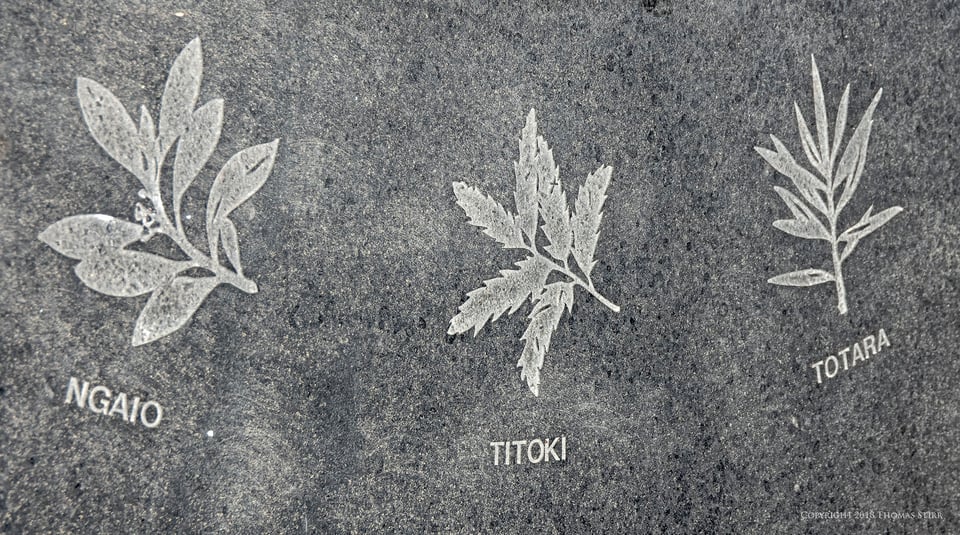
I’m often drawn to the details in what I find like these leaf designs located at the bottom of the Chalice Sculpture. Due to the angle of the strong afternoon sun and the number of people around the sculpture I had little choice but to capture this image at a difficult angle. Given the shooting conditions I did my best to capture the gentle sweeping motion of the leaf designs. I needed to adjust the perspectives in post and rotate the image 90-degrees.
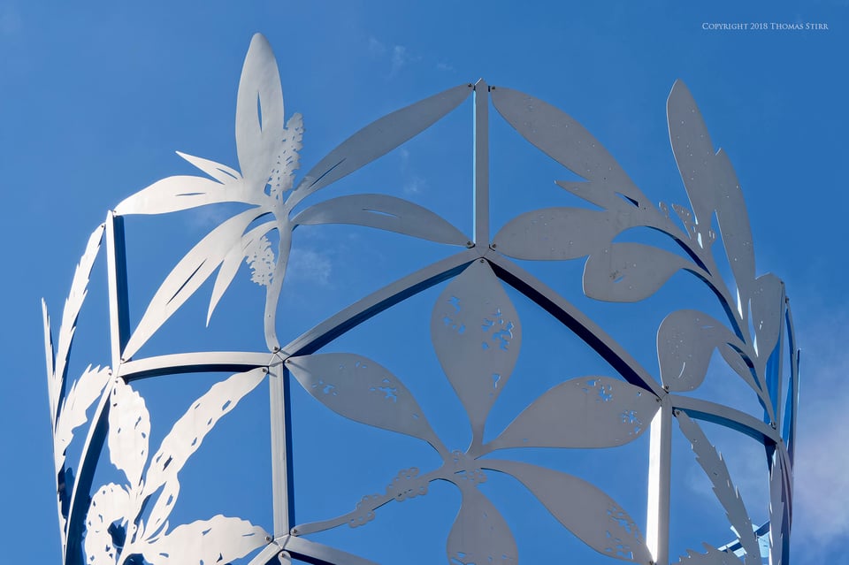
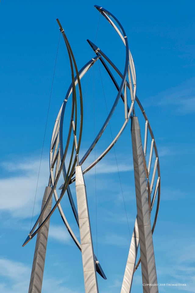
The sun highlighting the top of that same sculpture also caught my eye. I used equidistant composition to create some balance in the photograph.
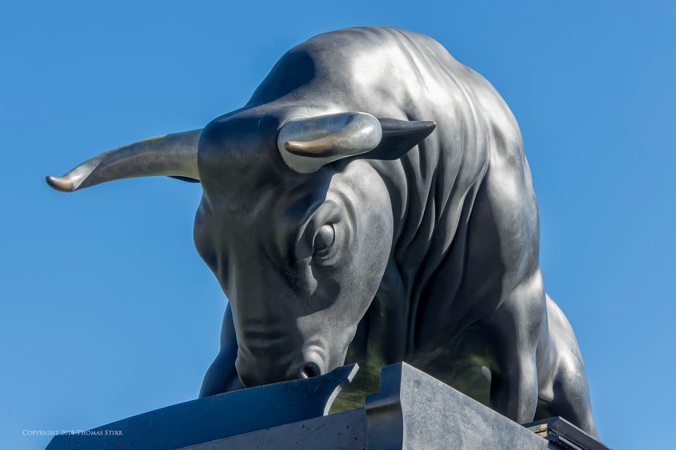
Sometimes overhead wires, trees and other visual distractions can be a challenge when composing images in urban areas. I shot this photograph from close to ground level, looking up towards the sculpture to create drama and also eliminate the visual distractions. Using a camera with a flip screen is ideal of this type of composition, as was the use of a zoom lens.
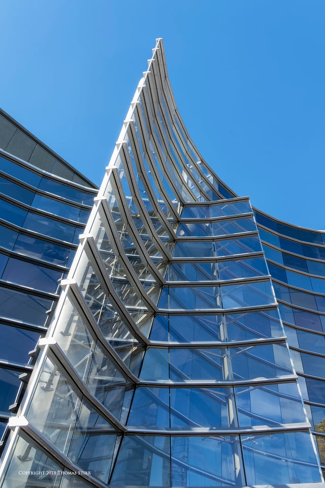
Getting in close to the base of a building and shooting skyward can help to accentuate the elegant lines found in architecture. Composing images with the use of corner exits can help to increase the eye flow in a photograph.
To get intricate shapes and angles to align in a pleasing manner often involves walking around a subject in order to discover the best shooting angle. My objective was to find some parallel shapes and intersecting lines that had good flow.
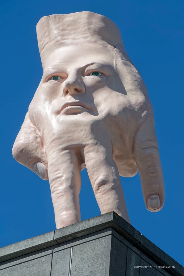
The sides and back of this sculpture were as creative as the front view. It was the intensity and angle of the sun that led to me deciding on this perspective, which helped avoid shooting directly into strong sunlight.
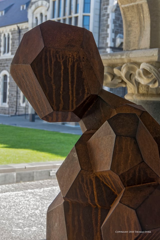
I composed this image using a partial subject bleed to add a bit of drama to the above composition. I also wanted to contrast the modern, angular lines of the sculpture with the rounded carvings and classic stonework found on the building.
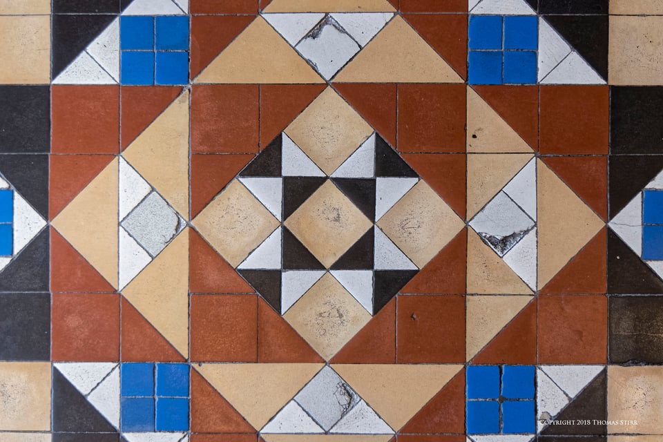
As regular readers will know, I love to find strong geometric patterns to photograph. I composed this image with my camera held out at waist level pointing down with the rear screen flipped out at 90-degrees. I adjusted the focal length of my zoom lens to ensure that my feet would not appear in the image. I used some perspective control adjustments in post.
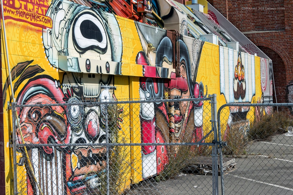
Street art found on urban buildings can be wonderfully vibrant and colourful. Sometimes we can walk by such pieces of urban art without giving them much thought. I enjoy studying these artistic expressions and often photograph specific portions that catch my eye.
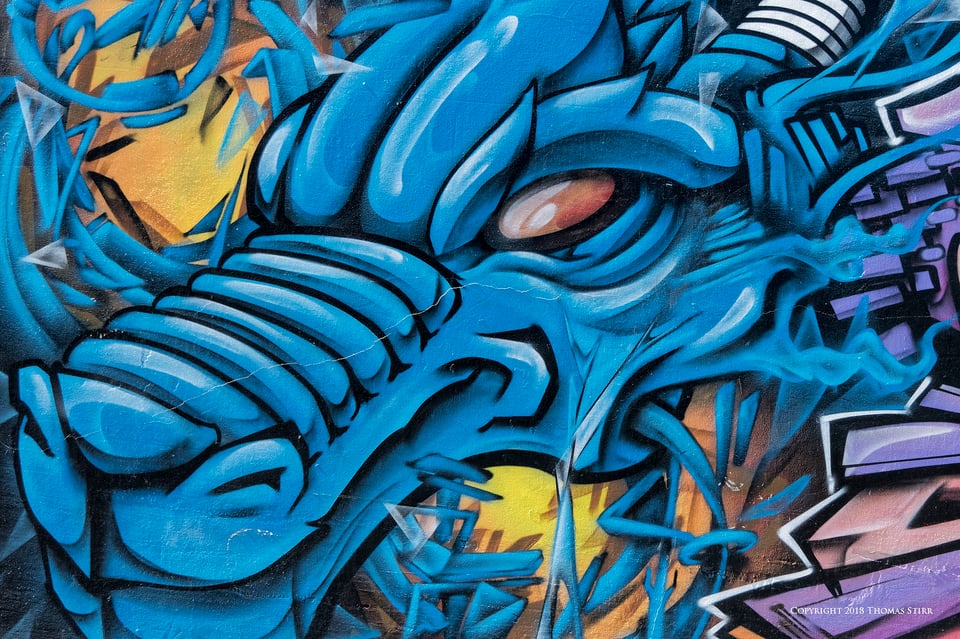
I loved the colours and the futuristic nature of this dragon character. I used a tight crop to add some drama.
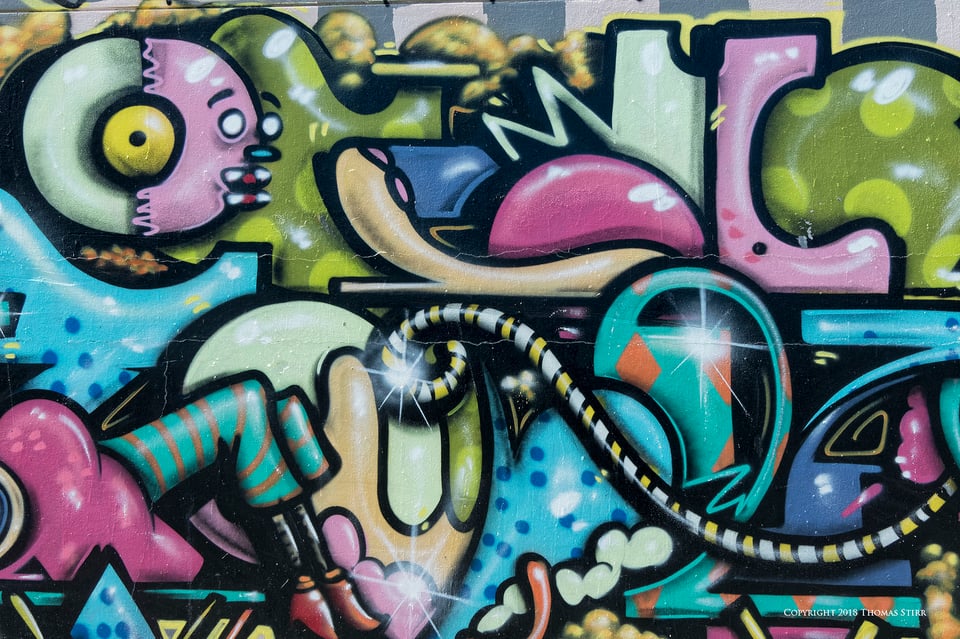
The colours in this abstract drew me to the illustration. Framing the composition with the pink elements around the outside gave it some colour balance to my eye.
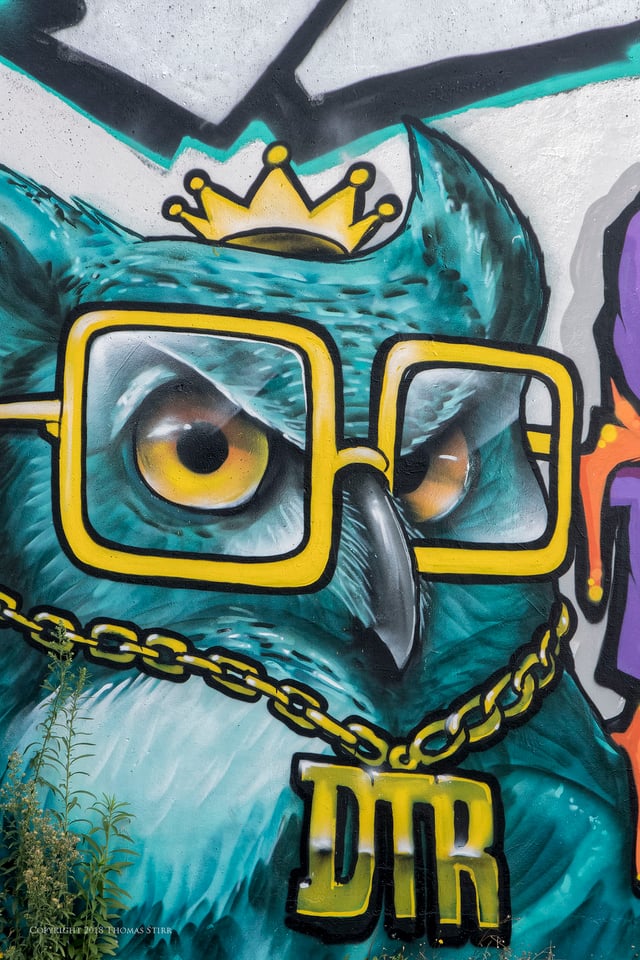
Who wouldn’t love an owl with spectacles! The strong, simple colours screamed out to be photographed.
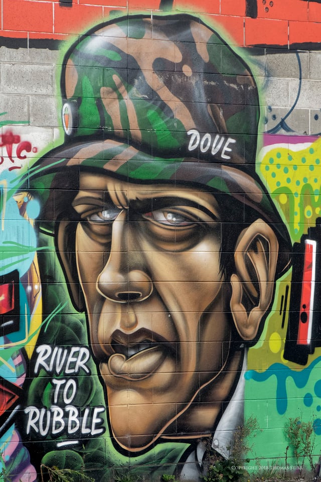
I appreciated the facial details and tones that the artist achieved with their creation. I included the small bushes growing up against the wall as they added to the 3-D nature of the painting.
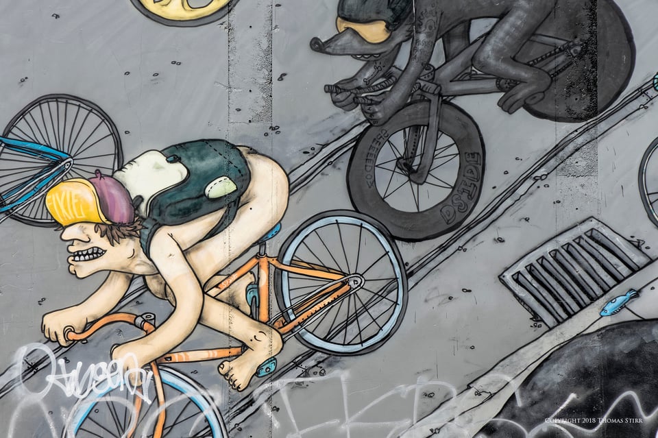
I found a couple of extremely detailed murals that had been painted on the sides of buildings. Rather than photograph them in their entirety, I was much more intrigued with some of the interactions of individual characters and the attention to detail paid by the artist.
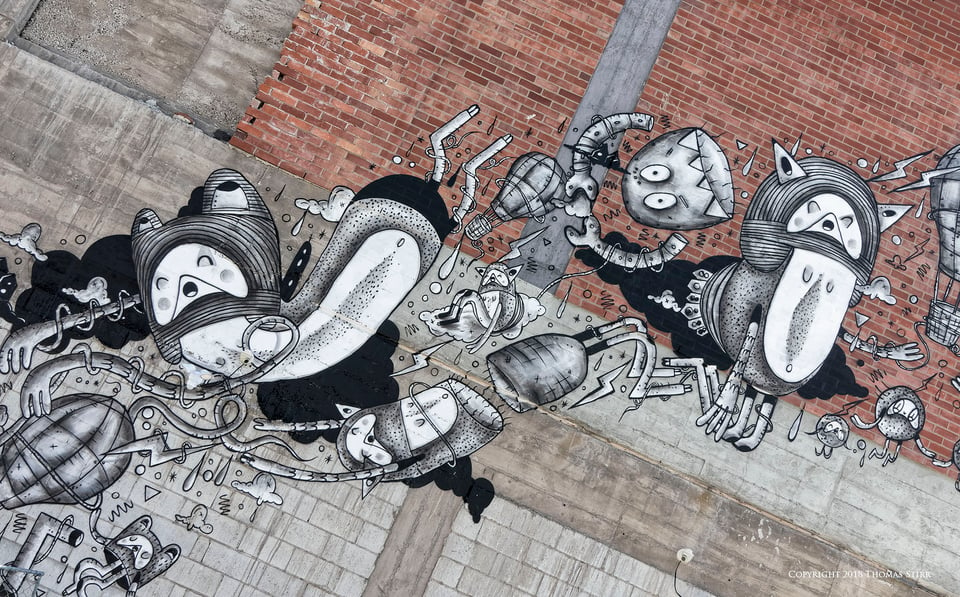
I angled my camera to create a strong visual flow with the image above. This also allowed a more pleasing colour separation in the photograph.

This is a very small section from the same mural. I had to shoot upwards at the mural to capture these specific elements which distorted the characters. As I composed this photograph I realized that I would need to adjust the image with perspective control software. I purposely included some mural elements in the photograph that didn’t want in the final composition. I knew that these elements would end up being cropped out once I adjusted the perspective.
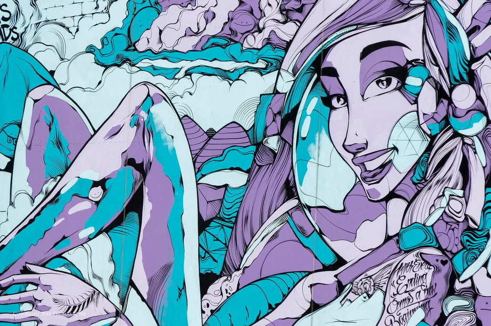
This mural covered one entire side of a 5 story building. In order to eliminate some chain link fencing and other visual distractions I zoomed in tighter on the mural, cropping off about 25% of its left-hand side and shooting just above the fencing.
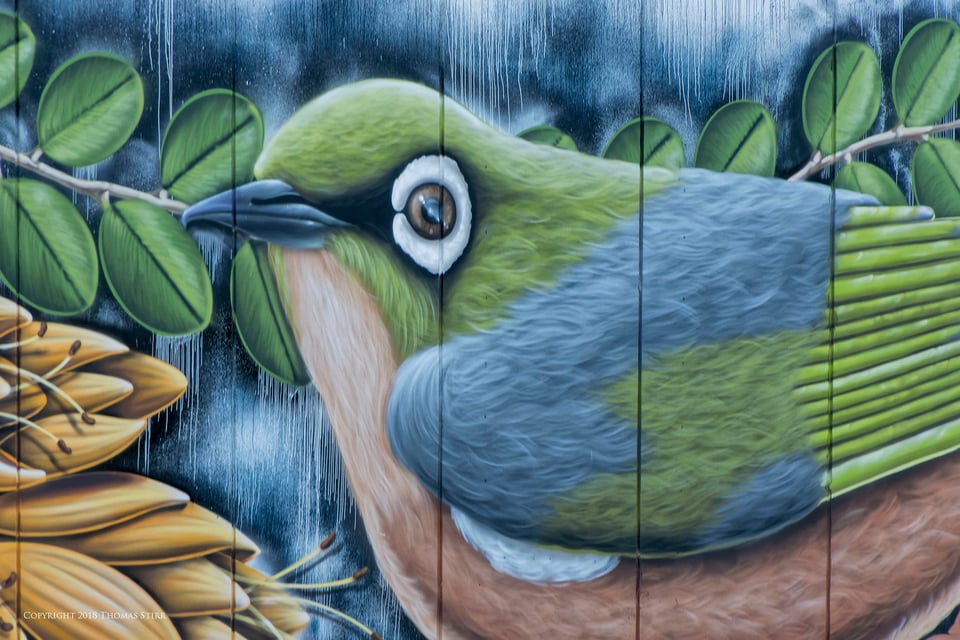
This was another beautiful mural that covered the side of a long building. There were various posts, wires and a host of other visual distractions causing some challenges. By changing my physical position I was able to find a specific shooting angle that allowed for an unobstructed view of a portion of the mural.
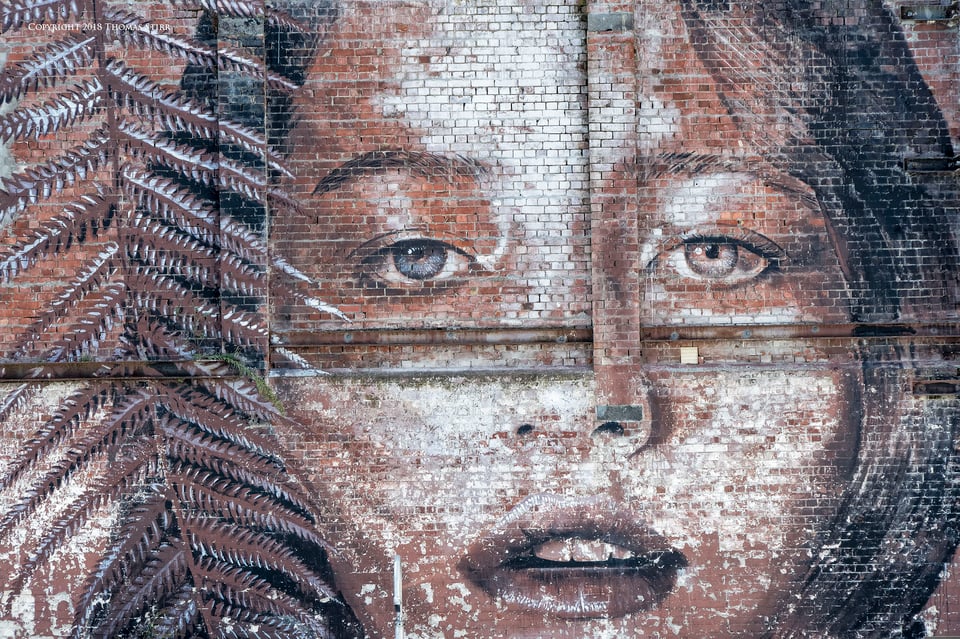
This mural was one of the most incredible pieces of building artwork that I have ever seen. The details and emotion in it stopped me in my tracks. It took a bit of time to finalize the composition, shooting just over some parked cars and vans, and cropping off a window on the left-hand side.
While my wife and I spent almost all of our time in the rural areas of the South Island of New Zealand photographing landscapes and nature for an upcoming eBook project, we certainly enjoyed our brief visit to Christchurch, appreciating the beauty of the building designs, sculptures and street art we found during our walk.
Technical Note:
All photographs were captured handheld with Nikon 1 gear as per the EXIF data. Images were created from RAW files using my standard process of PhotoLab, CS6 and the Nik Collection.
Article and all images Copyright 2018 Thomas Stirr. All rights reserved. No use, adaptation or reproduction of any kind is allowed without written permission. Photography Life is the only approved user of this article. If you see this article or any of the images contained in it reproduced anywhere else, it is an unauthorized and illegal use.
I like how the writer organized his thoughts in addition to he visual part.
Great article. I live in Christchurch. Since the essaysservicesreviews.com/essayusa-review Ii wander around the city regularly taking pictures
I’m glad you enjoyed the article Martin. We’ve had the very good fortune to be able to visit your wonderful country a number of times and thoroughly enjoyed each visit.
Tom
Great article. I live in Christchurch. Since the earthquake Ii wander around the city regularly taking pictures of the street art. As the rebuild has progressed it gets built or covered over. The blue ballerina was my favourite. In a building that has masked this gem they have put an internal window through which you can see part of this work.
Hi Mark,
Thanks for sharing your experiences as a Christchurch resident! We’ve had the opportunity to visit your wonderful city three times (2004, 2013, 2018) in the past and found each visit memorable in its own right. During the first visit we had the chance to see The Wizard of Christchurch. The second visit was post earthquake when many businesses had moved into converted shipping containers. Our most recent visit allowed us to see a city still rebuilding and in transition. Through all of our visits the spirit and creativity of New Zealanders was evident.
Tom
Of course the street art is there to help cover up the ugliness of post-earthquake Christchurch. Still, a silver lining!
Hi Russ,
A silver lining that showcases the strength and creativity of New Zealanders!
Tom
Great article!
Like you, I was stopped in my tracks looking at that woman on the brick wall. I mean, there’s talent and there’s art, but then there’s that magical level, higher than the others, when the human soul is captured, both in the image and in the viewer. What a stunning piece of work.
Thanks much.
Thanks Keith – I’m glad you enjoyed the article! I agree that the artist reached a higher level with the portrait of the woman on the brick wall. If my memory serves that particular piece of art covered one side of a 3 or 4 story building. I was mesmerized.
Tom
“This mural was one of the most incredible pieces of building artwork that I have ever seen. The details and emotion in it stopped me in my tracks. It took a bit of time to finalize the composition, shooting just over some parked cars and vans, and cropping off a window on the left-hand side.”–Thomas Stirr
Tom, do come visit Detroit for some incredible building artwork: Eastern Market, Midtown, Cultural Center, The Belt and murals in common areas will amaze you to be sure. (Besides, you are close to us in Ontario.)
Eastern Market is one of the oldest open air food markets in the U.S., so you will eat extraordinarily well while during your photographic adventure. www.muralsinthemarket.com/murals/
Shepard Fairey’s steadfast and dynamic contribution to the our cityscape facing legal challenges reveals not only his superior talent but artistic tenacity. Behold his art and stay in Motown for spell: www.google.com/searc…8;bih=1333
Mural fans and muralist, come see all that we have to offer you and, of course, one could not possibly overlook the Detroit Institute of Arts and the Diego Rivera “Detroit Industry Murals.” A world class experience and history will leave you awe-inspired and such supreme talent will overwhelm with subject, size (his second largest) emotion and power. The marble flooring and skylight of Diego Rivera Court is a most fitting environment for creating an unforgettable experience. www.khanacademy.org/human…try-murals
Detroit’s recovery is a daily inspiration and our artistic community flourishes.
Hi Ron,
Thank you for the information about Detroit and its ongoing recovery – it certainly looks like Detroit could be an very interesting spot to visit!
Tom
Always a pleasure to read your articles!
A bit funny to make pictures of pictures:)
Hi Cees,
Yes, I agree it is a bit odd…but I felt that some of the artistic expression was wonderful and deserved some exposure to encourage people to view this part of Christchurch.
Tom