I’ve always enjoyed seeing alternate versions of famous photographs. Maybe frame #22 is the photo everyone knows about, while frames #18-21 have faded into obscurity – despite showing the same subject with minor variations. Of course, it’s not just famous photographers. Every photographer out there has an “almost portfolio.”
The reason why I’m writing about this topic is that, in most cases, photographers put a lot of thought into selecting which photos make the cut and which ones don’t. Personally, I’ve made the wrong decision here a few times and printed/published a variation that I ended up not liking as much. Below, I’m going to show some close variations of some of my photos and explain how I decided on the version I prefer, including why I initially made the wrong choice. Hopefully it will be an interesting demonstration and give you some ideas on how to find the best variation from the start.
Table of Contents
The Grand Mosque of Abu Dhabi
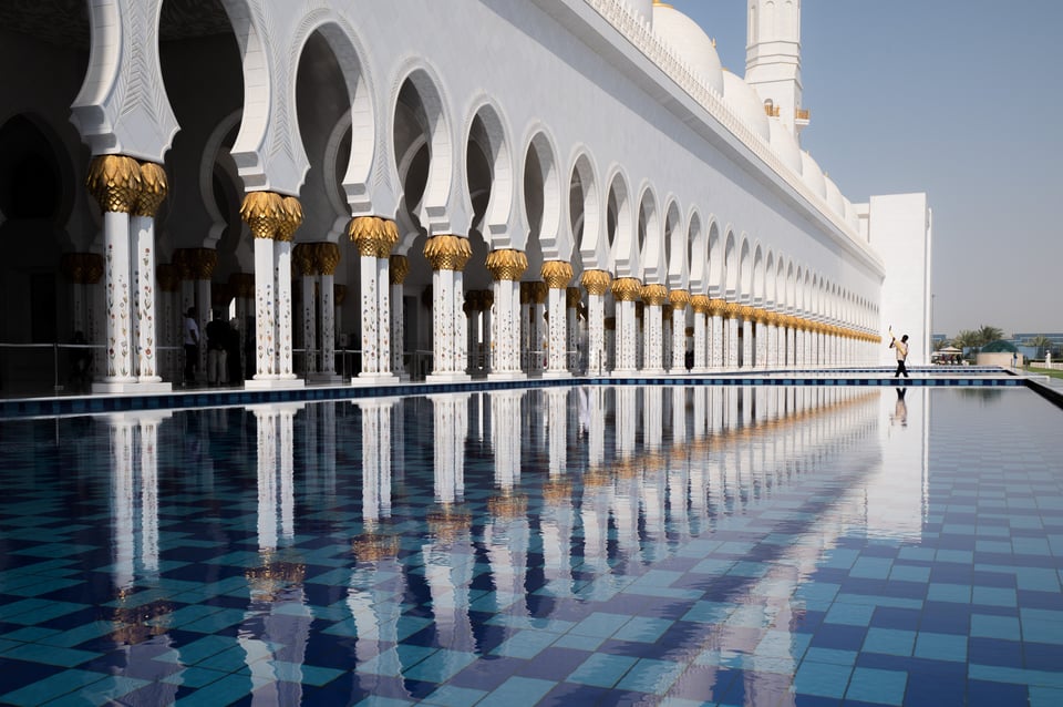
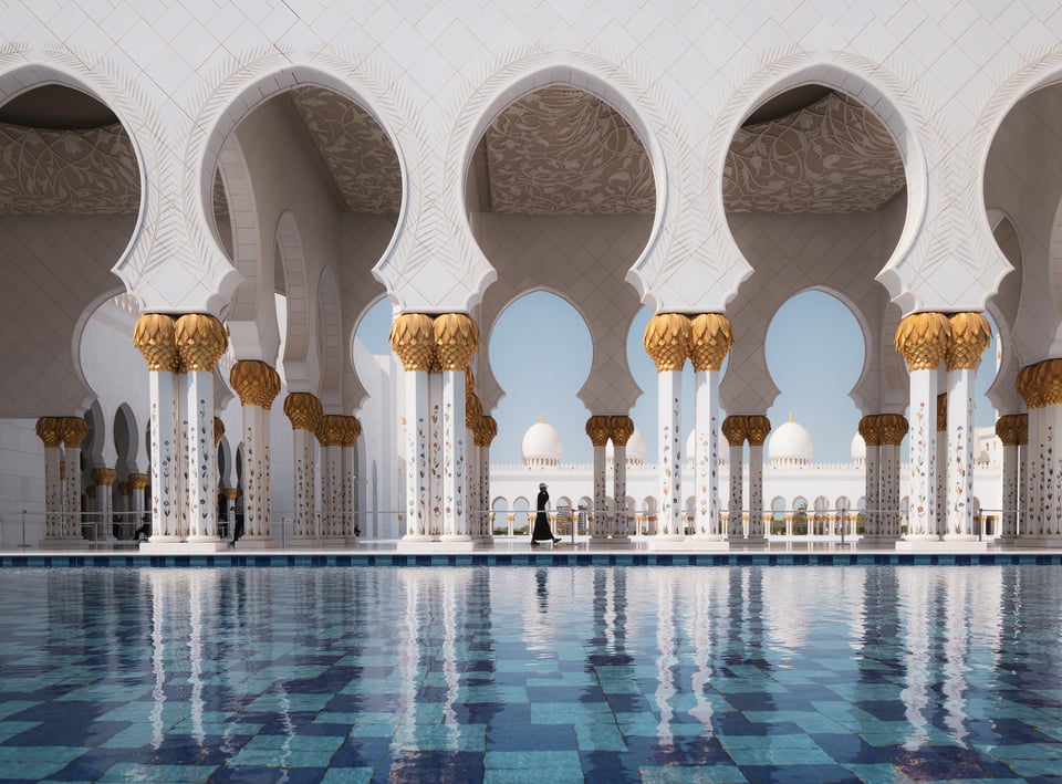
On Photography Life’s most recent workshop in the UAE and Jordan, our group spent an afternoon taking pictures at the Grand Mosque of Abu Dhabi. The architecture here is simply stunning, with brilliant white pillars reflected in a series of blue pools outside the mosque. It makes for a great location for photography, but the sheer number of potential subjects can make it difficult to figure out what to spend the most time on.
Alternate
Portfolio Shot
Background Info
Although I currently prefer the portfolio photo pretty clearly over the alternate, it was the other way around at first. When I was taking these pictures, I felt pretty strongly that the diagonal composition of the first photo would work better, and I spent much more time trying to capture that picture as a result.
In fact, I actually took the portfolio image first without too much thought (see photography from the heart and head). I then spend the next half hour taking various diagonal compositions, waiting and waiting for the right person to walk by.
Sometimes, too many people walked through the frame:
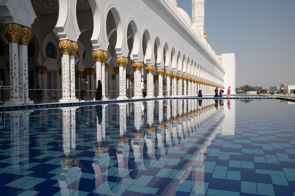
Other times, the subject’s clothes faded into the background too much:
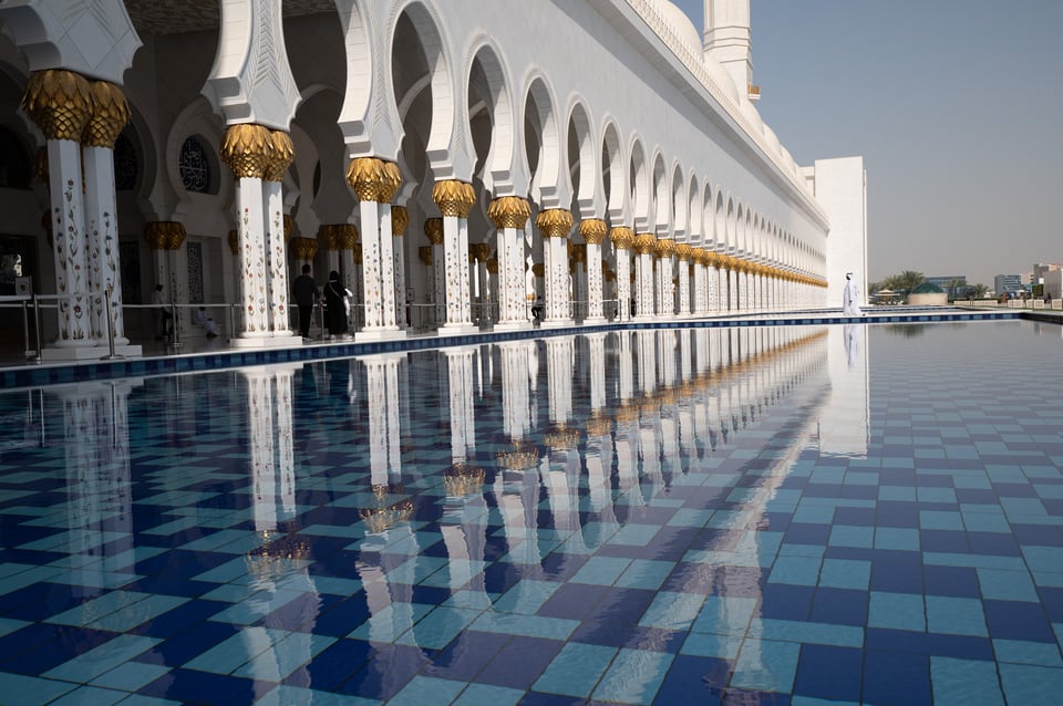
But, eventually, the staff at the mosque closed that particular pathway and began cleaning it, which led to the composition that I nearly ended up using:

There are still a few things wrong with this photo. First, the subject is facing out of the photo, which I don’t think works as well as the other way around. Second, although he isn’t wearing white, his tan shirt is still light enough that it fades a bit more than I’d like into the background. Third, the diagonal composition as a whole – which I thought would give the photo a nice sense of movement – feels somewhat overcomplicated to me now.
Instead, the head-on composition from my portfolio photo tells a simpler story and conveys the same emotional message without as many distractions. There’s more breathing space in the frame, and the subject is more distinct as well (largely because of the silhouette lighting). To top it off, the timing/position of this subject is simply much better. I got very lucky to capture this person’s stepping motion right as they walked under the center of the archway.

Why I chose this photo:
- Simpler, clearer message with fewer distractions
- Primary subject (the person) is more distinct
- Better timing and position of the subject
Why I liked the alternate better at first:
- Required more effort to capture (a long time waiting while baking in the sun)
- It shows a more unusual moment (subject is cleaning rather than walking)
Dream Lake at Sunrise
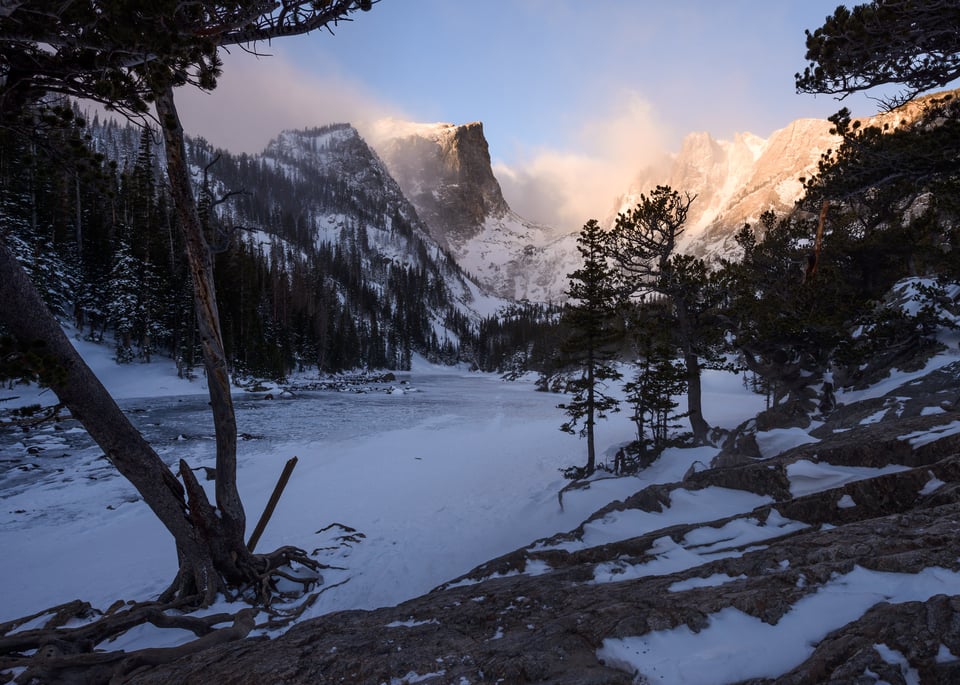
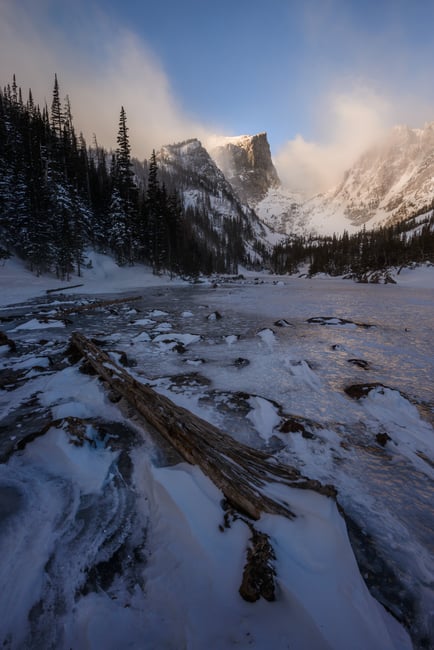
After running uphill through knee-deep snow right at sunrise – my punishment for hitting snooze too many times – I was completely out of breath, but also in awe of one of the most amazing landscapes I had ever seen. This is Dream Lake in Rocky Mountain National Park, now among my favorite places in the world. It’s also a hike where I’m bringing snowshoes next time ‘round.
Alternate
Portfolio Shot
Background Info
Sometimes, landscape scenes with a stunning background – but no obvious foreground – are very difficult to photograph well. Do you switch to your telephoto lens and cut out the foreground entirely? Do you kludge a foreground out of something you normally wouldn’t use in your photo? Or, is it better to spend all your time trying to find a genuinely good foreground, where one may not even exist?
I did all three that morning at Dream Lake. It was my first time at the location, so I couldn’t rely on compositions I’d scouted earlier, and the sunrise was getting less vivid by the minute.
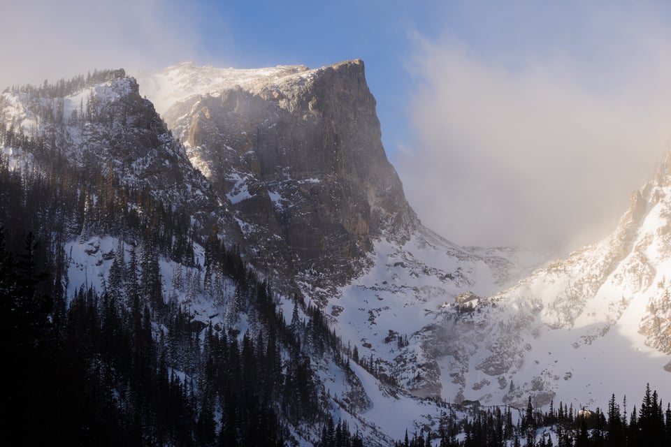
Here’s one of the telephoto variations I took, which I think cuts out too much context, since it doesn’t even show the frozen lake at all:
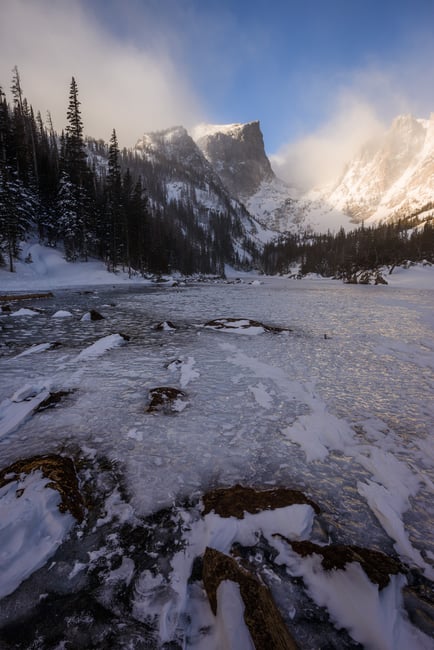
And a version with a kludgy foreground, which isn’t terrible, but doesn’t add much interest to the photo:
Seeing variations like these and feeling underwhelmed, I initially gravitated toward a composition that used some nearby trees and rocks as a “frame” around the image:

This type of composition is fairly common to see in landscape photography, perhaps unsurprisingly. “Framing” your photo with silhouetted trees (or similar) gives the photo a natural vignette. It draws your viewer’s eye to the well-lit subject, while blocking off the edges of your photo and creating a composition that feels intentional.
The trouble is, that’s why these compositions are so seductive, when they don’t always work as well in hindsight! On the back of a camera screen or as a thumbnail in Lightroom, this version of the photo stands out more (at least to me) and seems like it would be better than the one I ultimately selected.
But with some more thought and time to step back, the “story” of this photo just isn’t as strong. Why are there trees randomly covering the photo? Do they have any thematic connection to the background, or are they just there for aesthetics? (Admittedly, the fact that these are high-altitude conifers adds a bit to the story, but it’s pretty tenuous.) Photos framed this way – a distant background surrounded by trees – definitely can work well at times, don’t get me wrong. But in some cases, including this one, it’s better in theory than in practice.
Instead, a more interesting story is a tree that fell into the lake during summer, then froze amidst the rocks when the weather began to turn. This composition is also neater than the prior one, with fewer distractions. In short, sometimes, the right answer is to search for an optimal foreground, even if you’re not sure it will exist. Luckily, in this case it did:

Why I chose this photo:
- Better story and thematic connectedness between foreground and background
- Simpler, more straightforward composition
Why I liked the alternate better at first:
- The alternate photo’s “vignetting” style of composition is punchier at first glance
- In the field, I thought it would be the better angle, which colored my perceptions when sorting through the photos later
Greeter Falls in the Rain
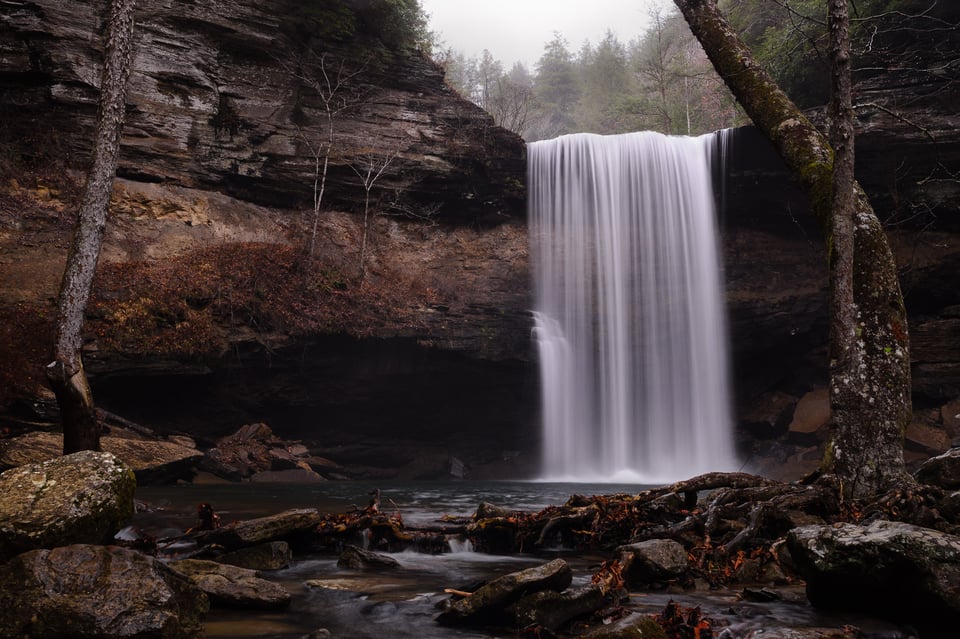
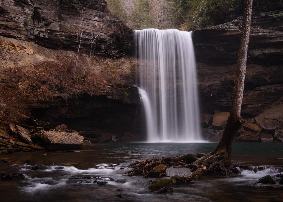
Though I now live in Colorado, I grew up in Tennessee and would periodically drive to farms and waterfalls to practice my landscape photography skills. One place I revisited time and again was Greeter Falls on the Cumberland Plateau. Although this waterfall can dry up on occasion, it’s a beautiful sight during or after a rainstorm.
Alternate
Portfolio Shot
Background Info
Although it may look like I took these photos on the same day, I actually captured them about a month apart (the alternate in November 2014 and the portfolio shot in December 2014).
In this case, I really liked the earlier photo I took, and I was pretty reluctant to abandon it in favor of anything new. Not to mention, I had already edited this photo exactly how I wanted – so, to my eyes, any new pictures I took of this subject fell a bit short.
Looking at the two of them now, I definitely prefer the newer composition. The foreground doesn’t cover any of the waterfall, the top of the photo isn’t as distracting, and the message all-around is much more streamlined. But my attachment to the earlier photo was strong enough to overrule those improvements, at least at first glance.
(As an aside – I really don’t think that I’ve gotten better at fixing that bias in my photography over time. If I visit Dream Lake or the Grand Mosque of Abu Dhabi again and take a slightly better variation of my portfolio image, will I realize it fairly quickly? I suspect not. Hopefully I’d figure it out in the end, given enough time.)
Why I chose the portfolio image:
- More simplicity and clarity in my message, with fewer distracting elements
- Primary subject is distinct, without anything covering it
Why I liked the alternative better at first:
- Because I took it a month earlier, I had edited it already, while the new (unedited) photo looked pretty dull in a side-by-side comparison
- I had formed an attachment to the first photo and had convinced myself it was the “final” image already
Takeaways and Conclusion
The photos above all have fairly different subjects, but the three most successful variations all work well for similar reasons. Each time, my preferred image makes better use of simplicity and sends a clearer message than the alternatives. Along with that, the primary subject is noticeably more distinct in the first and third portfolio image (Grand Mosque and Greeter Falls), and arguably is a bit clearer in the Dream Lake portfolio image as well.
My reason for sticking with the alternates for so long each time was also fairly similar. In each case, before I had a chance to compare the different variations from a photoshoot, I had already settled on the “wrong” one and biased my selection process accordingly. But just because a photo required more effort to capture, or because the in-camera preview looked good, doesn’t make it the best photo you took that day.
Here are some tips I recommend to help select the better version of a photo as often as possible:
- When comparing photos, make sure they’re all in the same stage of editing
- Try to see the photos in terms of storytelling/conveying a message, and ask yourself which one does so more effectively
- Consider waiting a couple weeks to load your photos after you’ve taken them, to help see your work in a more objective light
- Ah, who am I kidding? If you take an amazing photo, of course you’ll want to load it as soon as possible! So, at least go back to that folder at a later date to re-examine the photos you may have missed. Right now’s a pretty good time to do that, if you’re staying home and have some free time
Lastly, I’d like to point out that it’s perfectly fine to prefer one of the alternate photos I showed in this article, rather than the portfolio image in any of these cases. The preferences I talk about above are just my own, and given how similar the alternate/portfolio shots are, I have no doubt that many photographers will have a different opinion.
I hope you enjoyed this article. If anyone is interested, I may decide to write a Part 2; almost every photo in my portfolio has some alternate versions, and it was difficult to narrow down to just three examples above. Or, if you have any other questions, feel free to ask away below!
I feel like I should write a “Thank you” note for you guys in every photo I post! Your site and YouTube channel awesome. Thanks for all the knowledge shared!
Great perspective on the process. I also love how you returned to the same location to shoot again, even though you were already really pleased with the original waterfall photo. I bet a lot of people would think, “Why shoot it again? I already have that shot,” but in your case you refined your composition and came away with an image you were happier with. Great message to always keep looking for improvement, even when you find what feels like a perfect shot.
Super Interesting!
What bothers me most about the Dreamlake pictures in the alternate pictures there are the trees near the center blocking the background, without them i think the alternate would be much better.
What i tend to do on well known locations is find another angle that isnt the usual picture from that place. Sometimes people get so caught up in taking “that” shot that they ignore other compositions.
Would love to see a second part on this topic!
Greetings from Germany
Thank you Spencer. I appreciate the insight and self critique that is a necessary step in the self evaluation of our production vs effort. The success, failure or improvement of our attempts at making images that may or may not have the impact we experienced. Please keep up the good work and sharing your process.
Great article! I am waiting for part 2.
Thanks for the excellent article. I have three comments that illustrate my personal difficulties with editing.
1. How difficult was it to get the shot? If I had to make a long hike in the dark, or if I was being eaten alive by mosquitoes while searching for the best composition, it’s very difficult to give up on an obviously sub-par photo.
2. (Related) How difficult will it be to try again? For example, I have been to Yellowstone twice. The first time (2008) I was blessed with wonderful light but relatively primitive talent/technique and equipment. By my second visit (2019) I had (slightly) improved my equipment and hopefully my technique as well, yet the prevailing conditions during my week in the park prevented me from capturing the landscape shots I had been dreaming about since my first visit. (Don’t feel too sorry for me, as I got to see lots of wildlife). Nonetheless, it’s difficult to throw those shots away knowing that I may not be able to return any time soon.
3. Most difficult for me is how to choose between many similar photos. In the article you choose between different compositions of the same subject, but when I get excited by a composition I will generally take a bunch of shots with only slight differences, such as running through a range of apertures, adding an ND filter to lower the shutter speed, trying a polarizing filter, etc. If I am lucky enough to still like the composition upon later review, I am then faced with the very difficult task of choosing between the many variations I took.
I wonder if this is a symptom of not have settled on a “personal style” and not knowing what I really want in a photo.
Thanks again. Looking forward to your next article.
Spencer, thanks for the article. Did you be happy with the Tamron 17-35 f/2,8-4E ?
Interesting alternate/portfolio pictures, Spencer.
I am totally with you regarding the biases one can have about particular shots based on circumstances or on work input and what not. As a reader, since this is the first time I am seeing the pictures side by side with no prior knowledge or surroundings of the places, hopefully you don’t mind if I chime in about these.
1. For the mosque picture, i like your portfolio picture better than the alternate. I was wondering if the alternate picture was shot from a bit right, to show the arch facade architecture a bit more to declutter the plain white color, but I suspect it would show more people in the frame.
2. Honestly, for me, both alternate and portfolio pictures didn’t evoke much emotion within me and didn’t work for me. But I agree your portfolio picture is better than the alternate, if not significantly. I don’t know, I feel something is missing or I fail to see it.
3. The alternate version of waterfall has nice colors near the rocks and base of the tree, but the light at the top is too distracting. The waterfall in the portfolio picture is great because of the angle and separation between two falls (smaller and taller). It’s an easy pick as I am seeing them for the first time side by side with no influence of any biases.
Cheers,
Venu
Thanks, Venu! It’s interesting to hear your first impressions, given that it’s impossible for me to go back in time and see these pictures with fresh eyes myself. I think the reasons for your preferences are broadly similar to mine, with some minor differences. I appreciate your honesty on not finding the Dream Lake picture as interesting. After all, we’re all different photographers with our own visions on things. If everyone liked the same stuff equally, everyone’s work would be far too similar and stagnant.
Thanks Spencer for the article. It’s amazing that you put in so much hardwork in your work. Not to mention how meticulous you are in your thought process when taking a shot…
Cheers…
Really interesting article, curating is one of the more difficult things to do and sometimes your view over which is the best shot changes significantly between the first week or two, and 6 months later.
Thank you, Rich! In terms of the time differences, I agree. A lot of that is because our creative preferences change over time (arguably improve too), and some photos we took a while ago look different under that new perspective, whether better or worse. Personally, old photos in my portfolio tend to look worse over time, whether because my creative preferences have changed, or simply because I notice more technical issues with them that I didn’t see earlier. But occasionally it’s the other way around, where I realize an older picture is much better than I gave it credit for at first. That’s always more fun!
Spencer, thanks for the article. Always helpful to see the thought process of other photographers. Looking forward to the next part.