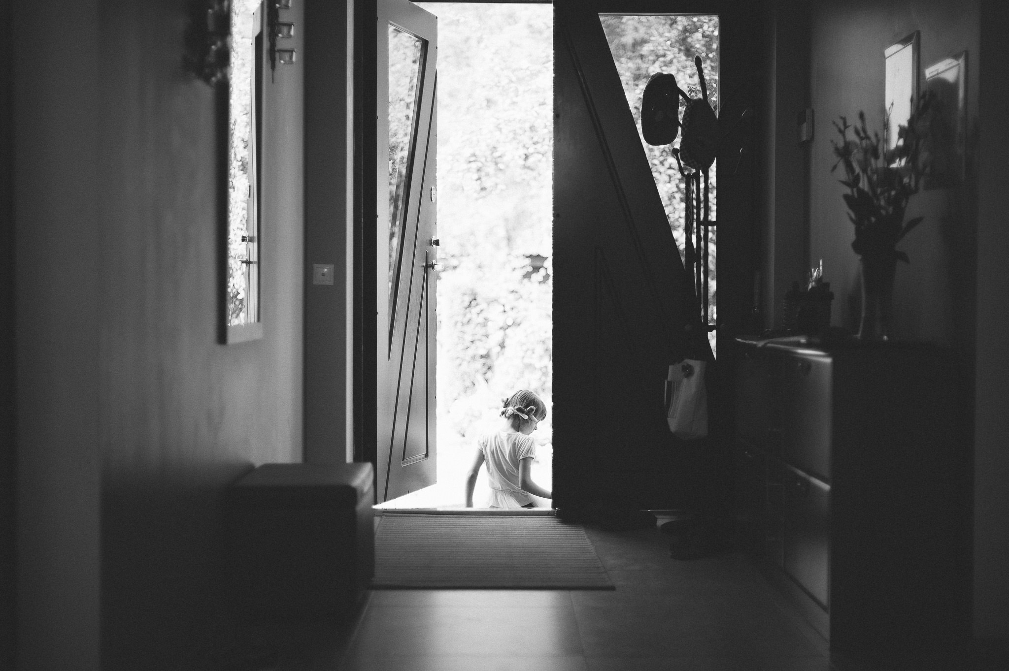
I get asked very, very often how I process my photographs. And it is no secret – most of the time, I simply use VSCO. It suits me so well, coincides with the way I see and pre-vizualise my work, my style and my taste so accurately, only rarely do I need to dive deep into the post-processing closet to pick something else on my own. And yet despite me saying it, I get asked this one question really rather often – how do I achieve that look? It took me a while to figure out what do most people mean by that look, but I have. It’s not the colour or the light or the composition that a lot of you are so interested in when you ask me that question, it turns out. I also figured out why it’s so hard to describe properly – there really is no term for it (a reader has told me it is called “matte” and while personally I’ve not come across it before, we will see if the term will stick for good). It’s a sort of… vintage-retro-dreamy-low-contrast-film look. Sounds vague? It is. That is why any help on the matter is so difficult to find. And yet I am pretty sure you understand – or at least imagine – what I mean. Basically, a lot of you are wondering how to make the photograph on the left look like the photograph on the right.
You will be glad to know it really is rather simple.
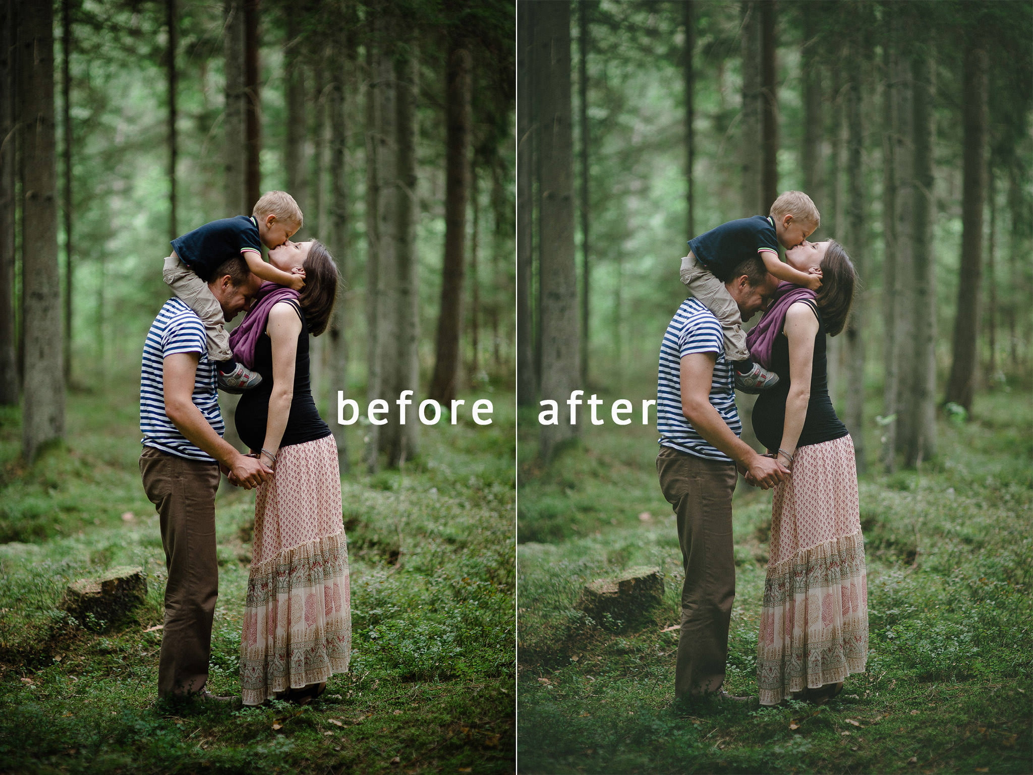
Table of Contents
Why Is It so Mesmerizing?
Whether you like the look or don’t is, as so many things in photography and art in general, very subjective. The above image looks just as good (or bad, if you don’t like it) both ways, does it not? Be that as it may, the reason why this style of post-processing is described as dreamy and film-like is because it reminds us of old prints in our family albums. Of course, those aren’t actually prints as we make them today, they weren’t made with ink. They were made with chemicals. And such photographs, when enlarged on a piece of paper, they didn’t have pure whites or deep, thick blacks. There was no such thing as #000000 value black or #ffffff value white (those are hexadecimal colour codes, by the way, and if you don’t know what that means, don’t even bother yourself with it, it’s so very not important!). These days, printing is all about contrast and tonal range – how close the blacks are to absolute black, and how close the whites are to absolute white. Back then, all you really had (at least in your family albums) was a range of grey tones. Dark grey, light grey and everything in between. Certainly no six digits and no six letters. And, my word, those photographs are beautiful. Why? Why is giving up information captured in the lightest and darkest parts of an image beautiful? Because it resonates with our memories. It’s nostalgic. It’s… well, for the lack of a better word, dreamy. Personal. It associates with memories.
That is what I think. You may think it’s all just a lot of drivel, but I am pretty sure most will agree with the next paragraph.
A Word of Caution
Don’t go re-processing all of your images. Jumping from one style to another just because of ever-changing fashion (and this sort of processing is very popular these days) will do you no good, nor to your images. It does not work with every light, every subject and every concept – I’d never have used this post-processing for, say, my bachelor’s degree, simply because the subjects and my idea demanded a completely different sort of B&W. The fact that it will not actually improve your photography holds just as true. This is just post-processing and it is not superior to any other way you may like. It does not add weight, strength, emotion, substance to your photograph, but it can fool you into thinking as if it does. So if you think adjusting the tone curve is a substitute to learning composition, light and communication skills with your subjects, I am not going to even tell you where to start.
Hold on. Did I just..?
It is All About the Tone Curve
If what we like about the old enlarged photographs so much is that there are no pure whites and blacks, the way to achieve it with digital photography is to just, simply speaking, cut those tones off. And the most powerful tool for controlling tones in my personal choice of software, Lightroom, is the Tone Curve.
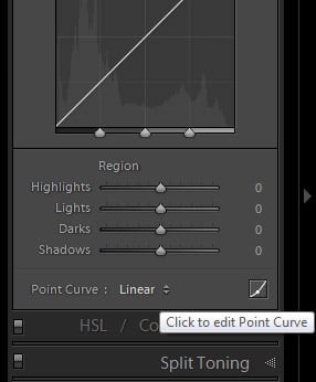
To limit the tonal range of a photograph, first of all select the Tone Curve Tab on the right-side panel in Develop Module. Then, choose the Edit Point Curve mode, as this is where Lightroom gives you full control over your Tone Curve:
Once you’ve done that, you will notice that the curve (which, unless you’ve made adjustments, is actually straight) has two points at each extreme end. The lower point controls the black tones, whilst the upper point is there for whites. You can add additional points in between to control the grey tones, although most will find that exiting Edit Point Curve mode helps you achieve a smoother result. For this particular task, however, we are interested in the two mentioned points.
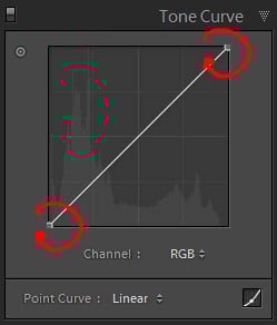
The point that is responsible for the blacks in an image – let’s call it the Black Point for the sake of convenience – is located at the bottom-left of the Tone Curve tool. It defines how dark the darkest tones of the image are, or how dark they can potentially be. The lower the position of this point is, the darker the tones can be. So, if the very bottom represents absolute black, it stands to reason that if you move it upwards a little bit, all the blacks will now be dark grey instead. Go ahead, try it – move it to, say, 50% position and see what it does to your photograph. Not pretty, but very illustrative. It is exactly the same case with the White Point – if you move it downwards a little bit, all that was or could have been completely white will be light grey. How light you want it is really a matter of taste, but the lower you move the White Point, the darker the lightest tones in the image will be. The histogram illustrates the change very well. Take a look at the following screenshot and compare the position of the Black Point and White Point, and the effect it has on the Histogram tool in Lightroom:
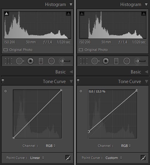
I moved the White Point downwards by just a couple percent, and upped the Black Point by 13.3%. The Histogram tool illustrates very clearly how much tonal range has been omitted in this particular case – none of the whites were effectively cut off because there were no such bright tones in the image (and now there can’t be), but some of the blacks that were there are now dark grey.
That is about it, really. The rest is the usual sort of post-processing you do. It is a good time to leave the Edit Point Curve mode and adjust the Tone Curve further to get some of that contrast back within the tonal range that is left, since moving the Black Point upwards also lightened the rest of the tones as well.
Don’t Overdo It
It is very easy to overdo this “effect”, especially if you’re happy about finally learning to achieve it and are overzealous with your adjustment. Keep in mind, though, that the more you restrict that tonal range, the less distinguishable the elements become from one another. Be especially careful when “cutting off” the whites – generally, brightest portions of the image attract the most attention, and if there are no bright whites, the image can start to look very dull indeed.
I have never been a fan of this look. It appears ‘washed out’, and it has been overdone by so many photographers, amateur and pro alike. I was raised in the film era that showed photos with heavy color, contrast, and grain, so that’s how I prefer my digital photography, except with more texture than grain. The ‘Dreamy” look to me is more of a Soft Light with touch of Gaussian Blur and a tendency to be a bit more high-key but without blown out highlights.
Knowledge is power. I was going to purchase presets to achieve this look and here I found the answer on how to do it for free from the website I’ve learned to love so much.
optimally – it was necessary to impose more and shading, as well personally I still like the result before and not after;)
Дело вкуса, Игорь. Thanks for the input ;)
Romanas,
I have always been a huge fan of your photography and the manner in which you process your images. Great shots, and what a great article too. I only wish that I could see more of your work.
Thank you for sharing,
Jason
Jason,
thank you for such kind words, they really mean a lot. And I promise, there will be more. Especially at the end of this month/at the start of November. Nasim planned something very special for me and I intend to do very well as my gratitude. You’ll see. ;)
www.efoto.lt/forum…histograma
Pabandyk sita metoda. Jis labai greitas, efektyvus ir WB pareguliuoja.
Hey! Thanks for the link, although I do know how histograms work, given that I wrote an article about it :) That said, I tend to expose my images in a way that some would even consider them “underexposed”. I don’t. It’s a matter of taste. Another thing is, when converting RAW files in-camera, there is no way to have a live histogram during the conversion, so it is not nearly as convenient, takes quite a lot of time. If I were to do such serious work, I’d do it in Lightroom where I can use every necessary tool properly and without compromise.
As for white balance, the X-E2 did a splendid job. Much more accurate than my Nikon equipment and very much to my liking.
In any case, thanks!
on a retina macbook pro … cannot see any difference between before and after in the top photos .. hmm … eyes going?
Not sure why, Greg. Perhaps, even if you see the correct results, it’s a question of whether there is enough difference for you to care about or not. :) Very subjective, but I was quite subtle with the look.
Excellent article.
I love the post-processing tricks, and this one was introduced with many valuable thoughts, reminders and gentle warnings around it.
Again, excellent article. Thank you.
Oh, I forgot to add that articles detailing how to achieve certain looks and moods with basic tools (so everyone can reproduce them) are extremely valuable. Keep up the good job!
Thanks, David!
THANKS ROMANA!….I sent you a personal message via Facebook regarding this, and I’m extremely grateful that you were able to put together a post regarding my exact question! Keep up the EXCELLENT work lady!….
Tanya,
hello, thanks and you are welcome ;) Mind you, my name is Romanas (or Roman) and I am actually a chap, not a lady ;) lol
Thanks for the great article / tutorial.
I appreciate your comment about taste. I find this very odd, because it inspired me to go back and look at some of my old film photos a little more closely…as if I had forgotten what they look. Here is the embarrassing truth. I now prefer the “digital look” despite learning on film and spending enormous time with it (there wasn’t anything else….) I actually prefer the before to the after in the first picture. Despite my preference, I really love the last picture. The atmosphere evokes a feeling of nostalgia.
Also, I think this look works very well for weddings.
There is nothing embarrassing about your preference, sir (sorry, I do not know your name). Neither of the two images, the before and after, is the “better” one. They are merely different, and so both as good or as bad as the other. :)
Also, notice how photography changes with time. What you like now, you might not like in a year. Yet after ten years you might like again for completely different reasons. As we change, as the time changes, our work changes as well. That’s the only way it ever could be.
Very wise comment about changing tastes. For sure, what I like has evolved and I didn’t even notice :)
hi romanas,
i love your photography and i am a huge fan of classic vintage look.
so thank you for this tutorial. i have a q though.
i know it’s all about tone curve. the vsco film presets do not suffice?
look forward to your replying.
the best
Hello, Betty.
VSCO presets also adjust the tone curve. This article is not about VSCO, though, it’s about the look in isolation, without VSCO.
thank you so much, romanas! much appreciated:))
Hi Betty,
Thought I’d reply to your question, too, because I’ve been asked a few times to go for that ‘vintage’ look for clients, and also because I also like it personally. There are a number of articles on what exactly VSCO accomplishes vis-a-vis Lightroom — it’s much more than a set of presets in the traditional sense, in that there are also camera calibration profiles that make a huge difference in the final aesthetic after one selects, say, “Portra 400+,” but if you are liking the style, I would suggest you also start to experiment with colour-grading in Lightroom via the “Split-Toning” tab in the development module. You do NOT need VSCO to accomplish this at all. In addition to tweaking the tone curve as Romanas points out, and I would add a big key is to add “points” to the curve near the blacks, and then make mini-S-curves to accomplish a more finessed low-contrast feel), colour-grading will take your vintage ambitions to a whole new level and radically affect the “mood” of your photograph… so experiment with colour-grading! There are also tons of tutorials on this, too.
Best,
Brian