In this article, I will go over a simple methodology I use in choosing how to use color in photos. We have masters like Sebastião Salgado who shoots exclusively in black-and-white, Steve McCurry who shoots only in colors and Jimmy Nelson who shoots in muted colors. Shooting in color, in black-and-white, or anywhere in between, has its own appeal, so why don’t we use a mix of all depending on our needs?
I shoot only in color, and when necessary, convert to black and white or reduce color in Lightroom. There are some advantages in shooting in color, then converting to black-and-white in post processing (see Spencer’s article on Black and White Photography for more information), as opposed to shooting in black-and-white / monochrome mode through the camera. At the same time, there are advantages in getting black-and-white done in camera as well. But it is beyond the scope of this article – here we will concentrate on shooting in color and convert to black-and-white in post-processing.
Photographers like Jimmy Nelson use color grading techniques to create a muted and cinematic look to their photos, but if you do not want to go through the process of altering specific colors, reducing color saturation can work out quite well too. Below are 3 specific questions I ask myself when trying to decide whether to keep the image in full color, adjust it to muted color or convert to black and white:
A. Color contains information related to the story
B. Color creates element separation
C. Color creates distraction or disharmony
Table of Contents
1. Keep Image in Full Color if A=YES
Example #1:
In the photo above, I could have gone with black and white, but that would give a different message to the viewer. The pink dress of these nuns in Myanmar are one of a kind in the whole world of Buddhism. In this case, the color contains useful cultural information to the story, therefore I leave the photo “as is”, in color. Having the photo in black and white has a different message – it would then change it to be all about the girl that is looking at the camera and nothing else.
Example #2: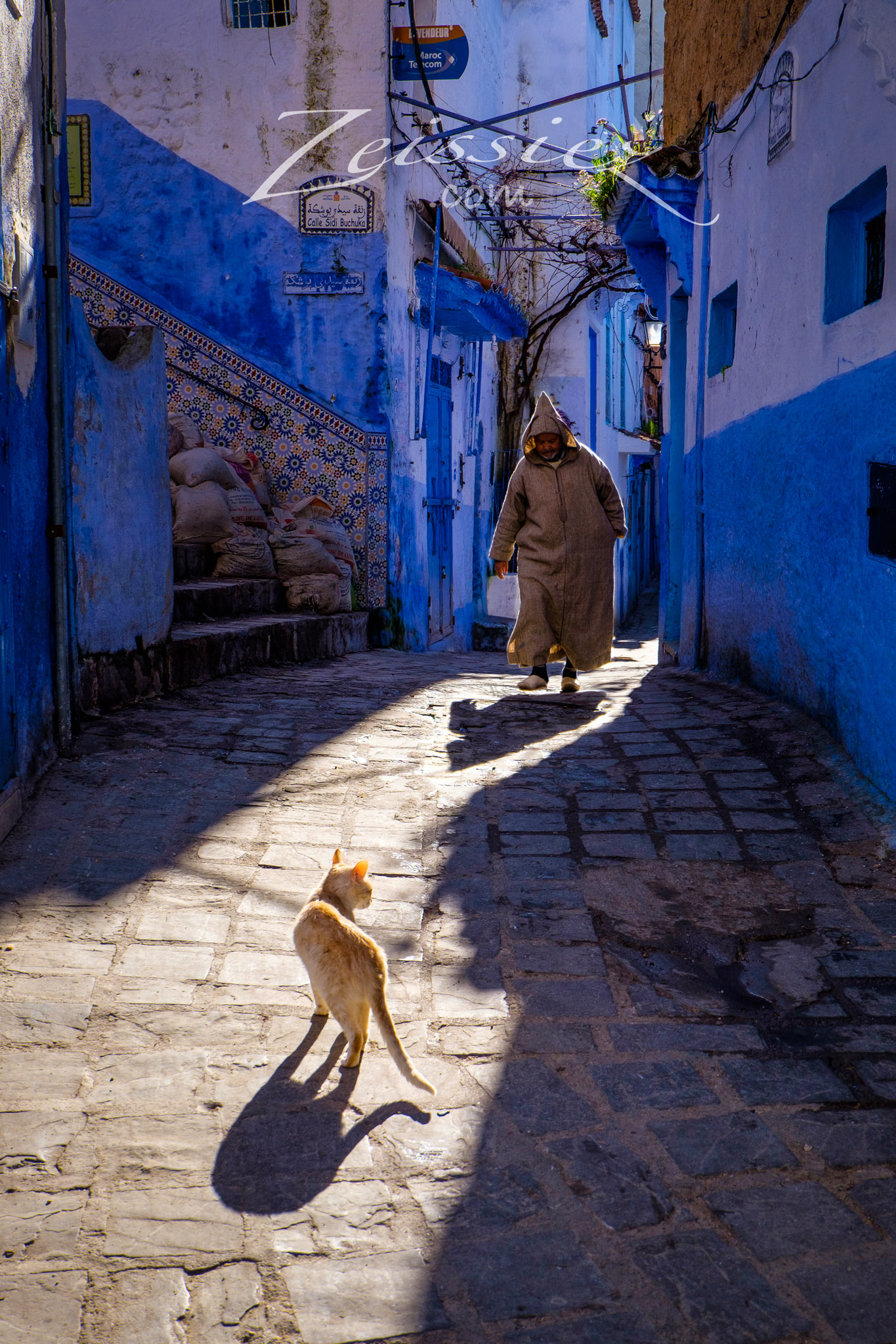
The photo above was shot in the “Blue City” of Chefchaouen, Morocco. One look at the photo and we know where the photo was taken, because of the unique color of the walls and the Djelaba the man is wearing. Because of this, the photograph works best in full color.
2. Keep Image in Full Color if B=YES
Example #3:
The original photo was in color, and you can see the black and white version on the right. The subjects in the black and white version clearly blend with the background, which is not good. Color in this case is needed to create subject separation, which is why I kept this photograph in full color.
3. Convert Image to Black and White if A=NO AND B=NO
Example #4: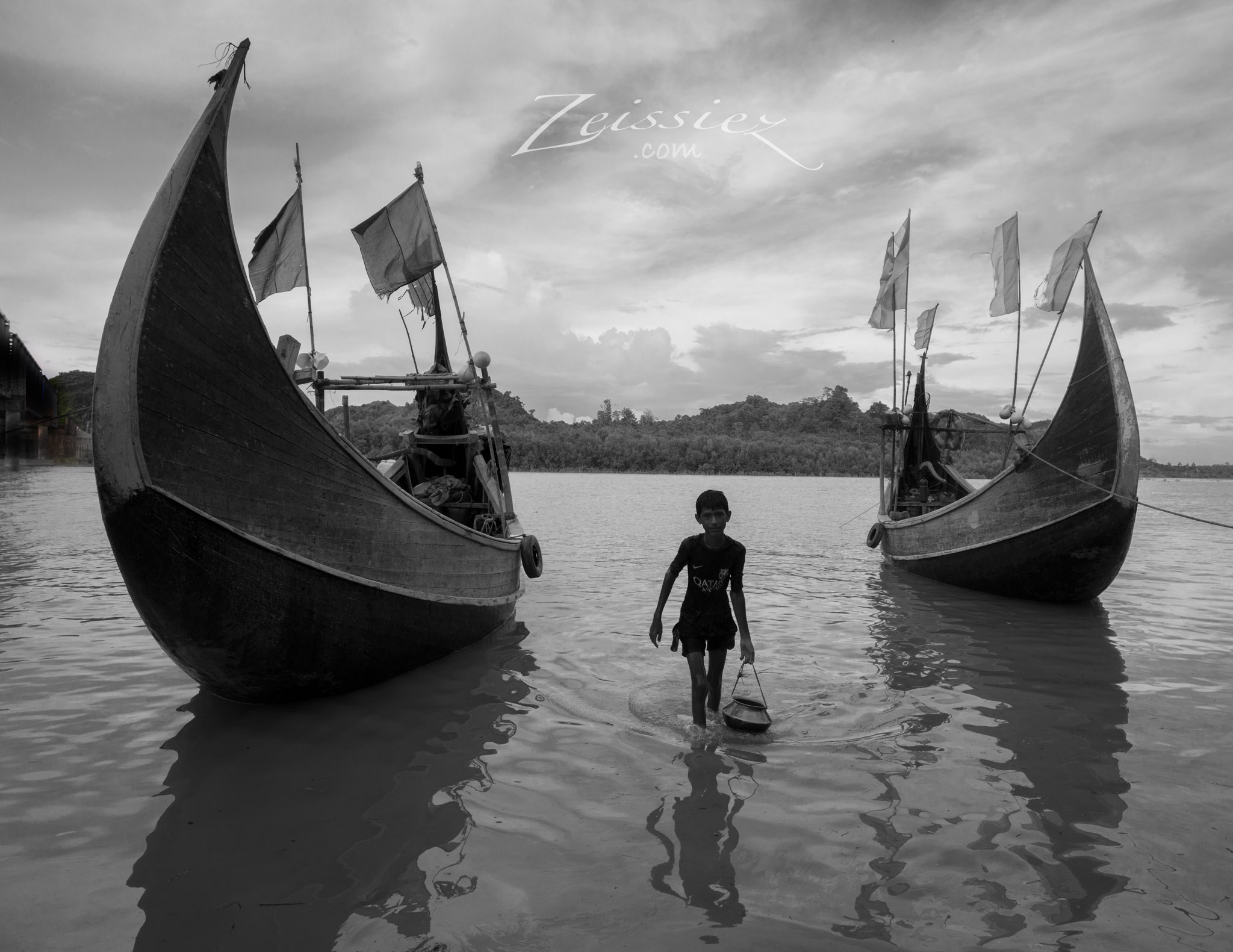
When a photo does not need color to complete the message, it is at its purest. I consider it a blessing if photographs work in black and white each and every time. But as we have seen previously, sometimes the conditions do not favor black and white.
Example #5: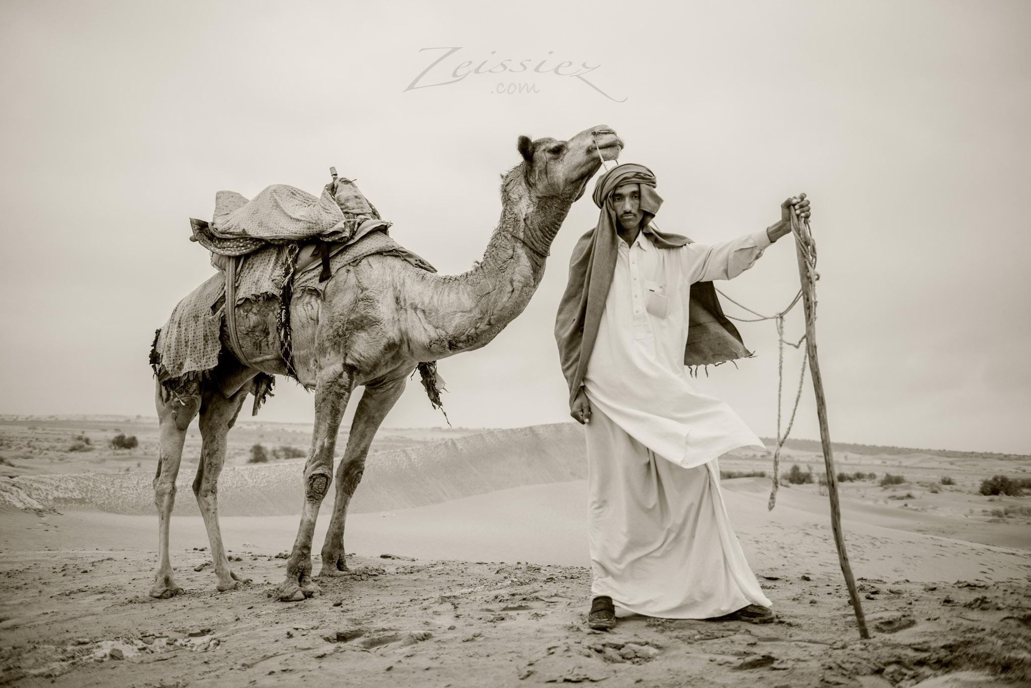
The same situation here – color does nothing to enhance the photograph, so it is not necessary to show off the primary subject and his camel.
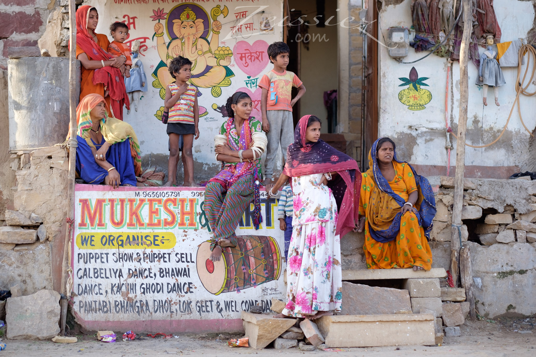
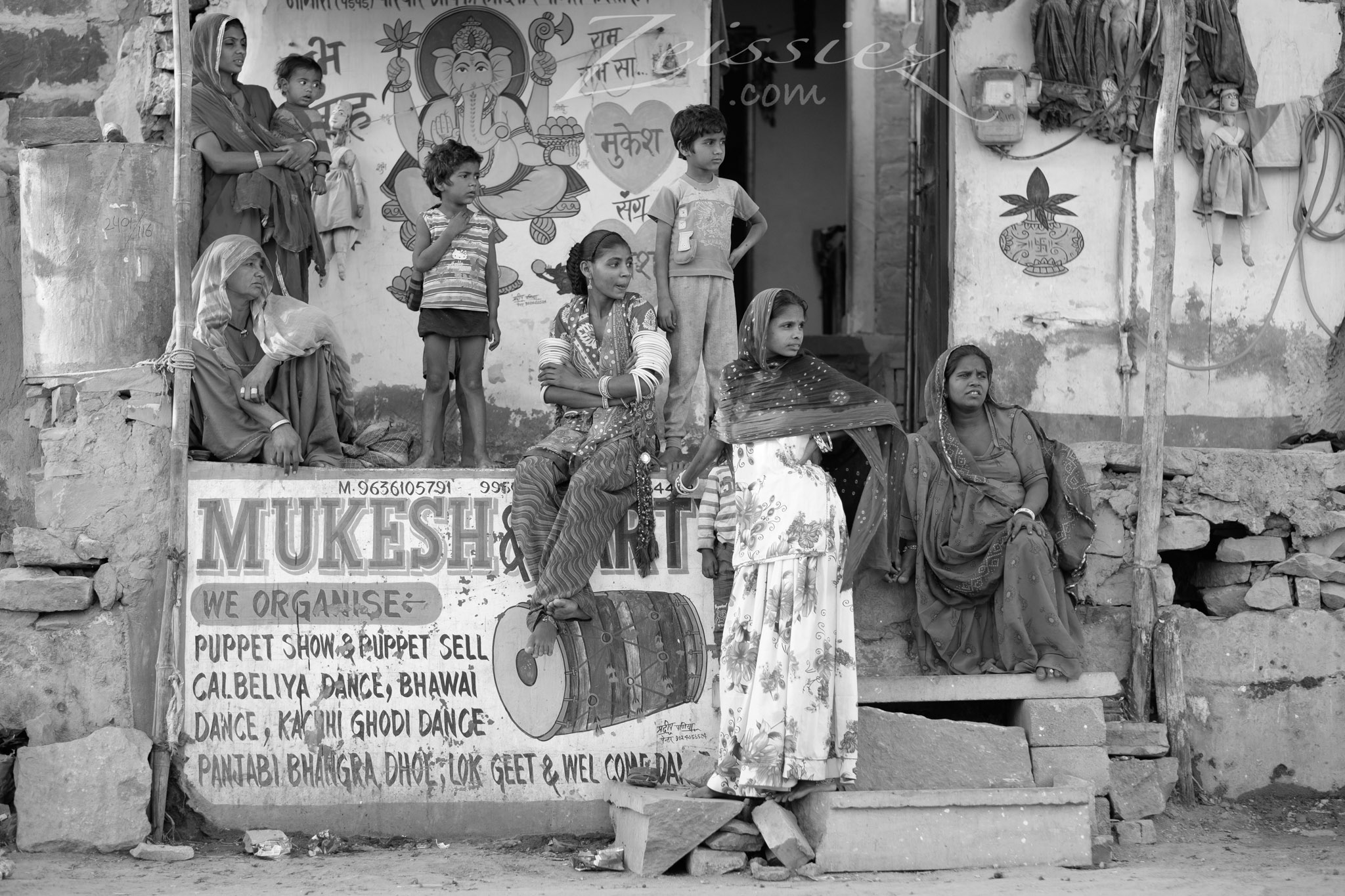
Example #6: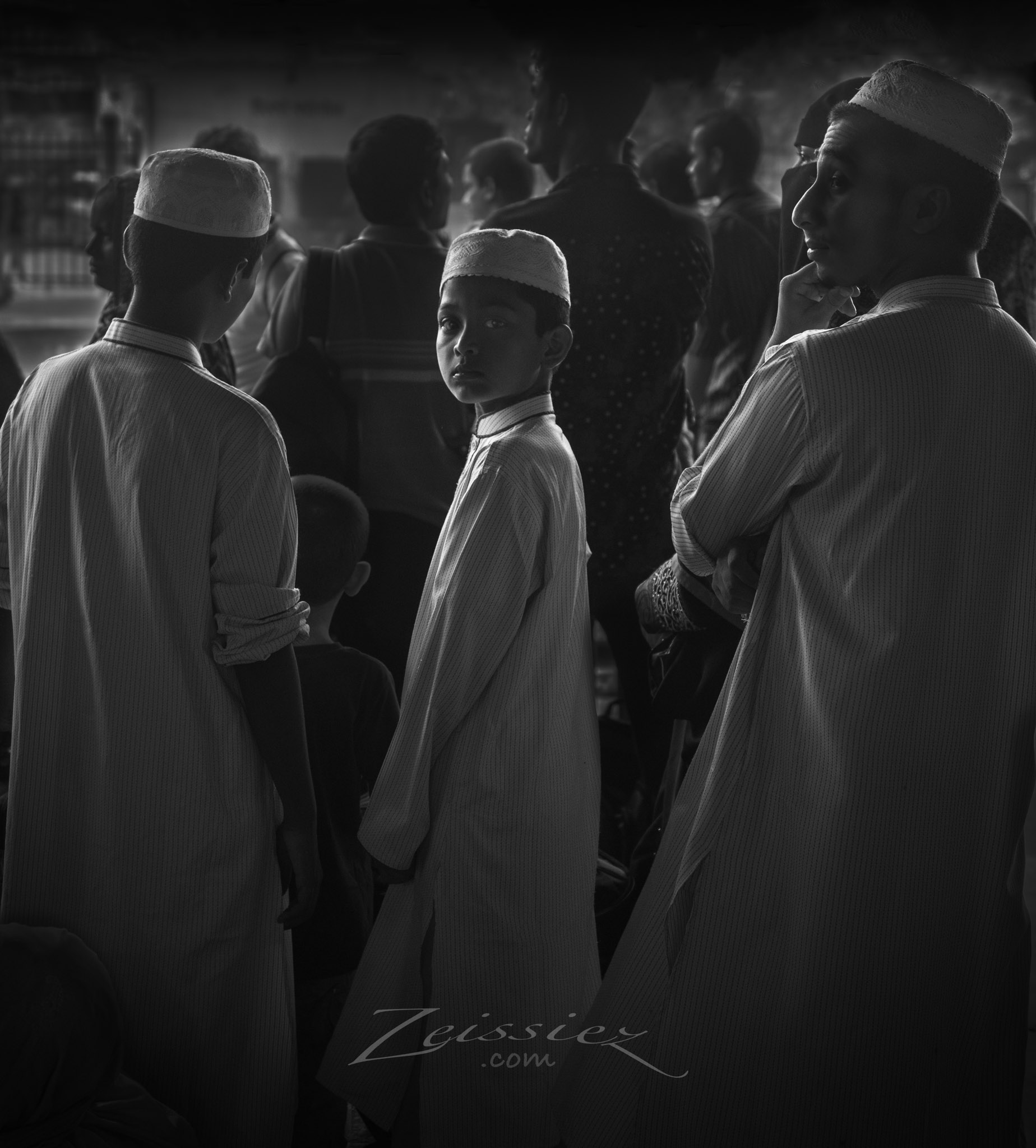
The original colored version contains different colored shirts of background subjects in the scene, which is distracting. Therefore, this photograph works the best in black and white.
4. Convert Image to Muted Colors if C=YES
Take a look at the below photograph in full color, as it was captured with my camera.
Example #7: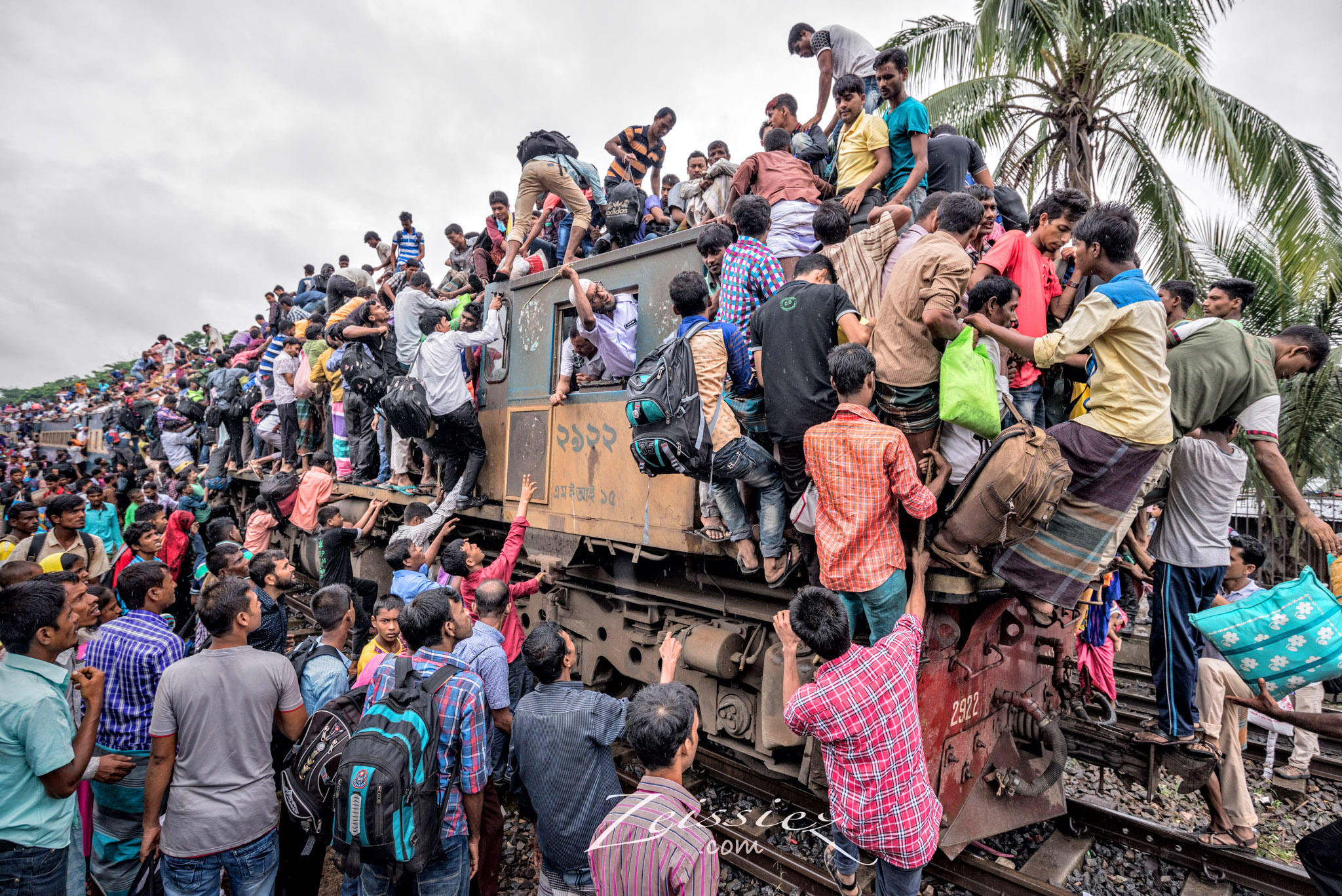
The colors of the shirts and bags is clearly distracting. Let’s now see how the photograph looks in black and white:
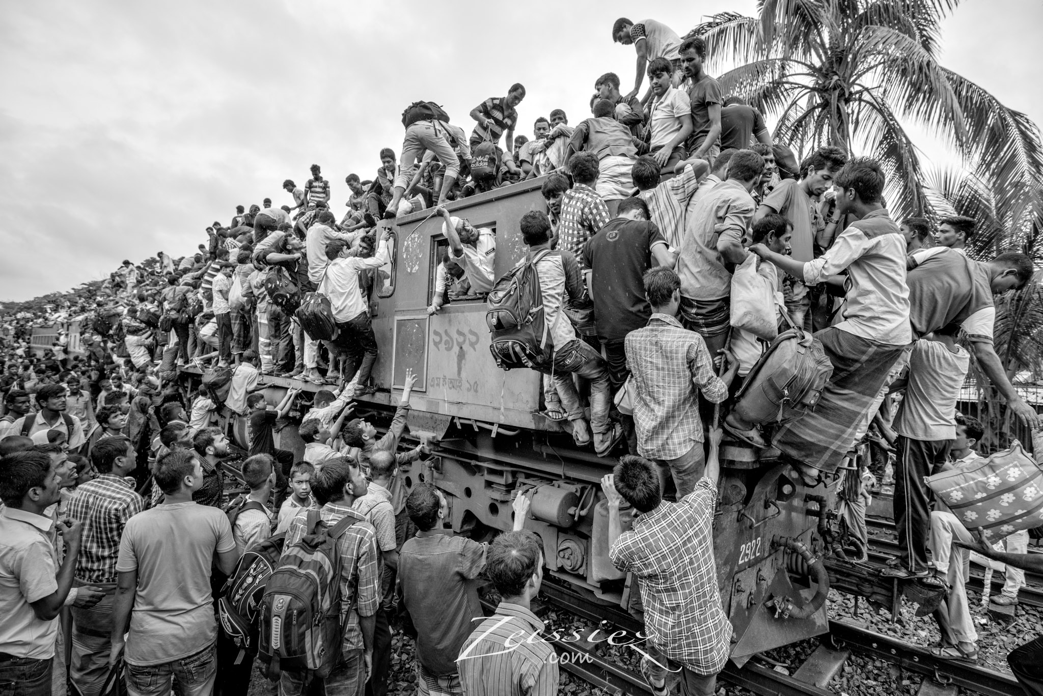
The problem got sorted out, but now everything seems like it is blended together. Now let’s take a look at the same photograph, but this time with saturation levels lowered in post-processing:
To me, this is a better version of the three. The subtle colors provide good separation between the subjects, and at the same time are not too distracting.
Below is the last example where muted colors also work the best compared to either full color or black and white.
Example #8:
In the next article, we will examine the subject of color grading and shooting in black-and-white. That’s all for now, thanks for reading!
Very good article, I enjoyed it a lot! Puts everything in clear and simple words. Thanks a lot Chee Ping!
Great article, I would love to see the first shot in B&W as the light is beautiful.
B&W is generally more reserved for patterns, shapes and silhouettes, whereas the color would be too distracting. Additionally, B&W much better conveys the mood of the photos as well as the essence of the people portrayed. So, as always, the intended output is in the hands of the photo’s creator and what he/she chooses is what the viewer is left with. Using subdued colors is a compromise between the two extremes, when retention of a little bit of color is still desirable for purely artistic purposes…..
That’s my take on color vs B&W.
I think it would be helpful to include the color images in section 3 prior to desaturation so that we can see how color is creating dissonance rather than harmony. Thanks!
Here it is:
The colored version: The viewer will pay attention to the blue sky, the murky water, the front portion of the boat which has a cyan color. These are the FACTs, but not the message that called for my attention to make this shot.
The B&W version: With color out of the way, the message is much simpler: The boy + moon boats, nothing else. The message is purer, the photo is more artistic.
Black & White has it’s place. Imagine a colorful Gotham city in a batman movie.
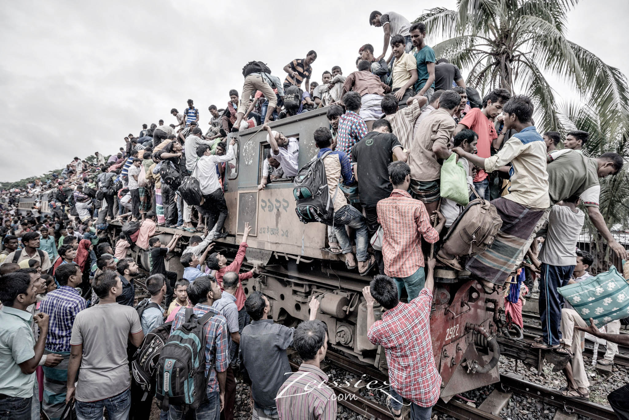
Some great examples Chee. I agree with others that the crowded train picture could also work best in B&W, because in my view the main artistic element is the pattern created by the ‘passengers’, and its journalistic look. But muted colour also works well.
Another key issue is the intended output. I would broadly suggest that colour looks relatively better on computers/phones, and B&W looks relatively better when printed.
Key issue is shoot in Raw, then you retain all options.
Thanks for you opinion. If we look at the B&W photo of the train, the train driver is not noticeable, although he is doing something interesting (holding a stick, beating the passenger). We are only left with an impression of a group of people crawling over the train. The message is much simplified. This is what B&W can do. If we look at the muted color version, the train driver and some of the other characters emerge, and we have little stories in each character, then we look at the interesting bit. You see, it is amazing that such a small difference in color, from muted color to B&W, the whole message is so different. There’s no wrong or right here, they give different emphasis to the photo. This article serves to remind us that, we don’t need to always use color and think B&W is cult, nor should we think that only B&W is cool. They all give different messages. It is up to the photographer what message he wants to send across.
Very important point Mr. Ping, excellent examples to back up your point, great article.
I agree with authors ideas to the extent that I also apply them.
By converting the picture in to B & W, we may be diminishing the chaos that people really undergo every day. Look at the pic of passengers hanging on to train. B & W version projects less chaos than color version. B&W makes better picture but suppresses the chaos that people go through in real life.
“When a photo does not need color to complete the message, it is at its purest. I consider it a blessing if photographs work in black and white each and every time.”
And therein lies this article’s bias.
Photos are not at their “purest” when they’re in black and white. They’re at their purest when they convey what the photographer wanted them to convey. The worship of black and white is silly. There is nothing more artistic, or “pure” about black and white. It is just one of the many choices we make when we create a photograph.
I agree with you, perhaps “simplest” should have been a better word. But believe me, those 3 black-and-white photos in the article do look better than the colored versions, that’s why I converted them to B&W. But if you deny that sometimes black-and-white photos do look better than in color, then obviously you don’t understand B&W photography. Take a look at this photo: . If this photo is not in black&white, all the mood is gone.
very good explanations,thanks for your share
Excelente las explicaciones y los comentarios.
Gracias