Just a few years ago, if you wanted more saturated colors in your landscapes or any other sort of photography, there was one basic adjustment to apply – saturation. Especially for beginner photographers, the Saturation slider in Photoshop was one of the most useful tricks to learn and seemed to change everything. You start with boring, flat-looking sundown, and you end up with this magnificent landscape to behold.
We will leave the virtues of saturated, bright colors for another day. In this article, I want to discuss something else. Because if all we had then for the task was Saturation (and Tone Curve, to an extent), we now have another option. And a rather confusing one at first, too, as it’s called Vibrance. To some, that sounds… well, it sounds as if two words that mean pretty much the same thing, doesn’t it? Let’s find out if that’s true. More importantly, let’s find out which one is the more usable, if not quite the more useful.
Table of Contents
The Definition of Saturation and Vibrance
When talking about color, saturation basically defines its purity – how red the red is, how blue the blue is, and so on. If we were to get really technical, it all has to do with the intensity of light of a specific frequency/wavelength coming from a light source, which is the reason why color saturation of the surrounding objects changes as the light changes, despite the color itself remaining the same. But we won’t get that technical. For our purposes, it is enough to understand that saturation is the concentration, and intensity of color – the more saturated the color is the “purer” it is considered to be, and vice versa. A completely desaturated color becomes a shade of grey, as in – a desaturated red has absolutely no red in it. The concept is quite confusing to try and explain, but not that difficult to actually understand.
What about vibrance? Well, to start with – it doesn’t really exist. Sounds silly, yes, so bear with me while I explain. The term “saturation” has all sorts of formulas attached to it – it can be measured and calculated as it is an actual property of light and thus color. Vibrance, on the other hand, is something Adobe came up with. In fact, my browser’s automatic spelling correction doesn’t even know the word! Now, naturally, it is not like vibrance is a completely random word – it clearly has something to do with how vibrant the color is. But then the exact same thing can be said about saturation, too. So how do we distinguish the two?
In order to do so, we must constrain the concepts within the context of specific software, for example – Adobe Photoshop or Lightroom, as that is the only context where Vibrance (slider) has any distinguishable difference when compared to Saturation (slider). So, according to Adobe (quote), Vibrance adjusts the saturation so that clipping is minimized as colors approach full saturation. This adjustment increases the saturation of less-saturated colors more than the colors that are already saturated. Vibrance also prevents skin tones from becoming over-saturated. I’d say that explanation is quite detailed and easy to comprehend. Vibrance is basically smart saturation. Now, though, let’s leave theory somewhat behind and move on to practice.
Theory and Practice: What to Use to Enhance Color
Exaggeration is arguably the easiest, most basic, and most effective way of making a point, and it is something I am going to employ now to visualize the difference between Saturation and Vibrance adjustments in Photoshop CS6.

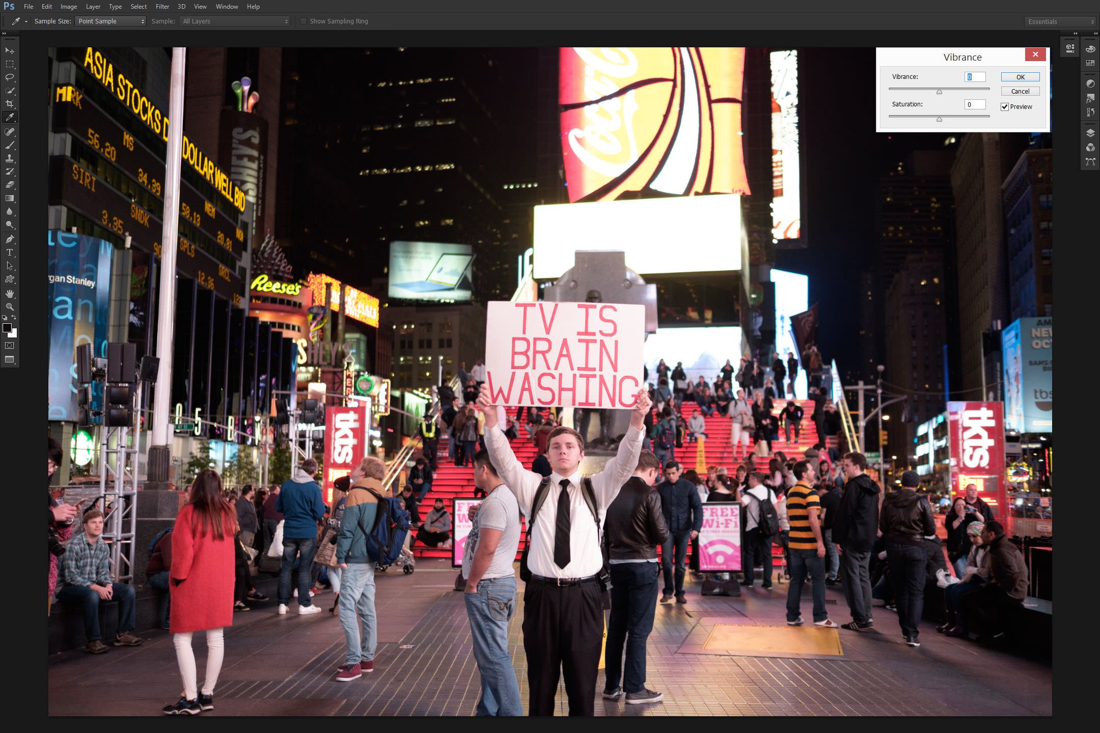
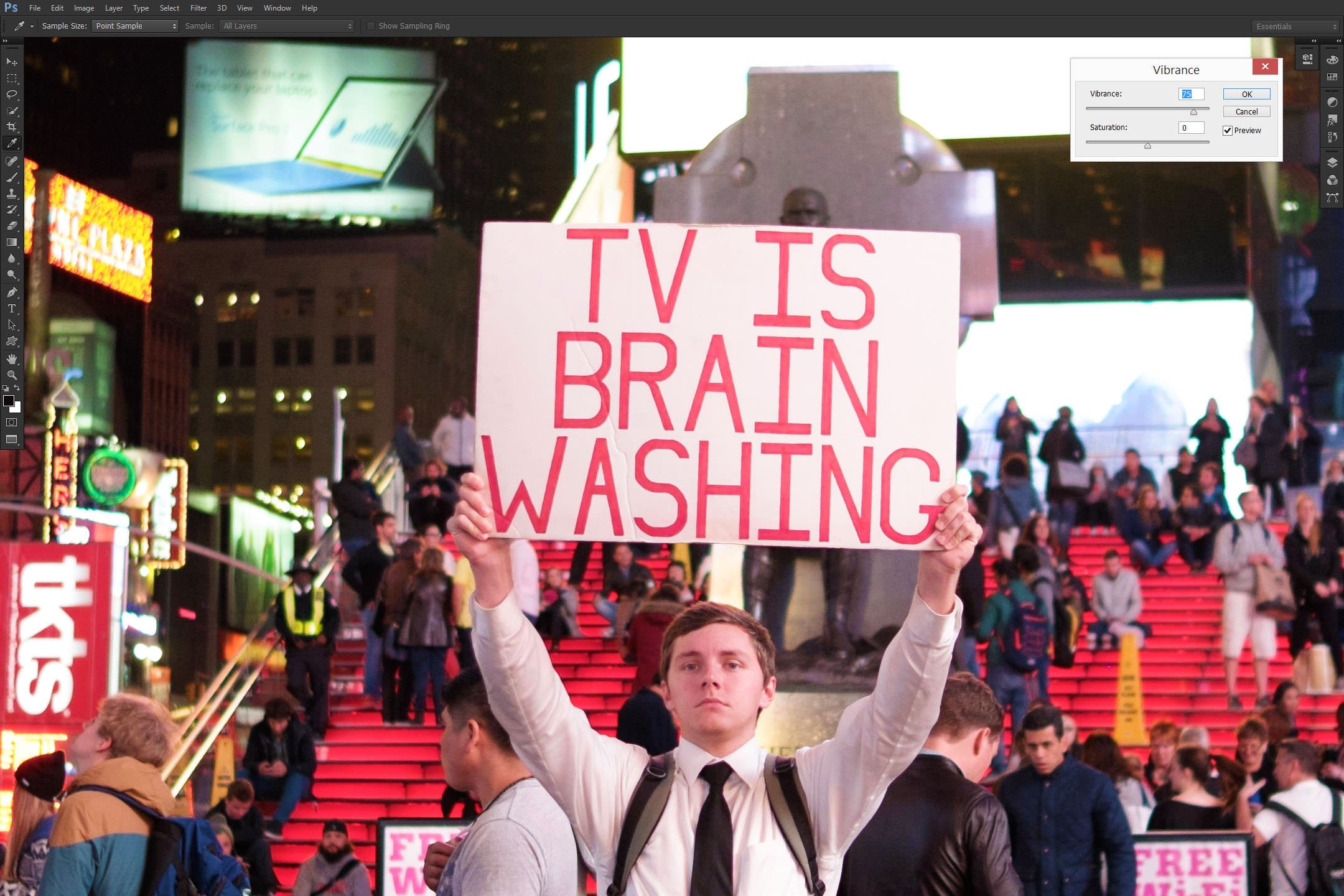
What you see above is an unprocessed (other than default Lightroom sharpening settings and my beloved Pro Neg. Std camera profile) environmental street portrait of a young and tireless man doing his best to blow against the wind in NYC Times Square. The image has plenty of red color – something a lot of Bayer sensors traditionally struggle with, X-Trans less so – as well as some other prominent hues. Well, I say prominent… Should you not think so, trust me, I will leave you in no doubt soon enough.
The first test I am going to do requires the image to be opened in Photoshop and Vibrance (Image – Adjustment – Vibrance…) adjusted to a not-so-modest value of +75. The result when compared to the original? Well, take a look:
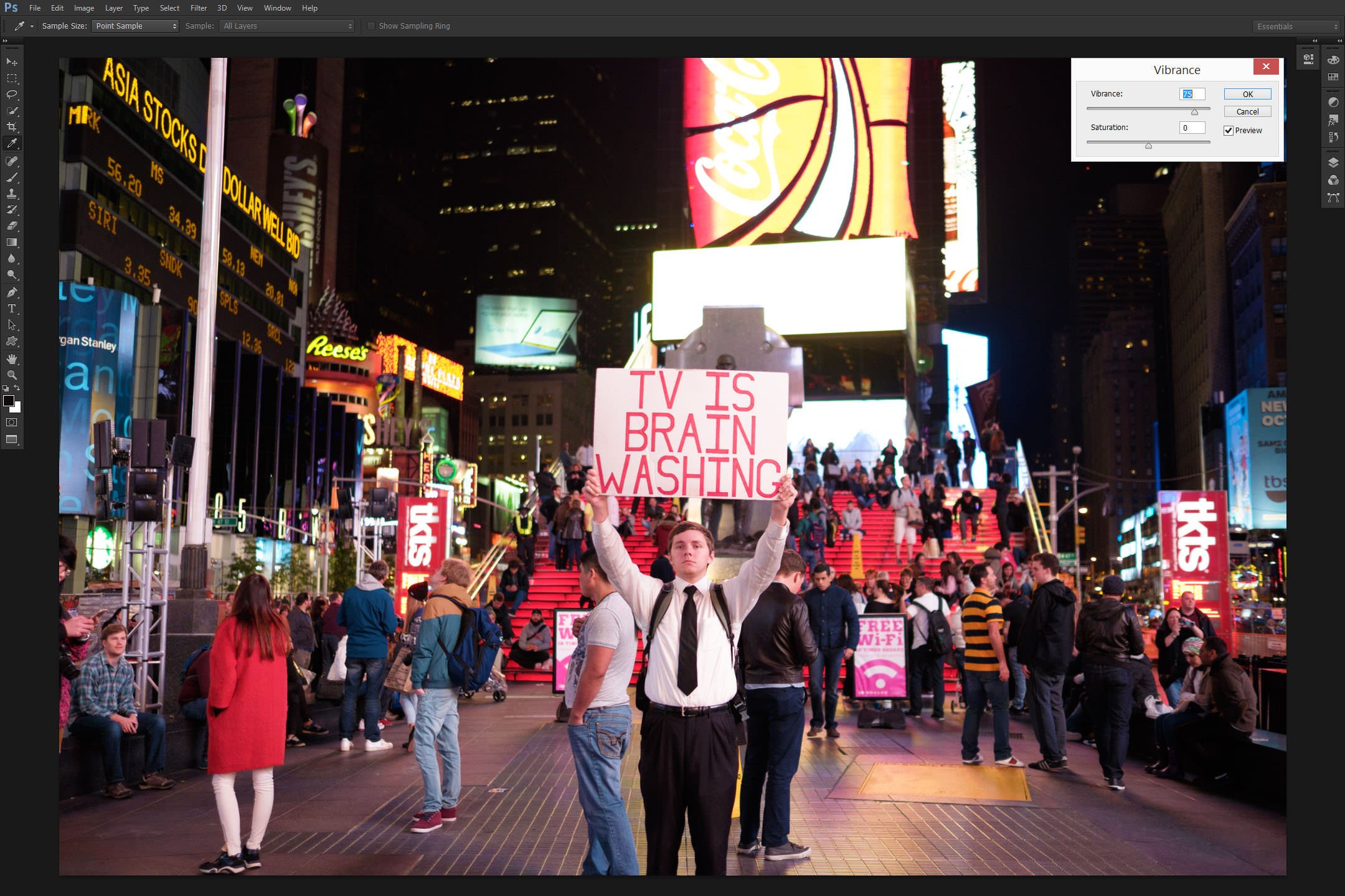
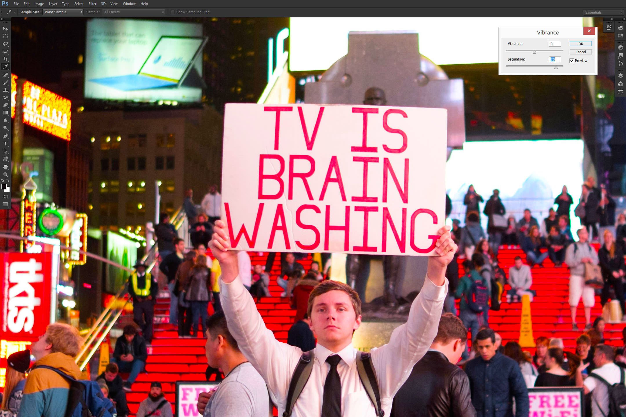
Right. So the difference is not as striking as one might think given we applied the value of +75 out of the total scale of -100 to +100. Yes, the reds are a little redder, and other prominent colors likewise. But it’s not exactly over the top, is it? So what happens if we compare this result to one achieved by moving the Saturation slider in the same dialogue (Image – Adjustment – Vibrance…) to the same numeric value of 75?
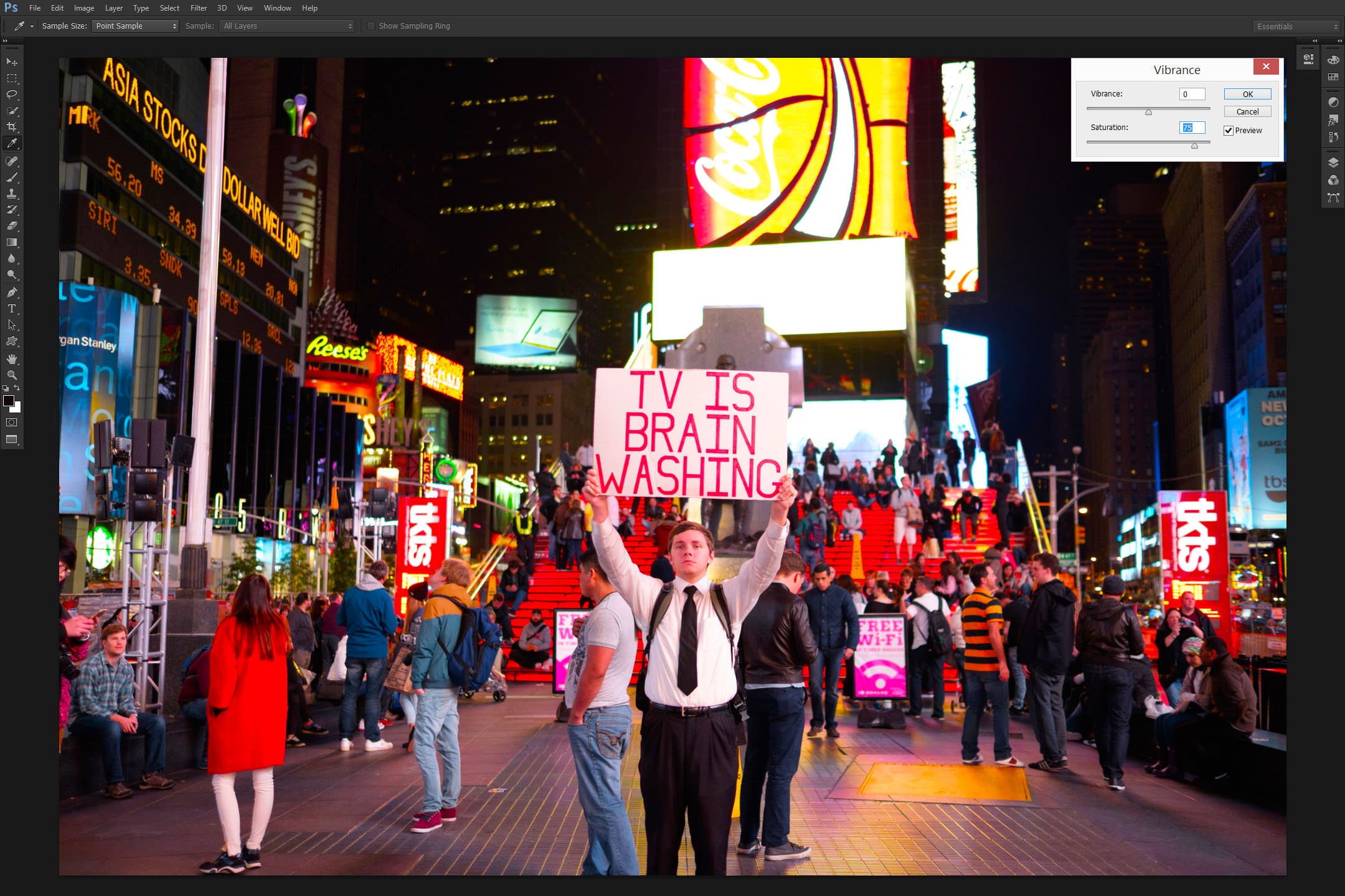
Oh. Suddenly what was a noticeably, but subtly more vibrant version of the original image becomes… well, a bit of a mess, really. Every tone, every shade is now that much more intense. To a point where the color is not what it was to start with, too. More than that, some color clipping is very apparent – a fact that becomes even more alarming considering we moved the slider to +75, not +100. Why is that? We applied the exact same numeric value, but the Vibrance image sample is staggeringly bland in comparison. Well, the answer lies in the above-mentioned theory and Adobe’s description of its Vibrance feature. Saturation adjusts the vividness of every single color. More than that, it affects every color to the same degree. In other words, every color captured in the image is made more “pure”. What was slightly blue is nudged (gently speaking) towards its most vivid version, and the issue is more complex than you might think.
Yes, the sky of a landscape image will be unnaturally blue if you overdo Saturation, but portraits are affected in even less pleasant ways. Don’t forget, the skin contains mostly orange, red, and some yellow color, but I doubt many would say our actual faces are orange. No. The colors form a very subtle mix. Adjust Saturation and that red is suddenly very prominently red, and that orange is very prominently orange. Adjusting Vibrance does not do that. Adobe made sure the setting didn’t affect skin tones all that much. More than that, Vibrance adjustment leaves already saturated colors almost untouched – it’s the more muted tones that get a gentle push.
To give you a better idea of what I mean, let’s take a look at a crop of the above images starting with the original version compared to the Vibrance-adjusted sample:
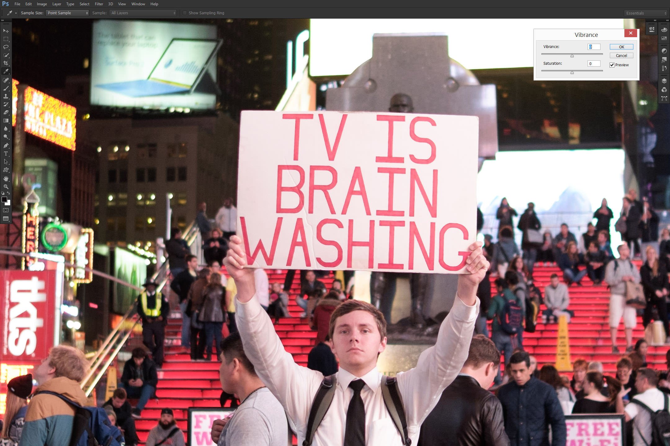
As you can see, the reds are noticeably more vibrant, especially the stairs behind our main subject. Other colors are also more punchy, but it still looks very natural and there is virtually no clipping to be seen. Even the young man’s face – although it shifted towards reddish, is mostly due to the light hitting his face and less so because of the skin tones. It all looks very natural. So what if we compare this natural-looking Vibrance-adjusted sample to the effect of Saturation?
The first impression I got after looking at the above comparison was how unsophisticated and blunt the Saturation tool is in comparison to Vibrance, at least when working with photography and not graphics. It is all a matter of taste, of course, but in my opinion, the rendition is rather ugly, not to mention the shift in color. It’s not just more vivid, it’s actually different – one look at the stairs is enough to notice it. What were previously areas with smooth transitions between ever so slightly different shades of red are now blobs of solid color. The adjustment did no favors to skin tones, either.
Vibrance puts a lot more restraint on how far you can push the vividness of those colors. It’s as if Adobe is there holding a safety net for you. Now, on one hand, few want their software to make decisions for them. But in this particular case, I strongly believe that, if you find the Vibrance scale not enough for your image, there is a chance you need to practice some restraint. Not always, no, but quite often.
Smart Saturation it is, then.
The Other Saturation Slider
Photoshop is among the most complex pieces of software available to photographers, and yet I was still surprised to find out the old way of adjusting saturation was still present. You may have noticed that the previously used Saturation slider was actually located in the Vibrance dialogue. So if we accept Vibrance as the “Smart Saturation” feature, the Saturation slider in the mentioned dialogue could be considered… mildly educated. In other words, it’s restrained in its effect and limited in functionality. The original Saturation tool, however, is not – it’s much more complex and even less forgiving. I am not going to go into much detail explaining all the functionality of the tool. Suffice to say this: you can find it by clicking Image – Adjustment – Hue/Saturation or by hitting Ctrl + U on your keyboard; it requires well-practiced lightness of touch to avoid almost catastrophic results.
To show you what I mean, let’s compare the previous and already somewhat-over-the-top Saturation-adjusted image sample to one achieved with the original Saturation tool (numeric value, as before, set to +75):
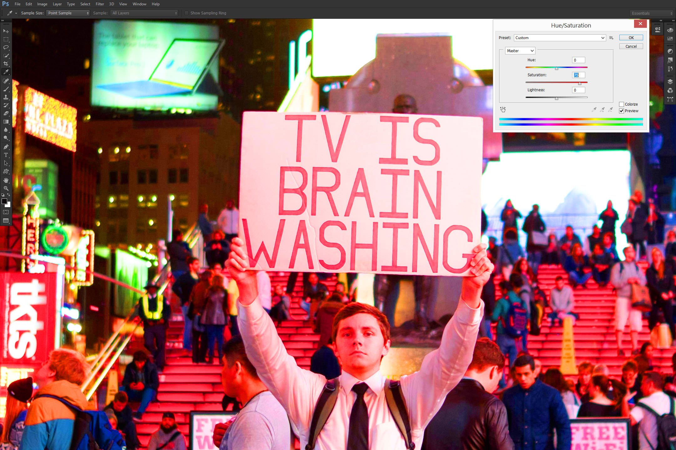
Would you not say the somewhat over-the-top does not seem anywhere near as bad as it did moments ago?
Is Saturation Now Useless?
No. Saturation has numerous uses outside strictly photographic post-processing, but even with such images, it is not a useless tool. It is merely a tool that requires careful approach and restraint. Don’t adjust that slider by tens – try much smaller numbers first. Also, using the Saturation controls in the HSL Tab in Lightroom allows precise control over each individual color, something that can be used to, for example, improve skin tones. Finally, you can’t do B&W by dialing -100 with Vibrance. Having said all that, if you just want more intense colors in your images, chances are Vibrance adjustment is the way to go. It doesn’t pack quite the same punch, but also makes ruining a photograph with too much vividness that much harder. And that is a good thing.
Excellent explanation, very clear! Thank you!
I was surprised to find that the basic Saturation slider isn’t actually suitable for reducing selections to black & white. It doesn’t weigh the contributions of the primary colors as nearly every other basic tool does (e.g. YCbCr formula). I used Saturation for this purpose for a while until I noticed that the overall brightness sometimes slightly changed, which I dismissed as a fault of my perception, and faint noise became more pronounced in the greyscale version instead of getting averaged out.
Now I always make a copy, and go through Mode > Greyscale to desaturate.
I can’t see any obvious problems when using a sane saturation range of ±20, although it still doesn’t sit well with me that the process isn’t perceptually accuarate.
Hmm. The photos I attached didn’t come through. Sorry about that.
Thanks Romanas, for the clear and concise explanation. It has always been an unanswered question of mine. I’ve been using ‘Vibrance’ for sometime, but only had a vague understanding of its definition. I still use ‘Saturation’ occasionally.
in lightroom, those two sliders, clarity and vibrance, are soooo tricky for me to use .. they ruin a lot of good photos very quickly :-)
THEY ruin it? all by themselves? or you ruin it? :) :) Ha Ha..Just needling you! Have a good day! :)
Very good explanation..!! To be honest, it wasn’t that difficult to understand, and yes, I actually thought the two words meant quite the same before.. Got it cleared to an extent now.
Vibrance is very nice, but saturation still has its place. The thing to remember is that vibrance is applied most strongly to areas with less saturation, which can sometimes have unexpected effects.
A good example is a sunset in which there is a nice warm glow at the horizon and a very slight blue cast on the clouds. Increasing vibrance will increase the yellows and oranges in the warm glow a little bit, but the clouds can end up quite blue if too much vibrance is added. A judicious mix of both vibrance and saturation can bring out just the right amount of colour.
From notes I’ve acquired for a faux HDR look:
Faux
HDR Look
* Completely lower highlights; completely open shadows, blacks and clarity (probably leave the whites where they are).
* Lower the luminance of a color and then raise its saturation. Do this for as many colors as you wish.
* Raise general saturation until one color becomes too much. Now raise general vibrance, since other colors need more saturation.
* Use the Graduated filter, starting in the border and dragging in the opposite direction of the image to affect the whole image. Raise the
clarity and shadows. Do another Graduated filter if necessary. Add a lot of sharpening.
(The attached photo is my fun attempt at this look with a store front in town.)
For a matte look, lower saturation and raise vibrance.
Here are some experimental uses for saturation and vibrance adjustments:
For a faux HDR look, try using high saturation and vibrance, very low highlights, very high (raised) shadows, blacks and
clarity, lowering the luminace of a color and then raising its saturation.
For a matte affect, raise vibrance (to saturate unsaturated colors), and lowering saturation (to lower already saturated colors).
The photo I’ve included here was my own fun with the faux HDR look using the method I described above.
Thanks for a very useful description of the differences
between Vibrance and Saturation and practical comparisons. In trying to increase sharpness of photos
taken at higher ISO values, it seems that the chance for unappealing artifacts seems
to be exacerbated by increasing Vibrance, particularly in the blurry out of
focus areas of the picture. As another
way to visualize how Vibrance and Saturation differ, there is a useful set of
comparison graphs in an article by Mark Meyers in Photo Journal www.photo-mark.com/notes…aturation/).