Perhaps you read our composition tips for landscape photography and realized something interesting: It never mentions the rule of thirds. If you aren’t familiar with this technique, you’re rare — the rule of thirds is, by far, the most common rule of composition you’ll find in photography. But does it actually work? Can it really improve your images? The truth is more complex than you may think.
Table of Contents
1) Not all photos need to follow the rule of thirds


All of these photos have something in common: Their compositions have nothing to do with the rule of thirds.
What does that mean? The main subjects of the photos have a structure other than this:

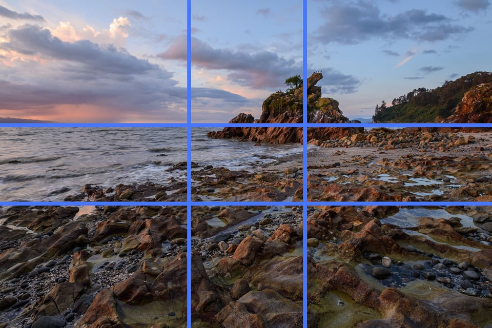
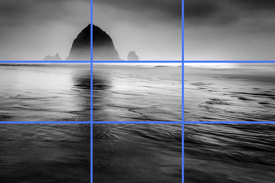
If all the photos above followed the rule of thirds, they would match very closely with this diagram. For example, the photo below does line up with the rule of thirds:
Pretty simple.
Clearly, you can take good pictures without matching the rule of thirds. But are they just exceptions to an otherwise valuable technique? Or, does the rule of thirds have some larger problems?
2) The intent, and the corruption
If you want to see whether or not the rule of thirds is valuable, you’ll want to look at its intended audience. The rule of thirds, quite simply, is intended for beginners. It’s meant as the first lesson to people who don’t yet know anything about composition, since they’re only starting to learn photography.
The rule of thirds is a tip that you tell your Uncle Bob when he says none of his photos turn out well. It’s a way to teach first-year photography students that off-center compositions can lead to beautiful photographs.
In this way, the rule of thirds can be a surprisingly useful guideline. It’s catchy and easy to put into practice.
Here’s the problem: People don’t realize that the rule of thirds is a one-trick pony. Yes, it helps teach people about off-center composition — and then it leaves them there, as if the only good off-center photo is one that follows the rule of thirds.

This waterfall is clearly off-center, but it doesn’t align with the 1/3 mark.
The rule of thirds fails when people start to use it as a guide to composition rather than a reminder that, sometimes, central composition doesn’t work.
There’s no reason why this is the “rule of thirds” rather than the “rule of two sevenths” or the “rule of thirteen twenty-ninths” except that it’s easier to remember. There is nothing magical about the 1/3 intersection points in a grid — and, no, our eyes don’t gravitate toward them, despite what some photographers say. (In fact, our eyes gravitate toward the interest points of a photo, generally without regard to where they are. If you’re looking for a good case study of this effect, here’s a fascinating Business Insider piece.)
This is why the rule of thirds is problematic. Yes, it’s a quick way to remember that dead-center compositions don’t always work well. No, the 1/3 lines don’t have any special powers.
3) It’s not just the rule of thirds
People like coming up with their own explanations for things. It’s what makes us human; we want to figure out the world for ourselves, inventing our own rules to explain how it all works. Unfortunately, we can also be quite stubborn. That’s not always a great combination.
When I first started taking pictures, I wrote a list of “compositional tips” on a sheet of notebook paper. Some of them were fine:
- A vivid-colored subject stands out clearly from a desaturated background.
While others were clearly false:
- The best photos contain three subjects, with each one slightly different from the next.
No!
The issue, though, is that no one is immune from thinking like this — that there’s a way to take better photos just by basing your composition upon a pre-existing template.
Unfortunately, there isn’t. The conditions that create a good photo change wildly from scene to scene. You just have to compose each photograph differently, depending upon the world in front of your camera (as well as your goal for the image).
Online, everyone has a voice — which means that the rule of thirds isn’t the only “rule” that you’ll encounter. There’s also the golden spiral, dynamic symmetry, the diagonal rule, and countless others. Just like the rule of thirds, these techniques don’t hold any water for advanced photographers. They happen to work for some images, and they aren’t ideal for many others. You shouldn’t waste your time on them.
Instead, compose a photograph for its own merits. Don’t use a thoughtless template, and don’t analyze your photos after taking them to see which gridlines they happen to overlap. It’s a recipe for confirmation bias.

This photo follows the golden ratio. That must be why I like it!
4) Which compositional techniques actually help?
It’s not all bad.
No, none of the grids that you can superimpose on top of your photos actually help. The rule of thirds is not a magic formula, and neither are any of its variations.
But there are still valid ways to improve your photos. Learn about simplicity and visual weight. Pay attention to positive and negative space. Most of all, think about the emotions of your photo, and find good light that matches your mood.
This article isn’t the place to cover each of these individually. Composition is a deep, multi-layered subject. If I had to give just one sentence of advice, it would be this: Form a vision for what you want your photo to say, and then make every single decision in the field — technical choices as well as creative — to turn that vision into reality.
Composition is about giving your photos a structure. It’s the framework for your emotional message. That’s why it’s so important to avoid using preconceived, formulaic compositions. Some of these “rules” might sound intriguing when you first hear them, but that doesn’t mean they hold true in reality.

5) Conclusion
So, what’s up with the rule of thirds?
The answer is that it doesn’t work all that well. Sure, the rule of thirds is a way for beginners to learn that off-center compositions exist. But it is absurd to think that 1/3 markers have some innate power, aside from simply being easy to teach. They don’t.
If this is your primary way to frame photos, you’re missing out on an entire world of other compositions. The rule of thirds will give every single one of your photos a very similar structure, even as your subject changes. That’s not a recipe for thoughtful, personal work.
There are no universal truths — no imaginary lines — that make a photo succeed. There’s just good photography, and good photography doesn’t depend upon what grid you use to compose a photo.
See also:
- Finding Good Light in Landscape Photography (Don’t chase after gridlines when you’re looking for a good photo. Chase after light.)
- Composition Tips for Beginners (The fundamental elements of composition.)

That 2nd photo from the top is great
Thanks Charlie, I’m glad you like it!
Great Resource for my students