For a while now, editing photos has been about more than just Adobe Photoshop or Lightroom. A number of other companies have popped up in recent years like mushrooms after the rain. One that you may have heard about is the company Skylum, with their Luminar Neo software. Does the inclusion of AI in its algorithms mean a revolution in photo editing?

Table of Contents
The User Interface
The user interface in Luminar Neo is clear and quick to navigate. There are three tabs at the top, two of which are familiar from other programs. From left to right, they are: Catalog, Presets, and Edit. Although, it’s quite possible that dust will settle on the middle tab – but I’ll get to that later.
There aren’t many options to tweak the environment in Luminar Neo (found by expanding the button at the top left of the screen). About the only major thing I recommend changing is the histogram display in the View tab. In Preferences, you can basically only set the max size for caching/backup and GPU use. At least you’ll soon be done and can get on with the important stuff, which is photo editing.
Catalog
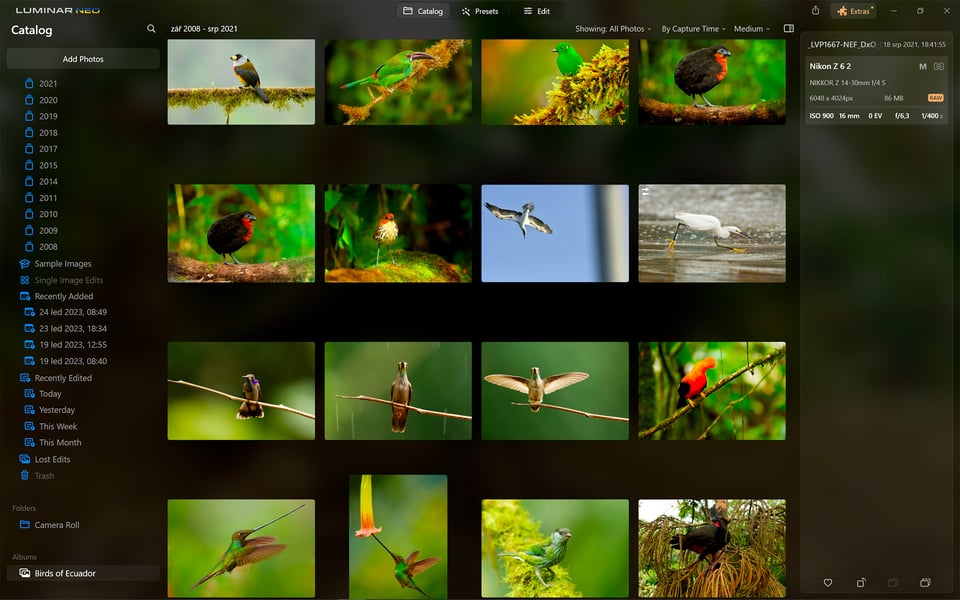
There are two ways to look at the features and functions of the Luminar catalog. For some, it may be too simple and lacking in sophisticated features. For others, it is much more intuitive than other cataloging software. Personally, I am somewhere in between.
What I like about the catalog is that you can get familiar with it quickly – all but instantly. From the Add Photos or Folders menu, you just click through to the source of your photos. No complex import setup like you might be used to in Lightroom. The selected photo, or all the photos from the corresponding folder, are loaded within moments.
To make sure you don’t get lost in the number of photos, you can filter them by date taken, date imported, whether or not you’ve already edited them, and a few other simple parameters. If you don’t need advanced features like keyword search, coordinates, camera or lens used, you’ll be happy. But more advanced users may find these organizational options on the slim side.
Akin to Lightroom catalogs, you can use Luminar’s “Albums” to gather together your photos without moving the corresponding source files around on your disk. In the right-hand column next to the photo thumbnails is a slide-out panel showing the metadata, along with the ability to “Favorite” a photo.
Presets Tab
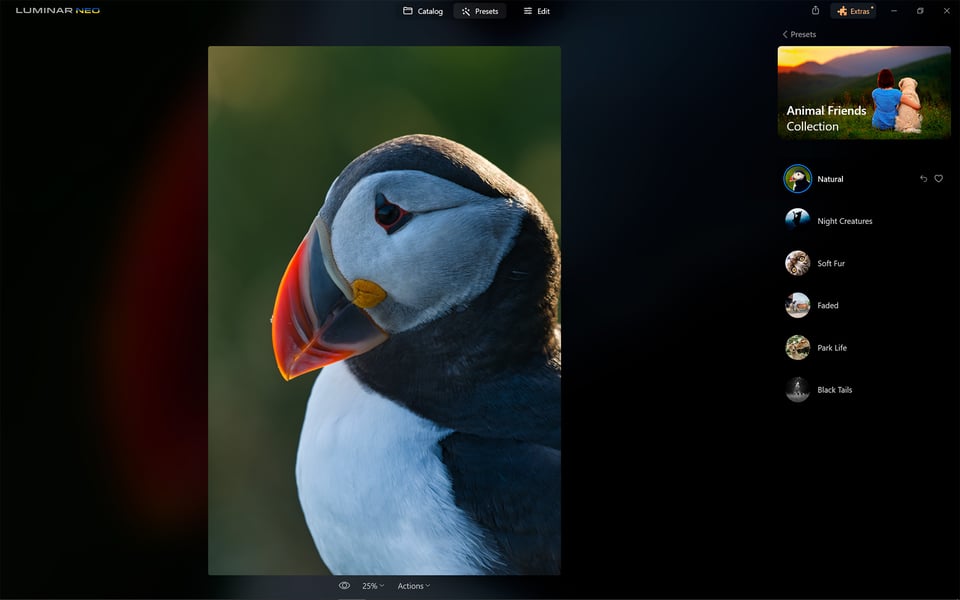
The Presets tab is something you’ll either love or hate. As the name implies, you’ll find a variety of different settings that let you edit your photos with literally one click.
To help you navigate their varied selection, Luminar Neo will automatically explore what’s in your image and offer you a series of Presets selected just for your shot. Of course, if you don’t accept this offer, you can continue your search across all available preset categories.
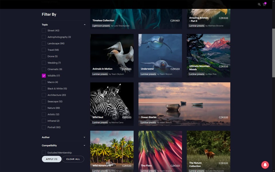
You get a basic set of presets when you purchase the program. You can then expand it (almost infinitely). Clicking on the Get More Presets button will take you to the Skylum online store. Depending on the genre you are interested in, you can buy Presets to your liking. In the Wildlife section alone, I came across 17 different packages. One of them, for example, was created by renowned photographer Marina Cano. The price of these packages is usually $19.
Does using presets created by someone else seem like a cheap trick and a kind of cheat to you? Yes, it can be seen that way. But I found them interesting, even though I would never actually edit my photos with one click. That’s because the individual presets are not a black box that you can’t see into. On the contrary. Choose the preset that interests you, and switch to Luminar’s Edit tab. In the Edits tab, you can then see all the steps that are responsible for a particular look.
Not only will you see the tools that have been used, but also the degree to which they have been adjusted. You can further modify these adjustments as you wish. That’s why I see Presets as a great didactic tool that is useful even if you don’t like one-click editing.
Edits
And this is where it all begins. The tools in Luminar’s editing toolbar are sorted thematically into several categories. Layer Properties and Crop are followed by Favorites, Essentials, Creative, Portrait, and Professional.
There really are a lot of tools, and we can expect to see more in the future. Therefore, I would appreciate it if it were possible to create my own toolset. I would like a Custom Tools drop-down palette where I would only include what I will use the most. And the already quite broad range of editing tools in Luminar can be further expanded with additional plugins you can purchase.
It is not within the scope of this article to introduce you in detail to all the tools. Rather, I’ll show you the ones that I found most interesting. But mainly I’ll introduce you to the way Luminar Neo works.
There are two items at the top right of the screen. The Tools menu contains all the tools at your disposal. If you click on Edits, you’ll see all the edits you’ve made as they went in chronological order. You can further tweak them, by clicking on the eye icon temporarily disable them, or you can reset or delete them.
Essentials
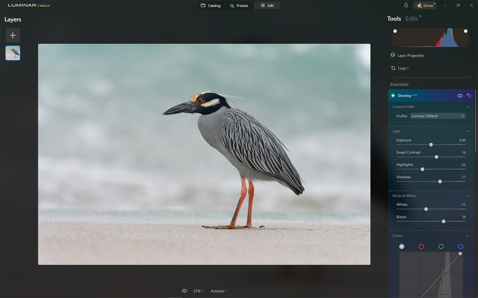
If you shoot in RAW format (which I recommend), I suggest you start editing in this category of tools. Like Lightroom or Adobe Camera RAW, this is a sort of gateway editing tool to the entire editing environment. You can fine-tune the exposure, highlights, shadows, contrast and white balance, and then move on to bolder edits.
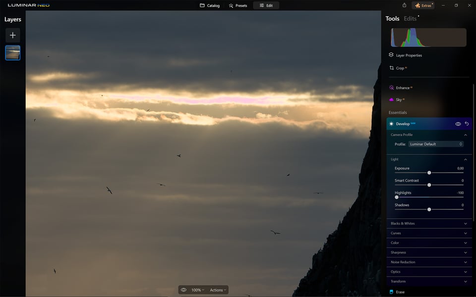
I did notice one problem in a photo in which the sun shines through an opening between dark clouds. This created a lot of contrast and overexposure at the area of highest brightness. I pulled Highlights to the left when trying to restore it. The result was not a restoration of the highlights, but their replacement by a pink patch. It was an odd issue.
Most of the other tools in Essentials won’t surprise you. These are basically the tools you’re used to from other programs. Worth mentioning is the Erase tool. This allows you to delete unwanted objects from a photo, akin to a spot healing tool. For simple erasing, it’s not bad, but for more complex tasks, the program sometimes fails. The only option then is to use the good old clone stamp, which is fortunately available.
An interesting new feature is the removal of powerlines. For regular images, this works quite well. To give Luminar a proper challenge, I used a bit of an extreme sample. A bunch of wires disappeared from the photo. Enough to cause a blackout in the entire town. But if your subject is powerlines, the software gets a bit confused.

Another tool that caught my eye is Structure AI. By the way, it’s the only “artificially intelligent” tool in this set. Structure AI adds an interesting contrast to the photo, giving it a more plastic, almost 3D look that can be good for stylized designs.
Creative
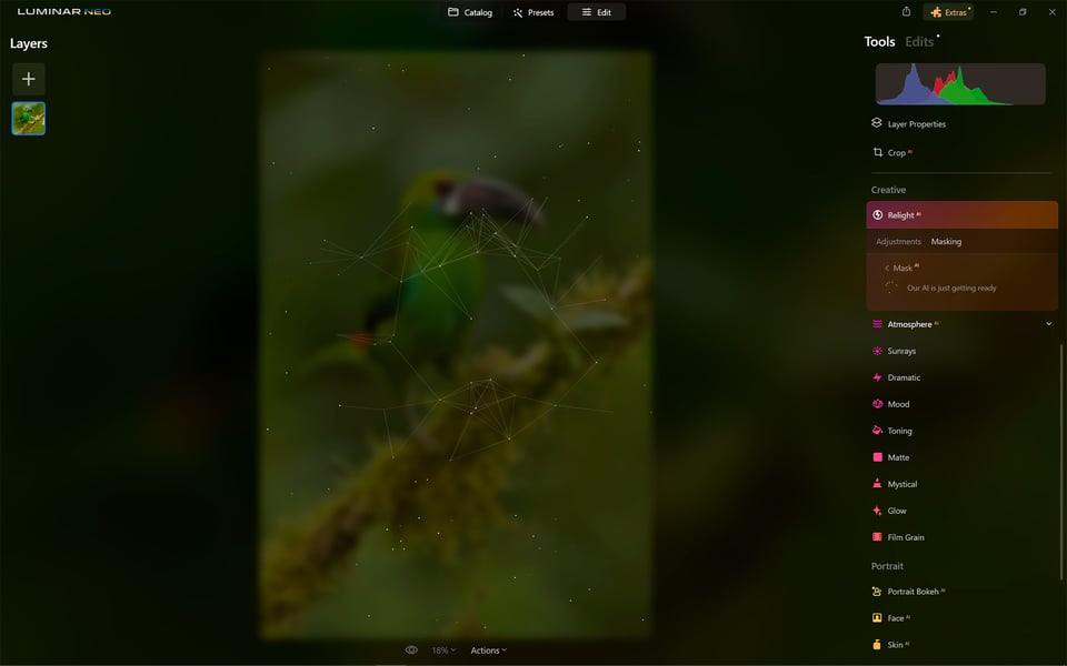
In the Creative toolset, we’re already getting into the area of wilder edits. Worth mentioning is the Relight AI, which allows you to balance foreground and background lighting. Atmosphere AI will conjure up different types of fog in your photo. If you prefer sunny weather and the sun is missing from your photo, you can add it in with the Sunrays tool.
A total of ten tools in this set allow you to completely change the atmosphere of your photo. It depends on the taste of each user. These sorts of edits are not to my taste whatsoever. That said, by using some of the tools sparingly, you can get results that don’t harm the integrity of the scene (like making the mist stand out in an already-misty landscape, for example).
Portrait
Here you can find everything you could possibly need to edit photos with a human as the central motif. Some tools are reminiscent of the filters and features used on your smartphones. After all, these are some of the users Luminar Neo seems to be targeting. No big complexities like in Photoshop.
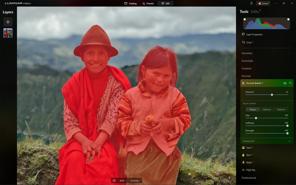
For example, the program automatically detects the person or people in the image and blurs the background with the Portrait Bokeh AI tool. You set the amount of background blur. Thanks to the integration with Mask AI, the result surprised me with its accuracy.
Face AI focuses only on the face. Namely, the face, eyes and mouth. You can make subtle changes that you may have been planning to make anyway, like brightening the subject’s eyes slightly, or reducing the bags under their eyes. But there are also very dramatic changes you can do here – things I would not recommend most of theme, like narrowing the subject’s face, enlarging their eyes, and so on.
The Skin AI tool removes skin blemishes, including unwanted glare and specular highlights. Body AI focuses on other areas, specifically the shape of the body and abdomen. All it takes is two mouse movements and the effect is similar to that of months spent in the gym. Unfortunately, only in the photo. It felt rather creepy to me, but we have all seen how magazine editors do this sort of thing to celebrities already… maybe it is a feature meant to save those magazine editors some time?
Professional
There are four tools in this set. Of these, I find Supercontrast and Color Harmony the most useful. In the first one, you can control the contrast in highlights, midtones and shadows independently. The second one provides quite broad color grading options. Especially in conjunction with Mask AI, it’s a powerful tool for those who like to work with colors.
Masking
If you want to bring more control to the process, that’s what the Masking tab is for. (You’ll also see it in most tools individually, by the way.) With masks, you can apply adjustments only to the area of the image you’ve selected.
And this is where it gets really interesting. Last year, Luminar added a feature that caused a well-deserved buzz. After the usual masking tools you know from other programs, it added the Mask AI feature. How does it work? Very simply.
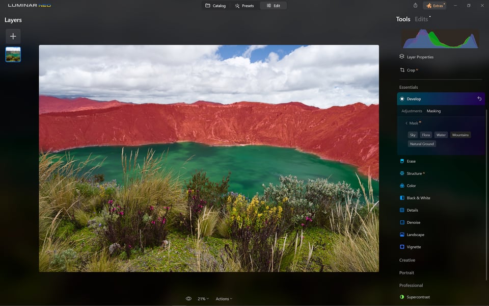
By activating Mask AI, Luminar detects the objects that are in the image. After a while, you can then find an overview of what it has discovered in the photo in the tool’s menu. For the photo below, the AI was successful and detected the essentials that are in the photo. You can then switch between the objects by selecting them from the menu. You can select one or all of them. It’s up to you.
To me, this is a great way to make local adjustments to a photo. It helps avoid the halo effect that you’ll often see with careless local editing.
If the AI didn’t create the mask exactly to your liking, you can use the brush to modify it. Either paint in the mask or brush out what’s overlapping. You can also copy masks from tool to tool, which is helpful if you spend time making a complex mask.
It’s also great that Luminar Neo allows masks to be freely combined. For example, if I select Man Made Ground, Natural Ground and Human in Mask AI, I can make adjustments to those three objects. For subsequent editing, I can simply add or subtract additional objects to the mask. One click and you’re done.

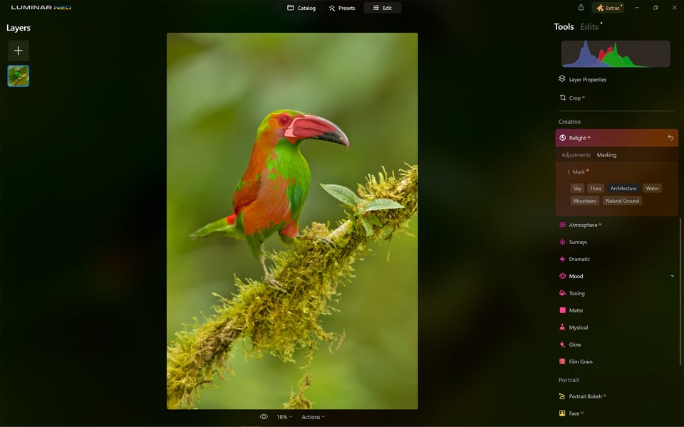
Unfortunately, the current algorithm inside Mask AI doesn’t always detect objects correctly. Of course, I was most excited to see how the program handles animal detection. But this is an area where Mask AI still has a lot to learn. If there is a bird on a branch in the photo, then for some reason it is automatically evaluated as “Architecture”. The Andean fox on the slopes of Cotopaxi was a “Human” for Luminar Neo, for example.
I contacted the Luminar representation to inform them of this problem. I got a response almost immediately that the developers were aware of the problem and were working on it. At the same time, I promised Luminar help in the form of my photos for the algorithm to learn from. I commend them for their exemplary communication. Hopefully in the next update, they’ll be able to recognize such bizarre birds as the Andean Cock-of-the-rock.
Favorites
The Favorites category contains very few tools, but that’s by design. The Enhance tool is one of a series of tools in Luminar with the magical “AI” acronym. Based on Luminar’s artificial intelligence tech, it evaluates what’s in the image – you then set the degree of automatic adjustments to be applied, using the Accent slider. If there is a sky in the photo, then the Sky Enhancer slider will also be active. This allows you to separately tune only the sky editing level.
Then there’s the familiar Sky AI tool, which is part of what made Luminar famous. They have had this feature long before Adobe Photoshop added it. For many, this single feature is reason enough to buy the program, or enough to hate it forever. Let’s leave aside for now the discussion on the ethical aspects of swapping skies, and swapping anything in photography in general. This single topic would make an entire article. Let’s rather stay on the technical level of how the sky replacement feature in Luminar performs.
Luminar Neo’s flagship feature works very well indeed. To test it, I chose a photo that I assumed the program would fail on. I certainly would be cursing my luck if I tried to replace the sky manually. The photo is of a car driving through a deep puddle. Mud is splashing in all directions. Thousands of tiny and larger droplets against a uniform sky. Click, sky replaced, droplets remain.
From the palette of skies, you choose the one that matches your intent, and the program simply places it in your photo. You can then fine-tune the position and orientation of the sky. You can also play around with the overall color of the image, the possible reflection of the sky in the water, etc. There are more options, but they’re all quick and intuitive. And the result is very convincing indeed. You can expand the sky database with your own, or you can purchase additional skies. Like it or not, if I were running an ad campaign for the car in the photo above, I know which photo I would be using for the billboard.
Nondestructive Editing
If you’ve applied everything in Luminar’s toolbox to your photo, your source image has probably changed beyond recognition. Luckily, there’s nothing easier than clicking “Revert to original” in Actions. This is because Luminar Neo layers edits on top of the original file (RAW, JPG and TIFF) so any changes you make can be easily undone. In short, like Lightroom (but unlike Photoshop), Luminar Neo is a nondestructive photo editing software.
Comparison with Capture One
Being a Capture One user for many years has somewhat manifested itself in some of my complaints about the Luminar Neo. I admit that this may not be entirely fair. The two programs have their own distinct philosophies that may suit some more, and others less.
What do I see as Luminar Neo’s biggest advantage over Capture One? It’s the continuously expanding palette of (semi) automatic tools. Even an inexperienced user can accomplish masking that would be either very difficult to do in Capture One or not possible at all. For many of the adjustments that Luminar Neo allows, it would be necessary to leave Capture One and continue in Photoshop. This way the user gets everything needed in one neat package.
Where Capture One excels is in the user customization options, which are virtually endless. The tools in Capture One are truly numerous, yet you can hide the ones you don’t need. You can virtually build your own variation of Capture One, including keyboard shortcuts. The filtering and photo management options are also significantly more advanced. You can create your own presets for exporting photos and so on.
Capture One’s Color editor is also a powerful tool with many possibilities for use. This allows really very fine work with colors, creating selections based on colors, etc. In general, I would say that Capture One allows for more precise work. With some of the tools in Luminar Neo, sometimes a value of 1 is already too much. I never encounter this in Capture One.
If I were to put it simply, Luminar Neo is a tool working in the spirit of today’s hectic times. With a minimum of time, spectacular results can be achieved – sometimes beyond the edge of photographic ethics or natural realism. Almost as if you were holding your smartphone in your hands.
In contrast, mastering Capture One is, with a bit of exaggeration, like piloting an airplane. It has a lot of features that are not so straightforward to learn. But once you understand how they work and learn to use them, they reward you with unprecedented performance. Capture One sometimes takes its time with new features, but once they’re out there, it’s top-notch.
I am not an Adobe Lightroom user, but there, the situation is closer to Capture One’s philosophy as well. It doesn’t allow for quite as much customization, but the filtering tools and complexity demand more knowledge from its users.
Conclusion
Luminar Neo is gradually becoming a confident editor that is a welcome alternative to programs like Adobe Lightroom or Capture One. The range of AI tools will appeal to graphic designers, advertising photographers, questionably ethical Instagrammers, and a few others. And the simplicity of getting good results will appeal to anyone who wants to edit quickly without spending too much time behind the computer.
However, the program is also simple in some places that can bring disadvantages. First of all, I would have welcomed more user customization options. I use many of Luminar’s tools only very rarely, maybe not at all. I would like the ability to choose my toolset and group them in the order I use them most often.
I’d also like more options for filtering photos – parameters like camera, lens, and exposure values, not to mention stars and color tags. It would allow for more choices and subsequent filtering. I’d also really like a feature to search for photos by geo-location. Just enter a point on the map and let the program create a collection of photos at a selected distance from the point. All of these features are things other software, like Lightroom, has already.

I believe the algorithms in Mask AI will get better with each update. However, nowadays, I find that I need to use the brush fairly often. Too bad the brush doesn’t allow for further refinement, a sort of semi-automation that finds edges and refines the manual selection. Currently, it’s either all or nothing. Instant automatic selection, or tedious brushwork.
As for the quality of photo editing, I have few complaints, but I do put it as a step worse than Lightroom or Capture One in terms of subtlety and complex edits. Even so, I had no issue getting my photos to the point I had in mind, and I often could do so more quickly in Luminar compared to Capture One.
Luminar is not a perfect software package, but it’s getting better and better, and it already makes a compelling option on today’s post-processing market. I don’t think it’s a true revolution in photo editing, but it’s clearly inspiring other companies to follow in its AI-style footprints – so it’s a step in that direction, at least.

Luminar Neo
- Features
- Ease of Use
- Speed and Performance
- Stability
- Value
Photography Life Overall Rating

i use Luminar at the end of my edits, just to add some mood or finish things off. some tools work great (dust removal and Sky ai are spot on), others not so much. but overall, it helps me wrap up edits faster. for the price, it’s worth having.
Bought Luminar Neo hoping for a solid editing experience, but it’s been nothing but crashes and freezing. Reached out to Luminar support, and they initially responded asking for more info, which I provided; but then… silence. No replies, no follow-ups, nothing. Now I’m just trying to get my money back. Not impressed at all.
Bill K
I too really appreciate this review and discussion.
IMHO, I really don’t like Photo-Phoney-Baloney resulting from post-procesisng. I like the photo to be genuine to the actual experience I saw/felt while it was snapped. Now, a bit of cropping, some contrast and sharpening, for sure. Faux anything (sky, and pretty much anything masked) ia a no-go for me.
Do I understand the need for post-processing “gymnastics”, for sure. Is there an ethical limit? To me there is. However, ad agencies, marketing folks, and other more nefarious entities will use these tools to milk the old addage of “seeing is believing”.
Who am I? An avid amatuer photographer (with lots to learn) that is embarrased to have spent 30 years in marketing. It was actually in research, but the results I provided were twisted beyond anything remotely ethical.
I have been a long time LR user for developing my RAW Nikon photos. However I started looking for another editor to replace LR principally because of the pay model Adobe is using. I started using Luminar 2018, but always ended up back in LR with photos. However with the latest version of Luminar Neo, I can now say I get better results, than I do in LR. Also, the photostack module was a welcome feature and has worked very well allowing me to abandon other stacking SW. Since I shoot a d850, the images are big an LN does take more resource than LR. So for my experience LN has become my editor of choice, and I am rarely double checking photos in LR. Based on comments, editing tools seem to polarize – so this is just my experience.
Thank you for your insight and personal experience, Scott.
I received Luminar 4 for free with the purchase of a lens. I actually found it to be easy to use and liked the fairly clean interface. The down side was that it was buggy as hell – especially the Crash To Desktop feature that was labeled “Export”.
So, when Neo came out, I said “Ah, why not?” and bought it. I’m glad it wasn’t that expensive.
I find the interface horrid – everything that used to be plainly in view is hidden under gimmicky category labels. Everything is geared toward one-click, overcooked edits.
Oh, and it ate my library and I lost all my edits once.
It’s basically a buggy, gimmicky way to sell buggy and gimmicky presets.
Thanks for the experience, David. User interface is always a bit of a personal taste thing. As a Capture One user, I’ve also been looking for some features for a while. It’s a bit like getting behind the steering wheel of a car in the UK or, let’s say, Australia. Sometimes you just use the windshield wipers instead of the turn signal. I agree about the tendency to overcook. You have to be very careful with the edit bars. Especially if you are used to working in Capture One.
I tried Luminar and hated it from the first click. I simply wanted to replace a background with plain gray. To do that I found I would have to buy an extra module with plain backgrounds. I ended up taking my own photo of a plain gray background. So, to do anything, even the simplest thing, you have to buy extra modules. Plus, the interface is not intuitive. And the worst part is you get inundated with email messages—half a dozen a day—from Skylum urging you to buy this or buy that. I HATE THAT! I got my money back and severed all connections with Skylum.
Being inundated with lots of emails is certainly annoying. I think this problem could easily be solved in the settings. About the modules. Skylum’s business plan is clearly largely based on them. So Luminar Neo itself can really be seen as a kind of platform that opens up other possibilities. It is up to each user to decide what makes sense to invest in. That has a lot of advantages, but it can also be a potential source of frustration. Coincidentally, a few weeks ago a friend asked me to edit a photo of his father. Among other things, the background needed to be removed or suppressed. To make a long story short… In the end, I just did it, without AI, the old-fashioned way in Capture One. I think I could have done the same thing with Luminar Neo. Instead, I went the tried and true way. Which brings me to the interface. It’s always a little tricky to evaluate this aspect from the perspective of a user of another system. Take Sony as an example. Their menus were certainly not considered the easiest to navigate. Nevertheless, every owner learned to navigate them over time without being hindered in any way. Finally, an important indicator of the quality of a user interface is the time it takes to learn from another system. In this respect, I think Luminar Neo does not stand out in any way.
I’ve got to say, I HATE sky replacement in photos. It feels too much like deception and trickery and steps over the line of what feels acceptable in PP. It’s not representing the scene you took and it, IMO, misses the important thing about photography; capturing a moment. Sometimes those moments are fortuitous, lucky or the result of hard work and planning. Editing in something that wasn’t there is for schmucks I say.
I see it, Luke, just like you. If I showed people photos where I’d changed the sky beforehand, I’d feel like I was cheating them. On the other hand, I understand that it can be a useful feature in advertising or other commercial applications. In those cases, sometimes the swapped sky can be the truest thing in the whole photo.
I seem to use the same says all the time.
I am yet to commit to a Software that requires purchasing and works with Z9 RAW Files, Nikon Studio is in use at present.
I have seen a Z9 Image used in the article, and when visiting the Web Site for the Software, I could not learn of any compatibility with File Types. Is this compatible with the Z9 RAW Files?
Additionally there is not a prior to purchase Trial Period, it is seemingly a direct purchase, this is something I am not attracted to, when attempting to learn about how a complete editing package can fit in with my needs.
Yes John, I can confirm that Luminar Neo has no problems with RAW files from the Z9. Visualista writes that he got his money back, so if you are not happy with the program itself or any of the modules, this can be addressed.
Hi Libor
Thank You for this explanation.
Another one on the AI bandwagon……….
We should stop using this term AI. There is absolutely nothing intelligent about all this stuff. It is just number crunching and pattern matching. Some other photo software I use can not even get a sea horizon straight half of the time I use AI rotation….. Probably not trained properly. So much for intelligence…
It really annoys me this AI stuff. Not for nothing was it abandoned in the eighties. At least at that time they tried reasoning. Now it is all brute force number crunching..
The last thing I am waiting for is another RAW processor unless they can really do something new (I wouldn’t know what though). Nevertheless I looked at the specs and offering of Neo but I can see nothing that would even make me want to try it.
What I am waiting for is a raw processor which also does metadata properly. None of them do both proper metadata and good raw processing.
Agree. I gather that ‘machine learning’ is the appropriate term – ‘ML’ for short. Hate to think how much CO2 is needlessly produced by this stuff.
ML would certainly be a more appropriate name at this point. However, all marketing is now based on the magical combination of two letters of AI. There seems to be little point in fighting this terminology battle. We probably have no choice but to wait for ML to evolve into AI over time.