Lens Sharpness, Contrast and Color Rendition
Unfortunately, as I reveal in my lens comparisons section of this review, the performance of the Sigma 50mm f/1.4 is not that great when compared against Nikkor lenses, specifically at large apertures and in the corners. Here is what I was able to get in my lab with Imatest:
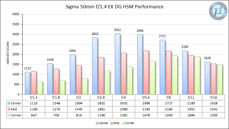
The Sigma 50mm f/1.4 EX DG HSM is not a very sharp lens at maximum aperture. Once stopped down to f/2.8 however, the lens shows much better sharpness in the center and in the mid-frame. The sweet spot of the lens is at f/4, where the center of the frame appears very sharp and the rest of the frame also looks really good.
Bokeh
Bokeh is a very important characteristic of 50mm lenses. I would be ready to pay more for a lens that can yield better bokeh, even if it performed slightly worse than others at very large apertures.
Here is the full image from which I made the below bokeh crops:
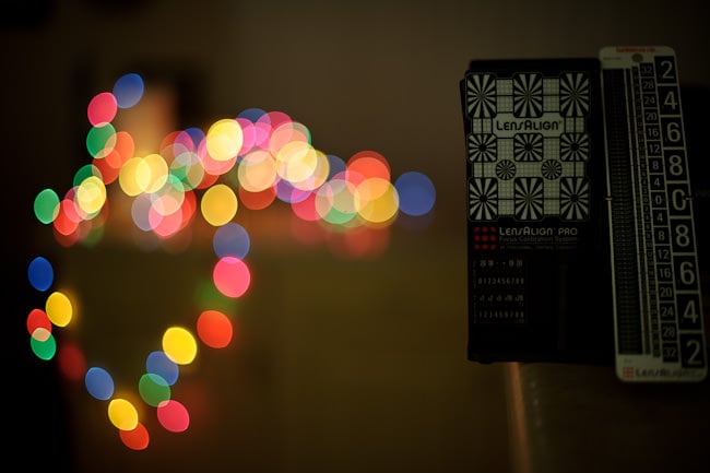
You can see where I got the center and corner crops from. The corner crop is really not a corner, but rather an area taken from the left-center of the image. Let’s take a look at how the Sigma 50mm f/1.4 compares against Nikon f/1.4 lenses wide open at f/1.4 away from the center:
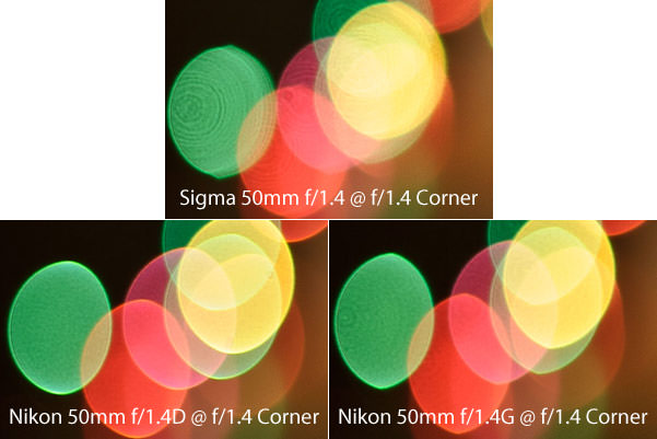
The Sigma seems to have the worst bokeh here; it looks as if the highlights were sharply cut on their right side, and the bokeh refractions, also known as “Onion Rings” or “Onion Bokeh” are too visible when compared to other lenses. These rings typically show up in lenses with one or more aspherical elements, which is the case for the Sigma 50mm f/1.4 (both 50mm Nikkor lenses do not have aspherical elements). At the same time, the Sigma does not have as defined outer rings as the Nikkors, which is a good thing – it means that transitions in out of focus areas are done smoother and would look more natural.
Now let’s take a look at the center:
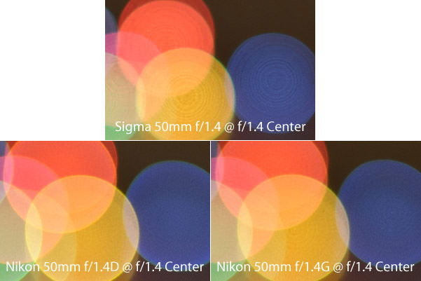
If it was not for the onion rings, the Sigma would have looked pretty good with its smoother transitions. The Nikon 50mm f/1.4D looks the best in both crops with clear highlights and a more round oval shape. It is worth noting that the Nikon 50mm f/1.4D looks much different when stopped down beyond f/2.0 – its bokeh highlight shape takes a form of a heptagon, due to the straight 7-blade diaphragm of the lens. When comparing bokeh at a range of apertures between f/1.4 and f/4.0, the Nikon 50mm f/1.4G overall gives the best bokeh in my opinion. If you would like to see a comparison of these lenses with other Nikkor 50mm primes at f/1.8 and f/2.8, see my Nikon 50mm f/1.8G Review.
After I posted similar bokeh comparison results on the Nikon 50mm f/1.8G Review and criticized Sigma for its bokeh, I received a number of emails from some angry Sigma 50mm f/1.4 owners – they all complained that my bokeh comparisons are not fair and only look at one side of bokeh with light highlights. Some of them specifically mentioned that they bought the Sigma 50mm f/1.4 lens because it yields better bokeh than Nikkors. I obviously could not leave the bokeh test incomplete and ran a number of other tests to see how the bokeh of Sigma looks in different environments, with subjects in front of and behind the focused area.
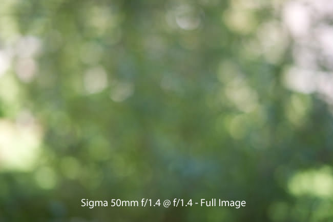
Here is another test I performed in an outdoor environment (resized full image, move over to see the Nikon 50mm f/1.4G):
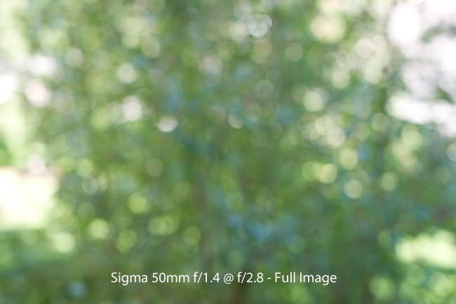
As you can see, the edge of background highlights on the Nikon is more obvious than on the Sigma. Defined bokeh edge like this is a negative characteristic to bokeh quality, so the Sigma in this case clearly has a better bokeh. Here is how bokeh looks with both lenses stopped down to f/2.8:
Stopped down, the Nikon looks a little better with less defined image circles. This transition from bad to good on the Nikon happens at around the f/2.0 mark. If you are wondering why the image from Nikon 50mm looks more zoomed in than Sigma’s, that’s because Sigma’s focal length seems to be around 45mm instead of 50mm.
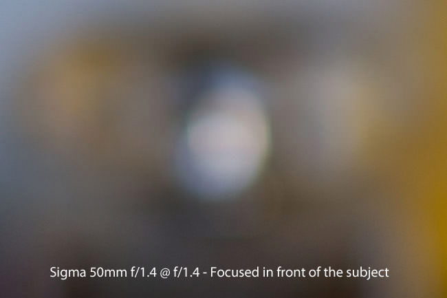
And to top this all bokeh comparison madness, here are two more tests – with focus behind and in front of the bokeh area. We’ll start with front:

And crops (mouse over to see the Nikon result):
Again, this test also shows that bokeh from the Sigma looks better when shot wide open and focused on the front area. Stopped down to f/2.0 and beyond, the Nikon 50mm shows more pleasant and less defined bokeh than the Sigma.
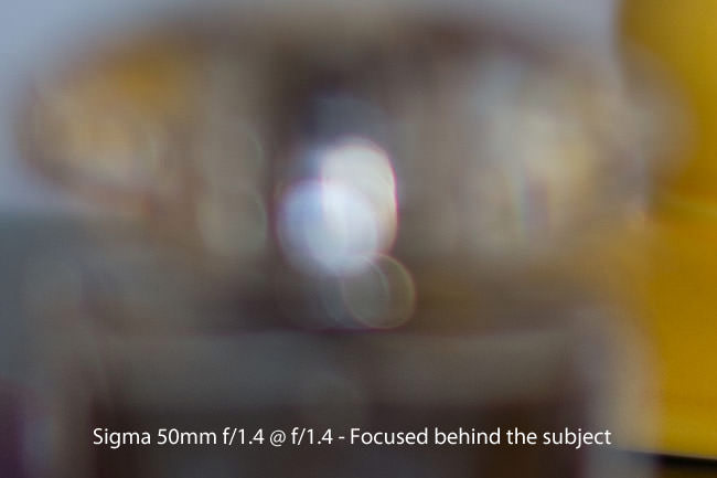
Focused behind:
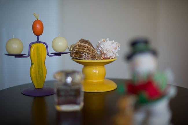
And crops (mouse over to see the Nikon result):
What a surprise – the Nikon looks much better than the Sigma wide open, when the out of focus area is in front of the focused area (focused behind). The highlights are less defined on the Nikon and look very pleasant, while the edges of highlights on the Sigma look very pronounced and thick, with some visible color fringing.
Conclusion: I probably spent way too much time doing bokeh comparison tests of these lenses. I just wanted to provide as much information as I could for those that are trying to decide which lens to get based on bokeh characteristics. As you can see from the above crops, Sigma only outperforms Nikon in one case – when shot at largest aperture of f/1.4 and the out of focus area is behind the subject. In every other case, bokeh on the Nikon 50mm f/1.4G still looks better, especially when stopped down to f/2.0 and beyond.
I hope these tests are comprehensive enough to all bokeh peepers out there. At the end of the day, these differences do not really matter, so I encourage my readers to take this all with a grain of salt…
Vignetting
Most prime lenses heavily vignette when shot wide open, especially on a full-frame body. The Sigma 50mm f/1.4 lens has a very large front element, which helps with reducing the effect of vignetting at large apertures. There is a moderate amount of vignetting at f/1.4, which is greatly reduced by f/2.0 and completely gone above f/2.8. Here are some vignetting samples at different apertures on FX:
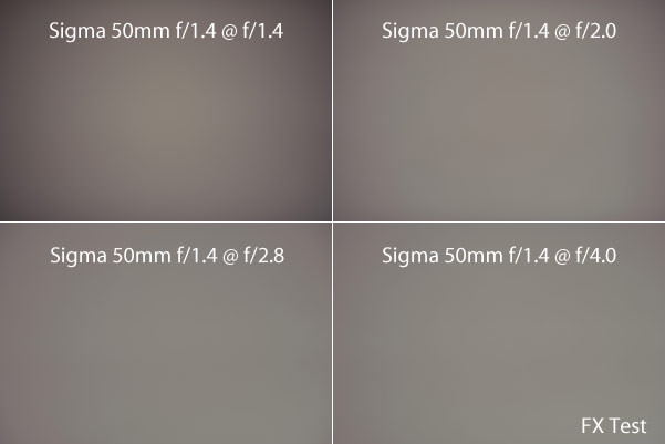
Vignetting is very easy to fix in post-processing. Lightroom already has a built-in lens profile for the Sigma 50mm f/1.4 and enabling it under “Lens Corrections” removes any signs of vignetting, even at f/1.4.
When mounted on a DX camera, the amount of vignetting is much less pronounced, with only a slight darkening of the edges at maximum aperture:
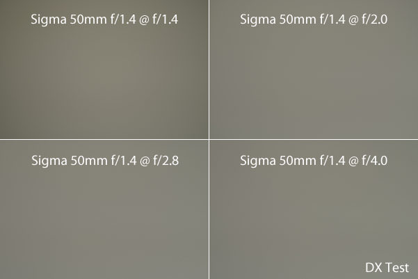
The good news is that the Sigma 50mm f/1.4 is better at vignetting than any of the 50mm Nikkors. Here is a comparison against the Nikon 50mm f/1.4G:

The Nikon 50mm f/1.4G is about the same at infinity, but at close focus, it is significantly darker in the extreme corners and its vignetting is much more pronounced than on Sigma, all the way to f/2.8.
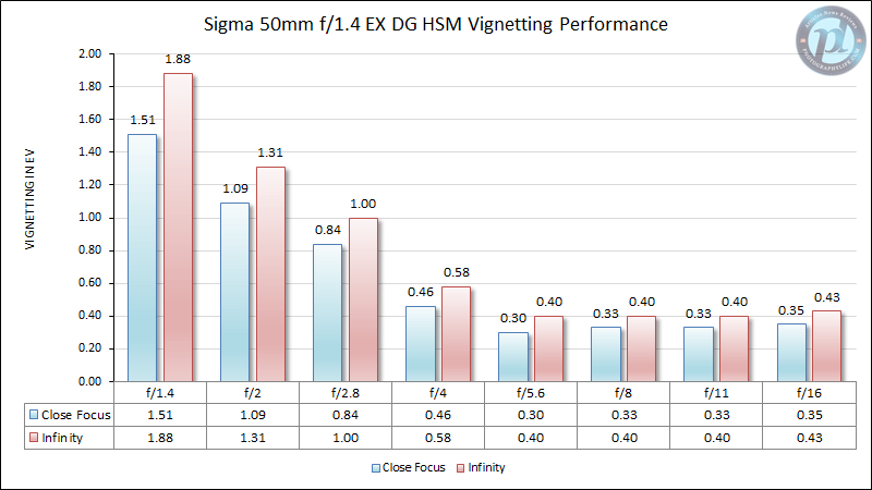
And below are vignetting performance results, as measured by Imatest:
Ghosting and Flare
In most cases, the Sigma 50mm f/1.4 handles flares and ghosting well. When shot against the sun, with the sun in the corner, there is a single flare that shows up as a straight line with a couple of ghosts. Stopped down to f/8, the line becomes thinner, but more obvious. Compare that to Nikon 50mm f/1.4G, which has large green and blue flares. Here are some image samples at f/1.4 and f/8.0:
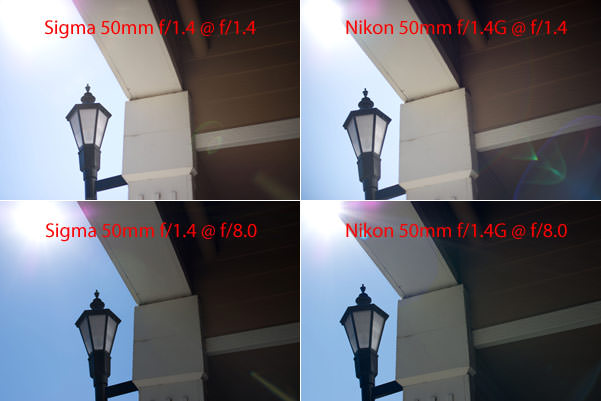
Note that the above were shot without a lens hood. If you keep the lens hood on the lens, you will get even better results when shooting against a bright source of light. Please note that the above images were taken without any filters. Using UV and other filters can potentially introduce more flares and ghosting to your images.
Here is a sample image shot at f/8, against the sun:

Distortion
Similar to other 50mm lenses, the Sigma 50mm f/1.4 has a slight amount of distortion when mounted on a full-frame camera. Imatest measured barrel distortion at 0.98%, which is not bad. On DX, distortion is not noticeable and practically non-existent. As noted earlier, Lightroom already has a lens profile for the Sigma 50mm f/1.4 in the latest version, so you can easily take care of any distortion issues with a single click. Here is how the image looks like without any distortion corrections applied:
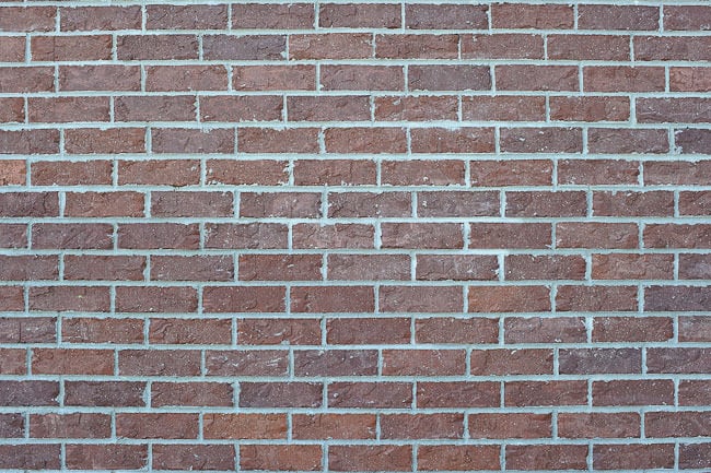
Note the curved lines on the top and on the bottom of the image.
Chromatic Aberration
Lateral chromatic aberration nears around 1 pixel at most apertures, as shown from Imatest results:
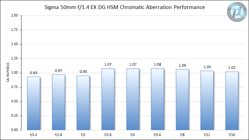
Longitudinal chromatic aberration (which is the effect of color fringing in front of and behind the focused area) also does not look good. Take another look at the same LensAlign crop:

The above image was shot at f/1.4 and lit with 100 watt directional lamps. Unfortunately, stopping down the lens to f/1.8-f/2.0 still produces quite a bit of LoCA.
Table of Contents
