Camera Construction and Handling
The Olympus OM-D E-M5 looks and feels nothing like other Olympus Micro 4/3 cameras. It was designed with a DSLR shooter in mind, which means that the camera body, ergonomics and construction are designed to satisfy even advanced photographers. Out of all the mirrorless cameras I have tried so far, the Olympus OM-D E-M5 is the only one that actually feels like a compact DSLR camera. Its fully weatherproof and dustproof camera body has magnesium alloy shell, not cheap plastic as on some mirrorless cameras. The controls are also DSLR-like, with a traditional PASM exposure dial and two rotary dials for adjusting the exposure on the top of the camera. In fact, the dual dials that can be rotated from the front and the back of the camera remind me of my Nikon DSLRs that also feature a similar dual dial system. Two programmable function buttons can help simplify camera operation by allowing to quickly adjust camera essentials like ISO, White Balance, etc., without the need to adjust those settings in the camera menu:
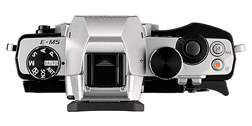
One of the advantages of Olympus mirrorless Micro 4/3 cameras, is that they do not come with a proprietary flash shoe that can only be used with manufacturer-specific accessories. That’s a huge plus, because an ISO standard flash shoe allows using all kinds of flashes and accessories on the camera without having to mess with adapters. This was one of my main criticisms of Nikon 1 cameras and Sony NEX cameras. I love being able to use on-camera and off-camera flashes and various flash triggers. I used the Olympus OM-D E-M5 with my Nikon SB-900 flash in manual mode and it worked great. I also mounted a PocketWizard Plus III unit in a studio environment and I was able to take great studio shots, which is great. All mirrorless camera manufacturers should make cameras with ISO standard hot shoes, period. Even Canon is smart enough to do it (Nikon, I hope you are listening!) and Sony finally fixed its mistake with the Sony NEX-6 (and will continue to do so on all future NEX cameras). As for the lack of a pop-up flash, that does not bother me a bit. Most pop-up flashes on mirrorless cameras are small and weak anyway, so I never use them. Olympus supplied an accessory flash (FL-LM2) with the E-M5, but I have not taken it out of the box, because I know I am not going to use it most of the time. Although at times, this flash unit might be usable as fill flash when taking portraits. Keep in mind that the E-M5’s flash sync speed is limited to 1/250th of a second, which is pretty good, as other cameras are often limited to 1/160 sync speed.
The front of the camera has a very simple, rangefinder-like design with only a single lens release button. The back of the camera, on the other hand, has a number of interesting features and controls. The 3″ OLED camera touchscreen is nice, but doesn’t quite match the 910K dot LCD screens in terms of resolution (limited to 610K dots). However, the ability to tilt the screen upwards or downwards is a great plus for those moments when shooting up or down with limited visibility, or when shooting video:
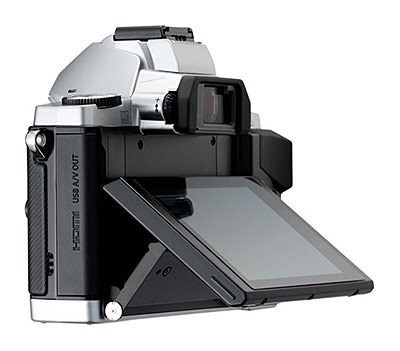
I personally don’t care for the touchscreen capability, since I am very used to the camera controls. But it is certainly not nearly as good as the touchscreen on the Canon EOS M.
Camera controls are good, but I do have a couple of complaints though. Because of the thickness of the articulating screen, the back of the camera where the controls are is slightly protruded. Olympus placed the Playback button along with the Function 1 button on the metal plate of the camera shell, which makes it quite inconvenient to press these buttons, despite their sizes, as seen in the below image:
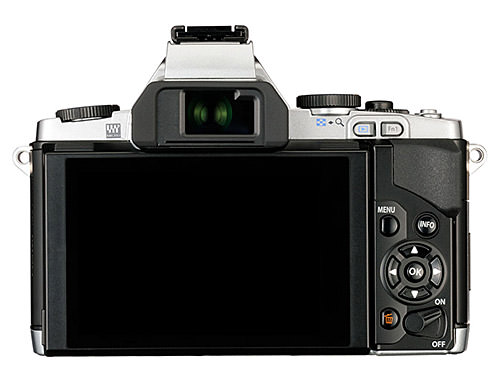
I tried to press these buttons when wearing gloves on and I could not do it. The Menu and Info buttons are located nicely, but the four way dial is of an old type and design – I wonder why Olympus did not use a multi-function rotary dial, similar to the one on Nikon 1 and Sony NEX cameras. It would have certainly made it easier to navigate through the menus and change settings, instead of constantly hitting the four way buttons. The trash button is where it should be – on the bottom of the control area. However, Olympus screwed up with the On/Off button. I do not understand the point of putting an On/Off switch on the bottom right side of the back of the camera. It should never be there. When I first picked up the E-M5, I had no idea how to turn darn thing on – I was looking for the On/Off switch on the top of the camera, where it is typically found on most cameras. It is not a huge inconvenience, but certainly not great in terms of ergonomics. I would rather trade the video record button on the top with the On/Off switch, since it does not have to be a lever.
As for the size and bulk, while the E-M5 is certainly bigger than Olympus E-PL series mirrorless cameras, it is not much bigger than the Sony NEX-7, as seen in the picture below:
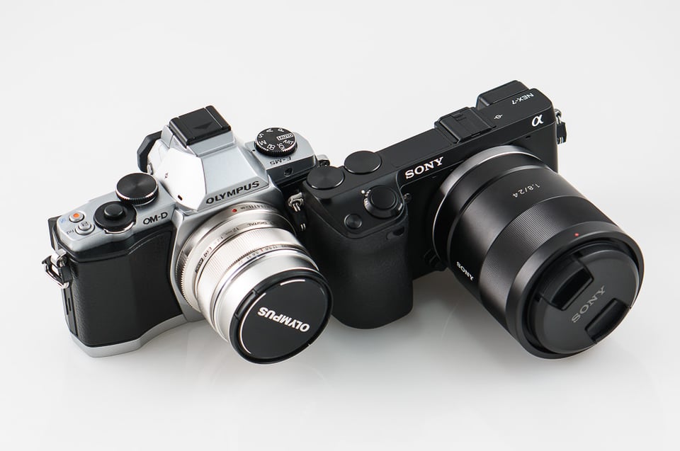
The length is about the same, so it is only the height that makes the E-M5 look bigger, thanks to its SLR-like viewfinder shape. But note the size of the Olympus 12mm prime lens and compare it to the Zeiss 24mm f/1.8 on the NEX-7 – that’s what I mean by “small and compact” lenses. Most Sony lenses look huge and bulky when compared to Micro Four Thirds lenses – that’s the cost of the larger sensor size.
For those who own a DSLR and want to know how small the E-M5 is in comparison, take a look at this image that shows the smallest Nikon entry-level DSLR, the Nikon D3200 next to it:
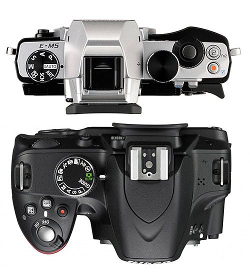
As you can see, while both cameras are somewhat similar in length, the Nikon D3200 is much bigger and bulkier in width, thanks to the mirror and the required distance from the mount to the sensor. Interestingly, I thought the E-M5 would look bigger when I first saw pictures of it on the Internet, I guess because of its SLR-like looks. The camera is indeed very small and compact when compared to the smallest DSLR cameras on the market. You can imagine what the comparison is going to look like when you put it against something more serious like the Nikon D800. I won’t even go there with weight differences…

Camera Menu System
One thing that I am certainly not excited about on the E-M5 (and this actually concerns all Olympus mirrorless cameras) is its menu system. When I first handled the Olympus E-PL3 last year, I absolutely hated its overly complex to navigate user interface (UI). I do not mind a text-based interface, since Nikon and Canon also provide text-based menu UIs. However, Nikon and Canon menu systems are much easier to understand and navigate through than Olympus’. Similar to Nikon cameras, the menu is vertically grouped by “Shooting Menu 1”, “Shooting Menu 2”, “Playback Menu”, “Custom Menu” and “Setup Menu”. The Shooting Menu 1 and 2 are cluttered with a bunch of random menu options.
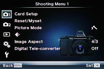
For example, “Card Setup” that is used to format or erase a card, sits as the first option here. First of all, what is the point of having “All Erase” and “Format” in a camera? Formatting a memory card is all we need, the All Erase option is redundant. Second, most cameras I have used so far will have the memory card formatting option under “Setup” – that’s where it typically belongs. Next, we have the option to Reset the camera or Create/Choose a Preset. I don’t mind this one to be there, since having quick access to Presets can be quite useful. However, the rest of the menu options are either completely useless, or are in the wrong place again. For example, the third option is “Picture Mode”, which allows switching between different camera effects for JPEG images. Who cares? I never shoot JPEG, so none of this stuff matters. Next, we have an icon that looks like triangle with a bunch of dots, with no text to describe what a heck it is. For a person who has never shot with an Olympus camera, does it make it clear that this triangle with dots is supposed to mean “Image Size/Quality”? Seriously? Why couldn’t Olympus just use text Image Size/Quality instead of this stupid icon? Plus, this setting should be under Setup – it is not something I would change every day. The next two menu options are again useless for a RAW shooter – Image Aspect and Digital Tele-converter. The Shooting Menu 2 is a little more useful in comparison, but it is also filled with a bunch of random stuff. And the “IS 1”, “IS 2” and “IS 3” options under “Image Stabilizer” do not make it easy for a novice to understand their differences. Why not use something more descriptive and easy to understand than a bunch of numbers? While one could press the Info button to get help in the menu, some things like IS 1/2/3 are not explained well. The camera just says “IS 2 and IS 3 are used for panning with the camera” and nothing else to actually describe what each setting does. So if you want to learn more, expect to spend some time on Google or reading the camera manual (not that there is anything wrong with that).
I do not have any complaints on the Playback Menu, since I rarely go there. Custom Menu is logically grouped, which is nice, but I would still do away from icons without text and replace them with text fields instead. A lot of the menu items are unnecessarily abbreviated, sometimes because of a combination of icons and text. Instead of these, Olympus should have used smaller and more narrow text letters – a lot more would have fit on the 3″ screen.
Unfortunately, there is no focus peaking feature available either, which can be extremely useful for manual focusing. Some people posted a workaround using an art tool that emulates focus peaking, but I tried it and it is certainly not even close to a real focus peaking implementation. In short, from the UI and menu system perspective, the E-M5 is rather weak. Olympus should hire a good menu designer that knows how to make a useful menu system and add focus peaking to make the E-M5 much more compelling.

Not all is lost though, since Olympus does provide a couple of shortcuts to make it easier to use the camera. They are just not enabled by default, oddly. There is a great “Super Control Panel” that gives access to the most widely accessed settings such as ISO, Exposure Compensation, AF mode, Image Stabilization, etc. It is buried under section “D”, “Control Settings” option in “Custom Menu”. Once enabled (Live SCP set to On), you can press the OK button and the Super Control Panel will show up as an overlay. If you hit the Info button once, the overlay will change to occupy the whole screen and you will be able to use the touchscreen to change camera options. Also, the E-M5 gives you a lot of customization options – some that you won’t even find on most DSLR cameras. For example, the camera allows choosing custom functions for pretty much every button, including the video record button. This is great, because you can customize these buttons to give you quick access to different settings. As far as I know, no other mirrorless camera comes close to the E-M5 in this regard.
While the Olympus OM-D E-M5 does not have the same rich set of in-camera features such as Panorama and HDR as on Sony NEX cameras, its responsiveness is certainly much better. Many of the Sony NEX cameras suffer from strange lag effects that periodically occur for no reason. The E-M5 is much better in that regard – I have never seen it lag, whether changing camera settings or shooting pictures. The only real bummer is that there is no built-in intervalometer, so you will have to resort to third party accessories if you are into timelapse photography.
