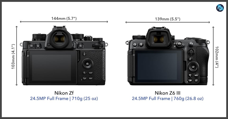
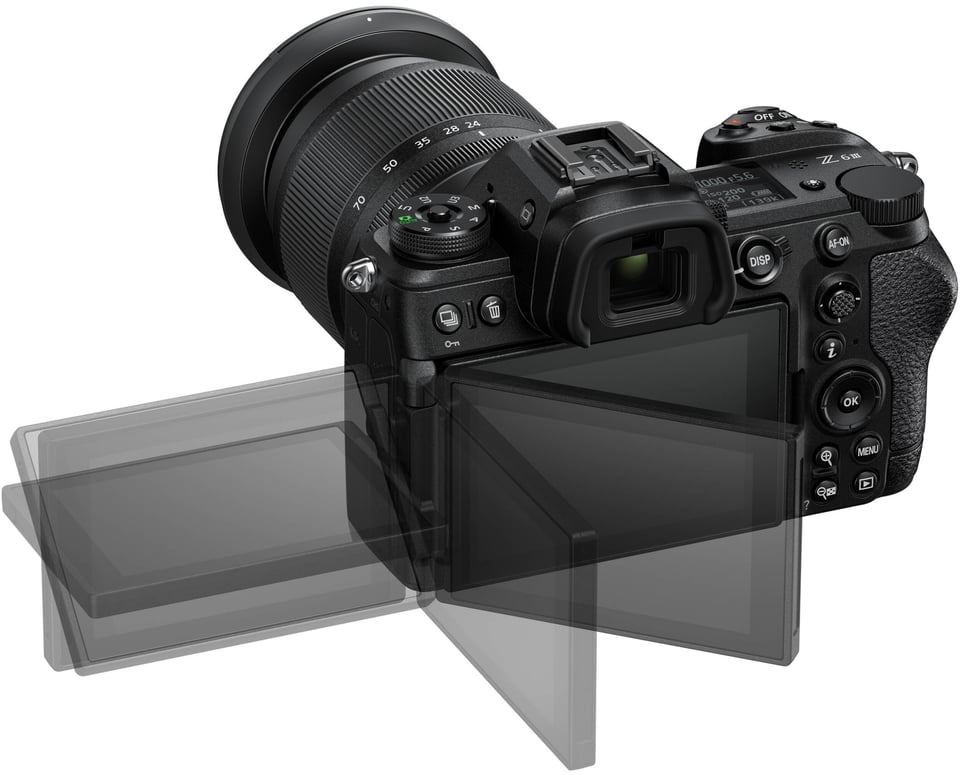
When I first got my hands on the Z6 III, I almost felt like I was holding a Z8. Although the Z6 III is clearly a continuation of the Z6 and Z6 II, something is different. The body is a little bigger, the grip is a little more substantial, and the button layout feels a little more refined. Each change is small individually, but it adds to a camera that feels very different from the prior Z6 and Z6 II.
Nikon Z6 III Buttons and Controls
Taking a look at the top of the camera, you can see some of these differences. Here are the tops of the Nikon Z6 II and Nikon Z6 III for comparison:
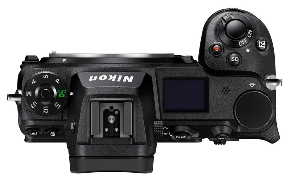
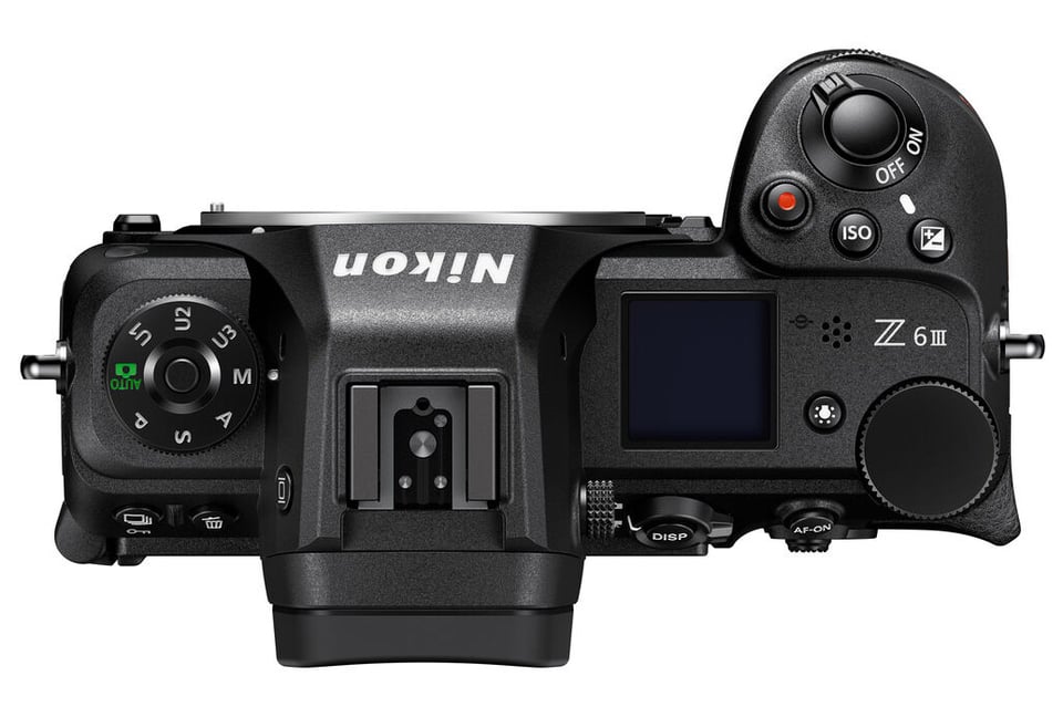
The left side with the mode dial is unchanged, but the button positions on the right-hand side now look like they do on the Nikon Z8 and Z9. If you have learned the buttons from working with either of those cameras, you will immediately be able to use the Nikon Z6 III without rewriting your muscle memory.
Another change is the Illuminator button. This is new for Nikon. For years, Nikon used the power switch for this purpose. I don’t know why Nikon made this change, but this probably is not the last time we will see this design. Unfortunately, this button only illuminates the top control panel, not the buttons like on the Z8 and Z9 (or the top DSLR bodies).
Let’s move to the back of the camera:
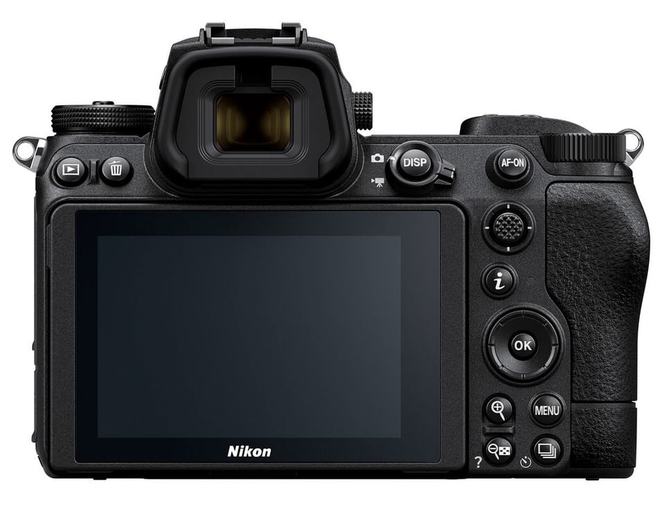
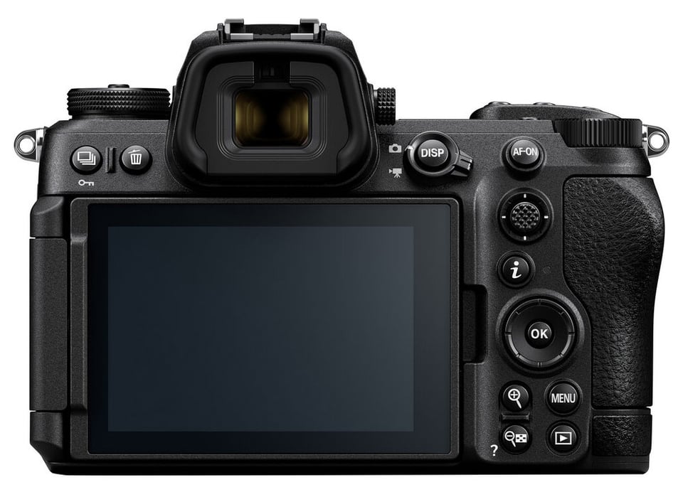
The changes don’t look huge at first glance, but they continue to bring the Nikon Z6 III in alignment with the Nikon Z8 and Nikon Z9 layouts. Most of all, the playback button and the release mode button have swapped places. I prefer this newer button placement, and I appreciated that going from my Nikon Z9 to the Nikon Z6 III was a painless process ergonomically.
Also, I am glad to see Nikon adding the ability to lock photos with the button marked with a key icon. I like using this feature. I scroll through all the photos I’ve taken, protect the good ones with the key, then hit “Delete All” to remove the rest. The only way to do this on the older Nikon Z6 cameras was to use the Function button next to the lens.

That seems to be the end of the story, but don’t be fooled. In fact, the most important improvement in the Nikon Z6 III’s handling occurred inside the camera’s digital circuitry. One of the biggest limitations of the Nikon Z6 and Z6 II was an inability to customize the buttons exactly to my habits. Nikon removed this limitation with the Z6 III, and I can now customize it so that it practically matches my Nikon Z9 (apart from retaining the traditional PSAM dial).
I was really excited about this because the Z6 III now allows me, for example, to have three different focus modes on three different buttons. This is exactly what I have on my Z9. I’ve chosen to put “wide area” on the AF-ON button, “3D tracking” on the DISP button, and “dynamic-area (S)” on Fn1.
This was not possible with the Nikon Z6 II. Personally, the endless possibilities for customization are one of the biggest reasons I would consider a Z6 III.

And how does all this compare to the Nikon Zf? Well, comparing the design of those two cameras is like comparing an orca to an elephant. Both are about the same size and weight, and even have the same lifespan, but both species have completely different life histories and their bodies are designed for completely different environments. The same can be said of the Z6 III and Zf. They simply do not occupy the same niche.
Which one you prefer will depend on your style of photography. But for me, as someone who values high levels of customization and similar layouts across my cameras, the Nikon Z6 III has a clear advantage.
Viewfinder and Display
The Nikon Z6 III has improved upon the rear LCD and electronic viewfinder compared to the previous generation Z6 II.
Starting with the rear LCD, the resolution and size remain unchanged. But the LCD is now fully articulating. Personally, I prefer the dual-axis tilting LCDs found on cameras like the Nikon Z8 and Nikon Z9, but a fully articulating display is better than single-axis tilt, as was found on the Nikon Z6 II.
The viewfinder gets even more changes. While the magnification remains at 0.8x, the resolution (5,760,000 dots), brightness (4000 nits), refresh rate (120 Hz), and dynamic range (DCI-P3 color gamut) have all increased significantly. In some ways, the Z6 III’s viewfinder even surpasses that of the Nikon Z9.
I can confirm that the view into it is indeed very natural and clear, even in the bright midday sun. When I compared it to the Z9 in these lighting conditions, I found the viewfinder on the Z6 III to be slightly more contrasty, with clearer deep shadows. It wasn’t a dramatic difference, but since I already find the viewfinder on the Z9 to be excellent, anything better is… how can I put this? More excellent?

Table of Contents
