3. Design and Quality
This thing is beautiful. As much as I tried to do justice to the Surface with these product shots, I don’t think I succeeded – “in metal” (both figuratively and literally), it is a very well-sorted piece of design with the simple lines only spoiled by the inherently ugly but necessary ports, such as the USB. The proprietary charging port is much more elegant, as is the charger itself. The Surface Pro 3 could be simpler still, although that’s quite a feat to achieve, not least because it needs some serious cooling and thus vents. If often design is limited by the company’s technical prowess, Microsoft has managed to do well and the quiet elegant understatement is very much to my liking. There is not a single chrome detail on the shell itself, which is reasonably faithful to the “as little design as possible” idea. The Surface Pro 3 is confident and not shouty. It is staggering how quickly Microsoft (almost) caught up with Apple in this regard – and, as Apple products gain more and more bling, Microsoft has a real chance at surpassing them at some point. Mind you, it is not as simple as an iPad, and not quite as well crafted, but then it happens to be potentially much more capable and, more importantly, complex.
X-E2 + XF23mmF1.4 R @ 23mm, ISO 200, 1/60, f/1.4
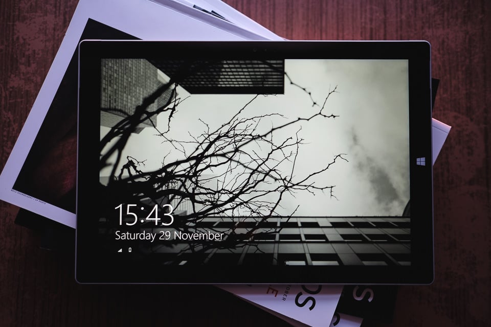
The front side of the device is dominated by an enormous slab of Gorilla Glass 3, surrounded by a slim strip of magnesium that the rest of the Surface Pro 3 shell is made of. A very subtle, but nice detailing is the thin glass cutouts for the stereo speakers on both sides of the device. There is also a barely noticeable “lip” where two parts of magnesium (different shades) meet at the top edge of the device – again, very subtle, but it’s there to catch the eye. There is no plastic insert between glass and the shell as is now usual with more expensive, premium products, so there is nothing to break the aesthetics of a smooth glass surface and magnesium. It does look good and the lack of any distracting detail certainly helps – the only detailing that is immediately noticeable is the new-ish, simple Windows logo that works very well with the straight-lines-all-over design of the Surface Pro 3.
X-E2 + XF23mmF1.4 R @ 23mm, ISO 200, 1/8, f/2.8
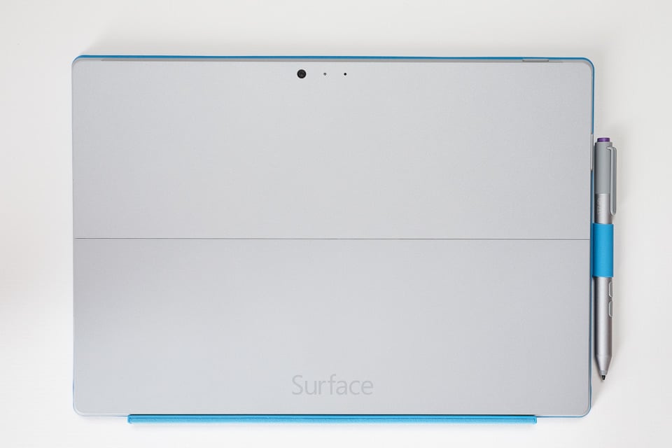
The other side of the Surface is nearly as lacking in detail. What you will notice immediately is the camera, ambient light sensor, and microphone (they are less noticeable on the front). Obviously, the kickstand also.. uhm.. stands out with a line running down the middle of the device. The final touch is the “Surface” writing on the kickstand, in a rather elegant grey font, I must say. The kickstand itself does a good job of hiding the honestly ugly, but strong and stiff hinges, as well as some more necessary writing, so that when the device is used as a tablet, nothing spoils its looks. As I’ve mentioned before, the back panel of the device (and the edges) is made of a one-piece (if you don’t count the kickstand) magnesium alloy. It feels very cool to the touch every time you pick up the Surface, and very high-quality. Speaking of magnesium, bead-blasting is extremely fine, works wonderfully with the ever so slightly matte finish and certainly adds to Surface Pro’s sophisticated look and feel. High-quality bead-blast is not easily achieved, so I am impressed. Microsoft didn’t skimp here.
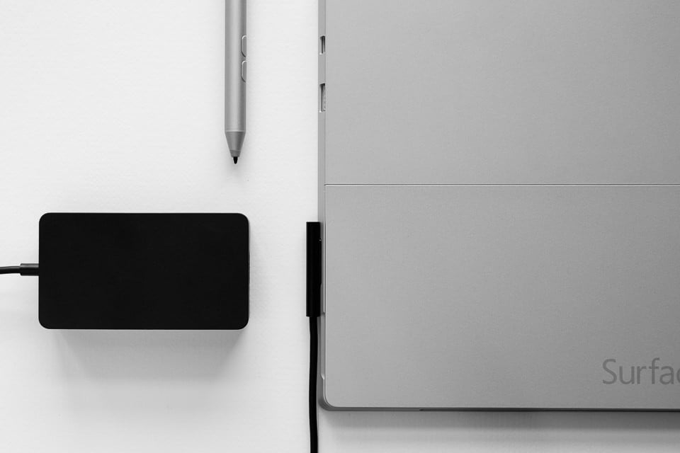
Even the charger connector is quite elegant and, because it’s plastic this time around, is unlikely to scratch that magnesium after longer periods of use. It can be plugged in either way as contacts are symmetrical, and is also “safe” – should someone trip over the wire, the connector will simply pop out without any damage given that it stays in place thanks to a magnet. MacBook users are familiar with such a design, of course. What really shows Microsoft’s attention to detail is, surprise surprise, the AC adapter. Even this is a custom one and not taken “off the shelf”, it’s very simple, reasonably compact and, in a rather weird fashion, reminds you you’re dealing with a premium product each time you have to charge up your Surface Pro.
X-E2 + XF23mmF1.4 R @ 23mm, ISO 1600, 1/320, f/2.0
Overall, I am very happy with the looks of the tablet computer, Microsoft did well with what they had and managed to incorporate the necessary details quite elegantly. Throughout the month of use, the Surface Pro 3 has stood up to daily handling very well, too, although I should point out I am quite careful with my possessions in general. You could definitely scratch the back panel with, say, a key. Also, while you should not worry too much about cracking the screen should you bump the expensive tool somewhere – magnesium is quite strong in this respect and should not give in easily – I’d be very careful about dropping it as I don’t think the Surface Pro 3, despite its extremely solid feel, would handle a crash even from moderate height very well.
Finally, there is some “play” here and there: the kickstand, before you place the device on your lap or a table, has a little flex in the hinges and while certainly to a very minor degree, it is still present on my particular copy. Nasim has used his Surface Pro 3’s kickstand a bit less than I have and he has no such issues, yet; the power button on top has a little play in it, but feels as high quality as the rest of the device overall and, like the rest of the physical buttons, has great tactile feedback; finally, the Gorilla Glass 3 is a little bit too fingerprint-prone to my liking and could do better in this regard. But in all honesty, these niggles are so pitifully minor (and vary from one device to another save for the glass at the front), I never worry about them. The feeling of solidity and density of the Surface simply brushes aside any slight manufacturing imperfections. So much so, in fact, that I feel as if I am being too pedantic at times. Which is probably true.
I may not like the word much, but the Microsoft Surface Pro 3 does indeed look very professional and purposeful, Ryan Gosling in a superbly tailored suit. Classy, Microsoft. More importantly, it also feels like it. Well done. I can only hope the Redmond giant will further improve this design with every iteration of the device – there is certainly room for both design and technological innovation here (some sort of fanless cooling springs to mind which, as a technological innovation, would bring aesthetic advantages, too).
4. Ergonomics, Handling, and Portability
None of the specifications mean anything if the tool itself is not easy to handle. Even design gives way to ergonomics, which at the very least ought to be “good enough” for any device, and no less than “pretty damn good” at this price. Given the overall positive tone of the review – don’t blame me, this is a rather impressive device – you probably think I have few complaints here. And you are quite right.
X-E2 + XF23mmF1.4 R @ 23mm, ISO 200, 1/8, f/1.4
The first thing that struck me is the almost perfect size of the Surface Pro 3 – it’s very close to that of a regular magazine. Naturally, that makes it larger than, say, the usual suspect for comparison, Apple’s iPad Air. Quite a bit larger. And heavier. But then this is in a whole different class, too. And yet, something I was immensely pleased to find out, it fits perfectly (and I am not kidding or exaggerating) into the back pocket of my Think Tank Retrospective 7 shoulder bag (review of which is coming shortly, but if you’d rather not wait, just go and buy it – it’s that good). The device is thus small enough to carry around wherever I go, which I pretty much always do, yet large enough for comfortable work, especially writing. Now, I don’t imagine I will be doing a whole lot of post-processing with the Surface – my PC is still more suitable and comfortable for that task – but buying such an expensive computer and not being able to do post-processing comfortably would be silly, given that I am a photographer. Thankfully, I’ve had no real issues there, too, although how well Lightroom and Photoshop are handled by the Surface remains to be seen in one of the following sections of this review.
The two physical buttons that you will find on the Surface (power/sleep key at the top of the device, volume control on the side) are made of magnesium, feel very solid and offer great tactile feedback – not too hard to press, not too easy, but when you do, you definitely know what happened. The capacitive Start “button” is also well positioned – it makes sense when you use the device vertically and is also both easily accessible by your right thumb and not prone to accidental touches when handling the tablet in a horizontal orientation (at least for someone who’d hold the device as I do). Having mentioned actually holding the device, the comparatively thick bezels might not be everyone’s cup of tea now that most manufacturers seek to maximize screen size for given dimensions, but they do provide just enough space to hold the device comfortably. That said, I certainly hope the screen size will grow further to 13″ or so without increasing the size of the tablet itself, at the cost of bezel thickness. Come on, Microsoft, it’s not that hard. Software-enabled palm rejection is a common trick these days. To end the paragraph on a more positive note, speakers seem to be positioned with perfect sense – not too close to one another and not somewhere you would often cover with your hands by accident.
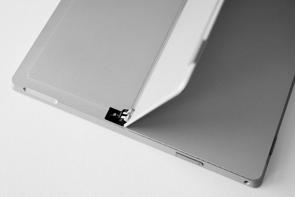
X-E2 + XF23mmF1.4 R @ 23mm, ISO 200, 1/8, f/4.0
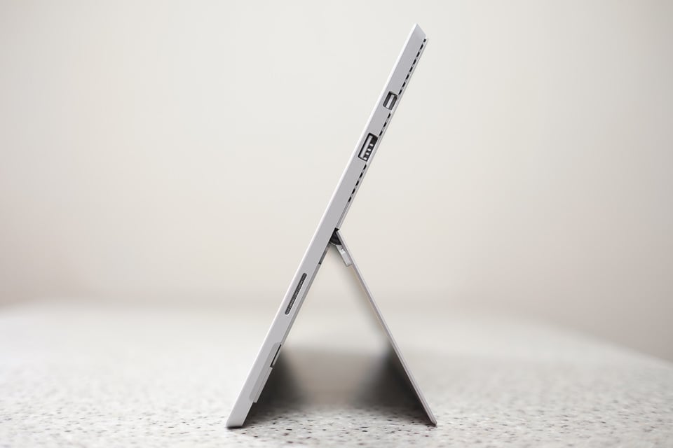
The kickstand is one of Surface’s most advertised features, and for good reason. With such compact hinges hidden so well when the sheet of magnesium, there to keep the device safely upwards, is folded, it is not too hard to see how much effort was put into designing this seemingly simple mechanical bit of the device. Now, I mentioned upwards, and that is not the whole story. The kickstand can be reclined by well over a 100 degrees – you can almost push it the whole way, in fact. That means you are likely to find a comfortable angle no matter the surface you want to put your Surface on (pun is completely unplanned!). The hinges feel strong and offer plenty of resistance even though there is a little bit of play on my particular device after over a month of reasonably active use. Not something I am concerned with. Hinges and some additional information about the device are not the only things cleverly hidden by the kickstand – a microSD card slot also resides there. It is as easy to use as I could hope.
What a lot of people seem to wonder is whether the Surface, when coupled to the Type Cover, is comfortable to place on one’s lap as with a regular laptop. While you have to be a bit more careful with how you handle the tablet – you can’t really pick it up by the keyboard as you can with a laptop computer – I can certainly vouch it is very comfortable. The keyboard itself can be “snapped” to the bottom bezel of the Surface (it, too, contains a magnet to hold it in place), raising it at an angle a little bit. The device itself is lightweight and so is not tiring to use in such a way for longer periods of time, nor does it get hot. The Type Cover itself is more than stiff enough for comfortable typing even when fixed at an angle.The kickstand is easy to unfold due to comfortable cutouts for your fingers at both sides of the device, and is easy to adjust with precision. Once not needed, it clicks securely into place thanks to a magnetic strip. Getting used to it does not take long.
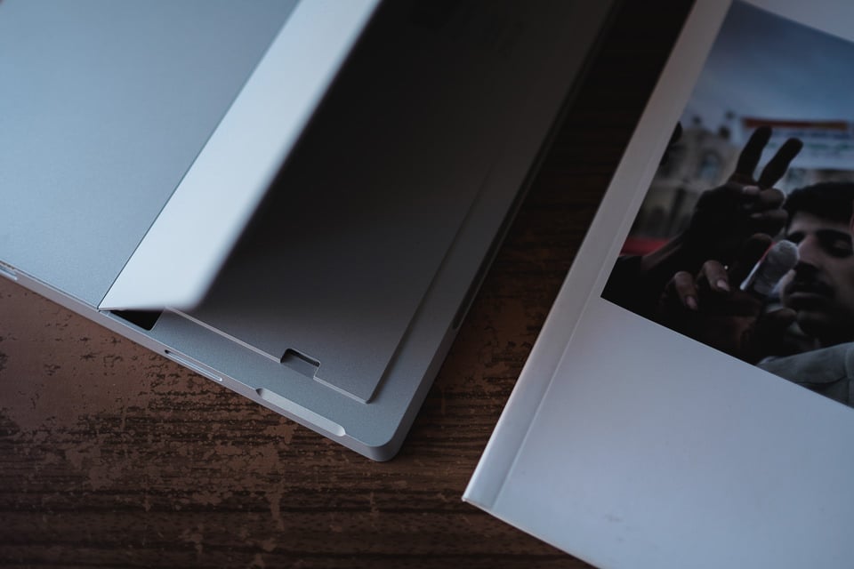
X-E2 + XF23mmF1.4 R @ 23mm, ISO 200, 1/50, f/1.4
The device is quite lightweight at 800g, but holding it without resting it on your lap for longer periods of time can still be tiresome. This is, after all, not your average 8″ Android tablet, but an actual Windows 8.1 Pro running computer with an i5 processor. Alright, so that sounds like an excuse – truth be told, I often tend to look for a way to rest my hands against something when hand-holding it. Moving on, the touchscreen feels superb and gladly accepts finger input with no unnecessary resistance, as well as that of the Surface Pen. It feels very neutral, almost natural to “write” on with the latter. Mind you, I can’t comment much on the Pen itself given how little I’ve used it (not done any serious retouching yet). But from what I’ve learned so far, it is no less premium-feeling than the tablet itself and has three physical buttons. The one where you would normally find an eraser on a pencil launches OneNote by default, while the two located closer towards the tip are responsible for enabling the select function of the Pen, or the eraser. The Pen connects to the Surface via Bluetooth and runs on batteries which should last a good chunk of time.
Should the tablet run hot, you will feel the most heat coming from the top-right side of the device, rear panel. Usually, this is a good indication of where the processor is located “under the hood”. As soon as it gets hot (which can happen even when watching an HD video, but that’s perfectly normal), fans come up. Depending on how much heat there is to be removed, the fan can be whisper quiet or quite audible, but I’ve never found the volume irritating or distracting. The ventilation holes face from the sides of the device outwards which, coupled to the location of the processor in the first place, means your lap should not get burned by the Surface. During regular use – me writing this review, for example – the device stays absolutely cool. Nothing to worry about.
Last question some might have on their minds – can you run games on the Surface? Yes. Solitaire runs perfectly and without a single glitch. :) Let’s move on!
Table of Contents