Menu
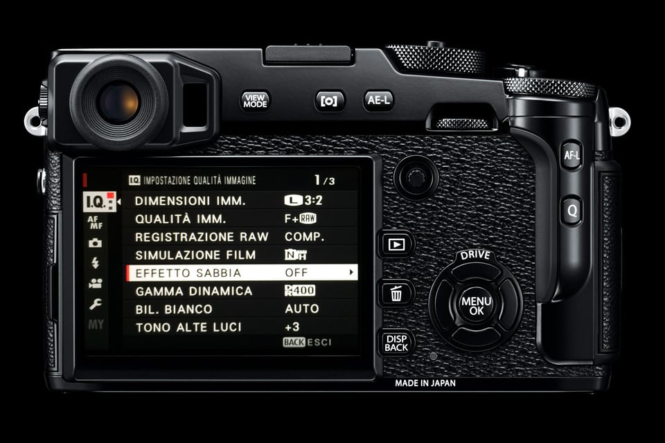
Navigating the menu is absolutely simple and intuitive. Options are easy to understand and set. The only two minor notes in this section are the use of fonts with different spacing, size and kerning (very annoying for my taste), as well as some really funny translations in the Italian localization (I guess this isn’t a big deal for English speakers).

Fuji completely changed the menu system on the X-Pro2 when compared to the X-Pro1 and it is so much better in comparison. I love the way Fuji organized the menu into major sections and sub-sections, similar to what we are used to seeing on DSLR cameras from Nikon, Canon, and Pentax.

X-Pro2 + XF10-24mmF4 R OIS @ 10mm, ISO 800, 1/5, f/4.0
Controls
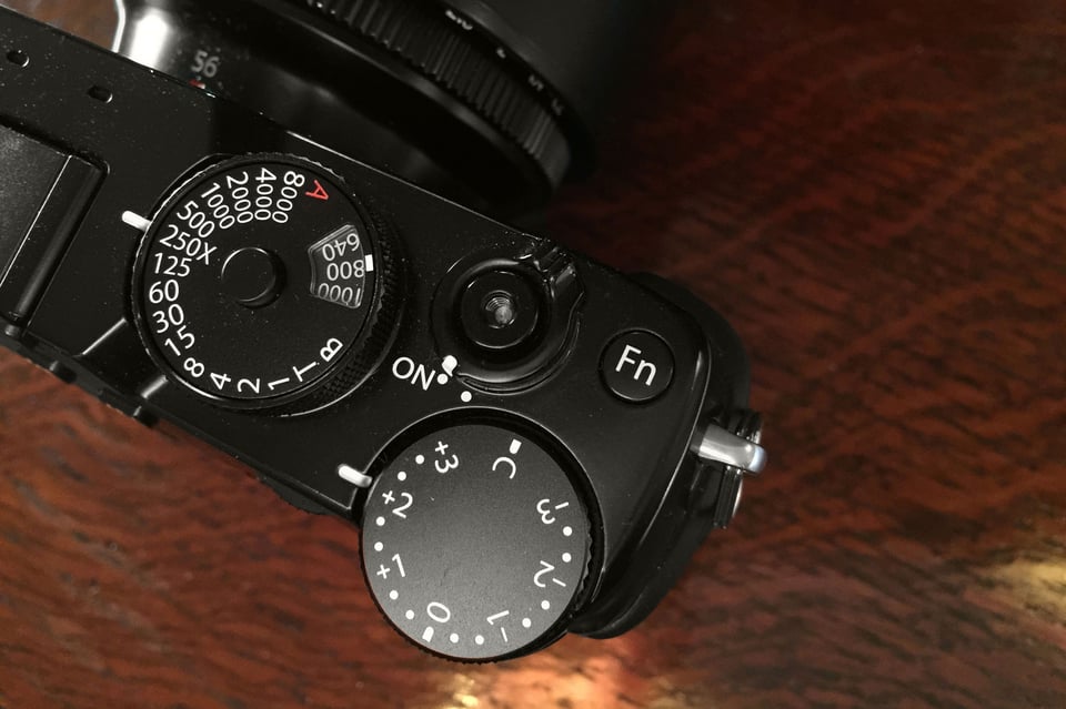
The controls are well laid out, although I much prefer the layout of the Fuji X-T2. Controls are easy to reach and close at hand: perfect to avoid missing any opportunities. The ISO selector is aesthetically wonderful! A great retro-style addition and it is very convenient to have a real dedicated ring: definitely outstanding. The only drawback, in my opinion, is the way you need to operate it: it is necessary to select the ISO by pulling the ring and turning at the same time. This can often lead to unintentional modifications of the shutter speed (ISO and shutter speed are on the same dial). I know it’s not a big deal, but from my point of view, it’s decidedly impractical although aesthetically “gorgeously vintage”.

I also love that Fuji added a joystick to quickly move the focus point. Before the X-Pro1, none of the X-series cameras had a joystick and I am glad that Fuji finally incorporated one. Considering that the same joystick appeared on the Fuji X100F, X-T2 and the GFX 50S, it is an indication that Fuji is going to continue integrating focus joysticks into its future cameras, which is great! The joystick makes a huge difference in the overall experience of the camera because you no longer need to assign any other button to change the focus point and you can customize the camera heavily if you would like by assigning different functions to each button.

X-Pro2 + XF23mmF1.4 R @ 23mm, ISO 200, 1/500, f/8.0
The EVF (Electronic ViewFinder)
I really appreciate the “hybrid” approach which has always characterized both the “Pro” and the “100” members of the X family, mostly because of the general look: thanks to the OVF (Optical ViewFinder), you can eliminate any electronic mediation at will and see directly what is framed, almost like in an old rangefinder camera. In fact, one of the things that can be hard to get used to on mirrorless cameras is the Electronic Viewfinder (EVF) – on many cameras, you have no immediate visual feed of reality because everything is mediated by electronics and display capability (color, contrast, definition), sometimes offering a far from ideal perception of what is in the frame. This definitely bothers some people, including me. However, I must say that the EVF on the Fuji X-Pro2 is exceptional in performance, exhibiting virtually zero perceived lag, displaying exactly what will be recorded in the image, including set white balance and film simulation.

X-Pro2 + XF56mmF1.2 R APD @ 56mm, ISO 200, 1/200, f/4.0
The ability to see what’s happening in real-time on the camera’s LCD with virtually no delay makes it much easier to take advantage of some shooting situations, where composition through the viewfinder might be difficult. In such cases, an articulated and tiltable screen such as the one present on the X-T2 is a valuable addition to the package. At the same time, this is not always helpful for me and my way of working. I’m thinking of situations, for example, when shooting with strobes and needing to totally get rid of ambient light, but still needing the possibility to figure out what to focus on and track subject movement… In that specific situation, everything gets a little bit messy with mirrorless cameras. Even in very dim conditions, the combination of high-contrast settings that I usually adopt, combined with low light, make EVF use often difficult and unpleasant. If there was a way in which I could see the reality through EVF exactly like through a good old pentaprism it would be wonderful!

X-Pro2 + XF10-24mmF4 R OIS @ 14.5mm, ISO 200, 1/20, f/5.6
Table of Contents