It seems so long ago I opened an image on a computer for the first time. It was last century, in fact. And, as strange a thing this may be to remember, it is because opening that first image was the first thing I ever did with a computer (an old four-eight-six running Windows 95 for those who know what that means). Strangely enough, I don’t remember the image itself, not even vaguely. What I do remember is the software that was used to do it – it was ACDSee. I remember it from eighteen years ago – this lightweight, snappy, simple, functional image viewer with some mild editing capability.
Oh, how things have changed. ACDSee Pro 8 is not an image viewer, you see. And the editing capability is anything but mild, even by today’s standards. With a few caveats, the Pro 8 is a full-on Lightroom alternative, and that fact puts a lot of pressure on it. Let’s see if it can stand its ground, shall we?
Table of Contents
A Few Notes Worth Mentioning
Let me start with the standard disclaimer: the license to this copy of ACDSee Pro 8 was provided by the software developer specifically for reviewing purposes. However, we at Photography Life build our reputation on our unconditional integrity and – I can’t stress this point enough – our words are always our own. ACD Systems made no attempt to influence our impression of the software (which, by the way, speaks for them), and should such a thing ever occur with any software developer or manufacturer, it’d be in vain. Not once did we lie about our findings, nor will that ever happen on purpose.
Another important thing to mention is the complexity of the software. While I will share a few thoughts on the matter later in the article, why I am mentioning this here is for a very simple reason – it is virtually impossible to review every aspect of ACDSee Pro 8 in detail while keeping the article of reasonable length. It’s that packed with features (understandable, since ACD Systems is aiming squarely at Lightroom) despite a refreshingly low size of around 175 MBs when installed. The goal of this review is to discuss the software, not explain every tool, dialogue and menu, and while I will do my best to discuss the more important tools in more detail, attempting to do so with every small bit of the software would result in an improbably long article.
What is ACDSee?
After starting off as a mere image viewer with mild editing capability, ACDSee has evolved into a whole family of photography-related software. At the core of its main features are three (in no particular order) – image management, image viewing and post-processing. So, in essence and much like software such as Lightroom, it serves as a tool for more or less each step of digital photography management and post-processing workflow. At this time, four products stand out in the family as photography-centric tools:
- ACDSee Photo Editor 6 is software purely for simple post-processing. It lacks the image organizing tools of other ACDSee versions. I’ve not used it much, but while it contains some powerful tools that, in the right hands, could really be just about enough for post-processing serious work, I believe it is best suited for family use with emphasis on automated features and filters.
- ACDSee 18 is the newest version of that same program I used eighteen years ago. It combines photo management tools with post-processing and is perhaps the best bet for anyone looking for a single tool. I believe it to be especially suitable for amateur hobbyists or even simple family use. A lot of focus has gone into the ease of use and speed of the software with lots of automated features and filters.
- ACDSee Pro 8 – the version I am reviewing in this article – takes it another step further. It adds more advanced image management features as well as more control during post-processing. On top of that, there is non-destructive editing, too.
- ACDSee Ultimate 8 carries a rather misleading name as it is actually the first “ultimate” version to be released by ACD Systems, and the most recent ACDSee released overall at the time of writing. In the family tree, it sits at the very top and above the Pro 8 version. It also builds on Pro 8 with the majority of capabilities being exactly the same. So, as with Pro 8, you get advanced image organizing tools and advanced post-processing tools. What the Pro release does not have, but Ultimate 8 does, is layer-based editing and 32 bit and 64 bit image support.
This is not all, of course – there is a Mac-specific version of ACDsee as well as some video tools. You can see the whole list of products on this page.
User Interface
There is quite a lot to mention when it comes to the user interface of ACDSee Pro 8. Let’s start from the start, though – the elements that it’s comprised off.
1) Tabs and Panels
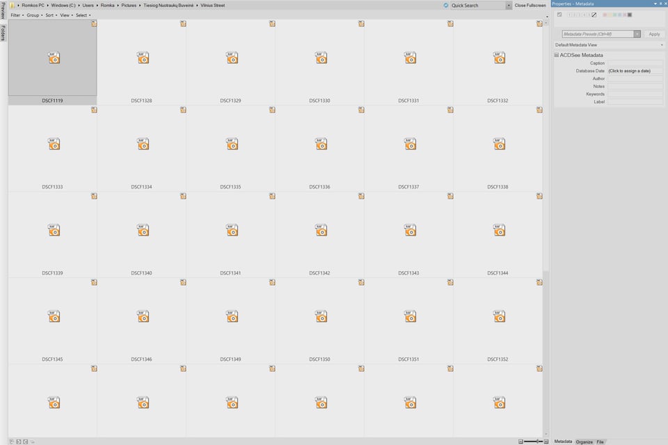
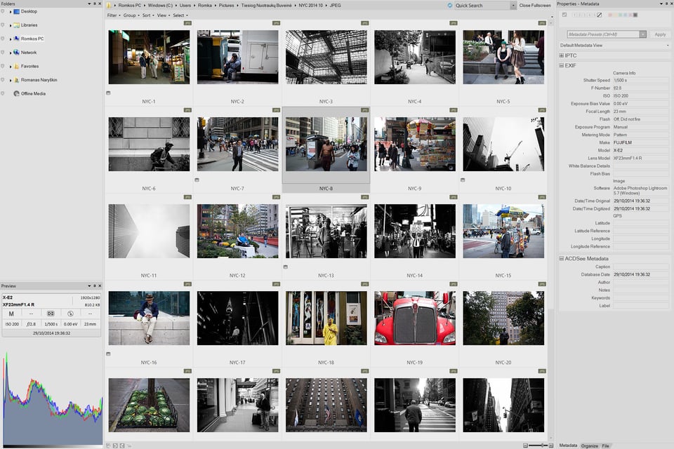
The user interface of ACDSee Pro 8 is fairly easy to understand and holds few surprises. On the left side, you have the Folders tab which is basically your navigation tree. It works like a charm and has an ingenious feature – small flags next to every folder that allows for easy selection of multiple directories (no need to hold down Ctrl or Shift keys). The flags are on the small side, but should not pose a problem on all but the highest density screens (it is bordering on “too small” on my Surface Pro 3, which has a very high density screen). The Folders tab is the quickest, simplest way of navigating your entire hard drive, and there is a good chance you are already familiar with such a tool – it’s hardly rare. Just below the Folders tab there is the SeeDrive log-in panel. Once you log in with your ACDSee 365 account (ACDSee 365 is subscription-based service), the tab allows you to navigate your cloud storage.
Underneath the SeeDrive tab you have a Preview tab which, as you would expect, shows a preview of the selected image. However, the small thumbnail image itself is rarely useful if you tend to use thumbnail view in the file grid. What is perhaps the more welcome functionality is the EXIF information displayed in the same Preview tab, along with a histogram. More than that, the Preview tab can be customized greatly – right-clicking on any of the three elements (EXIF information, image preview and histogram) will bring up the customization menu or dialogue for each element. If you, like me, find the image preview unnecessary, disabling it makes the histogram more prominent. Neat!
On the right side of the screen you will find the Properties panel by default. This tab holds metadata information, allows you to edit it and manage metadata presets, too. On top of that, you can tag files or assign various filters to selected images using this panel – such as colour label or rating.
As you would expect, the whole user interface is dominated by the middle portion – image grid view. This is where all the basic management happens – you can search, filter, set tags and ratings, colour labels, categories, work with metadata, copy, rename… in short, anything you can think of. You can rotate any image using the tools at the bottom of the grid, or engage the very functional comparison mode which can hold up to four images at a time (but, should you select more than four, the comparison dialogue allows you to scroll through selected images in any preview window). I really like this feature, it is very simple to use and very functional.
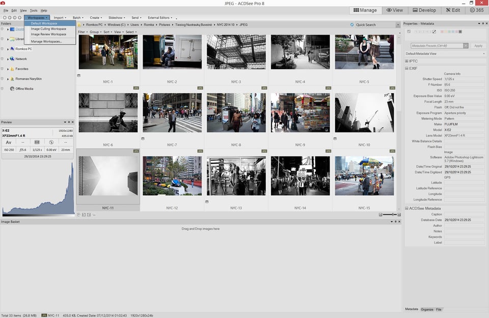
Above the main grid, which you can also use for navigation in a pinch, sits the address bar, filter and search tools, toolbar that holds quick shortcuts to certain features, such as Workspace presets and Slideshow tools, and what you might call ACDSee “modules” – Manage, View, Develop, Edit and 365 (for subscription). I will discuss each of these in more detail a bit later. For now, let’s talk about customization, as basically everything you see in the main window can be changed.
2) User Interface Customization
At first, I found the user interface of ACDSee to be a bit of a mess. I don’t like the design much – it’s too chaotic, the tools and menus are all over the place, flat elements are mixed with Windows XP-style gradients, something that does not work at all. It’s almost as if several designers worked on different parts of the software and then just combined it all without choosing one specific language. Also, I found the default black colour scheme to be a bit pretentious somehow, as if someone was really trying to make the Pro 8 indeed look “pro” (but this point, in my opinion, is valid when talking about other post-processing tools, too). Whether you agree with me or not, thankfully there are plenty of ways to customize the look and overall ergonomics of the software.
The first thing I did was switch to a lighter colour scheme. It is rather easily done, too – all you have to do is go to the options (Alt + O or click on the Tools menu and choose “Options…”), select the Manage Mode tab and choose one of the three Display themes from the drop down menu, as shown in the screenshot:
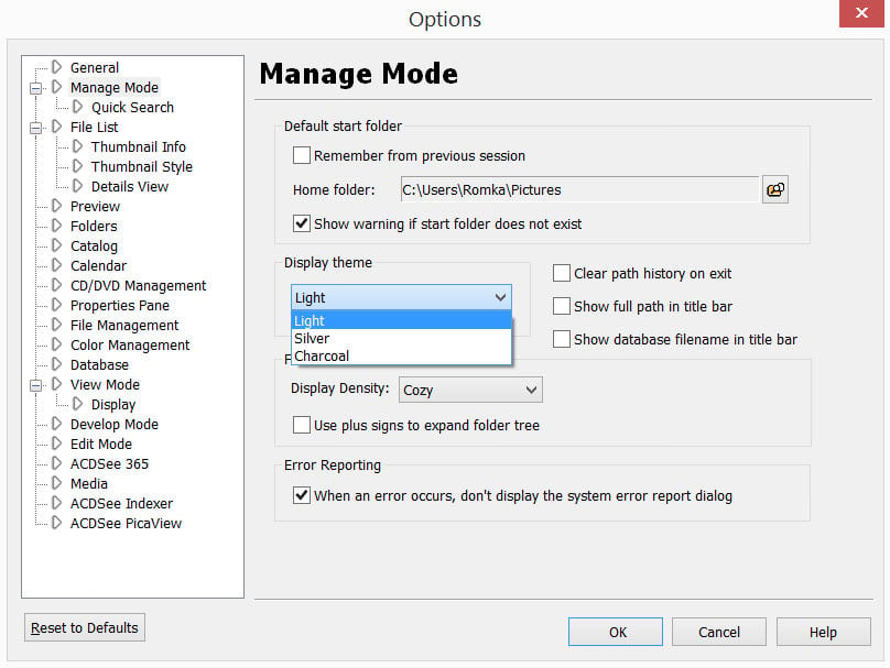
While at it, I also changed the Display Density setting in the Folder Tree section of the Manage Mode tab to “Cozy”. These changes are not exactly what you’d call drastic, but given that there is the possibility to adjust even such minor details to your liking, why not do it? That said, let’s move on to what are arguably more useful changes.
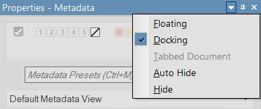
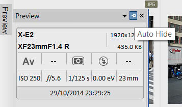
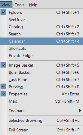
Pretty much every single tab or panel that you see in the Manage mode of ACDSee Pro 8 can be either resized, removed, hidden or repositioned. In addition to that, you can have the panels float separated from the rest of the user interface. Such options are available by clicking on a small triangle (▼) at the top of each panel separately. Auto Hide function is accessible by clicking on the small pin located right next to the triangle. More than that, there’s a plethora of other panels and tabs available, too (enabled or disabled through the View menu).
What brings customization to a whole new level is Workspace presets. Whatever changes you’ve made to the user interface, you can save as a preset and switch between them with ease. For example, I have two separate Worksapce presets saved: one for culling images with Folder Tree and Preview panel hidden, and Image Basket enabled; the other for regular reviewing purposes, which is the default ACDSee Pro 8 Workspace, only with ACDSee SeeDrive panel removed.
One last thing I want to mention about the interface is the full-screen mode (Ctrl + Shift + F). Whenever working with images – be it organizing, culling or post-processing – I like all the available screen area to be used for that purpose and not taken up by tools and features I don’t need at that time. I even use full-screen mode when writing articles with the otherwise very space-efficient Chrome browser. Anyway, this is where the ACDSee pro 8 full-screen mode comes in, as it hides the menus and Windows taskbar. For the most part, it works brilliantly, if not for one caveat – the menu bar, as well as “modules”, disappear completely. In other words, you can’t use File, View or Tools menus while in full-screen, nor can you switch from Manage mode to Develop or Edit. Ideally, these tools ought to auto hide and appear when you move the cursor to the very top of the screen, but they don’t. You lose some, you gain some. And I don’t think you should lose. Oh, and since I am on the subject, sometimes full-screen mode would not work when hitting Ctrl ÷ Shift + F if anything other than the image grid was active at the time. I was able to reproduce the issue by selecting a folder or a file using the image grid, and then clicking somewhere on the Properties panel. Very weird and very frustrating.
Overall, I am very impressed with how much customization is possible. I am pretty sure virtually anyone would be able to set up ACDSee Pro 8 according to their needs.
ACDSee as Image Viewer
1) View Mode
You might find what I am about to say rather ironic given the vast functionality of ACDSee Pro 8, but I certainly don’t mean to make it sound that way. See, one of the most brilliant features of this software also happens to be the oldest and the simplest one. It’s the JPEG viewer. On one hand, there’s not that much that can go wrong with a simple viewer. All it has to do is display an image full-screen as you double-click on it, and scroll if you hit the arrow keys. Right? Well, yes. But what I found with ACDSee Pro 8 that I did not find in, say, FastStone image viewer, is refinement.
First of all, the preview quality is spectacular whatever the original resolution of the image might be – there are no artifacts, no blurriness or jagged detail present. The images are sharp and clear, always. What traces of downsizing may be present, they are virtually unnoticeable in normal use. More than that, it was always the same story, even a few years back when Google Picasa had such issues as grain when viewing images. Another crucial asset is the speed – ACDSee is as-near-as-makes-no-difference instantaneous in regular use, at least with JPEGs. It pre-loads the next image in the sequence, and keeps previous image in memory, too. All of this results in absolutely no compromise in terms of speed versus quality, and there is no pixelation as the image is being loaded. Of course, should you try and provoke ACDSee, you could force it to lag by scrolling through heavy TIFF files quickly. But if you are actually viewing images, it’s so smooth you don’t even notice it. Just how it should be. In short, the software is very well optimized for image viewing and should you experience any slowdowns in regular use, it’s probably not the software’s fault.
Finally, ACDSee in general has no issues with non-Latin symbols, such as Cyrillic and even Lithuanian letters (š, ū and the sort) – it will always display these images either full-screen or in the image grid. Not a big deal, yes? Perhaps it should not be, but it is – this is the main reason why I discarded FastStone immediately. The otherwise decent image viewer would refuse to even “see” folders if they were named using non-Latin symbols, and it was a huge issue for me (mind you, FastStone is completely free).
Not everything is great, though. One small issue I have with the image viewer is the scroll speed when using a touchscreen (these are becoming more and more popular with new laptops, for example). With my Surface Pro 3, even a slight brush results in very quick scrolling and it is extremely easy to jump two or three images rather than scroll to the next one. In other words, it’s too sensitive, to a point where it’s uncomfortable to use. A pity, since pinch-zoom works fairly well.
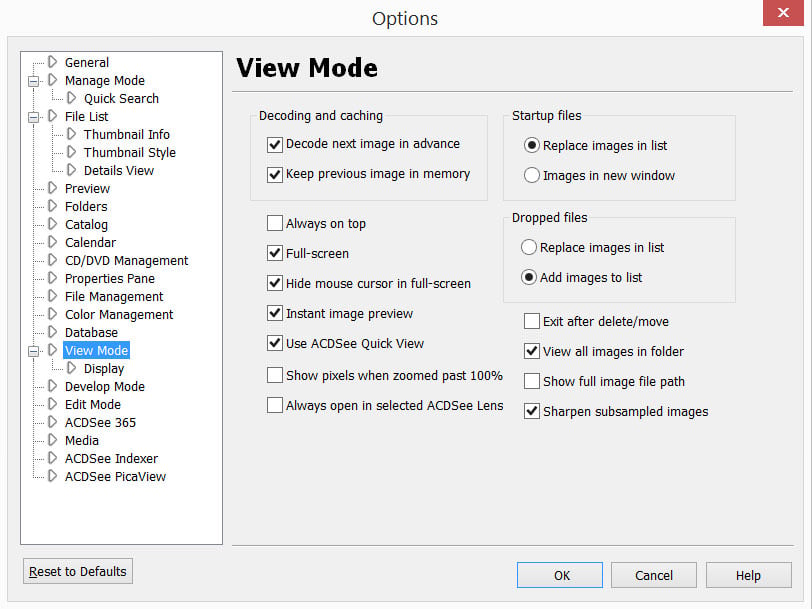
There is only one other issue that I have with the image viewer, and it’s the default settings. ACDSee does not display images in full-screen by default, you have to dive into the options and set it up this way yourself. To do that, go to the Options (Alt + O or Tools > Options…) and enable the Full-screen checkbox in the View Mode tab. And, while you are at it, you might also want to change View Mode background to white in the Display subsection of the View Mode tab – a personal choice, this, but I prefer to view images on white (how many photo galleries have you seen that have black walls?).
A side note: previewing RAW files is, of course, much slower, especially if you set up ACDSee to render its own high-quality previews rather than just use the embedded JPEG. In this case, it will first show the embedded preview and then switch to own render. All of this takes much more time. If you need a quick way to view RAW files as they are and discard any embedded JPEG previews, nothing beats FastRawViewer.
2) Quick View
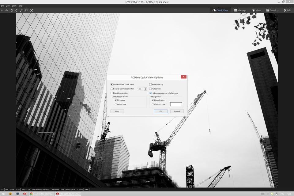
ACDSee Quick View is a lightweight image viewer that is launched for the single purpose of viewing images when the rest of ACDSee Pro 8 functionality is not yet necessary. So, when you first double-click on an image file somewhere in your hard drive, instead of launching ACDSee Pro 8, which can take a couple of seconds, the image is shown through Quick View, which starts up almost immediately. By default, it does not display images in full-screen mode, nor show them on a white background, as can be seen from the screenshot below:
To enable full-screen mode and, should it be your preference too, change the background to white as I did, go to Tools > Options… (or hit Alt + O), mark the Full-screen checkbox and choose Custom colour for the background. All of this makes the transition from Quick View to full-fledged ACDSee View Mode very smooth and seamless.
I find Quick View to be a brilliant solution for speeding up image review. It launches faster than the main software and the transition from it to View Mode (which can be done by double-clicking on the image during preview) is never really noticeable. When out of full-screen mode, it also features shortcuts to Manage, View, Develop and Edit modes, in addition to simple tools such as image rotation. Quick View is a big part of the reason why image viewing with ACDSee is such a polished process. When you look closely, it’s quite complicated, but designed in such a way to never seem complicated so that you never even think about. Everything works as it should (once you adjust the default settings). Should you want to disable Quick View, you can do so in ACDSee Pro 3 Options dialogue, but I see no disadvantage in keeping it enabled.
3) ACDSee PicaView
Years ago (many, many years ago), PicaView was a sort of a plug-in. For a while now, it’s been an integrated part of ACDSee, however. It’s main function is very simple and remains as it ever was, but also quite useful. PicaView displays image/video preview as part of the right-click file menu, as shown in the screenshot:
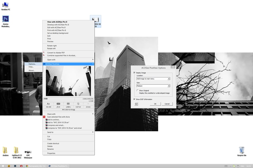
Clicking on the preview itself will launch ACDSee QuickView much like a simple double-click on the file would, which is neat. However, the brilliance is that you can see relevant EXIF info as well as the image itself simply by right-clicking on it (video playback works, too). More than that, you can customize the size of the preview by going into options, and specify whether the preview should be located in the main menu or sub menu (which helps shrink the main menu). You can also hide the EXIF information, or hide the preview itself and only keep the EXIF.
Personally, I disabled PicaView (ACDSee Options dialogue, ACDSee PicaView tab), but I can see how some might prefer to have it enabled. It is a useful little tool.
Organizing and Managing Your Images
1) Image Import
With Lightroom – one of ACDSee Pro 8’s key rivals in many regards – Importing image files is crucial. That is always the first step one has to take before being able to do pretty much anything else using the software. This is because Lightroom is a catalog-based image management and post-processing tool. It is only possible to work with files that have been added to the active Catalog with Lightroom. After the Import is done, all the metadata changes and post-processing happens inside the Catalog, they are added as descriptions of sorts. The original files are fully accessed again during Export operation, but not for regular edits.
ACDSee is very different in this regard. It, too, supports non-destructive editing, but it works differently and does not require the same sort of Catalog. There is a certain plus to such a solution – ACDSee sees and can access any image on your hard drive or even a USB flash drive, too, without relying on that image being added to its database first. Basically, if you can view the images directly from the hard drive (using Windows Explorer, for example), you can just as easily navigate to their destination with ACDSee and manage them in any way you need. Still, it does have a very versatile, powerful Import tool. Why, you might ask? To handle imports to the hard drive from a memory card or camera.
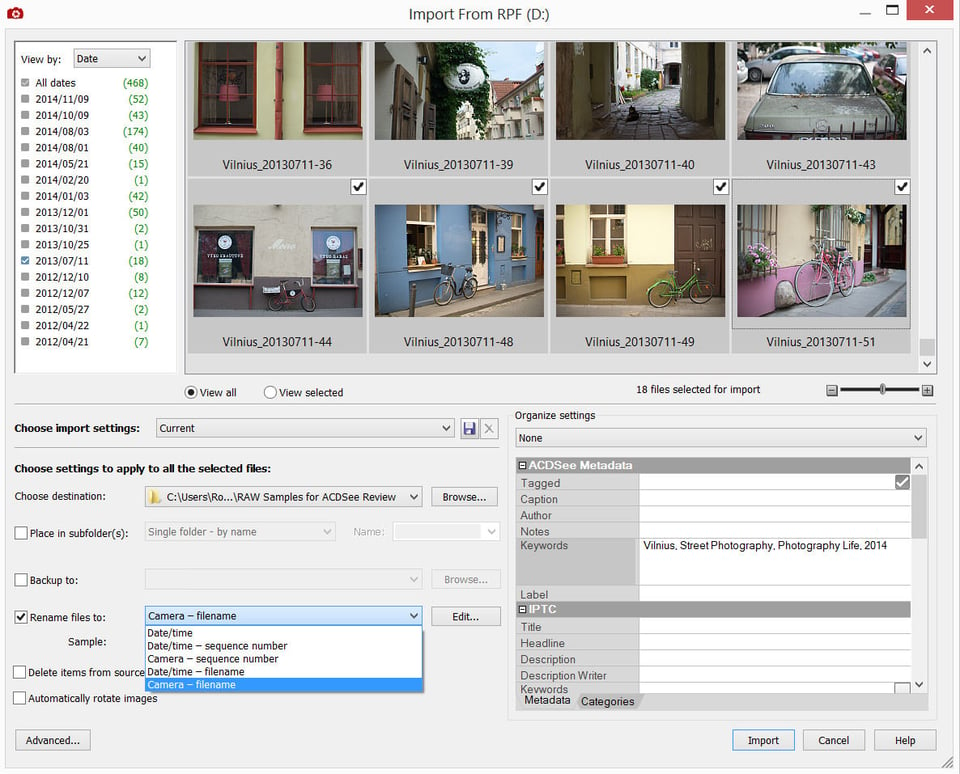
In many ways, the Import dialogue is very simple to that you will find in Lightroom, at least as far as functionality goes. It’s also quite straightforward. First of all, you select the files for import. After that, you can choose the destination where you want the files to be copied and add metadata entries, such as keywords. Presets containing various settings can be saved, which is very handy. Something else I find very helpful is the auto backup function – you can have ACDSee make a copy of the files as they are imported onto a separate location, and also have it remove images from the source once the import is finished and both copies are safely stored at their destinations. There is also an infinitely configurable automatic renaming function. If you are one of those photographers who struggle with maintaining a clear image import workflow after a photoshoot (ever dropped some valuable RAW files into a “New Folder (insert-number-here)” and forgot about them for far too long?), ACDSee Import can be very helpful. Unfortunately, there are some very obvious functions missing.
To start with, you can’t change the source destination. It is always the one ACDSee identifies as a separate device, be it a memory card, a USB drive or camera. Lightroom makes a suggestion – it directs you to a device with external memory “presuming” that is where you want to import from, but ACDSee makes this decision for you. But that is alright, I can live with that given that ACDSee can see all the images on my hard drive without me having to import them first. What is not alright is that you can’t view or navigate the destination device/folder as it is, all you can see is all the image files from the device in one sequence. For example, if I want to import a specific set of RAW files from a USB drive that contains lots of other images, I am basically forced to look through all of them and select the ones I need from the enormous list, rather than just navigate to the destination folder that contains only the necessary files. The filter that allows you to either view images by date or file type does not help in this case. Another thing I missed during the few times I used the Import feature was Select/Deselect All button. Even stranger was the fact Ctrl + A did not work.
That’s not all. While the auto rename function is infinitely adjustable, you can’t actually enter custom text. In other words, if you are importing images from your recent trip to Vilnius, you can’t name them “Vilnius 2015 Winter #”, all you can do is choose from a set of presets or create your own. There is no field for custom text.
To be completely honest, I am staggered by such omissions.
2) Image Management, Filters and Organizing
While talking about customization options, I mentioned ACDSee has all sorts of tools and panels besides the Folder Tree, Preview and Properties. All of these tools give the software unsurpassed image management capabilities. Of all the programs I’ve tried, nothing beats ACDSee Pro 8 in this regard, not even Lightroom which, on its own, is already very capable.
One such great panel is the Image Basket which allows you to easily select images for whatever needs by just “throwing” them into the panel temporarily, and is a great alternative to the Tag feature. Speaking of which, the latter is very similar to Flag as Pick in Lightroom and lets you mark images by hitting the \ key (even when viewing images full-screen), and then select all marked images by hitting Ctrl + \. Both selection tools are very useful and comfortable for organizing, culling and otherwise managing image files.
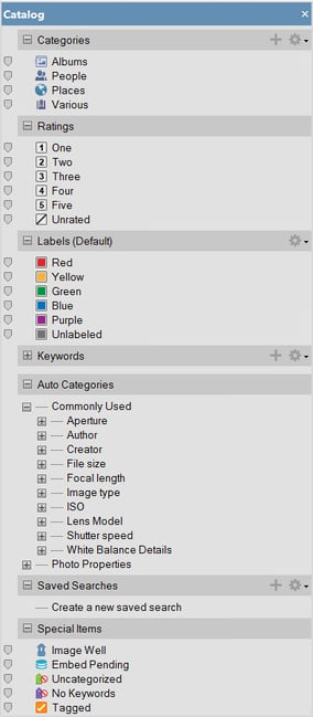
Another brilliant panel is called Catalog. It makes cataloging (hence the title) a breeze as you can simply drag-and-drop images onto a colour label, rating or category to assign it to selected images. More than that, selecting that colour label, keyword, EXIF entry, rating or any other parameter in the Catalog panel will instantly display all images that have the said parameter assigned to them. From my experience, it works flawlessly and makes searching for specific images very, very easy.
These are just some of the tools and panels. I have not yet mentioned the Burn Basket, which allows easy selection of images to burn to a DVD, or the Map panel for image geotagging, or the Calendar panel. All of these panels can be enabled from the View menu and are adjustable, too. Suffice to say, it’s all well thought through and functional, especially when coupled to Workspaces.
Post-Processing: Develop and Edit Modes
Don’t be surprised to find two modes that deal with post-processing images. Develop and Edit are actually quite difference despite appearing to mean pretty much the same thing at first. Or perhaps it would be better of me to say – they ought to be different. In short, the Develop mode is an alternative to Camera RAW, while Edit mode is a sort of mini-Photoshop that’s designed to be used with raster image files.
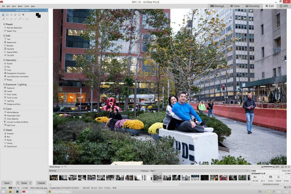
1) Edit Mode
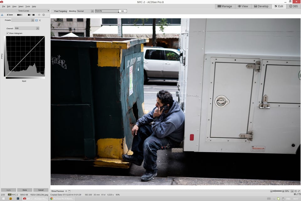
Edit mode is mostly meant for JPEG image files and the majority of features found there support this. Using Edit mode, the following is possible among other things: adding text to an image, increasing or decreasing brightness or contrast, adding borders, usage of all sorts of Photoshop-borrowed selection tools (Lasso and Magic Wand), a bucketload of effects and filters for you to ruin your photographs with (I am only partly serious, of course), B&W conversion and more. It also has some rather RAW-specific tools, too, such as Exposure slider and White Balance adjustment, but even these are actually designed for JPEG.
Overall, Edit mode sports a lot of tools and functions and is suitable for both amateur and (in a pinch) “professional” work, especially thanks to a well-implemented and functional Tone Curve tool.
2) Develop Mode: RAW Converter
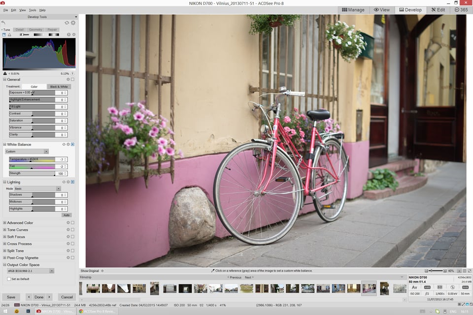
Develop mode offers similar functionality to Lightroom’s Develop Module (hence the somewhat unimaginative naming) and is best suited for RAW file development. It is also very obviously inspired by Lightroom, too, and you may even get the feeling some of the things have been blatantly copied over. For example, at the top of the left-side panel where all the RAW-specific tools are available, you have the Treatment selection… much like you have Treatment selection at the top of Lightroom’s Basic Panel. But let’s not mind the much-too-similar similarities and talk about the capability a little more.
Most of the tools a Lightroom user is used to are available, and all those you would require from a basic RAW converter. However, while the basic function of each slider is as you would expect it to be, there often seems to be something wrong with how they operate in practice. So, you have Exposure slider that can be adjusted from -2 to +2 stops, something I find quite restrictive given the astonishing dynamic range modern sensors are capable of. Then you have the Highlight Enhancement slider, which not only adjusts highlights in just one direction (dials them down rather than allowing you to boost them, too), but actually affects shadows quite a bit, too. Fill Light, on the other hand, affect brighter portions of the frame rather than just filling in those shadows, and by quite a degree. On the flip side, default rendering – before you make any adjustments – is already quite pleasant to my eye.
There is a slightly confusing and, from what I gather, rather useless White Balance slider called Strength. Set to a value of 0, and any WB adjustment you make is fruitless. Set it to 100, and Temperature slider acts as it should. So primitively speaking, if you add 500 degrees to Temperature and set the Strength slider to 50 (half of full “strength”), it will be as if you added just 250 degrees using the Temperature slider. Why not just set it to 250 in the first place? You then get to the Lighting group of adjustments and find Shadows, Midtones and Highlight sliders. The first two work pretty much as you would expect, but the last one, again, affects pretty much everything to the same degree, not just the highlights. Cross Process group – a set of settings that should imitate the ever-surprising and diverse effect of using the “wrong” chemicals to process film – has just one slider, Strength. Cross-process should be infinitely adjustable, and yet there is just one slider.
Not everything is bad, mind you. For example, I found the way Sharpening works to be very neutral and well-judged. Only by pushing the sliders much too far can you make it seem unnatural in some way. But then you only have one slider to correct distortion, as if all lenses have exactly the same sort of distortion that only varies in its prominence – and that could not be further from the truth. I could go on, but I won’t. In short, while not everything is bad, a lot of it is. And the numerous weaknesses of ACDSee Pro 8’s RAW conversion engine simply overshadow the positives. I would never willingly choose ACDSee for processing my RAW files over Lightroom because, while I am fairly confident achieving a desired result is possible, it is tedious, especially after having used something as well thought-through as Lightroom is. ACDSee is simply not up to scratch…
3) RAW Support
…and not just because of those reasons. One other serious flaw is RAW file support. The list of supported camera models has a serious, gaping hole. RAW files from my Fujifilm X-E2 can not be processed nor even viewed with ACDSee Pro 8. Was I surprised? Yes. X-E2 is over a year old. But then I noticed none of Fuji’s X-Trans cameras are supported. To be fair, this is not really important to most photographers. After all, it is not like Fujifilm is the only good mirrorless camera system, far from it. On top of that, X-Trans RAW files are not that simple to crack, even Adobe is struggling. And yet if you happen to own a Sony A7 – any iteration, in fact – that model is also not in the list.
Final Words
At the core of Adobe Photoshop Lightroom is Camera RAW, a plug-in for converting RAW files. The said plug-in has been dressed in a new set of image management and organizing clothes, and released as a standalone software. It works fairly well, but the origin of Lightroom is obviously seen in its strengths. It started off as a post-processing tool for RAW files, and that remains its strongest, most convincing feature. Not that organizing image files is tedious, oh no. As a photo manager, Lightroom has just enough functionality. Not groundbreaking, but enough to be satisfactory.
At first glance, it is much the same story with ACDSee, except for one thing. It started off not as a tool for post-processing, but as a tool for viewing and managing image files. Fast forward over a decade and the said functionality remains Pro 8’s biggest strength. I’ve not used or even come across anything quite as convincing as a photo manager, ever, despite some very surprising flaws (Import springs to mind). Throughout the years of development, ACDSee has grown and grown. And from here things take a slight turn, for it seems as if it has grown just for the sake of it. Can too much functionality be a bad thing?
In my opinion, ACDSee lacks what Lightroom has seemingly nailed. It lacks thought and refinement. It’s incomplete and very, very messy, almost as if it’s not one piece of software, but a dozen merged into one. I know a lot of users might not want to hear me say this, but trust me, I wanted to love this software. I really did. And some of the issues that I found, many might not have even noticed before. Perhaps they are not as serious as I think or make them out to be, too. Perhaps I am being overly harsh or just plain missing something, and I almost hope that is indeed the case. And yet, right now, it is not how I see it. ACDSee is like a Christmas tree that has never been undecorated. Each year, with each iteration, ACD Systems takes the same tree with the toys and lights from the past decade still hanging on it, and puts up new lights and toys. After a while, you can’s see the tree anymore, the core idea of it. You still know it’s there, of course, but all the lights and glittering decorations – all the functions and tools of the software – turn it into something of a mess. It is chaotic, cramped and attempts to be everything for everyone, something that is not actually possible. The developer has been chasing Adobe – both Photoshop and Lightroom – and it has failed at something that should not have even been attempted in the first place. If you are chasing someone, you can’t be in the lead, can you?
Stuffing a piece of software with all the tools you can possibly imagine is actually quite easy. Just keep coming up with different tools, necessary or otherwise. The real genius is in coming up with a piece of software that does few things, but does all of them flawlessly. That is when the developer knows for certain what his goals are and how to achieve them. ACDSee is trying to be everything for everyone, and that is its biggest issue. Because while it has an astonishing array of tools, few work as well as they should. ACD Systems need a reset button. They need to pick up a piece of paper and a pencil – not an iPad or a laptop, but the simplest of tools – and write down several words. Speed, refinement, simplicity. View, organize, develop. And then start from scratch.
This review is quite negative, isn’t it? But remember – I had high expectations. I used to love ACDSee back when there was a clear idea behind it. Now, it’s just too much of everything that’s not done well enough. As an alternative to Lightroom for both image management and post-processing, it doesn’t work, not for me. But that does not make it useless, oh no. ACDSee works reasonably well as an organizing tool and makes complete sense if your post-processing needs are taken care of by, say, Photoshop. It also works very well as a simple image viewer, though for this single purpose it is a bit of an overkill. Finally, there is something Adobe could learn from ACD Systems, too. It’s very refreshing to see such a feature-packed software “weigh” so little, as minor as it may seem.
Still. Do less, but do better. Find that reset button, please.
ACDSee Pro 8 : Searching for Alternatives
- Features
- Value
- Ease of Use
- Speed and Performance
- Stability
Photography Life Overall Rating
I’m glad I didn’t read this review before I switched from Lightroom to ACDSee or I might not have done it.
I completely agree that ACDSee is an excellent photo manager. It was such a relief to escape Lightroom’s catalogue. I find ACDSee an absolute pleasure to work with.
I haven’t had any particular sense that ACDSee is cluttered like an old Christmas tree, or cramped. Coming to the software completely cold 6 months ago (I confess I’d never heard of ACDSee before the introduction of Lightroom Classic prompted me to explore other options) I had expected it to be different to what I was used to. However, after a short learning period I adapted perfectly well. But messy – not that I’ve noticed (and as for very very messy – maybe the review is getting a bit carried away there). As for being cramped, I run two monitors and love being able to detach the panels and sit them on monitor 2, freeing up monitor 1 for the image. On the occasions I have returned to Lightroom, I have found it to be uncomfortably cramped.
I have noticed other reviewers giving ACDSee’s raw developer a bit of a hard time, and I can’t entirely understand why. I have compared many images I have processed in both Lightroom and ACDSee and I generally find them comparable. A poor Raw edit is more usually due to me than either piece of software. Not mentioned here is ACDSee’s excellent Light EQ, which I would now very much miss if I had to go back to Lightroom. The one area I would say ACDSee struggles with compared to Lightroom is handling blown out highlights, such a cloudy skies. Otherwise, this is a very capable raw editor if a person takes the time to get used to how it works.
I agree with other comments that ACDSee is not a perfect piece of software. Nor is Lightroom (otherwise I’d still be using it). But I think it is significantly better than this review suggests (I have also, by the way never had any issues with the software as per comments 10 & 13, despite 6 months of heavy usage).
As fas as photo management goes, ACDSee rules. It’s still one of the best tools for organizing your images.
I also use and recommend BatchPhoto. It’s a tool for Windows and Mac designed to edit multiple photos at once. Really useful if you have to resize, watermark or date stamp images in bulk.
I have used ACDsee right from the very beginning and always found extremely useful. Later iterations have tended to introduce more problems however. I am now using Ultimate 10, and like Eddie above, I am finding that it hangs up frequently. This has recently started happening to me with frequency, although no software or other alterations have been made to my setup. I can edit perhaps 10 or 15 files before the program hangs and only by going to task manager and closing the program, and starting over, can I continue – perhaps for another 10 or 15 files..
anyway you should visit it: www.vmuzyka.com
believe me, dat comparison worth a lot
Naresh
Do NOT buy ADCSee! Their software is utter crap. Like MANY many other people who use ACDSee I too get the dreaded ‘ACDSee has stopped working’ (or it just becomes totally unresponsive) several times a day.
I am a software developer and I can see all the things wrong with their software. They are utterly unable to write decent multi-threaded software. The very core of their product is rotten. They can make it look shiny and add new cool features but having ‘ACDSee has stopped working’ in your face 10 times a day is just madness.
ACDSee support is non-existent. The ONLY reason ACDSee is still in business is because enough people keep hoping the problems will be solved in the next version. And it never is nor will be.
AVOID LIKE THE PLAGUE!
Not my experience at all. Never had problems with Acdsee and the latest version ACDSee Photo Studio Ultimate 2018 is very stable and efficient.
Compared to LR my experience is that AcdSee is also much faster. Stopped using LR with ver. 5.7 as I got really tired with the database concept which often lead to “corrupt catalog” – luckily LR always managed to repair the database.
One thing that is not so nice about Acdsee is that everytime a raw file is developed, Acdsee stores a copy of the developed file as jpeg in hidden folder named Developed besides an XMP file in the same folder as the raw file. It is really crazy that it cannot be disabled, but the argument as far as I know, is that it speeds up viewing, but it takes up huge amounts of space.
I am using ACDSee Professional 2018 for a few months and I think the stability getting 4,5 out of 5 stars is overrated. As Eddie wrote, it seems ACDSee is kind of buggy, as it hangs even when doing basic things like batch resizing jpegs. Other strange bug is regarding showing basic information of jpegs, like image’s dimentions, which are simply not shown on some files. I appreciate the essential idea of navegate directly the file system in instead of having to import photos to the workspace. But, this kind of software’s behavour (aka bugs) makes me question its reliability, the money I’ve invested and the considerable time I’ve spent managing ratings, flags, tags and so. Hapily, all metadata is inserted into my jpegs, making an eventual migration easier. Disconsidering these stability problems, I enjoy using ACDSee.
Hi Romanas
Unlike few photographers I purchased many softwares from: Photoshop elements (7,8,12), AcdSee Pro 5, Topaz collection, Nikk plugins suite, LR( v2 to 6.3), Photoshop CS5 extended, ON1 v9.5, DXO (6,7,8,9,10) + DXO viewpoint (1,2),+DXO Filmpak 3, photomatix Pro, PTL lens , luminosity mask plugins, fastrawviewer, etc. The problem with all theses softwares is to find training videos showed in the right sequence that will allow you to master them in a short time.
I am now spending 90% of my time editing using LR + Photoshop + Nikk plugins not because they are the best but because I have taken the time to get good training on them (kelby training for a year). If any companies wants to replace LR they will have to find a way to train (free) their users with very efficient videos that will includes the same training files as the ones used on their videos. There is no way I will jump to different softwares without being able to get proficient rapidly.
Please add your comments:
Why have I spelled the word “shadows” with two d in several places in my last post? Oddly.. :-)
My advice to you (Mark) is to first try ACDSee before you reject it as an alternative to Lightroom! :-)
Sure, ACDSee is not a perfect software – but that also applies to Lightroom and all other similar softwares that I have tried. It was pointed out in the review that the tool “Fill Light” not only affects the shadows but also the highlights. That may be so, but I prefer it over the corresponding control in Lightroom that gives very little effect on the shaddows in the image. I have noticed several times that some dark areas that should be lightened up with “Shaddows” in LR does not. This means that you have to use the exposure slider or the dencity slider (both affect shaddows and highlights) and then lowering the highlights by using “Highlights” after you have used the shaddow tool. With Lightroom, it is often not enough to simply adjust the shaddow slider, but also “Exposure” and “Highlights” must be used to get it right. With ACDSee it is usually sufficient to light up those dark parts with “Fill Light” and then tone down the bright parts with “Highlight Enhancement” to find a good balance between light and dark areas in the image. No need to use the exposure tool in this case!
And who needs five exposure steps to correct a badly exposed photo!? :-) Two are enough in most cases, I think. “Fill Light” in ACDSee can otherwise be used as an additional tool to adjust exposure if the two steps are not enough. Using both exposure- and fill light-slider should roughly give you access to four exposure steps that you can make use of when adjusting your image. And of course..you can also use the lighting sliders (Shadows, Midtones and Highlights) to change the exposure further. Or the tone curves-tool!
Lightroom is a well made software, but it is not perfect either and does not suits us all. I much prefer ACDSee Pro 8 I must say! I will admit that even I thought ACDSee Pro seemed a little messy in the beginning – it was my first impression of the software. However..when I had been using it for a couple of hours, I thought differently. Especially after my own customization of the interface. Now I think it is very logical to use!
Moreover, it is very nice to avoid constant import and export of files to/from a catalog that one must do in Lightroom. Also nice that there is no need to do a separate back up of the XMP-data in ACDSee, which is not the case with Lightroom. In Lightroom you instead have to remember to back up both the catalog and the XMP-data.
I am a Lightroom (4.4) user and found this review when looking for an alternative. You’ve convinced me that ACDSee Pro 8 isn’t it, but I’m hopeful the the new version 9 might be. I’d be very interested in an updated comparative review.