How does print size affect the emotional feel of a photo? It may seem like an image that works at one size will be equally good at any size – but in practice, I don’t find that to be true. Instead, the best print size changes from photo to photo. It’s all about what you want to say.
In this article, I’ll explain why print size is such an important decision in photography, as well as the different moods and emotions carried by photos of different sizes. I hope that this sheds some light on a crucial, yet little-discussed area of creative photography.
Table of Contents
The Emotional Impact of Small vs Large Prints
My philosophy as a photographer can be boiled down to this: You have several decisions to make, and each one shifts the emotional mood and impact of the photograph. By making those decisions consciously and with a clear emotional message in mind, you can make the photograph as effective as possible.
One of those decisions is print size. Small and large prints both carry different emotional messages, and they tend to emphasize or de-emphasize different elements of the photo. When you’re choosing a print size, make your decision just as carefully as you would for any other part of creative photography.
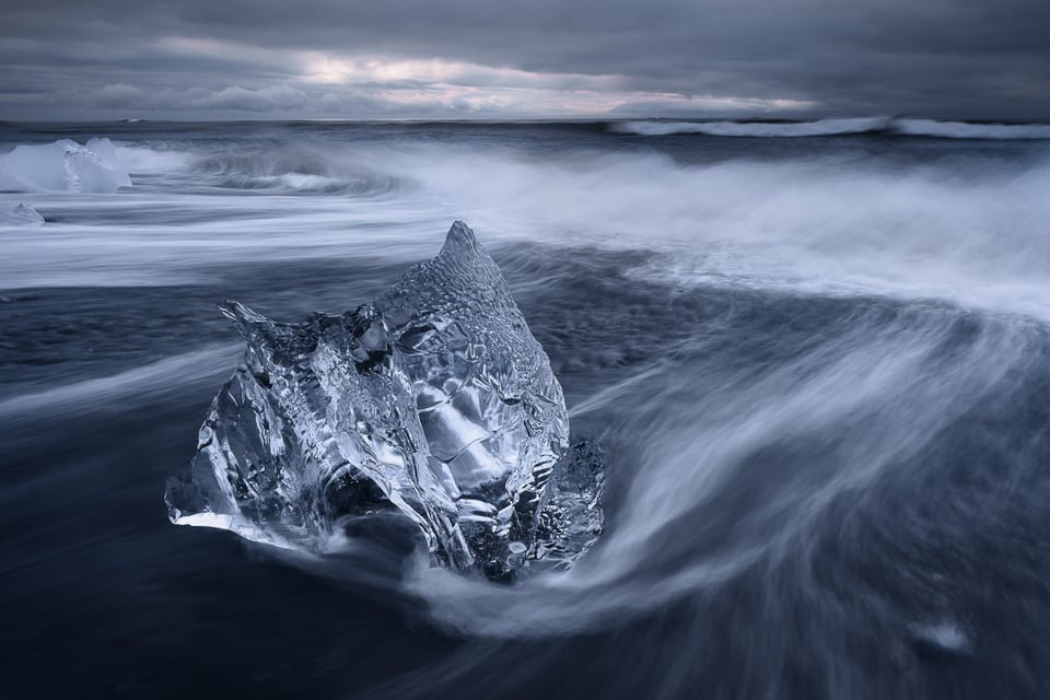
Let me start with small prints, which are criminally under-appreciated among photographers. No, they don’t have the immediate attention-grabbing power of a wall-sized mural, but they still stand out in their own way. Very few photographers specialize in small prints, so it’s actually a very good way to set your work apart from the crowd. Not to mention that an increasing number of collectors are prioritizing small photograph prints nowadays.
Small prints have a few characteristics that you need to keep in mind. First, for better or worse, they hide the tiniest details in an image. This can accentuate a photo’s minimalism (by obscuring small textures and patterns, for example) and draw more attention to the main elements of the subject. It does, however, sometimes hide details that are important to the photo’s emotional message.
Another reason to print small is that the most monotonous areas of a photo – say, foregrounds or skies that are all one tone – become less overpowering. In a wall-sized print, those areas of a photo can draw undue attention and harm the print’s overall appeal. They don’t have the same effect at small sizes.
Most of all, small prints ask a viewer to get closer. You need to get right up to the print in order to experience it properly, which is a much more intimate experience. If you’ve ever spent time studying a really small print, you may know what I mean when I say the following: It’s more memorable, somehow. Or, at least, it can be if the photo is good enough to reward your effort.
Personally, I like to make small prints of gentler, softer landscape scenes, like a hidden waterfall or a bit of texture in the sand. It’s a quiet style of print that works well for intimate landscapes. Abstract photos are also some of my favorite choices to print at small sizes, particularly when I want to exaggerate their mystery. More and more often, I find myself preferring small print sizes for my landscape work.
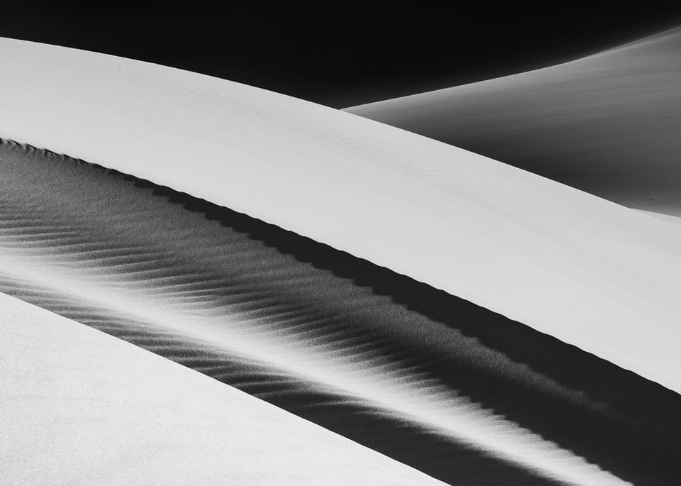
As for large prints, I probably don’t need to spend very much time extolling their virtues – I’d guess that you’re already a fan of them! In my experience, photographers generally try to print as large as their budget and wall space will allow, and even though I disagree with that approach, I can understand it.
Large prints are immediately striking. A big photo can be the centerpiece of a room, attracting more attention at first glance than any small print would. They make a photo feel impactful and significant, and I definitely can’t deny the appeal. (At a more cynical level, it’s also easier to justify high prices to potential buyers if the print you’re selling is really large.)
Compositionally, the biggest effect of a big print is to reveal details. These details can include textures, small subjects, and – of course – flaws that would not be visible at smaller sizes. All of this can impact the balance of a photo, leaning it more in one direction or another as the viewer’s attention shifts.
As much as I like studying small prints up close, large prints have more space to study in the first place. For busy, detail-filled photos, I generally gravitate toward large prints for this reason. The same is true any time that the immediate impact of a large print adds to my photo’s emotional message.
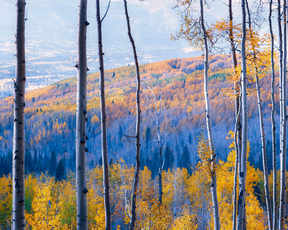
Two Case Studies
Let me tell you the story of two of the most impactful photographic prints I’ve seen, which I still remember vividly many years later. One was a print of Edward Weston’s Nautilus, a contact print from 8×10 film (so, the dimensions of the print were roughly 8 x 10 inches / 20 x 25 cm as well).
Nautilus is the perfect photo for a small print. In a huge enlargement, the extensive areas of the photo that are dark and monotonous would start to overpower the subject, but that problem doesn’t exist at 8×10. Further, at a small size like this, many of the photo’s faint details are hard to see. Of course, that effect isn’t always wanted – but for Nautilus, it heightens the alien nature of the subject in a very effective way.
To say that Edward Weston was known for his 8×10 contact prints is an understatement. In fact, he almost never printed larger than that. It may sound like a pretty limiting approach, but his body of work proves otherwise. Since he knew that he would make an 8×10″ print, it is not a stretch to think that Weston would have selected subjects and composed his photos tailored to that size. I believe this to be one of the many reasons why his work is so enduring.
As for the other print I mentioned, it takes the opposite approach: Avenue of the Americas by Andreas Gursky. There are so many details in this photo that I can’t help but try zooming into the digital version of the image, and I definitely put my nose near the glass when I saw it in person. Like much of Andreas Gursky’s work, it was printed extremely big:
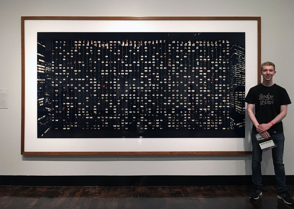
With an art style like this, a large print can be a tour de force. If it had been printed at a small size, the very subject of Avenue of the Americas may not have been clear – some buildings at night? Lanterns hanging from string? It could be hard to say.
So many details in the Gursky’s photo beg for close inspection, from the splashes of red to the dark bars at the top and bottom of the image. With a print this large, we can examine these mysteries and take the time to understand the photo for ourselves. And, of course, the print immediately fills a room and draws attention in a way that most small prints do not, at least at first glance.
Medium Print Sizes
The two examples above are from opposite ends of the spectrum, but both times, the photographer’s choice of print size contributed to the photo’s effectiveness. At the same time, many photos are best when printed at a size somewhere between the two extremes – say, a print in the 11×14″ to 16×20″ range, rather than something particularly small or large.
Medium prints have some elements of both large and small prints. They reveal enough details to change the balance of your composition, for example, but they don’t overpower the viewer. But the most important aspect of medium-sized prints is that they don’t draw undue attention to the size of the print!
I’d compare it to using a normal lens instead of an ultra-wide or supertelephoto lens in photography. You aren’t breaking new ground in terms of focal length, but you also probably aren’t slapping the viewer across the face with the photo’s perspective distortion. The focal length basically fades into the background and lets other aspects of the photo take center stage.
Medium prints remind me of that. They are versatile and less “showy” print sizes, which don’t add much of their own character to the photo. That said, one potential weakness of medium prints (but perhaps a strength) is that the photograph itself needs to carry the day. You aren’t relying upon the sheer size of a huge print to call attention to itself, nor upon the mystery of a small print to draw a viewer closer. It leans more on the qualities of the photo itself.
The Effect of Viewing Distance
I’ve been using the terms “small print” and “large print” as if they’re fixed things. But even a massive print will act like a small print if viewed from far away.
Many of us dream of having our photos printed billboard-sized, but that doesn’t mean a distant billboard is a great medium for displaying photos! Unless you climb the ladder and stand right under the print, you’re probably viewing a billboard from so far away that all the little details are too small to see.
On the other hand, I’ll periodically see prints that are too large – so large that they can’t even be viewed as a whole unless you stand very far away (usually giant advertisements and similar). Needless to say, that isn’t a very effective way to display a photo. Closer to home, the same thing applies if you try to display a big print in a small room, like a typical bathroom. There might be enough space on the wall, but that doesn’t mean there’s enough space for the viewer.
So, be sure to consider viewing distance when you’re deciding on a print size. Even something like a table or couch below the print can force the viewer to stand further away, causing the print to feel smaller than it otherwise would. Or, in a small room, even a medium-sized print can feel overpowering.
Conclusion
I hope that this article has highlighted the importance of one of the most under-discussed, yet crucial parts of photography: the print. More specifically, that your choice of print size is much more important than the question of what fits on your wall!
A photo’s emotional message will most likely change, even slightly, depending on the print size and viewing distance. If you don’t take that into account when printing your work, you may find that something feels “off” about the final piece without knowing exactly what.
Over the coming months, I’d like to write more articles on printing technique, especially the creative decisions at play when bringing your image from the digital to the physical world. To me, printing is just as important of a topic – and requires a similar amount of artistic input – as something like post-processing, even though it rarely gets as much attention.
So, do you have a go-to print size? When you compose your photos or edit them after the fact, do you make decisions with that print size in mind? I’d love to hear more about your printing philosophy in the comment section below! And, as always, please let me know if you have any questions, and I’d be happy to answer.
I’ve done my own printing since the analoge dark-room days (1967), after going digital I’m using a low-cost A3 plus printer (Canon) with a paper a that suits the subjct, usually Hahnemühle. For exhibitions I use A3, for a series of prints I might use A4. All prints will be framed matted. The used sizes are very popular, usually fit very well into an average living-room and all the material can be re-used a couple of times.
Thanks for picking up this topic.
I’m a photographer and I own a professional picture framing shop. Also, I own large format printer and print for other framers, my customers, phographers, and myself. My colleagues (and myself) who do landscape photography consider 36″x24″ as a small print. Can you imagine Yosemite or Zion National Parks photos printed at 8″x10″. My format for those is at least 54″x36″. Impact of large prints is impossible to underestimate. My D850 easily handles noise and resolution, especially with TopazLabs help. Besides, how many of 8″x10″ do you have to sell to make living?
After years of printing landscapes at 16×20/24 and sometimes larger I have found myself printing more and more at 5×7/8 or even 4×6. Matted and framed in an 8×10 or 11×14 frame the image becomes an artifact to be examined, held in the hands and dwelled on, and if on a wall inspected closely. i.e. really looked st. It seems the experience is more intimate and it’s harder to just pass by an image when you hold it…
Great article Spencer, as someone who has recently got into displaying prints in their home I found the printing process to be a steep but enjoyable learning curve. I favour larger prints but mostly between 11×14 and 18×24 for home display. For me, wall space and ceiling height determine the print size as you mentioned in your bathroom wall example. What I didn’t appreciate though was the actual framing process which is just as important as the printing. Working with a professional framer can take your print to a whole new level and choosing frame and mat colours as challenging as editing the original RAW file. It can get a bit pricey though, I find that display frames are a good start as you can switch out prints to keep your work current and see if your edits were the correct ones, lot cheaper to reprint and change using a display frame as opposed to a custom frame and matting. Perhaps a second article on framing?
Thanks, Michael! Frankly, I still have a lot to learn about framing before I’d be comfortable writing about it. I know what I want my frames to look like, but for the most part, I have not had the money or time to get them exactly right, so far.
I am reminded of what one of my professors in graphic design school told us years ago, only half facitiously – “If you can’t make it good, make it big.”
Spencer, what a great article. I recently acquired an Epson P900, so my in-house printing is limited to small or medium prints. At first I thought this was going to be an unfortunate constraint, but the more I got into the art of printing I found being restricted in size forced me to think creatively in ways I hadn’t before. Reading through the comments, I think you’ve hit on fertile territory, and I look forward to more printing articles. I’d add bookmaking to the list. I love printing my work but have yet to discover a pleasing way to bind my prints into a book.
Another print option is metal. Several shots I’ve taken, an example is a wide print of Portofino with considerable detail, lend themselves to a larger print size however my home is not well suited to standing too far back. I would not wish to lose the detail and texture in this shot. Unlike canvas for example I found that metal maintains clarity, assuming the shot has sufficient resolution even when viewed closely. An article regarding the print aspects of different mediums would be interesting.
Thanks for the timely article. It’s an issue with particular importance to me at the moment. I recently upgraded to an A2 printer. (16.5×23.4) but have made little use use the full size, so far. It’s nice to have the option but I plan to print mostly A4 (8.3×11.7) which is 1/4th the size.
A key factor is the ink cost is lower per ml with for the larger size printer, (Epson P900 vs P700) so it was worth the extra expense. Twice the ink size cartridge for the 900, is an extra $4 per cartridge, so it’s a more logical choice.
I also like to frame larger prints occasionally.
That said, it is the quality of the image which counts for me. I am very selective about printing and while A4 is my default size, I enjoy the fact that some images do work better if they are printed bigger.
That said, for exhibitions and public display, I am more likely to opt for large print sizes.
Nice article. I typically use a “professional” printing service, like WHCC, etc. I don’t print a lot. I recently looked at photo printers, e.g. Canon Pixma Pro-200, in this price range Wondering if any benefits to printing yourself? (Sorry if this is planned in future article!).
Gus
Cost?
I use a Canon Pixma Pro-100 and it was great value for money (bought in 2013). It prints to A3+ which is a pretty decent size for prints to put on the walls at home. The only problem is that A3+ doesn’t fit readily into commercially bought frames and buying bespoke is quite a bit dearer – especially oak. A3+ paper also tends to be dearer than plain A3.
Very helpful.
Some thoughts on paper choices in due course perhaps?
(For B&W I used to use Ilfobrom velvet stipple).
Good idea, will do! Ilfobrom is a great line of paper – I’ve used it some for my darkroom work, even today. I intend to get into actual bromoil or oil printing before long, but it’s quite an endeavor.