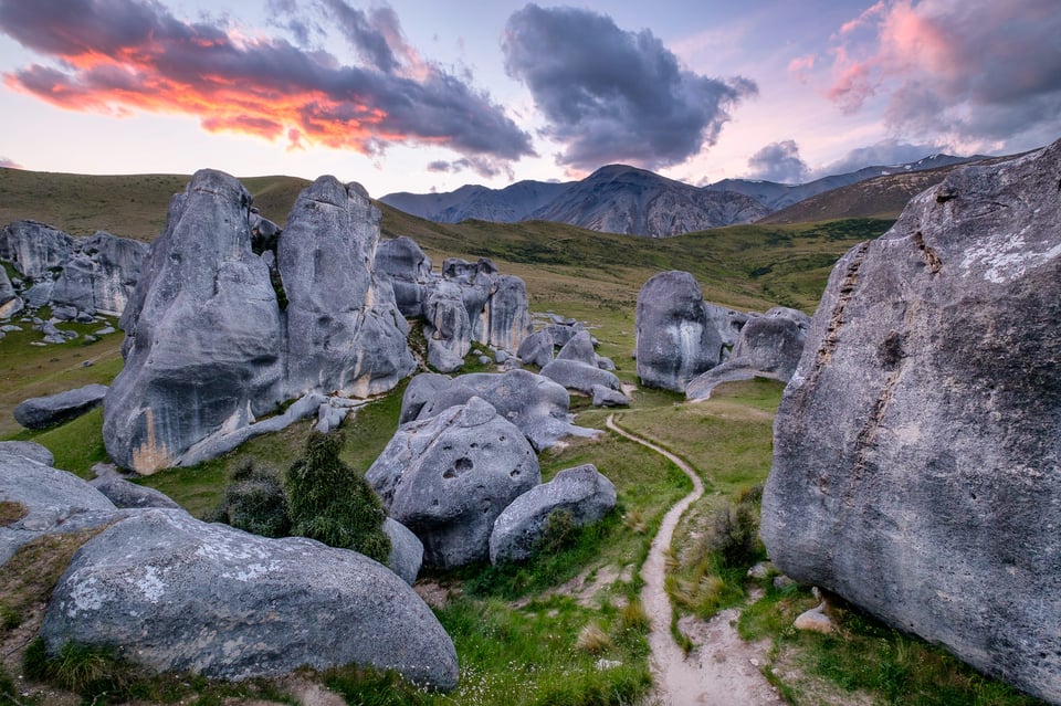
Fujifilm X-T2 + XF10-24mmF4 R OIS @ 10.5mm, ISO 200, 1/10, f/7.1
Many beginner and intermediate-level photographers struggle with post-processing their images, especially once they switch from shooting JPEG to RAW. Images initially look bland, and once the experimentation phase kicks in, they can start getting their “overdone” look. An experienced photographer can easily tell if an image is not post-processed well and if it can be improved by some image manipulation. That’s because seasoned photographers have done it enough to understand how to make images look good both for their own and the public’s viewing pleasure. In this article, I will share five basic rules of post-processing with our readers, which will hopefully make it easier to understand how to properly post-process images.
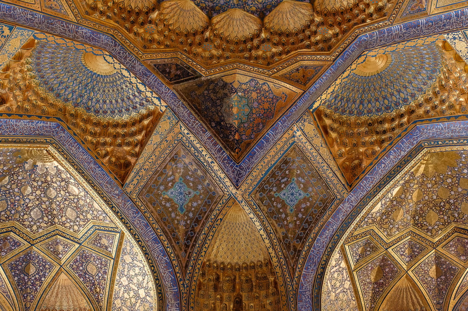
Fujifilm X100F @ 23mm, ISO 3200, 1/60, f/5.6
Please note that the below “rules” are similar to other photography rules. Meaning that they only serve the purpose of guiding beginner photographers, nothing more than that. There are many exceptions to each one of these rules, especially once you get a bit of experience working on your photos.
Table of Contents
Start with a Solid Image
One of the biggest mistakes many beginner photographers make is assume that a bad photo can be salvaged in post-processing. If you start with a poorly executed photograph, you will have a poorly executed final image, no matter how much time you spend working on it. Even if you are a Photoshop wizard who can replace skies and subjects in photographs, you cannot take a bad photo and make it look glorious.
The number one rule of successful post-processing is to start with a successful or at least partially successful image that you can make look better. First, spend more time getting to know what truly matters in photography, such as light, subject, emotion, mood, and composition. From there, apply your photography knowledge to the image capture process, with the goal of yielding solid photographs. Your end goal should be to try to get as comfortable with the pre-visualization process as possible since you will know what to look for.
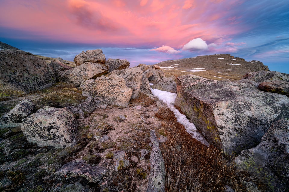
NIKON Z 7 + Laowa 10-18mm, ISO 100, 0.6s, f/11
Once you have a bunch of images to go through, you can apply the same knowledge to pick the right candidates for post-processing. That’s right, even picking the right image to post-process takes some skill!
This means that your goal should be to make yourself be as picky as possible during the image culling process. If you pick the right candidate for post-processing, getting a good end result is relatively easy.
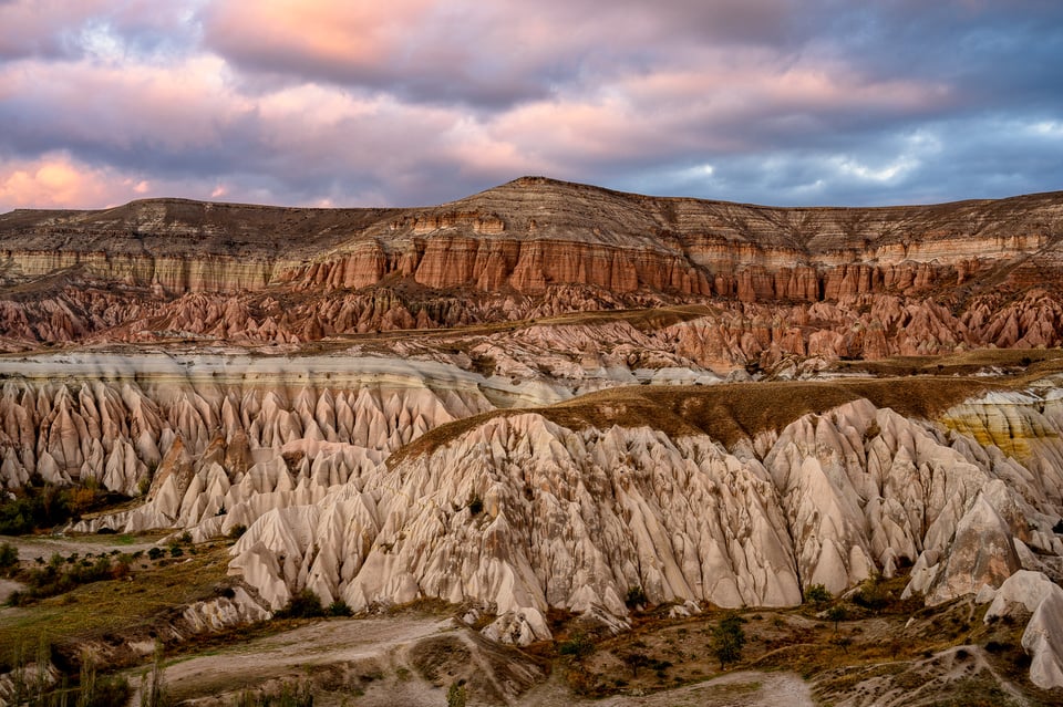
NIKON Z 7 + NIKKOR Z 24-70mm f/4 S @ 44mm, ISO 64, 1/4, f/8.0
Visualize the End Result
Once you have a solid candidate to work on, the next step is to understand what you want out of it. This is one area many beginner photographers struggle with, because they often have very little idea about what they want their image to look like. This leads to the dangers of post-processing experimentation, where photographers try different post-processing methods and tools to make their images look better. While experimentation is a very natural cycle of learning, if you find yourself stuck in that phase, it is time to dig yourself out of it sooner than later.
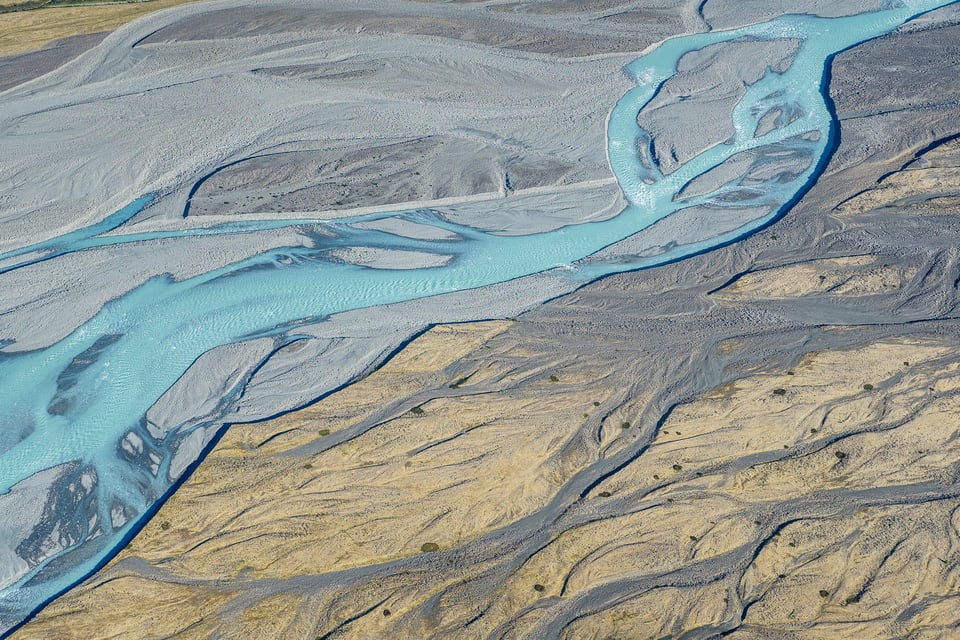
X-T2 + XF35mmF2 R WR @ 35mm, ISO 200, 1/350, f/6.4
How? My recommendation would be to study art and your favorite photographs. What makes a given painting or a photograph look appealing to you? Don’t think about light, subject, and composition, since those are a given, but pay attention to how the image is presented in terms of its overall brightness, contrast, and colors.
Also pay attention to how the primary subject of the scene is highlighted. Sometimes basic exposure tweaks and dodge and burn techniques can help in guiding the eye and show the essence of the subject in a photograph.
Once you know what type of “look” you enjoy the most in your favorite works, you can apply the same concepts to your photographs. This would be a great start for you. With time, you will learn how to stop replicating other people’s work and you will be able to apply your own style to your photographs.
If you learn to visualize the end result while culling through your images, you will be able to pick better candidates for post-processing. It is OK if you end up choosing one or two photos from a batch of thousands. I have been shooting for many years now and I can tell you that I still take a boatload of bad images that I will never touch. It is the ones that I choose to post-process that actually matter.
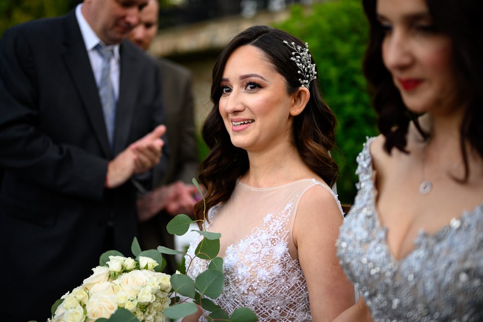
NIKON Z 7 + NIKKOR Z 50mm f/1.8 S @ 50mm, ISO 800, 1/3200, f/1.8
Aim to Provoke Emotion
A good photograph is one that can provoke viewer emotion. If you are able to do that, you have a successful photograph, period. But triggering someone’s emotion with an image is not easy, especially when dealing with mundane subjects, or photographing something that is known not to directly connect with people’s feelings. If you have a photograph of a crying refugee child in a dark setting, triggering emotion is relatively easy when compared to a photograph of a bird in flight, or even a pretty landscape.
However, there is one thing you can do to your images, which is to communicate your emotion at the time you edited a photograph. How do you do that? I would argue that it is the way you post-process your images.
As artists, we can choose what to show to our viewers. If you struggle with depression and feel like you want to communicate that with your viewer, you can intentionally make your images dark and gloomy. If you feel happy, you can also do that by making your image bright and happy, maybe even colorful. Some photographers are skilled enough to do something in-between, while others intentionally choose to communicate the opposite of their feelings. Others detach their feelings from their images completely, sometimes by choice.
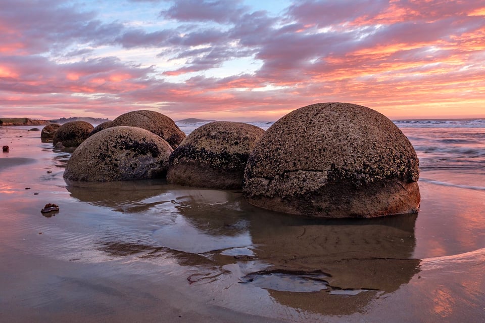
X-T20 + XC16-50mmF3.5-5.6 OIS II @ 16.7mm, ISO 200, 1/6, f/8.0
When you look at my images, you can probably tell that I enjoy bright and colorful far more than dark and gloomy. I think it has to do with the state of my mind when I edit my photographs. I often choose to do it when I am in a good post-processing mood. In addition, I could even say that I like the “bright and happy” look to cheer my viewers and it has become my style over the years.
However, it does not mean that I want to keep it this way – I know that I want to be able to express a range of emotions through my photographs, something I still have to learn how to do. For example, I love black and white photography and I want to get better at it. I recognize that black and white photography communicates on a completely different level with the viewer when compared to color photography.
In contrast, Spencer has a very different post-processing style. His images can sometimes look dark and gloomy, and sometimes he intentionally chooses to make them look bright and happy. He clearly has a wider range of different looks he chooses for his photographs. I do not know if his style of post-processing is impacted by his mood at the time of editing. I will leave that up to you to analyze.
The point here is that both Spencer and I intentionally choose a particular “look” to our images. We even pick candidates for editing very differently! I am sure if both Spencer and I sat down on the same computer to do the image culling process, we would end up with different candidates.
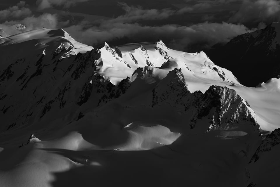
NIKON D810 + 70-200mm f/2.8 @ 70mm, ISO 140, 1/500, f/9.0
And that’s really what makes every photograph so unique. Knowing that a photographer intentionally picked that photo, to make it look that particular way already tells us a lot!
What is the takeaway then? Pick an emotion and tie it to your photograph. If you don’t know where to start, my recommendation would be to start with Bright and Happy. It is an easier look to achieve and it is something most viewers will connect with.
The “Bright and Happy” Look
Once you have a good candidate and you chose to tie the “bright and happy” emotion to it, there are some simple steps you can take in post-processing to quickly give it a solid look. Keep in mind that most bright and happy images have plenty of brightness and contrast in them, to make the overall image “pop”. This means that the two most critical factors to pay attention to (aside from highlighting your primary subject) are brightness and contrast.
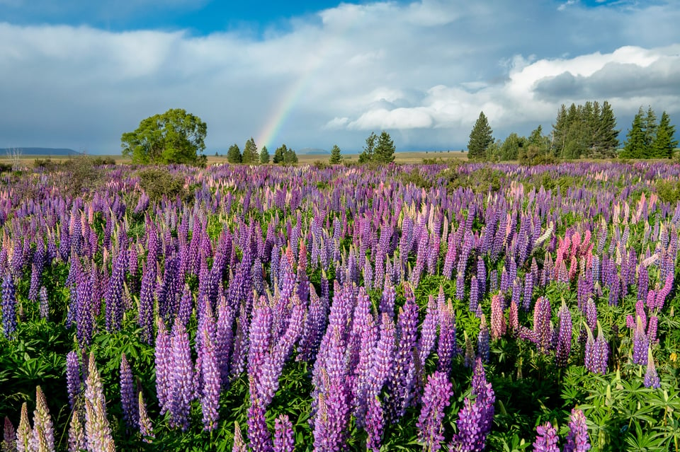
First, pick the camera profile that gets you a good start. In Lightroom, you can pick a corresponding camera “Profile” to do that. Depending on the camera you shot the image with, you should be able to go through a range of different options such as “Camera Portrait”, “Camera Standard” or “Camera Landscapes”. Each one of these is already set to give a certain “look” to your images with different brightness, color, and contrast levels. I personally choose “Camera Standard” as my default for most cameras, but it can be a bit too much for some photographs, so it really depends. If your post-processing tool does not give you a choice of different camera profiles, then just move on to the next step.
The next step is to assess the overall brightness of the photograph and identify different zones of brightness. If you have an image that has a very wide range of brights and darks, you will need to potentially work with such sliders as “Highlights” and “Shadows” to recover some details. Since your aim is to get a bright photograph, you want to be careful about how you adjust the highlights and shadows of your photograph. For example, do not recover shadows too much, since it does not look natural and you will end up with a flat-looking photograph.
Third, adjust the Exposure slider to make the image as bright as possible without blowing anything out. The latter part is important because you do not want to end up with overly bright parts of the photo that you cannot recover. This is where you might need to go back and forth between the Highlights and the Exposure sliders to figure out the best combination.
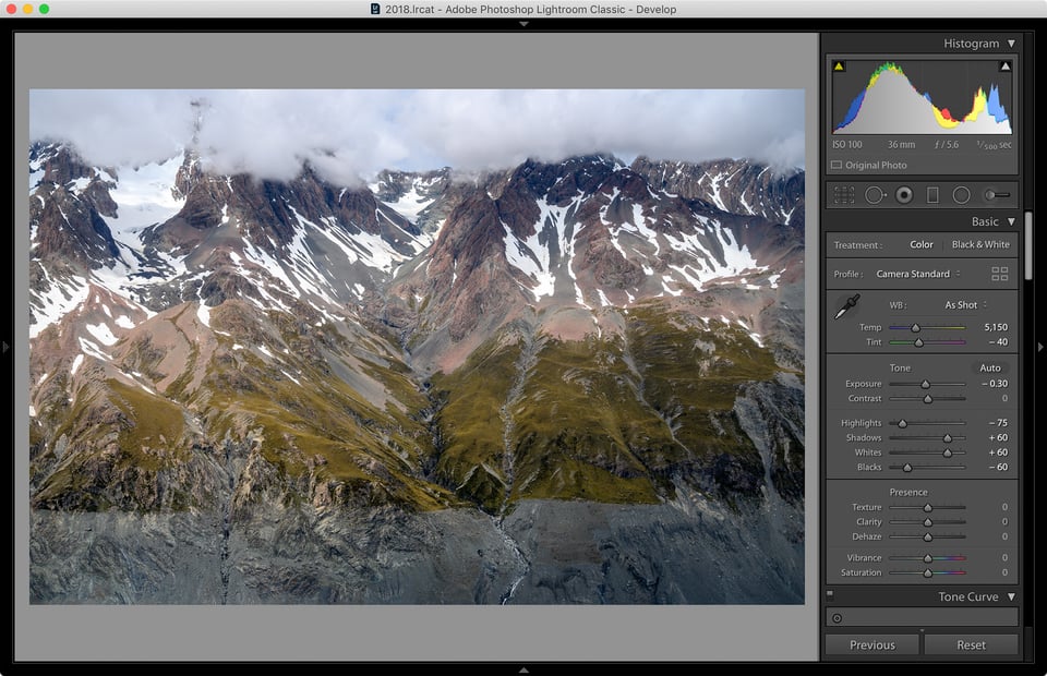
Now you are ready to boost the contrast of the image. In Lightroom, you can do that in several ways, but the three most common ways are to use the “Contrast” slider, the “Whites” and “Blacks” sliders together, and the “Tone Curve”. Personally, I rarely use the “Contrast” slider, because I do not like to adjust contrast with a single setting. This is why my personal preference is to start out with the “Whites” and “Blacks” sliders.
The idea is to push Whites as far as possible to brighten the bright parts of the image, then push Blacks down to increase overall contrast. Once you do that, you will notice that the overall image got significantly brighter, potentially making it way too bright, especially at higher Whites settings. In some cases, you might need to go back and re-adjust your Exposure slider and tone it down.
Here is an extreme example of such adjustments in Lightroom:
As you can see, I pushed the Whites and Blacks sliders by “+60” and “-60”, which is a bit extreme and I rarely push these two sliders that far. However, I started with an image that had very little contrast to begin with, so I knew that I needed to push the two quite a bit to get the image to pop. Although I initially started with the Exposure slider at zero (the image was already bright enough), I had to tone it down to a third of a stop after adjusting the Whites slider.
To understand what these adjustments did to my photograph, take a look at the below “Before and After”:
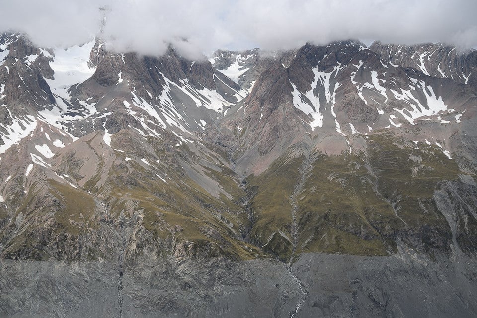
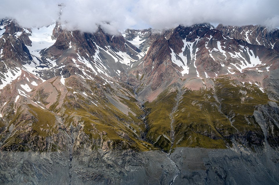
As you can see, it is a pretty drastic difference between the two images. Normally, I do not push the Whites and Blacks sliders beyond 30-40, but each image is different and in this case it gave me the result I was looking for.
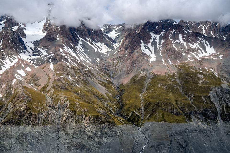
Here is how the image looks after final adjustments to the image (click to see a larger version):
NIKON Z 6 + NIKKOR Z 24-70mm f/4 S @ 36mm, ISO 100, 1/500, f/5.6
Although the “Tone Curve” can also be quite useful for adjusting contrast, it is a bit confusing to use for many photographers. I personally do use it on some images if I need to fine-tune contrast even further, but not too often.
The “Dark and Gloomy” Look
While getting an image to look bright and contrasty is easy, achieving a “dark and gloomy” look is much more difficult in post-processing due to many different factors. First of all, it highly depends on the image you are starting with. If you have a bright and colorful photograph, you will need to tone it down quite a bit.
If you want to retain colors, you will probably need to push it towards the blues rather than oranges when adjusting white balance. You might need to reduce contrast and potentially push some of the settings to the extreme. In many cases, you might need to convert the image to black and white, or reduce colors significantly for that “eerie” look.
Here is an image that I post-processed in Lightroom as an example of a “dark and gloomy” look:
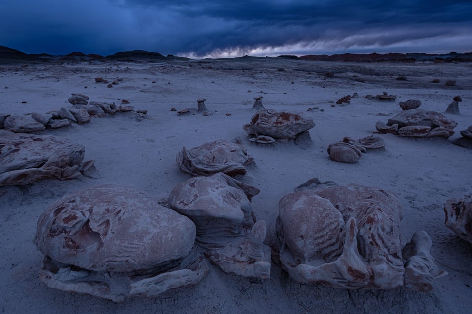
Fujifilm X-H1 + XF10-24mmF4 R OIS @ 10mm, ISO 200, 0.8 sec, f/5.6
Notice how different the image looks compared to most other images in this article. The alien-like structures in the foreground make it look like I am on another planet. The dark and stormy clouds in the background overwhelm the brighter part of the sky, indicating of an upcoming storm. Basically, the whole landscape appears to be…dead. I think you can agree that this image is just not the right candidate for a “bright and happy” look.
To make it look this way, I darkened the photo even further (although I started with a pretty dark image), tweaked the white balance towards the blues, reduced highlights to -100, added some shadows (+30), and added some texture and clarity. To highlight the foreground structures a bit, I dodged and burned them with a 0.4 exposure setting. Finally, to make the sky more intense, I added a gradient filter that reduces the exposure and boosts contrast and clarity.
There is no magic formula for the “dark and gloomy” look, so you will need to experiment a little until you achieve your desired result. The same goes for trying to achieve something in-between or converting an image to black and white. Spencer wrote a very nice guide to black-and-white photography, so I recommend that you check it out.
Emphasize Your Primary Subject
When looking at the most successful photographs, you will notice that most of them contain either one or more important subjects that the photographer wants the viewer to pay attention to. Most photographers will only feature one primary subject and have other secondary or even tertiary subjects to support the primary subject. A photograph can rarely succeed without a subject, although there might be exceptions to this.
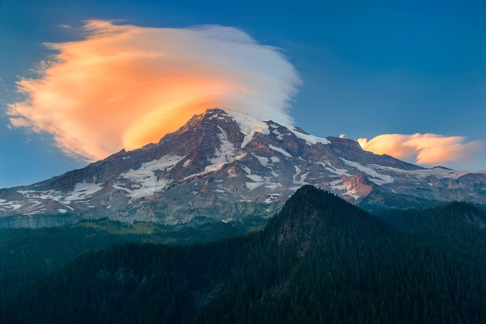
The point of highlighting the subject is to guide the viewer’s eye toward the most important part of the image. Sometimes you can do it by using visual guides in your composition, and other times you can do it by utilizing specific post-processing techniques like dodge and burn. Although your goal as a photographer is to try to use beautiful light to highlight your subject at the time of capturing the image, it might not be enough to really showcase your subject. And this is where your post-processing comes into play.
So how do you highlight your subject? The answer has to do with the subject’s brightness. Make the subject bright enough relative to the background and other subjects in the scene, and you just made it more prominent. To do that, start out by assessing the overall brightness of your subject. Is it bright enough that it already makes it stand out from the rest of the scene? If the answer is “yes”, you might not need to make it look brighter. If the answer is “no”, or “maybe”, then you should adjust its brightness and see if it helps to make the subject stand out.
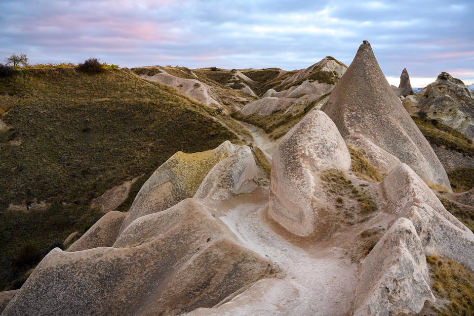
NIKON Z 7 + NIKKOR Z 24-70mm f/4 S @ 36mm, ISO 64, 2.5 sec, f/8.0
Performing “dodging and burning” in Lightroom, Capture One and most other software is quite easy. Just pick a brush with a different Exposure setting and start painting parts of the image. In Lightroom, there are multiple ways to dodge and burn. You can use the Adjustment Brush, Radial Filter and even Graduated Filter to highlight or diminish parts of the photograph. I personally prefer to use the Adjustment Brush in most cases, but if I need to apply a quick adjustment, the Radial Filter does the job quite well.
If you use Capture One, you are going to love the built-in local adjustments that you can layer on top of each other. The best part is that there is practically no lag when doing it when compared to Lightroom and other post-processing software.
Here is an image where I dodged the potter’s face from Uzbekistan to bring it out more, since it was too dark in the original photo:
And here is another image from Uzbekistan, where I dodged and burned different parts of the ancient city that were too dark or too bright:
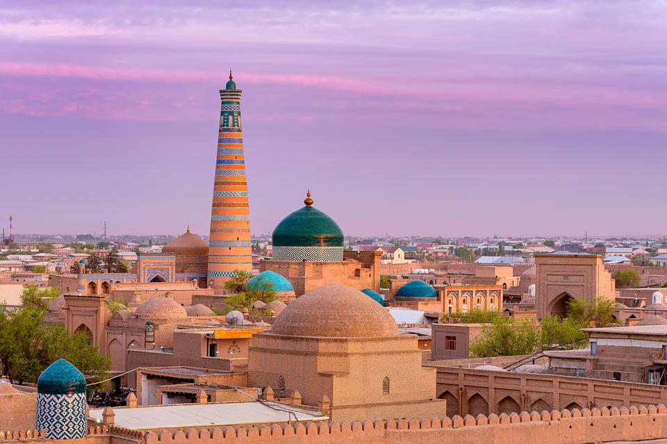
Fujifilm GFX 50R + GF110mmF2 R LM WR @ 110mm, ISO 100, 1/6, f/8.0
With the mosque and its minaret in the distance being my primary subject, I made sure to highlight it a little relative to the foreground and other surrounding elements.
Do Not Over-Process
Lastly, do not over-process! With all the excellent post-processing tools we have in our hands today, it is easy to get carried away. I personally rarely ever touch the Saturation and Vibrance sliders in Lightroom, because they can quickly make images look way over-saturated. Ditto for Sharpening, Texture, Clarity, and Dehaze sliders that can inflict quite a bit of damage if not used right. You should be careful even when recovering Highlights and Shadows, as pushing those two in opposite directions too much will make your images look too flat.
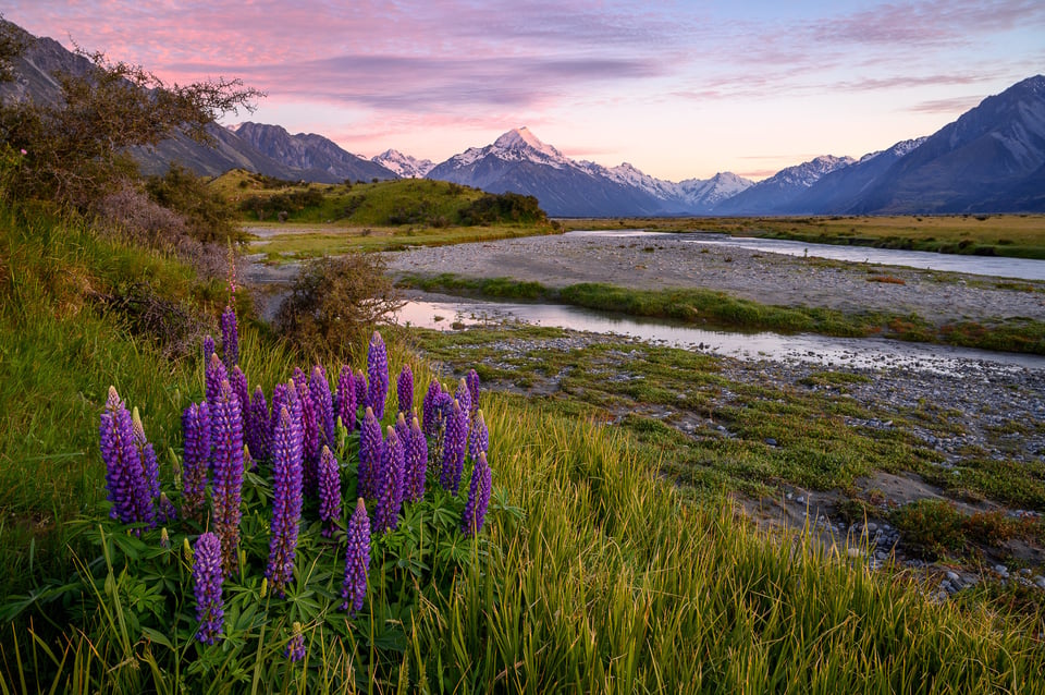
NIKON Z 6 + NIKKOR Z 24-70mm f/4 S @ 25.5mm, ISO 100, 1 sec, f/11.0
The same goes for HDR and other tools and techniques. Try to make your images look as natural as possible without making them look too overwhelming. Keep in mind that color also impacts contrast and you can blow out color channels easily if you are not careful.
Hope you found this article useful. If you have any questions or concerns, please let me know in the comments section below!

This is very useful information for me. As I am a member of upcoming photographers group and I really want to improve my skills. And eventually become a professional in this business. So any ideas are useful for me.
Thank you so much, your article enlighten me so much.
A technique that I have found useful is to put your recently-processed images as background on your computer (and make sure your screen is on all the time). By doing that, you see these images several times over and will, sooner or later, discover if there’s any processing you want to change.
BTW, I use Windows and it’s not too hard to do as I have suggested. I don’t use Macs, so I don’t know if you can use this technique on Macs.
I like the articles. Good for learning and review. Thank you.
Excellent article. Thanks for sharing your thoughts. It is so often we skip the basics either because we never knew them or just so wrapped up in what we do day in and day out that we get into a habit and sometimes, well, just skip the basics. Your article reminded me that every once in awhile I should just stop and look at the image and make sure my vision clear or could there be alternate end results.
As for Rule #1, about 15 years ago when I was new to Photoshop I had a lousy picture that I was convinced I could turn into a masterpiece with enough tweaking. I spent 11 hours working on that picture and showed it to someone who exclaimed “That’s ugly!”. I had to face the fact that he was right and I had just wasted 11 hours on an ugly picture. I still have that picture on my computer, partly because I can’t stand to delete a picture I spent so much time on, and partly as a reminder never to let that happen again.
I am going to Uzbekistan in about two weeks, so you gave me some inspiration! Which city is the potter from?
Fergana region, town of Rishton.
One of the best artist is ceramics Master Alisher Nazirov. His studio is a courtyard and his display lines the walls of the courtyard,
What a nice article! I think you nailed it with these 5 basic rules.
I use the same way to add some contrast with adjusting the blacks & whites. In most of my pictures it works pretty well to adjust highlights (-), shadows (+) , Whites (+) and blacks (-) which creates something a friend of mine calls “dynamic D”
I use this for the basic adjustments before going into the details.
Keep up with your great work ! :)
Thoughtful, well written and helpful article. The basic approach you present is a good one and where I start.
There is an interesting quote – “If you don’t know where you are going, it doesn’t matter how you get there.” You snapped that shutter for a reason. You saw something at that moment. Remember that when you are working on your photos. If I cannot remember why I took the shot, I usually wind up deleting it.
I do a lot of underwater photos so my order of steps differs a bit from the above water stuff, but I still have a process, I use it and it works. Thanks again for the reminders.
I see you confront the same problem I always find when trying to brighten a person’s head/face that is too dark, e.g., the bride photo. There will be part of the head/face that is darker than the rest and when the whole is made brighter that area gets noisy. I find it hard to get it even with the rest of the head/face. It shows up at a “line” between the two areas. In the bride photo you see it at the top of the neck. I find that transition difficult to get right. I enjoyed the article and examples.