The deeper you go into photography, the clearer it will be that everything is about emotion. Each decision you make – every single part of your thought process – matters for that one reason. A prominent example? Positive and negative space. These two elements of photography are important because of the emotions they carry. So, what are positive and negative space, and how can you use them to improve your work?
Table of Contents
1) What are positive and negative space?
It’s all about what stands out in a photo. Which parts of the image attract the most attention? Which ones fade into the background?
- Positive space is any part of the photo that jumps out from its surroundings. That includes your subject, for example, along with other noteworthy areas of detail.
- Negative space is just the opposite — parts of an image that don’t attract as much attention, surrounding the positive space and giving it a buffer.
The simplest example is writing on a page of paper. Words pop out at us, and the background doesn’t. So, words are positive space, and the background is negative space.
Photos are no different. Take a look at the picture below:

You won’t always take pictures of silhouettes with such obvious regions of positive and negative space, but my hope is that this image sets the stage for more complex compositions. These concepts always apply, no matter the photo.
2) Positive Space – Examples
Some photos have more positive or negative space than others. Below, I’ll show a couple images with high amounts of positive space, and I’ll explain what makes them that way.
2.1) The crowded forest
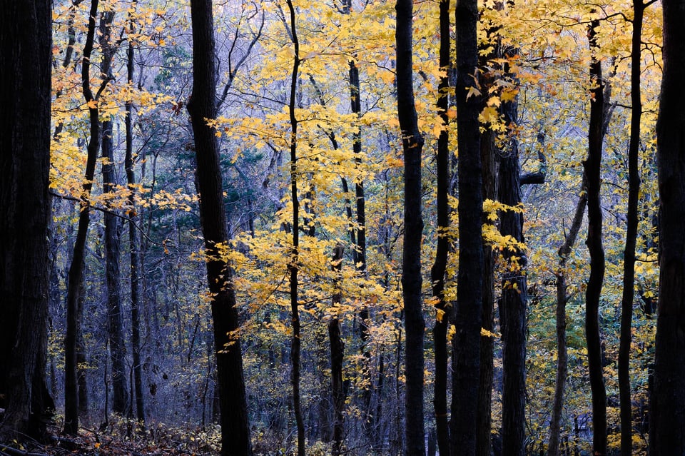
In this example, plenty of leaves and tree trunks across the image all attract attention. There’s no unified “background” here. You could argue that some of the blue-lit trees in the distance fit that description, which is fair, but they don’t take up much of the image. The same is true for the center of the tree trunks, which have very little detail in their darkest regions — but, again, only cover a fraction of the photograph. Other than that, most of the photo has high levels of texture and detail. It’s a very busy, crowded image.
2.2) Paris architecture
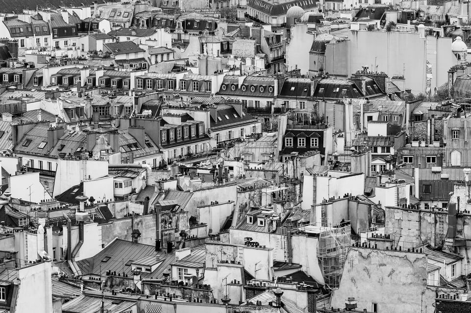
This photo is a textbook example of extreme positive space. The entire image has details from top to bottom, without any clear background at all. It’s a very chaotic picture — and that’s the point.
My goal here? I wanted to show the crazy, busy jumble of interesting architecture in Paris. The photo works because the crowded composition matches the crowded nature of the city itself.
Every part of this image attracts attention, but none stands out significantly more than the rest. It’s all positive space.
3) Negative Space – Examples
Negative space is equally important in the world of photography. It might even be more important, since it’s a good place to start if you want to capture simple, effective images.
Below are some examples of negative space photos and what makes them so effective.
3.1) A Dragonfly and the Sky
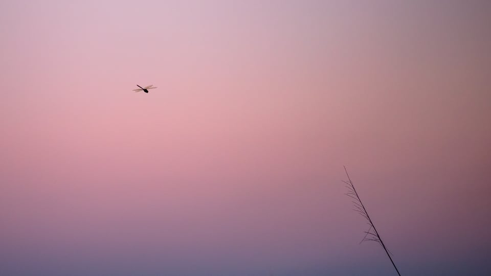
This is a clear example of a negative space composition. The photograph is very empty — even minimalistic.
Only two parts of the image attract significant attention at all: the dragonfly and the plant. Everything else in the image is negative space, fading into the background.
Comparatively, the subjects are dwarfed by their surroundings. They are, essentially, floating in a void of negative space. It’s a large buffer around them, and it has a huge impact on the mood of this picture.
3.2) The Eiffel Tower
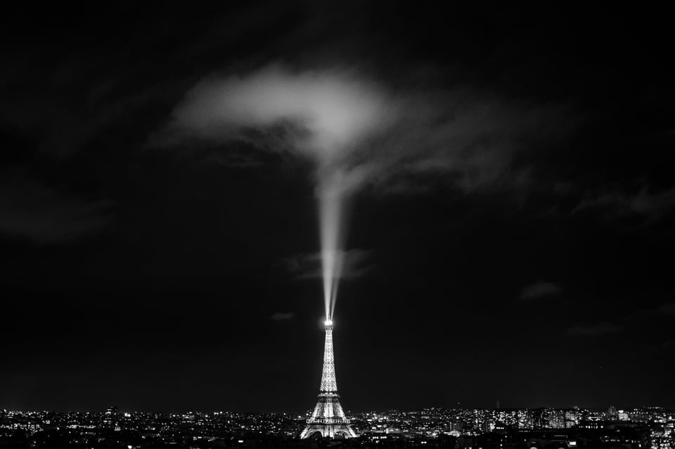
Everyone knows that the Eiffel Tower is a huge, magnificent structure. But compared to the size of the night sky, it’s still quite small.
At least, that’s what this example tries to convey. Like the dragonfly photo, there is a huge amount of negative space in this picture. More than half of the image is just darkness, without any details at all.
Which parts of this photo do jump out? Simple: the Eiffel Tower itself, the spotlight, and the cloud above it. To a lesser degree, all the other city lights are positive space as well, and that’s it. The rest of this photo fades into the background. It’s very heavy on negative space.
4) Positive Space – Emotional Message
Positive and negative space matter because each one carries a different emotional message.
What emotions does positive space convey? Exactly what you would expect: crowdedness, power, movement, chaos, and strength. Some of these emotions might sound negative, but they don’t have to be. If you want your photo to be active, with many areas of interest, positive space could be exactly what you’re after. Here’s one such example, where the photo carries a feeling of intensity and power:
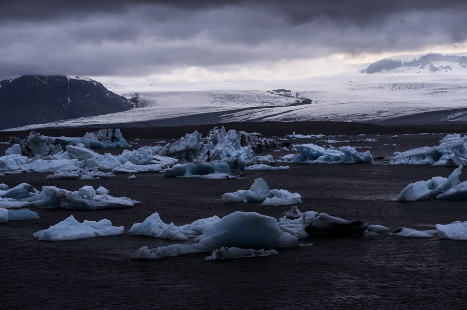
This photo does have some regions of negative space — the water, for example — but it’s pretty heavy on positive space, too. Several different elements of the photo all stand out and attract attention, which makes the final result more active and dynamic.
Photos with high amounts of positive space are:
- Intense
- Busy
- Powerful
- Strong
- Active
5) Negative Space – Emotional Message
The emotions of negative space are just the opposite. They give your photos a sense of calm, peacefulness, and subtlety. Depending upon your subject, they also can appear lonely or solemn.
Negative space is very popular in photography at the moment. Part of it has to do with the purposefulness behind photos with a lot of negative space — they have a very intentional, aesthetic feel — and another part is just the simple fact of screen size.
People are looking at photos on smaller and smaller screens in today’s world. A busy, chaotic photo can work well in a large print or on a huge display, but it may fall apart when your screen is three inches wide. Negative space photos, though? They work quite well at small sizes, sometimes better than normal.
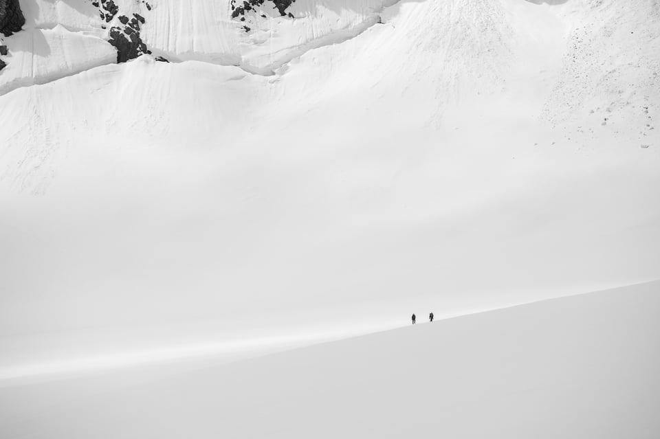
How do you find negative space? All you have to do is look for empty areas in the world. At first, this might not be easy — searching for elements that don’t stand out — but it becomes more natural over time. For example, try including the sky in your compositions. It’s huge, everywhere, and (often) filled with negative space.
The same is true for depth of field. By using a large aperture setting, you can capture a shallow depth of field and eliminate many distractions around your subject. Or, if that’s not an option, even a blank wall counts as negative space. Get creative, and you’ll find options everywhere.
Photos with high amounts of negative space are:
- Empty
- Subdued
- Peaceful
- Calm
- Isolated
6) Summary
Positive and negative space are two of the most crucial tools at your disposal as a photographer. They impact the emotional feel of a photo, which is more important than anything else.
Some photos have more negative space, making them comparatively empty. Others are filled with positive space, resulting in a crowded composition. (Certain images, of course, strike a balance, and they don’t fall clearly in either direction.)

Also, it’s important to remember that neither positive nor negative space is better in photography. Without a doubt, you can take successful photos either way. The key: Both simply carry different emotions. That’s what makes them so important in photography.
See also:
- Composition Tips for Beginners (This article goes into much more detail about composition, one of the most important parts of photography.)
- How Light Creates Emotion in Photography (Positive and negative space affect the emotions of your photos. So does light — to an even greater degree.)
this helps a lot thx
This article hits the spot man
Love this article! I had seen some of the videos on negative and positive space but i couldn’t get any clear concepts.Now,this article does.Take love.
I got interested in “REAL” photography at an old age. For years I’ve been taking photos with no clue of what I was doing. And then …. I discovered this website and a whole new world just opened for me. I cannot thank you enough for the valuable and excellent information you put out for the public to use and learn. I am retired and have the time and patient to learn and you just made my dream come true. Furthermore, thanks to you I an going to experiment in the field at different hours, seasons and landscapes. I am going to replace my “point & shoot” camera with a decent DSLR or something like the Sony RX10 Mk IV. Thanks again for a job well done.
Aaron, I know my response is late, but I want to let you know that I appreciate the kind words, and we at Photography Life are very happy to have played a part in inspiring you to take photos with more knowledge and information. Thank you indeed!
Great article! Little is so often so much better.
I may have missed this is above: A longer lens is great for creating negative space images; especially the outdoor nature types of subjects
cheers
Very well written, Spencer ! The concepts you covered came through crystal clear, and the examples you provided were right on the money. I’d suggest there is one other aspect to the use of negative space and that is scale. The image above of the hikers brought this to mind. IMO the vast amount of negative space dwarfs the two figures which also imparts a true sense of the scale of their surroundings.
Thank you, Bruce! Yes, the scale in that image is one of the main reasons I took it (and the specific goal I had in mind for the composition). Negative space definitely does a good job conveying a sense of scale, since it makes your subjects look far smaller than they would in other contexts.
Recommended further reading:
Notan: The Dark-Light Principle of Design by Dorr Bothwell and Marlys Mayfield
Thank you for the suggested book, Neil! It looks super interesting. Here’s the Amazon link for anyone who wants to check it out: www.amazon.com/Notan…olife0c-20
Glad I found this site….I can readily identify with the thought behind this article.
Thanks.
We’re also happy that you found Photography Life, thanks, Terry :)
I did not think the examples conveyed the power of positive and negative space. I found that my eyes kept jumping around. In fact, I felt more irritated by the compositions than anything else. In dragon fly image, I know that branch was used to render a sense of scale but its placement did not seem complimentary. I am drawn to the fly and then proceed to the branch and I am left with the feeling of why. The two hikers have the same effect. The cliffs and rocks provide the sense of scale and the first place my eyes are drawn, followed by the hikers. But my eyes don’t stay there but jump back to the cliffs and they seem to go back and forth which I found to be irritating, Does this make sense?
Hi Mark, I definitely see where you’re coming from. In the hiker photo, I do like how the background gives some sense of scale to the scene — and I have a few images without any background details, which I don’t like as much — but that doesn’t mean it’s a universal thing. For the dragonfly image, it’s quite true that the grass doesn’t have any innate connection to the dragonfly, and that does lead to a bit of a disjointed result if it stands out to you. And thank you for your comments!
Thank you so much spencer for the explanation of positive and negative spaces. Just few hours ago I read another article and the author used the words NEGATIVE SPASE. I was trying to figure out and was going to google for it. Thanks for sorting out this for me.
Glad that this article sorted things out, thank you, Anpu!