In this Guide to Black and White Conversion using Photoshop, we will look into the pros and cons of different options Photoshop offers to turn an image into monochrome. Practically, there is not one single method that suits everyone or more precisely, not one method that suits every single image shot by the same photographer. But certainly, some methods are more powerful than the others and give us more control over the output. Before you go through this article, please take a look at my article on Low-Key Monochrome Photography. You may wonder, by converting a picture into grey-scale, we are just removing the colors, then how does one method differ from the other. Let us look at these one-by-one and at the end of this article, you will know how each one is different from the other and hence decide on the ones to avoid and the ones to use. But before we get to the conversion itself, there are a few important steps.
The first step in black and white conversion should be color correction. You may wonder why one should color correct an image that is going to end up without colors anyway? Take a look at the illustration below. Image #1 is straight out of the camera and you can see that it has a color cast and the one right below is a black and white version. On the other hand, Image #2 is color-corrected and the one below that one is a black and white version.
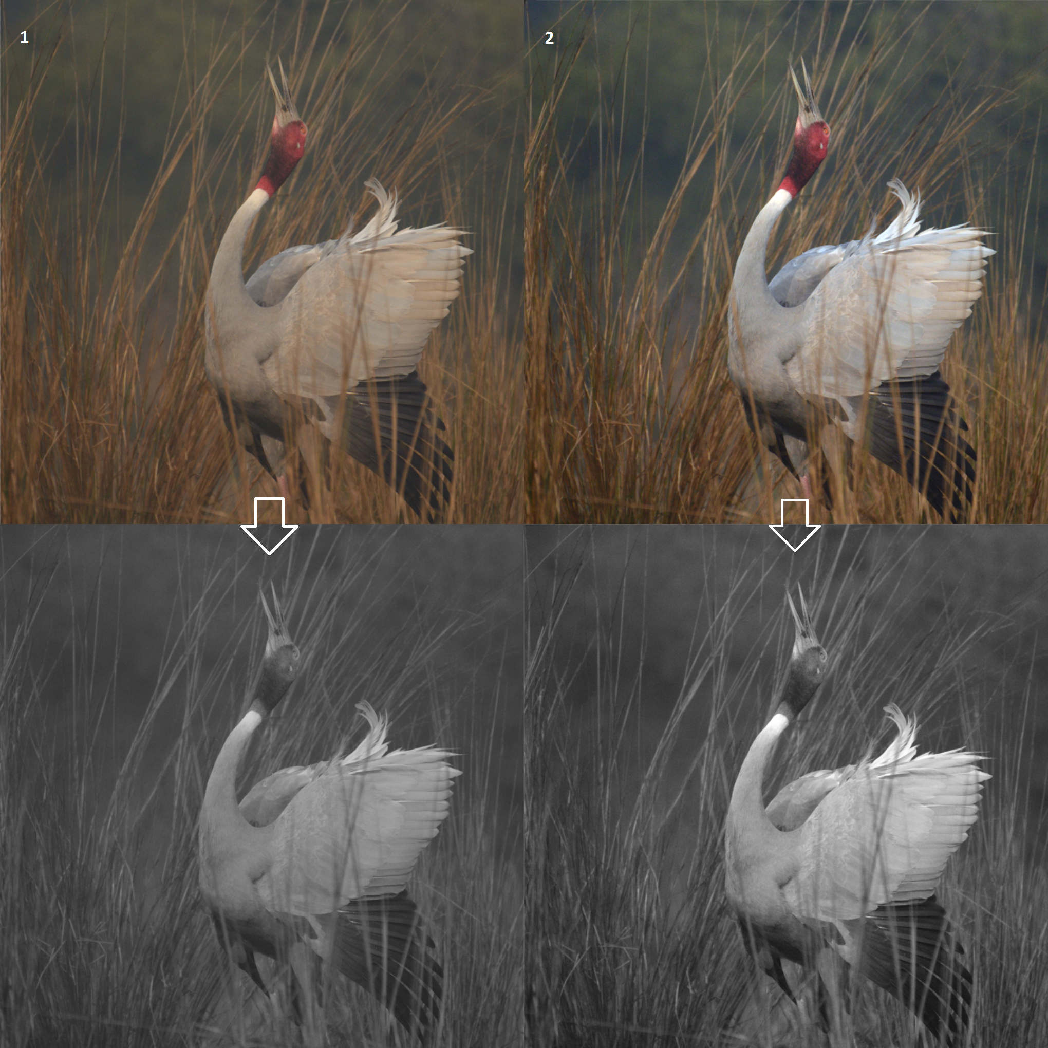
Taking a look at both black and white images, you can clearly see their differences. The first one has noticeably less contrast than the second because of color cast. You can bring out the same contrast later on by using curves or any other contrast enhancing tool, but with a color-corrected image, you start working on a picture with more contrast at step one. Since color gets converted into tones in a black and white picture, having accurate colors helps in making its B&W version show more contrast.
Let us understand the difference between color contrast and tonal contrast. In the picture below, you can see that the black and white version looks flatter than its colored counterpart. That is primarily because this particular picture has more color contrast (contrast in color ie., between blue and the red/orange and less tonal contrast, contrast in luminosity).

Most of us might have assumed a picture to be much better in its grey scale form, but when the conversion is done, we only feel disappointed as the picture looks way worse than what was expected. In a black and white picture, color contrast becomes literally insignificant. I have an article on Photoshop curves that has a simple “one-click” solution for color correction. Now let us take a look at the different ways in which we can convert our pictures to B&W starting from the simplest, leading to more complicated ones. The simpler ways will have the most constraints while the more advanced ways would give us increased control over our images.
Table of Contents
B&W Conversion in Camera
Even basic DSLR and mirrorless cameras today have built-in options to shoot in B&W, or have simple tools to convert color images to black and white. I have seen a lot of photographers do this as they want to have a preview of how their composition looks in greyscale on the field. It appears to be pretty simple and useful on the field. But this method of conversion is to be avoided. The photography workflow in making any photograph starts before clicking the shutter button and goes all the way to post-processing and publishing. The most desirable practice should be to get the maximum possible image quality in the camera and then process it to what we pre-visualized before clicking it. When we convert a picture to B&W in-camera, depending upon the make of the camera, we either throw away information, or the camera puts a B&W filter on top of your image. In the former case, you are throwing away valuable information and in the latter case, you would need the camera brand’s proprietary software should you need to revert it back to color. You might take a few test shots and convert it into black and white to see how it looks, but for the actual picture itself, shoot it without any filter and do the rest in post-production.
Grayscale Mode
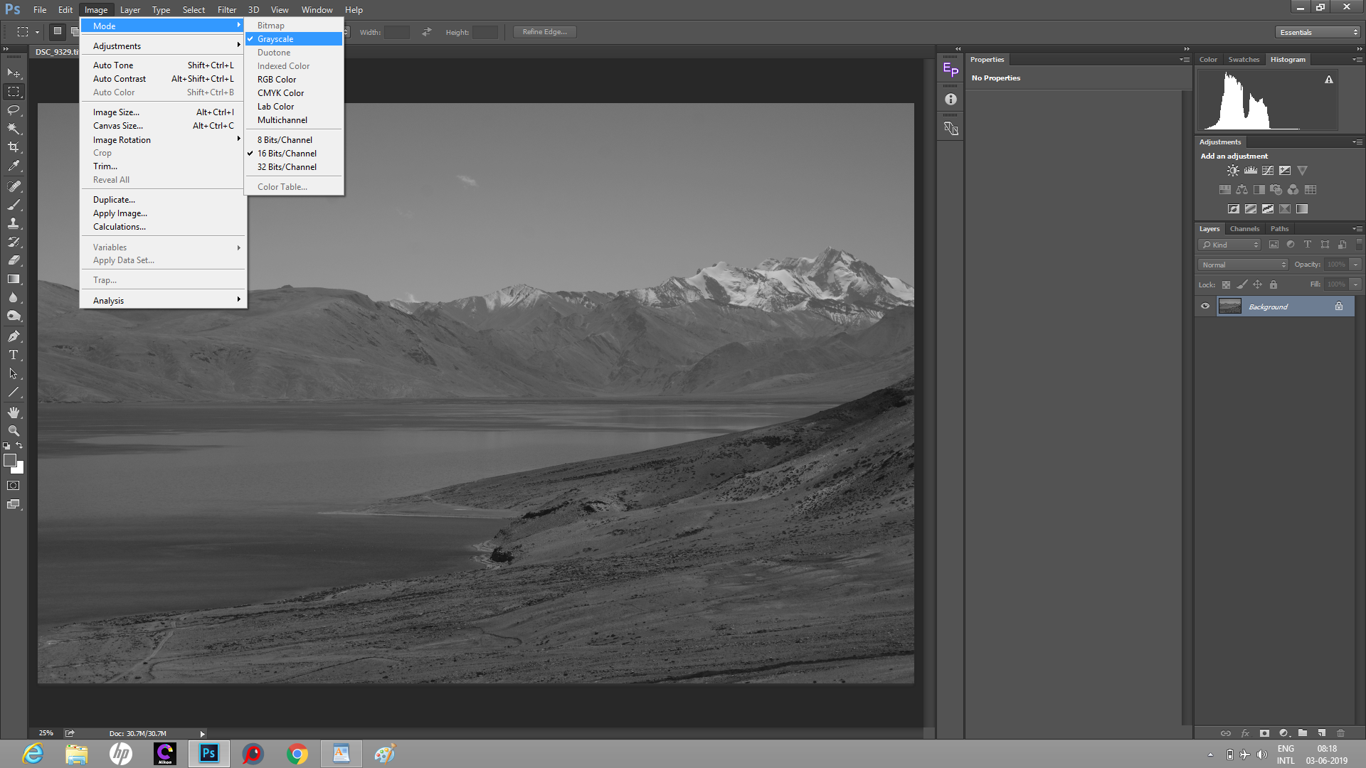
Once we have the image opened in Photoshop, we have a “one-click” option for black and white conversion. Go to Image->Mode->Grayscale menu. Just like the previous method, this too is destructive. Photoshop asks you if you are ready to discard the color information. As an effective practice, till the last step of our post-production, we do not want to throw away any information. In fact, one of the primary reasons to shoot RAW is to have maximum information which translates into maximum image quality. Even though Grayscale Mode is a simple option, it is to be avoided. Later on, you might add more tonal contrast using curves or other tools, but the workflow gets a lot easier if you get a better picture to work with during the conversion itself.
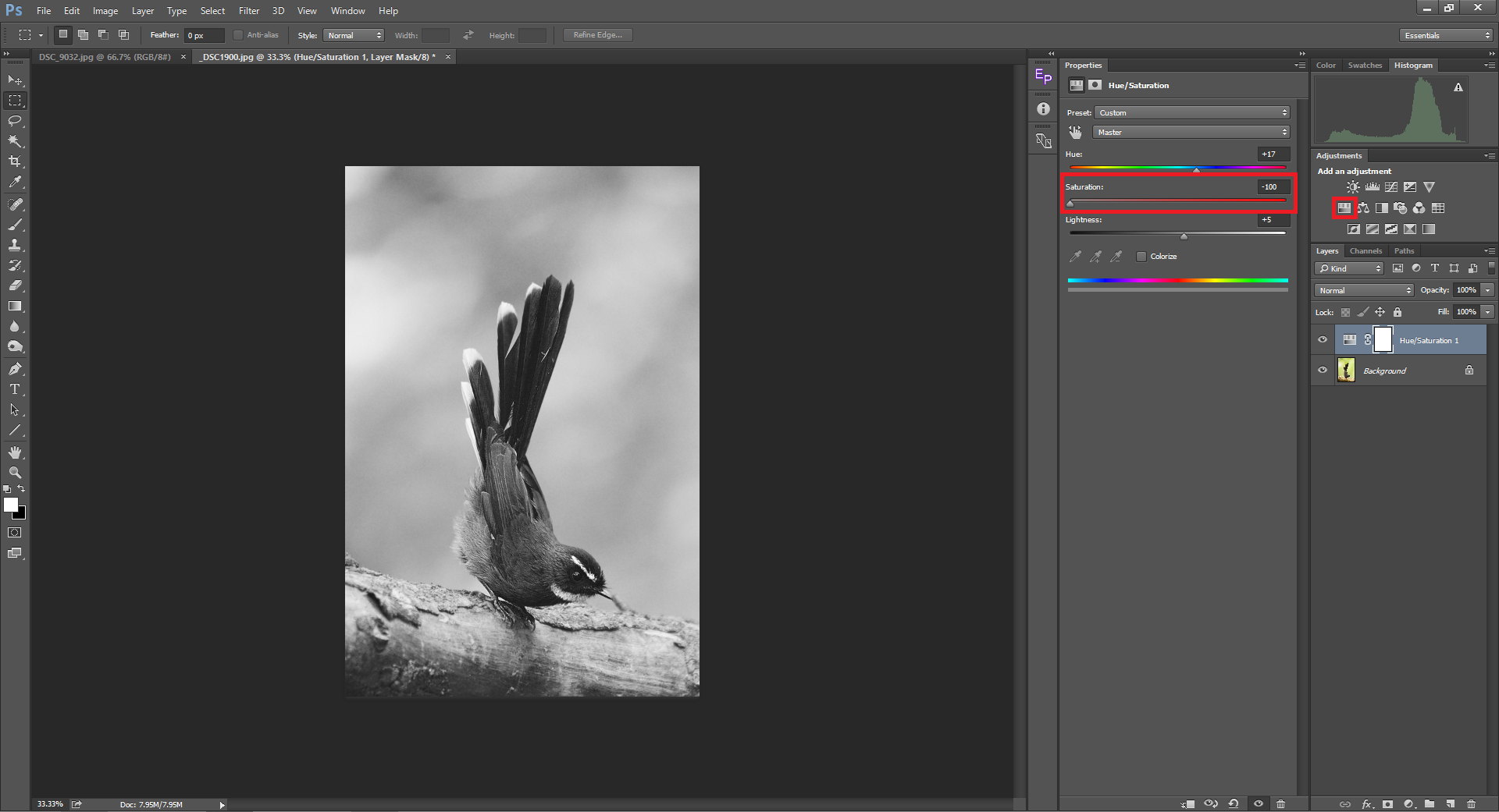
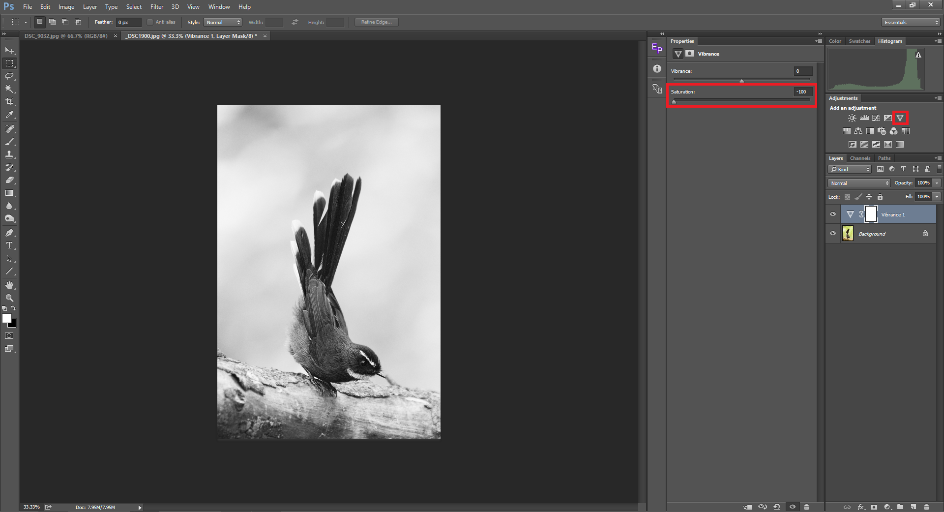
HSL/Saturation | Vibrance
Yet another simple way is to add an HSL/Saturation or a Vibrance layer on top of your image and then drag the saturation slider all the way to the left (-100). Both adjustment layers yield the same results when used for B&W conversion. The difference between the above two methods and this, is that by using it as an adjustment layer, we are not throwing away any information, instead we just hide the color information hence making it a non-destructive approach to editing.
Channel Mixer
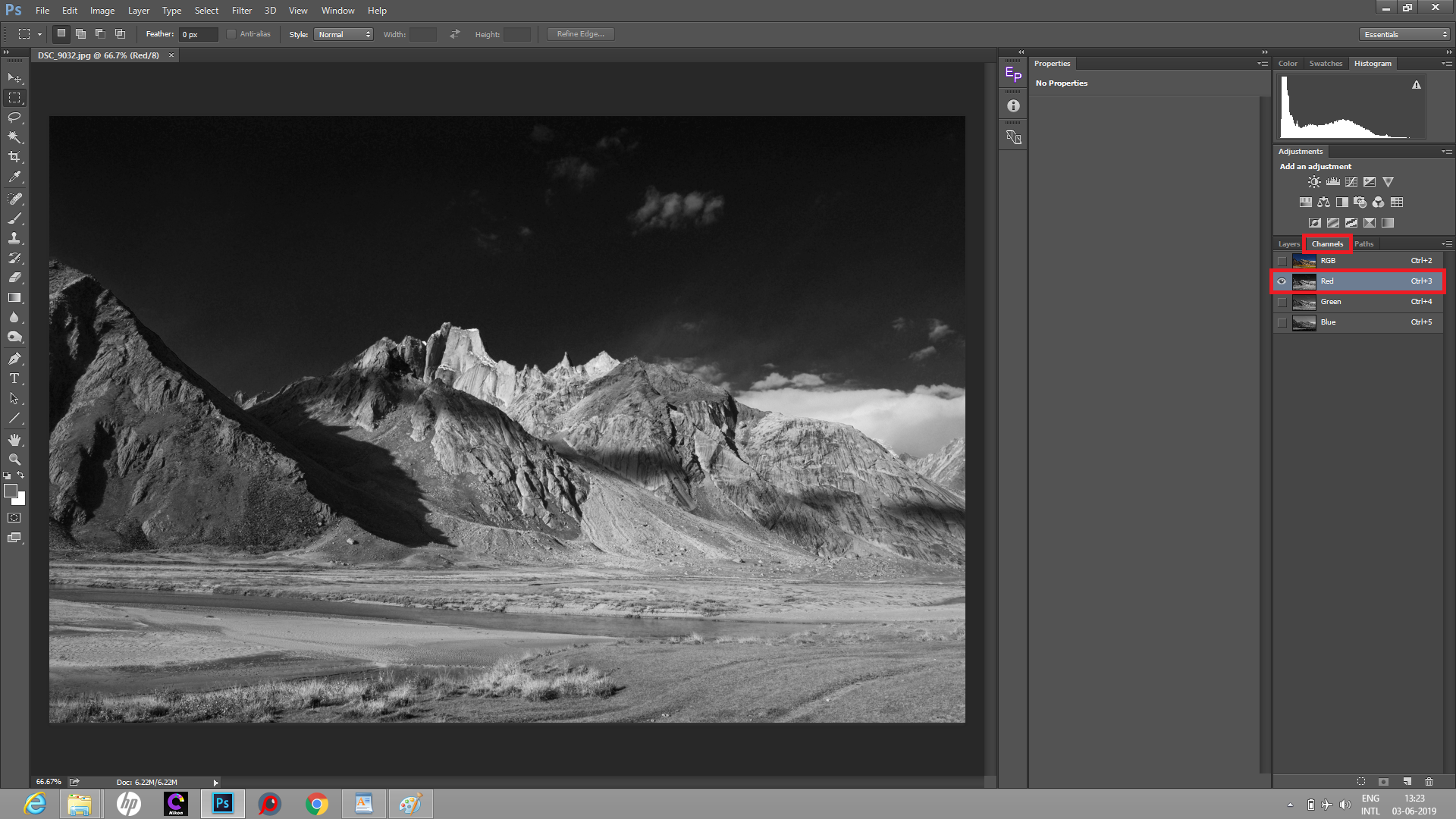
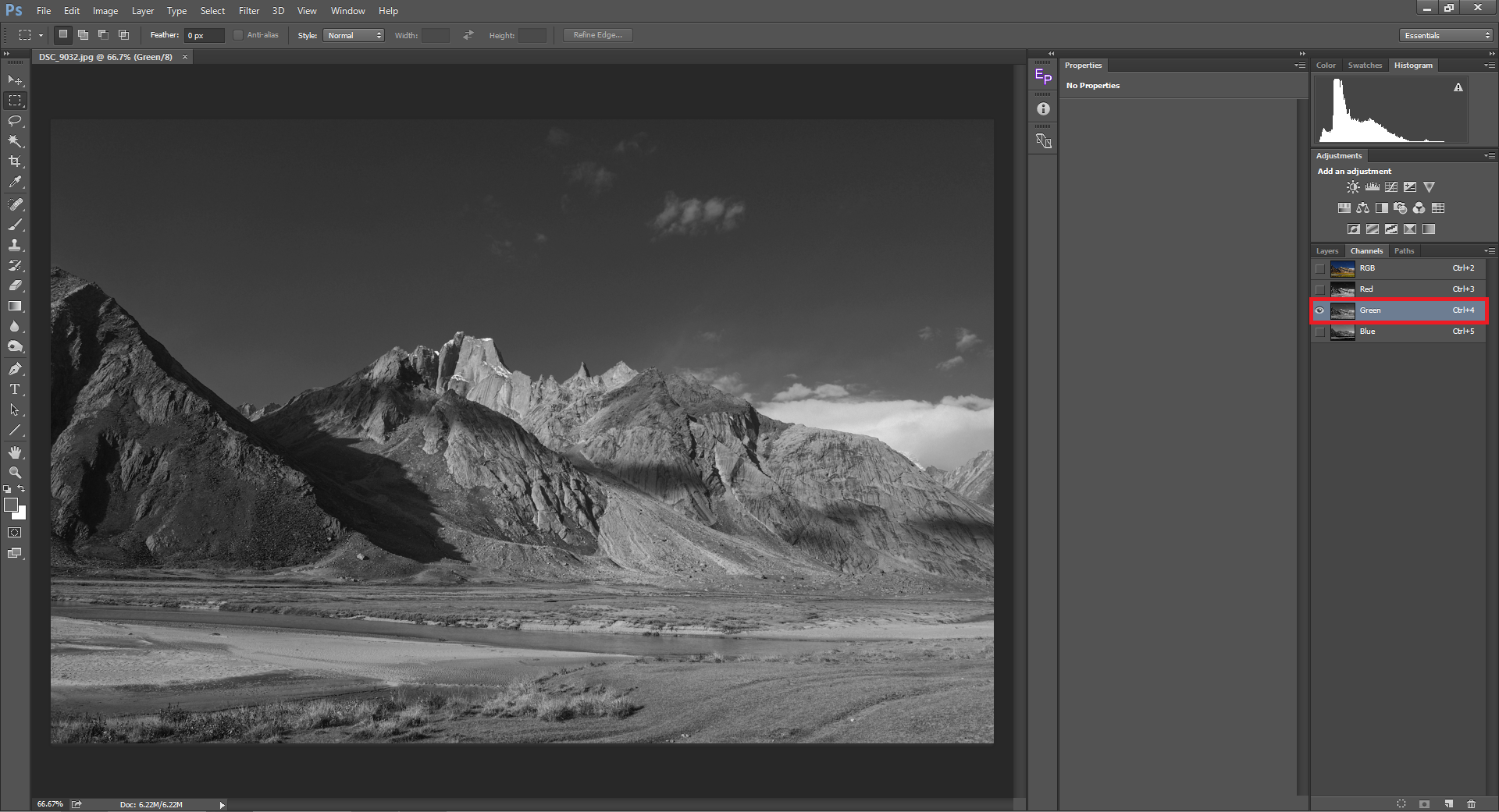
Before we proceed to Black and White conversion with the Channel Mixer, let us understand channels. You probably already know the fact that RAW images are color blind and that Bayer algorithm demosaicing process is what converts black and white images to color. During this process, three colors in the filter array are worked with, and as most of you have guessed right, they are Red, Green and Blue – the same three colors that are featured in Photoshop’s Channel Mixer. Let us see how different each channel is for a given image.
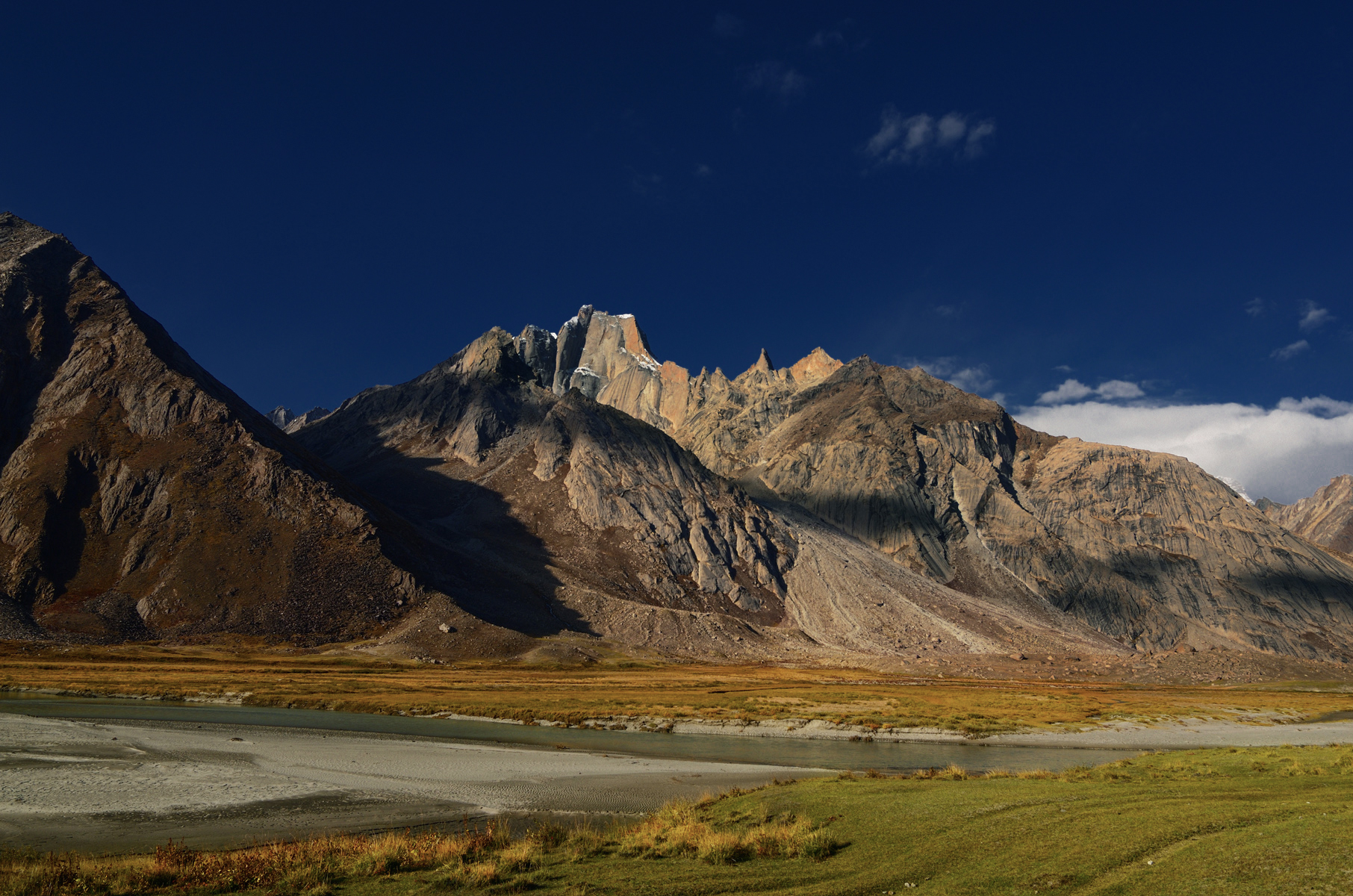
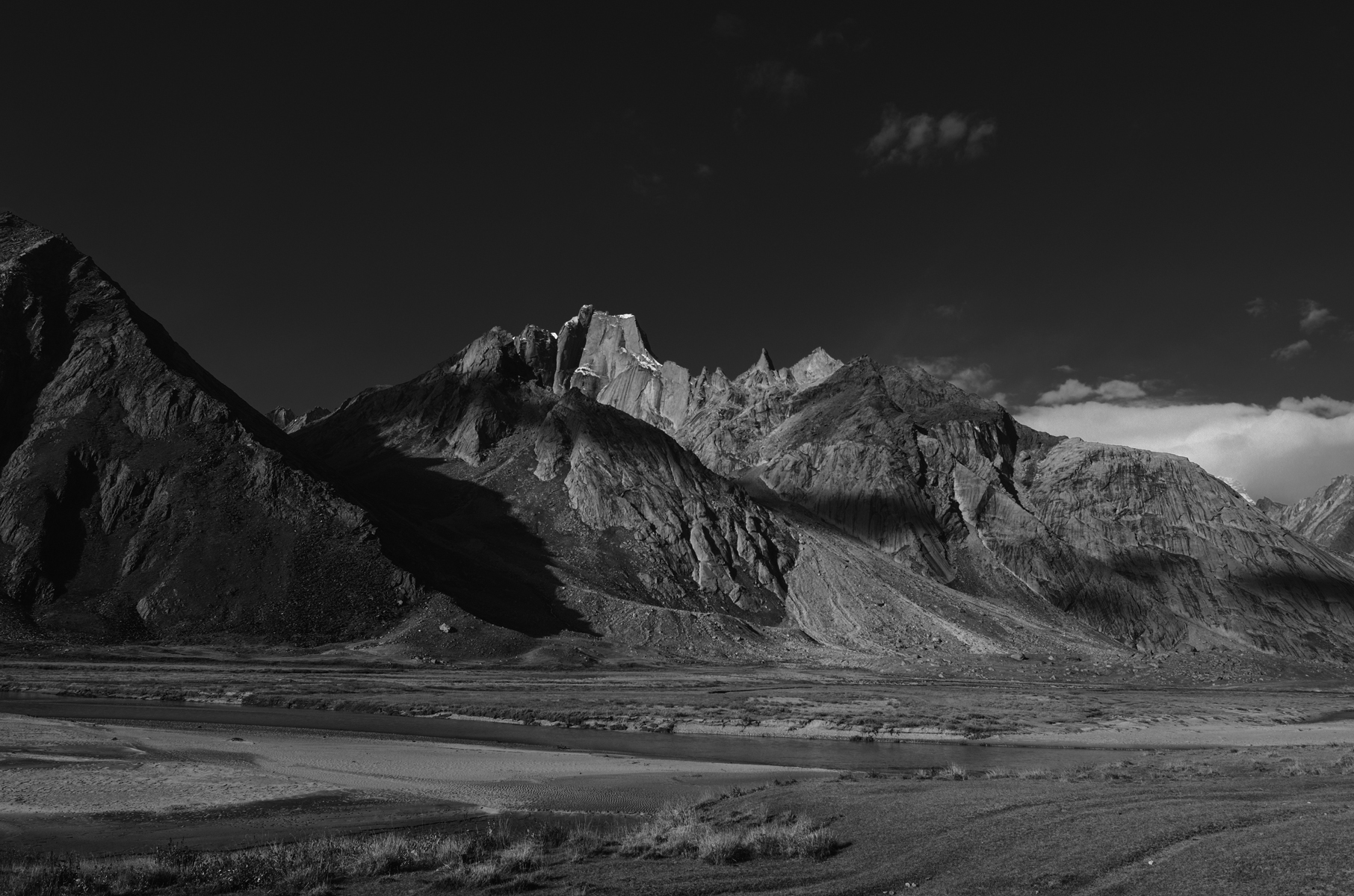
The monochrome image is a plain Grayscale version of its color version. Let us take a look at how the three different channels look.
Red Channel:
Green Channel:
Blue Channel:
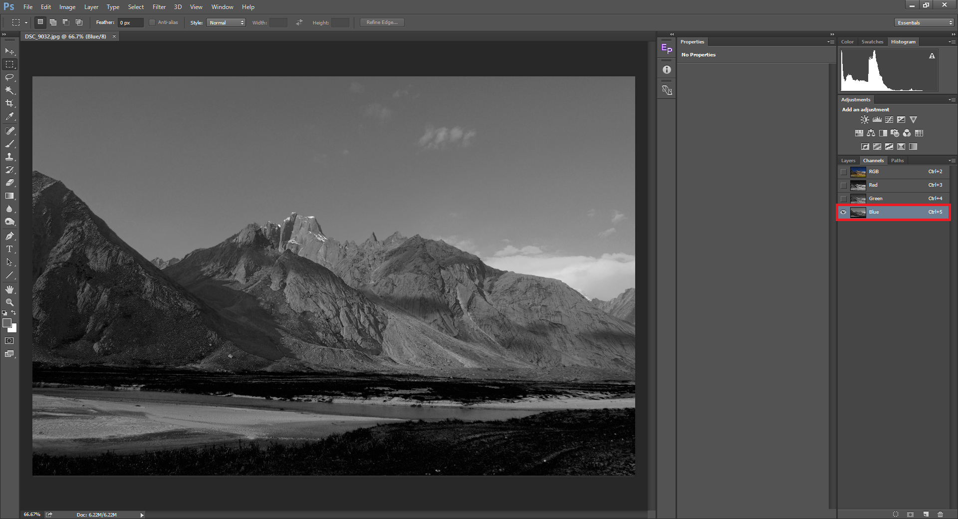
As you can see, the sky looks darker in the Red channel whereas the part of the mountains that contain yellows/reds appear bright. The opposite happens in the blue channel. The mountains appear dull while the sky appears much brighter than it did in the red channel. Also take a look at the grass in the foreground (green). It is almost underexposed in the blue channel. Taking a look at the green channel, the grass is properly exposed, while the sky gets darker again. What you see above is similar to having Red, Green & Blue filters on top of your lens and shooting it as a monochrome image. Red absorbs most of the other wavelengths allowing only reds to pass through, hence making the reds alone brighter. The same holds true for green and blue.
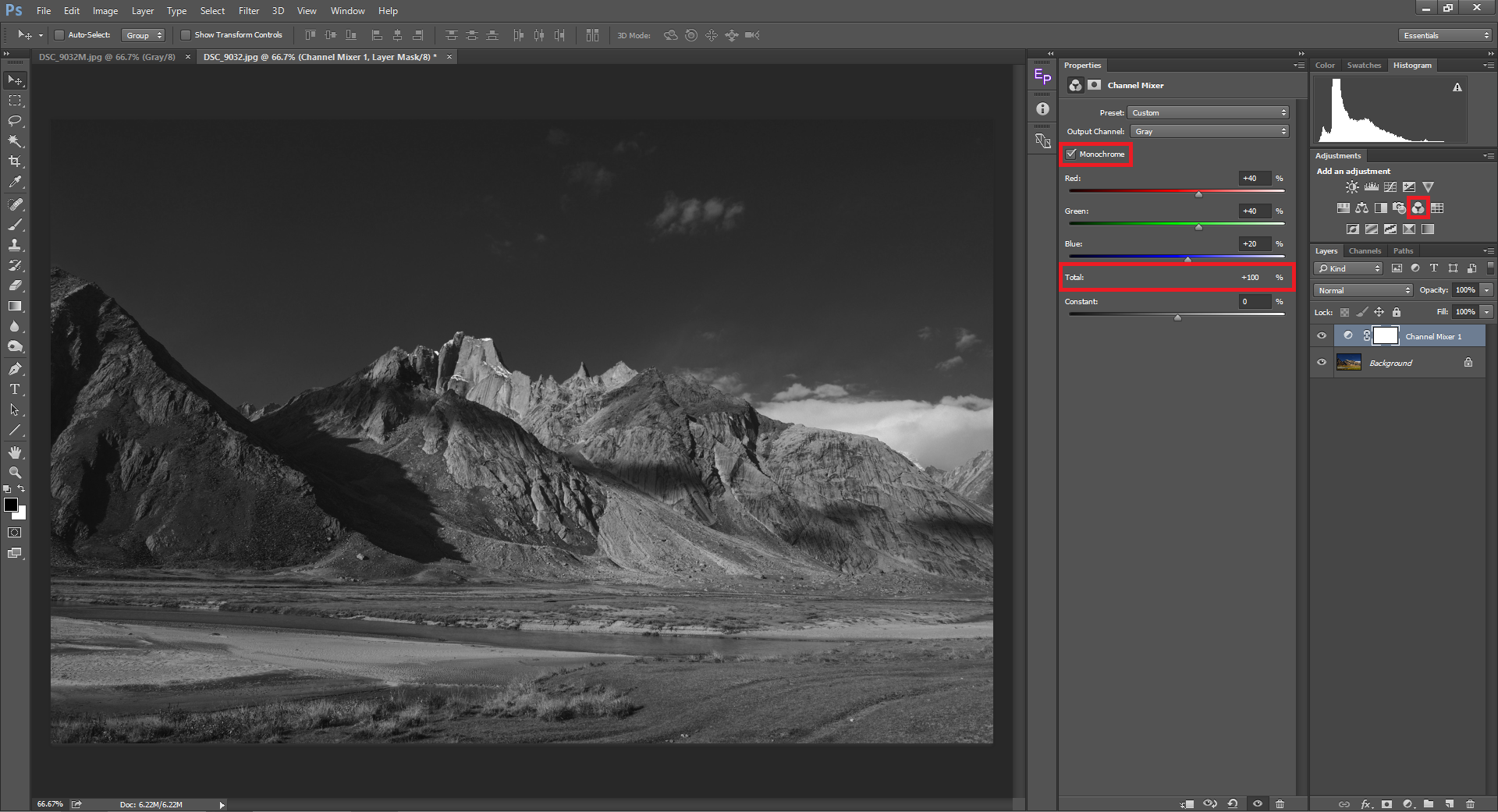
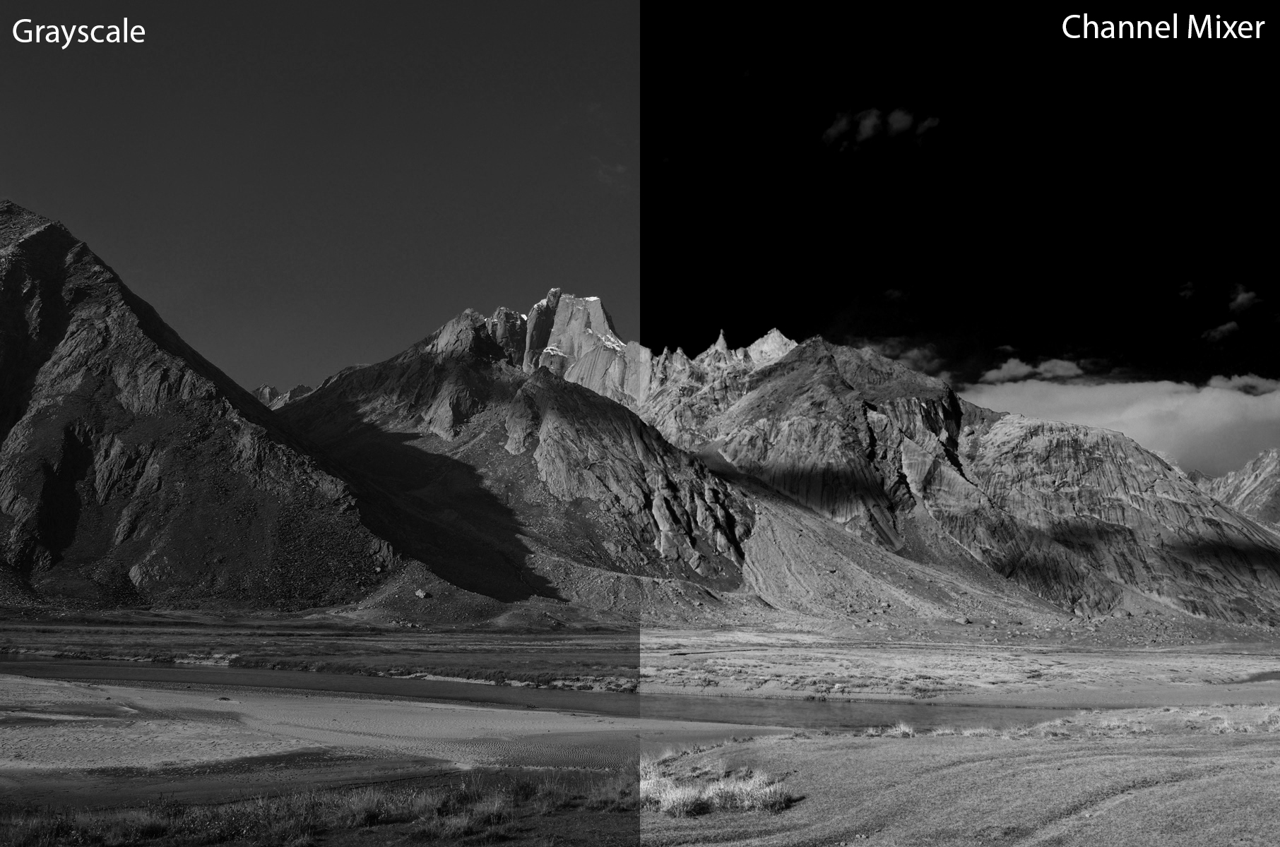
The channel mixer adjustment tool allows you to control the tonal ranges of red, green and blue individually. For example, if I seek to make it a low-key monochrome image, I might want to darken the sky making the foreground pop-out. You can add a new channel mixer layer by clicking on the Channel mixer tool in your adjustments tool palette. It is basically a tool mostly used for color correction which we can also use for B&W conversion. You can do it by clicking on the Monochrome checkbox. There are a few presets as well that the tool offers. By reducing or increasing one of the three primary colors (RGB) we can create contrast with this method of B&W conversion. With the above picture, I have darkened the sky to make the foregrounds pop, pulling the blues down while increasing the reds and greens up. Below the RGB channels, you will see “Total”. Whenever you adjust the channels, make sure this Total value does not get over 100% which will end up over-exposing certain pixels. Below Total, you will see another slider called “Constant”. It will increase or decrease the overall brightness of the image. The picture below shows the difference between a mere grayscale conversion using HSL/Saturation and conversion using the channel mixer adjustment tool. Due to the fact that the channel mixer tool can also be used to color correct an image, you can use it to remove color cast in an image which converts into haze when you use the same for B&W conversion.
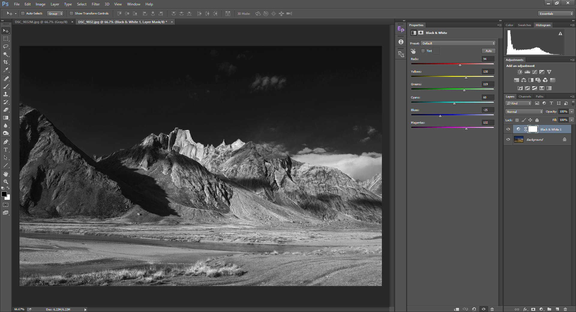
Black & White Adjustment Tool
This is the tool I prefer to use most of the time. It gives more control over the conversion than the channel mixer. With the Channel mixer tool, we have control over which of the three channels show up by how much. The black and white layer allows us to increase or decrease the tonal range of all six colors viz., RGBCMY (Red, Green, Blue, Cyan, Magenta, Yellow), the primary colors and their opposites. Unlike the channel mixer tool, the Black & White adjustment tool does not have a Total column. There is one important point to note though while using either the Channel mixer or Black & White adjustment tool. Reducing a tone too much is likely to add noise to the photograph. As with most other editing techniques, being subtle is the best way to go about.
B&W Conversion using Calculations
This is one of the most powerful tools for B&W conversion. If I end up with an image that does not give the desired result with B&W adjustment tool, this method is my last resort. You have to be familiar with blend modes in Photoshop to work with Calculations. What Calculations does is, it takes any two channels among the three (RGB) and masks one with the other using the selected blend mode. You can choose it by clicking on the Image->Calculations menu.
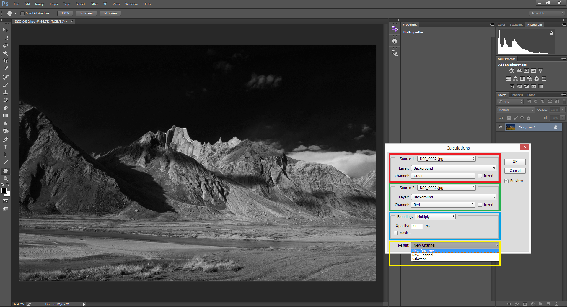
The illustrative image above will make us understand Calculations better. It takes the Green channel from Source 1 file (DSC_9032.jpg) and then masks it under the Red channel from Source 2 (same image) and blends it using the multiply mode. In a nutshell, the multiply blend mode makes the whites transparent and the darks opaque with all shades of gray in-between. The green channel of this image had the green, yellow and red tones exposed more and the blue tones under-exposed. The blues were under-exposed in the red channel as well. So it blended both and the result was a high contrast image with a darkened blue sky. If you feel that the conversion is too strong, you can decrease the opacity to the desired value. It can be done either by directly punching in the numeric value or by dragging the mouse over the Opacity label (the mouse pointer turns into a hand with two arrows on either side icon).
Conclusion
In this article, we looked at the different methods of black and white conversion using different tools. B&W images hold the key to certain emotions that colors can never replicate. The elimination of colors other than gray takes us to a whole new dimension and doing so requires more care than dealing with vibrant colors. I have kept the most important tip for the last. Excluding color correction, black and white conversion should be your first step of post-processing. In-fact your pre-visualization that a given photograph will end up as a B&W should happen even before clicking the shutter release. I have seen quite a lot of people doing it as the last step which is to be avoided. In case of any doubts, queries or suggestions, please put them in the comments section below. I shall try to respond to them at the earliest.
Thanks for listing these options. I agre with Bernard (above), the PS B&W adjustment tool looks very similar to the LR version. I’d go further, on the strength of a couple of trials – it seems to lead to vey similar results. My inexpert opinion – It’s the same “under the hood”.
I doubt that I will ever be easy with PS calculations – too many steps / chances to mess up! However I’m planning to look into the Channel mixer some more. This does seem to offer different possibilities – and it’s yet another piece of PS that I didn’t know was there. Thanks again!
Just calling atttention to the current issue of DIgital SLR Photography, a fairly rich whole issue on this. A bit of disagreement there about using RAW+JPEG b/w setting as a preview, at least for beginners having trouble visualizing a result from a color display. Also some examples of evaluating shooting situations that benefit from b/w as opposed to color processing, and that don’t. (Sometimes I “discover” b/w after the fact, other times set the )shot with it in mind.}
Many thanks Madhu, your essay came very timely for me, as I have just started to explore conversion to B&W. I want to go beyond NIK et. al. to have control over the process and your essay is exactly what I need. Good work!!! Hope you are going to bring even more!
Duża dawka cennej wiedzy, Dzięki ;)
Thank you very much Madhu for your interesting and detailed article. I was wondering how the B&W adjustment tool in PS compares to converting a photo to B&W in Lightroom, as the same adjustment sliders appear?
Thank you.
While kind of interesting, I think you have left out more powerful options for producing a monochrome image from a RAW capture. I’m concluding this stems from a lack of understanding of some of the more powerful color correcting tools in Photoshop. In truth, as you suggest there are as many different ways to get a black and white image as there are people. That said, I would suggest that learning more about the color adjustment layers is really valuable when it comes to really finessing (verses over processing) color and B/W images. The big clunky tools will certainly get the job done, but a part of the big challenge that I observe many struggle with is respecting the value relationships in the conversion, as well as the hue contrast. In my experience, this requires more time to understand the benefits of more subtle tools, which leads to less over-contrast, or over-saturation, or created dynamic range, as is fairly common among posted images. Producing strong B/W images is double hard compared to strong color images since you have so much less to create strong contrast (purple flower against a field of yellow flowers behind it). Any way, I think this is doubly challenging in landscape images, which I don’t shoot much.
Anche se il tema B&N è alquanto complesso lei lo ha trattato in modo semplice e chiaro, complimenti.