Photography Case Studies

In this article, we will present you a list of different case studies that our readers and our team have submitted over the years. Through these case studies, we hope that our readers will have a chance to learn how to deal with specific issues related to camera gear, post-processing and technique in the field. Some of these might be quite relevant to your photography or the particular issues you are dealing with. We will start from one of the earlier submissions from our reader Gaurav Rajaram, a bird lover and photographer from Bangalore, India. Below is what he sent me.

I use a Nikon 300mm f/4 paired with a Nikon D200 for my bird photography. While shooting, I notice that I do not get a clean background, which I would expect from a prime lens. I have got such a background in one image of mine, however, the subject is a little too soft for my liking (the picture is attached). Is there any way to get a clean background so as to help the viewers’ focus remain on the subject (the bird in this case)? Could you share a tutorial with us? I’m attaching sample images for this case study in JPEG format with full EXIF info.

And here are the two images Gaurav attached:
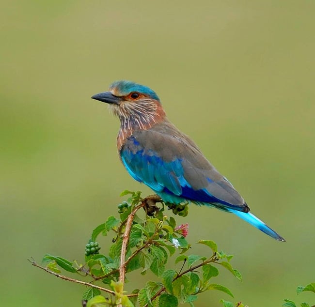
NIKON D200 @ 300mm, ISO 100, 100, 2857/1000000, f/4.0

The first image above is cropped, showing a pleasant out of focus background (bokeh) with a slightly blurry bird.
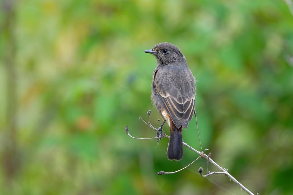
NIKON D200 @ 300mm, ISO 200, 200, 4000/1000000, f/4.0

The bird on the second image is sharp, but the background is busy.

So Gaurav’s question is why does the first image have a nice-looking background, but a blurry bird, while the second image has a sharp bird, but busy background?

Before I talk about the background blur, let’s first see why the first image is sharp and the second is not. Looking at the first image, the exposure is 1/350, f/4, ISO 100, while the second image is shot at 1/250, f/4, ISO 200. Both are shot in Aperture Priority Mode using Spot Metering. I am assuming that Gaurav was using a tripod or a monopod to get the above shots, because the shutter speeds are a little low to be hand-held for this lens and camera combo. As I explain in my “how to photograph birds” article, if you want to get sharp photographs when shooting hand-held, your shutter speed should be at least the total focal length of your lens multiplied by the sensor crop factor. So in this case, Gaurav would approximately need a shutter speed of 1/450 and above to get good results if he hand-held the camera + lens. But this is an approximate “suggested” value – with a good hand-holding technique, one could certainly get sharp results even at lower shutter speeds.

Why did I think that Gaurav used a monopod or a tripod to take the above images? Because the bird on the second photo, as well as the branches on the first photo appear sharp. The source of the problem on the first photo is focus – it is not on the bird, but a couple of inches off on the branch. Therefore, the only thing Gaurav could have done better, is reacquire focus and try taking another picture. If the lens he was shooting with has no front/back focus issues, he could have gotten good focus on the bird after several tries.

Let’s now talk about the background blur – the bokeh on both photographs. Why does the first image have a nice, clean bokeh, while the second photo has a busy bokeh? The explanation here is very simple – there was nothing close behind the bird on the first photo, while you can see leaves and branches of a tree behind the second bird. So the problem here is proximity of objects behind the birds. If you want to have a beautiful, creamy bokeh, you should pay attention to four things: focal length of the lens, aperture/depth of field, camera to subject distance and subject to background object distance. The longer the focal length of your lens, the larger the aperture, the closer you are to your subject and the further away your subject is from the background objects, the creamier your bokeh will be. Phew…that sounds too darn complex and too long! Basically, try to stay close to your subjects and move them away from the busy background. How could Gaurav have accomplished this on the second photograph? Aside from moving closer towards the bird and filling the frame (which would have probably spooked it), he could have changed the angle. If I see a busy background behind birds, I will move around the bird and try to find a spot that will have the least busy background. It is obviously not always practical, since the bird might not tolerate you walking around it, plus the environment you are in might not be suitable for circling like that. But you hopefully get the point.

The only other thing you can do, is try to fix the image in post-processing. Now this would require some advanced Photoshop skills, but if you have the time and patience in your hands, you can do it with pretty good results.

Here is my quick attempt to clear up the background on the second photo (took me 5 minutes):

And here is what I did in Photoshop:

  1. Create a duplicate layer
  2. Select the second duplicated layer
  3. Select Filter->Blur->Gaussian Blur
  4. Radius: 125 pixels, Click OK
  5. Select the second layer and set it to “Overlay” in the Layers panel
  6. Pick the eraser and start erasing the bird
  7. Work on the edges with the eraser tool and get rid of extra branches
  8. Set the second layer back to “Normal”
  9. Merge both layers
  10. Sharpen the image
  11. Crop the image
  12. Resize the image
  13. Save for Web

I did it very quickly and obviously did not do a good job with feathers, but I hope this shows what you can do with the background in situations like this.

Hope this helps. Please let me know if you have any questions!

Our second case study was submitted by our regular visitor Dennis, who lives in Singapore. Here is the description of his problem:

Hi Nasim, I have tried night shots using 35mm f/1.8G. It is a landscape shot with river reflecting street lamps. I do it handheld, aperture mode, f1.8, shutter 1/5sec, ISO 1600. Strangely despite a dark black sky, the shot came out reddish sky and the center focus point have some reflected light that shouldn’t be there. I tried to shoot other night shots on sky, it appeared to have this reflected light. The pattern is random, depends on what I shoot. I don’t understand why. Do I have to take out the UV filter attached on it? I have read through these tips, but couldn’t understand what causes this to happen. Yours look sharp!

Dennis sent me the following picture as an example, which was taken in a public park in Singapore:

Here are my comments on the photo, along with the solution to the problem:

  1. Since the image was shot at 1/5th of a second @ ISO 1600 (I looked at the EXIF Data), there are clear signs of camera shake and noise when the image is viewed at 100%. Photographing scenes like this hand-held is not recommended, because you not only introduce camera shake, but also unnecessary noise due to high ISO. The camera shake happened because the hand-holding rule was not followed. If you put your camera on a tripod or some other stationary object, you could have used ISO 200 and a very slow shutter speed without introducing camera shake.
  2. Another problem is that you shot the scene at f/1.8 or “wide open”. It is understandable that there was not enough light, but when you take a picture of a scene like this at maximum aperture, due to the small depth of field, your nearby objects will all appear out of focus.
  3. In a night scenery like this, it is tough for the camera to guess what the right white balance is, due to a mixture of natural and artificial lights. If you shoot in RAW, you can change white balance in Lightroom later.
  4. The image is not leveled. When you take images of straight objects or horizon/reflections hand-held, always try to align the horizontal grid inside the viewfinder with the horizon or straight line. Although it is easy to level an image in Lightroom, you would lose a significant portion of the image, because Lightroom would have to cut off from all sides to properly level the image.
  5. The spots you are seeing in the sky and in the water are lens ghosting/flare. This might have also been due to a filter that you have in front of the lens. Did you buy a quality filter? Is it an MRC (multi-coated) filter? Try a test next time, go to a similar location with lots of light, take a picture and if you see ghosting like this, remove the filter and take another picture. Then compare the two to see if it is the filter causing it. In this case, it is very simple to remove the ghosting spots in Lightroom, but I bet you do not want to deal with it. Unfortunately, many lenses suffer from ghosting/flare and it is quite normal to have these kinds of issues when shooting against bright spots of light. Only the expensive, ultra wide-angle lenses are capable of producing images with minimum flare…

So, what would I have done if I took the same scene with your camera? I would have either put the camera on a tripod (ideally), or put it on something that does not move, then set ISO to 200 (Auto ISO: Off), set aperture to f/8 or f/10 and shot in RAW. If flare spots were caused by the lens, I would have to deal with them in post-processing. Removing those spots in Lightroom does not take much time…

A good friend of mine, Yechiel Orgel, who is a professional commercial photographer specializing in product photography out of NYC, contacted me last week and asked for some advice on shooting the New York City Skyline from a rooftop of a luxury condo building in Brooklyn. The aim of the shoot was to show the NYC skyline that can be seen from the roof of this building. The building is located in downtown Brooklyn, roughly 3 avenue blocks from the water. The client apparently wanted to get a really large print, which would be displayed in the lobby of the building, possibly made into a wallpaper. Yechiel was a little uncomfortable with these requirements, because it is not his area of expertise and he has never produced prints that large. So he wanted to get some recommendations on how to best handle the situation. He presented a list of the following requirements:

  1. The image needs to show the surrounding area, along with the NYC skyline in the background
  2. The NYC skyline needs to be clearly visible, with the least amount of haze
  3. Resolution and detail level need to be high, because the planned print size is 9′ long
  4. Access to the rooftop is mostly limited to business hours, with some freedom after hours

Here is the view from the rooftop that had to be captured:

Along with a general recommendation on how to address the above requirements, Yechiel had a couple of important technical questions to address. First, he wanted to find out what the best time for shooting the NYC skyline would be – Sunrise, Midday or Sunset to avoid the haze. Second, based on the print size requirements, he wanted to find out what camera would fit the job – Nikon D600, D800 or perhaps even medium format. Lastly, he was curious about what lens to use. He had the Nikon 14-24mm f/2.8 and the 24mm f/1.4 lenses in mind and did not know if those were adequate for the job, or if he needed something else. Gear was not an issue, because he was going to rent and expense anything that he did not already have.

I wrote a detailed response on how I would shoot the scene and provided some recommendations, which I wanted to share with our readers.

In terms of the time of the day, I was going to recommend to shoot early in the morning (preferably at sunrise) to get the best colors and minimum haze. Haze is mostly environmental in large cities and gets worse during the day due to traffic and dust, so my preference is to shoot in the mornings to minimize haze as much as possible. Unfortunately, that was not an option for this particular case, because access to the rooftop was limited to normal business hours. The client indicated that they could work with times close to sunset and perhaps even past sunset, but definitely not before 9 AM. Based on this, I recommended Yechiel to arrive at least an hour before sunset, set everything up and shoot during and after sunset. Ideally, a sunset shoot would incorporate colorful clouds and beautiful tones, but if the weather did not cooperate, then shooting past sunset at slower shutter speeds could be a good alternative.

In terms of gear and printing requirements, I recommended to go with the Nikon D800 and use the panoramic photography technique to get the maximum resolution. Looking at the scene, the most important question was if there was anything in the foreground that needed to be captured. After talking to Yechiel and seeing the above image, I realized that there was no need for any specialized “no parallax” panoramic gear. So a typical tripod with a ballhead or a gearhead would do perfectly fine. I recommended to go for a single row vertical panorama, because multi-row panoramas can get quite complex and require a good discipline and proper setup. Basically, the idea was to level the tripod head, then allow for panning motion on the head and take vertical shots from left to right or right to left, with about a 20-30% overlap between shots (while keeping exposure the same between shots). Next, those images would be taken to Photoshop or other third party applications and merged together to form a single, high-resolution image. The big variable was the highway to the right of the scene with moving cars. If he wanted to eliminate cars from the scene, it would involve more planning and plenty of work in post with some blending techniques using multiple shots, and possibly use of cloning tools. If he went for really slow exposure times and capture the movement, he would have to find ways to blend those lights after stitching the panorama, which would also be demanding in terms of post-processing skills. Since Yechiel has never worked on high resolution photography and panoramas, these concepts were a little foreign to him. Knowing this, I recommended to go for a “safe” shot first, in case something goes wrong with stitching a panorama later. 36 Megapixels is still a lot of resolution, so if if the pixel-level quality is good, an image could be up-scaled to very large prints. Only once he was fully satisfied with the shot, I recommended to experiment with the vertical panorama technique.

For settings, I recommended to go for the sweet spot of the lens, which is generally the f/8 – f/11 range. Since the scene was going to be captured on a tripod, I recommended to go with the base ISO of 100 and turn off Auto ISO. I also suggested to use full manual mode, especially for the vertical panorama shot for shot-to-shot consistency, which is pretty much a requirement for stitching panoramas. It goes without saying that VR should generally be turned off when shooting from a tripod and remote cable release or Mirror Lock-Up, in combination with the Exposure Delay mode should be used to reduce vibrations when shooting at slow shutter speeds. For focusing, I recommended to use Live View and turn off autofocus (without touching the focus ring) for the subsequent shots. Since the nearby buildings are 50+ feet away, they would already fall into infinity using a wide angle lens, so I suggested to use one of those buildings for focusing.

In terms of lenses, I recommended a zoom lens, something like the Nikon 24-70mm f/2.8 or Nikon 24-120mm f/4 instead of a super wide angle lens like 14-24mm f/2.8 or a prime like 24mm f/1.4. Why? Because wide angle lenses are designed to photograph objects at close distances – they are not meant to be used for these kinds of shots. At such distances, the shot would be too wide and the objects would appear tiny, with a lot of space wasted. And going too wide is a big problem for panoramic shots as well, because those can be painful to stitch due to distortion. Yechiel already had a 24-120mm f/4 zoom, so I told him that it would do the job just fine. And why not a prime lens? Because he had limited space on the rooftop and he needed the versatility of a zoom to be able to try working with different focal lengths. I told him that he would probably use the 35-70mm range for this type of a shot, depending on what he wanted to capture.

Yechiel sent me the final image that he captured earlier this week and from what I can tell, he did a good job with successfully completing the task. Here is his shot of the scene that he presented to the client:

NIKON D800 + 24-120mm f/4 @ 75mm, ISO 100, 13/1, f/11.0

He was pretty happy with the result, but said that he is still working on the post-processing.

From what I can see, the detail level is pretty high and the customer should be able to make a 9′ long print. Although some colors in the sky would have made the image more appealing, I know that it was outside Yechiel’s control. I think he did a fine job with capturing the shot, especially considering that it is not something that he specializes in.

Would love to hear the opinion of our readers. Do you like the end result? Or would you have captured the scene differently? Please let us know in the comments section of this article!

One of our readers sent me some sample images from his camera, asking why his photos are not sharp and often too bright and flat-looking. He is using a pro-level body (Nikon D700) and very good lenses like the Nikon 24-70mm f/2.8 and the Nikon 16-35mm f/4 that he bought after reading my reviews and he is disappointed with his setup. Here is what he wrote me:

I really need your help.

I own the Nikon D700 + Nikkor 24-70 f/2.8 + recently bought the Nikkor 16-35 f/4 after reading you review. I wanted the 14-24mm f/2.8, but without filter it is a big problem for me. Anyway, I have owned the camera for about 8 months and I am not satisfied with the results…

I mostly shoot in RAW with Active D Lighting set to “Auto”. My photos never seems as sharp as the samples you put on your site and they always looks too bright and flat. It’s like they are “dead” without contrast and color and I don’t know what’s wrong with my setup. Maybe it’s a problem with the camera sensor or I don’t know what… I am not a pro photographer and not even close, but I expert much better results from what I have. I mean I can always fix in post-processing software like Aperture 3 which I have, but i want great photos out of the camera without playing with it too much in post.

Please let me know if you see what the problem is and if there’s something wrong with what I am doing? I totally feel hopeless…

Thank you for your time.

Let’s go through each photo and see what is going on here (images are extracted out of RAW without any post-processing):

  1. The first image (below) was shot at 48mm, f/6.3, 1/160, ISO 200 in “P” mode (Program/Auto Mode). When photographing such scenes, I always recommend to use f/8 and higher, because you are including close objects in your frame and you want to make sure that they stay sharp. At 48mm f/6.3, the sand sand on the low part of the frame simply looks very blurry. Composition also lacks here and the sky looks very pale and there is too much of it in the frame:
  2. For the second image, the photographer once again used the “P” mode at 42mm, f/3.5, 1/80, ISO 200 and for some reason dialed +1 EV (Exposure Compensation). This image is a clear indication that the photographer lacks some technique – f/3.5 is too shallow for this shot and +1 EV resulted in the image getting overexposed. In fact, all of the photos, except for the first one, are overexposed by at least a full stop. Slightly overexposing images is actually good (expose-to-the-right technique), because you can recover a lot of data from those images. However, more than 1-1.5 full stops of overexposure can actually lead to loss of highlights and brighter tones. So you have to be careful when “exposing to the right“. Similar to the first photo, this one also lacks composition and I’m not sure what the photographer was trying to capture here:
  3. This third image is grossly overexposed, by at least 2 full stops. Here is the EXIF data: 66m, f/10, ISO 200, +1 EV, also shot in “P” mode. While the aperture seems to be good, again, I don’t know why +1 EV was dialed on the camera. I’m guessing he simply forgot to turn it off after dialing it earlier. All four photographs were taken at noon (around 12 PM), again, not the best time to take pictures:
  4. The last photograph is much better in all regards compared to the above three, but there is still too much of the pale-looking sky in the frame. Exposure settings are: 27mm, f/9.5, 1/45, ISO 200, shot in Aperture Priority mode. The sky is blown out, because the camera was trying to balance the dim ground and the bright sky. The sky is certainly recoverable, because you can see some blue colors. The camera was pointed almost towards the sun (it was on the right side of the frame), so the right side of the sky is irrecoverable. Again, technique is clearly a problem here – the aperture value of f/9.5 looks odd, I’m guessing a result of playing with camera settings earlier:

In terms of sharpness, all of the images look pretty good. Let’s take a look at a 100% crop from the above image:

NIKON D700 + 16-35mm f/4 @ 27mm, ISO 200, 1/45, f/9.5

Considering that there is no sharpening applied to the RAW image, there is plenty of sharpness and details in the above photos. So there is definitely nothing wrong with the camera or the lens that the photographer used here.

So, what is wrong with the above images? Here is a quick summary:

  1. Camera technique – the photographer needs to learn how to properly expose images. I highly recommend starting from the exposure triangle and understanding what aperture, shutter speed, ISO and exposure compensation do in various camera modes. The images came out overexposed, because exposure was not set correctly on the camera and +1 EV was dialed in some of the photos. Due to difficult lighting conditions (sky being much brighter than the ground), I would also have used a Graduated Neutral Density filter for the sky. Next, I would read about camera to subject distance and depth of field and get a good grasp on how to properly control camera aperture.
  2. Composition – I just don’t see anything interesting in the above photographs. Composition clearly lacks here and there is nothing that catches the eye. Simple things like rule of thirds could have helped here (see my examples below).
  3. Post-processing – much of the “punchy colors” and sharpness you see in my images come from the way I post-process images. Whether you like it or not, post-processing is a big part of photography and every photographer must learn how to work with images in Photoshop/Lightroom, especially if they were shot in RAW.

So, what would I do with the above photos? Here is a result of 2 minutes of changes in Lightroom (no Photoshop):

The sky doesn’t look nice, but I do not know how else I can make it look good. Any suggestions?

And here is what I did in Lightroom:

  1. Properly aligned, then cropped images.
  2. I changed camera profile to “Camera Standard” (under Camera Calibration).
  3. Added between 10-30% to “Blue Primary” (under Camera Calibration) to add more blue colors to the sky and water.
  4. Dropped some Graduated Filters with -1 exposure with slight blue color to paint the sky.
  5. Added some sharpness (Amount: 50, Radius 1.0, Detail: 50, Masking: 0).
  6. For some of the images added some Fill Light and a little bit of Saturation.
  7. Bumped up Clarity to +40-+60.

Thus, there is nothing wrong with the camera or the lenses our reader is using. If good technique, along with proper alignment and composition were employed, the images would have looked much better right out of the camera.

One of our readers sent me an image with the following question as a Case Study:

I have no idea what this streak is on my pictures could you give me an idea? I bought a new lens, because there was a small scratch on my old one. However, the same streak appears in the exact same place. It is a line about 1 inch on the top right of my pics. Usually seen when shooting skylines, clouds. etc.

Here is the attached image:

NIKON D70 @ 24mm, 1/160, f/16.0

So, what are those spots and streaks that are clearly visible in the above image? First, the good news – the above spots and streaks have nothing to do with the lens. In fact, lens problems and even major scratches on the front lens element rarely ever show up in images. Unless the rear lens element is damaged/scratched, you should not see any lens defects show up in your images. Those of you who have seen my articles on cleaning DSLR sensors probably already know what these are. They are dust spots, along with a piece of hair that is sitting right in the middle of the camera sensor (the long dark line streak). Now the bad news – whenever you see something like this consistently show up in your images when shooting at small apertures, you will have to either clean the camera sensor yourself or send your camera for cleaning in order to get rid of all this dirt on the sensor. The latter is a safer method, but will cost you a lot of money to continue sending your camera every time you need it cleaned; plus, you won’t be able to take pictures while it is in service. The cheapest method is to clean your camera sensor yourself. As I have shown in the my cleaning DSLR sensor article, you can clean a sensor very quickly without any hassles, as long as you have the proper tools. Is it risky? Unless you do something stupid, the procedure is very safe (obviously, I take no responsibility for any potential damage to your camera). Just watch the video and then watch the more detailed videos on how to clean DSLR sensor and keep your camera gear clean for more info.

Another case study was submitted on Nikon D7000’s handling of colors. Here is what our reader writes:

Hello Nasim, 2 months ago I bought my first Nikon camera – D7000. I’ve read much about it and decided that this is best camera for me, but recently I am noticing that in certain lighting conditions colors are inadequate. There is an awfull yellow-green color, especially noticeable on people’s faces. Skin on pictures is also has strange color. Changing wb temperature is hardly helping. As an owner of the D7000 could you tell me if this is the problem of all D7000 cameras or is it malfunction of mine? What can i do to fix this?

And here is a sample image that was attached to the case study:

NIKON D7000 @ 18mm, ISO 1000, 10/250, f/3.5

Our reader can relax – there is nothing wrong with his D7000. In fact, even the best camera in the world would not have produced an image with better skin tones and colors. Why? Because in this case, the ambient light around the subject is what is affecting the colors and skin tone. The picture was taken in the evening, after sunset, so the light is coming from what seems like a mix of incandescent and fluorescent lamps over and on the side of the subject. To understand how artificial light affects skin colors, one needs to fully understand “white balance and how it affects colors in images. The hardest and nastiest light that can make a photo impossible to fix is when multiple light sources are thrown into the mix – for example, when there is natural light on one side, bulb light on another and some flash on the front. You might have been in a situation when you want some of the ambient yellowish light in the room to be visible and yet want to throw some flash on your subject to brighten up the face. The end result – a very ugly picture with blues and yellows that is close to impossible to fix in post-processing. How do you go around those types of situations? The answer is not as simple, because it depends on the type of light around you, but you could use some very simple techniques like using gels on your flash to balance the light coming out of flash with the ambient light. These and other flash photography tips and tricks can be found in our “Flash Photography Tips” section of the website. We will be adding more content there very soon, perhaps in another “flash photography month”.

I asked my post-processing guru Lola to try to edit the above image and see if she can fix the skin tone and here is what she came up with:

NIKON D7000 @ 18mm, ISO 1000, 10/250, f/3.5

She is currently working on a big project and once she is done with it, she promised to write a detailed article on working with skin colors and how to correct them in post-processing. The above image was sent in resized JPEG format (it is close to impossible to change white balance in JPEG), so she was limited in what she can do with it. It took her a couple of minutes to do this and I then resized and sharpened it a little for the web.

Another alternative is to convert an image to black and white, which should even out the skin tones. Here is her second version of the photo in B&W:

NIKON D7000 @ 18mm, ISO 1000, 10/250, f/3.5

When photographing subjects, if you are not sure what White Balance (WB) setting to pick, you should shoot in RAW. When you open a RAW photograph in Lightroom or Photoshop, you will have the option to change WB to whatever you want. See my JPEG vs RAW article for more information on why you should be shooting in RAW. Recovering images with incorrect WB will also be much easier in post-processing:

The subject of skin colors can be rather complex, but once you employ good post-processing techniques, use proper lighting and have a solid knowledge of white balance, you can achieve great results when photographing people.

One of our readers, Steven Ross, was kind enough to send an image to me as a Case Study. He is wondering why his image did not come out sharp, with some light spill and overexposure. Here is what he sent me:

NIKON D5000 @ 34mm, ISO 200, 15/1, f/5.6

And his comments:

I used the camera on aperture priority mode and on a tripod but it appears that since the monument was being lit by spotlights the shutter speed was too long and the monument seems much brighter/overexposed compared to the rest of the scene.

I was just curious how to get the monument sharper when it is so much brighter than the surrounding dark area. It was roughly 20+ mins after sunset and pretty dark.

Here is a 100% crop from the above image (unprocessed):

As you can see, the image is indeed not very sharp. In addition, the monument is overexposed and there is that extra white line on the right hand side that does not look very appealing. So, what happened here? Here is the basic exposure information (the rest is preserved in EXIF):

Camera: Nikon D5000
Lens: Nikon 24-120mm f/4G VR
Focal Length: 34mm
Aperture: f/5.6
Shutter Speed: 15 Seconds
ISO: 200
White Balance: Auto

My Analysis: When dealing with very long shutter speeds (in this case it is 15 seconds), you have to make sure that the camera stays absolutely still on a sturdy tripod, from the beginning of the exposure, to the end. In the above case, the reason why there is an extra line on the right side of the monument, is because the camera was slightly moved from right to the left, most likely due to camera shake. Why from right to the left? Because the extra line is on the right side and not on the left. Steve probably did not use a remote camera release and his hand caused the camera to vibrate when he squeezed the shutter and then released his hand from it. Or perhaps he accidentally touched the tripod while the shutter was open. So sharpness in this case suffered due to camera shake. If I were shooting a 15 second exposure, I would have used a remote camera release, set my camera to “Mirror Lock-Up” or used a timer to minimize vibrations.

The second problem is overexposure on the monument. Now this one is a little tough to address in this kind of a situation. First of all, what is the right exposure? Steve shot on aperture priority mode and used Matrix Metering, which looks at the entire scene and tries to compute the exposure. The problem with Matrix Metering, is that it is not always very smart, since its purpose is to balance the whites and the blacks. To expose the monument correctly, I would have used Spot Metering and pointed at the monument, which would have given me a better exposure for the monument. But at the same time, a shorter shutter speed would have caused another problem – the sky and the reflection would have looked a little darker. There is really no “sweet middle” for these kinds of situations, but one thing you could do, is take two separate exposures – one at 15 seconds to expose for the sky, then another shorter exposure for the monument. Then, you could combine the two in Photoshop and using simple masking tools, get a balanced image. The good news, Steve shot the image in RAW, so not everything is lost – the overexposed areas are easily recoverable by just dialing -1 Exposure in Lightroom:

Also, you do not necessarily have to shoot two separate exposures in similar situations. The color of the sky can be changed through White Balance in Lightroom/Photoshop (by moving the temperature towards the blues) and its brightness could be adjusted a little by using “Fill Light”.

In terms of composition, it is typically tough to get creative with scenes like these. If he moved the horizon down a bit, it would have cut the reflection. Moving the horizon up would have been too boring. Obviously, moving the monument off the center would not have produced a good shot either, unless there were other buildings/objects around to be used for a better composition.

Here is the processed version of the image that I adjusted in Camera RAW:

And 100% crop:

Now the white line on the right hand side is still there, but with 5-10 minutes of additional work in Photoshop, it could be easily removed.

Here is what I did in Camera RAW:

  1. Temperature: from 4150 to 3400
  2. Tint: +15 (as shot)
  3. Exposure: -1
  4. Fill Light: 15
  5. Blacks: 2
  6. Clarity: 25
  7. Tone Curve: Medium Contrast
  8. Sharpening Amount: 75
  9. Sharpening Radius: 1
  10. Sharpening Detail: 50
  11. Noise Reduction Luminance: 50
  12. Noise Reduction Luminance Detail: 100
  13. Camera Profile: Adobe Standard

Everything else is default.

Before and After:

If you would like to send your picture for a case study, please send me an email through our Contact Us page. I will reply to your email, so that you could attach the original RAW/JPEG file.

Hope this helps! Please let me know if you have any questions.

It’s a simple fact of life for many photographers that excessive contrast sometimes ruins a photo. If you’re photographing a scene with bright highlights and deep shadows, it can be a nightmare to expose your image properly – not losing any details on either side of the histogram. Here’s how I dealt with such a situation while taking pictures during an amazing sunrise, and how you can apply the same lessons to your own photography.

NIKON D800E + 70-200mm f/4 @ 135mm, ISO 100, 1/125, f/8.0

In the Field

The first step, as always, is proper exposure. In digital photography, proper exposure means exposing to the right, or ETTR. Although some people think that ETTR involves capturing brighter photos than your camera’s meter recommends, the opposite is true just as often – you’re underexposing by several stops in order to keep all the highlight detail possible. (The definition of ETTR is simply capturing the brightest possible exposure that doesn’t blow out any important highlights.)

Here, I exposed to the right by using -2EV exposure compensation:

NIKON D800E + 70-200mm f/4 @ 135mm, ISO 100, 1/125, f/8.0

I took the image above as part of a three-shot bracket. Here are the other two photos:

NIKON D800E + 70-200mm f/4 @ 135mm, ISO 100, 1/640, f/8.0
NIKON D800E + 70-200mm f/4 @ 135mm, ISO 100, 1/40, f/8.0

All of these are JPEGs exported from Lightroom without any editing to the RAW file, aside from my default conversion to Camera Standard rather than the Adobe Standard color profile. As you can see, the colors in this landscape were great, but the amount of contrast is absurd! In cases like this, it’s always a good idea to take a set of photos with different exposures so you can blend them later if needed.

Post-Processing: HDR Attempt

Although the title of this section is a bit ominous, it shouldn’t be surprising to hear that my first thought in this case was to make an HDR, then edit from there. So, that’s what I did. Here is the HDR as assembled in Lightroom, with some initial adjustments to demonstrate its dynamic range (+1.50 exposure, -50 highlights, +25 shadows):

HDR of the three images I captured

The colors are a bit intense, but at least now it looks like a good starting point for post-production! So, I started editing it – a mix of color temperature, HSL adjustments, vibrance and saturation decreases, and some local edits to the clouds. 

I won’t go into the exact steps here – but not because I’m trying to hide my process. Instead, when the image looked like this near the end of the editing stage…

…I noticed a fatal flaw in Lightroom’s HDR merge of this photo. Can you see it? At first, with this view, I couldn’t. But after zooming in (and brightening), the problem is pretty clear:

As you can see, there is a huge difference in noise levels within the cloud in this HDR.

Yikes! The photo has moderate levels of noise in the lefthand part of the clouds, and then it abruptly transitions to an area that is completely smooth and clear. This is due to the HDR. One image from the merge (the brightest one) has noticeably less noise than the others, and the transition area isn’t smooth at all as a result.

Because of the extreme contrast in this scene, I should have adjusted my HDR technique more in the field. Specifically, it would have been better to take more than three images, and I should have used smaller jumps in exposure from image to image. As it was, my three exposures had -4EV, -2EV, and 0EV of exposure compensation. The two stop difference between each photo is a large part of what ruined the result. Even opening these images in HDR-specific software would only do so much to minimize the problem; this was an issue with the photos, not with the HDR software.

So, I had no choice but to work from a single picture. The D800e’s impressive dynamic range saved me here. Although some noise is visible in the final image, it is quite clean overall.

Post-Processing: Single Image Attempt

Luckily, my -2EV exposure was exposed to the right, meaning that none of the important highlights were blown out, but the image was still as bright as possible. Since the only other option was the -4EV image, that’s a good result. The noise in the -4EV image would have been much more noticeable after brightening in Lightroom. 

Because the image was so dark, my first edit was to increase exposure and decrease highlights in Lightroom, in part just to see things better. I also wanted to do an initial crop and rotation to help visualize how the final composition would look. The photo needed quite a bit of straightening, since the apparent horizon in the image had some noticeable tilt. Interestingly, the actual landscape was pretty sloped, and the unedited version is actually closer to “level” than the final RAW photo. But you would never know that just by looking at the image.

At this point, though, the colors weren’t quite right, and I knew it would take some serious editing to help them look ideal. That’s frequently the case when you work with especially high-contrast landscapes. Recovering the shadow and highlight detail itself isn’t hard – but the colors often don’t look natural.

Unfortunately, there isn’t a one-stop fix for strange colors in your image, unless you’re planning to convert to black and white. My answer to this problem (and most post-processing dilemmas) is just to keep finessing the photograph and improving it bit by bit.

In this particular case, I wanted to have a few more slider options than what I’d find natively in Lightroom. I often like to shift gears to Nik Color Efex Pro when I’m dealing with tricky colors, and this image was no exception.

However, before bringing it into Color Efex, it’s important to revert the crop of the photo back to its original state. This is a critical step! Otherwise, any crop you’ve done to the photo in Lightroom is permanent, since Color Efex exports a TIFF file that doesn’t have any of the photo’s edit history. You can’t recover those cropped pixels without going back to your RAW file and redoing all your post-Nik edits!

So, after creating a virtual copy of the photo and resetting the crop, I opened it in Color Efex.

I went through my typical routine in Color Efex. I usually apply most of the options you see starred in the screenshot above – especially Brilliance/Warmth, Contrast Color Range, Pro Contrast, and Tonal Contrast. The particular settings will vary depending upon the image.

I tend not to do much local adjusting in the Nik step, and I really only did a bit of darkening to the clouds in this image. Don’t get me wrong – Nik’s control points are quite good. I just prefer to do most of the local adjustments later in the editing process, since it’s easier to undo them. 

Personally, my edits in Color Efex tend to get a bit extreme, even when I’m going for a more realistic look. That’s not ideal, since you can’t undo any edits you make in Nik software after exporting, but there are workarounds. My favorite is to bring the pre-Nik and post-Nik images into Photoshop as layers, then reduce the opacity of the post-Nik image until the result looks more normal. In this case, at the end of that process, here’s what I had:

NIKON D800E + 70-200mm f/4 @ 135mm, ISO 100, 1/125, f/8.0

Although it is a bit too dark, it is a definite improvement. The colors look smoother, the contrast is more intense, and the overall atmosphere is more akin to what I want the final result to be. This is a good jumping point for the remaining edits.

After re-croppping the photo (just by syncing with my original cropped RAW), I did more global adjustments. None of the values were especially high, since I’d already finished most of the large-scale changes. Here are screenshots of those Lightroom settings, if you want specifics:

The only remaining thing at this point was to do most of my local adjustments. Here, I was mainly worried about the clouds. I didn’t want uneven transitions in the gradients, and I also didn’t want any bright regions to appear overblown. This varies so much from image to image that my only recommendation is to avoid hard transitions whenever possible; if your brush leaves any sort of halo, the result will very likely look fake.

After all that editing, here is the final image one more time (click to see larger):

I hope you found this case study enjoyable, and perhaps you learned some techniques that you can apply in your own photography! If you’re inspired by this location, I took this photo at sunrise from the top of Valahnúkur mountain in Þórsmörk, Iceland (hike info).

And if you have any questions about the process shown in this article, feel free to ask below.

Exit mobile version