One of our readers sent me some sample images from his camera, asking why his photos are not sharp and often too bright and flat-looking. He is using a pro-level body (Nikon D700) and very good lenses like the Nikon 24-70mm f/2.8 and the Nikon 16-35mm f/4 that he bought after reading my reviews and he is disappointed with his setup. Here is what he wrote me:
I really need your help.
I own the Nikon D700 + Nikkor 24-70 f/2.8 + recently bought the Nikkor 16-35 f/4 after reading you review. I wanted the 14-24mm f/2.8, but without filter it is a big problem for me. Anyway, I have owned the camera for about 8 months and I am not satisfied with the results…
I mostly shoot in RAW with Active D Lighting set to “Auto”. My photos never seems as sharp as the samples you put on your site and they always looks too bright and flat. It’s like they are “dead” without contrast and color and I don’t know what’s wrong with my setup. Maybe it’s a problem with the camera sensor or I don’t know what… I am not a pro photographer and not even close, but I expert much better results from what I have. I mean I can always fix in post-processing software like Aperture 3 which I have, but i want great photos out of the camera without playing with it too much in post.
Please let me know if you see what the problem is and if there’s something wrong with what I am doing? I totally feel hopeless…
Thank you for your time.
Let’s go through each photo and see what is going on here (images are extracted out of RAW without any post-processing):
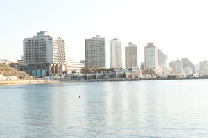
- The first image (below) was shot at 48mm, f/6.3, 1/160, ISO 200 in “P” mode (Program/Auto Mode). When photographing such scenes, I always recommend to use f/8 and higher, because you are including close objects in your frame and you want to make sure that they stay sharp. At 48mm f/6.3, the sand sand on the low part of the frame simply looks very blurry. Composition also lacks here and the sky looks very pale and there is too much of it in the frame:

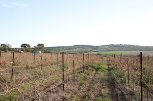
- For the second image, the photographer once again used the “P” mode at 42mm, f/3.5, 1/80, ISO 200 and for some reason dialed +1 EV (Exposure Compensation). This image is a clear indication that the photographer lacks some technique – f/3.5 is too shallow for this shot and +1 EV resulted in the image getting overexposed. In fact, all of the photos, except for the first one, are overexposed by at least a full stop. Slightly overexposing images is actually good (expose-to-the-right technique), because you can recover a lot of data from those images. However, more than 1-1.5 full stops of overexposure can actually lead to loss of highlights and brighter tones. So you have to be careful when “exposing to the right“. Similar to the first photo, this one also lacks composition and I’m not sure what the photographer was trying to capture here:

- This third image is grossly overexposed, by at least 2 full stops. Here is the EXIF data: 66m, f/10, ISO 200, +1 EV, also shot in “P” mode. While the aperture seems to be good, again, I don’t know why +1 EV was dialed on the camera. I’m guessing he simply forgot to turn it off after dialing it earlier. All four photographs were taken at noon (around 12 PM), again, not the best time to take pictures:

- The last photograph is much better in all regards compared to the above three, but there is still too much of the pale-looking sky in the frame. Exposure settings are: 27mm, f/9.5, 1/45, ISO 200, shot in Aperture Priority mode. The sky is blown out, because the camera was trying to balance the dim ground and the bright sky. The sky is certainly recoverable, because you can see some blue colors. The camera was pointed almost towards the sun (it was on the right side of the frame), so the right side of the sky is irrecoverable. Again, technique is clearly a problem here – the aperture value of f/9.5 looks odd, I’m guessing a result of playing with camera settings earlier:

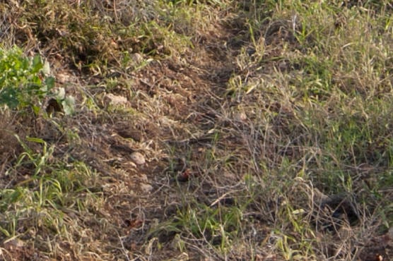
In terms of sharpness, all of the images look pretty good. Let’s take a look at a 100% crop from the above image:

Considering that there is no sharpening applied to the RAW image, there is plenty of sharpness and details in the above photos. So there is definitely nothing wrong with the camera or the lens that the photographer used here.
So, what is wrong with the above images? Here is a quick summary:
- Camera technique – the photographer needs to learn how to properly expose images. I highly recommend starting from the exposure triangle and understanding what aperture, shutter speed, ISO and exposure compensation do in various camera modes. The images came out overexposed, because exposure was not set correctly on the camera and +1 EV was dialed in some of the photos. Due to difficult lighting conditions (sky being much brighter than the ground), I would also have used a Graduated Neutral Density filter for the sky. Next, I would read about camera to subject distance and depth of field and get a good grasp on how to properly control camera aperture.
- Composition – I just don’t see anything interesting in the above photographs. Composition clearly lacks here and there is nothing that catches the eye. Simple things like rule of thirds could have helped here (see my examples below).
- Post-processing – much of the “punchy colors” and sharpness you see in my images come from the way I post-process images. Whether you like it or not, post-processing is a big part of photography and every photographer must learn how to work with images in Photoshop/Lightroom, especially if they were shot in RAW.
So, what would I do with the above photos? Here is a result of 2 minutes of changes in Lightroom (no Photoshop):
The sky doesn’t look nice, but I do not know how else I can make it look good. Any suggestions?
And here is what I did in Lightroom:
- Properly aligned, then cropped images.
- I changed camera profile to “Camera Standard” (under Camera Calibration).
- Added between 10-30% to “Blue Primary” (under Camera Calibration) to add more blue colors to the sky and water.
- Dropped some Graduated Filters with -1 exposure with slight blue color to paint the sky.
- Added some sharpness (Amount: 50, Radius 1.0, Detail: 50, Masking: 0).
- For some of the images added some Fill Light and a little bit of Saturation.
- Bumped up Clarity to +40-+60.
Thus, there is nothing wrong with the camera or the lenses our reader is using. If good technique, along with proper alignment and composition were employed, the images would have looked much better right out of the camera.
Table of Contents


