A few months ago, I started the Mastering Composition series of articles. The goal of these articles was not only to give some useful composition tips for beginners, but to also engage our readers with small assignments. The assignment given to you in the first article of the series has already been addressed in the recent discussion. In this short article, we will address the assignment given in the “Open and Closed Composition” piece.
Table of Contents
The Assignment
As always before we begin, here is a quick reminder on what the assignment was all about. The “Open and Closed Composition” article explained two main types of composition – open composition and closed composition (both of which have many varieties). Each type also had a few sample images to highlight the differences and make the theory easier to understand. At the end of the article I listed five different photographs and asked you to try and determine which of the two main types of composition was used for each specific image.
The Tricky Part
Determining which type of composition is used in a particular image is not an easy task even with all the theory explained. Photography, painting, or any sort of art for that matter, is not science and it is often difficult to categorize it in any way confidently. There is just too much interpretation involved in how one sees the work. Suffice to say, there were a lot of replies in the comments section with differing opinions. One could hardly expect anything else, but whilst some of the provided images were indeed dual in their composition and posed a real task to define, others were much more definite, because, more often than not, characteristics typical to one of the types are more prominent than those of another in a single photograph. Now, let’s see what is what.
Image #1
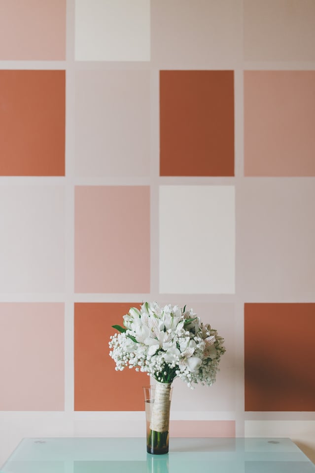
Closed composition. I expected this one to be tricky for the majority of our readers, but, on the contrary, quite a few of you were very concrete. Some did propose that this photograph employed open composition, however. Here is why that is not actually the case. Yes, the background does seem to stretch to an infinity around the subject and, because of that, there really is a whisper of open composition about this image. But the actual importance of the background is not so high as to make it compete with the main object, which is the bouquet. Viewer’s gaze always returns to it, it never actually wants to leave the frame, but rather lingers very close to the main element. The composition is also very static (frontal, symmetric) thanks to the bouquet being positioned so low within the frame. Now, if it were positioned in the middle and the square shapes of the background would “emanate” from it and/or if the squares were within the field of sharp focus, brighter, more prominent; if they were to act as more important elements of composition and not just a graphical part of the background, then the composition would have been open.
Image #2
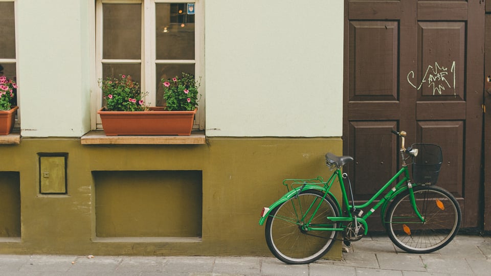
This is likely the most difficult of all the examples and one I struggle to strongly assign to either type. If I had to say it, I’d propose this is a closed composition, but it’s arguable. Why closed? Well, the windows, flower pots and doors positioned at the edges of the image frame what might seem to be the main element of focus (green bicycle). It is also a frontal composition and appears to be quite static. Now, if we crop out the left half of the photograph, that’d be that. However, while we can understand that the bicycle is probably the most important object in the frame rationally, as an actual element of composition (the importance of which depends on its size, color, tone, light, etc) it is somewhat on par with the other objects – it’s neither much brighter or more vivid that the walls and flower pots, for example. As a result of that my gaze keeps moving towards the left of the photograph and out of the frame. Verdict? Perhaps best leave it as “both”.
Image #3
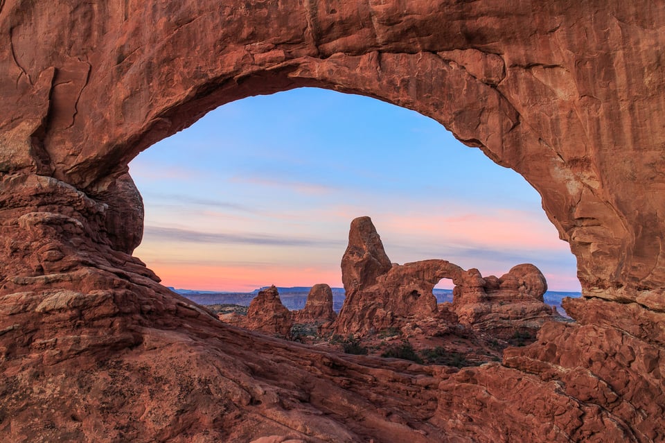
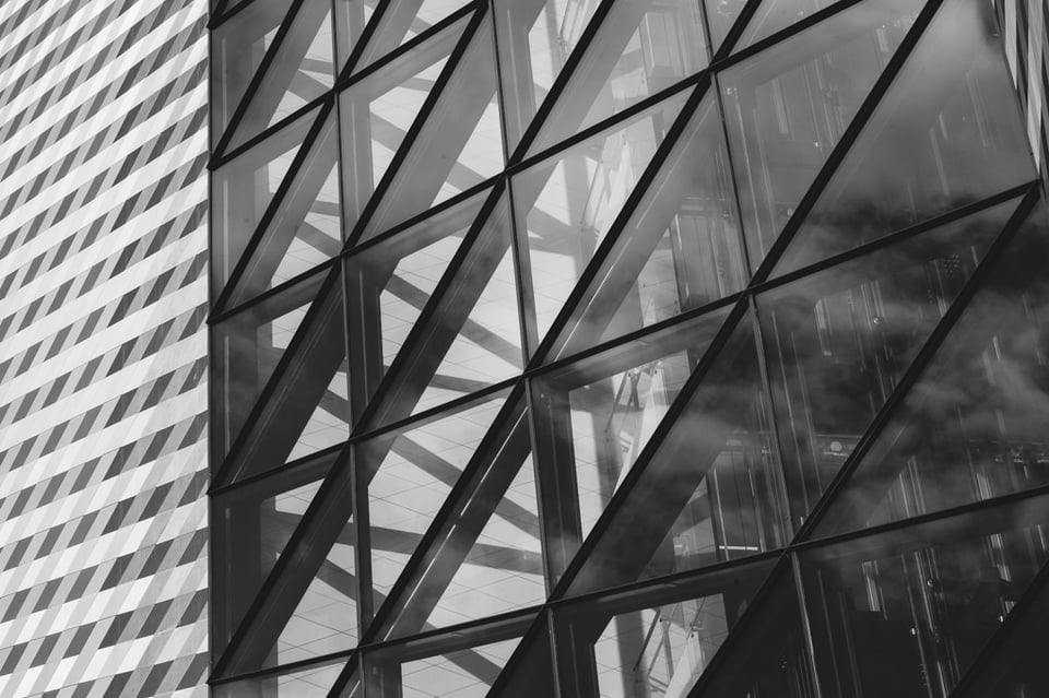
Open composition, most of all because of the abundance of repeating patterns, diagonal lines, general fragmentation of the image and lack of any distinguishable main object.
Image #4
Open composition. This photograph is much more static than the previous example and, as such, could be considered a closed composition. However, the sheer lightness of tone at the edges of the image attract the gaze and take some of the middle bit’s importance away. There are too many parts of the photograph to be interested in, it’s but a fragment of a wider view.
Image #5
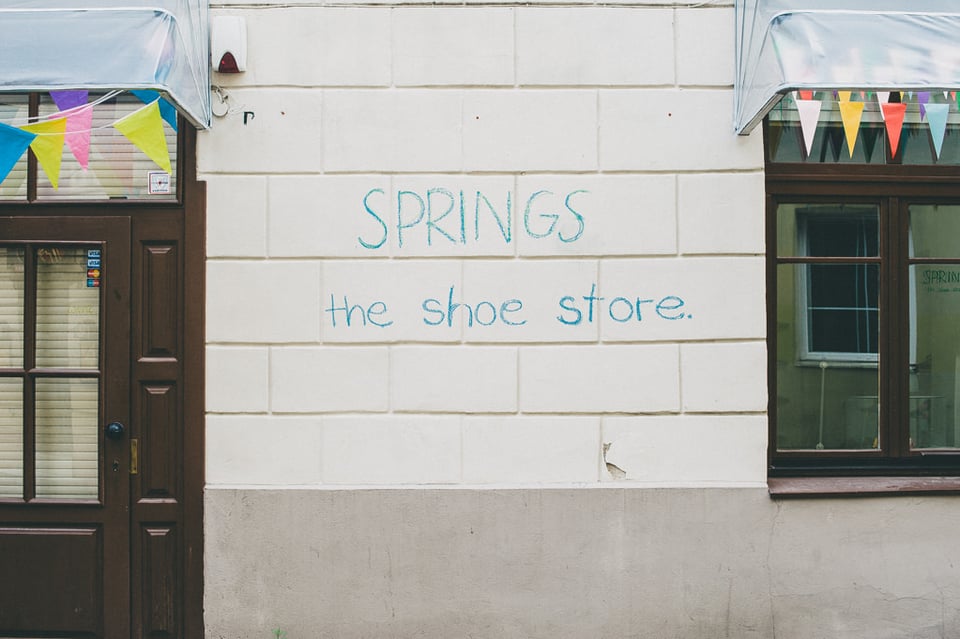
Closed composition. There are objects (the door and the window) that extend beyond the frame, but in this case they sort of enclose the main element of composition within it (like a frame) and force the gaze to come back to the centrally, frontally composed writing on the wall.
Be Sure to Disagree
As you can see, some of the provided images are quite difficult to “classify” as either open or closed composition. I’ve read plenty of well-supported opinions under the original article, so there is a good chance you will disagree with some of my choices. The thing is, it is very difficult to enclose art in a set of rules and definitions. A photograph can have characteristics found in both types of composition, meaning it can be both open and closed at the same time. It all depends on the creativity, idea and skill of the photographer himself, as well as the way the viewer chooses to see the image. Thus, you are more than welcome to discuss my choices in the comments section below!
I agree with all of your answers! Only for the last photo I was really having trouble deciding if it was just closed or both open & closed. It’s hard when you are closely examining every aspect of a photo so I found I had to keep looking away and then having a fresh look & observing where my eyes naturally went. If they naturally stayed on an element then I knew it was closed but if my eyes wandered all over the photo or even wanted to imagine what is beyond the photo I knew this was open. I hope this is a good way of looking at composition! I’d love to see more examples of the sub types of composition!
I did not look at any of the other comments, not until I post mine.
1. open, the different squares entice your eye to move around the photo.
2. open, the door, bike, flower box pull your eye to look at each element
3. open, the diagonals, and leading lines keep your eye busy
4. closed, the leading lines take you direct to the focal point, the end.
I love the way you prepare your lessons and examples. I wish I could afford a photography school. I have searched for books to find this type of instructions.
Thank you
Read more: photographylife.com/open-…z2uOxTDYjG
I like the article but would quibble that image #2 violates some major tenants of composition. First the cut-off window and planter on the left are distracting and add nothing to the image. Same can be said about the ‘box’ in the wall to the right of the cut-off planter. With that re-crop, there are only 3 ‘subjects’ vying for the viewers attention – the bicycle, the planter/flowers, and the graffiti on the door. Finally, there is some perspective distortion in that the windows and door are not vertical. With a little crop and straightening, the image would be much more compelling.
I enjoyed the article, but with the text preceding the picture, it took the fun out of guessing!
my bad, did not know this was concluding a previous article