You already know a great deal about the composition choices that I make. You know my thoughts on what matters most in photography, the rule of thirds, central composition and element placement at the edges of the frame. Whichever preference is yours, I certainly hope you’ve learned something from reading those articles. Now, I am about to share something else with you, and here is where we start: regardless of where I place the important elements in my photography, whenever I have the chance I always, always surround, enhance, bathe them in negative space.
What is Negative Space?
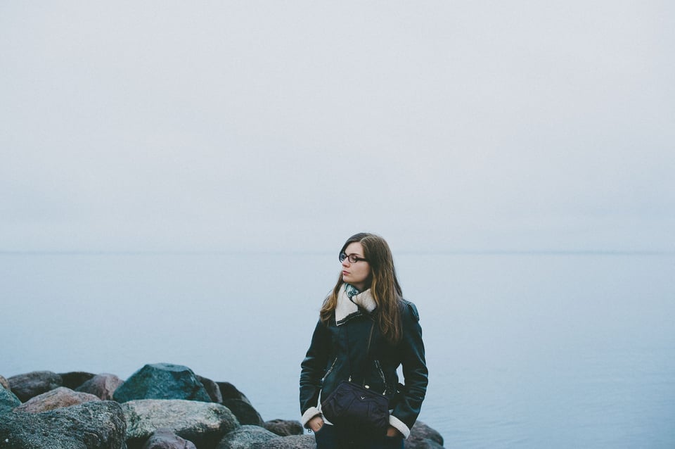
In photography, design, sculpture, installation or performance art, basically – in pretty much every genre of visual and sound art, negative space is perhaps the single most important aspect that helps the subject in your work – the element of interest – stand out and attract the viewer’s attention. Mind you, these are merely my own words, but I really do think it is that important. Now, in every genre of art, negative space has a slightly different form. For example, pause can be seen as the negative space in sound art. But we are not interested in sound art, we are interested in photography. And in this genre, negative space is basically the space that surrounds the main element of interest, which itself can be called positive space.
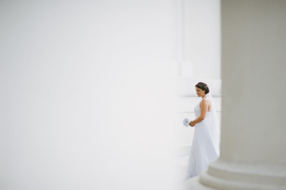
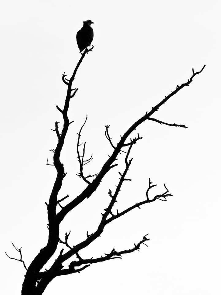
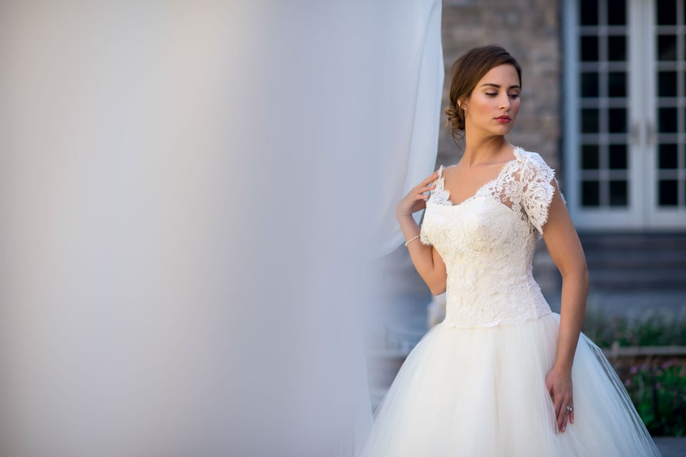
In the two photographs that you’ve seen thus far in this article, the negative space itself was emptiness. It lacks any sort of detail or color, but it does not necessarily have to be this way. In some cases, even well-defined buildings and people in the background also act as negative space, but a different sort, one that conveys a different story or emotion. Basically, negative space can be created with the help of all sorts of objects (for example, when I took the portrait above, I used two pillars of the Cathedral of Vilnius to create negative space around the bride) or even with the help of light. Naturally, in the end it is all part of the overall composition.
The Importance and Effect of Negative Space
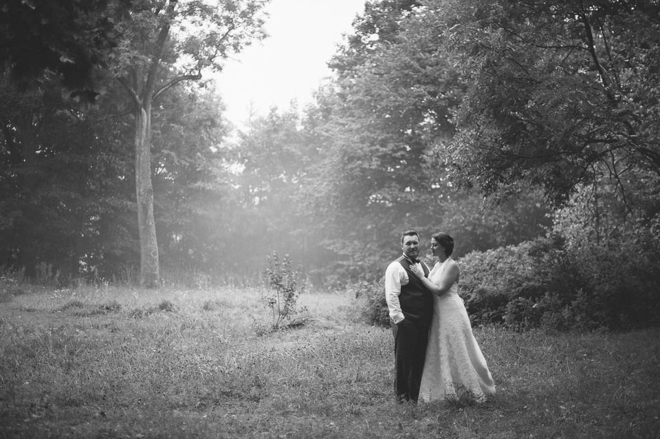
Negative space can drastically change the mood and story of an image. In many cases, negative space is the mood, the emotion, what creates those things in the first place. It can act as a context, it can create a sense of lightness, airiness, it can strengthen the positive emotions in a photograph, emphasize the feelings of your subject whether they are romantic or simply joyful. It can also add a sense of loneliness, despair. In short, whatever message you are trying to send out, whichever feelings, emotions you want to convey, whichever story you want to tell, the use of negative space affects it all. It can either emphasize all of these aspects, or, when used incorrectly, turn everything around.
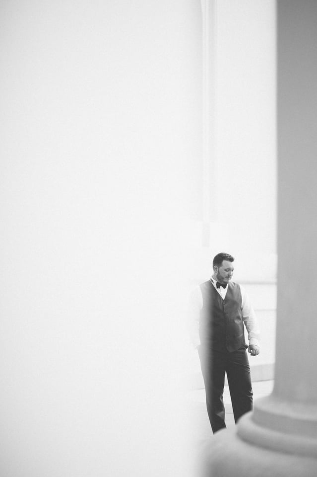
Now, because negative space often (but certainly not always) lacks any sort of detail, one might think it’s not an active element of composition itself, merely a mean to emphasize other elements. That’s not true. Like everything in a photograph, it, too, has visual “weight” and you need to be very careful when deciding how much “emptiness” to include and where. More than that, “adding” or “taking” away negative space affect the weight of other elements in the image, as they effectively become smaller or larger within the frame. That also means you can use negative space to balance out your composition. Technically, the above portrait isn’t balanced very well – it’s a little heavier on the right side. Fixing it is easy – I can either crop it from the left a tiny bit, or add more of the darker pillar on the right. Usually, I try to avoid such extensive “photoshoping” (and I obviously didn’t weigh my composition quite well enough during shooting), so the best way for me to illustrate the difference is the former. In essence, though, both solutions do the same thing, and that is make the negative space on the right side of the frame more prominent (in order to really see the difference, click on the first image to enlarge it and then use arrow keys to switch from one to another):
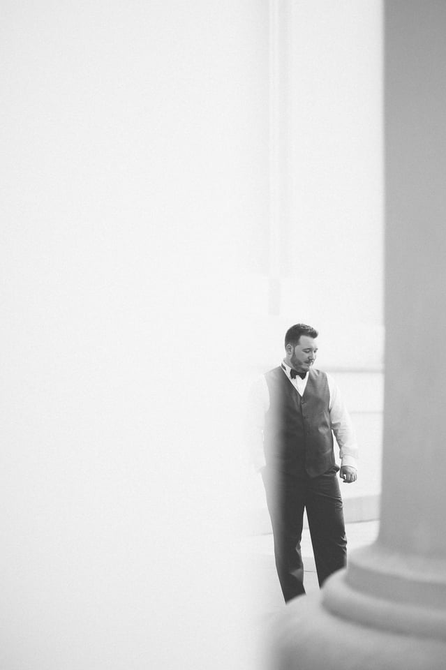
Now, click on one of the photograph and switch between both to see if you notice the difference. It’s subtle, but the second photograph is technically better composed and all it took was some negative space adjustment. Now, I said “technically”. Why? Because in the end, it’s not whether the image is balanced or not, is the way you like it more that matters. Had I noticed I wasn’t leaving enough space on the right side during my time with the groom, I’d have adjusted accordingly, perhaps taken half a step back and shifted the camera rightwards ever so slightly. But I didn’t and if I had to choose between the original photograph and the “better composed” cropped one, I’d go with the original. I want that extra bit of emptiness there, that airiness, that “breathing room” just to emphasize the groom’s calm and deep happiness.
Final Words
It is so easy to focus our attention on the subject, on what we see as the main, most important element of the photograph. It is so easy to focus on his or her emotion, laughter, tears, whatever it may be that draws us to that person. And often, that is exactly how we should photograph. But not always. Negative space is a very powerful and peculiar tool, if we can call it that. At first glance, it “lessens” our subjects, makes them smaller, seemingly drowns them in empty space. But the first glance is never enough.
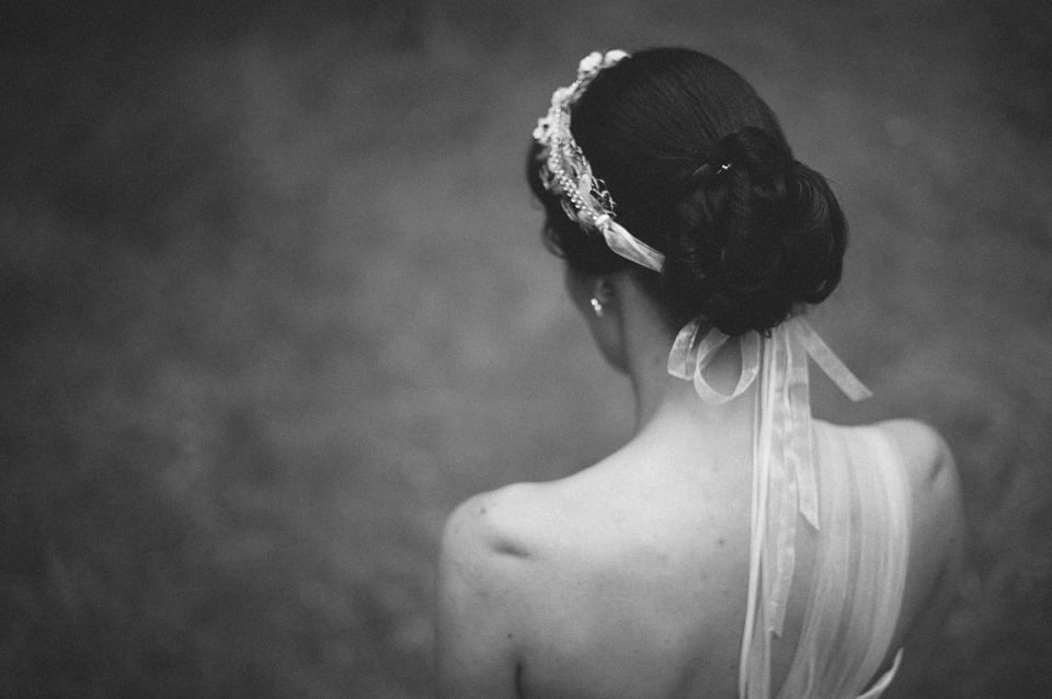
Negative space is an immensely powerful element of every photograph, or at least it has the potential to be such. It, much like central composition often can be, is a case when less (subject) becomes more (feeling). Learning to use it well will certainly help you find not only new ways of composing your photographs, but also new ways to learn and tell the story of your subjects.
++
thank You
Really Useful
I have enjoyed reading each one of your articles on composition. I have a special appreciation for this one on negative space. I also think it creates an interesting mood that surrounds the subject.
You are very articulate in your writing, meaning in this case, taking more complex subjects and making them simple. Please keep on writing about photography I am learning much.
Take care, and take pictures, Ceil
Another great article of yours, thank you for sharing the knowledge. In the past, I’ve done some shots with negative space (which I found to be quite nice). After reading this article, I now know that there is a specific name to this “technique”.
Awesome artcle as always, please keep on writing.
cheers,
A.Monoang
Great article, Romanas.
Home run Romanas. Your perspective, description/definition of how Negative Space work is very within and around an image is “moving.” I had always seen this in an image that attracted me to it, even those that I had taken myself, but just did not know what it was. Thank you for turning on the light….I see it now.
Cheers :D
Romanas , your selection of models is something that intrigues me. They all have a great outlook to them, as if we can see a whole personality in the picture.
When you mention that placing a subject near the corner of the frame allows you to include the environment in the photo. Should we not use a smaller aperture to increase the depth of field? If the background is blurred, then you have actually not included the environment in the photo.
I am a regular reader of u. Very few photographers r true in sharing their hard earn knoledge.u r one of them. Thank u. I want to share a photo with u to have ur comment on it. How can i do this?
Hello, Jayatu! Thanks for your kind words, they mean a lot. You can share images for critique in our forums.
Hm, that’s a bit too much negative space for my taste, half white photos and I also don’t like the foggy white going over the subject. I do always wonder what the best place is to put the horizon in pictures like the first. I’m usually having a hard time deciding where I like that line best.
Hey, Petra, and thank you for your opinion. It is, of course, a very subjective matter. Mind you, exaggerating is a good way of showing something, so even if there’s too much negative space for you, I think it served the purpose of illustration ;)
I bought my new Tamron few weeks back
and did some bird shoots…..
I want to upload the pcis to get health critcism on them
Will post the pics soon
thanks
babar