Post-processing is one of the trickiest aspects of photography. You can get all your settings right in camera and have a great composition, but still end up with something strange with unflattering edits. In this article, I’ll share my favorite post-processing tips that will improve your results each time!
I believe that you can get great results straight out of camera, or straight of camera with only the most basic edits applied. However, I also believe that most photos benefit from careful post-processing.
Part of this is because even unedited Raw images are already processed, in a sense – since your software has interpreted the Raw data to show you an image. I think it’s better to control over how this interpretation takes place, by changing color profiles or sliders as befits the image. Otherwise, you’re leaving the look of your image up to the software company’s default preferences. Why use tone and color modifications chosen by someone else?
But post-processing is no doubt tricky and takes some time to learn, not to mention years to develop a style. Over time, I have realized that I rely on some tricks and tips that have helped me a lot, and I hope they help you too!
Table of Contents
1. Edit in Three Sessions
When I really care about a photo, I edit it over at least three sessions. The first session is like a rough sketch in the world of drawing: It gets the basics down from my first thoughts and impressions. I try to make the exposure and tones look good, while reducing noise, sharpening the image, reducing noise, and fixing any composition problems with a little cropping and rotation.
At this point, I like to take a break of a few hours or even days because I need time to absorb the essence of the photo. Coming back to a partially-edited photo after some time gives me new insights. Then, I go in for the second session with finer tweaks. This involves things like local edits, contrast adjustments, and so forth. I might even create a second copy of my photo to edit separately and test out some ideas.
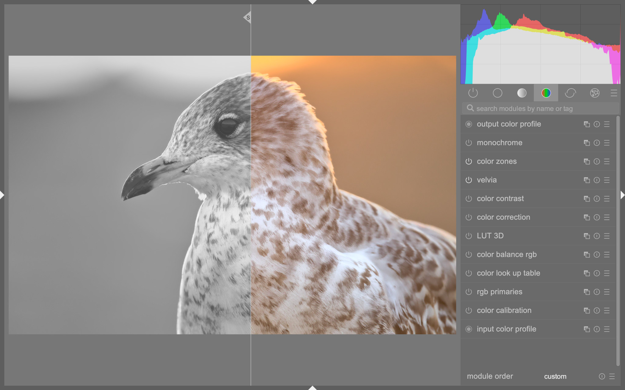
The final session is for the truly subtle tweaks. This would involve a few more local edits and trying out a few different things to make sure I didn’t miss anything. In this very last stage, I pay extra attention to the finer details of color. I might also try a totally different way of editing to see if a different method doesn’t yield better results, or has something to teach me. Here is an example between stage one and stage three:

Even after I am fairly satisfied with my three-session editing, there is often something to improve. I love going back to old photos and re-editing them. Every time I do so, I find something I miss. I find this is a lot like music. Many of my favorite pianists have said that they always find new things when they go back to the score, and I think there is always something new to be done to a photo. Spencer even wrote a whole article about this, and I echo his recommendation: go back to those old photos!
2. Convert to Black and White
My second tip is to switch to a black and white conversion, even if my photo is in color. I then examine the photo just in terms of its tones to see if I am happy with the tonal separation. Often, I am not, so I go back and change something.
I find checking the photo in black and white to be one of the most powerful techniques. That’s because color is just so distracting. Sometimes, an array of colors will be quite confusing and obscure the dark and light relationships of a photo. Other times, a color channel might be close to blowing out, and it might influence me to be more conservative in my tonal edits.
That’s not to say that you should edit your color photo to optimize for black and white. Rather, I’m only saying that the black and white photo has the potential to give you some hints and ideas about tonal relationships that might be useful in your color edit.
3. Overexpose and Then Go Back
Often, at the start of my first editing session, I will create a second version of my photo that is overexposed. The reason why I do this is that the darkest areas of my photo might have something going on in them that is easy to miss when the photo is “properly exposed”. As I am editing, I check against the overexposed version to make sure I am not ignoring the darkest areas.
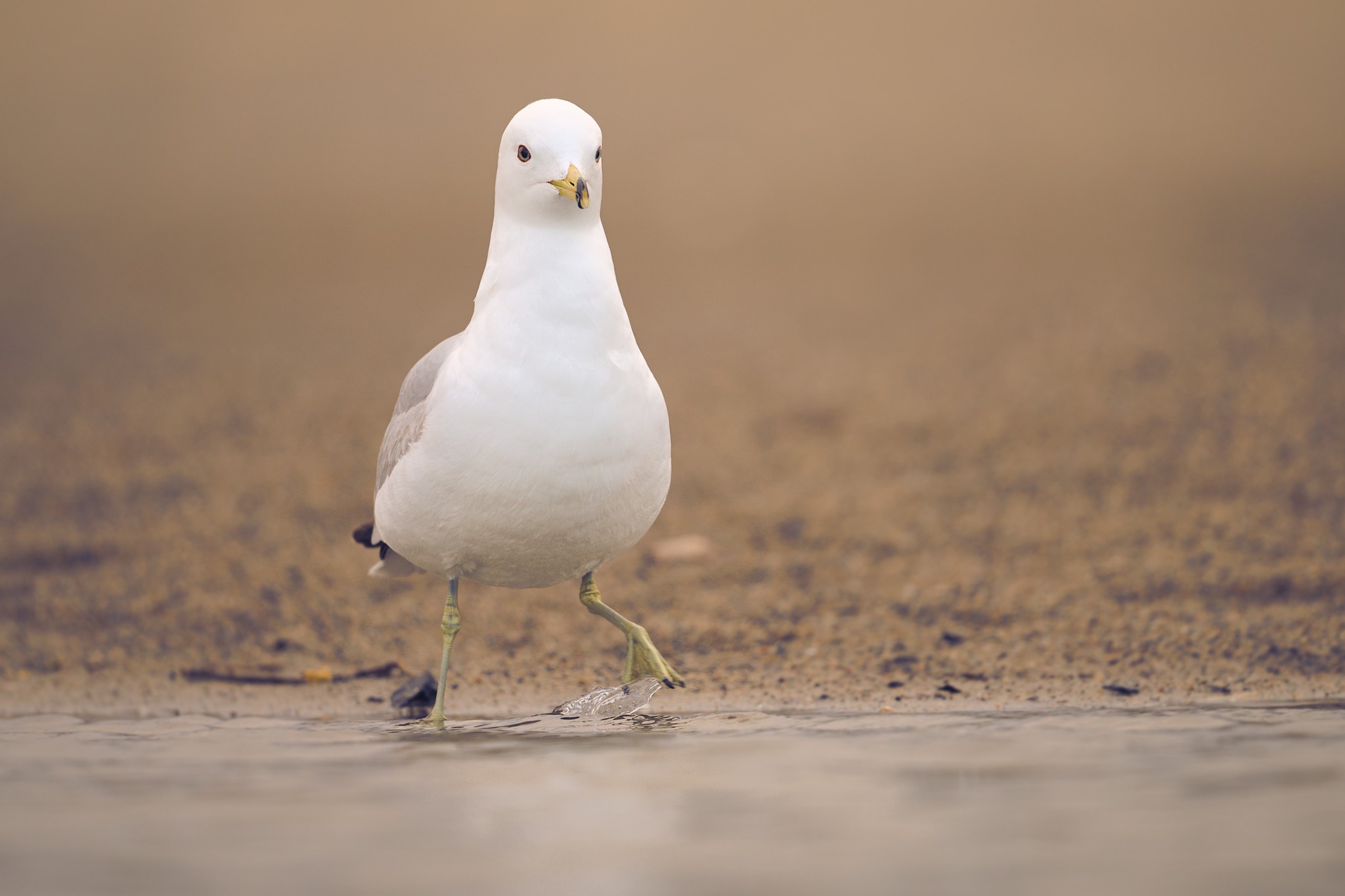
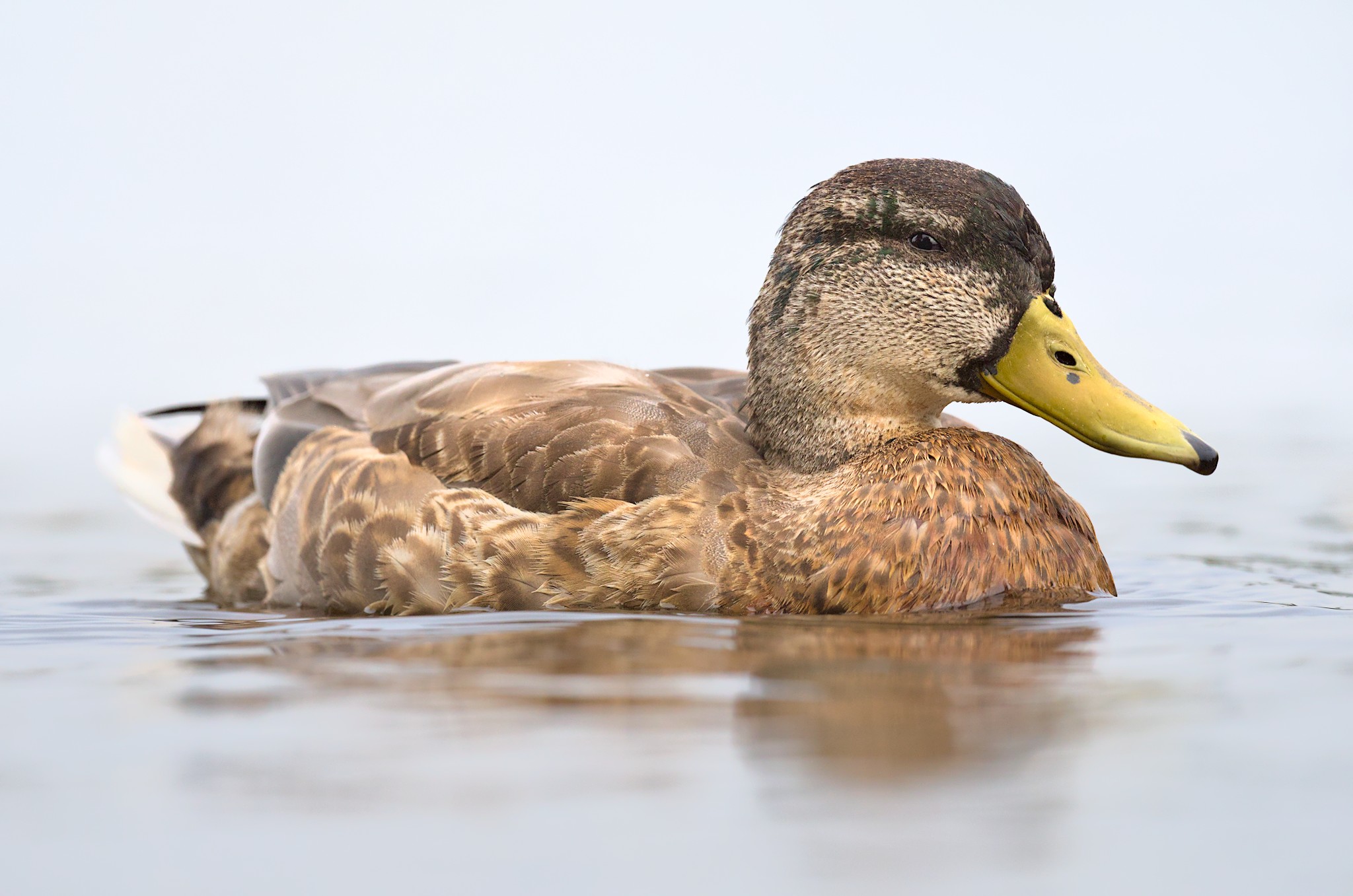
This is especially useful when you have a shot that has a single bright area. For me, this often happens with birds with a small patch of white feathers. In this case, the histogram can be confusing, because the histogram will show a properly exposed photo and yet overall, the photo will be too dark for my tastes. My goal then will be to bring up the darker tones and shadows a little – without, of course, eliminating any detail in the brightest areas.
Thus, the overexposed version of my photo often tells me that I need to bring up the shadows a little either globally or with a local edit. Of course, sometimes it’s better to leave a photo partially dark. Not every photo needs to be super bright, but most photos do benefit when you look at a brighter version and learn from it.
4. Pay Attention to Color Grading
If I had to name one thing that is more difficult than anything else in editing, I’d say “color” without hesitation! Color is tricky for a few reasons: different camera sensors treat color differently, color perception in the brain is complicated, color tools in modern Raw processors seem to have more controls than an airplane… hmm, maybe I should just shoot in black and white?
But most of the time, the allure of color makes it worth the effort. That’s why I suggest paying it extra attention and learning some of the color tools in modern Raw developers, including their strengths and weaknesses. While there may be a dozen ways to – for example – make a photo more orange, not all of them are going to be a good choice. Let me go through some of the major color edits below and explain why this is the case.
4.1. Color Temperature and Tint
Color temperature (and the related Tint adjustment) is one of the best color correction tools available. It shifts the balance of the entire image to be more warm, more cool, or more green/magenta.
Correcting color temperature and tint is usually my first step when editing color. Generally, I will either target a neutral color balance (where something gray would have no color tint), or an accurate color balance (where something gray would have a similar color balance as the light itself – for example, blue if taken in blue hour, or orange if taken under tungsten light bulbs).
4.2. Split Toning
Split toning is the process of adding one tint to the shadows and another tint to the highlights. Some software also allows a tint to be added to the midtones.
This technique can add mood and even change the perception of distance in a photo, since warm colors can appear closer and cool colors more distant. As a method of color correction, however, it is a bit too stylized, since it adds the same hues regardless of the underlying colors. Instead, it’s more of a color stylization tool and less of a color correction tool.
4.3. Saturation and Vibrance
Depending on your Raw developer, your starting saturation might be quite weak. Thus, you might like to increase the saturation of your photo to appear more vibrant. A similar slider that helps prevent oversaturated clipping, and doesn’t overdo skin tones, is the Vibrance slider – see Saturation vs Vibrance for a full explanation.
Most images need an increase in saturation or vibrance, but not all. Also, I often increase the saturation in the shadows and midtones, and I’m a little more gentle with the saturation in the highlights. This seems to get closer to a more natural or film-like look, and it’s also a technique often used in color grading video. However, not all post-processing software has separate saturation sliders for shadows/midtones/highlights, so you may need to work with local adjustments or masks in order to achieve this effect.
4.4. Edits by Color (Hue, Saturation, Luminance)
A lot of photographers are tempted to edit colors with hue/saturation/luminance adjustments that are divided by color. It’s easy to see why. Maybe the photo looks good overall, but the blue sky is too saturated – you can just lower the blue saturation slider and fix it quickly.
However, making per-color edits like this is best done with a soft touch. Do too much, and you’ll start to add extreme levels of color noise to the image or mess up subtle gradients in the sky with high levels of banding.
While these can be powerful and flexible edits, don’t rely on them exclusively. They’re best for the finishing touches rather than broad color corrections or stylization.
4.5. Lookup Tables
A color lookup table is basically a method to change the colors of your photo by applying a transformation. This transformation uses a table of colors and a rule that defines how each should be modified. You can create lookup tables by hand in most Raw editors by using charts or color checkers, or simply by modifying the table directly in order to subtly change the rendering of colors.
Lookup tables are an advanced topic but worth looking into because they can be used to create high-quality custom color profiles. Also, color modifications using a lookup table are often superior to other color modification tools (such as selective hue and saturation modifications) because the change in color resulting from a lookup table is smoother. It lacks some of the common artifacts that come with HSL slider edits, for example.
Although color is complex, it is worth understanding the differences between the tools at your disposal, because they all have individual strengths. A little attention to color can bring new life into an image or even just make it more accurate and pleasing. However, if there’s one tip I’d give on color, it’s to be subtle. Just because a slider can go to 100%, doesn’t mean it should!
5. Use Local Editing, Especially with Tones
Something I learned to do a bit later in my photography journey was edit locally. For example, I might apply a mask to the sky and edit a restricted tonal range, then make a different sort of tonal edit in the ground.
Local editing is very useful for doing small adjustments that bring out certain parts of an image. Local adjustments can be used for tones, but also color and even sharpness: sharpening an entire image too much will often appear unnatural, but if you just apply selective sharpening to certain parts of your image, you’ll get two benefits: a more natural look and more emphasis where you want it.
Even if the effects of local edits can sometimes be done with a global edit, local edits are more conceptual and help organize the flow of editing. However, I tend to recommend doing your edits in order of global first, local second, because I also see photographers make the opposite mistake and overdo the number of local edits.
Conclusion
If you are serious about good post-processing, it can be a lifelong journey of constant improvement. Even after almost ten years in my photography journey, I still feel like I am learning new things about post-processing, and I’ve certainly found it to be the most intricate and challenging of skills.
I hope you’ve learnt something with these tips, and if you have any of your own, please share them in the comments!
Jason Polak, your insights on post-processing techniques are truly enlightening. I particularly appreciate your emphasis on maintaining natural tones while enhancing images.
I am looking forward to implementing these secrets in my photography workflow. Thanks for sharing!
like to see you do an example of split toning using PS or a plugin
Thanks for the feedback! I use darktable as my editor to make split toning but it should be possible in most editors that allow curves with independent channels….I think PS does that. Just change the mode of curves to independent channels and manipulate the shadows or highlights with it (add control nodes in the midtones).
thanks for sharing these skills
You’re welcome! I’m glad you liked it.
Hi Jason,
Great article. Thank you.
If i can highlight a related issue – of a good photo editor software.
These days I am hunting for a good editor software, as my last Lightroom (outright purchased version) has run out of upgrade and cannot be moved to another computer. The choice is only to take a LR on subscription, which I would like to avoid.
But it is difficult to decide another option of photo editor, considering all have some pros and cons.
I would have loved to see an article on photo editors review and recommendations in Photography Life.
Happy to hear any suggestions / recommendations.
Cheers,
Manish
That is a great idea! I will have to see if I can get CaptureOne and Lightroom to test them out and compare them against some others.
Jason, Thank you for this insightful discussion about your process. Perhaps the most important thing I’ve learned is to use the editing tools sparingly and to slow down and revisit a photograph several times before calling the editing done.
Thank you, Richard! I appreciate the comment. Yes, for me also, editing in multiple sessions is one of the most important things I do.
Some good tips here that I’m going to try. You’re correct…editing is a lifelong journey. I look back at some of my old images and wonder what I was thinking/doing.
Thanks for the encouragement! I feel like I still learn a lot every year. And same here. I’ve looked at my edits from year one and I’m shocked…Sometimes in a good way, other times not. haha.
One of the rather unfortunate aspects of global image editing while manipulating sliders in Photoshop is that the colors can change in indesirable ways. For example, adjusting clarity can inadvertently enhance color balance. Even if you adjust a color slider first, then clarity, and finally another color slider to offset the color effect of the clarity change, it will not offset the color shift caused by clarity change, in a predictable way. One intriguing use of manual control is by manual blending of exposure bracketed images, such as images of scenery or stationary objects especially when the dynamic range of the initial image cannot convey the entire dynamic range of the scene.
That is interesting. I never really liked opaque sliders like clarity anyway. And it is true, that you can manually blend multiple exposures. I’ve tried it a few times and I’ve liked the results.