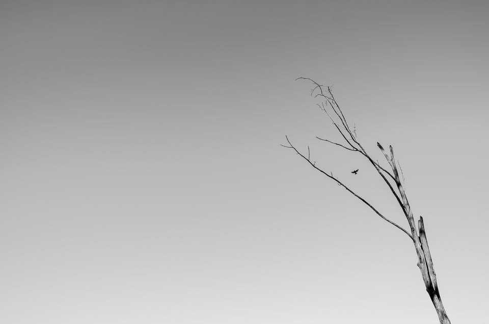
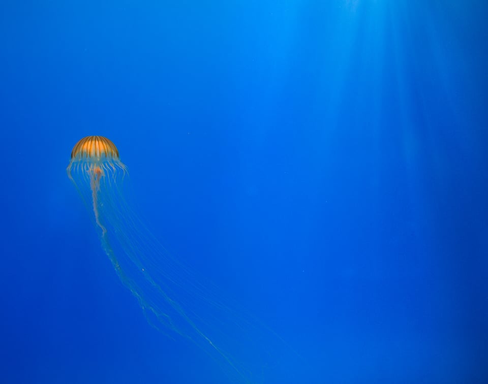
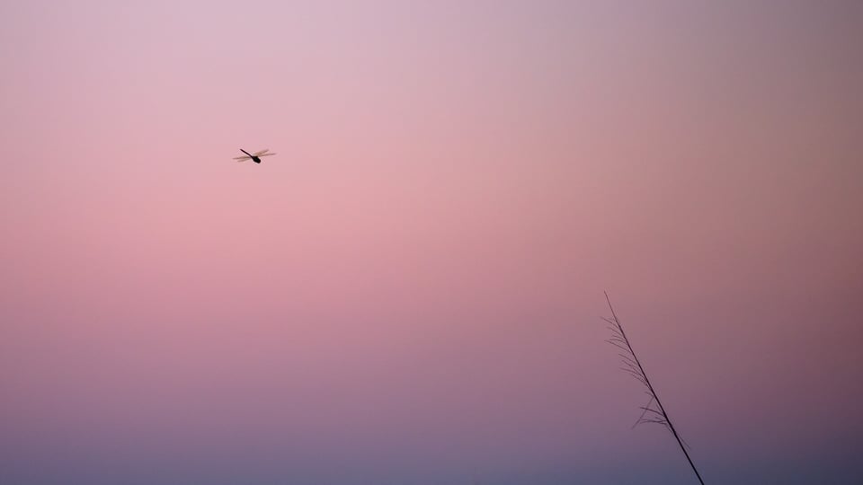
As people look at photos on smaller and smaller screens, there has been a growing trend towards taking photos that are more and more minimalist. Especially on platforms like Instagram, minimalism is exploding; it’s everywhere, and it has been for a while now. There are some pros and cons of minimalism, and I have mixed feelings about how common this trend has become, but there’s no denying its popularity. In this article, I’ll cover some of the main reasons you’d want to capture minimalist photos, along with some tips for using this style of photography as effectively as possible.
Table of Contents
1) Minimalism Communicates Your Message
One of my first recommendations for a photographer who’s learning composition is to hone in on your message.
What do you want the photo to say? Which emotions or thoughts should your viewers have while looking at the photo? And, most importantly, how can you simplify that message and communicate it as effectively as possible?
For a lot of photographers, minimalism is the answer — and it’s not a bad answer at that. If your goal is to depict a pristine sand dune, without any footprints or other distractions, a photo that shows the arc of a single dune against a blue sky could make for a very striking image.
Minimalist photos often have a few characteristics in common with one another. First, their color palettes are not distracting; there are usually only one or two main colors drawing attention, or the photo may be monochromatic. They also tend to have large regions of “negative space” — empty areas in the photo where people’s eyes won’t naturally fall. Finally, the main subjects tend to be small, low in detail, and well-defined, with sharp transitions setting them off from the background.
When I take macro photos, minimalism tends to creep into the final frame, whether I want it to or not. That’s because a lot of these elements are present in the macro world — unified colors, significant negative space (due to the thin depth of field), and very well-defined subjects. Not every macro photo is minimalist, but it’s a good example of a field where this type of image is common.

Still, minimalism can happen in any genre of photography, so long as you’re able to find a lot of negative space. If you want to take minimalist photos, that’s the first thing I would look for — empty areas that you can use as a backdrop for your main subject. If your final photograph includes just one or two subjects against an unobtrusive background, you’ve hit the nail on the head.
2) Minimalism Works on Small Screens
People are using phones to find content far more than ever before, and a lot of photographers have changed their styles to suit the new medium.
When you’re looking at a small screen, minimalism works really well. The tiny area of phone screens means that there’s not much room for complex details and areas with a lot of interest; instead, a single subject against a monotone background will stand out much more easily.
On one hand, this is a bit sad, because it’s nothing like the experience of viewing a large print of a detailed landscape close-up. At the same time, people will always be changing, and it makes sense that photographers would adapt accordingly.
If an area of beautiful, complex features in a large print appears as a bunch of chaotic pixels on a two-inch screen, there’s a good argument against photographing beautiful, complex features — or, at least, against posting such photos onto social media. Personally, I do still post my normal, non-minimalist photos on sites like Facebook, but I do so knowing that people won’t get the full impact they otherwise might have.

3) Great Symphonies Are Complex
Think about history’s greatest pieces of art. From Beethoven’s symphonies to Michelangelo’s frescos, almost all of humanity’s best-known works have tremendous levels of complexity.
I don’t mean to compare masterpieces like that to hobbyist photography, but there is an underlying theme: Minimalism only gets you so far. Sure, a minimalist photo may look good on Instagram, but its simplicity makes it difficult to convey much more than you see on the surface.
How many great photos can you remember off the top of your head? Are any of them minimalist? Sure, some amazing photos — say, “Afghan Girl” — are clear and straightforward, but I would shy away from calling them simplistic or minimalist. If they were, it would be very hard for them to have the same deep emotional impact.
I have seen some documentary photo series where one or two photos will be minimalist, and that’s almost always done to convey a single point as clearly as possible. But the sheer lack of information in a minimalist photo makes it difficult to show a more nuanced, intricate perspective on the world. In many cases, that puts a cap on how successful they can be.

4) Minimalism Can Get Old Quickly
With the high numbers of minimalist photos posted to apps like Instagram every day, it’s no wonder that this style of photography is starting to wear out a lot of people. If every other photo is a minimalist shot with the same composition, how can you expect anyone to see it as great, unique art?
Maybe this isn’t a fair point, though, since it’s not minimalism’s fault that it’s getting old — it’s the fact that so many photographers are using it all the time. In that sense, it’s like the Orton Effect; by itself, minimalism isn’t a problem, but when it’s so insanely popular, it’s easy to find it annoying.
If you’re trying to avoid too much minimalism, the easy fix is just to vary things up. Sure, take some simplified photos if they look good for a particular subject — but take normal photos, too. So long as you don’t go out of your way to make a photo as minimalist as possible, and you make room for complexity along the way, you’ll be good.

NIKON D800E + 70-200mm f/4 @ 200mm, ISO 100, 1/1000, f/8.0
5) Conclusion
Even after all that, I actually like minimalism quite a bit. For certain subjects, it conveys the essence of the scene much better than any other style of photography. I’m certainly not going to avoid taking minimalist photos if I see a good one in the future.
It’s also useful if you’re just starting out in photography; minimalism can add a sense of deliberateness that your photos may not have had before, making you think more carefully about composition. In that sense, I recommend that most photographers practice with it and take some successful minimalist photos while they’re starting out. If you want to get good at complex subjects, it helps to master the basics.
At the same time, most of the best photos I’ve seen have a lot of layers to them, providing a greater sense of interest. Overly simplistic photos are like the tune “Happy Birthday” — catchy, often popular, but not of the same emotional depth as a well-written symphony.
As a whole, it can be nice to have minimalism in your toolbox, so long as you don’t overdo it. Minimalism doesn’t work well if you have a lot of information to convey, but it’s great if you’re trying to express a single message as clearly as possible.
Hopefully, the tips in this article gave you a good sense of when minimalism works well and when it doesn’t. What are your thoughts on the matter? If you have any questions or points to make, feel free to let us know in the comments.

I like the jellyfish one
Really like your images in this article, especially jellyfish. Helpful discussion of minimalism!
Minimalist is more a trend bcuz of product sell, sell photos sell products, sell this sell that.
And what you call it when a photo is complete different as minimalist? Now that the trend give a name, but what is the name that go for the totally different style.
Wait…
Why recapcha???? Did you know how hard they are on small cellphone screens, I hate them, that is the most annoying thing on web, is catcha was annoying enough, recapcha is suicidal.
Damn it already try twice already. And last one was like six set of photos.
I love it, good reminder that I shall go for images like this more often than I do….great job Spencer!
Hi Spencer,
It seems to me that minimalist photos work for people when when they only have a moment with to capture the picture’s message. Someone walks by a minimalist piece and a glance is sufficient. People need more time with complex art. A case in point, the the floor I enter my apartment building and across from the elevators hangs a 1889 painting of a dutch village depicted from across a canal. This is a complex painting of brick dwellings, people at the edge of the canal working, boats with people rowing by, tall buildings and towers in the background. When I call of the elevator, I routinely walk four paces over to the painting and study it. The lighting, the detail, the people, the buildings require careful study to appreciate what the painter saw and shares. I’ve performed this ritual study for years and haven’t exhausted the content of the painting. Granted I look at it for about three or four minutes at a time and at extremely close range, after all the painting is about 20×24 inches. Back to my premise, complexity requires time to take all the elements in. So I think it unwise to hang a complex photo where people don’t or can’t stop to study it. Minimalist and, in a sense, impressionist photos work in that environment…as well as small screens as you point out.
Hi Spencer, very nice presentation. Thank you.
I find with either my minimalist or my more complex photos, my kiddies (now in their mid 50s!) and others take some element in complex photos and the only perceived subject in minimalist photos, zoom in to frame it tightly on their phones, even rotating it, to see a small sector of what I’m presenting. I always include a tag line” Best viewed on a larger screen,” but it really never happens as noted in responses: “Sorry, I don’t have time!”
So, how do we handle this revolting development? I guess I need to print them and use the mail system! Seems now I look at my photos, show them to my wife, then turn off the iMac.
minimalism is best printed large so you can get lost in it. If fact much of photography is better large and in many cases looks better than the LCD.
Hi Spencer,
And thank you for making us think once again!
I have three points I’d like to share:
Minimalist Art, including photography is used to define the nature of the space surrounding the subject. A minimalist sculpture is often used to cause us to consider the quality of the space it occupies. In Photography, a frozen, ice covered tree, in a seemingly empty expanse, comments emotionally and physically on the vastness and remoteness of it’s location.
In a similar fashion, considering the small screen world we currently inhabit, minimalist images with very large areas of negative space, coupled with their tiny subject matter, subconsciously enlarge our sense of the screen size, causing us once again to consider the space it occupies, even if subliminally.
Thirdly, an examination of balance, I think needs to be brought into the discussion. Balance in my opinion is the single most neglected element of composition (a deeper discussion of that statement is better suited for another day). In the image of the jellyfish, the weight of the blue negative space would not be balanced but for the rays of light descending from the top right. This breaks the enormous swatch of blue (with regard to the yellow) and balance is achieved! Likewise in the image of the dragonfly, without the branch from the bottom right the image would be unbalanced and fall to the left. The branch not only adds balance, but context and thus story to the warm fading light.
In closing, I think that minimalism, like all styles of Art, can be utilized as successfully as any other provided “The Art Spirit” as Robert Henri would describe, is applied throughout.
Thank you once more for sharing your thoughts and experience with us and for providing a forum for discussion…
Regards,
Duffy
Thank you, Duffy! And my apologies to you (and the other commenters) for not responding this past week. I’m back on the grid now, and should be for at least a little while.
I definitely agree with your three points. Balance is such a crucial element of composition, and you’re right that it is particularly visible in minimalist photos. That’s also one reason why I like seeing photographers learn minimalism before applying its principles to more complex subjects. You can’t play Beethoven until you can play Happy Birthday!
Hi Spencer,
Good point to prompt photographers to think about what and why they are taking a photo and the to consider the end display type; monitor, smart phone, pad of some sort & etc.
One point that needs to be emphasised however is that minimalism isn’t capturing small subjects or taking a photo when the subject takes up very little space on the LCD screen – remembering that when sent to a small screen, the subject inevitably becomes smaller too. The dragonfly is a fine example, the one of the dragonfly in flight or the falcon/eagle shot aren’t and would get lost when sent to a small device’s screen or monitor.
Minimalism is reducing the subjects’ claim over the frame much more than it being reduced in size. Your shot of the abstract is pretty close to perfect in my mind.
Ron
Ron