Many of our previous Mastering Lightroom series articles focused on specific Lightroom 4 features and tools, as well as ways of using them in your everyday workflow. I’ve explained how to use the Basic Panel and talked about the Tone Curve in great detail. We’ve also learned how to use External Editors, Spot Removal Tool and Virtual Copies. However, simply learning what each feature does is not our goal with these articles. After all, theory makes sense only when put to practice. In the end, we want to teach you how to actually edit your images, start to finish, no matter the subject or scene or desired result. We want you to be able to use what Lightroom has to offer without thinking about it, just as we should use our cameras and lenses. Learning what each tool does individually is essential, but what matters in the end is how we make them work in conjunction with one another. Perhaps then it is time to shift away from features and theory for a while and move towards editing images to achieve desired look in practice? There are many aspects of Lightroom we haven’t covered so far. Many tools, options, modules and tabs yet await our attention. But this time, instead of explaining specific settings, we will do some simple portrait post-processing focusing most of all on color and tones.
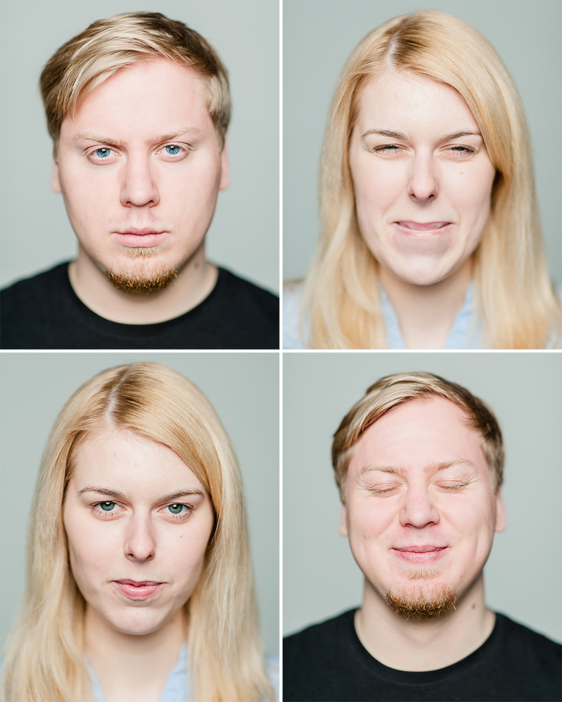
Table of Contents
About the Photograph – Things to Keep In Mind
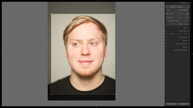
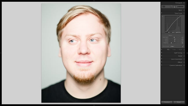
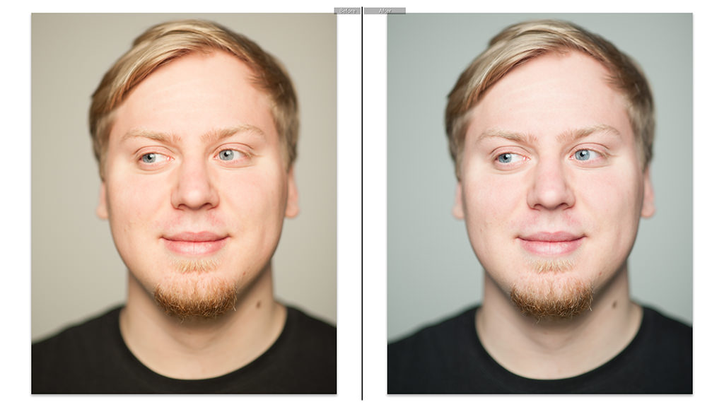
Say hello to Justine and David, our newest behind-the-scenes team members. As soon as weather warms up enough for some comfortable outdoor photography, they will be responsible for pretty much all the great, thorough video tutorials and workshops I have planned. But until their cinematography talents are needed, they’ve agreed to pose in front of my camera for some fun, simple portraits. In this article, I will be using the following portrait I chose out of all the other images (shown in Lightroom’s before-after view):
In our case, the person in this image is not what’s most important, however. The point I want to make clear is that there is no one way to process your color portraits or, in fact, any photograph. This is something I mentioned in my “How to Enhance Landscape Photos” article a while ago, too. Every photograph, depending on light, subject and vision will often require different editing. In our case, we have a simple, clean studio portrait taken using a single strobe with a large octagonal softbox. On the whole, it is a very flattering lightning setup, especially for women, but is not exactly creative. Shallow depth of field was used to keep only my subject’s eyes in focus. As all of these details would suggest, we are aiming for bright, pleasing skin tones and sharp in-focus details.
But perhaps I am wrong, perhaps you can indeed edit all images the same way? Well, to prove my point, take a look at the image sample on the left. Although it involves the same subject and was photographed only minutes before, everything about it is different, and thus processing is completely different. I also used a single light source, but in this case, it was hard. If I were to use the same settings on this photograph, it would’ve been of low contrast and rather pale. Why shoot using hard, contrasty light in the first place, then? The choices we are about to make for our target image would not work nearly as well for this particular lightning set-up and mood. For this reason, this is only one of the many articles on portrait photography post-processing topic that are to come. With that in mind, let’s get started!
Post-Processing Portraits with Lightroom 4
The portrait we will be working on, thankfully, doesn’t require too much editing. We will not be playing with Spot Removal Tool, nor will we use any External Editors. The steps we are going to take are quite simple and thus quick. Quick is good – the less time you spend processing your work, the more time you have for photography. Some light usage of Local Adjustment Brush as well as HSL Panel will be needed, and neither one of these have been covered in our Mastering Lightroom series yet. Bear with me if you’ve never used these tools before – I will make sure every step taken is explained in enough detail. In-depth articles about these and other features are to come soon, too.
What I list further on is essentially a mix of all the different techniques you can use to enhance your portrait. Feel free to stop whenever you want and skip certain steps if you feel such a decision will help you end up with a more suitably processed portrait. My goal is to show you as many options as possible while still making sure the whole process is not overly lengthy.
1) Starting with the Basics
Many of these settings can either be changed before you dive into more complex processing, or after you’re done with them. I often choose to take the first approach – it doesn’t require too much thought and attention. These adjustments can be safely applied to several images at a time. While at it, I think of the other adjustments I will need to make in advance. So, let’s start with the simplest ones.
- Crop: this photograph was taken with my Nikon D700 DSLR, which has a 3:2 aspect ratio much like any modern DSLR or mirrorless camera with APS-C or larger sensor size.
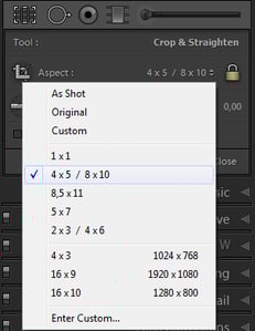
At times, I find this aspect ratio to be a little too narrow for vertical portrait shots. In such a case, the classic 5:4 aspect ratio works very well for me, and that is what I have chosen from the Aspect drop-down menu of the Crop Overlay panel (the left-most tool under Histogram panel, can be activated by hitting R on your keyboard). This aspect ratio got rid of excess negative space at the top and bottom of the image. I had to crop a bit tighter, too, because I failed to center my subject during exposure – he was moving slightly. Centering is often best avoided, but in this case I found such a composition to work better.
As you can see, there are several aspect ratios to choose from and you can easily specify your own through “Enter Custom…” option in the drop-down menu.
- Spot Removal: now, I mentioned I wasn’t going to do any cleaning even though there may be a spot or two that could use some. Due to the goal of this portrait – attracting viewers’ attention towards facial expression and features – I find a blemish won’t do any damage, quite the contrary. But then, these portraits are supposed to be fun, relaxed, nothing serious. More than that, we are going to sufficiently smooth-out the skin of our subject with further tone adjustments. Should your goal be different, you may as well use Spot Removal now. Also a good time to get rid of visible sensor dust if any is present.
- Sharpen: choose Sharpening settings while looking at the image at 100% magnification to better judge its effect. You can find these sliders in the Detail tab. Lightroom’s default Amount of 25 and Radius of 1 is not always enough when working with images taken at less-than-optimal f/1.4 aperture in terms of image crispness. For this image, I set the Amount slider to a value of 60 and Radius to 1.8. Such a relatively large radius adds a little bit of micro-contrast, which is important with shallow depth of field images.
Because there is very little in focus, I also set the Masking slider to a value of 80. Masking specifies which areas of the image are affected by sharpening settings. Simply put, the higher the value, the smaller areas are affected – those with more detail.
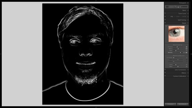
You can see which areas are affected by Masking if you press and hold Alt while dragging the corresponding slider. Read more in our “How to Properly Sharpen Images in Lightroom” article.
- Noise Reduction: as with Sharpening, these settings can be found in the Detail tab on the right-side panel in Develop module. By default, Lightroom doesn’t apply any Luminance noise reduction. As my image was taken at a low sensitivity of ISO 400, I’m not going to apply any. Perhaps your image is noisier than the sample we are working on? Then this is where you take care of the problem if it bothers you. Lightroom 4 can handle even very grainy images rather efficiently and, often, I find I don’t ever need Luminance slider set to a more substantial value that about 30. Your tolerance level may be very different from mine and you may prefer more aggressive approach. In such a case, you may want to read our “Photo Noise Reduction Tutorial”. I am hoping to have a separate article written on noise reduction in Lightroom soon.
- Lens Corrections: this tab on the right-side panel allows you to counter lens imperfections such as distortion and vignetting. Unfortunately, Lightroom doesn’t really support as many lenses as I would like. For example, my beloved Nikkor AF-D 85mm f/1.4 is omitted and the slow rate at which lenses are being added makes me doubt such an old optic will ever be there. Having said that, these portraits were taken at an aperture setting of f/1.4, which generally means heavy vignetting. Corner shading suits my taste most of the time, but not now, so I did my best to remove it manually. Hopefully, whatever the lens you used to take your portrait, it’s on the list and you won’t have to approximate. If you do, I find selecting a similar lens in focal length and aperture to be a decent starting line from which to fine-tune. In my case, this would be the newer AF-S 85mm /1.4G.


2) Working with Color and Tones
This is where the real changes begin. Previous adjustments are very important, but their effect is only visible on closer inspection. The following settings will bring much more dramatic and noticeable improvement.
- White Balance: you absolutely can not make any color adjustments until you’ve set your White Balance settings right. By right, I don’t mean scientific perfection in terms of color temperature and tint. Instead, what you should be aiming for is value that works well for your image and your vision disregarding what is technically a “correct” adjustment.
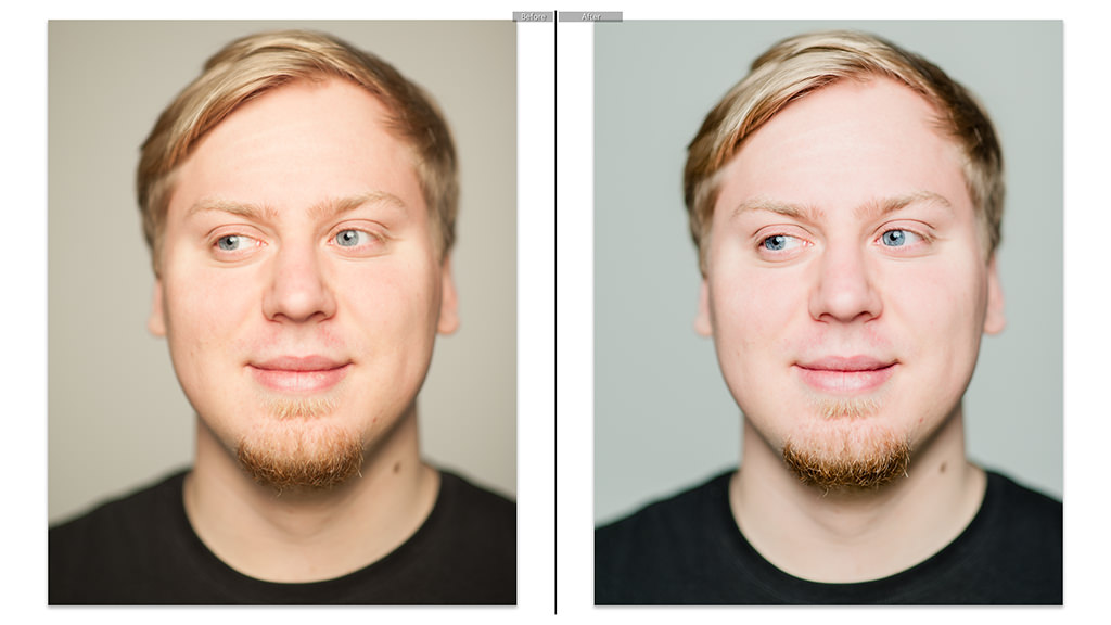
As you can see, the tones of my portrait are quite a bit too warm. Normally, I don’t mind warm-ish color, but this time, as we’re working with a very simple studio portrait, I find more accurate color would do good. Through trial and error, I’ve finally found that 2950 Temperature (from 3300) and -5 Tint (from -7) were more or less to my liking (despite being technically a little too cool). Don’t worry if you can’t make up your mind between a couple of settings. What’s most important is that you give yourself a good starting point from which to work on the rest of color adjustments. You can fine-tune anytime you want. Let’s see how much difference such a minor change of settings made:
Looks entirely different, doesn’t it? I can’t tell you how important adjusting White Balance is. As you continue with your processing you may find you’ve made colors too cool or warm, but as long as you have a good starting point you shouldn’t get any nasty surprises after fine-tuning Temperature and Tint.
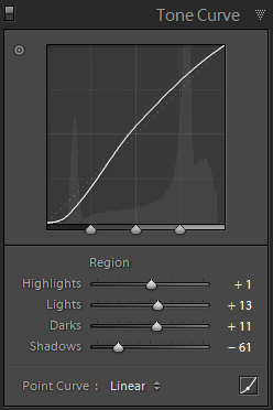
- Adjust Tone Lightness: time to brighten up that portrait. I will now make several different adjustments. Some of them may seem unnecessary and even counteracting at first, but bear with me. Making an image pop can be a very simple process – a basic S Tone Curve is often enough. But retaining smooth tone transition can be more challenging, as with our case. Because of all the different ways of affecting the brightness of our image (or certain areas of it) we are about to use, smooth tone transition should be preserved despite the added contrast. We are first going to brighten up the image, and then bring back some of the overly light portions down to where we want them. Let’s start with exposure.
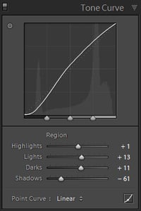
The exposure settings I chose initially are quite correct. However, with portraits, you will sometimes want them slightly overexposed so as to make the skin look softer and cleaner. Be careful not to push too much – you don’t want any highlights clipped to complete white! For our image, setting Exposure value to +0,30 did the trick pretty well. The reason why I didn’t go for more is because I will now brighten those tones with the Tone Curve as well, which gives me more control. Exposure changes all the tones, including the dark ones, while Tone Curve allows you to affect tones of different brightness levels separately. My goal is to brighten up all but the darkest tones and make that portrait pop. This is where an S curve with more emphasis on brighter portions of the tone scale comes in. Let’s see what we’ve got:
Looks a bit overexposed, doesn’t it? Some parts of Davids face are almost white, and for that, the Highlights, Lights and Darks of our brand new Tone Curve are to blame. The Shadows slider brought back some of the darker tones in the hair, beard and t-shirt. But we are actually not done yet with the brightening. Our goal now is to even-out the almost-white and slightly darker portions of the face by making the later almost equally as bright. Once we bring those tones down in the following steps, they will all be much smoother in transition because of it. It’s time for individual color adjustments in the HSL panel’s Luminance section.
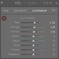
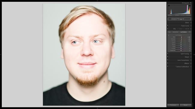
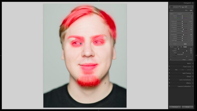
The colors we are interested in are those found in skin tones. They consist mostly of orange, red and yellow. You can manually increase the brightness of each color by choosing corresponding sliders in HSL panel’s Luminance section, or you can alternatively adjust it by clicking-and-dragging on the photo itself, which I chose to do. I’ve marked the tool for you in the screenshot on the left where my final Luminance settings are also shown. As you can see from the following image, the skin tones of our subject have become brighter still and, if you take a look at the Histogram, are dangerously close to becoming completely white.
To be completely honest, it’s not always a bad thing, having you subject’s face so bright. As I’ve mentioned, many photographers tend to overexpose when shooting portraits, even to such an extent. It works especially well when photographing women, because it hides almost all skin imperfections and focuses attention on more prominent detail, such as eyes, hair and lips. So, if you feel you like things that way, you can skip the following step where we bring skin tones back down a little and simply move on to “3) Local Enhancements”. But if you, like me, find such brightening a bit too extreme, the next step is for you.
- Bring Back What’s Lost: we do this by going back to Basic Panel and adjusting Highlights and Whites sliders to a negative value. This will bring brightest portions of our image down without affecting midtones and shadows, which we’ve mostly taken care of already with the Tone Curve. The brighter parts will be affected more than darker ones effectively minimizing the difference which, in turn, results in smoother tone transition – our original goal. This is the final step in achieving it successfully. Experiment with how much Highlights and Whites should be readjusted based on your preferred skin tone lightness. For the image we are working on, I chose a rather aggressive value of -60 for both sliders. You may be satisfied with half that or even less.
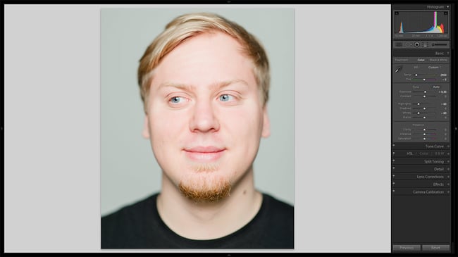
Looks good, I’d say. Yet not quite good enough. I like how the skin tones ended up, mind you. It’s just that other features – such as eyes and hair – are now too pale, while they should be much more prominent in the end result. Luckily, there’s an easy way to fix that.


3) Local Enhancements
What we are going to use now is a very useful tool called Adjustment Brush. You can find this tool right beneath the Histogram tab – it’s the last one. Alternatively, hit K on your keyboard to activate it. What this tool allows you to do is make all kinds of adjustment – starting with White Balance fine-tuning, Exposure and Contrast adjustment, all the way to Moire reduction and Sharpening – at specific areas of your choosing. In other words, you brush on adjustments where you want them. You can see just how powerful such a tool can be when post-processing your photographs.
There’s much to say about Adjustment Brush, and lots to show. In fact, a whole new article can and will be written about it. But we are not going to dive in too deep this time. Our task today is to work on a specific portrait, one that needs just a couple of last touches before it’s finished.
- Enhance General Features: we’ve worked quite hard to make those skin tones smooth and soft, but leaving David with such a featureless face is just crude. Certain features need to stand out to attract attention and make the whole portrait pop. These features are: lips, eyes, eyebrows, beard and hair. Fortunately, the task is quite simple. First of all, select the Adjustment Brush as described earlier. Next, cancel any changes to default settings that may have been entered previously – all Adjustment Brush values should be at zero. Then, adjust your Brush size until it’s comfortable to use over smaller areas, such as eyes, without covering too much skin around them. I set my Size slider to a value of 8, which is plenty large to make quick adjustment, yet small enough for keeping it decently tidy. Changing the size of the Brush is very simple and can be easily done on the go – just scroll your mouse wheel. You may find yourself changing the size constantly. That’s the right way to work with Adjustment Brush if you want to be precise.
Something else you may want to change before you begin applying adjustments (they can always be changed or canceled) is set Feather to 100 for smooth transition between adjusted and unchanged areas. You don’t want them to be very obvious, it has to look natural.Finally, the actual settings that will make the mentioned facial features more distinctive are Clarity and Sharpness. The latter isn’t quite as important, but as we’re drawing the viewers eyes towards these parts of our image, perhaps they should look a little crisper. I set the value of Sharpening to 25. You may prefer less or more depending on how sharp your image was to begin with. Essentially, this adjustment compliments our previous sharpening done in Details panel, but with less control over how it works (there’s no Radius adjustment, for example) and with more direct control over where it’s applied.
The most noticeable change is brought by Clarity setting, which I eventually set to 23. This setting mostly affects the transition between light and dark portions of the image (makes it less or more sudden, defined) and visibly alters the micro-contrast of the photograph. If changed extremely, it can also have a slight effect on the overall contrast of the image and shift the color somewhat. We don’t want that. When set to a positive setting it will make any shapes or forms more defined, starting with small, like skin imperfections, and ending with much bigger ones, like highlights in the background (the circles of bokeh) if present. Using Clarity through Adjustment brush allows us to avoid unwanted changes to the whole photograph from happening by keeping them within a chosen portion of the image. This means we can make eyes and hair stand out more without affecting skin.Time to apply the Brush. Here’s how I’ve done it (not too tidy, is it?):
Nearly there!
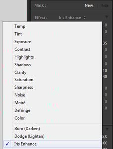
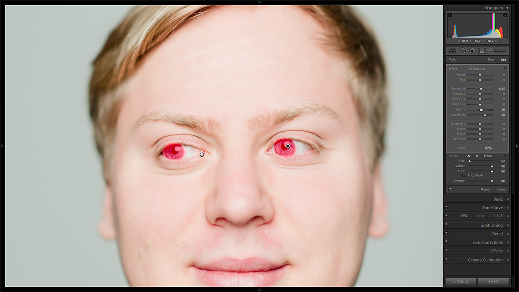
Enhance Eye Color: enhancing eyes is even more simple, because Lightroom already has a pretty good Adjustment Brush preset for you to try out. So, first of all, make sure to create a new Brush by selecting “New” in the top-most section of Adjustment Brush controls, called “Mask”. Then, choose “Iris Enhance” from the Effect drop-down menu, as shown in the screenshot. Adjustment Brush setting will be as followed: Exposure +0,35 to make the iris brighter, Clarity +10 to make details within the iris a bit more prominent and contrasty, and Saturation +40 to make the color more vivid. But these are default settings you won’t always be satisfied with. To see if that is the case, adjust your brush size and target only your subjects irises when brushing on as shown in the following image:
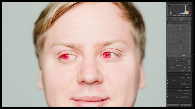
For me, the default Exposure setting of +0,35 is a bit too extreme, so I set it to +0,15 for my final image. Also, in case you want to enhance the color further on, you may use Color effect, which can be found at the very bottom of Adjustment Brush settings list. All you have to do is choose a color that would compliment your subjects eyes.
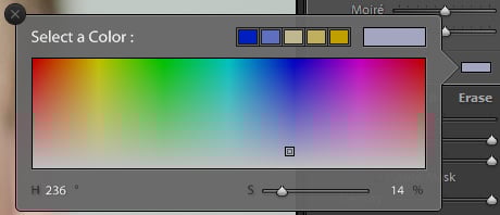
Make sure it’s not too saturated, however – you’ll need to be rather subtle in order to keep it realistic.

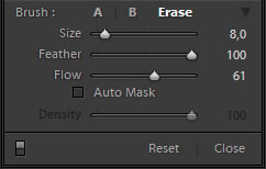
A side note: you can always alter the strength of your Adjustment Brush, even after you’ve applied it, and change any setting you want. You may also delete the effect from areas of your choosing if you’ve been too sloppy by using Erase Brush mode. We will discuss Adjustment Brush and the possibilities it offers in more detail in a separate article.
4) Last Touches
Most of the work is now done and the portrait looks much, much better than it did at the beginning of this article. However, there are a couple more options I would like to mention. While not something you necessarily must do (nor is any step in this tutorial, as a matter of fact), these settings may potentially improve the overall look ever so slightly even further. First of all, you can increase or decrease the overall Clarity of the image using Clarity slider in the Basic Panel. Because this portrait is of a male subject, I have no reason to avoid increasing Clarity slightly – say, to a value of +10. Were this portrait of a woman, I would not want to add more contrast to her features and would actually consider lowering Clarity to around -10 or leaving it at default value.
The other setting involves HSL Panel. Should you find any part of your image oversaturated, say – skin tones, you can easily desaturate corresponding tones in Saturation tab of the HSL Panel. In our case, I think David’s skin is quite fine, so I will leave Saturation at default values of 0.
Final Words. Was It Worth the Effort?
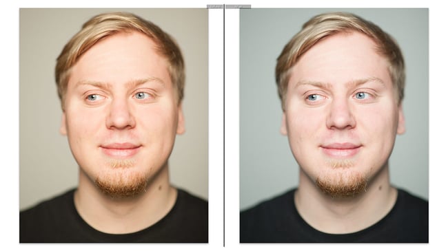
A simple question with a simple answer. For me – yes, the result of this particular portait image was very much worth the effort. It may not be for you or your photograph – as we’ve established already, they are all different, as are our visions and goals. Still, you may wonder whether some of these actions really made a difference – why lighten up the image only to bring it down again? Well, let’s compare the following images:
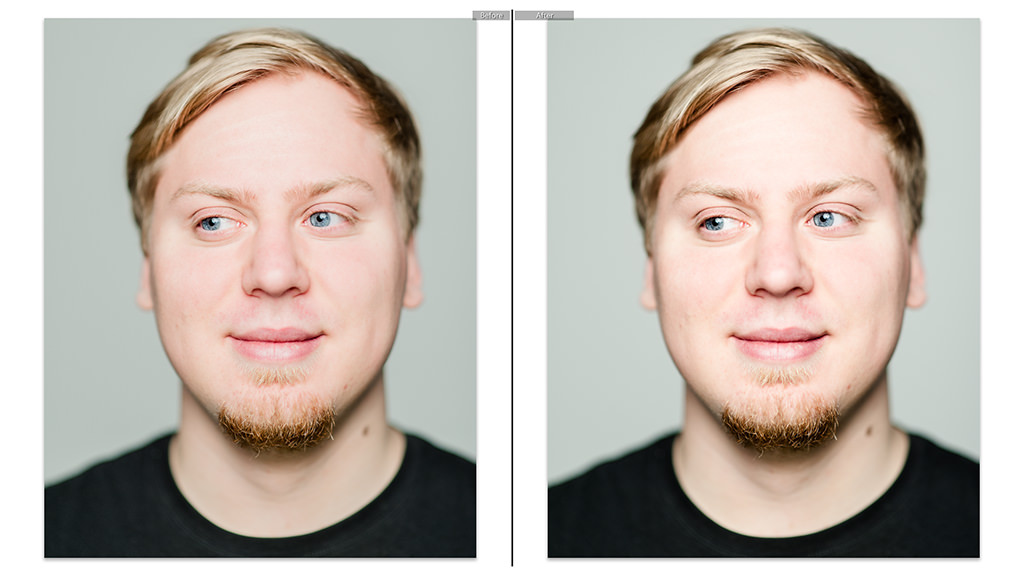
On the left side of the screen, you can see the final result we have been working on. On the right side of the screen, the very same portrait is shown, but without the Exposure, Highlights, Whites and HSL Panel Luminance tab adjustments. Which one would you pick? I believe the image on the left looks much, much better. Things aren’t as obvious with the following image, however:
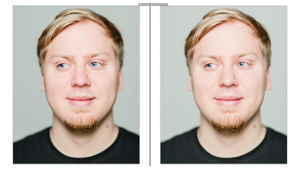
I chose to brighten my skin tones through HSL Panel so as to only affect my subject’s face, not everything else along with it. But you can do the same thing by altering Exposure setting instead (with a bit more brightness to the whole photograph added). Again, on the left side of the screen, our final image is shown. On the right side of the screen you will find an image that had its Luminance settings canceled, but lightened through Exposure setting by an additional +0,30 of a stop. As you can see, the difference is extremely subtle and only noticeable when you know where to look (t-shirt is lighter, for example, and some skin tones are not nearly as smooth on very close inspection). With some photographs, this may be more noticeable, especially if you need to brighten skin tones further than I did. Should you do it through Exposure, you may end up with a washed-out photograph, because all the other tones will be brightened as well – you’ll need to compensate through Tone Curve or any other tools. This time, the difference will not be worth the fuss of using HSL Panel over Exposure control for many photographers. Nothing wrong with that. In the end, you’ve just learned at least three ways of brightening and smoothing out skin tones – through Exposure alone, through HSL Panel Luminance tab alone, or through both in conjunction.
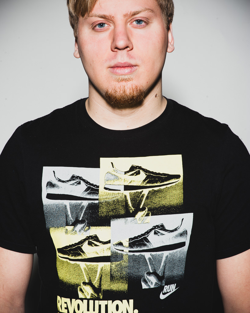
My goal with this article was to show you some of the things you can do, rather than what you must do. Lightroom 4 is great because it gives us several answers to one problem, and all of these answers are a little different and will suit different tastes. Hopefully, you will learn to use some of these steps in conjunction with other post-processing techniques to achieve the result you want. As for our portrait, let’s take another look at the photograph we started working on (left), and the result (right):
I hope you agree that the one on the right looks much better.
Wow this article contain very informative for the readers. Thank you for sharing.
Thank you so much!
Great job!
So much help for me!
Certainly taught me a lesson or two. Much appreciated tutorial! Keep those valuable tips coming!
One of the best tutorials I have read – thanks so much. I worked through your steps and got some amazing results. Thanks again.
Excellent article. I learned how subtle changes can have a big impact. Your explanation of the different sliders and why you adjust them was informative as well. Thank you.
Hello Romanas,
From Spain, i apologize my english level!. Thanks to the whole group for the article.
Romanas, i don’t know if you had writed in this series about the use of Lightroom with Nikon cameras, what software customization parameters to use, what camera profiles, what type of color management, etc. I use Nikon Capture NX for raw conversion and Capture One also, i see my photos better in this software. I see your photos processed with Ligthroom very well, and much worse the mines taken with Nikon D600, ajusted in Ligthroom 4 also, is the equipment (camera and lenses, monitors, calibration, and so on.) the reason?, is not to know the use of Ligthroom or the customization?, or maybe the photographer?
Regards.
Very interesting tutorial Romanas, thank you! It’s great to see how other people approach the same subject. There are a few points I’d like to contest though:) Firstly cropping. I would always do corrections to the complete raw file, that would allow for different crops to be done at a later stage, I’m not sure how the crop tool in Lightroom works, do the adjustments only affect the cropped image or the whole file? This also affects lens vignetting, any adjustment must be done on the total image, as a cropped image would have unequal shaded areas. Lastly sharpenning, this should always be done last, as it is dependent on the resolution output of the file, print or web, although some pre-sharpenning can be done at raw conversion stage. Peresonally, for portraits of this nature I do two raw conversions, one soft for skin and background, one sharp for details, hair and clothes, then layer them and paint in as desired on a mask.
Excellent work, thanks!
Is it possible to create a standard flow (or a generic profile) that you can use for portraits which will give you >90% of the quality compared to processing all portraits individually?
Your tutorials are excellent…the best I’ve seen. Thank you for this series! I learn far more from you than any book or other online source.
+1
On the first 2 comparisons then left side is said to be the result of edits (which I think is incorrect). The third comparison correctly says the image on the right is the final image.
Preston, Mark,
there’s no mistake – in the first two sets of comparison images in the last section of the article, the final result is displayed on the left side of the screen. In the first comparison, the right-hand image bares much less pleasing skin tones. In the second comparison, the images are very, very similar (I tried to match skin tones with Exposure slider as closely as I could despite slightly different processing). The differences become clear when you know where to look – shadows and t-shirt in the right-hand image are a bit brighter because Exposure affected the whole image, while HSL adjustment lightened up only skin tones on the left-hand image. Also, the color of skin is ever so slightly different – the image on the right is a bit yellower. What I wanted to show with the second comparison was that there are several different ways of achieving a similar result. Similar, but a subtle difference remains. It’s up to photographer to decide which way to use depending on what they want to achieve.
Romanas, this is very confusing. In all of your side-by-side comparisons, you have Before on the Left and After on the Right – according to the tiny (almost illegible) captions at the top of each image.
On the whole, I think your choice of a pale model, with changes almost too subtle to display at the low resolutions chosen for the web, has spoilt an otherwise interesting article. At one point you enquire: “Looks entirely different, doesn’t it?” – Well, no, it doesn’t, unless you have a magnifying glass! Yes, I did click on the thumbnail to reveal the lightbox, and the right hand photo IS cooler, but it seems quite a small change to me.
However, you explain the techniques quite well, for which I’m sure we are very grateful.
June,
I cannot possibly guesstimate how well or poorly monitor of each our reader is calibrated. There is a big difference between images before and after I tweaked WB – the one on the left is considerably warmer, especially if you understand how important even subtle changes are for skin tones.
What monitor are you using?
Dell U2412M – calibrated just fine, thanks!
I’m not questioning your colour perception, rather, my criticism related to the image sizes… and to the confusion between left and right in your reply to Mark and Preston – quote: “the final result is displayed on the left side of the screen”. All of your left side images are annotated ‘Before’!
Shurely shume mishtake (Connery, S)
Oh, June, forgive me, then. When it comes to image sizes, you have a huge screen with huge resolution. I have a slightly smaller Dell myself with 1080p. Whenever we upload images to PL, we need to make sure they are not too big for the majority of users, in other words – those browsing our website with much lower resolution screens.
As for the annotation, there’s a simple reason for that – the quickest way for me to show the difference in those two cases was to create a virtual copy of the final image, making it the starting point (and thus the “before” caption), and then canceling settings. So “after” means “after canceling settings”. The image on the left, in those two cases, is the final result of our tutorial. :)
Thanks for the reply Romanas. My apologies for the confusion. I had 2 independent reasons which led me to think there had been a mistake. 1) the first 2 comparisons in the “Final Words: Was it Worth the Effort?” section said the results were on the left, but I thought the skin tones on the images on the right looked better to me, and 2) despite the “better” image being shown on the left on the previous 2 comparisons, the 3rd and final comparison states that the final image is now on the right. #1 is obviously just a differing of opinion, so no need to go into that, but #2 could have been prevented if there was consistency in this regard.
I’m not trying to put down your photography or anything here – I just thought there was an honest mistake. I still learned some new tips in this tutorial, so thanks and keep ’em coming!