In this short tutorial I will show you how to use one of the easiest and most powerful tools found in Lightroom – the Tone Curve. In my previous tutorial about black & white conversions, I briefly showed you how to use the HSL Panel’s Luminance section to control the lightness of separate colors of the image. Using the Tone Curve Panel is very similar as it also allows you to control the lightness and darkness of various parts of a given photograph, however, rather than altering separate colors, the Tone Curve tool controls certain ranges of actual tones in the image.
Table of Contents
What Is It?
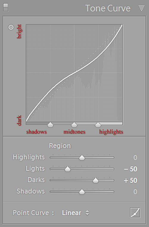
The Tone Curve represents all the tones of your image. The bottom axis of the Tone Curve is the Tone axis: the line starts with Shadows at the left-most end and ends with Highlights in the right-most end. In the middle you have Midtones, which are then further split into darker Midtones, called Darks in Lightroom, and brighter Midtones, called Lights. In other words, going left to right, the curve starts with Shadows, Darks, Lights and ends with Highlights. You can also see the corresponding range shown to you by Lightroom once you hover over a specific slider under the Tone Curve, in the Region section of the Panel. The Y axis represents lightness of a given tones. The tones get darker as you move lower and brighter as you move up the axis.
While all of this may sound very technical, it is in fact quite simple to adjust. All you need to decide on is which range of tones you want to alter, for example: if you want to make the Midtones of the image darker, just click on the middle portion of the Tone Curve and gently drag it downwards – you will notice your image getting darker as you drag it, similarly as it would if you were to decrease Exposure in the Basic Panel. If, on the other hand, you wanted to make your Shadows part of the image brighter, you should click on the left-most third of the Tone Curve which represents the Shadows and gently drag it upwards to see them brighten up. Simple, isn’t it?
Region Curve and Point Curve
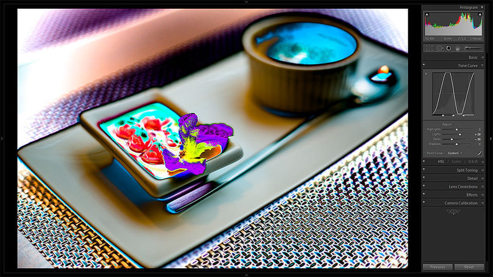
Lightroom has two different Curves you can work with. The one that I’ve been showing you so far (the enlarged screenshot at the top) is the easiest to operate, especially for beginners – lets call it the Region Curve for simplicity sake. When you’re using this Curve, Lightroom basically helps you keep it as smooth in transition as possible, so that you don’t ruin your image by accidentally distorting the Curve too much. You can either adjust it by dragging the Curve itself or using the sliders bellow it, which will give you exactly the same flexibility. You can also adjust it using an automated Lighroom tool, which appears as a dot at the top left of the Tone Curve Panel, right next to the Tone Curve. All you have to do is click on it to turn the tool on and then click-and-drag on the particular tone range or area of the image to adjust it. Even if you tried hard, however, you could not make a, say, “N” shaped Curve using Region Curve simply because Lightroom is aiding you by keeping a smooth tonal transition – a very useful feature, really, it saves you from ending up with something like this:
But then there is another Curve you can use if you do need to make adjustments not possible with the Region Curve, and it is called Point Curve. You can activate it by clicking a small square button at the bottom right of the Tone Curve Panel. Once you do that, you will instantly notice sliders disappear only to be replaced with one control – Channel. This setting allows you to choose which color – Red, Green or Blue – you want to alter (the default is set to RGB, which includes all colors). Changing individual colors opens up a whole new range of editing possibilities, like simulation of film cross-processing (deliberately using wrong chemicals to develop film and get crazy cool colors), but we won’t be getting into that this time – that’s a whole new article. Lets leave the Channel setting at its default RGB mode.
The idea of Point Curve is that you can alter it whichever way you like and make a complete mess out of your image – Lightroom will not get in your way. It’s a great tool for some advanced B&W and color work, but is also very useful when used as a starting point to work with Region Curve afterwards, much like the tone curve your camera uses when you take photographs. Lightroom actually allows you to choose one of the default settings of the Point Curve to use as a starting point – you can choose it by clicking on the drop-down list at the bottom left of the Tone Curve panel in either Region Curve or Point Curve mode.
I plan to discuss the use of the Point Curve in greater detail in future tutorials as it offers a complete new range of creative editing. For now, lets focus on the simpler and more popular Range Curve (and simply call it Tone Curve further on before it gets too confusing).
The Easy Part
As I have already mentioned, working with the Tone Curve is actually very easy. Depending on what you want to achieve, there are basically only four things you need to remember.
1) How To Make Your Image Pop
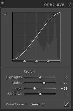
Most of the time, this is the primary intention when using Tone Curve. Sometimes you may find that, after you’re done with the Basic Panel adjustments, while everything may technically be correct, there is still something missing, something to make that photograph look worlds better than it does. And you can see it in your head – it should look better, but why doesn’t it?
There are a few ways you can adjust the Tone Curve to give your picture that bit of magic it seems to lack initially, but by messing with it too much, you might as well end up with a horrible, unrecognizable image. The most dependable technique is adding a slight “S” curve by dragging the lower third of the curve down slightly, and the upper third of the curve slightly upwards. What this does is darken the shadows, which is the lower third of the Curve, and lightens the bright portions of the image, which are represented by the upper third of the Curve. You may just as well use the sliders under the Tone Curve to specifically change exactly what you want.
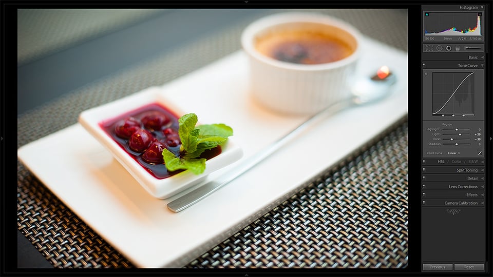
Lets take the above picture and try to add a little more contrast to it by playing with the Tone Curve. By setting the Lights slider to +29, I boosted the brighter portions of the image while still retaining enough tones to keep them from blowing out. By moving the Darks slider to -39, I’ve darkened the shadowy parts of the image, yet not enough to make them completely black. This is what I got (enlarge and use arrow keys to compare; note changes in the Panel):
Looks much better, doesn’t it? And with such a modest adjustment, too. You may notice color has changed somewhat as well – it’s a bit more saturated now, deeper, especially the cherries. While in this case I don’t mind extra punch in colors, it would be nice if I could set the effect to Luminance only – too bad Lightroom didn’t add such feature with the new version, Photoshop allows one to do that. Still, I can always bring those colors down by adjusting the Vibrance slider in the Basic Panel if needed.
2) And If You Want Less…
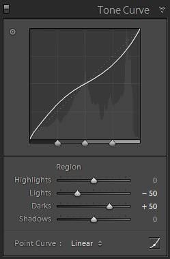
…all you need to do is set the curve to reverse “S” by bringing the Lights down and upping the Darks a little. You may want to do that when you find the image to be too contrasty as it is, or if you want to achieve a certain low contrast look. Setting the Tone Curve into reverse “S” will flatten the image, bring Lights and Highlights closer to Darks and Shadows in their tonality. This also helps if you have blown-out portions of image that you want to fix specifically with this tool, although you should always remember the Tone Curve works best in conjunction with the rest of the tools you can find in Lightroom.
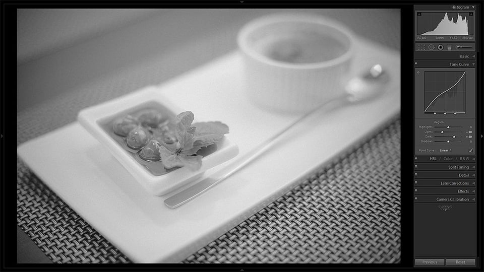
Lets see what happens if you push the upper half of the Tone Curve slightly down (Lights at -50) and the lower half of it upwards (Darks at +50):
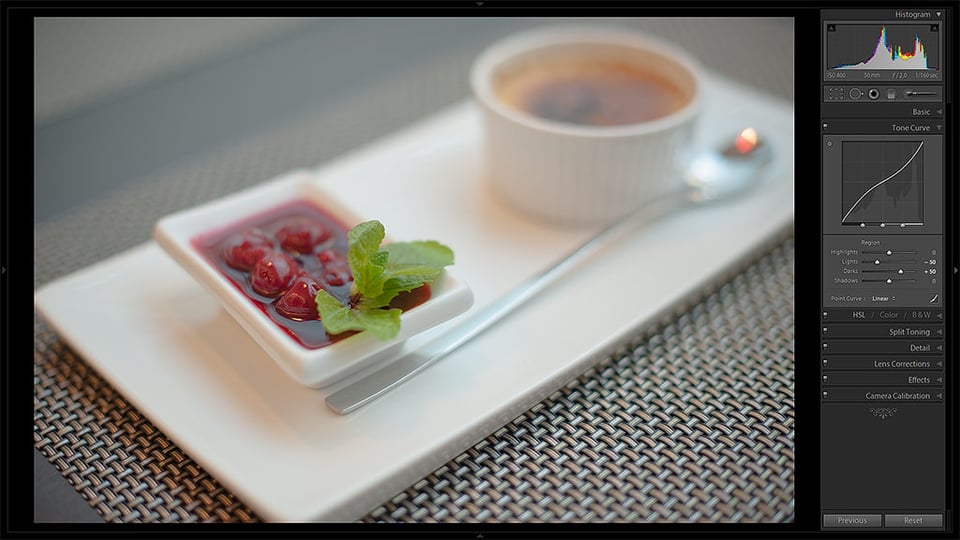
Looks much more flat, and the colors are less vibrant, too. This kind of Curve adjustment can often serve B&W photographs very well. Have you ever wondered why some of those black & white’s are so dreamy and moody? A low contrast Curve might just be one of the reasons, take a look:
3) Don’t Overcook It
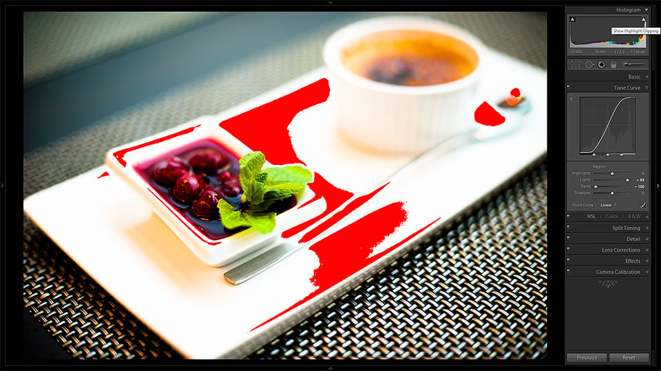
Too much is usually not a good thing, and Tone Curve adjustments follow this rule. Altering the Curve too drastically may lead to blown-out highlights and pitch-black shadows, so unless this is what you’re after, play safe and adjust the Tone Curve along with Basic Panel settings to get the best result. Remember, while it is one of the most powerful tools in Lightroom, you may end up ruining your image just as easily as enhancing it.
4) Experiment!
You may find that you only need to alter Lights, or Highlights, or maybe turn that straight line into a zigzag. Experiment! It’s the best way you can learn quickly and find new techniques to enhance your images on your own and then, hopefully, share them with others.
Good luck!

Thanks! :) i’m using Olympus Master 2 from my Olympus DSLR to make my photos look less lighter for my Nikon Coolpix images, it runs faster than the Nikon software so i’m using this instead, taking up-close photos isn’t too good with it, the macro on it sucks and photos closer to the subject i’m taking a photo of it gets flooded with too much light from the flash so i turn down the ISO to compensate but then it’s too dull looking, i always wanted to figure out how the Tone Curve pannel works on photo editing softwares and dragging the lower 3rd of it down then the top 3rd up works well :).
I like putting handy life hacks i figure out on pinterest, the 3rd photo i slightly moved the top 3rd left in a straight line too, just slightly, this kind of darkens it too but makes the objects look a bit more colorful and contrasted, might not work with some kinds of shots but it does for objects up closer or shiney plastic objects, this helped so much and now i can some what make my photos look better.
is there a way to use the lightroom 5 curve like the lightroom 4 curve feature? I’m finding the latest version very frusterating as i can not move it freely. why is this?
How would you use lightroom/tonal curve to reduce or soften sunlight on a subjects face? The prior version had a “recovery” option which aided with this, but it is not present in the newer version. Any suggestions?
Hello, Michael!
I would probably use the Tone Curve along with the Local Adjust Brush tool, of which I am yet to write. Also, Recovery option has been split into several sliders in Lightroom 4, which makes for a more versatile tool. Read about it here – photographylife.com/maste…asic-panel
Hi Roman,
To be frank, I really didn’t have a clue about what each slider do for me in Lightroom before reading this post and one other article both written by you.
All my photographer friends and all the online photography sites suggest that one should shoot in RAW, so I started doing it. But I had a big trouble when doing the post processing because I was moving each slider without knowing what it was doing and the end result always turned out to be a complete mess.
I have just done reading through this and “How to use the basic panel” articles, both of which are written by you and I am very thankful to you for giving us such a big help. Your writing is easy to understand and it didn’t get me confused at all. I was trying to look for Lightroom tutorials all this morning on internet but until I discovered your posts, I was being hopeless because I got more and more confused as no one explained as clearly as you did about how each slider affect which part of the image in such a step by step way.
I will continue to browse through Mansurovs for more Lightroom related articles and hopefully, I’ll get to know more about other panels other than this two, as well as about black and white photography and some other tips if you have written any.
Thank you again and wish you have a great day :)
Sincerely,
Shyam
Darktable, which I use instead of Lightroom, allows one to curve the luminance or rather ‘lightness’. Strike one up for software libre. :)
i’ve been using LR3 for almost 11 months, and recently upgraded to LR4(trying to get used to the new basic panels) , and because of this post, i finally know how to use the curves. Great help. Thanks. I hope you can also post some basics for PS, cause i really don’t know how to use it, and i think i need to learn it as well.
Anyway, thank you so much. Great help
Roman,
I just started learning LightRoom (LR) and I order LR3 from BH just before LR4 release. So far, I’m not sure what are major new feature in LR4. I hope your excellent tutorials should give a good jump start for any new LR beginner like me. Are you writing these articles specific to LR4 features?
So far, I am working with LR4, but plenty of controls are identical – you will find most changes in the basic panel, as I’ve described in this tutorial – photographylife.com/maste…asic-panel.
The Tone Curve is almost exactly the same, I believe, so go on and experiment. Lightroom 3 is a great program!
Following Lightroom’s “top to bottom” workflow, I find whenever I get down to curves any changes I make here usually push my images “over the top”. I seem to get plenty of “pop” via exposure, recovery, fill light, blacks, brightness, and contrast sliders.
What am I doing wrong that I never feel the need to use curves? Everyone goes on and on about how awesome curves are, so I know it’s probably me! ;)
-Shawn
Forgot to mention I also use Clarity, which is also before Curves, and that often adds plenty of contrast without going overboard.
Hello, Shawn!
Clarity has a rather different function than the Curve. I usually set my Basic Panel in such a way that I’m still left with room to adjust the Curve to the level of contrast I need. Basically I make sure I have all of my tones in check before moving on. I try to use every function the way it was designed to so that I achieve the best result. If Clarity works for you, great – there is really no wrong way in this as long as you like the result. I rarely use Brightness or Contrast sliders at all. Clarity is a very delicate setting that can easily bring unwanted effect. Read the following article if you haven’t yet to learn a little more – photographylife.com/maste…asic-panel
Maybe you’ll find it useful :)
Also, the curves are not limited to just adjusting the contrast. I hope to talk about it in more detail sometime later :)
You read my mind Roman. This is just the article I was waiting for from Mansurovs :)
I’m glad, Sid!
Anothe fine piece, thanks Roman! I am also cheesed that you cannot adjust a curve with luminosity only, as you can in Photoshop. Maybe in Lightroom 5!
Maybe, Matt, we can hope. Still, it’s a little sad we’ll have to wait even longer for such a useful and, frankly, rather obvious feature.