Lightroom has many features that can easily confuse those who are new to it. While the program offers plenty of different editing opportunities, in order to achieve the best results and user experience, it is important to understand the very basics of Lightroom. In the series of upcoming short articles, I will try to explain each of the most important Panels in Lightroom, so that in the end, you will find it to be a simple, quick and easy to use software for your post-processing needs. Lets start with the Basic Panel.
Table of Contents
Where to Find It
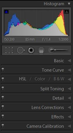 The Basic Panel can be found in the Develop Module right bellow the Histogram display at the top-right side of the screen. Expanding the panel will reveal a number of basic controls offered by Lightroom. These controls show you the most obvious benefits of shooting in RAW, such as White Balance and Exposure Compensation adjustments. Lightroom was developed with a left to right, top to bottom editing workflow in mind. While in some cases you will find yourself going back and forth between the settings, we will try to stick with that order at this time.
Tip – if you left-click the top of any Panel while holding down the Alt key (for Windows users) or the Option key (for Mac OS users), Lightroom will go into Solo Panel mode and only keep one Panel open at a given time (for example, if you had Tone Curve Panel open and then click on Detail Panel, the Tone Curve Panel will then close). This allows for a more tidy experience, especially if you often find yourself scrolling through the right-side Panel List. Clicking it again the same way will return Lightroom to previous state. If you want to open another panel without closing the previous one in Solo mode, Shift-click it. Ctrl(Command)-click a panel to open/close all.
The Settings
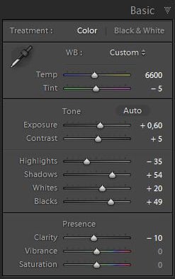
1) Treatment
The very first setting you can change in the Basic Panel is the Treatment of the image. You have two settings – “Color”, which is set by default and keeps your image in color, and “Black & White”, which, as I have mentioned in my B&W Portrait tutorial, is a great way to start working on a B&W look of your image if that is your intent.
2) White Balance
Sometimes the Auto WB setting on your camera may pick the wrong value, or you might choose a wrong one yourself. These settings are there to make sure that the color captured in your image is correct no matter how the camera was set when you took the picture, so if the image is too blue or too orange, you can easily correct it.
 Tip – you can also tell Lightroom what the correct White Balance is by using the White Balance Selector tool (press either “W” key or click on the eyedropper next to the White Balance slider) on a white color on your image. Lightroom will adjust accordingly. This tool will work best if you have a picture of an 18% Gray Card (X-Rite Color Checker works magic for these things) taken in that light – use the tool on the picture of the Gray Card and apply the value on all pictures photographed in that light.
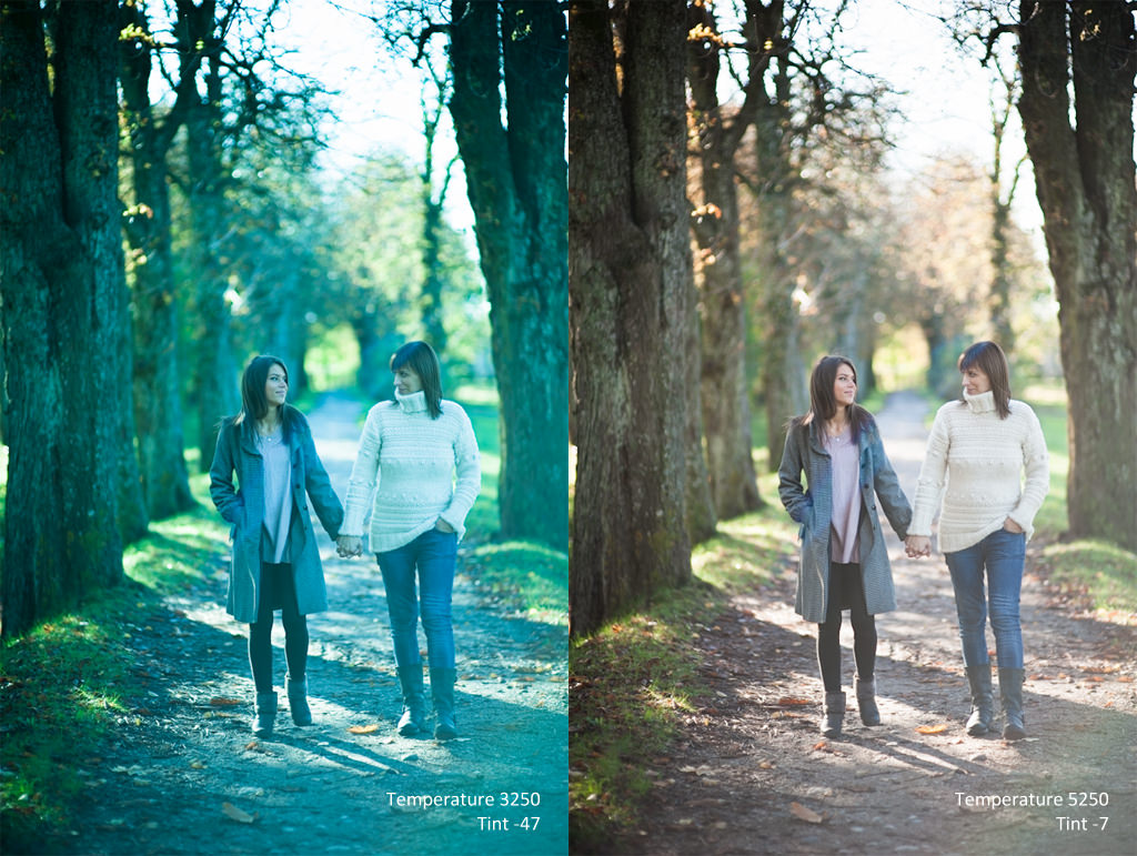
2.1) Temp
Here, you can either choose one of Lightroom’s presets in the drop-down menu and, if needed, tweak it further on, or simply set it to the value you think is best. Temperature tweaking is one of the most noticeable advantages offered by RAW image format over JPEG. It sets the warmth of color in your image. As you probably know, it differs greatly depending on the light source. Just move the slider until the color looks correct.
2.2) Tint
Sometimes setting correct Temperature may not be enough. Adjust this slider to the left if your image seems to have a purple tint, and to the right if it seems to have a green tint. The initial adjustment depends on what the camera was set to when the image was taken.
3) Tone
Tip – us the “Auto” feature to let Lightroom decide what Tone settings fit that particular photograph. While it might make a mess of things, sometimes you can find a good starting point in Lightroom’s automatic features that will only need a modest amount of tweaking.
3.1) Exposure
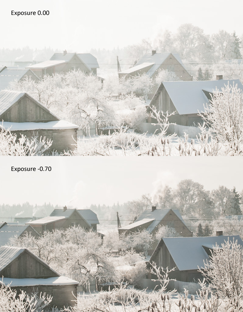 This setting allows you to, to an extent, artificially adjust the exposure of the image (for example, if you took the image at ISO 800, f/2.8, 1/125s and adjust the exposure to -1.00 stop, it will look as if the photograph was taken at 1/250s). The extent of the adjustment largely depends on the Dynamic range of the photograph (and, obviously, your camera). This setting is extremely useful in correcting any kind of over or underexposure that may have happened. Do note that it doesn’t really change camera settings, it just darkens or lightens the image, and so extremely dark shadows or blown-out highlights cannot always be saved. Brightening the image a lot will also increase the noise somewhat, especially in the shadows. Lightroom 4 lets you adjust the exposure by either +5 or -5 stops, while Lightroom 3 offers adjustments of up to +4 and down to -4 stops. Either is enough in most situations and often exceeds the Dynamic range of the image.
3.2) Contrast
Adjusting this setting will either make your image have more or less contrast. Move the slider to the left to make bright parts of the image less bright and dark parts less dark, or move it to the right to make shadows and highlights more distinguishable. This slider is good for making minor changes, but overall doesn’t offer much control over which tones should be considered as bright or dark. The Tone Curve is much better for that, but it’s also slightly more complicated.
3.3) Highlights, Shadows, Whites and Blacks
These tools are among the most powerful in Lightroom 4 and are real life savers, they let you individually adjust the dark and light parts of the image. If you find that, even after using the Exposure Compensation slider, some parts of your image don’t look good enough, use the Highlights and Whites sliders to bring back some of the seemingly blown out areas in the image, or Shadows and Blacks sliders to fill in those dark portions of the photograph and give the it more detail. With that in mind, you can also move the sliders to the other side to make the light parts of the image even lighter, or dark and shadowy parts darker. To make the light or dark parts darker, move the sliders to the left, and to make them lighter, move them to the right.
Tip – these tools work well in combination with the Contrast slider or, especially, the Tone Curve tool – they allow you to keep the image nice and contrasty while, at the same time, keeping those highlights and shadows at bay. These sliders don’t affect the mid-tones much, so your overall exposition will remain correct – just set it the way you like and then adjust the parts of the image that are either too bright or too dark to get exactly the look you want.
4) Presence
4.1) Clarity
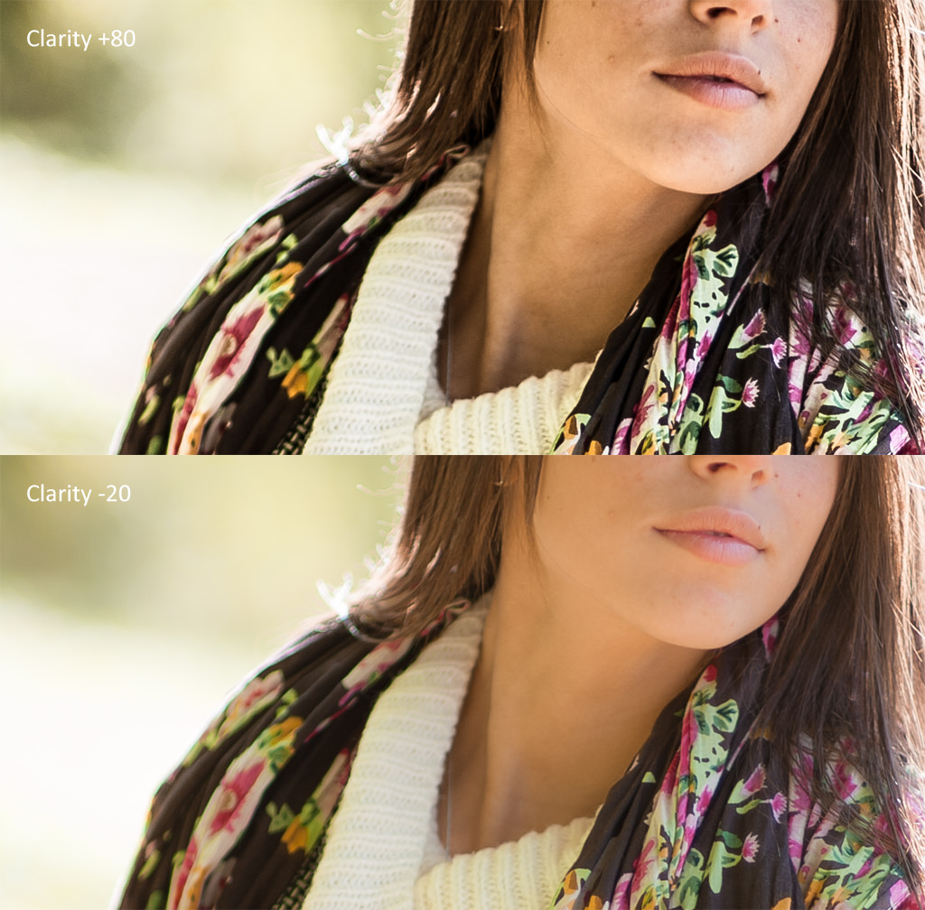 This tool mostly affects the transition between light and dark portions of the image (makes it less or more sudden, defined) and visibly alters the micro-contrast of the photograph. If changed extremely, it can also have a slight effect on the overall contrast of the image and shift the color somewhat. When set to a high setting it will make any shapes or forms more defined, starting with small, like skin imperfections, and ending with much bigger ones, like highlights in the background (the circles of bokeh). If you move the slider to the left it will, on the contrary, make the image less defined, give it an almost soft-focus effect, which fits portraits well. For landscape photography, it is often better to move the slider to the right to give a more defined look to textures and shapes. Don’t overdo it though, as it will make your images look too fake and over-detailed.
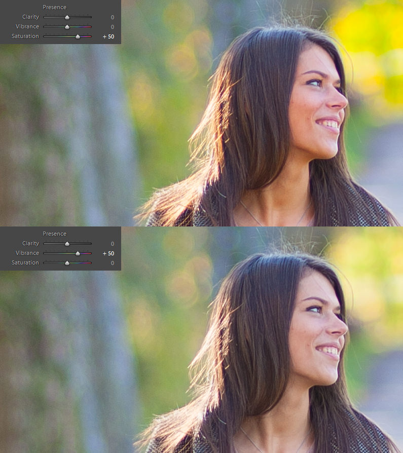
4.2) Vibrance
If you want the colors in your image to be more saturated, this is the setting you change. Now, while I said “saturated”, the correct term would be “vibrant”. This slider, if moved to the right, will make the colors more intense, but only where needed – it will not shift them or give a color cast to the image. If you move it to the left, the colors will be much less intense, but the photograph won’t go completely black & white.
4.3) Saturation
 Saturation is often wrongly used to make the colors of a particular image pop. While, if mildly changed, it can make a photograph more colorful, if pushed at least a little too much you will find your colors shifting, loosing detail and the whole image will have a sudden color cast to it. This is because this setting affects all the color in a particular subject, not just the one that dominates (faces, for example, will often become a mixture of red and orange). I recommend using this setting only if you want to desaturate your image for a B&W look. If you want your colors to pop, use the Vibrance setting, it will be a lot more flattering (neither should be pushed too hard, though).
Differences In Lightroom 3
The biggest visible differences between the older Lightroom 3 and newer Lightroom 4 are possibly found in the Basic Panel. The older version, instead of having separate Highlights/Shadows/Whites/Blacks sliders has Recovery/Fill Light/Blacks/Brightness sliders instead. While they are slightly inferior in flexibility to the new controls, they can still give you the desired effect. Use the Recovery slider to bring back the highlights and the Fill Light slider to make shadows brighter. While the Blacks control can not be moved to the left beyond the value of “0”, a combination of Recovery, Fill Light, Brightness and Exposure sliders can save you a lot of detail in both blown out parts of the image as well as the darker shadows. Experiment with these options to find the best balance for your image – even though the tools are slightly different from Lightroom 4, they are still very powerful. After you are done with all these settings your image should have perfectly fine colors as well as a correct exposure for both shadows and highlights so that you’re ready to move on to more advanced editing.
The Limitations of the JPEG Image Format
You will find that all the functions found in the Basic Panel will do their job when editing JPEGs, however they will have much less latitude (the Exposure slider, mostly) and will be much more intense. If you had a small error in your WB settings, for example, Lightroom might help you fix it, but only if it’s not too critical. With a more extreme adjustment, you will find your image losing quality rather quickly, simply because JPEGs limits the amount of information stored in the image, specifically color, shadows and highlights. Edit those JPEGs with care.
Thanks
Hi Roman! Thanks for the great tips! I’m still a beginner in using Lightroom, and your post just made everything more understandable. Am looking forward to more of your posts! :D
Hi There,
First I would just like to thank you for all the great resources and information, you’re website is super informative and great for amateurs such as myself.
My question, that I can never really seem to get a clear answer on (I suspect is because it’s somewhat subjective and personal preference) is when post processing in LR, how do you know when you’ve edited an image too much, not enough, or have edited to a point where it’s just right?
There’s so many things you can do in LR and although I feel I know my way around the software pretty well, but sometimes when editing my images I’m never sure if I’ve over-edited or maybe didn’t do enough… it would be great to maybe do a blog post/article on this! :-)
Thanks!
I know how to make a profile with Colorchecker Passport.
But how is the best way in lightroom 5, to adjust Highlights, Shadows, Whites and Blacks, with Colorchecker Passport ?
As a non lightroom user, can someone answer what hopefully sjould be a simple question.
The basic Develop and processing panels have a dark gray background with white lettering. Can you change this to black lettering on a white background?
I find this better on the eyes.
Thanks
Michael
Michael, sorry, no way to do so that I know of.
Thanks for sharing.Good luck!
Hi Roman, nice article very helpfull.
I like photography, yeah I’m not expert just amateur… Now I learn how to editing use LR4. This program very nice.
I still learn it. I want ask how we can use spot removal? And brush?
I know if we want edit just one side we use that brush right? But sometimes I confused how use brush with correct. Coz sometime i use brush for one area and make that area very bright, white.
That why I want ask how we use that brush with correct?
Include spot removal too? coz that we use to erase things we don’t want right?
Hope you can reply me in my email.
Many thanks for your help
Fan, Adjustment Brush will be covered in a separate article in extensive detail. As for Spot Removal tool, we have an article for you – photographylife.com/maste…moval-tool
Good luck!
Hi Romanas, thanks for reply me. Yeah I will read and try that. Many thanks…. ‘_’v
Hi Roman,
Thanks a lot for your articles. Very helpful!
I wanted to ask you, what are the differences between the highlights, shadows, whites and blacks in the basic panel and the highlights, lights, darks and shadows in the tone curve? I endlessly tweak them in both areas, not neccesarily to my satisfaction.
When I read your article, it makes sense, but when I get back to lightroom I get lost in moving the sliders back and forth.
What i’m mostly trying to achieve with post-processing is either
1) Bright, crispy, (white) balanced images
or
2) A soft, hazy look without losing too much of the vibrant colors and balance in all the tones
The latter I find especially difficult. Is this done with a filter rather? Or layers in photoshop?
Thanks in advance for answering!!
Hello Roman,
I wanted to take the time to say thank you for some great and useful articles; I have been using lightroom without any type of training whatsoever, and this has been very frustrating at times. Still need to learn so much!
You are very welcome! I can assure you, this is not the last article on Lightroom :)
Roman,
Thank you very much for your tips and information about LR article. It’s really useful and straight forward. Looking forward to read more articles from you and your team.
Regards,
Tina
You are most welcome, Hartina!