So, you’ve taken a photograph of a beautiful sunset or a peaceful, fog-covered valley. But something is missing in the picture – it just doesn’t look as good straight out of camera as the scene you were seeing at the time. By using simple Lightroom tools, such as Clarity, Graduated Filter and Curves, enhancing a landscape can be a very simple and fast process. While there are many advanced ways of processing landscapes, not all images require that much post-processing. In this Mastering Lightroom series article, I will show you how to quickly enhance landscape photographs using just Lightroom 4.
We posted an article on the same subject a while ago, “Landscape Photography Post-Processing Tutorial in Lightroom”. Although these two tutorials take a different approach to post-processing landscapes, the choices you make when adjusting certain settings will rarely be the same for every shot. Thus, you will find it to be a worthy read as well – see which steps work for you best!
1) The Photograph
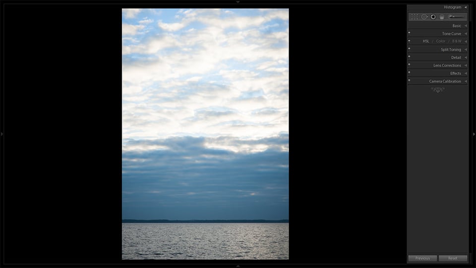
I took this image on a beautiful evening by a lake nearby. The sky had a very subtle yellow cast to it due to sun coming down. There was some gentle wind, so the lake surface was covered in small, nervous waves – it looked almost as if the water was on the verge of boiling. It also looked somehow solid – you couldn’t really see through it at all. Not a very dramatic sight, it was peaceful. I also liked the contrast between warm color of the sky and the cool color of the lake surface.
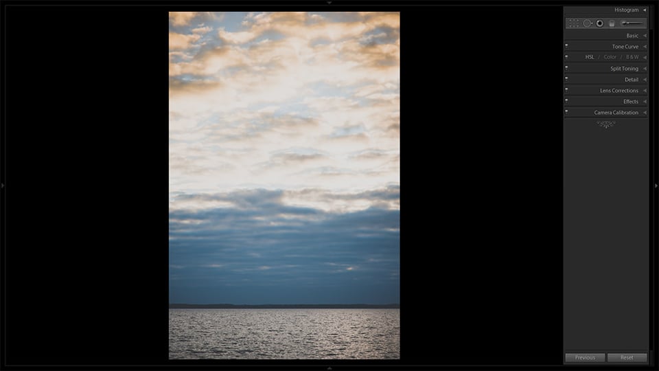
Unfortunately, though, flat RAW capture often means that the image will need some adjustments before it is close to what you actually see. Caught up in the moment, I didn’t bother with correct WB settings as I knew I’d need to work with color and contrast within Lightroom. My D700 failed to record subtle yellows of the sky and the contrast of the lake surface glimmering in the sun, or at least they didn’t show up in its unedited NEF image. Here is the RAW right after I imported it into Lightroom 4 – compare it with the final image above:
Just as I’ve said, water looks much smoother than how I saw it and the sky’s missing that gentle yellow glow. No worries, though – RAW is great because I get to decide how I want the image to look in the end, not the camera. Let’s get to work!
2) Enhancing Landscapes
There is a thin line between an attractively enhanced image and a ruined one. Too much contrast and saturation can often lead to less-than-tasteful results and it is crucial to know when to stop. I will now list basic settings you can adjust when post-processing landscape images. I will also show you what adjustments I made to get the image you see at the top of this article. I chose to enhance this image fairly subtly. What I wanted to do was bring back some of the yellow cast in those soft clouds and intensify sea surface creating a strong emotional contrast between the two subjects. Here are the steps I took to enhance the photograph:
- Straighten the Horizon – Tilted horizon (a typical result of bad framing) may not seem like such a big deal, but it can easily ruin your landscape. Fortunately, leveling it is a very simple process within Lightroom 4. To do that, you need to use Straighten Tool, which you can find in Crop Overlay tool-set. Activate the tool-set by hitting R on your keyboard. Then, choose Straighten Tool and draw a guide over a line in the image which is supposed to be level – in my case, it’s the horizon. Done! Alternatively, you can rotate the image on your own by moving your cursor outside image border. A rotation cursor will appear – click and drag to rotate the image.
This the first step I usually take when post-processing those few landscapes I do. I felt I made the right choice composition-wise, but there was a slight tilt in the horizon which I chose to fix using Straighten Tool within Crop Overlay tool-set. - Fix Distortion – Distortion can be as distracting as a tilted horizon. It is very important that you remove any distortion present in your landscape image. I chose to fix it so that I had a very defined, straight horizon (a sort of border line between soft clouds and chaotic waves on the water surface). It only takes a couple of mouse clicks. All you have to do is go to Lens Correction tab and check “Enable Profile Corrections”. Once you do that, if your lens is recognized by the software, it will automatically correct all distortion issues. If nothing happens and your lens is not supported, you can manually fix distortion by moving the distortion slider.
- Remove Sensor Dust – in many photographs, sensor dust, if present, is not easily noticeable. This is usually not the case with landscapes that feature a lot of smooth tone areas, such as the sky. I used the Spot Removal tool to quickly get rid of any dust spots. These dust spots were more apparent than usual because of narrow aperture of f/11 used to capture the image. Read my “How to Use the Spot Removal Tool” tutorial if you’ve never used it before.
- Detail Tab – generally, sharpness is an important aspect of a good landscape image. Even when shot at optimal apertures, using clever sharpness settings will make it that much better. To adjust sharpening, go to Detail tab. I set sharpness at 80 with a radius of 0,8 pixels and Luminance noise reduction at 20. It may seem a lot for a D700 image taken at a mere ISO 320 and I’m usually not one to worry about noise, but this time I wanted pixel-level smoothness. If you want to see a much more detailed guide on sharpening, see Nasim’s Sharpening in Lightroom article.
- Adjust White Balance – Color and tones are of extreme importance in landscape photography, so it’s important to set White Balance at a most suitable value. Generally, I tend to set it to a slightly warmer setting than the default value. In the case of the above landscape, camera-captured colors were a little too cool. I moved the Temp slider to 4800. Such a small change didn’t really bring back the yellows of the sky, but it did add a little warmth to the scene – after all, it was evening light. I also moved Tint slider from -7 to -4 feeling that my D700 tried a bit too much to counter magenta cast. A small, yet noticeable adjustment, it seemed to add to the scene.
- Increase Clarity – this adjustment was necessary to intensify micro-contrast and give a more defined look to texture of the sea and sky. I set the Clarity slider to +20 for this image.
- Graduated Filter – this is a very powerful tool within Lightroom environment. Essentially, Graduated Filter allows you to selectively post-process parts of an image and adjust all kinds of settings, such as Exposure, White Balance, basic Sharpness, Clarity and so on. I will discuss this vastly capable tool in much more detail in upcoming tutorial. For now, I only need to adjust a few settings with two separate Filters. In order to apply Graduated Filter, click and drag anywhere on the photograph to define where you want it to affect your image. Best way to see how it works is to set extreme settings first (Contrast and Clarity to +100, for example) which you can then tune down.
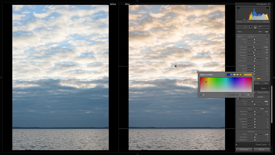
I will use the first filter on the sky. What I want to do is bring down those highlights a little. After some trial and error I set the Exposure slider to -0,43. I then increased Contrast to +10 and recovered highlights by moving corresponding slider to -10. Another step was to add a little bit more Clarity, so I set the slider to +10. I want those clouds to be well-defined, but not too much in comparison to water surface. With the second filter, I will add more Clarity there. The last step with this filter, however, is what’s going to bring us those subtle yellows. At the very bottom of Graduated Filter tab, there is a setting called Color. Using this setting you can add color tint to an area affected by that filter. I need subtle, warm yellow cast, so I set H (Hue) to 42 and S (Saturation) to 68% careful not to overdo.
The second filter is for the water. With this filter, I increased Contrast to 24 and Clarity to 20. Both settings made the waves a little bit more noticeable at the edges where it’s closer to the viewer.
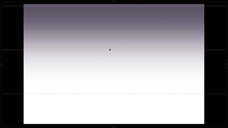
A side note: why did I use Graduated Filter to adjust Contrast and Clarity? The reason is simple. I adjusted Clarity setting using the Basic Panel in order to affect every part of the image. Graduated Filter allows me to affect only part of it – Clarity, Contrast, Color, Exposure and other settings dissolve at a specific border of the filter, which depends on how you placed it. Now, Exposure only made the very top of the sky appear darker with the first filter. Also, only those clouds closer to the viewer were affected by Clarity and Contrast settings. Color tint dissolved nicely at the horizon and didn’t affect clouds where sun couldn’t shine through. Here is an example of Graduated Filter applied on a white image. You can clearly see Color and Exposure effect diminish towards the lower part of the frame:
- Adjust Tone Curve – tone curve can be found in basically any decent post-processing software. If you don’t yet know how to use it, read our “How To Use the Tone Curve Panel” tutorial. In essence, tone curve allows you to control lightness and darkness of specific tones of your image. It is great for precise contrast control. Generally, making an S curve often gives the best results, so you can start with that. Pull the lower third of your curve down a notch, and push the upper third up. This will give you more contrast between the light and dark portions of your image and will make it “pop” right away.
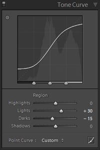 For my image, I first used Point Curve, which you can select by clicking on the Point Edit button on the bottom right corner of your Tone Curve panel. There, I cut off a range of blacks and whites by moving extremes of the curve slightly upwards and downwards, respectively. By doing so I effectively made all the blacks of my image appear as dark grays, and whites as light grays. It made my image look slightly washed-out, painting-like – this is close to how the scene looked in real life thanks to that gorgeous light. However, it also reduces the contrast slightly, so I went back to Lightroom-aided Region Curve and made a gentle S curve out of it.
 - Add Vignetting – not always a good thing to do, Vignetting may sometimes add greatly to an image. By subtly darkening the corners, you will guide the viewer’s eye towards the center of your photograph. For this reason, I don’t always choose to remove natural lens vignetting in the Lens Correction tab, and sometimes even add a little on top. To do that, click the Effects tab. There, set the amount of vignetting you want Lightroom to apply. Once you’ve done that you will have access to other vignetting settings. Use them to make it look more natural.
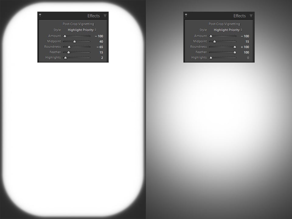
Lets go through the settings quickly. In a nutshell, Midpoint defines how large the unaffected by vignetting center is – setting it to smallest value will result in a larger area of your image under effect of vignetting. Setting it to a higher value will render a larger portion of the image to remain bright even with heavy vignetting applied. Roundness defines how round or square the vignetting will be, while Feather controls how diffused edges of vignetting are. Highlights setting allows you to preserve whites at the affected edges of your image without darkening them.
I will talk about vignetting settings in more detail in upcoming tutorial. For now, let’s just use Highlight Priority post-crop vignetting style. Here are the settings I used for my image: Amount -14, Midpoint 27, Roundness +38, Feather 83, Highlights 0. It made for a slight, natural-looking corner shading, which is what I was aiming for.
A side note: if you want to learn more about the effect of White Balance, Clarity and other settings found in the Basic Panel, read my “How to Use the Basic Panel” tutorial.
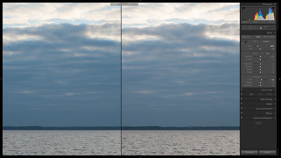
Lets see where these 6 steps took us:
Note how subtle the difference is. No need to worry, however. All these settings are vital, but the last couple of changes will add the most effect. Let’s move on.
That’s about it for me when quickly post-processing my landscape images.
3) You Are in Control
While I chose to enhance my image gently, your taste will vary. Changing all these settings more drastically will result in a more dramatic image, and depending on the scene and mood you want to capture, might be a good decision. Play with them, experiment to find what fits best that particular landscape you’re working on. With enough practice, you will learn to achieve a desired result very quickly. If you’ve got several particular looks as favorites, you may also save them as presets, which will help you spend even less time post-processing. If you haven’t yet learned how to use presets, read our “How to Manage Presets” tutorial to see just how useful they can be in your post-processing workflow.
I can tell these tips are going to help me a great deal!
Thanks for the tips! Can you make another tutorial on how to photo edit in PaintShop pro please? Something like this www.paintshoppro.com/en/pa…-workflow/ would very much be helpful for us who use PaintShop Pro and are still beginners at photo editing. Thankssss
Sorry, I wanted to say: “Graduated Filter, Tone Curve and Vignetting is not ALWAYS necessary”.
Exactly the same workflow I use except the sharp(Detail section) that I don´t use.
Graduated Filter, Tone Curve and Vignetting is not necessary.
Clarity is always used.
If it is a raw file you can also adjust the camera calibration profile from “Adobe Standard” to “Landscape”. There are some people out there that have created presets for Canon and Nikon profiles so you can apply them on import.
Very comprehensive, lots of details.
Excellent article.