With all the amazing new cameras and lenses creating outstanding color, most of us are flooded with saturated images all over social media. But, a few decades back, most of what we saw were gray worlds. Even though current day photography can bring out millions of colors to life, the gray world is calm, peaceful and fascinating on its own. In this article, we shall see how to make interesting monochrome images and bring them to life, in a nutshell.
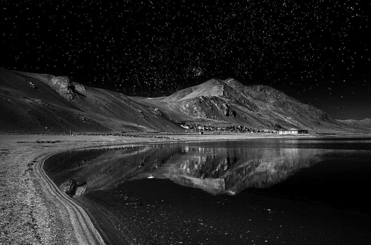
Table of Contents
Low Key vs High Key Photography
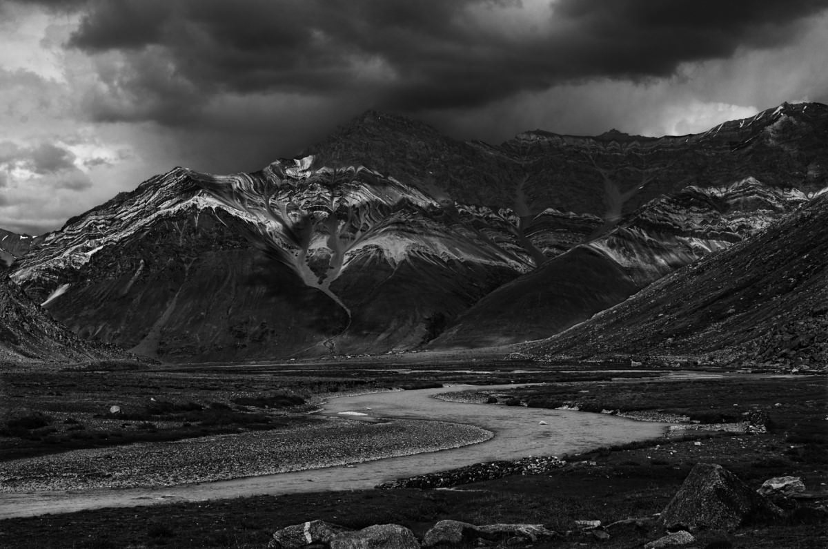
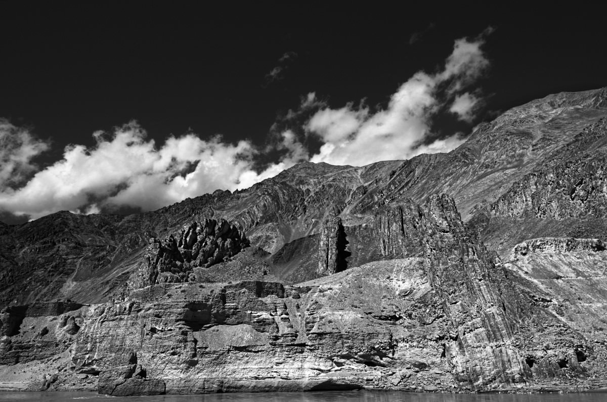
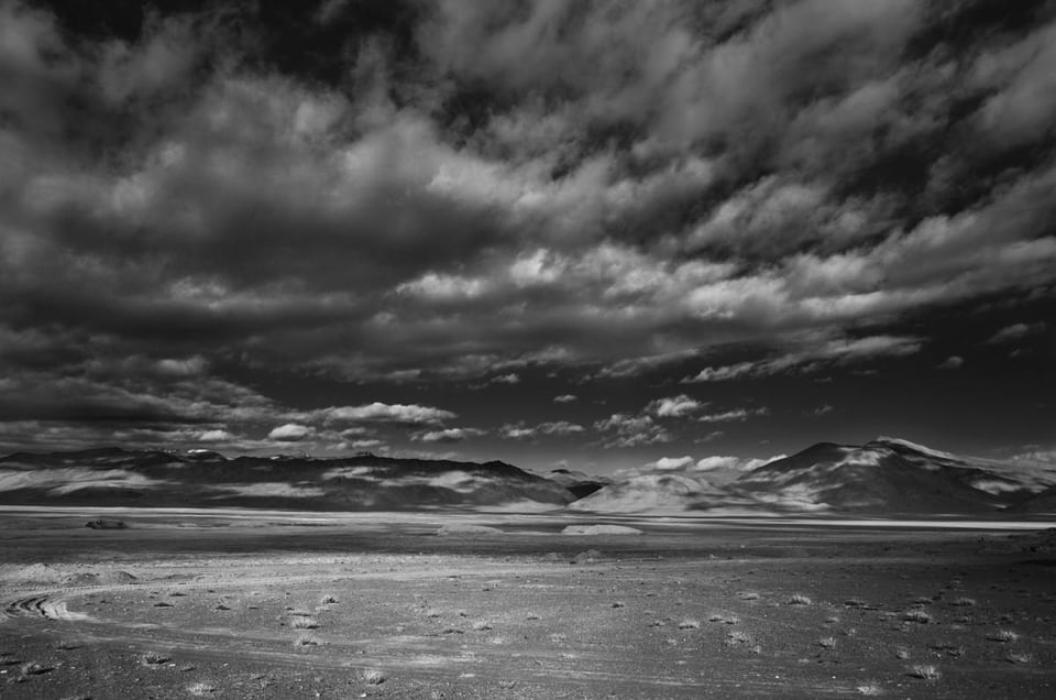
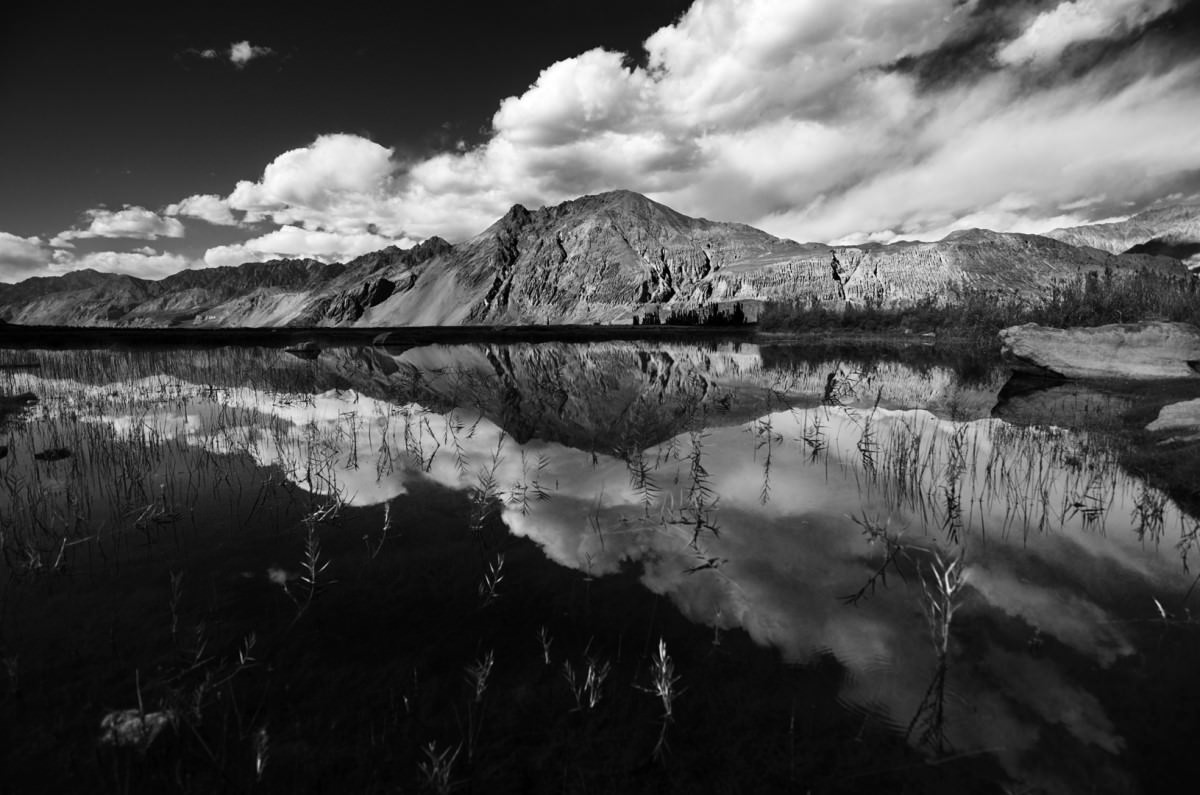
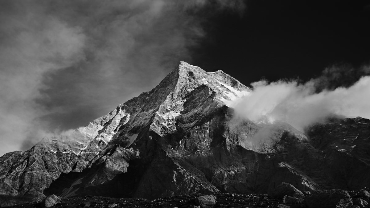
A low key photograph has bright and high contrast subjects on a darker background, whereas a high key image is the opposite, comprised of darker and low contrast subjects over a brighter background. The above image of a landscape is a typical low key image, whereas the one below is clearly high key. It is important to point out that low-key images cannot be considered dull by any means.
Since I live in India, where the great Himalayas stretch for about 1500 kms, and I typically love to shoot snow-capped mountains and glaciers, I’m more inclined to shooting low-key landscapes. However, low key black and white photography also seeps into many other photography genres including portraiture and even wildlife. (Remember also that we have a comprehensive black and white photography tutorial on Photography Life as well.)
Understanding Low-Key Monochrome Photography
Below is the list of essential ingredients for a low-key monochrome / black and white landscape photography:
The Ansel Adams / Fred Archer Zone System
Let me briefly explain what the zone system is for those who have just stepped into the abyss of photography. Back in the film days, the photography legend Ansel Adams (who has become a household name today) devised a method to get the optimum exposure in the final print. Ansel Adams explained it in great detail in his best seller books “The Camera”, “The Negative” and “The Print”. Those three books have been considered the Bibles of photography by many photographers, even today. Even though the Zone System can be used for color images, it was originally formulated for monochrome images and we will look at just that, and how effectively to use it to bring life to low-key landscape images.
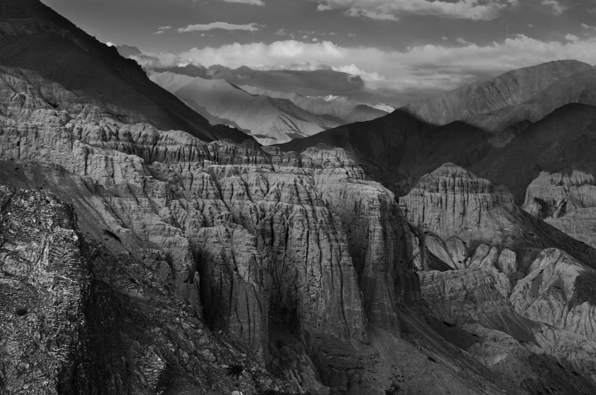
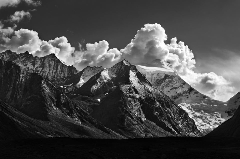
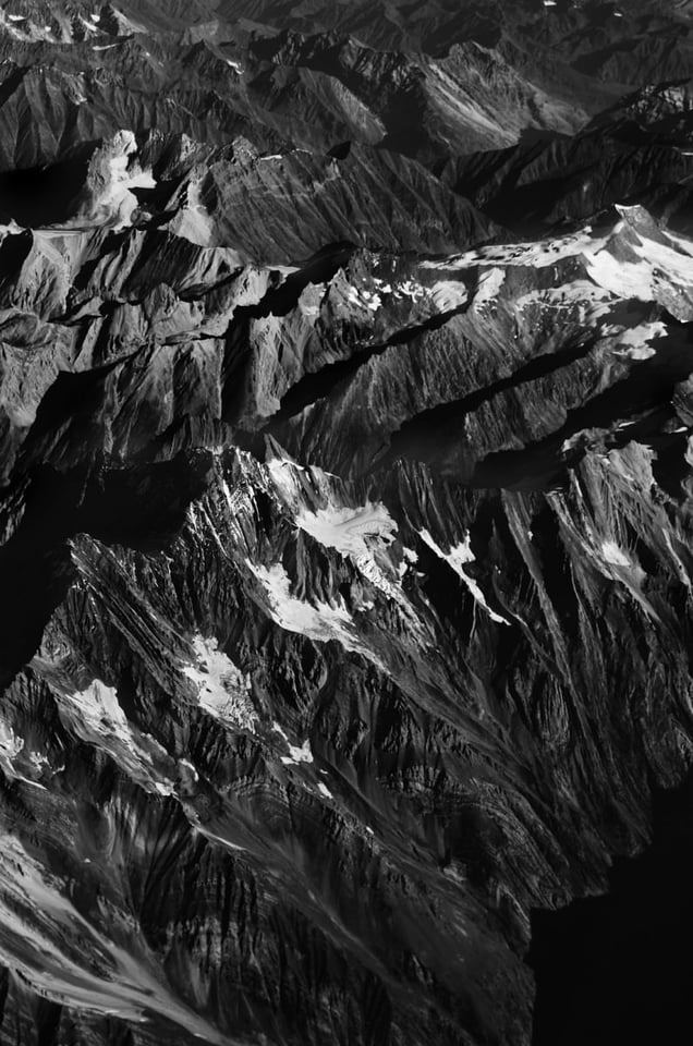
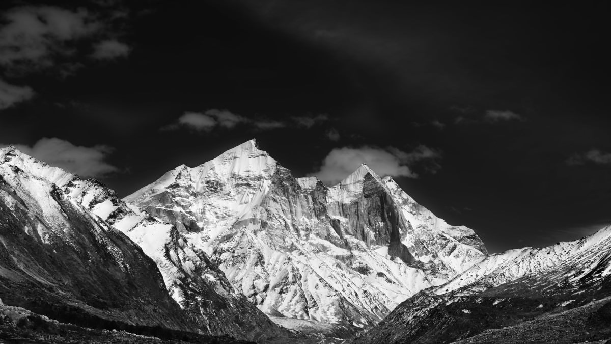
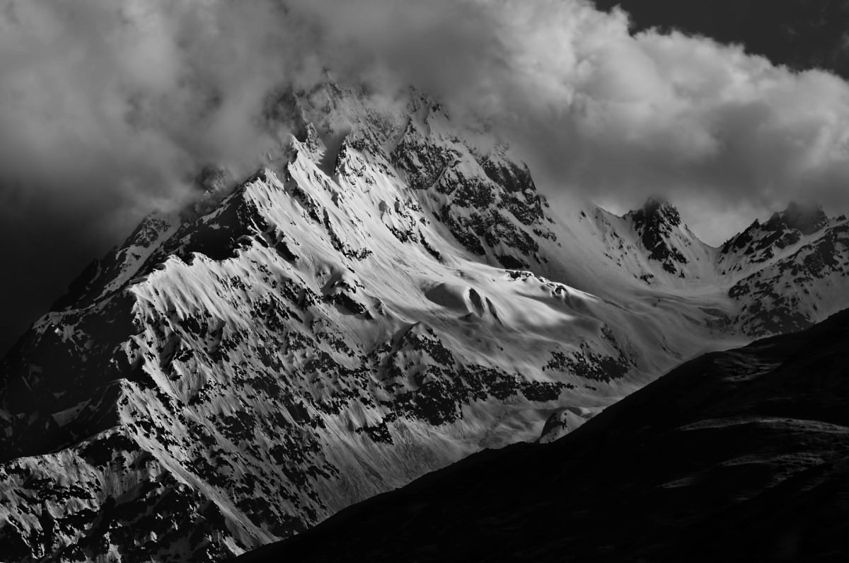
In simple words, the Zone System divides a scene into 10 zones starting from black (completely underexposed) to white (overexposed) with every zone separated by one stop. Generally zones I and II are considered underexposed as you cannot extract much details from those zones. Similarly, IX and X are considered overexposed, meaning it would be difficult to retain details from the whites. But as always, there are no hard and strict rules in any art from. We learn it so that we decide how and when to bend it. I personally prefer a blacked out sky in most of my images, as it helps bring out depth and contrast in the image, and a typical low-key image is supposed to be soaked in darkness. A brighter sky might also become a distraction as our eyes are always oriented to the brighter side. In the image below, it is the underexposed sky that pops out the layers of sand dunes to the front and helps keep the observer’s eyes to the land masses, which are the subjects.
To bring out high contrast, I personally avoid the middle zones (Zone V and/or VI) ie., divide the scene into bright tones and dark tones, placing the darker tones between zone III and IV and place the brighter zones between VI and VII or VII and VIII. I also like a small portion of the image to be overexposed (most probably snow/ice on the mountains) to enhance the contrast further. Quiet confusing right? You would understand better if you look at the image below:
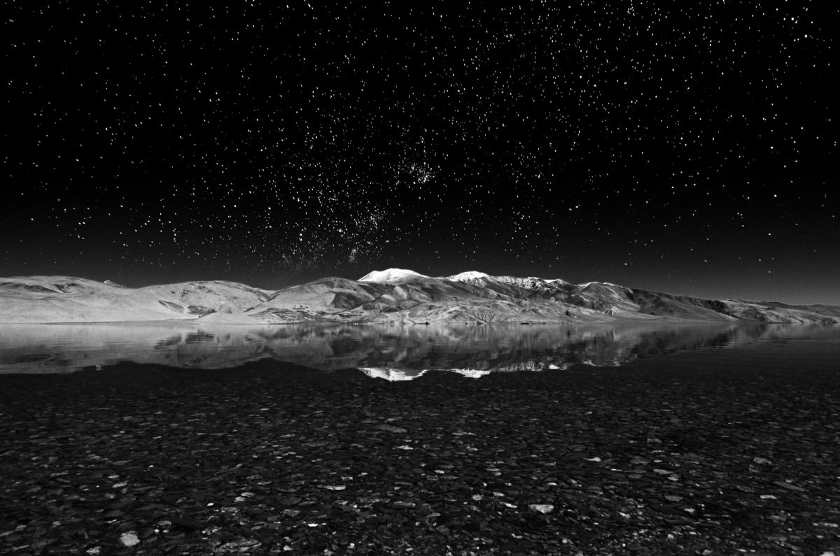
The sky is completely black, meaning it is in zone I, the stars and the small snow caps are in zones VIII and IX whereas the mountains are in zones III, IV and VI. The gravel in the foreground is between III and IV, with some brighter gravels in VIII and IX, giving them a shiny touch.
Exposure
Now that we have a fair idea of how the zone system works, the next big question is how to place your image in those zones? Again, there are no hard and fast rules, and it all boils down to the scene. Below are a few tips to get the optimum exposure.
- Pre-Visualization: The first step is to pre-visualize. I have seen a lot of folks convert a soft/blurry image into a grayscale image. On the contrary, I find that monochrome images demand more sharpness and contrast than their color counterparts. If you intend to make it a monochrome image, make the decision before even pressing the shutter button, so that you can plan everything accordingly, rather than doing it at the last step i.e., in post-processing.
- Illumination: Avoid mid-day lighting and / or back-lit scenes. In either cases, especially while shooting landscapes with the sky included, which is what we do most of the time, the sky gets exposed one or two stops brighter than the landscape itself and as a result, pulls the observer’s eye away from your subject. The most preferred way is to have the Sun around the horizon behind you, illuminating your subject. In such a scenario, your subject naturally gets exposed a stop brighter than the sky, especially if it is a snow clad mountain.
- Dynamic Range: As mentioned above in the zone system, we are dealing with a pretty high dynamic range when we talk about monochrome images. Always try to stick as close as possible to the base ISO. It is not the noise you should be worried about, but the dynamic range that a high contrast black and white image demands. All cameras have their best dynamic range at around the base ISO, so stick to that as much as possible.
- Bracketing: Since we are talking about 6-7 stops of dynamic range, it is difficult to get it right in one single shot all the time. This is where bracketing comes into play. Try to bracket 3 images separated by one stop, so that you end up getting a composite of 9 or more stops.
- Aperture: Unlike wildlife photography, where we tend to shoot mostly wide open, it is better to shoot at smaller apertures when shooting landscapes for a couple of reasons. Primarily, most lenses are generally the sharpest when stopped down and secondly, you need to be able to get very deep depth of field. In some situations, it might be best to use the focus stacking technique to get everything from the foreground to the background sharp.
- Tripod: Once bracketing comes into the picture, a tripod is pretty much required. None of the images in this article were shot hand-held. Considering that a monochrome image demands optimum sharpness, where you try to stick as close as possible to the base ISO and shoot with an aperture that is at least a few stops down, requiring you to bracket two or more images, all these things get very difficult to handle without a proper tripod. See How to Use a Tripod article for details.
- Metering: For most situations, Matrix Metering works great by default. As you probably already know, the matrix metering mode tries to achieve 18% gray, which most consider to be the middle tone. But what the camera ends up doing sometimes is, in its pursuit to achieve middle gray, making the image look flat. Especially in a low-key landscape, we want absolute blacks in a few spots, and obviously the matrix meter in the camera would try to expose it a bit more, trying to retain some details. This in some cases blows out the highlights and results in clipping (parts of the histogram breaching the upper limit). This is where Spot Metering becomes a savior. I generally spot meter to the brightest spot in the scene with a Single Point Auto focus, use the back button to lock the exposure, move the camera around to compose and then release the shutter button. If parts of your image are underexposed, you can expose them separately and then blend in post-processing. Since we already are sticking close to base ISO, recovering shadow details in Lightroom or any post-processing software should not be a problem.
- File Format: Obviously, you should be shooting in RAW.
- White Balance: There is no plan to end up with any colors in images anyway, so why even worry about white balance right? I disagree! A proper white balance does not only help achieve more accurate colors in images, but also helps with the histogram. For example, a white balance of 8000K will push your reds far more to the right than your greens and blues in your RGB histogram, which means that you will be overexposing one tone, while underexposing the other(s). The most suitable way is to get RGB channels in your frame overlap with each other as much as possible. Provided that you shoot RAW, it is always possible to correct it in post-processing, but I personally always prefer to get it right in the camera.
Micro Contrast
An article on monochrome photography, especially low key photography, would be incomplete without talking about micro contrast. Some believe its a hypothetical concept, but I’m firmly inclined to believe it. We all know and have been fed with choking levels of articles on contrast and sharpness, and precisely even the manufacturers themselves come out with MTFs to graphically represent their resolution. However, I am not referring to global contrast here! So what is micro contrast?
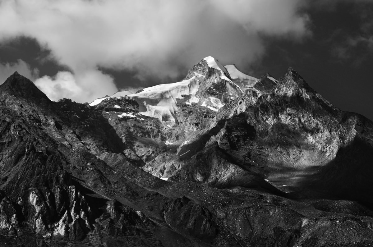
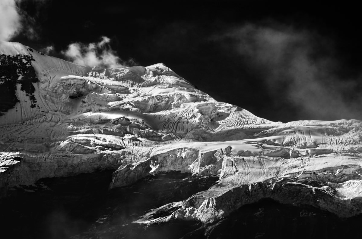
Both of the pictures above have almost all the zones in the zone system. If you saw colored images of land masses in both pictures, you would realize that they are of different tones of the same color. Micro contrast is basically the contrast between the various shades of the same colors. So once you convert a picture to monochrome, more shades of the same color cumulatively yield more shades of gray in your monochrome image. Unfortunately, we do not have much options to work on micro contrast in post, as it primarily depends upon the lens in use. MTF charts represent only global contrast, which means a lens that has amazing resolution can have poor micro contrast. For example, Zeiss Distagon and Planar series of lenses are considered to have immaculate micro contrast. Voigtlander and the classic Asahi SMC-Takumar M42 mount lenses are also well known for their superior micro contrast. Some might not be as sharp, but their micro contrast brings out unique mood and feel to the entire image. There are many more lenses that have excellent micro-contrast, but that’s outside the scope of this article.
Composition
Let’s take a look at some of the elements of composition:
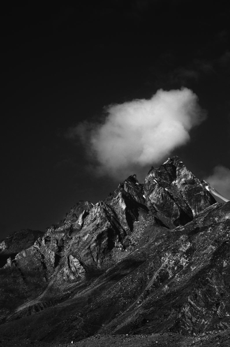
- Negative Space: Most low-key shooters drench their frame with negative space and I’m no exception. The darkness around the subject is what actually brings out the mood in the scene. When everything is dark, the observer’s eyes are naturally sucked into the brighter part of the image:

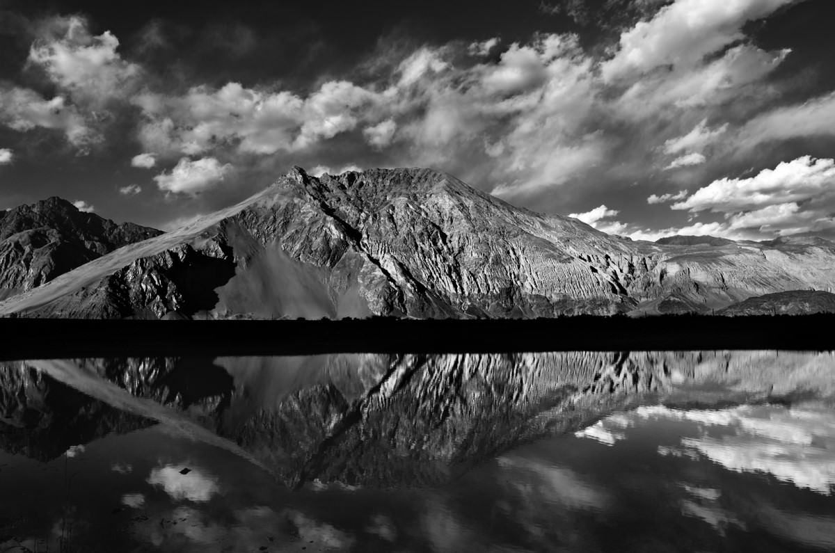
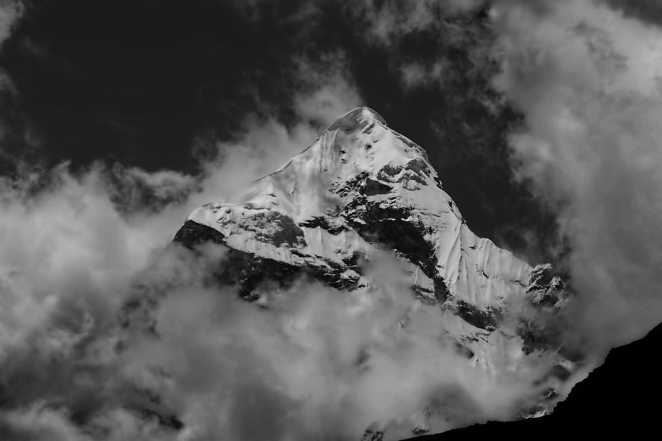
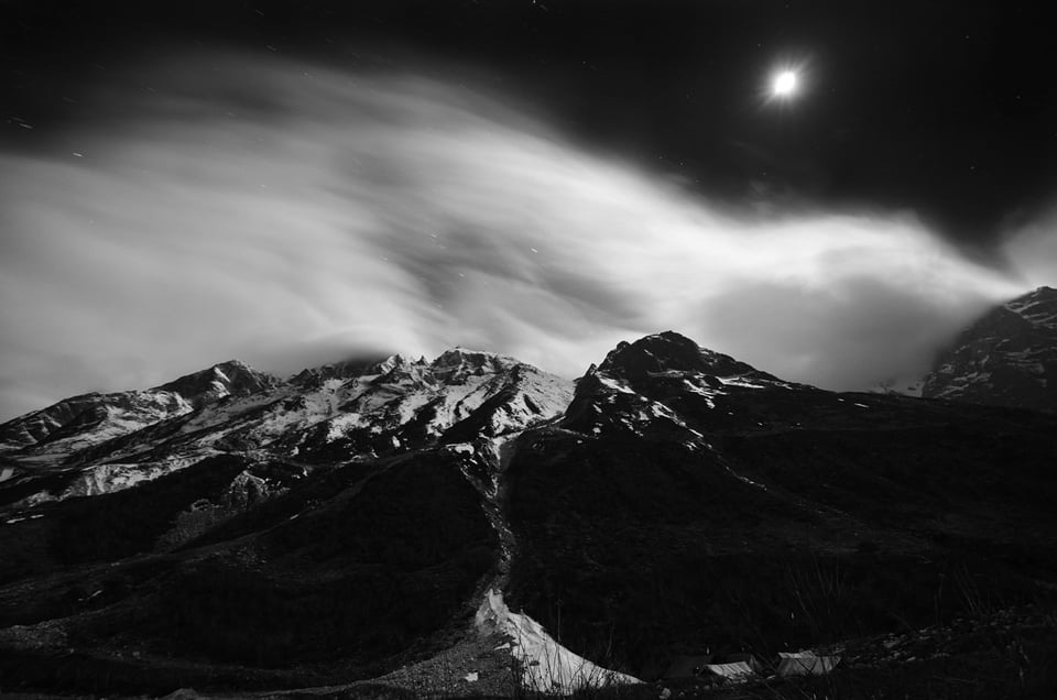
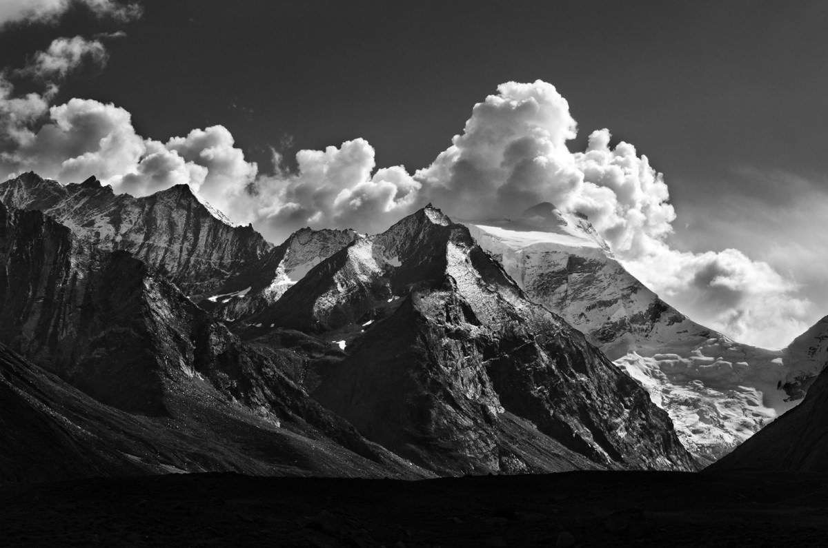
- Clouds: Most of us know that interesting cloud patterns bring amazing vibrance, depth and mood to photographs. And they certainly do so on low-key images. With a darker sky, clouds captured with all the contrast and details between them add great drama to photographs. Most of the time, clouds happen to be the brightest part of a photograph, and exposing them without blowing out the highlights could bring stunning moods to your pictures. Below are a few examples:

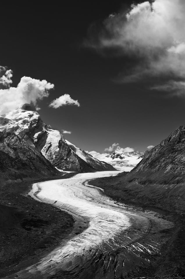
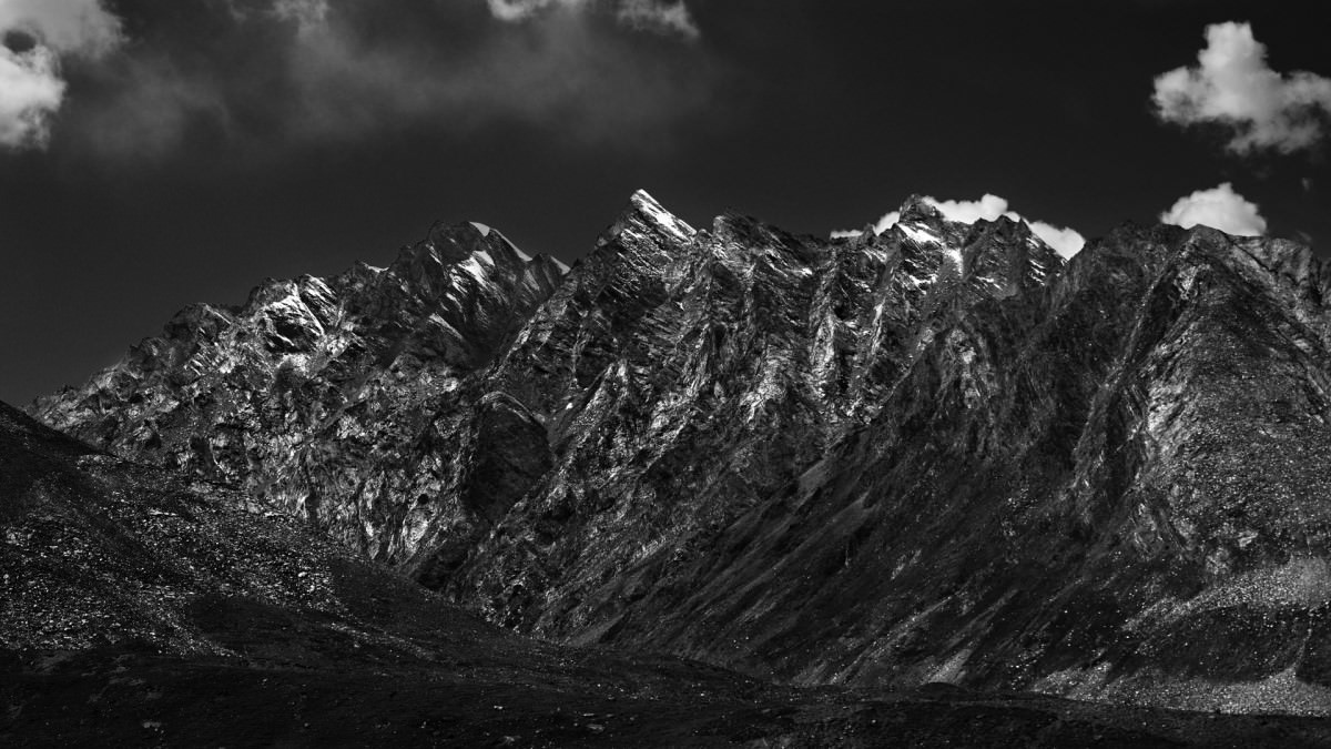
- Patterns: Watch out for flowing patterns in a scene. These could include zig-zags, curves, leading lines and the list goes on. Repeating patterns create an even better feel. The first picture below has a zig-zag and the second has repeating patters:
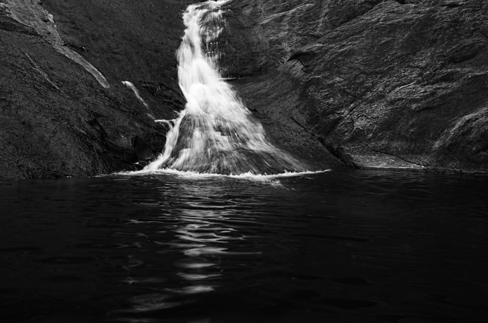
- Center Heavy: The easiest composition to draw the observer into the frame is to compose the brightest part of the frame around the center. Waterfalls are classic examples. If you can retain shadow details in the rocks, there is nothing more that could add to the feel of the image:
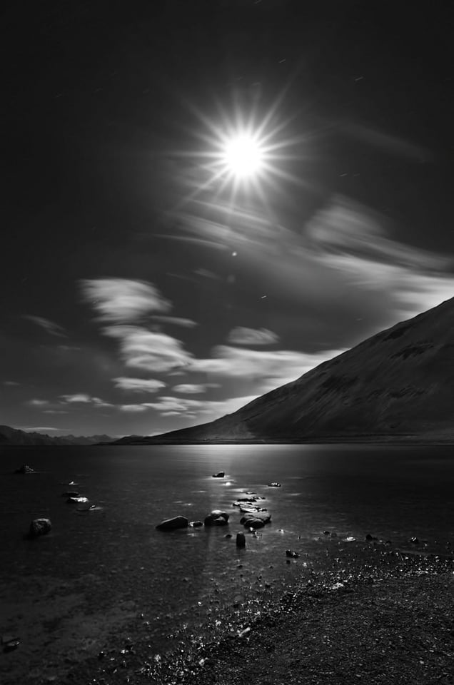
- Long Exposures: When the sun comes down, a whole new world awakens. Long exposure shots carry a deep mood, and the night is the easiest time to do it. Of course initially you might struggle a bit with low light and auto focus. However, once you get your ways around the issues, you might end up with really stunning photographs. Misty clouds add a whole new feel to the frames, and if you can get a star-burst on the moon, that’s even better:
- Negative Space: Most low-key shooters drench their frame with negative space and I’m no exception. The darkness around the subject is what actually brings out the mood in the scene. When everything is dark, the observer’s eyes are naturally sucked into the brighter part of the image:


Post-Processing
Image editing is a very wide topic, which in itself has many sub-topics each needing an entire article. Below are some editing techniques that I use most of the time:
- I prefer Nikon’s Capture NX-D to convert RAW files to 16-bit TIFF files as the first step. When converting from RAW to TIFF, the difference between Capture NX-D and Adobe Camera RAW is quite evident even before editing. Just try opening a RAW file in NX-D and in Camera RAW at the same time. You could literally see the difference. White Balance and Lens Corrections are better in NX-D than in Camera RAW as far as I have seen. Also, NX-D will be able to bring back quite a lot of overexposed highlights when we pull the exposure bar below zero. In comparison, Camera RAW has more limited capability in retaining details that are overexposed.
- Once I get the TIFFs out, I take them into Lightroom to make basic adjustments that would include bringing out shadow details and/or bringing down highlights or whites and adding a bit of contrast. I generally avoid sharpening and vibrance in Lightroom. The image is still a color image until this step.
- The next step is to import the Lightroom-edited image to Photoshop CC. This is where the image turns into monochrome / black and white. Most of us convert images to monochrome by sliding down the Saturation and Vibrance bar completely. Instead, a Black and White layer works much better. The Black and White Layer Tool allows you to tone in the luminescence of individual tones. For example, to get a darker sky, it allows bringing down blue tones alone, without affecting reds or greens. But as always, make sure not to overdo anything, so that the image does not have a plastic or an artificial feel.
- In situations where I have to blend in two or more images, I never use HDR software. The software does not know the scene and most software end up creating halos around borders. I always blend images mostly with layer masks and sometimes with luminosity masks.
- From here it is either one or multiple Tonal Curve layers to bring out contrast among the various sections of the image without creating halos or making it look artificial
I have tried to pen down most of what I do to make some of my favorite low-key images. Hope you guys found this guide useful, and if there are any specific queries you might have, please leave them in the comments section below. I will try to answer as early as possible. Happy Clicking!
what an excellent article – comprehensive, instructive and fantastic images!
David
Madhu, amazing article and such beautiful and stunning photographs !
Thank you so much for posting this article. The best B&W article on the web.
Beautiful images. I wish I had a chance to read this article before I went to Zanskar, Leh Ladakh last year :)
Excellent article, fantastic photos!
However, I have no idea how to actually use the zone system. Perhaps you would like to write another article detailing step by step procedures for using the zone system!
Steve
Hi Madhu, thanks a lot for the article! Could you elaborate a bit on why do you feel the conversion of RAW to TIFF via Capture NX-D gives better results than ACR? I’ve just tried comparing 16-bit TIFF converted from RAW with Capture NX-D with no processing to Lightroom version of the same RAW image. One obvious difference was the applied color profile, so I switched to Camera Neutral in LR to get the overall similar look. When zooming in I couldn’t spot any significant difference in terms of tone or local contrast. In fact, LR version has visibly better details. I tried to make sure this is not due to some automatic pre-sharpening and to my knowledge it is not. LR and ACR supposedly use the same processing engine although I mostly use LR so I cannot speak about ACR from the recent experience. Am I missing something?
Thanks!
Thanks for your appreciation Nic. Initially, I too was importing NEF (Raw) files directly into ACR and processing them in PS. I personally have not used Lightroom much as it sort of consumes a lot of my laptop’s resources. I wasn’t very happy with the saturation as I am not a fan of pulling that saturation slider all the way. When I tried my hands on Capture NX-D, I found it way better than ACR. More than colors, NX-D is better in extracting shadow details than ACR. When my Highlights were clipped, to a certain level, the NX-D was able to dial it back into range, whereas ACR still brought in clipped highlights. Also when you convert an image into 8-bit Tiff from a 12-bit lossless compressed RAW, the NX-D would throw out a close to 40 MB file. Whereas the ACR would give me a 20 MB file to work with. So I was inclined to believe that ACR does loose some of the details. I could find a lot of difference in editing an ACR extracted Tiff and a NX-D extracted Tiff especially with milky way shots. Just opening and viewing Raw files in NX-D and ACR side by side would show the difference. Hope this helps.
Fascinating, thanks for sharing.
Two questions:
1. Are you layering multiple photos together in post processing, or are you able to capture most of these in camera in one shot?
2. What lens was the first photo of the stars and mountain taken with?
Thanks so much!
Thanks Chris
1. Yes some of the pics are blended manually using layer masks but most of them are single shots. I just make sure not to blow out the highlights. I had to blend most of the snow/ice capped mountains as my D7000 has limited dynamic range.
2. That was shot with a D7000 + Tokina 11-16mm AT-X116 f/2.8 @ f/2.8 ISO-200 10s
Amazing pictures !!!
When you Say ” I personally avoid the middle zones ” , Is this something you do un post production or has to do with metering on camera ?
Thanks a Lot
It’s mostly possible only in Post processing Guillermo. As metering merely shifts the entire left or right.
Let me thank you for an article that goes beyond obvious and describes personal approach to taking shots, leaving readers to adjust it to their experience.
Thank you for the inspiring article. To get the sky darker one might use a circular polarizing filter if using a non short focal length. – It is hard to find sources about micro contrast. Some claim it just does not exist, others talk about high frequencies. To me it seems there is not much difference when using high end glass, preferably a fixed focal length. The sharpest lens ever I have experienced is the Nikkor Micro 55mm f/2.8 AI-S, an old lens without modern coating. – In the end, with all that post processing as described above I assume the part of the micro contrast is the lesser.
Thanks Jon.
I’m very much inclined to believing in micro contrast of the lens. Half of the mountain pics were shot with the Nikkor 60mm f/2.8 Micro. I have used other lenses to capture the same frame. But with some lenses I’m able to bring out more tones while others make me give up. As the saying goes, we can pull off only what is available.
Thanks, Madhu. So my impression of sharpness, regarding the 55mm f/2.8 Micro, is actually the high micro contrast besides the high MTF. Your article made me curious about the subject. I wonder if the Nikon AF-S 50mm f/1.8, which I favour very much, is a lens with a good micro contrast as well. I got the 50mm f/1.4 AI-S and the 50mm f/1.8 AF as well, but the AF-S produces somehow cleaner images, just noticable, but noticable.
Since you emphasized the part about micro contrast and it clearly makes sense now to me I wonder why that subject is so ambigous. Or maybe that is just my impression. Cheers! -jan
While reading your article again, I found a minor mistake: The zone system is numbered from 0 to 10. So that makes 11 zones.
Dear Madhu,
Thank you for bringing back understanding to photography at a time when photographs have just become hues of sharpened colours without any message, suitable for being plastered across billboards but devoid of any connection to the human soul.
And thank you photography life for posting this article.
Thanks a lot zee dee. Really appreciate it. True that modern gear have sure made life of photographers really easy. But on the flip side, as you have put it down rightly, it has removed the uniqueness and depth in a person which is reflected in his photographs. We seem to have more cameras but lesser photographers.
Your article really provides a first reading for understanding Ansel’s Zone system. Like “Zone system for Dummies” thanks for doing the hard work so the rest of us don’t have to. I plan to look through properly and then read up Ansel.
It also helped me realize what I find missing from a lot of photographs today, the deliberate effort of the underlying though to emphasize the purpose of the picture.
;-).
The shots are graceful.