One of the quieter revolutions in digital image quality has been dynamic range. The days of picking between highlight detail and shadow detail are gone; almost any modern camera can capture both simultaneously with ease. But even though this capability is remarkable, it’s also easy to overuse.
Unnecessarily Expanding Your Dynamic Range
Most HDR photos I see don’t need to be HDR. You know the ones. The sky is darker than the foreground, and everything floats in the image with unnatural glowing colors. The entire scene looks flat somehow. The highlights aren’t allowed to be highlights, and the shadows aren’t allowed to be shadows.
Even outside of HDR photography, many photographers have an irrational fear of clipping the dynamic range. No matter the image, they’ll recover highlights and shadows until Lightroom stops yelling at them for losing detail. God forbid any 0,0,0 or 255,255,255 tones sneak in; the spikes at the edges of the histogram would be sharp enough to kill us.
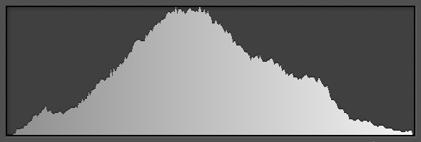
In fact – the opinion seems to be – the histogram below is a good target for a typical scene. It’s a nice, neat little bell curve that would make your statistics professor proud:
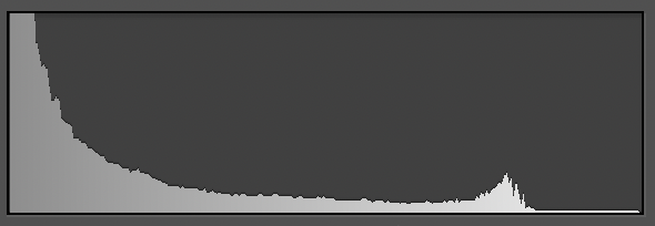
Meanwhile, the histogram below is a nightmare on a stick:
But things aren’t really so simple. In the world of art, bright whites and deep blacks can be powerful tools. How many centuries did painters long for the most brilliant highlights and darkest shadows and spend fortunes on paints to achieve them? No doubt they would laugh at photographers, who seem to be the only artists who want everything from the sun to the dark foreground smushed into midtones.
Case in point, the first of the two histograms above belongs to this perhaps-not-quite-a-masterpiece:

Whereas the second of the two histograms is from a photo you may have seen before called Moonrise, Hernandez, New Mexico.
In short, it’s ok to process your photos to retain their tones from the real world. Silhouetted trees don’t need +100 shadow recovery that shows every detail in the bark. And the sun doesn’t need to be darkened into a yellow disk in the middle of the day. Don’t be afraid of a saddle-shaped histogram, nor a histogram where everything is bunched toward one side or the other.
The scene that turned me away from HDR – almost for good – was this one:
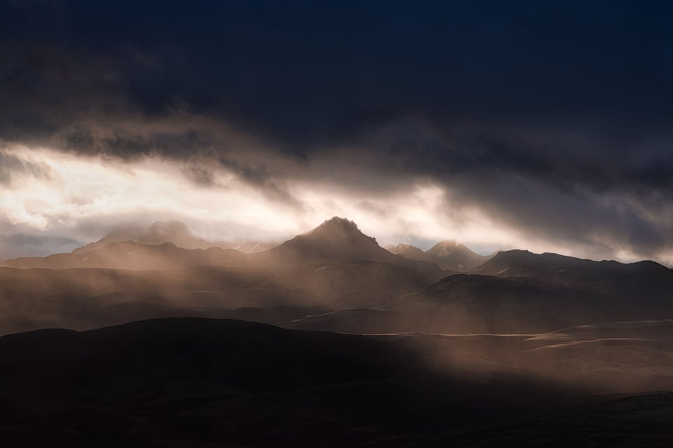
The photo above is not an HDR, but rather a single image that manages to clip both the highlights and especially the shadows because of the scene’s extraordinary dynamic range. I like it that way. But while I was on location here, the clipping concerned me, and I took some HDR variations just in case. Here’s how that turned out, edited to eliminate all clipping:
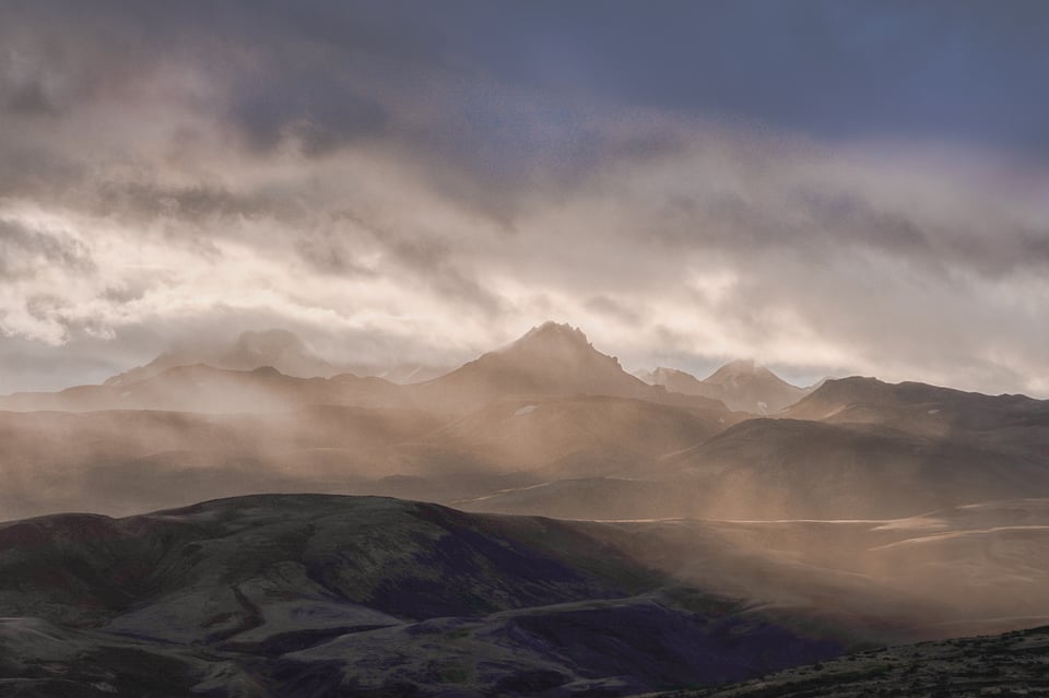
It has all the highlight and shadow detail that’s missing from the original, yet it has none of the character. I flattened the emotions alongside the light.
Granted, HDR and similar techniques can be useful, even necessary, sometimes. Architectural and real estate photography are some obvious examples, where you’ll often get blown highlights in all the windows otherwise (although that, too, isn’t always bad).
Instead, the key is to avoid unnecessarily expanding the dynamic range. Frankly, a lot of images look better when they clump some tones together. Don’t un-clump them – whether via shadow recovery, HDR, or any other technique – without a good artistic or commercial reason.
Unnecessarily Contracting Your Dynamic Range
At least as a landscape photographer, I see the “excessive shadow and highlight recovery” bug appear all the time, including in my own work if I’m not careful. But sometimes the opposite happens instead: The photographer brightens the highlights and darkens the shadows to the extreme, resulting in high contrast even if the scene demands subtlety.
The fact is that a lot of real-world subjects sit in the midtones. That doesn’t mean they need to be photographed that way – they could easily look good as a high-key, low-key, or high-contrast subject – but sometimes it does. You should never be afraid to leave midtones, moderate highlights, and moderate shadows in place. Often, it looks better than wantonly boosting contrast.
I think this particular issue used to be more common in the darkroom days, with high-contrast papers routinely outselling their low-contrast counterparts. If your print didn’t have deep blacks and bright whites, did it really stand out? Even today, this mindset remains prevalent in the realm of printing, where low-contrast matte papers are popular for portraiture but not nearly as common among landscape photographers, who tend to gravitate toward something like supergloss.
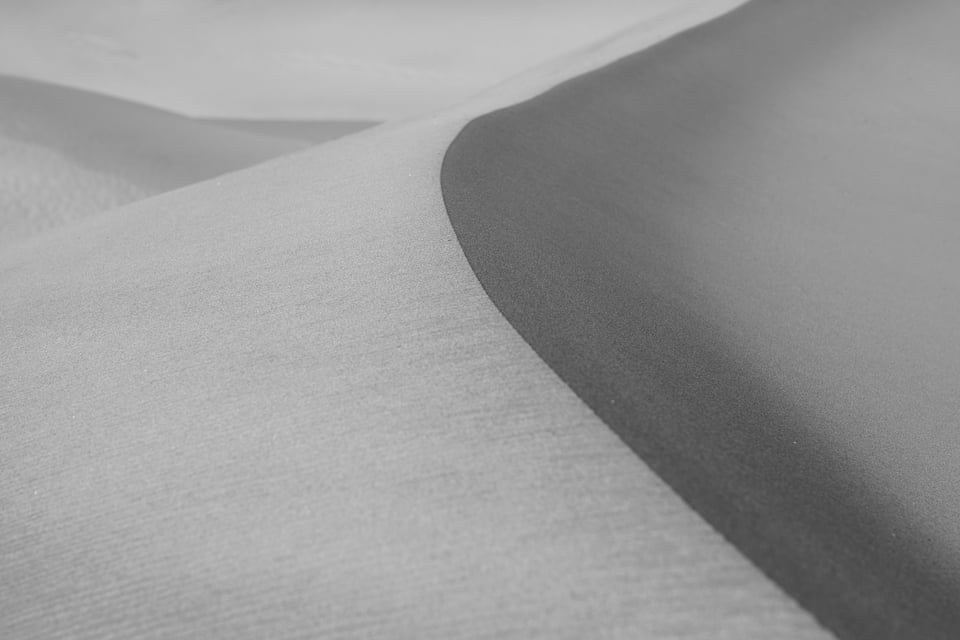
But subtlety carries emotions of its own and can be exactly right for your subject. I would never print this image on supergloss:
Nor would I add a Curves adjustment in Photoshop to push this photo’s tones toward white and black:
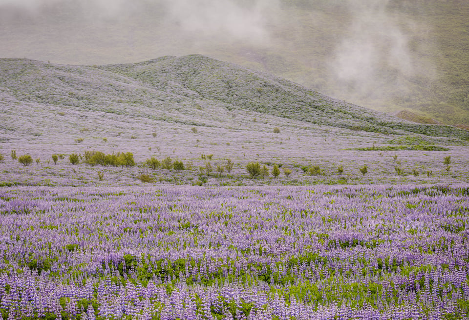
So, in just the same way that you shouldn’t unnecessarily recover highlights and shadows, you also shouldn’t push subtle midtones to the extremes when they’re better left alone.
Conclusion
I often say that every image should be created – especially composed and post-processed – to its own merits. If you find yourself doing post-production for any other reason than that, I’d suggest rethinking things.
For example, it’s surprising how often I see photographers editing the tones in their image while watching the histogram, instead of just watching the image. I don’t know what your mental concept of an “optimal histogram” looks like for an edited image, but just get rid of it. Clipped black or white tones are perfectly fine. Clumped shadows are perfectly fine. An image that’s all midtones is perfectly fine.
The only thing that matters is to aim for what looks right and what makes your emotional message more effective. In that sense, dynamic range is just like everything else in photography.
Great article. Same applies to unnecessary focus-stacking to get focus from the camera to infinity, long exposures on moving water, using multiple images to clone-out moving leaves on trees, etc. in an attempt to achieve perfection. The most effective images are rarely ‘technically perfect’.
You can adjust the picture as you want it in post. Photography is an art assisted by technology.
“Photography is an art assisted by technology.”
photography [noun]: The art or practice of taking and processing photographs.
‘The firm has just branched out into doing canvas prints and fine art photography.’
www.lexico.com/defin…hotography
It’s important to distinguish between “an art” and “the art or practice”. For example, forensic photography and the macro photography of postage stamps are photography, but they are not an art (assisted by technology).
I liked the HDR image more. Also felt the mountain with blue flowers would have looked great with a little more contrast.
Fantastic article and I’d summarize this as art vs. artless. Or capturing a feeling, texture, or illustrative confluence of lines vs taking a picture. Greater dynamic range gives you greater scope to initiate a dialogue with the viewer. You meet a stranger at a party, you can start a discussion on art, politics, or the weather, or how you know the hosts and it may lead to other topics but you’d never start a convo on all four simultaneously. Unless you’ve got an art installation on the political response to global warming being held at the host’s gallery…
That means…I don’t need sell my Canon 6d ii ? :)
As usual, excellent article and very much needed by myself and, by what one can see in Instagram, many others.
The one thing I could do without is Ansel Adam’s work. I must be missing something, because I never found any of his photographs worth a second look, or even a first, longer than 5-seconds look. His “Moonrise” must be one of his worst pictures. Not being snob or anything, I’m just hoping for somebody with… different?… taste than mine enlighten me.
To me, Ansel Adams is a master printer and a very good photographer. He pioneered a lot of development and darkroom techniques and is one of the earlier “modern style” landscape photographers, all of which contributes to his lasting place in photography.
My opinion is that his best compositions are among the best I’ve seen from anyone, but he also has many photos with compositions that just don’t interest me. A lot of his public domain images for the National Park Service fall into that category. I find them technically impressive but otherwise nothing special. Though there are exceptions like his image of the Snake River in the Grand Tetons, which I do like a lot.
Other photographers also learned a great deal from what he taught, from the zone system (I still use it today for exposing my film shots!) to using a camera and printing in the darkroom. I think it’s accurate to say that he knew more about photography from start to finish than almost anyone else alive at the time. Since then, people have learned from what he taught and – I think – taken better photos than his. But for the time, almost no one was doing what he was doing at his level.
“Moonrise” is a polarizing shot. I like it, especially at larger sizes. I saw one of his original prints of it a few years ago in a museum and did find it worth a second look in order to appreciate the illuminated crosses in the foreground. But it’s also not my favorite photo of his by a long shot. (Those would be his Aspen 1958 photos, Bridal Veil Falls, and Wonder Lake photos for me.)
Maybe this explains things a bit. In any case, I think there’s nothing wrong with finding his work good, bad, or somewhere in between. If we all had the same opinion on art, we wouldn’t be very interesting people or photographers.
Thanks, Spencer. I appreciate the time you put to explain what you value in his work. I wish there was more of his work (or any other’s) in my corner of the world (Argentina, and not Buenos Aires) in the way of exhibitions to be able to better judge his work.
As a “spin off” to what you add in the last pararaph, I would even go as far as saying that it wouldn’t be art if we all had the same opinion about it.
I agree with you Martin. I wouldn’t hang any of Ansel Adams’ prints in my living room, but then neither would I hang the Mona Lisa.
I used to comment to a music teacher about similarities between music and photography. Here too. A favourite musician of mine told a story against himself. An old-school producer had commented that his mix (he’s a multi-instrumentalist) sounded too ordered. The music didn’t breathe. The musician realised that he’d been mixing by watching his computer screen rather than by listening to the music. From then on he used to cover up his monitor (for which read cover up the histogram).
That’s a very interesting story. And amazing that the producer had such a good ear for those things. I do find it to be very similar in photography. Editing while watching the histogram or the sliders is different from editing while watching the image.
www.youtube.com/watch…ZV8rhgZCqk
I think this is the interview.
I was in my teens in the 70s, so that’s my music. If you like Mike Oldfield, this’ll be for you. Rob Reed’s ‘Sanctuary’ albums tick my boxes.
On the other hand, you do look quite young …
Ansel Adams said the negative is the score and the print is the performance! You can see this in his prints done at different times had different “interpretations.”
I am posting for the first time though I am a regular reader here. I agree with the artistic use of highlight or shadow clipping but I think you are wrong in the HDR part. Or, let’s put it more correctly, nowadays you can forget the HDR if you have a state of the art full frame or medium format sensor. Don’t forget that a huge part of non professional photographers are using apsc, mft or even smartphones and for those sensors the recoverability is limited (especially in highlights). I am using a high end APSC camera and in many cases I feel the need to bracket the shot just for the ability to push a little bit the shadows without any noise. I used to shoot seascapes at golden or blue hour, a very demanding task in terms of dynamic range and I don’t have the luxury of clipping the shadows on the foreground because my foreground is usually the sea. Since the light enables me fast enough shutter speed at base ISO I often shoot a bracket of three in order to catch some detail of the sea or the dark side of a ship and not ruin the bright highlights (after all the highlights are the subject of my frame).
In my opinion the belief that HDR has not place in modern photography is wrong. If you know what to do, HDR is an amazing technique. Except if you are using an R5 or Z7 II with f/2.8 lenses .
Thank you, Michael! It sounds like your type of photography requires HDR sometimes, and there’s nothing wrong with that. It’s a useful tool in some situations even though I think it’s overused in others.
Respect for Spencer’s articles. I’ll be 80 in a couple weeks, photographer for 55 years. Of course I had to deal with very limited DR for most of that time, but it was only while shooting stage plays in digital that I learned to make friends with scenes that were far beyond my camera’s sensor to fully comprehend. “Expose for what matters, in this case the faces, shoot in RAW, and don’t worry about it” became my practical motto. And it worked. There is nothing wrong with chiaroscuro!
Thank you, George. I’ve realized that the dynamic range of digital sensors has spoiled me now that I’ve been shooting slide film. These days, I sometimes have no choice but to lose detail in the shadows or highlights, and choosing which one is the artistic challenge. Yet the photos themselves look better because of it. Some crushed shadows or highlights do no harm to the artistic quality of a photo, and as you mention regarding chiaroscuro, can even be desirable!
A very well made case! There seems to be a bit of a groundswell at the moment – of accomplished photographers arguing against enormous pixel counts, super sharp lenses and now super dynamic range. I don’t think any are camera bashing, they simply state that you don’t always need all the technological advances made available by manufacturers, which even my own limited experience indicates to be the case. It would be nice to believe that the photographic community was about to reject the numbers game played by manufacturers – but in the meantime articles like this help to sustain minority viewpoints.
Personally, if the mid tones are reasonable I don’t really worry if the dark tones drop off the edge. I am more concerned about blown highlights. Small sparkles – great! Bigger areas start to look ugly. To me. Sure, that’s subjective, but then what isn’t?
Thank you, David! I do think it’s encouraging now that every modern camera is so amazing, we’re forced to look inward to improve our photos rather than outward to more gear.
A big swath of blown highlights across an image can be a problem in a lot of cases, I agree. I don’t have many good example photos that show otherwise. But I do see some portrait and wedding photos these days that have a high-key look with overexposed skies, with good results. And occasionally some minimalist landscapes with blown-out snow or sky as the background. In any case, if it works for the photo, that’s what matters.
I’m not sure I can post them here, but there are significant areas of blown highlights in the landscape photographs of the Yellow Mountains in China by Wang Wusheng. These function similarly to large areas of emptiness in traditional Chinese landscape painting, especially Song Dynasty painting. Because of their inherent ambiguity, they add a lot of dynamism to the landscape, suggesting movement and making the scale somewhat mysterious. I personally find them very effective.
This is, of course, not to disagree with the point that large areas of blown highlights are generally unpleasing, though I suppose it is to agree with Spencer’s main idea that technique is always in service of the emotion of the image.
Great article – thanks!