I remember describing Photoshop’s versatility and sophistication as both a strength and a weakness. On one hand, it is a very powerful piece of software with so many different and versatile tools, its capability is only limited by the user’s skill. On the other hand, such complexity can also be overwhelming and detract one’s attention, slow down simple tasks. This trait, to an extent, is also shared by Photoshop’s little sibling, photography-centered Lightroom. Although it is that much more specialized, there’s still a plethora of tools, panels and tabs which can, at times, make the post-processing experience somewhat… messy.
Thankfully, it would seem the team of developers behind Adobe Photoshop Lightroom are trying to do their best to make Lightroom as simple and fast as possible. Thus a certain amount of customization is available. You won’t be able to completely redesign the software, but getting rid of some things you find unnecessary is very much possible. In this article, I will give you some tips on how to purify your workflow and hide some of the functionality that you might find yourself rarely using, so as to not get detracted from the things you use most.
A side note: read our “Lightroom Loupe View Options” and “Lightroom Grid View Options” articles to learn how to toggle and customize information overlays, which help you learn the most important information about a specific image at a glance.
Table of Contents
1) Modules
Lightroom 5 has seven different Modules. Basically, each Module is an independent section that contains a set of tools relevant only to that particular Module. In other words, it is a way to group and organize different tools together. Within the Lightroom environment, you navigate between different Modules depending on your needs. For example, for organizing images and publishing an online photo gallery, you would switch to the Web Module, because the tools to create an online gallery reside in that specific module.
Having said that, I rarely, if ever, use all the available Modules. Some of them I haven’t really used at all, except out of curiosity (the Book and Print Modules, for example), while others I need very rarely indeed (the Slideshow, Web and Map Modules). The two main ones – Library and Develop – is where I spend up to about 95% of the time I work with Lightroom, so the rest are rarely needed. Which means I can safely hide them out of sight until they are.
To set up which Modules should be visible and which should remain hidden, right-click on the Module panel. A menu will pop up that looks like this:
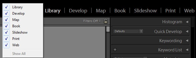
As you might have already gathered, the ticked Module names are the ones that are being showed. If you want to hide a specific Module, just uncheck the corresponding option in the menu. That’s it!
A side note: you can read more about Modules in our “Lightroom Modules Explained” article where we discuss the purpose of each Module in detail.
2) Panels and Tabs
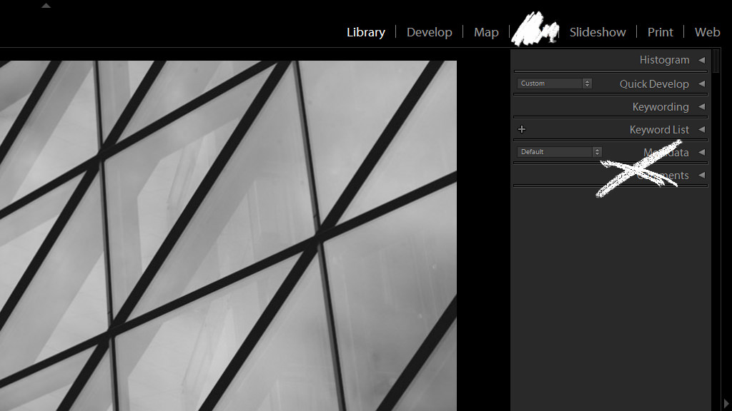
Before I start explaining how to customize the behavior of tabs and panels, perhaps I should specify which are which in this particular case. The are four panels in Library and every other Module in Lightroom. The top panel is where Modules are accessed through and can be simply called the Module Panel. The left-side panel is responsible for navigation in the Library Module. We shall call it the Navigation Panel and we have already talked about it in detail. The right-side panel is mainly responsible for Metadata, and the bottom panel is the Filmstrip. So, there you go – Library Module has four panels: the Module Panel, Navigation Panel, Filmstrip Panel and Metadata Panel. Other Modules have different side panels. Develop Module has Develop and Preset panels instead of Navigation and Metadata, for example.
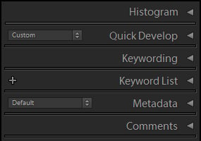
As for the tabs, they are the small panels inside panels. Sounds confusing? Well, it’s not, really. Here is an example – the Navigation Panel has Navigator, Catalog, Folders, Collections and Publish Services tabs, while the Metadata Panel has Histogram, Quick Develop, Keywording, Keyword List, Metadata and Comments tabs.
A side note: only two panels are consistent throughout the different Modules – the Module Panel and the Filmstrip.
As with unnecessary Modules, you can hide panels and tabs you rarely use. Both panels and tabs have small arrows (►, ◄, ▲ and ▼), which you can use to expand or contract them (or, in other words, hide or show them). With panels, a solid ► (or any one of the four) symbol means it has been expanded and will not automatically disappear as you move your cursor away. It the symbol is dotted rather than solid, the panel will remain hidden until you hover your mouse cursor on that edge of the screen. Click on the edge or symbol to toggle between the two modes.
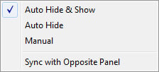
Right-clicking on the arrow or anywhere on that particular edge of the screen the specific panel is located at will bring up a menu with four settings:
- Auto Hide & Show – when hovered over, the panel will automatically show and then hide when the cursor is moved away;
- Auto Hide – the panel will automatically hide once you’re not using it anymore (mouse cursor is not over the panel), but will not show again when hovered on the edge of the screen or the arrow symbol. Instead, you will need to click on the arrow or the edge of the screen to expand the panel. Notice that once you click it, the arrow becomes dotted, which means that as soon as you move the mouse cursor away, it will hide. To stop it from automatically hiding, click on the edge of the screen again to turn the arrow solid. I find this to be the most useful setting as I frequently inadvertently trigger the panel when using the first setting and it slows me down and can be irritating and distracting at times.
- Manual – this basically leaves the arrow solid at all times, which means you may hover all you like, the panel won’t show up or hide unless you click on it!
- Sync with Opposite Panel – will synchronize the setting between two panels that are located opposite one another. Module Panel gets synced with Filmstrip Panel and vice versa, while Navigation Panel gets synced with Metadata Panel and vice versa. For example, if you set the Navigation Panel to Manual setting and then sync it with Metadata Panel, expanding the Navigation Panel will also expand the Metadata Panel.
You can personalize the behavior of tabs, too. When the arrows (◄ with the tab contracted and ▼ with the tab expanded) are solid, you can have as many tabs open in that panel at a given time as you like. Users with lower resolution monitors will often find the panels a bit cramped if several tabs are open at once, whilst closing unnecessary tabs manually can be cumbersome. This can be easily fixed. Clicking on any tab whilst holding down Alt key will turn a solid arrow into a dotted one. This indicates Solo Mode, which means only one tab can be open at a given time. For example, if you open the Collections tab and then try to open Folders tab, too, the Collections tab will automatically close and keep your Navigation Panel neat and tidy.
As with Modules, you can also hide unnecessary tabs from a panel. Right-click anywhere on that panel to bring up the menu and uncheck the tabs you’d like to hide. This works with all panels except the Filmstrip.
A side note: hit Tab key to quickly show/hide the side panels – Navigation and Metadata in Library Module, Presets Panel and Develop Panel in Develop Module, etc.
3) Identity Plate and Font Settings
I’ve already discussed this part of customization previously, but not mentioning it even briefly would have been wrong. In Lightroom, you can customize your own Identity Plate and also change the fonts a little bit. Identity Plate is the Lightroom logo that you can see in the left corner of the Module panel. You can brand your copy of Lightroom for your photography business by inserting your own logo instead through the “Identity Plate” setup. You can get to the “Identity Plate Setup” by clicking on Edit -> Identity Plate Editor, which looks like this:
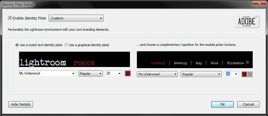
The Identity Plate can either be text, or a graphical image. Identity Plate Editor is also where you change the font, size and color of Module names. If you want to change font size of the rest of the text, you will need Interface Preferences. Go to Edit -> Preferences… and choose the Interface tab to change font size, Lights Out mode and more. Neither one of these changes will raise your productivity level to new heights in the most direct sense of the word, but making some visual changes, especially those concerning font size, might make working with Lightroom a bit more comfortable. Interested? Well then, I urge you to read our “Lightroom Branding and Customization” article to learn more.
4) Did I Miss Something?
I covered the most useful tips for customizing user interface in Lightroom, but I would not dare claim I mentioned everything that can be done. Lightroom is vast and I learn new things way too often to think there are no more pleasant surprises that I could find. Before I started working on this article, I did not even know I could actually hide tabs! I found out by trying things out and exploring all the options I could find. Now, Split Toning tab is gone from my Develop Module and I am sure I will not miss it for a long time – I rarely used it, if ever.
Know any additional tips? Share them and I will do my best to include them in this article!
Can the font size be adjusted in the panels. If yes, then how?
Hi Masim,
Could I ask you to take a review about Darktable (www.darktable.org), an open source alternative for Lightroom? They have Mac OSX build, and it would be good to share the world that they have an alternative for Lightroom (I’m living in a country who majority the user of lightroom use the pirated version of it haha).
No, I’m not the developer of Darktable. I’m just being curious about a question “should an average non-professional photographer like me have to use Lightroom?”
Thanks ^^
Romanas, I appreciate all of your Lightroom posts so far (among your other posts!). One question (that I haven’t been able to find an answer to yet after much searching): is there anyway to “save” or back up interface-related settings for LR? I already have backups of export, develop, etc. settings, and also backing up catalogs, but whenever I install LR on a new computer, I find myself having to manually set UI-related settings all over again. For instance, the hide/unhide module settings discussed above, background color of the workspace, and hide/auto-hide options are all NOT saved within a backed up catalog.
Aaron, unfortunately, there is no such feature within Lightroom itself, or at least I am unaware of it. All the settings you speak of are not Catalog, but Lightroom-related. Perhaps there is a specific file that can be copied and saved, though. I will have to look into it.
I was afraid of that! I’ve tried scouring through both LR folders within Program Files and Users\Appdata directories, but couldn’t identify which file(s) would contain such settings. Here’s hoping to an answer from you =D
Hi, I think you should also mention the Filter Bar in Library Module (press “\” to show or hide) and the Toolbar for all modules (press “T” to show or hide).
Marcin, that one is more of a feature than a customization option, much like other panels. It will be discussed in an upcoming article. :)
Nice summary, full of useful information – well done!
There’s one speed optimization trick that’s not that well known but worth doing. It’s possible to prevent certain modules from loading when Lightroom starts giving a slight speed performance. Do a google search on speed optimization lightroom modules and you should be able to find the answer.