Less philosophy and more actual photography this time, leading the eye into a scene is one of the tenets of composition (at least for me) and there is a multitude of ways in which this can happen. An image of something or somewhere can be a more rewarding experience for the viewer if they are led into, through or across it, spending longer to absorb and take in the scene. Advanced photographers will (I hope) forgive the simplicity of this article; I am no kind of expert on composition but I thought I would share some ideas.
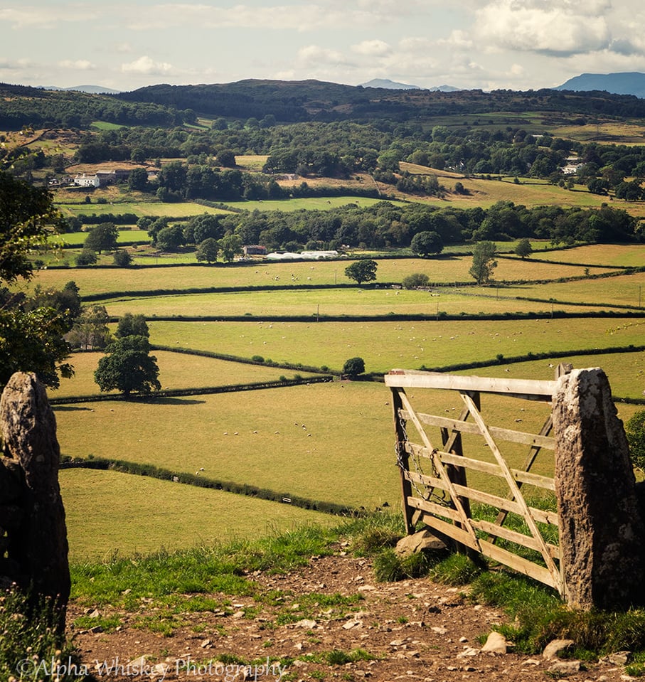
Firstly, the subject or location itself may have convenient leading lines or geometry to direct the eyes along. This may be something as simple as railway tracks or a stream converging on their vanishing point in the distance.
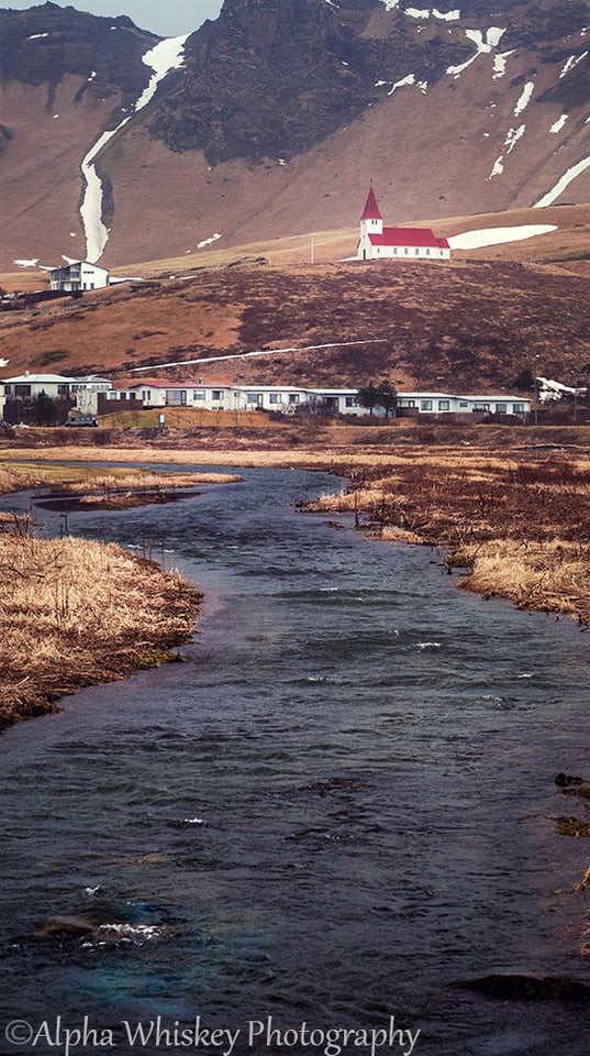
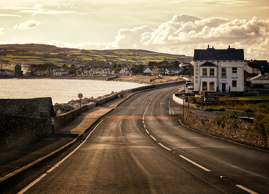
Roads and coastlines also offer a convenient set of leading lines, reaching and then disappearing into the yonder or towards a mountain or sea. Whenever I’m in the passenger seat I’ll always have my camera on my lap, ready to capture the journey through a landscape.
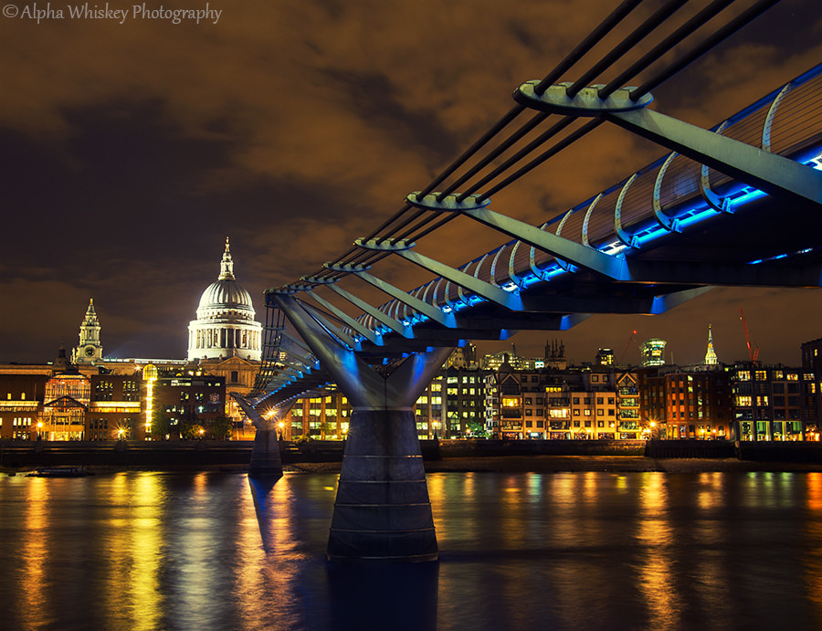
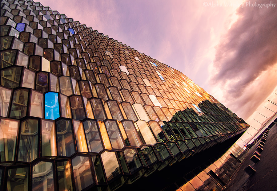
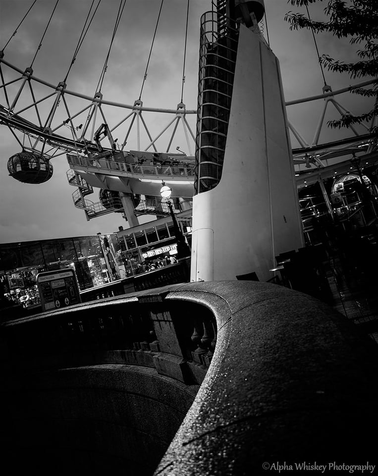
In fact, leading lines are ubiquitous, externally on architectural features such as bridges and tall buildings or internally on patterned floors. Tilting the image, as I have in one of the examples, emphasises the directional lines beyond the scene, disconnecting the viewer from the actual location and instead making the lines more relevant.
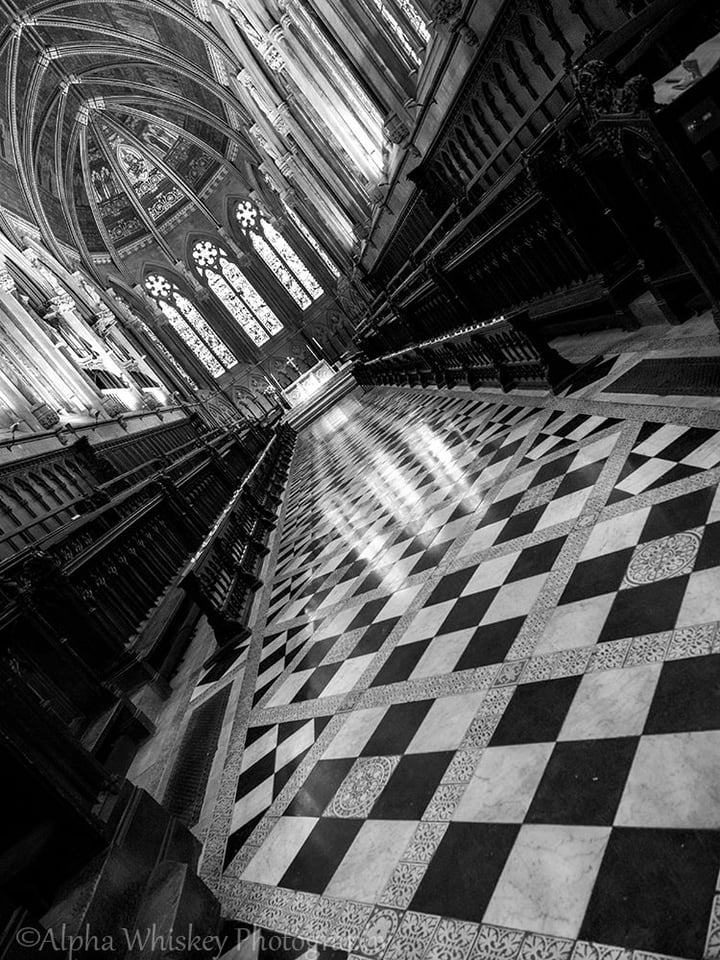
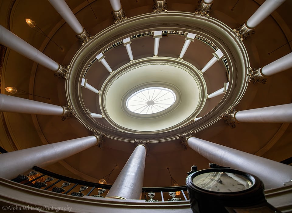
Stairs. They always lead somewhere and within an image they can lead the eye to their destination or onto a larger landscape. The eye will follow a winding staircase or travel down some steps into an open space. In each instance, you are helping the viewer travel somewhere.
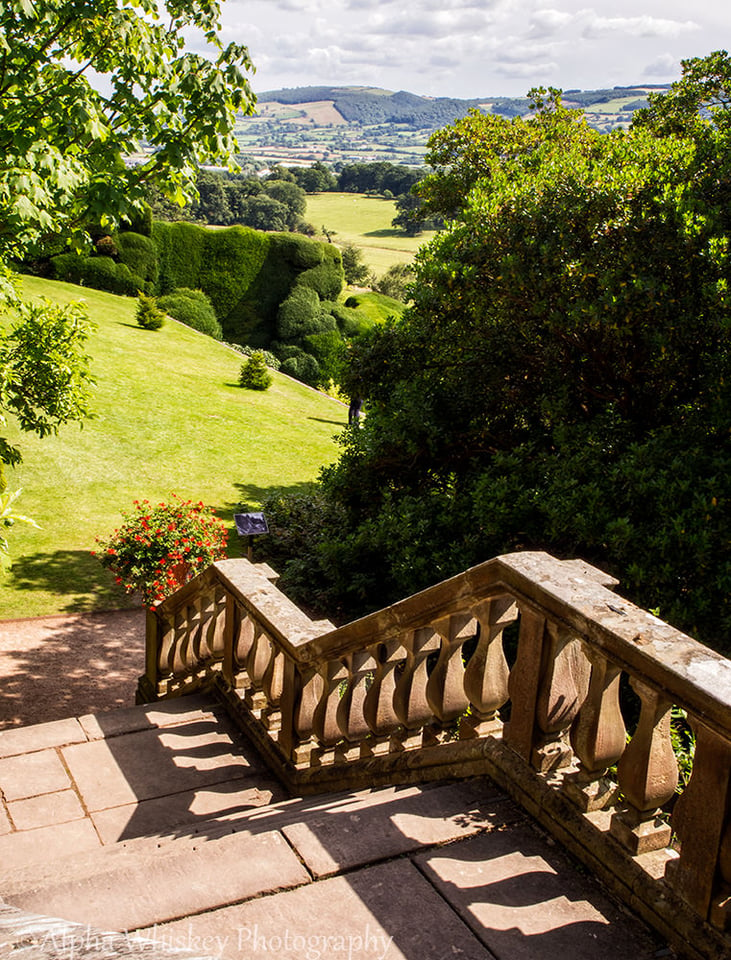
The placement of the horizon line can also influence how the eye is led across a landscape. A high horizon line will ask the viewer to draw across the land, taking in the features en route and making the experience more gratifying.
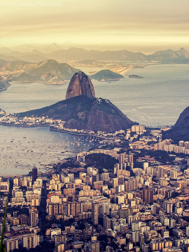
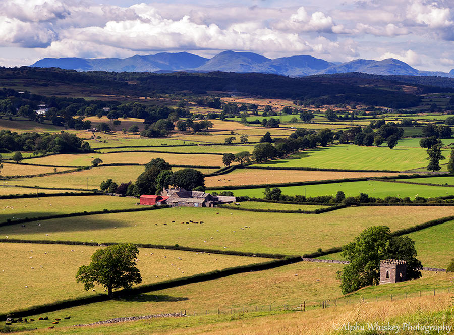
In much the same way, placing your focal point or main feature higher up in the image will also encourage the viewer to travel across the image to get there. Interesting features in the foreground will slow this process down and give them a reason to navigate through.
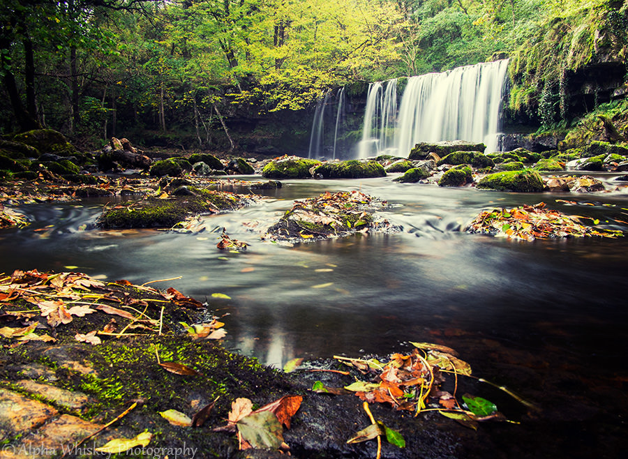
A foreground interest will provide a starting point or frame of reference, or even a sense of scale. This does not, of course, have to be achieved with just a wide angle lens. A longer focal length can still help you frame the image accordingly, while perhaps adding a little more compression to the elements within the scene. A narrow aperture or hyperfocal distance may be necessary to keep as much of the scene in sharp focus.
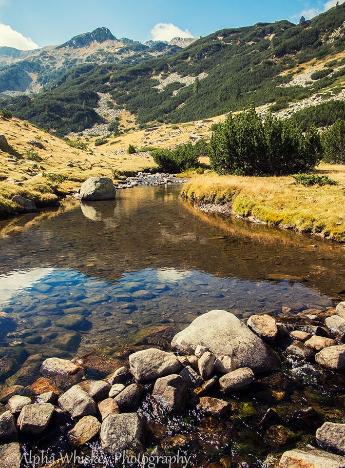
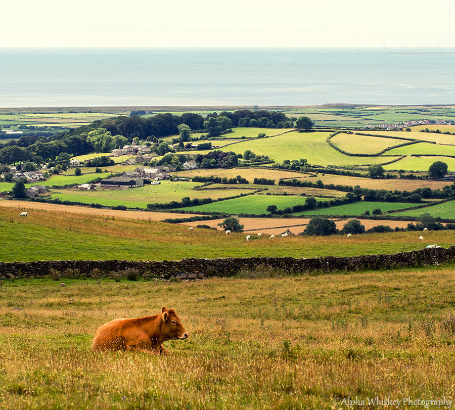
Many photographers will use an ultra-wide angle lens deliberately to achieve a forced perspective, exaggerating the foreground relative to the background in order to lead the eye towards the vanishing point. This is a perfectly legitimate way to achieve a composition but be aware that it can make the image somewhat front-heavy.

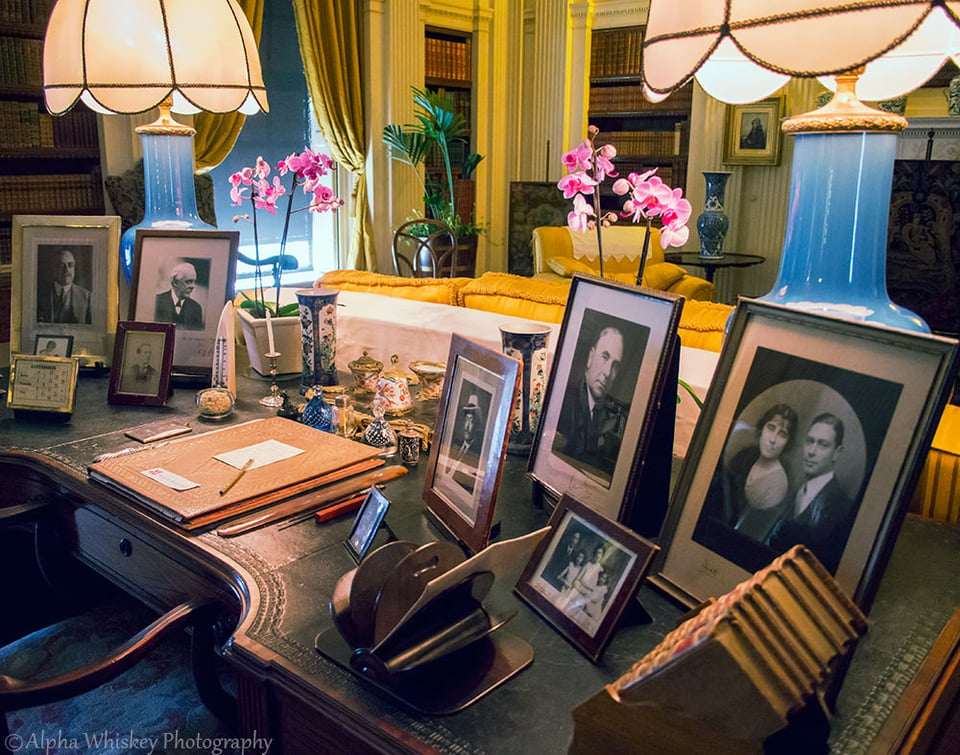
Indoors, one can draw the viewer through a room and not necessarily by capturing its entirety. Often, a tight field of view can be just as effective, giving a sense of the space, its contents and placing the viewer within it; a wider angle may make the viewer simply feel like an observer at the side. The height of the capture is important here too, as too high may show too much from above without drawing the eye more horizontally through the scene, and too low will obviously not give enough depth. Again, having something in the foreground to nudge the viewer on their way along the various features would help. To keep as much as possible in focus, a narrower aperture would again be indicated, and if light were at a premium then a higher ISO would be necessary to assist as well.

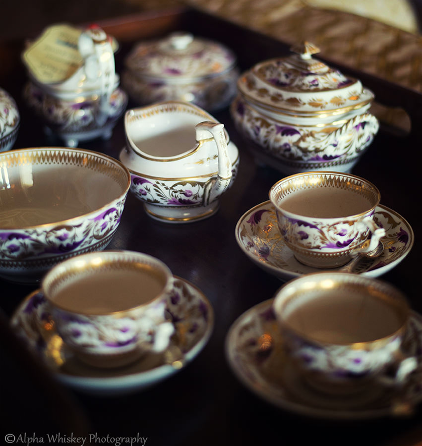
Not everything in a scene has to be in focus of course, and where you place the focus will obviously direct the viewer’s eye to it, especially if this in-focus area is in the middle or background of an image. Using a fast lens at a wide aperture, this is a very simple way of giving a sense of place while directing the eye exactly to where you want it to go.
Leading the eye isn’t just about physical features. Light is fundamental to any photography and it can be used to judiciously guide the eyes through a scene. The relationship of light to dark can be exploited to grab the eye and take it through the image. I find this is particularly effective in black and white, but colour itself can perhaps be used in the same way, with bold colours leading the eye into lighter or pastel tones. In post-processing, this effect can be accentuated with selective dodging and burning.
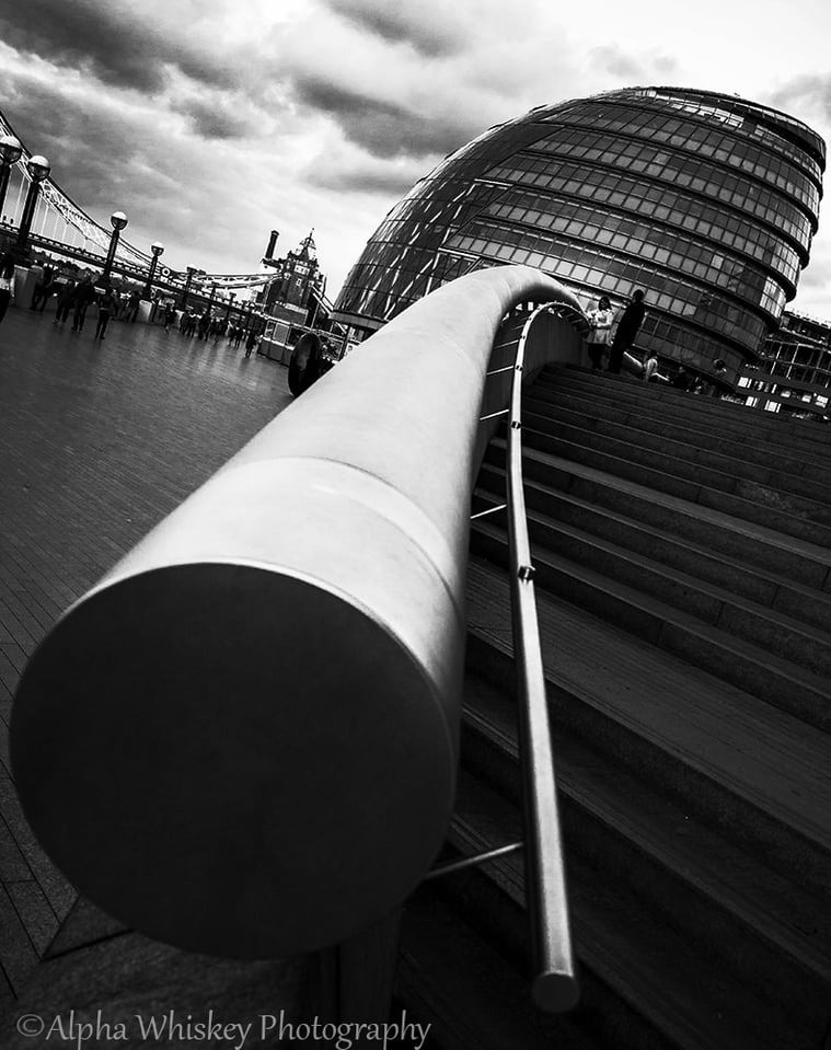
Back in my youth I learned from studying graphic illustration that the inker provides as much meaning to the scene as the pencil artist, often supplanting the fine detail by bold strokes of black, simply to add greater contrast and direct the reader’s vision. Important parts of an image can be subtly framed by deep areas of black, directing the viewer toward the lit subject.
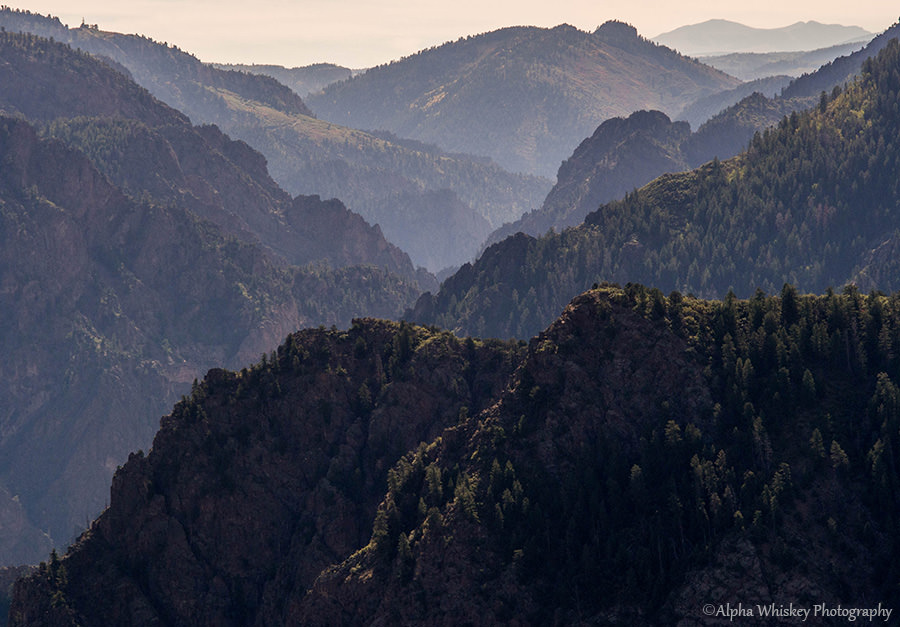
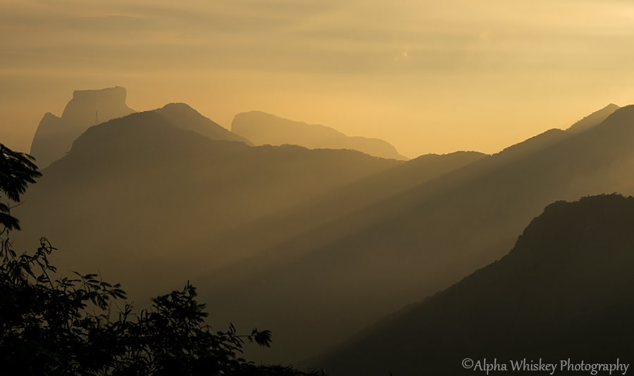
Light and shadow can also create layers and depth to a scene, with fading contrast giving a sense of and leading the eye across a great distance. Hills and mountains in the early morning mist (or even midday sun) can provide such opportunity.
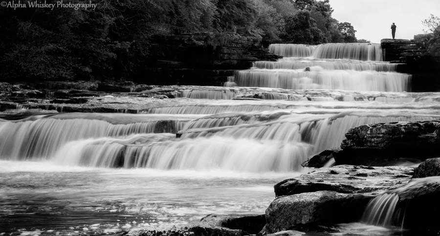
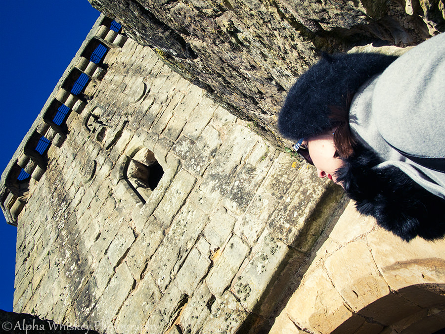
Having a person in the scene can also be a useful means of directing the viewer’s attention. As I indicated in a previous article we are often compelled to follow someone else’s gaze or simply the direction implied by their body or behaviour or movement. A person or persons can provide a point of interest or scale and in turn influence how we view the scene.
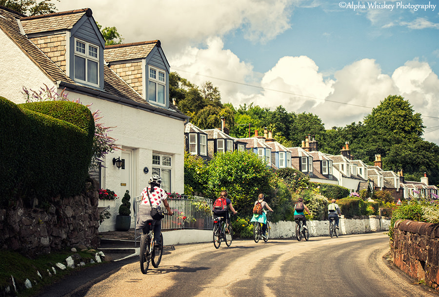

Well, I have skimmed through what is undoubtedly a much broader and complex subject. But I hope I have provided a few ideas on how to use the elements of your image, whether it is physical features, light or people, to direct the viewer’s attention and lead their eye through the scene. Considering these aspects may help to make your compositions stronger and more interesting, and I hope it will give you something extra to look for the next time you’re out shooting.
Regards,
Sharif.
Thank you for writing an informative article filled with lovely photos. There isn’t a single one I didn’t really like. :)
Thank you Katherine! I’m glad you liked it :)
When considering “leading the eye” in photography, it’s very useful to understand human visual processing and what “stands out” to people at a basic, biological level. A skilled photographer uses their experience to differentiate between things that stand out to them personally and things that stand out to a majority of people. A bit of reading on preattentive visual processing can help an experienced photographer further develop their skills and help a beginner develop a better “eye for things”.
Most of the information on preattentive processing related to visualization of data (graphs, charts, etc.), but it is certainly relevant to photography. Here is a good page that discusses the topic: www.csc2.ncsu.edu/facul…healey/PP/
In short, there are a set of visual differences that are noticed without engaging the brain’s full visual processing. This means these differences are noticed more quickly and kick in before any personal/learned/cultural/experience-based perceptions. It also means they are more universal to all people. These preattentively processed items make up the base guidelines for clear, clean visual display of information.
Perhaps one of these days I’ll get around to doing a photo series that parallels the classic series of blobs and lines as shown on the page above…
Hey everyone!!! :) I absolutely love this site it’s amazing!!!!! :) great job! I have a question though, what do you guys think of the Canon EOS 60D?
Awesome article!, I love that kitchen picture so colorful and appealing. Makes me kinda hungry for some home cooked food. The water fall image from wales is the best of the bunch IMO. I need to go out this weekend and hone some skills i haven’t used in a while. Keep up the good work.
Thank you Andrew! I’m glad you enjoyed the article and I hope you get some great pics this weekend :)
Hi Alpha Whiskey,
In general I have nothing but praise for your articles and I mostly like the photography. When I say I mostly like the photographer that means that I think you are really good and get it right the vast majority of the time. That comment would be true of anyone I think is really good. No one gets things right in my mind 100% and many would say the same for my photography.
Now to the article. I think this kind of article is soooo enlightening even for very experienced photographers. I believe, in general, that most of what we need to be good to really good photographers is fairly simple and one of the biggest components of making a photograph interesting is leading lines (leading the eye, as you say) so that the viewer is taken on an interesting journey through the photograph, being pleasantly led to a few key elements. This, along with balance and putting the detail in the right place get you most of the way there, IMO. The rest is focused practice.
So, I think nearly all the images are really good, but four really stand out and really exemplify “leading the eye”
1. Manx Coast. This photograph is interesting because there are two leading lines that are taking you to the same places through the photo. The road and the coastline both do the job! I try to look for this type of “double” leading lines all the time. Of course, it’s personal taste, but I love it.
2. Millenium Bridge. This stands out for me because the leading line is accentuated by the bright blue lights. This is a very strong element as well as a leading line.
3. Ah Wales. This is my favorite because of the leading lines creating by the meandering water around the little shoal in the middle. I am led to that element then toward the waterfall (the main element). Also the vegetation on both sides of the waterfall lead to the waterfall and the waterfall itself is part of that line. This is always something I like for but don’t find often enough! Awesome!
4. Spotter. I love how the a major element (the cascading water) leads your eye up to the main element – the Spotter. This photo has only 3 significant elements (the spotter, the flowing water, the rocks on the right) and the cascading water leads around and too the other elements.
I did notice as I was looking at these pictures that the ones that stood out the most for me involve water. Perhaps I should learn from this and incorporate more water scenes into my own photography.
Congrats and thanks again for the great article.
Thanks for the feedback.
Tolle Bilder..
Danke!
Nice photos. All but one photo lead my eyes to where the photo is supposed to. I wasn’t naturally lead to anywhere for the photo captioned “The Study”. Was the files on the desk where the eyes should lead to?
Thanks!
Thank you for the feedback Enayet. I think the eye is meant to be led across the desk and towards the rear of the room. It may not be the best example of a room shot. :)
Hi, how does your olympus handle highlights such as skies? sorry for asking about camera?
Hi there. The Olympus handles highlights very well. The last two photos in this blogpost will show you how much detail can be recovered from blown highlights (when shooting RAW).
alphawhiskey.slickpic.com/photo…oToPlovdiv
Thank you., it is hard to get such details about these cameras in commercial reviews.
It is incredible how much detail you were able to recover in that photo. Since you took that pic in moving car that tells me the focusing is great in this camera, would you agree?
The contrast detection AF is very fast but locking on to moving objects (or objects moving past) is not as good as bodies with phase detection AF, unless the object is far enough away that the AF has no trouble tracking it.
If someone is naturally good at composing pictures that lead the viewer’s eyes can it be said that they have a talent for leading the eye?
How does that Olympus handle highlights such as skies?
Wonderful photographs. Thanks for sharing and the useful article.
Thank you Ikhlaque:)