I suspect that many photographers have realized their best photos frequently come after several “getting there” images – scenes where something interesting stands out, and you gradually improve upon your early attempts, creating a composition that looks more and more refined by the end. The trend has been so clear in my personal photography that I thought it would be useful to show some examples, including how to apply this concept to your own work.
Below, I’ll demonstrate the refining process for the following four images:
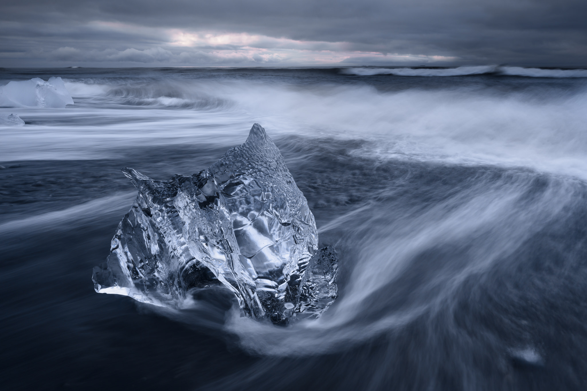
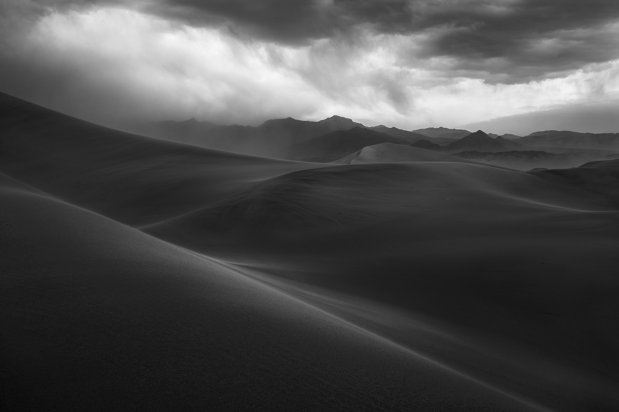
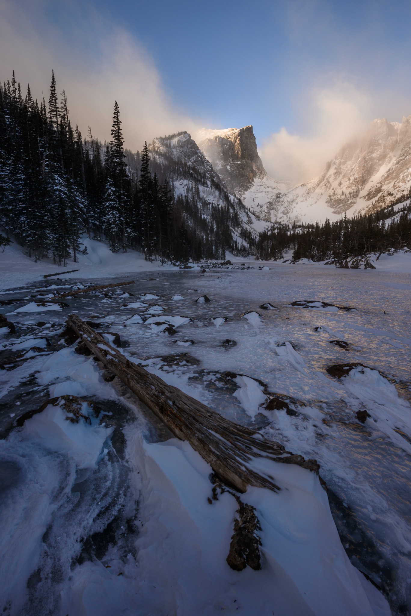
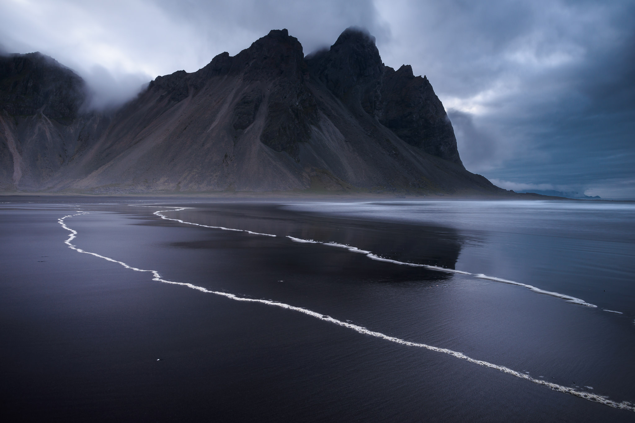
Table of Contents
Icy Beach at Jökulsárlón
The first example is from Jökulsárlón Beach in Iceland, a fascinating landscape and almost a playground for photographers. Melting icebergs flow out of a glacial lagoon and into the ocean, where some of them will wash back ashore. You’ll need to visit on a good day to find a large number of icebergs, but when conditions are right, it’s an amazing place to see and photograph.
I’ve written before that “good light” in landscape photography (or any type of photography) is light that complements your subject. You don’t need to capture golden colors in the sky to make a good photo; sometimes, that might even be the worst light for a particular scene! If your subject is harsh, for example, you’ll find that gentle, golden colors will counteract your central message, and the photo is likely to feel disjointed as a result.
The image below is one example, where the iceberg and the light send very different emotional messages. On top of that, the composition is static, with no interesting lines to lead into the background and no real sense of movement – not ideal when the scene itself is so dynamic:
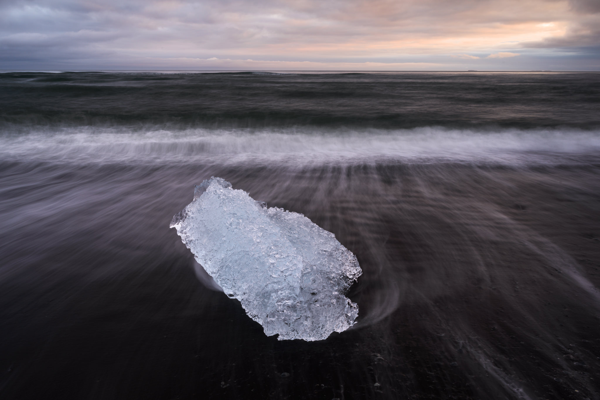
The colors in the sky are nice, and the scene is interesting, but there just isn’t any deeper meaning or message in this photo. The iceberg is blue and sharp; the sky is orange and soft. Why are they paired together? It’s hard to find a good reason.
On top of that, the subject itself leaves room for improvements. It isn’t ugly by any means, but there are other blocks of ice on the same beach with more interesting textures and shapes. I took this photo next, which has a better subject and a more dynamic composition, although it doesn’t improve much upon the conflicting messages between light and subject:
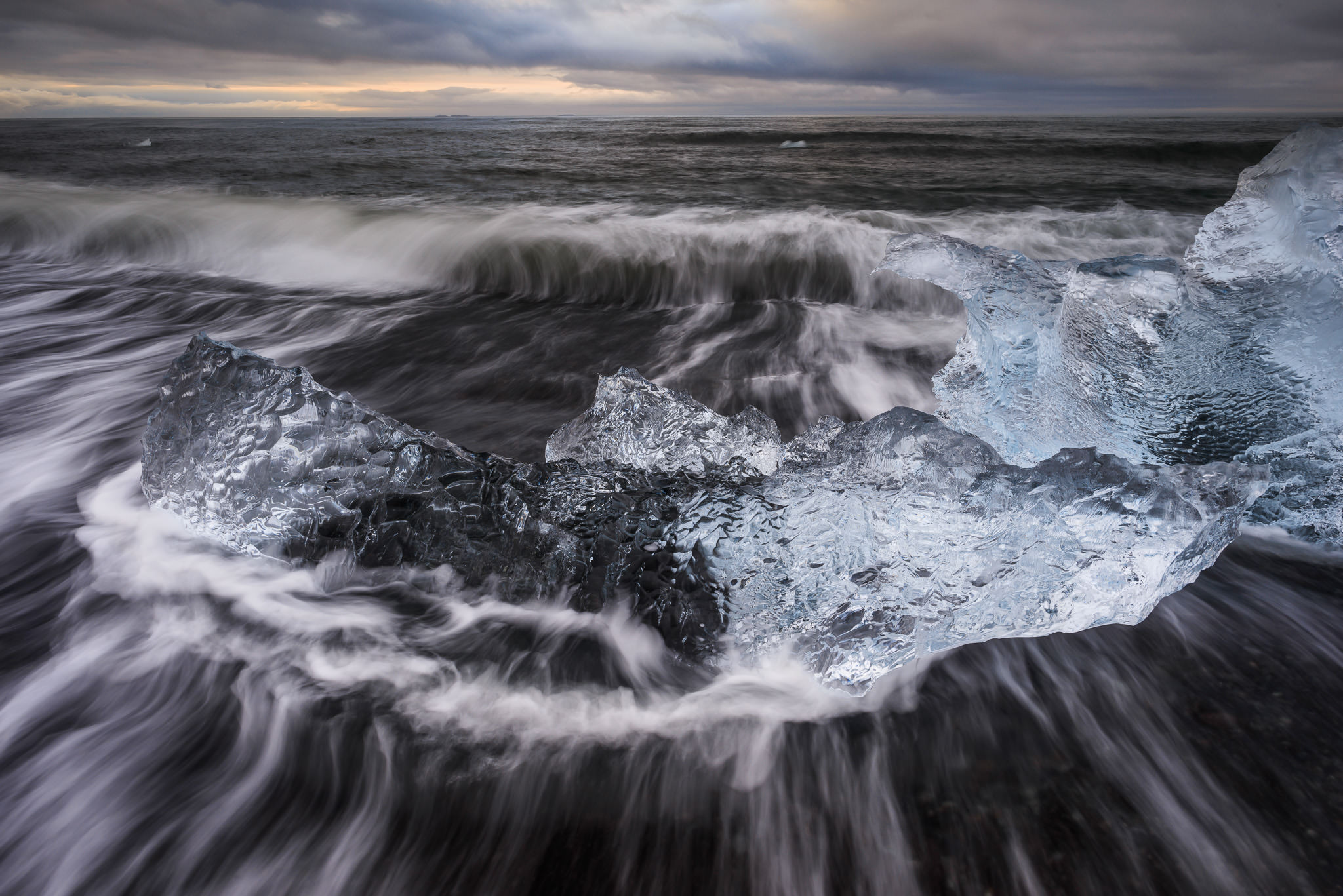
It’s making progress, but the composition above is now a bit too chaotic and difficult to understand. I made the photo more dynamic, sure, but I did so by getting closer to an interesting block of ice and practically shoving it in the viewer’s face. How could I achieve a similar sense of movement with a more straightforward composition?
My solution was to point my camera sideways down the beach rather than straight ahead, which fixed two problems. First, it gave the composition a strong diagonal line – waves receding into the ocean – giving it a greater sense of movement. Second, it changed the sky to showcase a blue area with a similar intensity to the ice itself. The result is much closer to conveying the message I had in mind from the start, but only captured hints of so far:
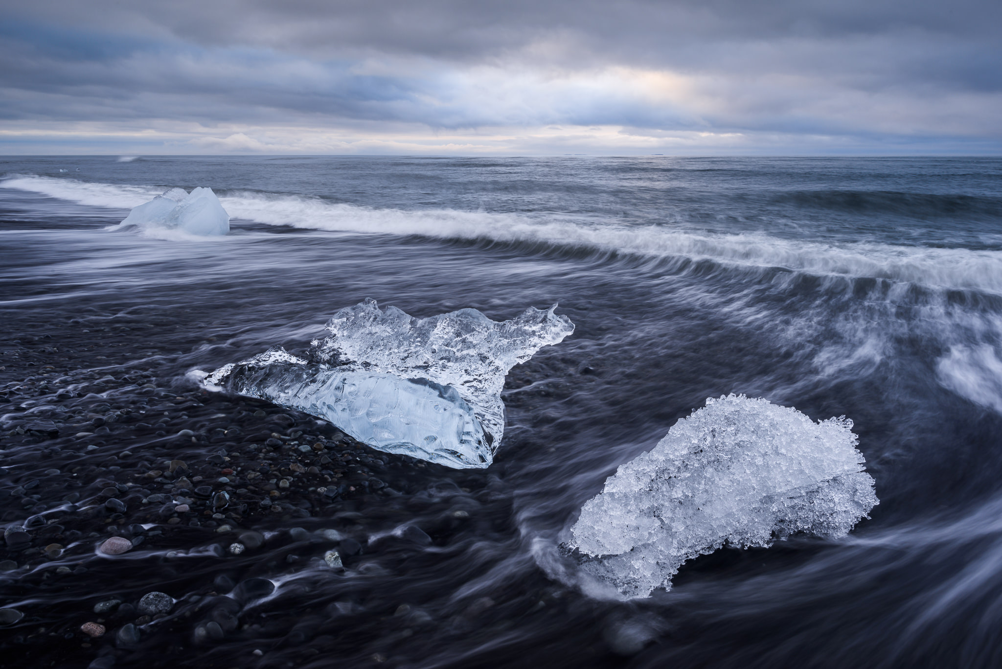
The remaining tasks at this point were small: find the most interesting possible iceberg, and simplify the frame down to its fundamentals. For example, if the middle iceberg were the only one in this photo, and I approached a bit closer so that it took up more space in the frame, it would be almost exactly the image I wanted (with fewer distractions and a sleeker subject). Although the other nearby blocks of ice made that composition impossible, I found what I was looking for with the following image:
I was lucky that the clouds had turned into a dramatic diagonal pattern in the meantime, but, as you can tell, it wasn’t a matter of just showing up and taking this photo out of nowhere. Almost of the compositional and creative work was already complete at this point. Each step of the way, I refined the message and idea I wanted to convey, and the result is a landscape photo with a much more cohesive message.
Death Valley Sandstorm
One of the most frightening and beautiful nights I have ever taken pictures happened in Death Valley’s Mesquite Sand Dunes as a sandstorm approached. More than an hour away from my car – but luckily with two good GPSs in hand – the atmosphere turned from clear and bright to an ocean of dust. I took all the photos below before the sandstorm completely enveloped the scene, but just minutes after the last one (my favorite, and the one I still display today), visibility dropped precipitously.
It should be no surprise that my goal here was to capture the landscape’s dramatic display of power and intensity. It is also critically important in a landscape like sand dunes to omit as many distractions as possible, since there will often be elements that can take away from your central emotional message as a photographer: footprints, shrubs, or other imperfections in the sand.
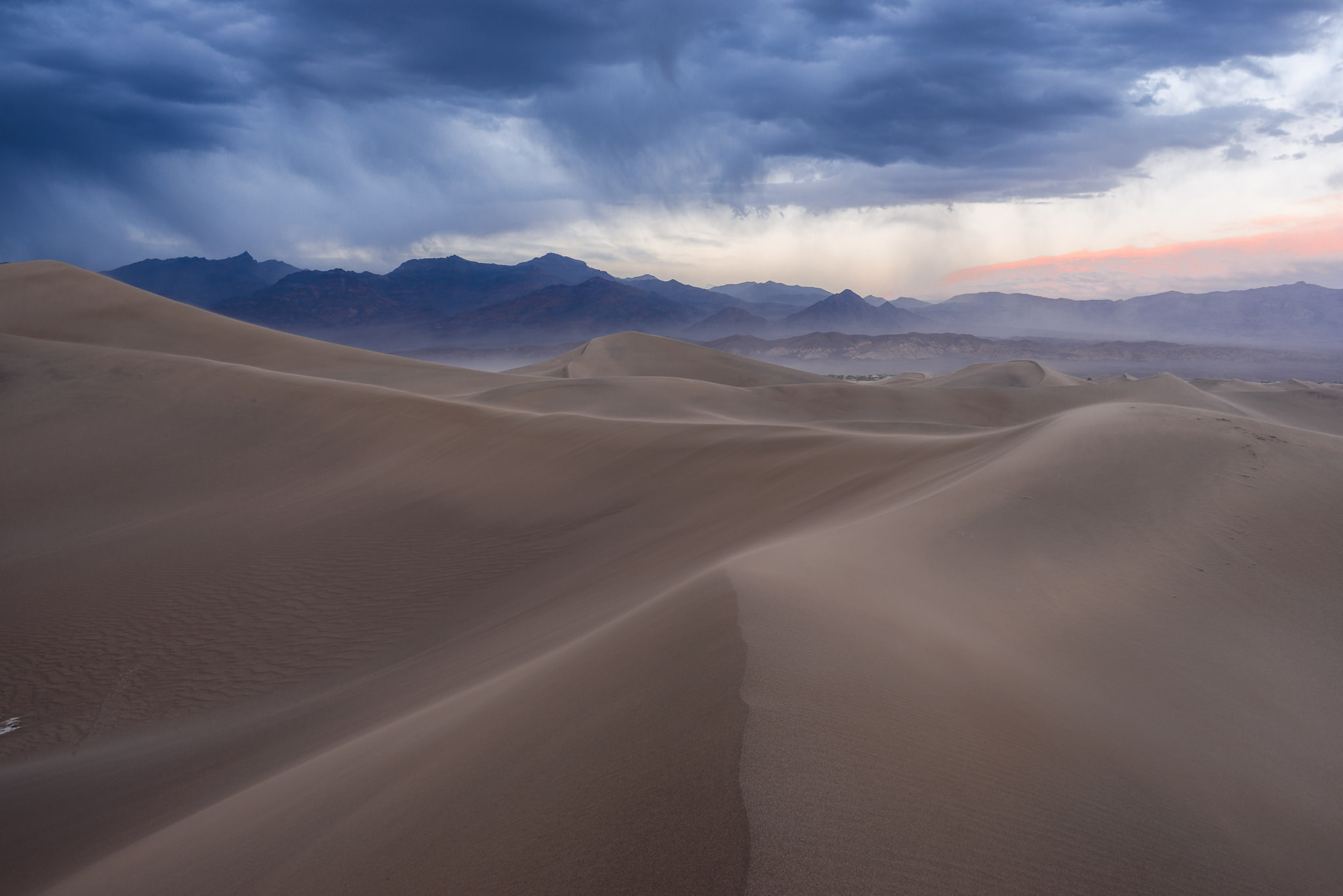
The first photo has a number of issues – another conflict between the sky and the foreground messages, as well as several distracting elements in the scene itself – but the fundamentals of the image are already in place. The left-hand side of the sky is perfect, with dark and stormy clouds that exemplify a feeling of terror and intensity:
However, the rest of the image has a number of problems. The foreground dune, for example, does have some interesting textures, but it also is a relatively awkward compositional element. Specifically, its size is almost overwhelming, stealing thunder from the photo’s main subject – the primary subject, as Nasim would say – despite being less important. And the right-hand side of the sky isn’t doing this photo any favors, either, with a bright (almost cheerful) region that is decidedly different from the rest of the photo’s message.
Perhaps those issues would be forgivable, but the middle ground of the photo is even worse, with a large number of distractions. The shrubs on the distant dune don’t add anything to the photo, but they do draw emphasis away from the more important areas of the image. The same goes for the very dark sand on that same dune, which almost act as black holes, sucking attention away from elements like the distant mountain that should matter more.
This sort of problem isn’t always fixable, and you’ll come across a number of landscapes where you just have to live with some distractions in the photo because that’s how nature looked. But in this case, I had a suspicion that walking farther into the dunes would let me get beyond the distractions and improve the photo. So, that’s what I did:
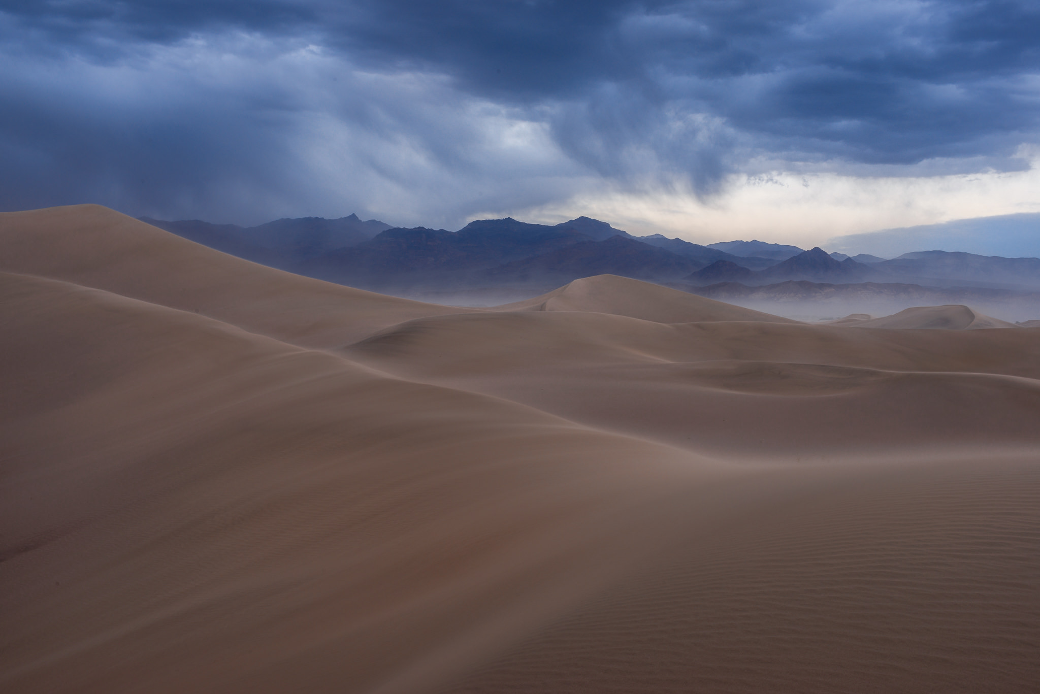
Making progress! There are still some distractions here (especially the white area of sand on the very left of the frame), but the overall composition is much better. The foreground no longer takes away from the primary subject in the background; it draws the eye into the distance instead. So, what issues still remain?
One of the biggest is that the leading line in the foreground is not very dynamic. It’s straight up and down, whereas a diagonal has the potential to work much better – same as with the Jökulsárlón example. And because of my attempt to exclude distracting elements out of frame to the left, the composition is relatively imbalanced; ideally, I would have framed the distant mountain more centered. My next move was to walk forward a bit farther to correct the two issues:
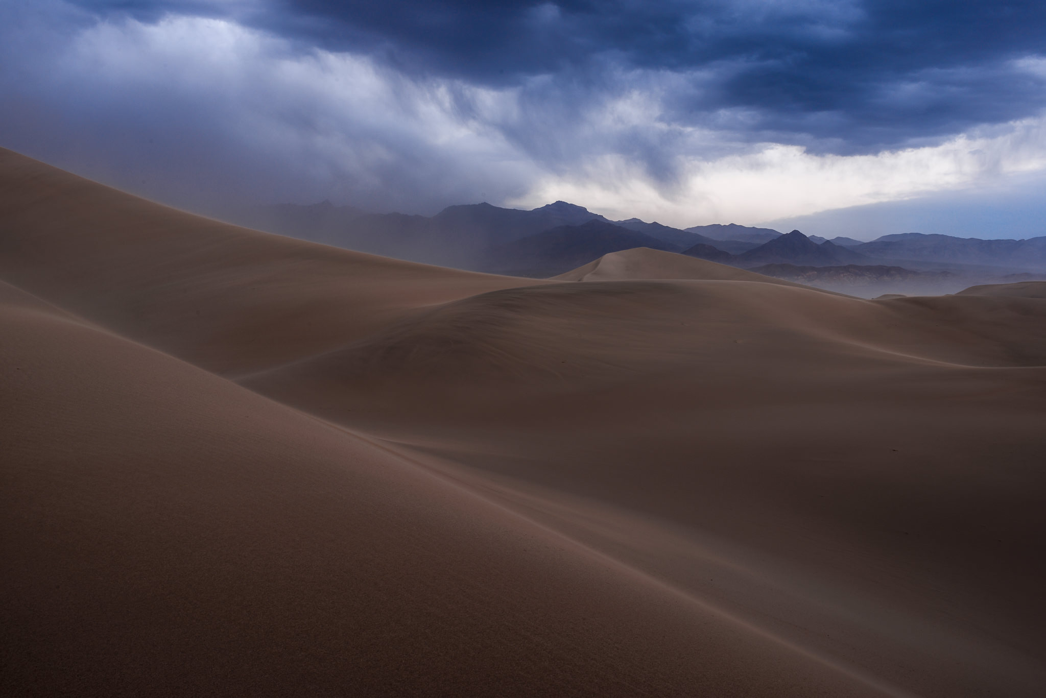
Most of the composition and message are in place now, with the remaining issues comparatively minor. If my camera died right after this moment, I still would have been happy with the image – but there is almost always room to refine things even more. Even when you really like a photo, take a look at it and see which elements still have room to be improved.
Here, although the composition is better and more balanced than in the prior example, the peak of the sand dune on the very left is a bit annoying. Although I could crop it out, that would place the intersection between the dunes and the mountain too close to the edge for my taste. I frequently like to leave the edges of an image with minimal points (i.e., two lines intersecting) and compositional distractions, preferring the boundaries of the photo to resembling a natural and continuous “frame” as much as possible.
Another issue is that the bottom portion of the photo is relatively empty. Again, not the end of the world, but perhaps moving even closer to the foreground would let me make the composition even more dynamic and fix this problem at the same time. It could also make the left-hand dune comparatively larger, offering more flexibility to crop it out without showing the peak of the dune. That’s how this image looked:
There we have it. Not only is the composition much better, but the front end of the sandstorm has nearly reached me (look at how the visibility changes on the small, very sharp triangular peak on the left in each photo). So, there is an added element of drama and intensity that works perfectly with my intended message! Not only that, but the pink and yellow colors in the sky are gone, replaced by a dark blue tone instead.
However, even though I like the blue color here, I ultimately decided that a black and white image conveyed my message even more strongly. It looks more raw, somehow, with darker tones and more intense contrast. When you know exactly which emotions you want to convey, post-processing is not just a final checkbox to tick, but a crucial creative element at your disposal. I hope you like the final image:
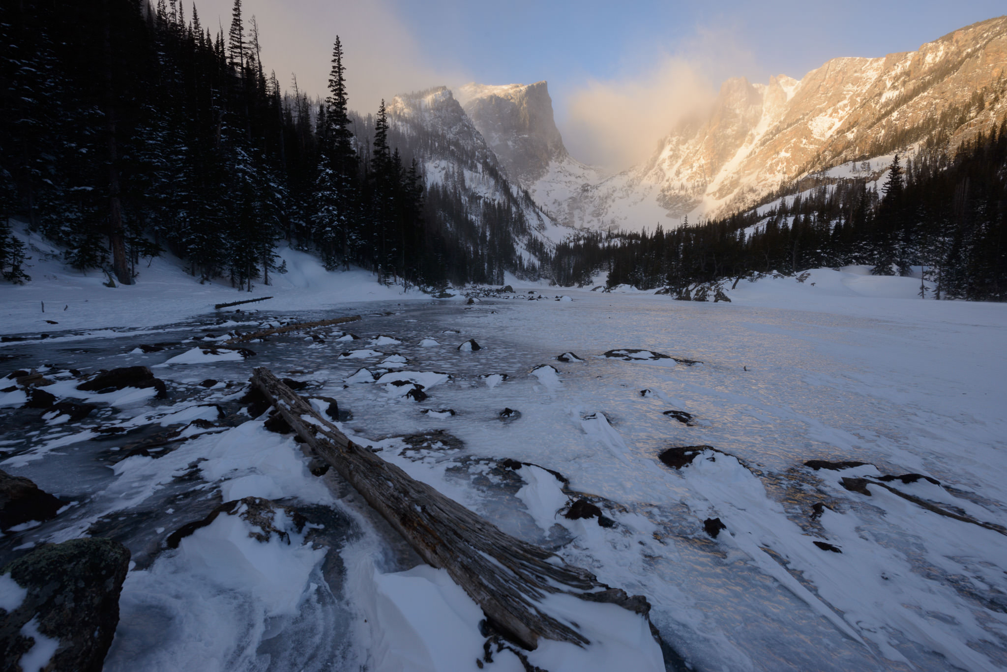
Rocky Mountain Winter
If you’ve ever tried running up a snow-covered hill at 9900 feet altitude (3000 meters), trying to make it to a location in time for sunrise, you must also be a landscape photographer with time management skills as… unrefined… as mine. But despite my tired legs after reaching the landscape, this sunrise is going to stick with me for a while. The cold beauty, the tremendous scale – it was simply amazing to see.
My first attempt at a photo, though, was not quite as good. The background shows a magnificent scene, but the jumble of rocks in the foreground does not draw the eye or suggest the same sense of deliberateness:
Note the fallen tree stretching across much of the frame, though. I felt like that element could provide what the photo above is missing: a link between the foreground and background, as well as a simplified composition. I approached closer, and this was the next image in my refining process:
That looks a lot better, although the new composition has some issues of its own. Although the foreground is much simpler and more direct, with a strongly defined shape to it, I still have a jumble of rocks to the left and an empty area of ice to the right. On top of that, the trees on the left are cut off by the top of the frame.
It also looks like the clouds, although they’re certainly interesting, are covering the central peak more than I would like. Luckily, they were moving quickly, alternately hiding and revealing the mountain. My next step was pretty clear, then: switch to a vertical composition and wait for the clouds to part. The result is – in a sense – exactly what I had wanted from the start, but hadn’t been able to bring into reality without some experimentation:
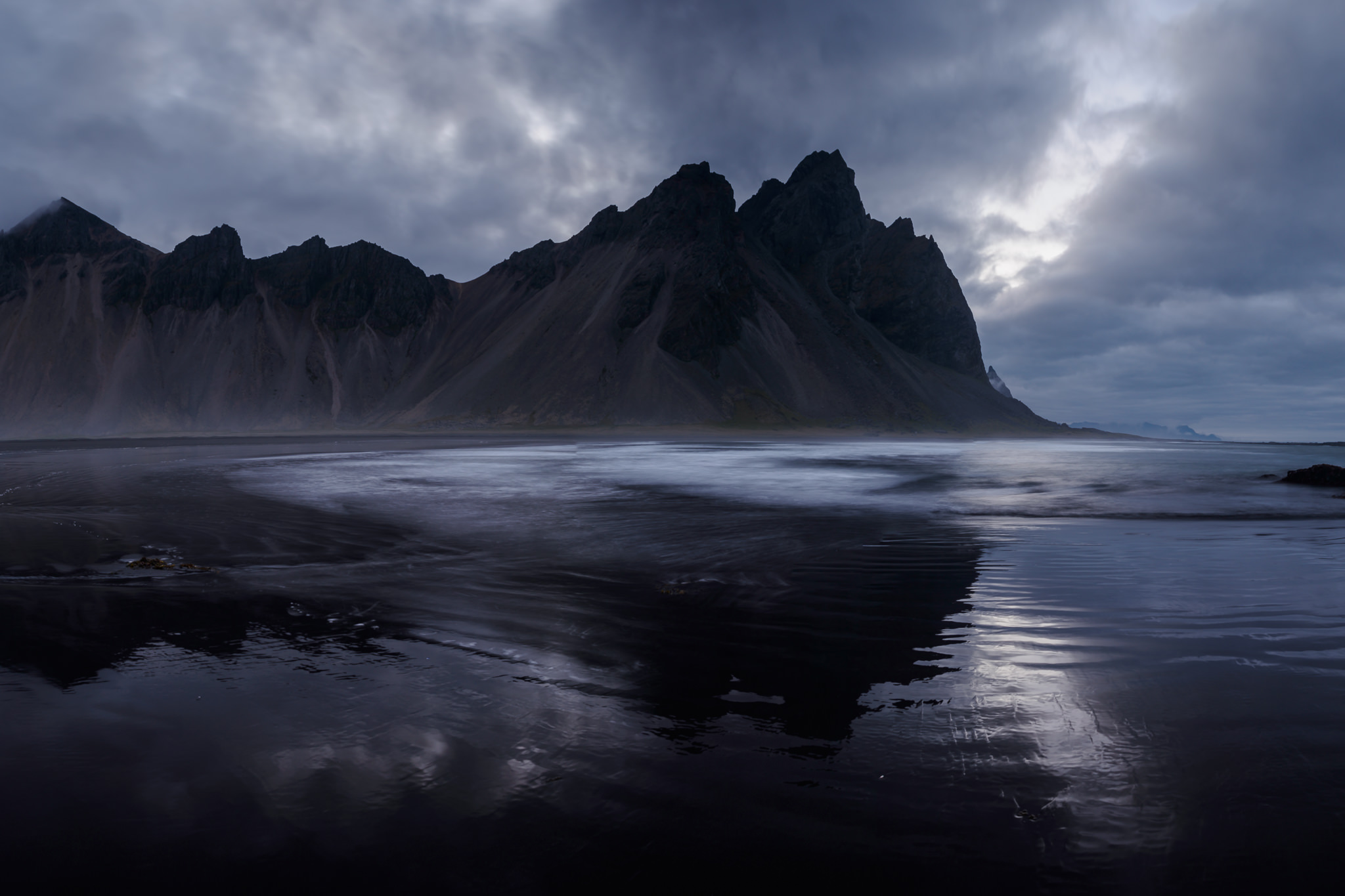
Vestrahorn at Blue Hour
The last image I’ll cover in this article is of the famous Vestrahorn mountain in Iceland, taken from the Stokksnes peninsula. Blue “hour” in Iceland can last for several hours near the summer solstice, since the sun spends so much time hanging just barely below the horizon. So, you have a lot of time to refine your photos here!
In this case, I took the first image as I was approaching Vestrahorn, and I stumbled upon a feature in the sand that I liked. To me, though, this photo doesn’t work very well. The structure in the foreground is too large and relatively dull. The blue light also is not at its best, with very flat clouds and not much interest aside from the mountain itself:

I figured that one of the best ways to make the photo more interesting and dynamic was to approach the ocean (visible at the very right of the image above) to see if some better foregrounds presented themselves. Soon, the sky started to get a bit brighter, throwing the mountain into more of a silhouette, which worked well; it added some intensity, matching more closely to the emotion of this mountain.
The following photo definitely has better light than the first image, but the distracting sandbar has been replaced with a distracting, weird-detail area of water washing ashore. The foreground still isn’t interesting, leaving plenty of room for improvement:
What to do next? First, I needed to move a bit farther away from the water so that the large area of receding waves wasn’t in the photo – it just doesn’t look very good. Beyond that, though, I also had to find a foreground that actually worked well. If only a well-defined wave pattern appeared… and then it did:

Now I knew exactly the photo I wanted. This was already 90% of the final image, but I realized that it would be very interesting to have two of these foam patterns in the foreground leading into the distance rather than just one. After only a few minutes of waiting, two waves washed ashore in sequence, both leaving a trail of foam that anchored the composition. This is what I was looking for the whole time:
Conclusion
Although it happens on occasion, it is rare that your first photo of a scene will be the best one you capture. By asking yourself – honestly and open-mindedly – which elements work and which do not, you have the ability to refine most of your photos in the field before it’s too late to change anything.
The images above are just four out of the many such photos in my portfolio; well over half of my favorite photos have very similar stories behind their capture. Hopefully, seeing the whole path from point A to point B, rather than just the finished and polished version of these photos, gives you a good understanding of what it can take to capture the image that you really have in mind, even if you don’t recognize it consciously at first. Getting there involves a lot of recomposing, moving around, and building upon your earlier images, but the results are sure to be worth the effort.
- Introduction to This Guide
- What is Composition?
- Elements of Composition
- Light
- Color
- Simplicity
- The Refining Process (You Are Here)
- Composition Tips
Was the shutter speed of 8.0 seconds Vestrahorn at Blue Hour correct? It seems that the foam and the barely visible water ridges in the lower right would show motion. A very helpful article. thanks,
Yes, that’s the correct shutter speed! The amazing thing in that landscape is that the foam stayed in place when the water receded, because the wind held it there. Two waves rolled up, one after the other, creating the two lines. (The first wave was a lot stronger and higher on the beach.) It led to one of the best foregrounds I’ve ever seen as a photographer.
I learned a lot reading this article, just like every article of yours that I read. Thank you Mr. Cox.
Hi Sir
A brilliant piece of advice and tutorial for all aspiring photographers including me. The process or journey to the final image, how much thought goes behind tbe scenes, well said. God bless you.
Hello Spencer,
Thank you so much for your article.
I’m a guy of 18 with a lot of passions and right now I’m approacing to photograpy.
I started to read some articles from photographylife and imho they are absolutely perfect.
I can clearly see the love you put in what your’re doing, and as I keep reading, photography became more and more interesting.
The fun thing in this article is that when I looked at the first attempt of a shot, I often had the same feelings of yours. For example, the last pic of the Rocky Mountain convey the best message and harmony.
But the most satisfying part is when i don’t agree with you. An example: even if the second pic at Vestrahorn mountain has something “wrong” (the waves pattern), the light is astonishing. This led me to prefer the second shot over the others.
Luckily, photography is subjective, and to me, a way to escape the rigidness of my other passions, like computers and physics.
I don’t have a camera right now but I’m saving money. Meanwhile, I just enjoy watching other’s pictures.
Sorry for my poor English but I’m from Italy.
Merry Christmas!
Hello Spencer Cox,
I love your articles plenty. I discover them very helpful as i am as a substitute new to pictures. But i have experinced the same. How i return to a reason and refine it, or return to a cause that had completely wrong light the primary time . Such a mornings i idea, possibly that is the manner of working for a professional photographer and i would love to see the way they improve their pictures.
I’m pretty sure that there are things that I’ll really help me improve on your article. So, that is an excellent article, thank you!
Excellent example of how an image can be recomposed under almost same exact conditions. Too often I hear advice on cropping out this or that. Instead, we should move around and experiment with different angles. Minor variations in composition can make a huge difference. I like to think that the best zoom lens is your feet.
I’ll pile on here: I’ve engaged in what I consider to be two significant learning experiences (beside my actual imaging) to improving my photography this year: 1) attended a John Fielder talk at Royal Gorge where he explained his thinking behind composition, and 2) reading this article. And for me, it’s not necessarily about “do this and it’ll work better”, it’s about how someone else thinks and mapping it to my experience.
Spencer, in my opinion you do the job of mapping the fundamentals into cogent explanation better than almost anyone else posting stuff on the web. Keep doing it…
Hi Spencer,
I wish more photography teaching materials, be it blog posts or even videos, were produced like this. It’s exactly what we need to learn. Your humbleness in showing the “draft” shots and how you worked each one until you got what you wanted really, really helps. Thank you so much for sharing this with us.
Best,
-Tulio
I’ll keep what you say in mind and try to do more articles like this, thank you, Tulio! Good photos don’t happen in a vacuum – there’s always a process of some kind behind their creation.
Great article. Thanks for sharing the process you use and what you were thinking at the time. I have much to learn!!
Thank you, Richard! I’ve always found it useful to see the behind-the-scenes process for photos I like; glad the same was true for you in this case.